
ここ最近、Expo UIに熱中しているのでまた記事書きました。
Expo UIのiOSのDateTimePickerのボタンがあまりにカスタマイズ製に乏しすぎるので、React Nativeで自由にボタンをカスタマイズしてかつiOSのホイールを手にいれる方法をやっと編み出しました。
@expo
zenn.dev/mu_tomoya/articles/…
1
2
76


May 11
Mantine 9.2 is out!
TreeSelect component, SankeyChart, RollingNumber animation, InlineDateTimePicker, use-drag hook, DateTimePicker range mode, notification swipe dismissal and more
mantine.dev/changelog/9-2-0/
1
1
26
1,204

Apr 16
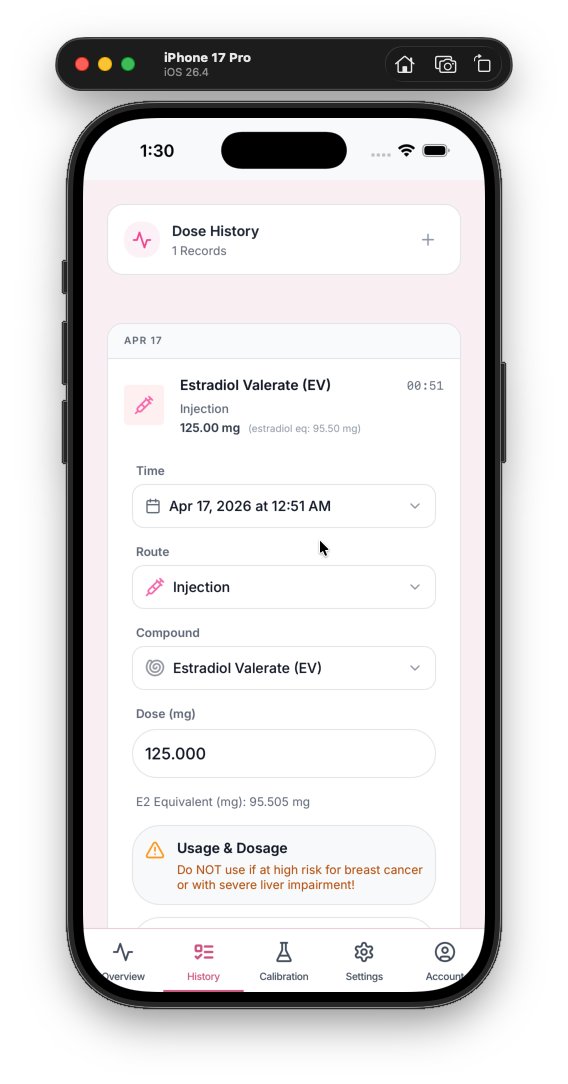
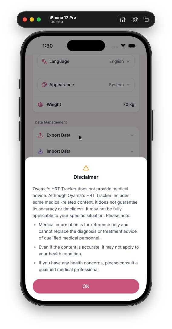
hrt.mahiro.uk update
- metadata.json: update description string.
- Modals: unified wrapper/spacing, safe-area handling and consistent button styles across many modals (Auth, Disclaimer, EstimateInfo, Password, Edit/Delete/ChangePassword, WeightEditor, etc.).
- Buttons/colors: replace many hardcoded pink styles with theme vars (--color-m3-primary / -primary-light) and adjust some accent colors to teal for template/icon states.
- DoseForm & LabResultForm: replace native datetime-local inputs with DateTimePicker component, add compact date button UI, improve responsive layout, templates/inputs styling tweaks, and color/focus updates.
- ResultChart: improved fullscreen handling for different mobile orientations, dynamic height style for landscape fullscreen, increased brush traveller width and small layout tweaks.
- WeightEditor: rebuilt modal layout for consistency with other modals, adjusted typography and actions to match new button styles.
- DialogContext/useAppData: dialog layout/buttons standardized; removed in-hook confirm prompts for deleteEvent and deleteLabResult (now delete immediately).
- Import/Export/Other components: input focus rings and hover states updated to theme vars; icons updated to match new color tokens.
- i18n: added authentication-related translation keys (sign in/up, username/password strings) for multiple locales.
These changes unify visual language, improve mobile/responsive behavior, add a consistent date-picking UX, and simplify deletion flows.
3
589

sabah 12 yaşındaki yeğenimin telefonuna, uygulama kuracaktım, ebeveyn kontrolü var dedi. izin iste diye uyarı çıktı.
Babasından onay beklerken, telefonu aldı elimden bende izliyorum ne yapacak diye,
Girdi ayarlara ebeveyn kontrolünden çıkmak için en az 17 yaşında olması gerektiğini okumuş.
hemen kendi profilinde de doğum tarihinin yazdığını gören bir datetimepicker olduğunu yere..
aa amcaa nasıl çıkacağımı buldum, yaşımı 17 yaşıcam hangi tarihi girmeliyim dedi.
dedim ki ebeveyn kontrolü açıkken yaş değiştirmeni engellemişlerdir, o kadar slk değillerdir.
yoo engellememişler dedi.
iyi dedim gir 2005 tarihini bakalım değiştirebilicen mi?
- hee yine izin istiyor dedi.
Anahtar kelime, "o kadar slk değillerdir."
x.com/donanimhaber/status/20…

1
86
38,818


Mar 4
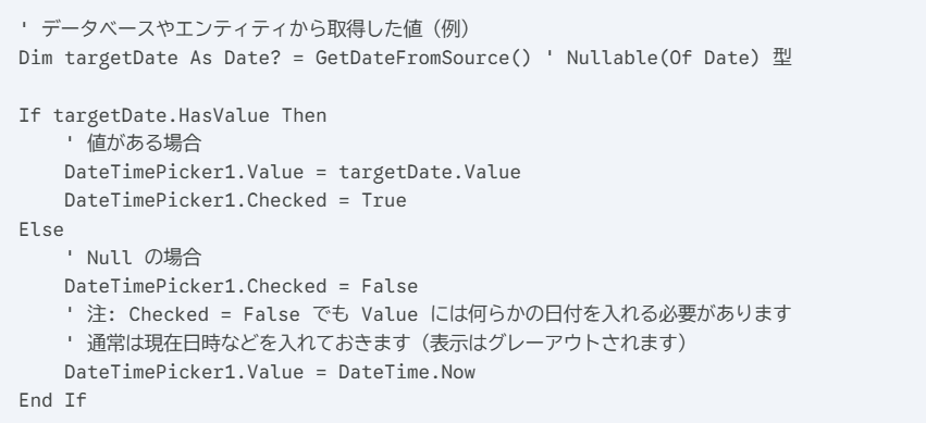
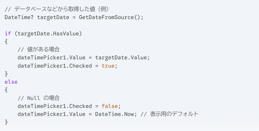
今更だけど、
DateTimePickerで日付を「未選択」に出来ないんだよ。
Geminiにコード書かせたら…
まあ、そうなるよね。
自前のチェックボックスでDateTimePickerの表示を制御しないときれいに表示できないってことです。
1
4
623

Mar 1
🚨 Expo SDK 55 just dropped and I need to talk about it.
This isn't a small update. This is a turning point for React Native development. Here's everything you need to know 👇
1) CORE STACK UPGRADE
SDK 55 ships with:
→ React Native 0.83
→ React 19.2
→ Hermes v1 (opt-in)
The foundation has never been this solid.
---
2) RIP Legacy Architecture
It's finally gone. No more `newArchEnabled` flag in app.json. New Architecture is THE architecture now.
If you haven't migrated yet... the time is now. No more excuses. 😅
---
3) 75% SMALLER OTA UPDATES
This one's huge for users.
Thanks to Hermes bytecode diffing, your over-the-air updates are now up to 75% smaller.
Faster downloads. Less data. Happier users. That's a W. 🏆
---
4) Expo Router v7
Expo Router keeps leveling up.
More native APIs, better brownfield support, and a new /src/app folder structure that cleanly separates your app code from config files.
Finally feels like a grown-up framework. 🙌
---
5) expo-widgets is INSANE
You can now build iOS home screen widgets and Live Activities using Expo UI components.
Zero native code. Zero Swift. Just React.
I genuinely didn't think this was possible to pull off this cleanly. 🤯
---
6) AI Tooling Built In
SDK 55 ships with MCP support agent skills for Claude Code.
Your AI coding assistant now understands your Expo project natively. This is just the beginning of AI-native mobile dev. 👀
---
7) expo-blur on Android — FINALLY
Background blurs on Android have been painfully slow forever.
SDK 55 switches to the RenderNode API on Android 12 and it's buttery smooth now.
Android devs, you deserved this. ✨
---
8) Expo UI keeps getting better
@expo/ui is evolving fast toward a stable 1.0:
→ DatePicker (was DateTimePicker) with range support
→ Toggle (was Switch)
→ ProgressView unified from two components
→ Jetpack Compose beta coming soon
SwiftUI Compose. Native. Beautiful.
---
9) expo-av is GONE
RIP to the OG. expo-av has been fully removed.
Migrate to:
→ expo-audio
→ expo-video
They're better in every way. Don't sleep on upgrading.
---
10) expo-brownfield for native teams
Got an existing native app? You can now embed Expo screens into it with zero React Native build tool installs on the native side.
Bi-directional communication, dedicated CLI, Expo-first design. Huge for enterprise teams. 🏢
---
11) One more thing: version alignment
All Expo packages now use the same major version as the SDK.
expo-camera is now ^55.0.0.
No more guessing which version is compatible. Clean. Simple. Obvious. 👏
---
SDK 55 is one of the most impactful Expo releases in years.
Legacy Arch out. New Arch in. AI tooling. Widgets. Smaller updates. Better blur.
The React Native ecosystem is cooking. 🔥
Drop a 🔥 if you're upgrading today!
@reactnative
#ExpoSDK55 #ReactNative #MobileDev #JavaScript
4
102


Jan 19
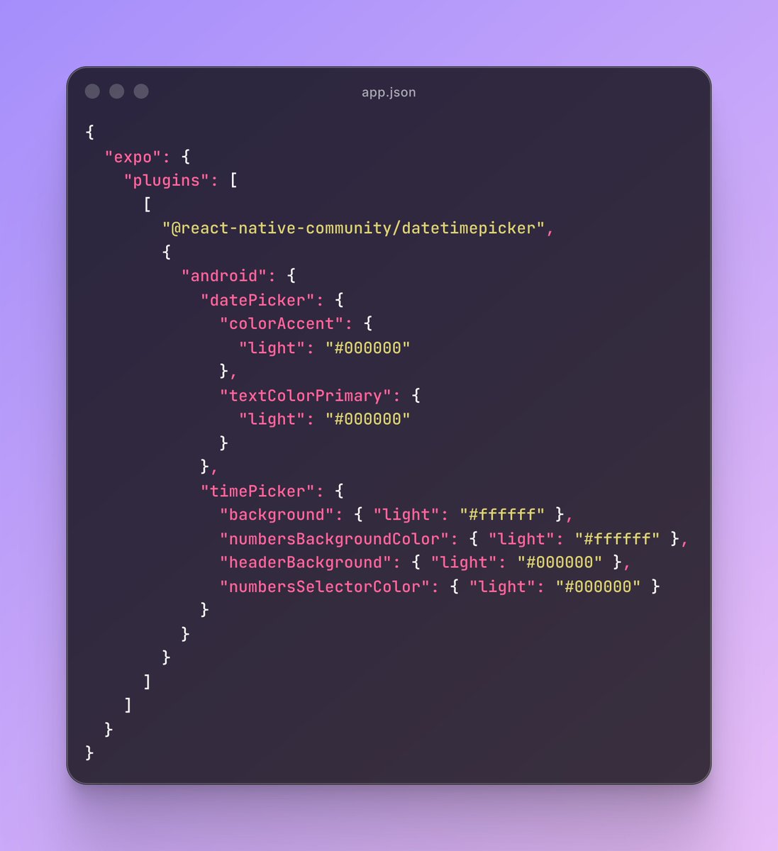
Pro tip for Android 📱
When using the DateTimePicker, prefer the imperative API instead of the component-based one.
✅ Way cleaner UI
✅ No layout jumps
✅ Easier control over when it opens
✅ You can fully customize the native look using the config plugin
Master React Native with me here: cwb.sh/rn?r=x
10
11
268
15,962


1 Sep 2025
改了个DateTimePicker的accessibility 问题,暴露出了菜单的一个bug,把这个bug修了,发现有好几个bug之前之所以没发现是因为跟这个bug互相cancel了,又把他们修了,发现皮肤上的配色变化因为这些bug被修了之后终于暴露出来了。还好之前为全部的控件都做了单元测试,每一个阶段渲染后的结果都 1/n
1
18
2,751

20 Aug 2025
For example
npx expo install -D @storybook/addon-ondevice-controls @react-native-community/datetimepicker @react-native-community/slider
Could now be
npx expo install -D @storybook/addon-ondevice-controls
Because now autolinking will look for nested dependencies
1
10
424

19 Aug 2025
i just switched the time pickers to native ones. They're pretty smooth on iOS, but I'm not sure about android yet
made with react-native-community/datetimepicker
here's the comparison
2
6
363


🎩 React Native tips #1
React Native keeps its core simple: built-in components like <Text>, <View>, and <Image> handle the basics, but stuff like DateTimePicker? That's not in the box—you'll grab it from community libs like react-native-community/datetimepicker.
Unlike Flutter's all-in-one vibe, RN shines with flexibility: Need custom native power? Bridge your own modules in Java/Kotlin for Android or Swift/Objective-C for iOS. Perfect for perf tweaks in real apps! 🚀
#ReactNative #MobileDev
2
91

7 May 2025
Here's a single-file example that brings together as many Expo UI components from SDK 53 as possible, using the new native primitives for both iOS (SwiftUI) and Android (Jetpack Compose):
import React, { useState } from 'react';
import { Platform, View, Text } from 'react-native';
import {
Button,
BottomSheet,
ColorPicker,
DateTimePicker,
Gauge,
LinearProgress,
Picker,
Switch,
TextInput,
} from '@expo/ui/swift-ui'; // For iOS
import {
Button as JCButton,
TextInput as JCTextInput,
} from '@expo/ui/jetpack-compose'; // For Android
export default function ExpoUIAllComponents() {
// Shared state hooks
const [isOpen, setIsOpen] = useState(false);
const [color, setColor] = useState('#ff0000');
const [selectedDate, setSelectedDate] = useState(new Date());
const [selectedIndex, setSelectedIndex] = useState(0);
const [checked, setChecked] = useState(false);
const [inputValue, setInputValue] = useState('');
// iOS/Android platform-specific rendering
if (Platform.OS 'ios') {
return (
<View style={{ padding: 24 }}>
<Button onPress={() => setIsOpen(true)}>Open Bottom Sheet</Button>
<BottomSheet isOpen={isOpen} onIsOpenedChange={setIsOpen}>
<Text>Hello, world!</Text>
</BottomSheet>
<ColorPicker
label="Select a color"
selection={color}
onValueChanged={setColor}
style={{ width: 300, height: 150 }}
/>
<DateTimePicker
onDateSelected={setSelectedDate}
displayedComponents="date"
initialDate={selectedDate.toISOString()}
variant="wheel"
/>
<Gauge
max={{ value: 1, label: '1' }}
min={{ value: 0, label: '0' }}
current={{ value: 0.5 }}
color={['red', 'orange', 'yellow', 'green']}
type="circular"
/>
<LinearProgress progress={0.5} style={{ width: 200 }} />
<Picker
options={['$', '', '$', '']}
selectedIndex={selectedIndex}
onOptionSelected={({ nativeEvent: { index } }) => setSelectedIndex(index)}
/>
<Switch
checked={checked}
onValueChange={setChecked}
label="Play music"
/>
<TextInput
autocorrection={false}
defaultValue="A single line text input"
onChangeText={setInputValue}
/>
</View>
);
} else {
// Android Jetpack Compose components
return (
<View style={{ padding: 24 }}>
<JCButton onPress={() => setIsOpen(true)}>Open Bottom Sheet (Android)</JCButton>
<JCTextInput
autocorrection={false}
defaultValue="A single line text input"
onChangeText={setInputValue}
/>
{/* Add more Jetpack Compose components as they become available */}
</View>
);
}
}
This example uses as many Expo UI components as are currently available, including Button, BottomSheet, ColorPicker, DateTimePicker, Gauge, LinearProgress, Picker, Switch, and TextInput for iOS, and Button and TextInput for Android (more Jetpack Compose components will be added as Expo UI evolves).
You can copy-paste this into your Expo SDK 53 project and see all the new native UI elements in action-just make sure to install @expo/ui and use the correct imports for your platform!
77


9 Feb 2025
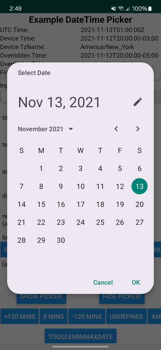
If you use the `react-native-community/datetimepicker` package, check out the newest version (8.3.0). I added support for Material 3 date pickers for Android!
4
7
123
4,878

23 Dec 2024
📢 #Angular Material Extensions v19 is out now! 🎉
‣ update Angular and Material to v19
‣ support the new Material theme API
‣ datetimepicker: improve a11y and RTL
‣ more!
github.com/ng-matero/extensi…
github.com/ng-matero/extensi…
2
39