
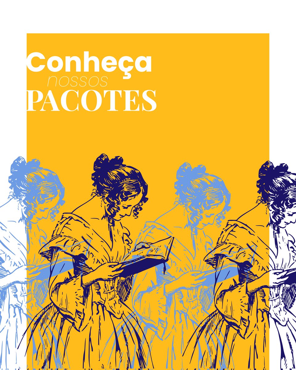
Muitos autores investem tudo no texto… E quase nada na capa. Resultado?
Livros excelentes passam despercebidos.
No novo episódio do UICast, conversamos com Rubens Lima, um dos grandes nomes do design editorial brasileiro.
Falamos sobre capas que vendem, erros comuns de autores e como posicionar visualmente um livro no mercado.
Se você quer publicar ou vender mais, esse episódio é obrigatório.
Assista ao episódio completo no canal da UIClap no YouTube.
youtu.be/u7wzgPparA4
Até!
#UICast #RubensLima #DesignEditorial #CapaDeLivro #Autores #UIClap
6

May 24
Quando a identidade vira imagem, a imagem vira assinatura.
#Myriam #MarcaPessoal #ArteDigital #AquarelaDigital #PersonalBranding #Criatividade #DesignEditorial

May 24

Turn your name into a luxury editorial collage inspired by you ✨
Every letter of your name becomes a different version of you.
Drop yours if you try it.
Prompt 👇

1
4
952


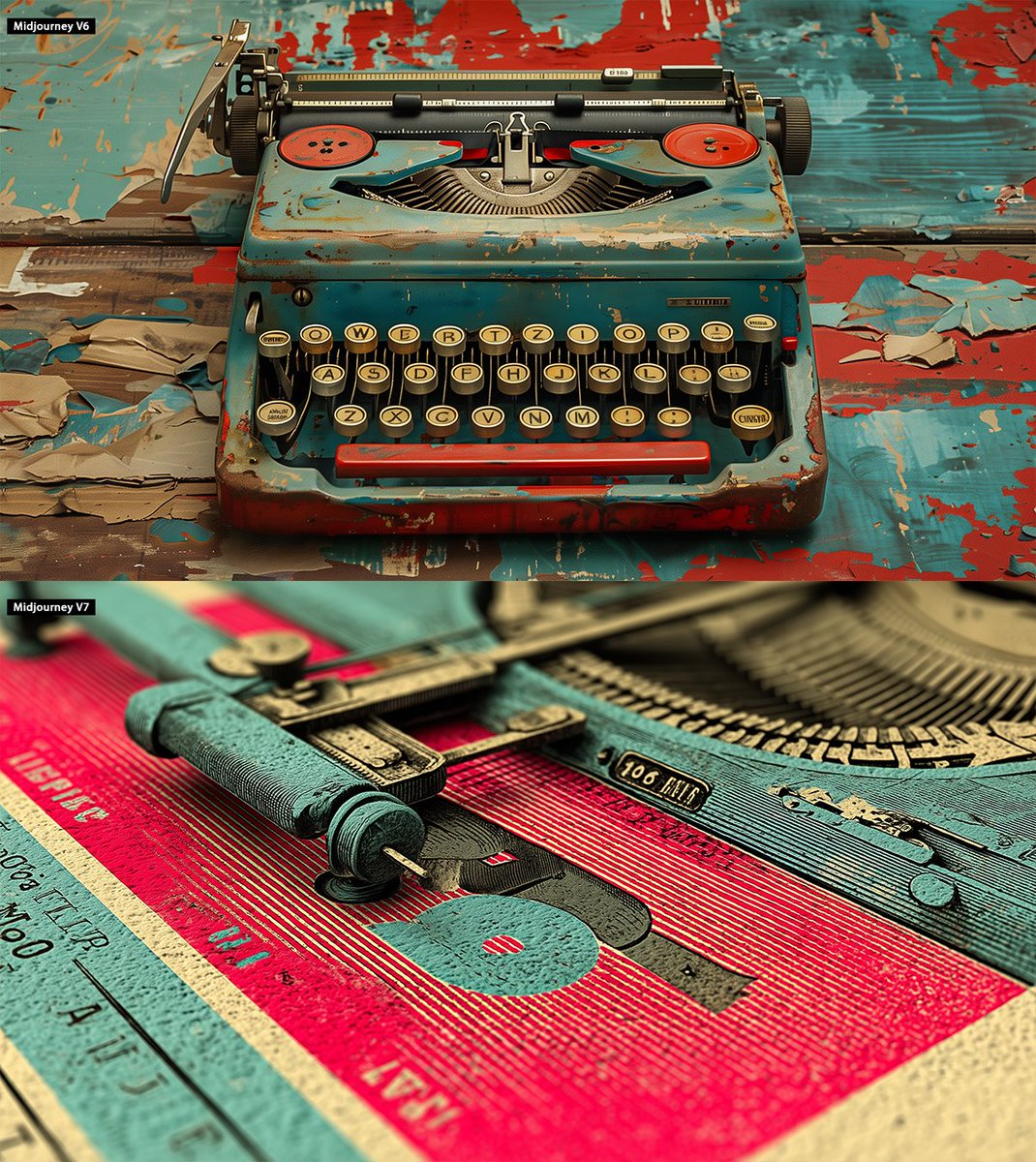
🎯 Test V6 vs V7 sur un prompt design :
vintage typographic poster, typewriter-style serif fonts, bold layout, 1960s editorial graphic design, limited color palette, paper texture
➡️ V6 : objet illustratif
➡️ V7 : affiche stylisée, composition pro
#Midjourney #AIart #DesignEditorial #AvantApres
1
103

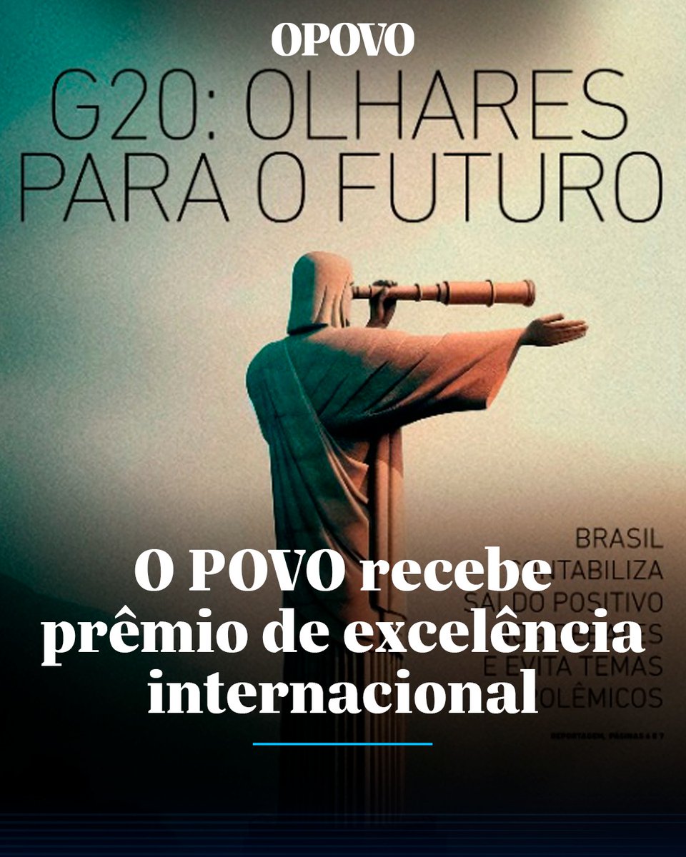
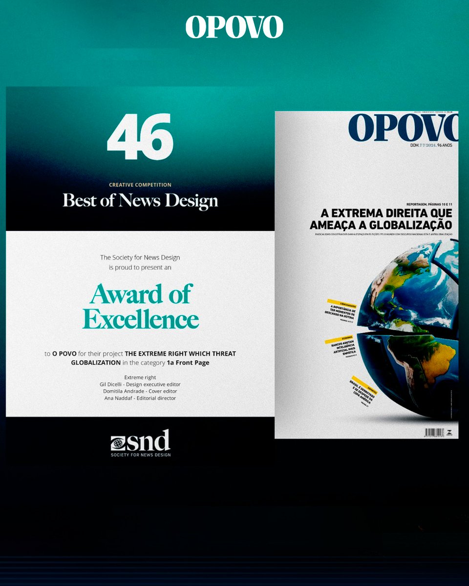
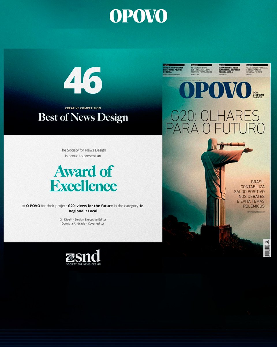
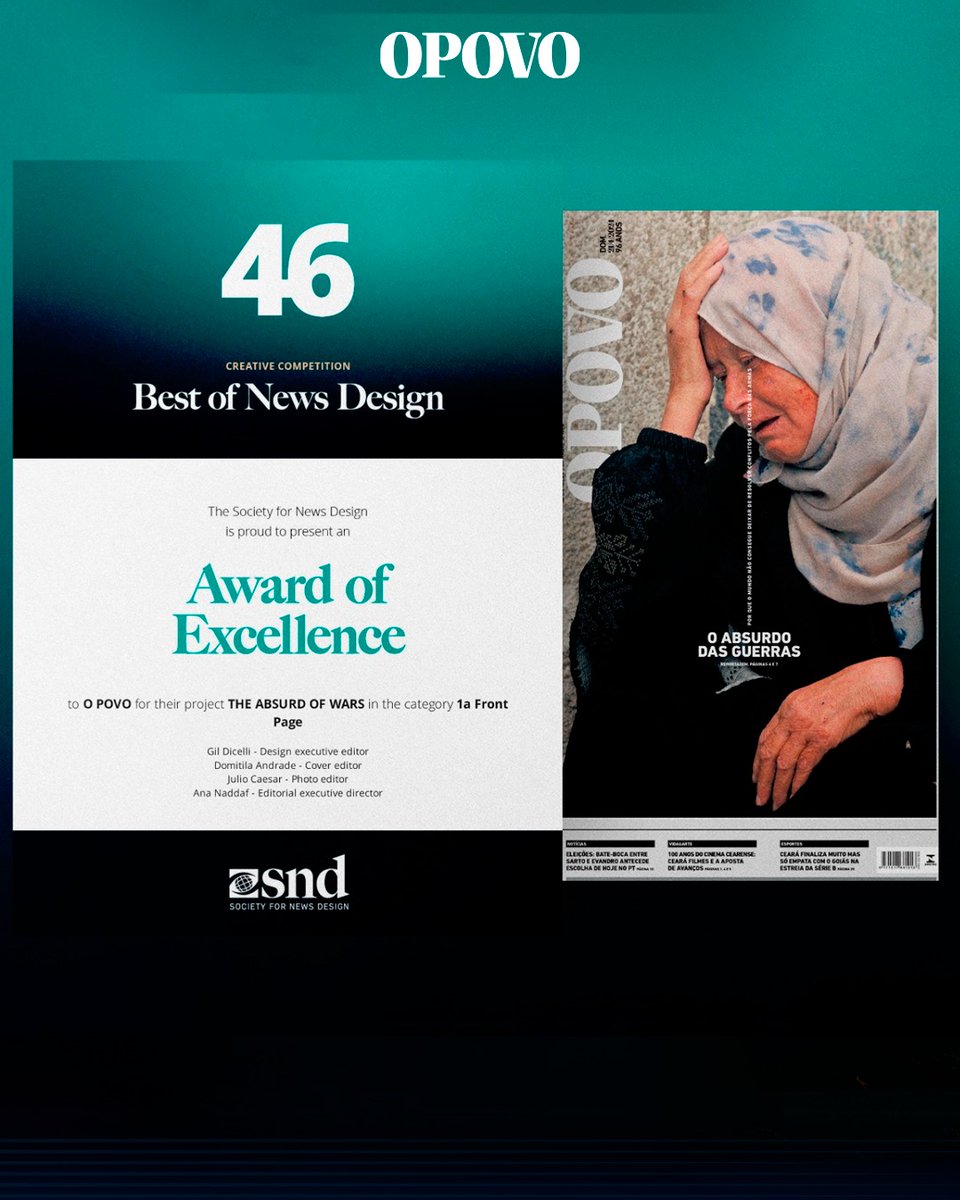
🏆 Reconhecimento internacional para o design do O POVO!
Direto de Minneapolis (EUA), foram anunciados os vencedores do SND 46 – Society for News Design, a mais prestigiada premiação global de design editorial, considerada o “Oscar” da área.
Entre mais de 5 mil jornais analisados em todo o mundo, O POVO volta a ser destaque e celebra a conquista de três Awards of Excellence!
As capas premiadas foram:
📰 "O absurdo das guerras" – Uma imagem impactante de uma mulher palestina chorando após o ataque a um hospital em Gaza. Uma capa que denuncia e emociona. A tipografia, que "chora", acentua a dramaticidade
📰 "G20 – Olhares para o futuro" – O Cristo Redentor, um do ícones do Brasil para o mundo, observa um futuro nebuloso por uma luneta. Uma metáfora visual sobre os caminhos incertos.
📰 "A extrema-direita que ameaça a globalização" – Um planeta fragmentado e instável. O layout reforça a mensagem com elementos visuais deslocados, rompendo o grid tradicional.
Esses prêmios reconhecem a força do jornalismo visual como ferramenta de reflexão e transformação social.
#DesignEditorial #SND46 #PremiaçãoInternacional #OPOVO #JornalismoVisual #SocietyForNewsDesign #AwardOfExcellence #DesignJornalístico
2
1
873

29 Apr 2024
SHOP theprintarkive.co.uk/collect…
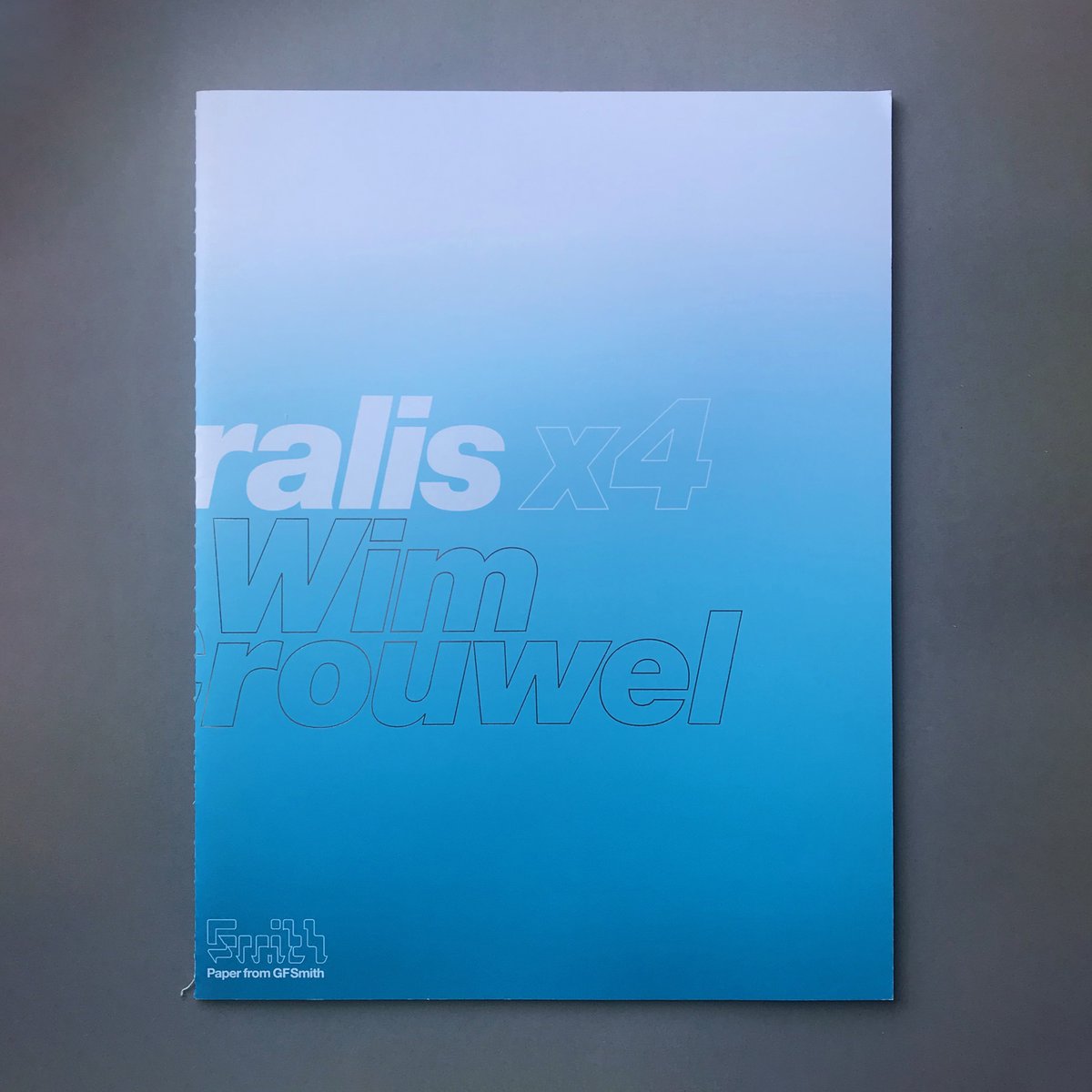
Naturalis x4 Wim Crouwel (SEA Design)
Publisher: GF Smith
Publication: 2008, Limited Edition of 2000
Design: SEA Design, London
The Naturalis series of magazines were published as individual numbered editions of 2000, printed on (GF Smith) Naturalis paper. This limited edition publication profiles the work of Wim Crouwel. Naturalis x4 was printed in 4 colour process plus 18 specials with an aqueous coating on a Heidelberg Speedmaster press using high pigment inks.
(Preface) ‘Thinking of my work from the past decades, I always see familiar images that are fixed in my memory. Each of these images remind me of certain periods of my life; there is always a story that goes with it. Sometimes I remember the place where we discussed the subject, sometimes I see the client and hear fragments of our discussion, and often I discover unexpected details between all the memories...
STOCK WANTED - Get in touch if you have (or know anyone with) design book, journal, magazine, or poster collections for sale.
#bookstagram #bookoftheday #theprintarkive #indiebookstore #designbook #graphicdesignbook #designmagazine #typographybook #graphicart #visualculture #designhistory #designinspo #designresources #designjournal #designresearch #designeditorial #gfsmithpapers #wimcrouwel #dutchposter #dutchdesigner @gfsmithpapers @SEA_London
ALT Naturalis x4 Wim Crouwel (SEA Design) - book cover. Buy and sell design books, magazines and posters designed by Europes best graphic designers with The Print Arkive.

1
4
577
22 Feb 2024
SHOP theprintarkive.co.uk
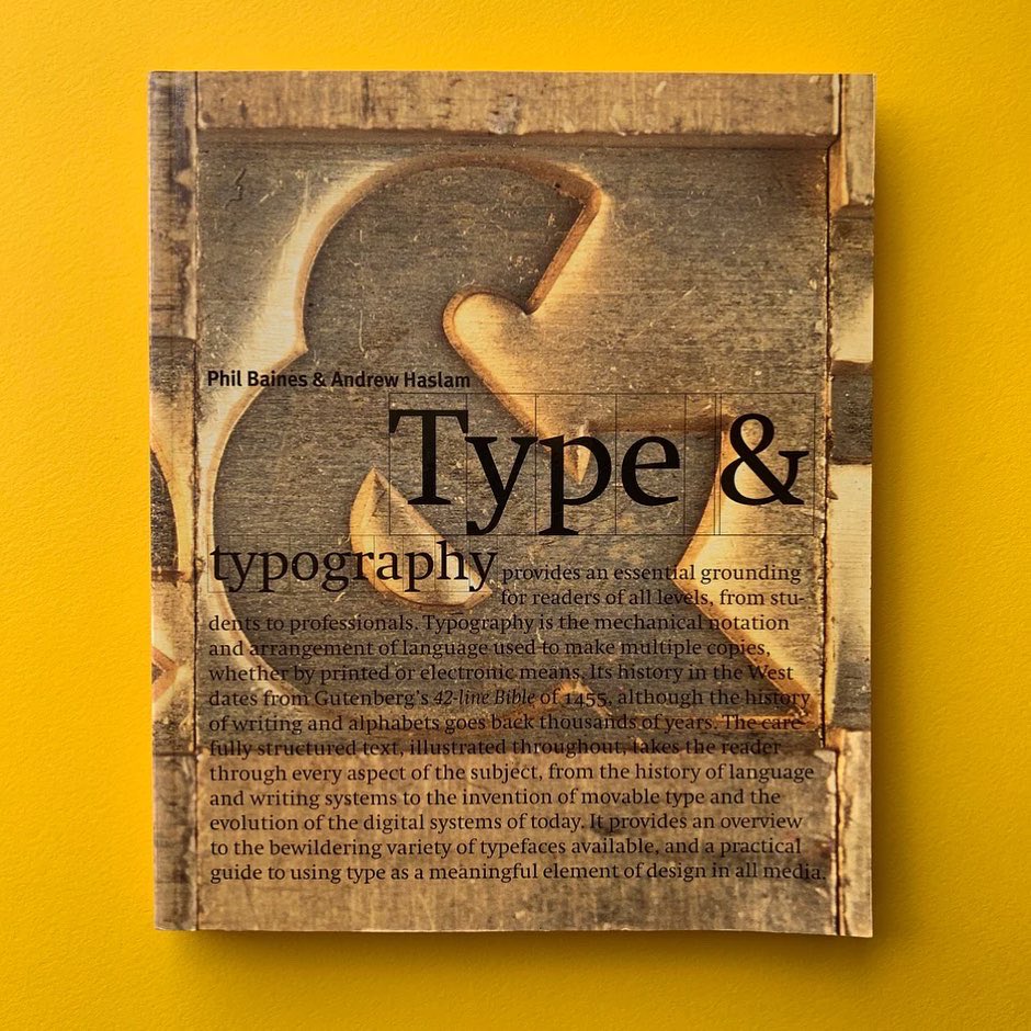
Type & Typography
Editor: Phil Baines & Andrew Haslam
Publisher: Laurence King
Publication: 2002
(Preface) ‘Type and typography provides an essential grounding for readers of all levels, from students to professionals, this carefully structured text takes the reader through every aspect of typography, from the history of language and writing systems to the invention of movable type and the evolution of the digital systems of today. It provides an overview of the bewildering variety of typefaces available and is a practical guide to using type as a meaningful element of design in all media.’
STOCK WANTED - Get in touch if you have (or know anyone with) design book, magazine or poster collections for sale.
#bookstagram #theprintarkive #indiebookstore #designbook #graphicdesignbook #typographybook #designhistory #designinspo #designresources #designjournal #designresearch #designeditorial #ornamentaltype #decorativelettering #typographymanual #creativetypography #philbaines #andrewhaslam @sarkytype

1
154
22 Feb 2024
SHOP theprintarkive.co.uk
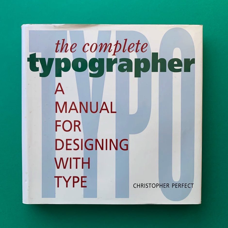
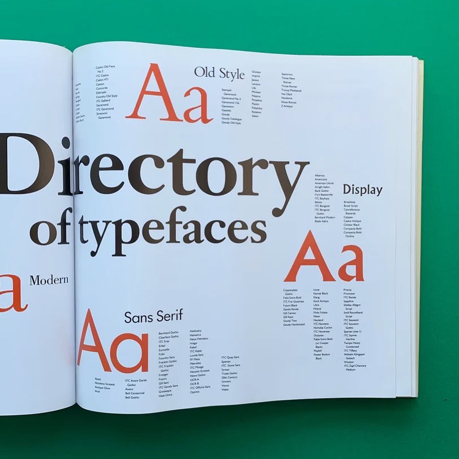
The Complete Typographer: A Manual for Designing with Type
Editor: Christopher Perfect
Publisher: Little, Brown and Company Boston/Toronto
Publication: 1992
(Preface) 'All forms of communication and design involve the use of type to some degree, so, for anyone who works with type, a sound knowledge of typography and its relationship with other disciplines is essential. This is exactly what The Complete Typographer provides. In it you will find an attractive, comprehensive blend of ideas and information that you can draw on to develop a discerning typographic eye and your own creative, individual approach to typographic problem-solving. It is an indispensable source of authoritative, accessible reference.
STOCK WANTED - Get in touch if you have (or know anyone with) design book, magazine or poster collections for sale.
#bookstagram #theprintarkive #indiebookstore #designbook #graphicdesignbook #typographybook #designhistory #designinspo #designresources #designjournal #designresearch #designeditorial #typographymanual #moderntypography

1
120
22 Feb 2024
SHOP theprintarkive.co.uk
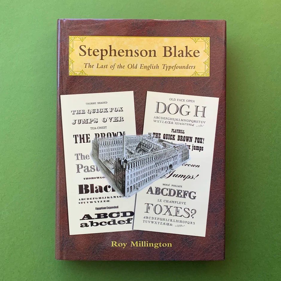
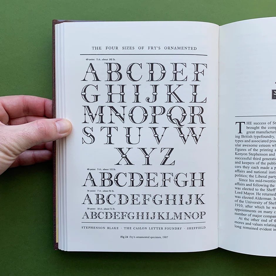
Stephenson Blake: The Last of the Old English Typefounders
Editor: Roy Millington
Publisher: Oak Knoll Press
Publication: 2002
(Preface) ‘This is an account of how Stephenson, Blake became in its heyday the most significant typefounder and printers’ equipment supplier in Britain and the Commonwealth. Although the quality of type produced was of the highest order, the design of many of the typefaces issued often left much to be desired. Typographical novelty and fashion, particularly in the late nineteenth century, took precedence over good design. However, Stephenson, Blake’s type, renowned for its quality and durability, sold well and typefounding proved to be a profitable business.
The rise of Stephenson, Blake spans five generations and many innovations. How the firm met the challenges is a fascinating read. This account of the last of the Old English Typefounding Companies belongs on the shelf of anyone interested in typographical or printing history and Britain’s great manufacturers.
STOCK WANTED - Get in touch if you have (or know anyone with) design book/zine collections for sale.
#bookstagram #theprintarkive #indiebookstore #designbook #graphicdesignbook #typographybook #designhistory #designinspo #designresources #designjournal #designresearch #designeditorial #stephensonblake #oakknollpress #typefounder #typefoundry #oldenglish #typeface

1
143
22 Feb 2024
SHOP theprintarkive.co.uk
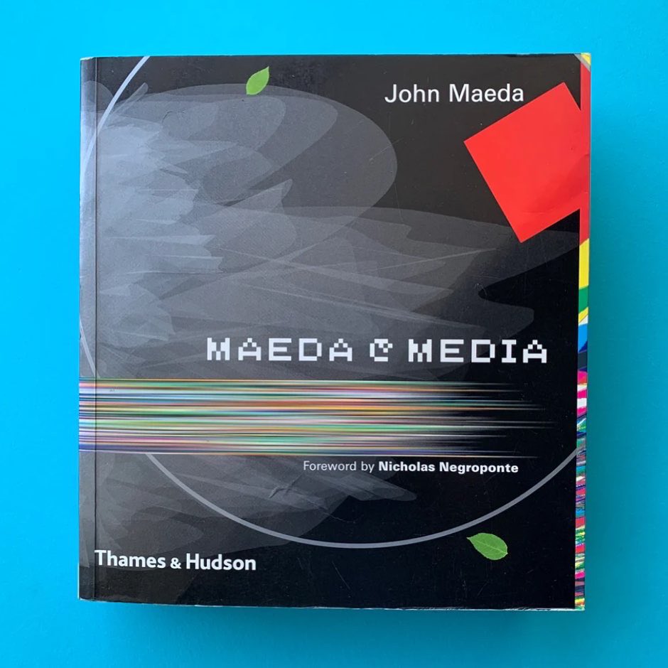
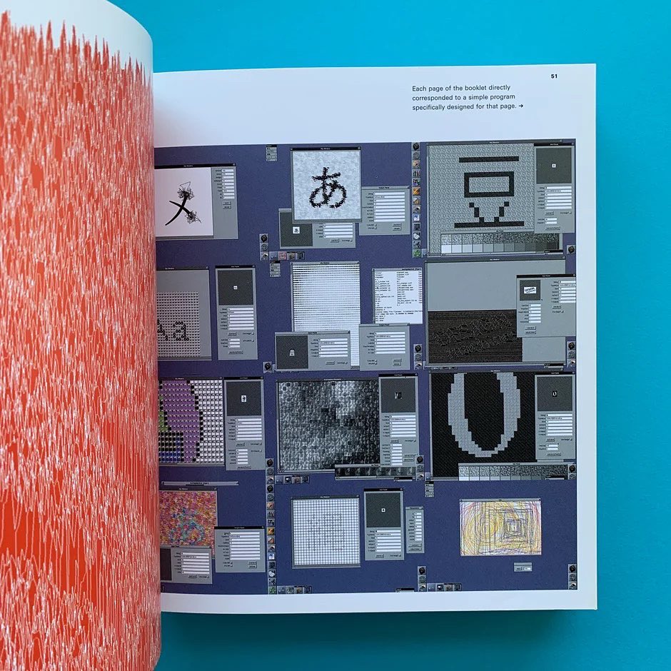
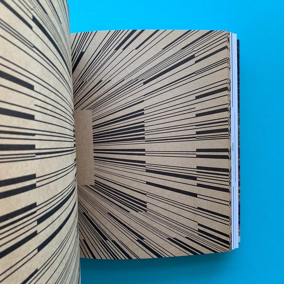
Maeda @ Media
Editor: John Maeda
Publisher: Thames & Hudson, London
Publication: 2000
(From the publisher) Hailed as one of the ‘21 Most Important People of the 21st Century’ by Esquire magazine in recognition of his contribution to contemporary visual culture, John Maeda’s mission is to forge links between computer science and the graphic arts. With his fascination for the untapped artistic power of computer programming and his conviction that the computer is not merely a tool but a powerful means of expression, Maeda has produced work that sits artfully between abstraction and craftsmanship.
An exploration of ideas and graphic form and a compendium of experience and experimentation that has taken a decade to gather, maedais the first publication to present Maeda’s entire output and to illuminate the philosophy and practice that drives it. At once a manifesto, a finely crafted manual and an inspirational sourcebook, this magnificent volume is destined to become a cornerstone of visual culture in the 21st century.’
STOCK WANTED - Get in touch if you have (or know anyone with) design book/zine collections for sale.
#bookstagram #theprintarkive #indiebookstore #designbook #graphicdesignbook #graphicart #visualculture #designhistory #designinspo #designresources #designjournal #designresearch #designeditorial #mediagraphics #digitalmedia #mediadesign #johnmaeda @johnmaeda
3
189
22 Jan 2024
SHOP theprintarkive.co.uk
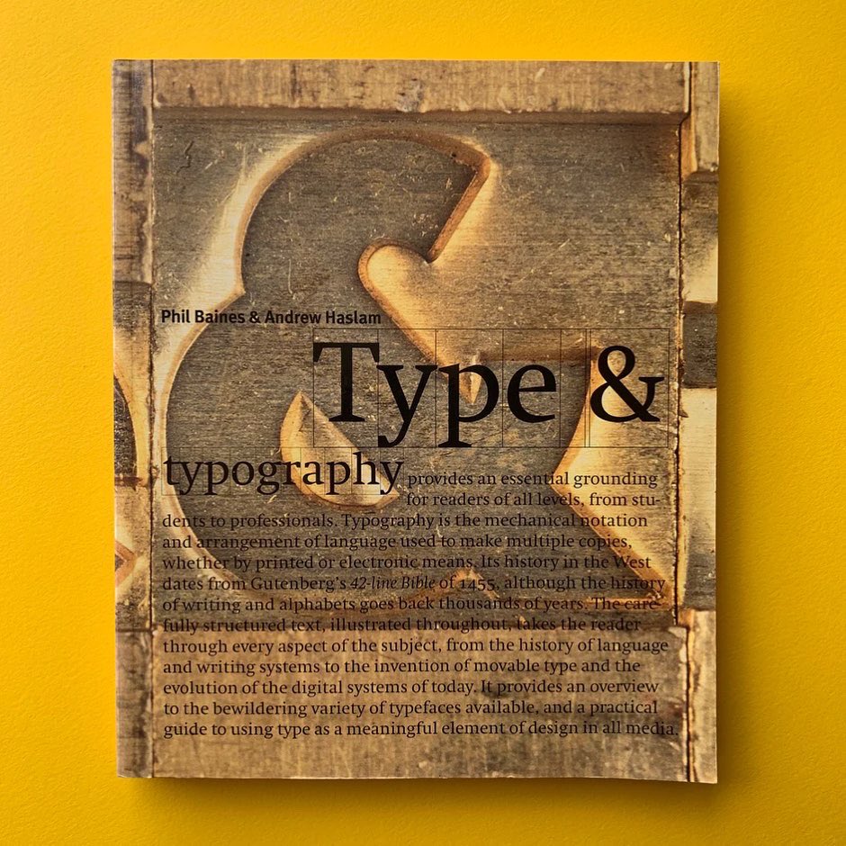
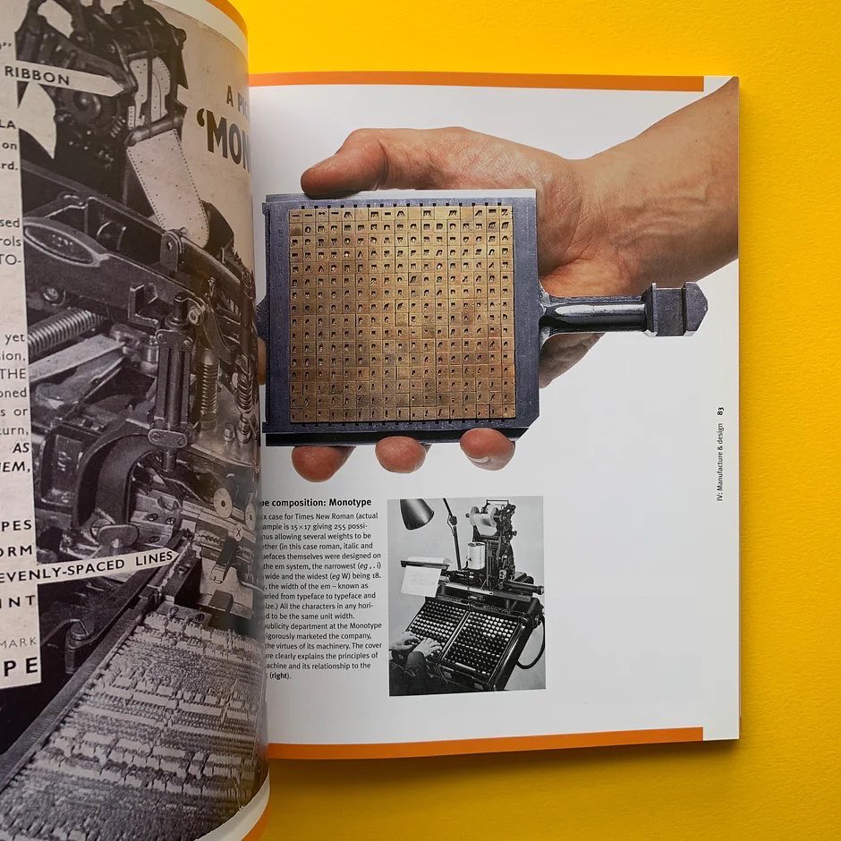
Type & Typography
Editor: Phil Baines & Andrew Haslam
Publisher: Laurence King
Publication: 2002
(Preface) 'Type and typography provides an essential grounding for readers of all levels, from students to professionals, this carefully structured text takes the reader through every aspect of typography, from the history of language and writing systems to the invention of movable type and the evolution of the digital systems of today. It provides an overview of the bewildering variety of typefaces available and is a practical guide to using type as a meaningful element of design in all media.’
STOCK WANTED - Get in touch if you have (or know anyone with) design book, magazine or poster collections for sale.
#bookstagram #theprintarkive #indiebookstore #designbook #graphicdesignbook #typographybook #designhistory #designinspo #designresources #designjournal #designresearch #designeditorial #ornamentaltype #decorativelettering #typographymanual #creativetypography #philbaines #andrewhaslam @SarkyType

1
1
7
346
20 Jan 2024
SHOP theprintarkive.co.uk
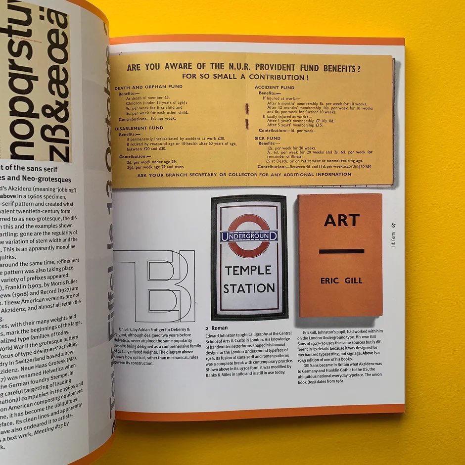
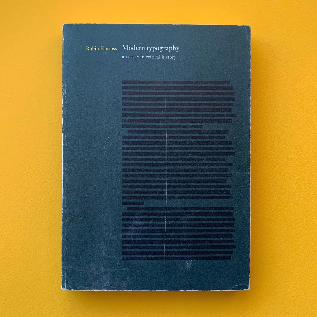
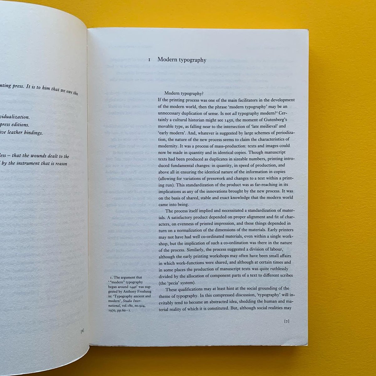
Modern typography: an essay in critical history
Editor: Robin Kinross
Publisher: Hyphen Press, London
Publication: 1992
(Publishers overview) 'A brisk tour through the history of Western typography, from the time (c.1700 in France and England) when it can be said to have become ‘modern’. A spotlight is directed at different cultures in different times, to trace the developments and shifts in modern typography. Attention is given to ideas, to social context, and to technics, thus stepping over the limited and tired tropes of stylistic analysis.'
STOCK WANTED - Get in touch if you have (or know anyone with) design book, magazine or poster collections for sale.
#bookstagram #theprintarkive #indiebookstore #designbook #graphicdesignbook #typographybook #designhistory #designinspo #designresources #designjournal #designresearch #designeditorial #hyphenpress #RobinKinross #moderntypography #typographymanual
3
217
20 Jan 2024
SHOP theprintarkive.co.uk
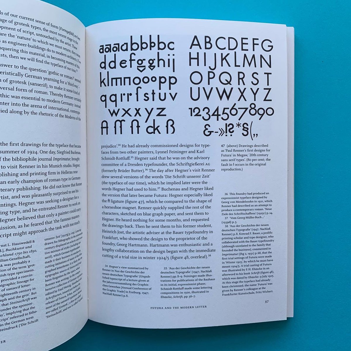
Paul Renner: the art of typography
Editor: Christopher Burke
Publisher: Hyphen Press, London
Publication: 1998
(Publishers overview) 'The work and life of this German type and book-designer are, for the first time, presented at length and with full historical documentation. Renner lived through the first half of the twentieth century, and this book is, in effect, a history of typography in Germany in those years. It also speaks to present concerns in design, and especially to the search for a rationality deeper than one of easy rules of style.'
STOCK WANTED - Get in touch if you have (or know anyone with) design book, magazine or poster collections for sale.
#bookstagram #theprintarkive #indiebookstore #designbook #graphicdesignbook #typographybook #designhistory #designinspo #designresources #designjournal #designresearch #designeditorial #hyphenpress #PaulRenner #ChristopherBurke #Germandesigner #typedesigner #bookdesigner #typographymanual


3
774
20 Jan 2024
SHOP theprintarkive.co.uk
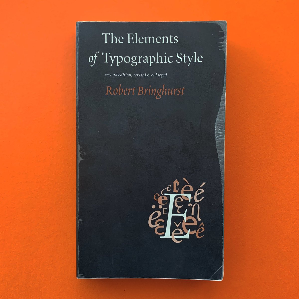
The Elements of Typographic Style
Editor: Robert Bringhurst
Publisher: Hartley & Marks
Publication: 1997
(Foreword) 'There are many books about typography, and some of them are models of the art they teach. But when I set myself to compile a simple list of working principles, one of the benchmarks I first thought of was William Strunk and E. B. White's small master-piece, The Elements of Style. Brevity, however, is the essence of Strunk & White's manual of literary technique. This book is longer than theirs, and for that there is a cause…'
STOCK WANTED - Get in touch if you have (or know anyone with) design book, magazine or poster collections for sale.
#bookstagram #theprintarkive #indiebookstore #designbook #graphicdesignbook #typographybook #designhistory #designinspo #designresources #designjournal #designresearch #designeditorial #TypographicStyle #RobertBringhurst #hartleyandmarks #typographymanual
1
188
20 Jan 2024
SHOP theprintarkive.co.uk
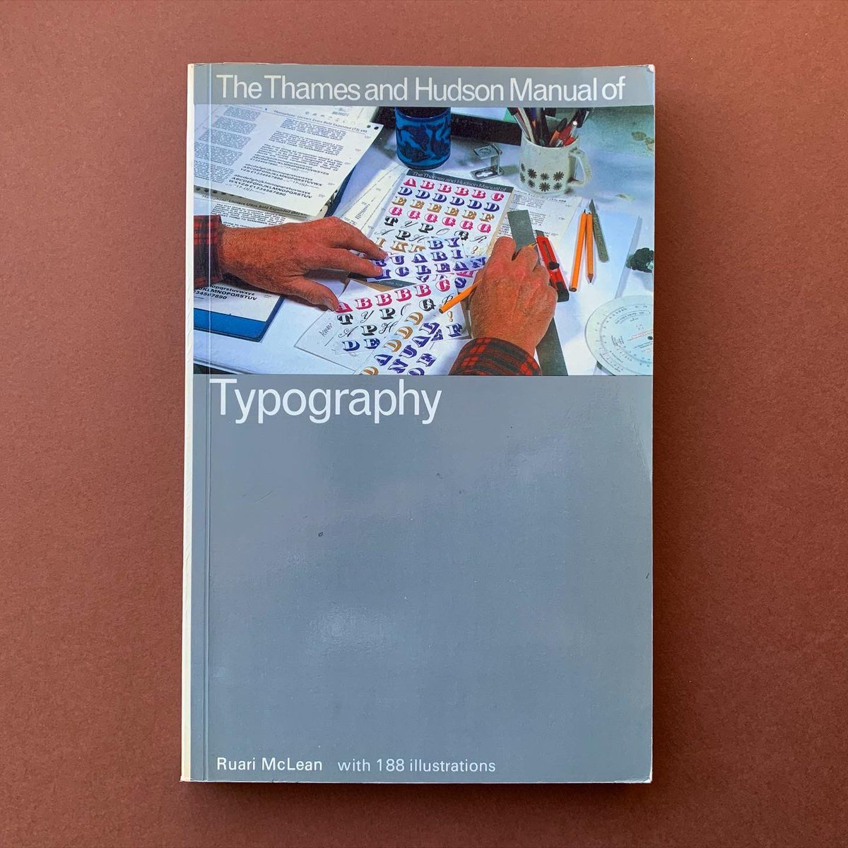
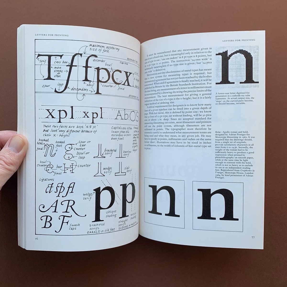
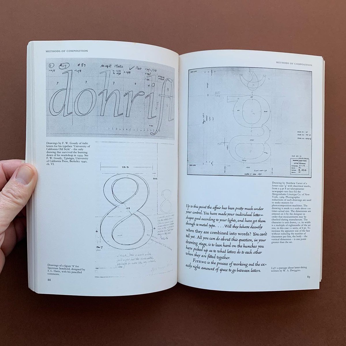
The Thames & Hudson Manual of Typography
Editor: Ruari McLean
Publisher: Thames & Hudson, London
Publication: 1980
'Typography - the art, or skill, of designing printed matter, especially printed words - has a history stretching back five hundred years. Ever since its invention in the fifteenth century printing has been based on the use of movable types, and this technology has conditioned the design of everything from pamphlets to newspapers, books and magazines.
But now: quite suddenly, in the last quarter of the twentieth century, a revolution has taken place. Printers throughout the world are jettisoning the old metal technology in favour of advanced filmsetting systems, which introduce new problems and open up exciting possibilities for typographers. This book is the first to tackle the full implications for designers of the 'filmsetting revolution'. Written with an infectious zest and enthusiasm, it is sure to become the budding typographer's vade-mecum.'
STOCK WANTED - Get in touch if you have (or know anyone with) design book, magazine or poster collections for sale.
#bookstagram #theprintarkive #indiebookstore #designbook #graphicdesignbook #typographybook #designhistory #designinspo #designresources #designjournal #designresearch #designeditorial #ruarimclean #pamphlettypography #newspapertypography #booktypography #magazinetypography #typographymanual
7
234
19 Jan 2024
SHOP theprintarkive.co.uk
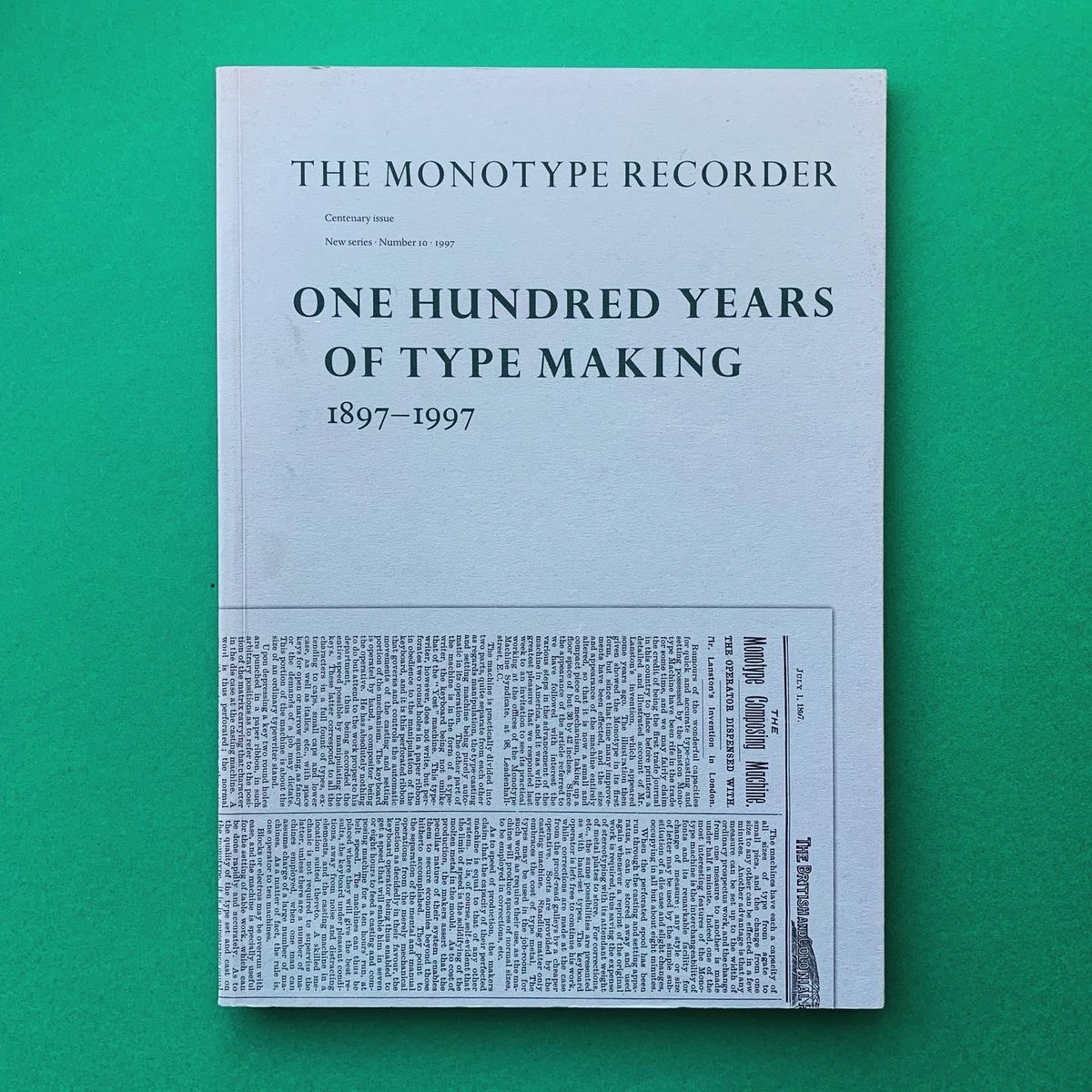
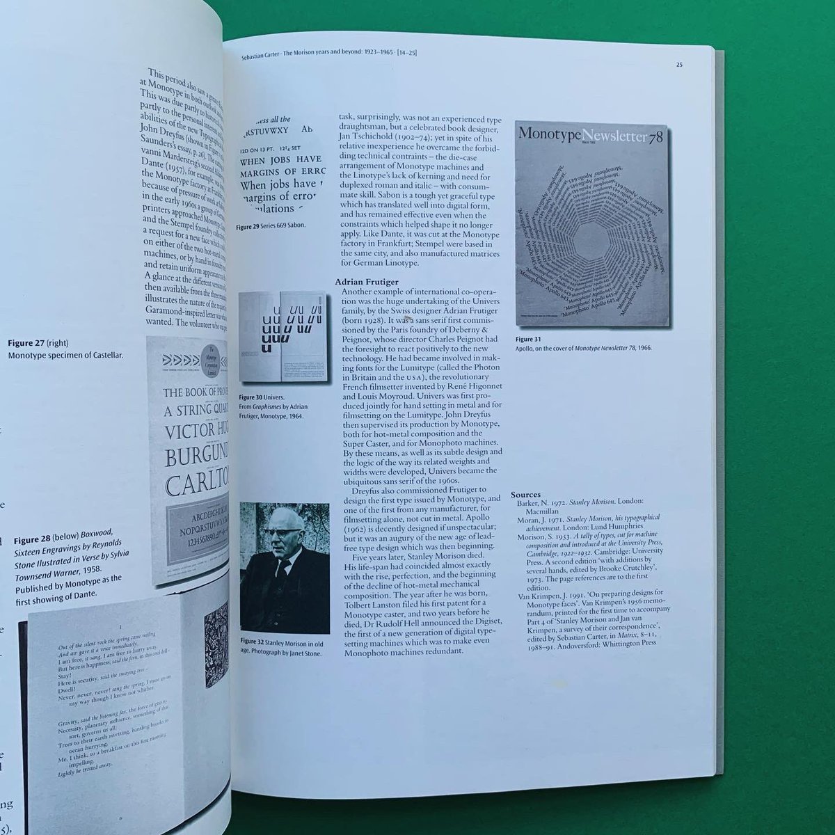
Monotype Recorder: One Hundred Years of Type Making 1897–1997
Editors: Andrew Boarg, Lawrence Wallis
Publisher: Monotype Typography Ltd.
Publication: 1997
The Monotype Recorder; Centenary issue, New series, Number 10, 1997. A series of essays covering the history of type making at Monotype in its first 100 years, with a chronology of key events in Monotype's history.
STOCK WANTED - Get in touch if you have (or know anyone with) design book/zine collections for sale.
#bookstagram #theprintarkive #indiebookstore #designbook #graphicdesignbook #typographybook #designhistory #designinspo #designresources #designjournal #designresearch #designeditorial #monotype #monotyperecorder #typography #typeface @byMonotype

4
200
19 Jan 2024
SHOP theprintarkive.co.uk
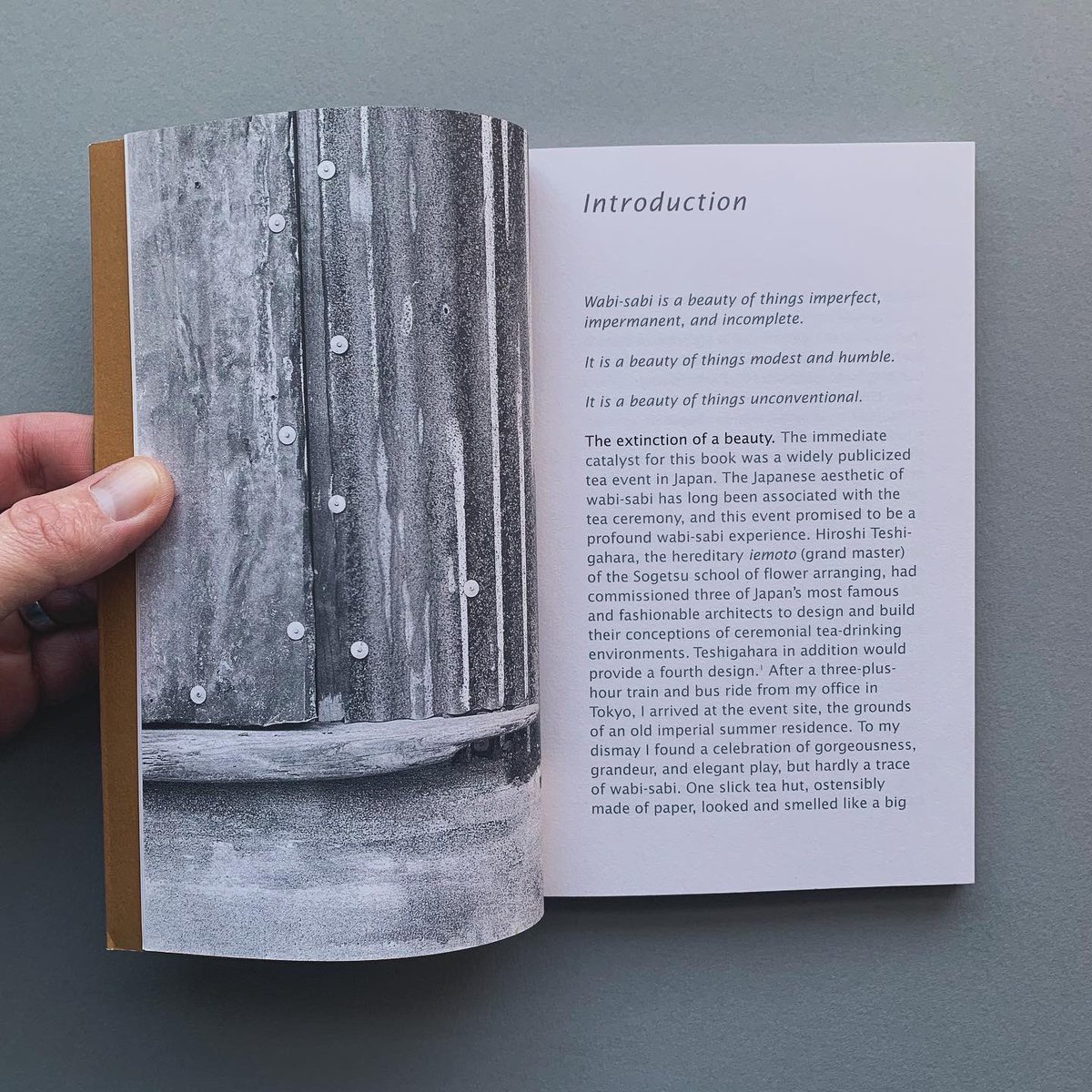
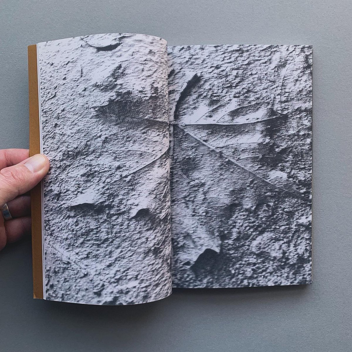
Wabi-Sabi for Artists, Designers, Poets & Philosophers
Editor: Leonard Koren
Publisher: Imperfect Publishing
Publication: 2008
(Publishers overview) 'Wabi-sabi is the most conspicuous and characteristic feature of what we think of as traditional Japanese beauty. It occupies roughly the same position in the Japanese pantheon of aesthetic values as do the Greek ideals of beauty and perfection in the West.
Wabi-sabi, in its purest, most idealized form, is precisely about the delicate traces, the faint evidence, at the borders of nothingness. Author Leonard Koren was trained as an architect but never built anything-except an eccentric Japanese tea house-because he found large, permanent objects too philosophically vexing to design. Instead he created WET: The Magazine of Gourmet Bathing, one of the premier avant-garde magazines of the 1970s. Subsequently Koren has produced unusual books about design - and aesthetics-related subjects. Koren resides in both America and Japan.’
STOCK WANTED - Get in touch if you have (or know anyone with) design book/zine collections for sale.
#bookstagram #theprintarkive #indiebookstore #designbook #graphicdesignbook #designmagazine #typographybook #graphicart #visualculture #designhistory #designinspo #designresources #designjournal #designresearch #designeditorial #wabisabi #leonardkoren #japanesebeauty #gourmetbathing

1
232
14 Dec 2023
NEW STOCK theprintarkive.co.uk
Graphic Design as a Second Language (Bob Gill)
Editor: Bob Gill
Publisher: The Images Publishing Group
Publication: 2003
STOCK WANTED - Get in touch if you have (or know anyone with) design book/zine collections for sale.
#bookstagram #theprintarkive #indiebookstore #designbook #graphicdesignbook #graphicart #visualculture #designhistory #designinspo #designresources #designjournal #designresearch #designeditorial #designstudio #BobGill #fletcherforbesgill @pentagram
2679


4
237
14 Dec 2023
NEW STOCK theprintarkive.co.uk
Pentagram Identities
Publisher: Pentagram Design Limited
Publication: 2000’s
'An identity is more than a design image. It is an organization's unique character, a combination of its reputation, name, corporate culture, operations and activities.
Identity design represents these qualities as well as the organization's potential. In doing so it also adds something to them. The identity designer has to become intricately involved in the organization in order properly to understand and thus influence its presented image.
In the application of identity design, it is not simply adherence to design guides and rules but flexibility and quality that bring about true distinction.'
STOCK WANTED - Get in touch if you have (or know anyone with) design book/zine collections for sale.
#bookstagram #theprintarkive #indiebookstore #designbook #graphicdesignbook #graphicart #visualculture #designhistory #designinspo #designresources #designjournal #designresearch #designeditorial #designstudio #TheoCrosby #AlanFletcher #ColinForbes #BobGill #crosbyfletcherforbes #fletcherforbesgill #visualidentity #trademark #logodesign @pentagram
2678


3
94
16 Nov 2023
NEW STOCK theprintarkive.co.uk
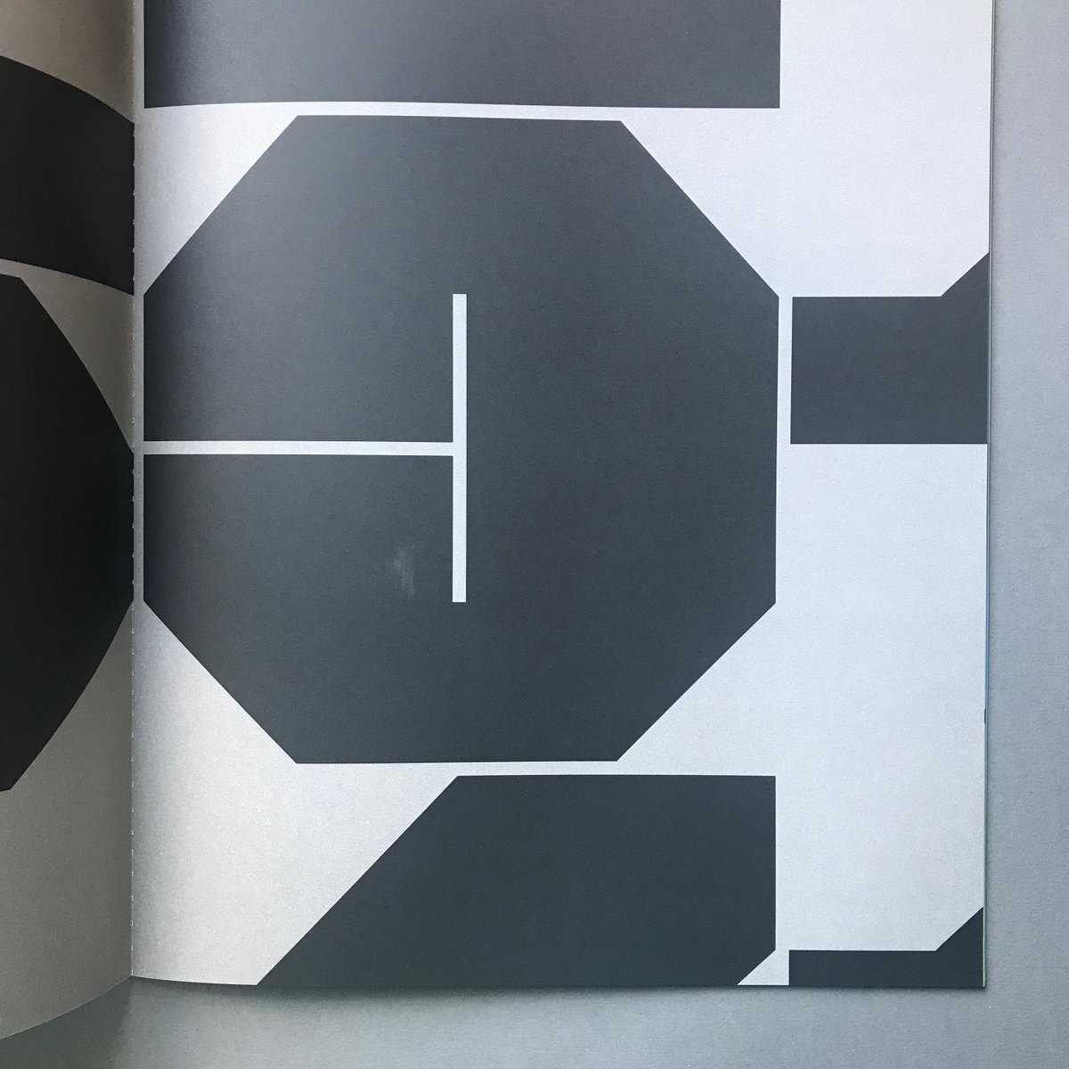
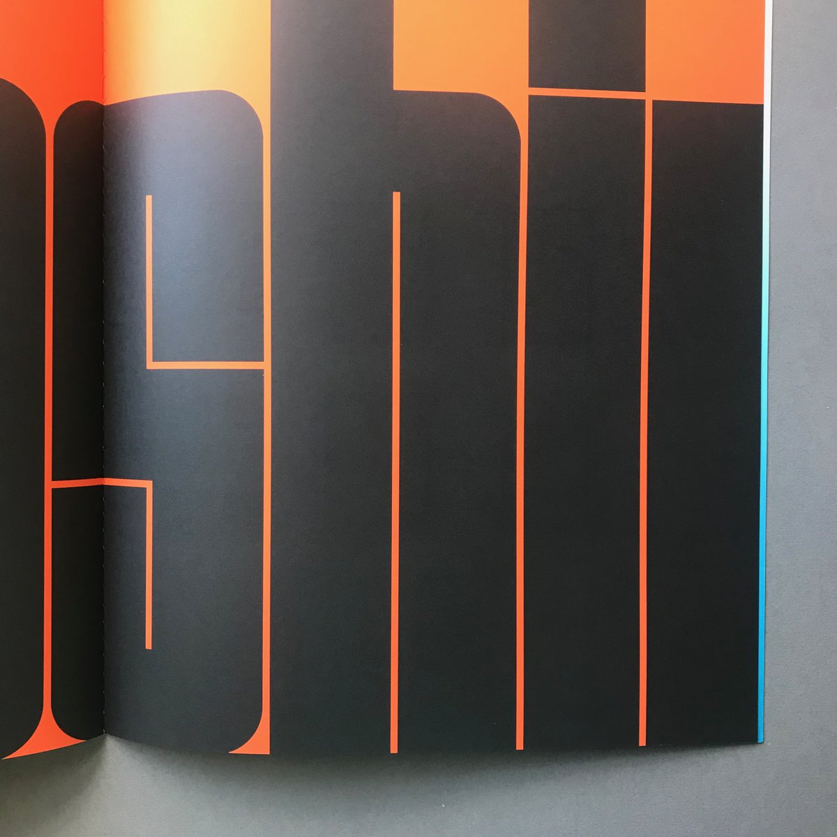
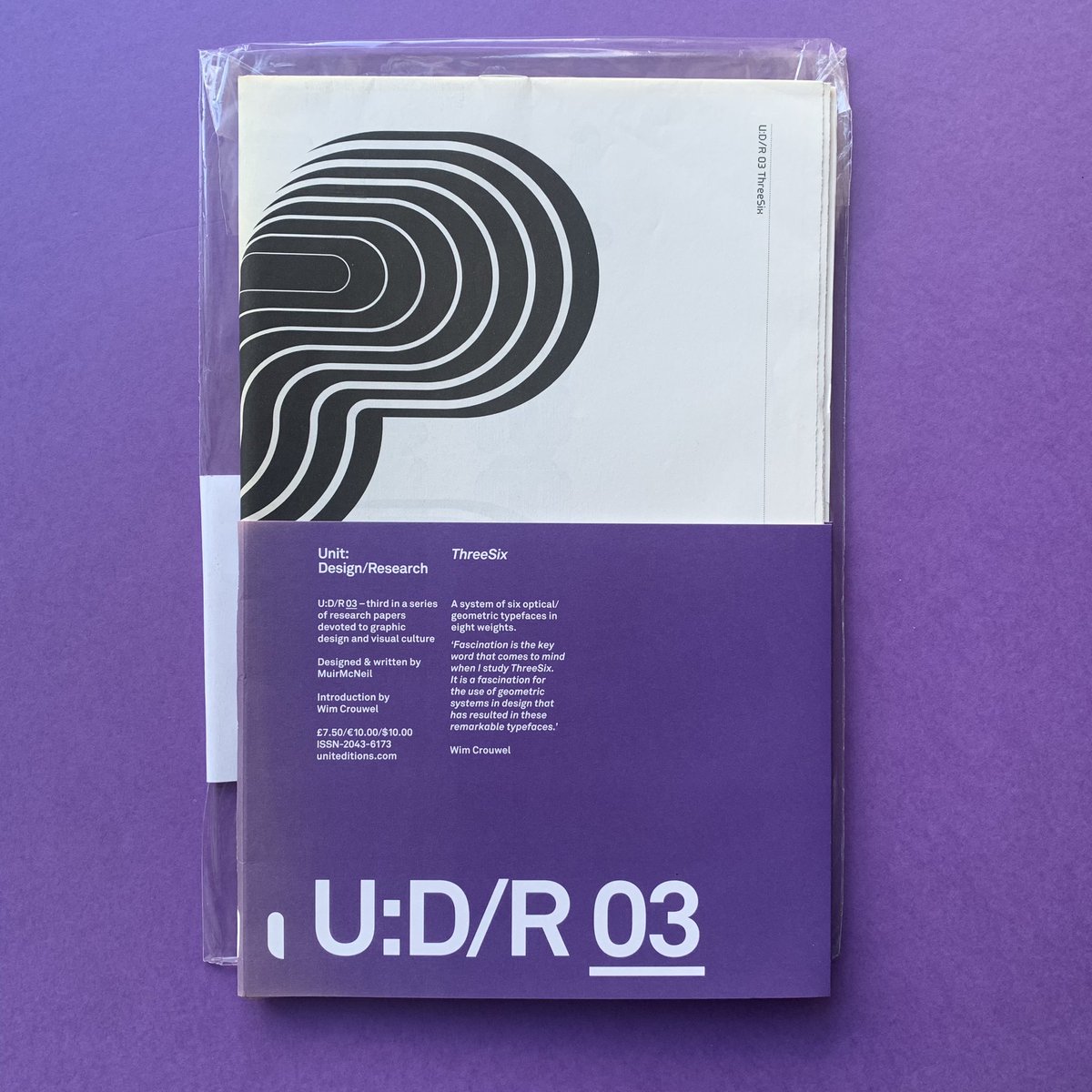
Unit: Design / Research 03 – ThreeSix
Introduction: Wim Crouwel
Publisher: Unit Editions, London
Publication: 2010, First Edition
Design: MuirMcNeil
Unit: Design / Research 03 – ThreeSix A system of six optical/geometric typefaces in eight weights. 'Fascination is the key word that comes to mind when I study ThreeSix. It is a fascination for the use of geometric systems in design that has resulted in these remarkable typefaces.' Wim Crouwel
STOCK WANTED - Get in touch if you have (or know anyone with) design book/zine collections for sale.
#bookstagram #theprintarkive #indiebookstore #designbook #graphicdesignbook #designmagazine #typographybook #graphicart #visualculture #designhistory #designinspo #designresources #designjournal #designresearch #designeditorial #threesix #MuirMcNeil #wimcrouwel @Spin_TonyBrook @AJWShaughnessy @spin_studio @uniteditions
1
6
354