
Ele devvia dar-lhe um tiro nos cornos
2
163

8 Nov 2025
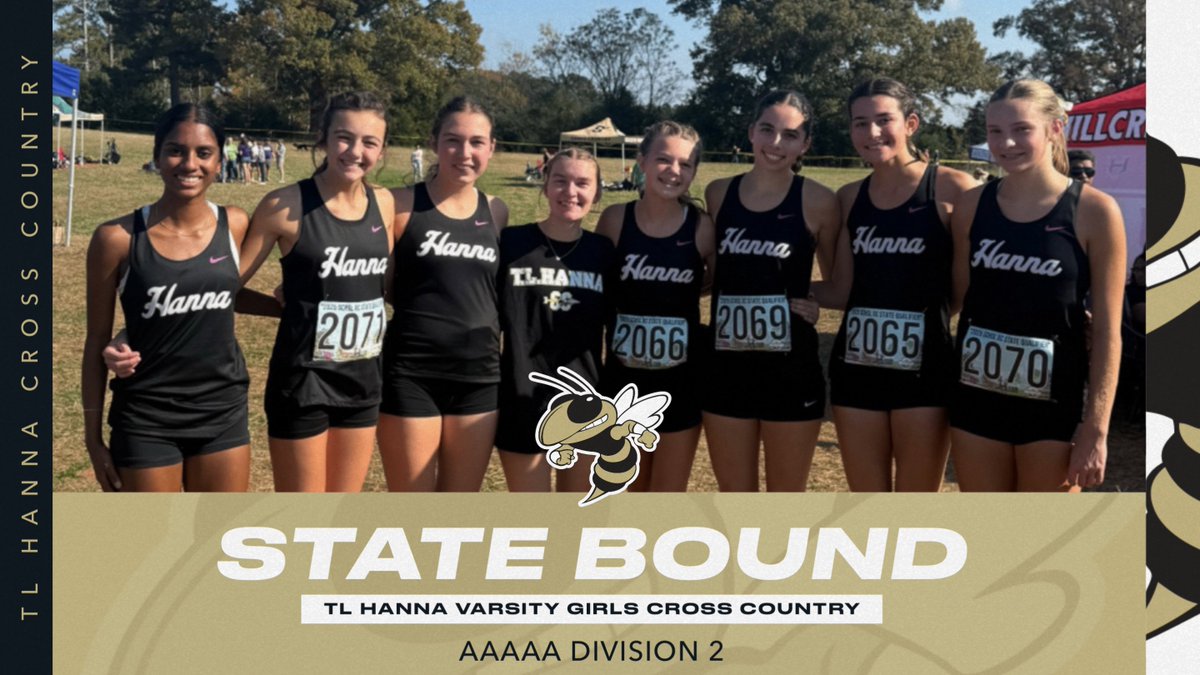
The TL Hanna Girls XC team punched their ticket to state with a 4th place finish in the qualifying race today in Newberry. Devvia Ravichandran, Wren Kirby, Ada Sharpe, Tessa Dobrin, and Allie Evans ran hard to finish top 5 for Hanna and lead the Jackets to state. @TLHanna_AD
3
151


28 Sep 2025
TL Hanna Girls Cross Country turned in a 2nd place finish at the ELectric City Invitational today with Devvia Ravichandran, Wren Kirby, and Ada Sharpe turning in all tournament performances by finishing in the top 10. @TLHanna_AD

3
180

1 Sep 2025
????????? o icon ta no passado, pra uma sombra do tempo essa Istaroth devvia saber isso🙄🙄🙄🙄
1
3
150

4 Aug 2025
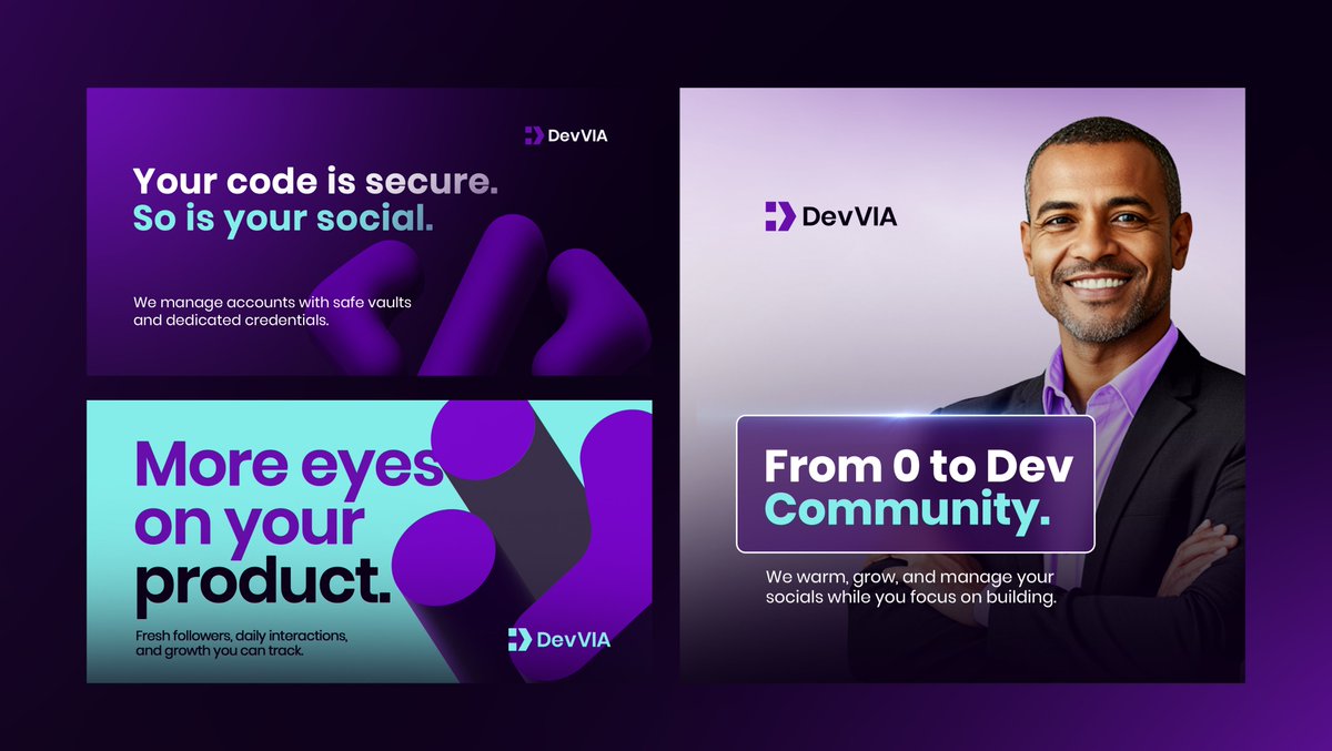
Day 28 - Redesign for DevVIA
The original logo combined the initials "D" and "V" in a custom type treatment.
While it was legible, it lacked distinctiveness and didn’t fully express the brand’s identity in the tech space.
The redesigned mark embraces modernity and clever symbolism. It fuses programming cues—: and >—into a bold, minimal icon.
Together, they hint at a smiling face, forward motion, and a directional arrow pointing to progress. The left shape subtly echoes the letter "D," grounding the visual in the brand’s initials.
✨ Represents code, motion, and positivity
✨ Strong geometric build for high scalability
✨ Evokes both personality and precision
This evolution brings clarity, relevance, and a fresh digital-first energy to the brand.


3 Aug 2025

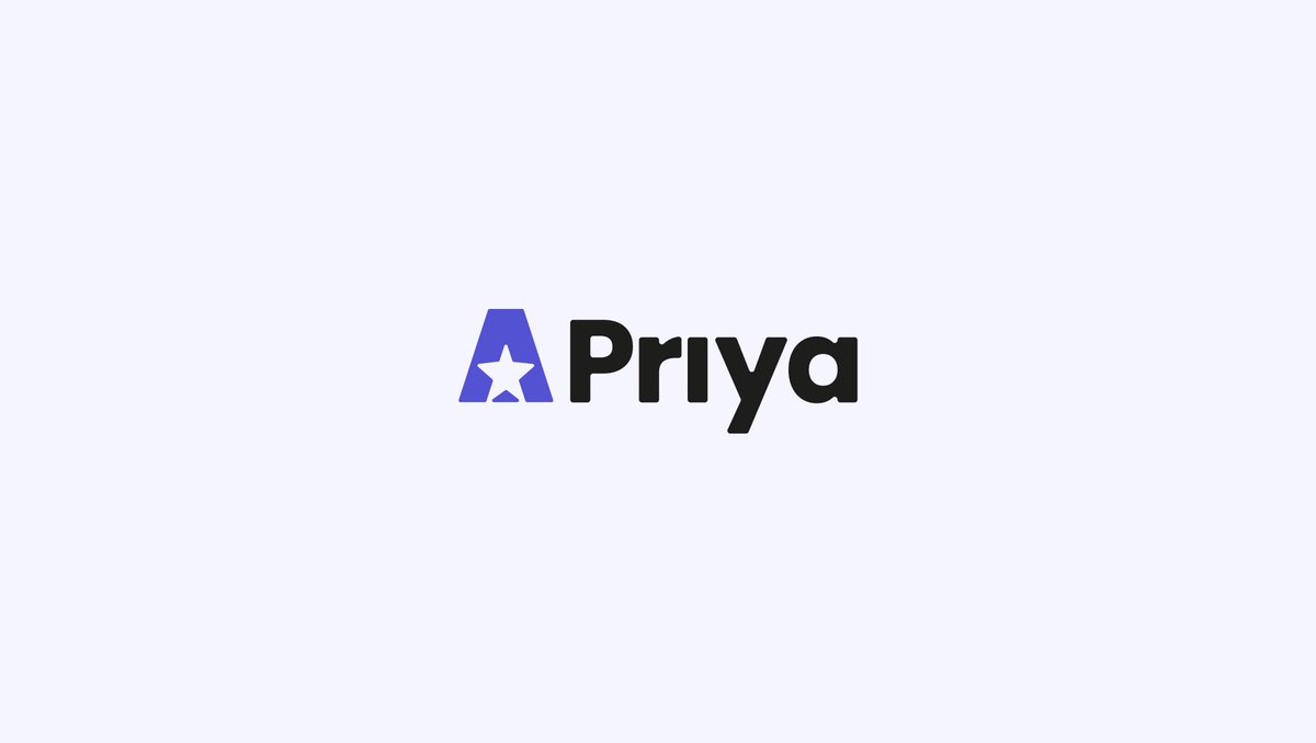
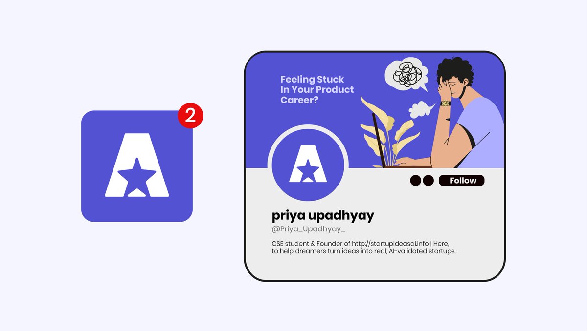
Day 27 - Redesign for Priya
The old logo used a stylized spark inside the letter A, distinct, but somewhat ambiguous and visually fragile at smaller sizes.
The new logo refines that idea with a bold star nested within a strong, geometric A.
It’s a clearer symbol of excellence, leadership, and forward direction, key traits in career growth and coaching.
⭐ Star represents brilliance, achievement, and guidance
⭐ Streamlined shapes improve readability across screens
⭐ Strong silhouette creates a confident, modern presence
This refreshed identity feels more purposeful, scalable, and aligned with a brand that helps professionals rise and lead with clarity.


7
24
1,504

4 Aug 2025
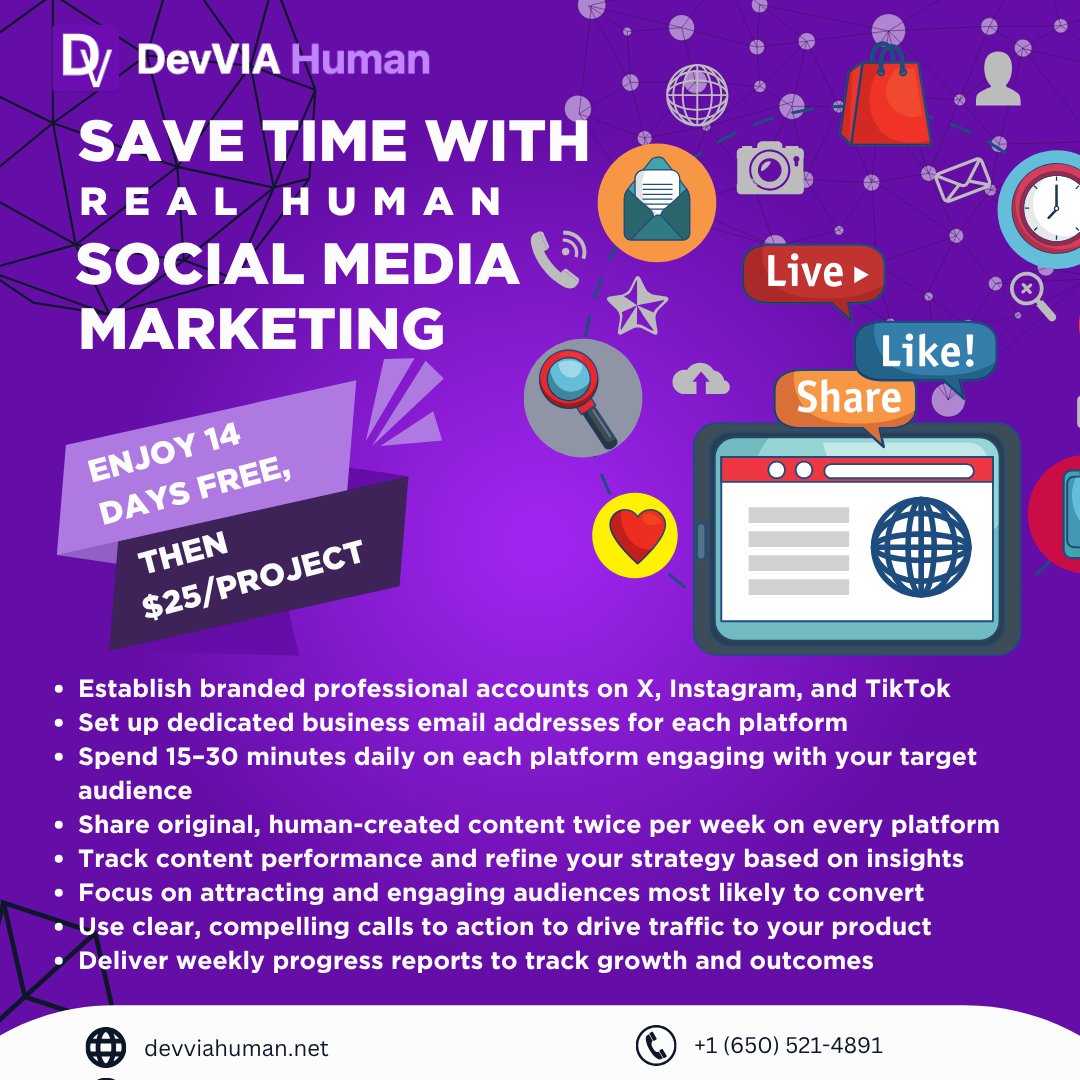
Tada! Thoughts on the new devvia offer?
Does it look appealing and fair to peiple? Also what would be your recommendations for turning this into an ad? (i am wondering if its too wordy / detailed or if people like the detail)
4
96
3 Aug 2025
Just made a MASSIVE improvement for devvia
- simpler pricing model
- and you get waay more marketing for cheaper
i think you'll all love it
New Pricing Update:
- 2 weeks free trial (14 days)
- $25 a week (per SAAS project)
includes full marketing on all 3 platforms (x, insta & tiktok)
SO..... Who wants some of the most affordable marketing ever?
FREE to try, and available to broke indie devs only😊

3
11
548

1 Aug 2025
From 0 to momentum in just 21 days.
3 weeks. Real humans. Zero micromanaging.
👇 Try DevVIA FREE
📞 1 (650) 521-4891
#IndieDev #DevVIA #BuildInPublic #SaaSMarketing #Solopreneur #MarketingForDevs #ProductLaunch #StartupLife
4
2
162
22 Jul 2025
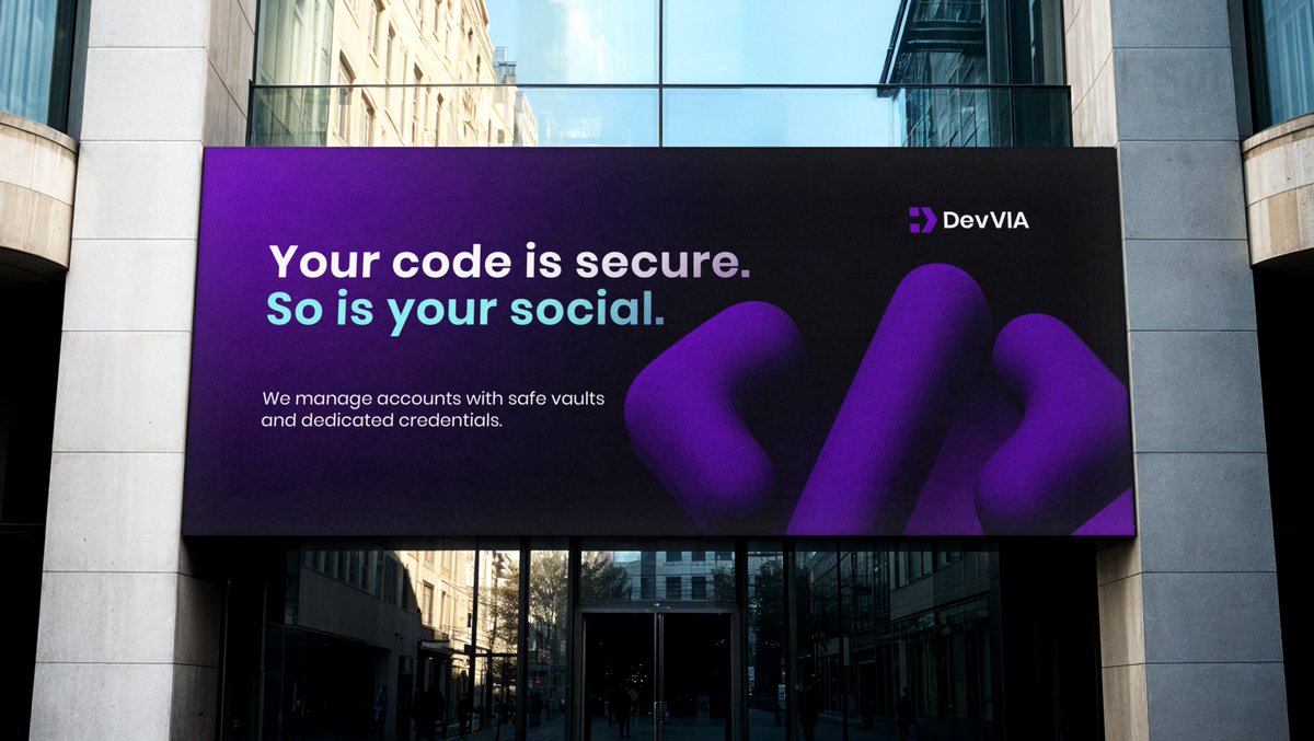
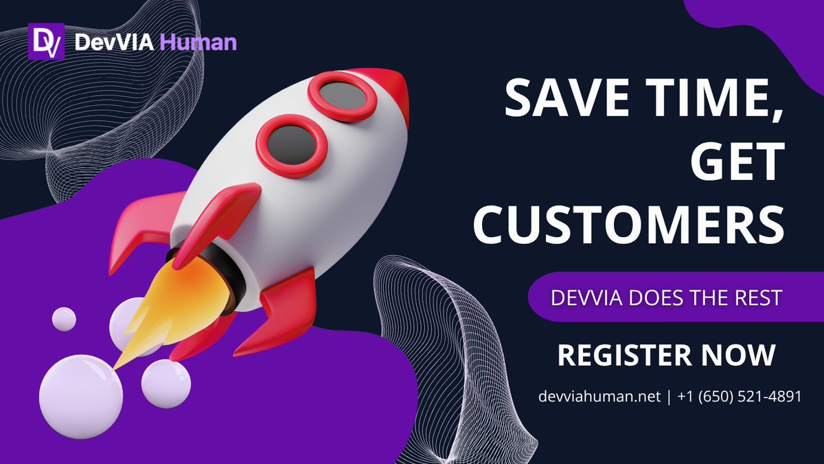
Save Time, Get Customers
Register now and let DevVIA do the rest!
👉 devviahuman.net | 1 (650) 521-4891
#DevMarketing #IndieDev #SaaSGrowth #HumanMarketing
2
69
2 Jul 2025
I tried agencies, AI tools, and freelancers.
All too expensive, risky, or time-consuming.
So I created DevVIA Human:
No passwords 🔑
No bots
No contracts
Just help that actually helps.

2
71
1 Jul 2025
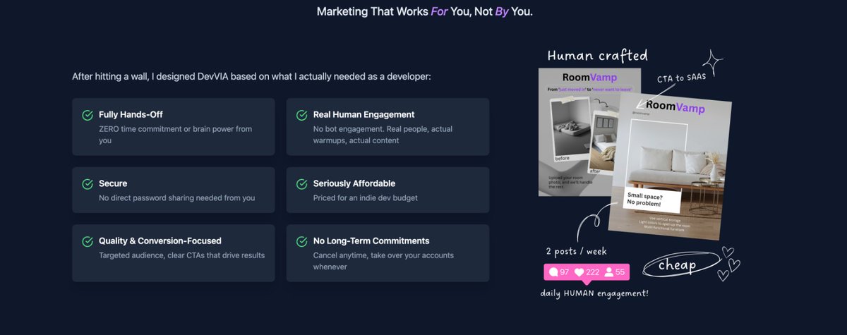
If you’re an indie dev and you’ve got:
- a product
- a tiny budget
- zero time for socials
You need DevVIA.
We warm up your accounts, engage, post 2x/week.
You stay focused on building 🛠️
3
103
30 Jun 2025
The reason I built DevVIA?
Because I wanted something that:
- Didn’t ask for passwords
- Didn’t drain my wallet
- Actually worked
…and no tool out there did all 3. So I built it 🔨

2
82
30 Jun 2025
WOOOOO!! Just got my first paying customer🚀
It's the last day of DevVIA's first pod of beta testers, i just switched stripe sandbox to live, and 50% of my beta users CONVERTED to subscription!!! (hehehe 1 of 2 users 😆 -- but still an EXCELLENT conversion rate!)
Also perfect timing for the last day of @boltdotnew hackathon!
Honestly i could have never be happier with this month's amazing journey. It started with a dev pain point i just couldnt stand, and that gut feeling has now transformed into a full blown human marketing agency with dashboards, system integrations & happy users.
Thank you so much to everyone who tested DevVIA early, its been such an amazing learning progress❤️

2
13
193
29 Jun 2025
The past couple weeks ive been grinding like crazy to update devvia to be daily posting for tiktok platform, but unfortunately i need to be practical and honest:
Really was hoping for the update to be complete before hackathon, but at this point with less than 24hrs left i need to cut off the update early and push it to next roadmap item
As a result, devvia will need to remain the mvp value points for the bolt hackathon submission. Id rather have a fully complete & quality update rather than a half- baked one
Anyway: to those of you curious of my progress and learnings, stay tuned! Will be having lots of threads in the upcoming week ❤️
For these next 24 hrs gonna be cutting out the update and pivoting so i can have a mini update as my full devvia submission
4
89
29 Jun 2025
GM explorers, today’s roadmap: finish the feature branch, glance at DevVIA analytics, keep coding.
2
48
23 Jun 2025
I built DevVIA for the version of me who was juggling a 9-5, debugging RoomVamp at midnight, and googling “best TikTok hashtags for SaaS” between coffee refills.
1
2
84
19 Jun 2025
What if you could grow your product’s socials without lifting a finger?
DevVIA handles setup, posts, and daily engagement.
It’s like having a marketing team in your toolstack 🧰
2
80
16 Jun 2025
Testing Market demand & my Pricing Strategy
(honestly i thought this strategy was fantastic & really helped me understand alot about my target audience -- but let me know in the comments if you agree with this method or if there is another method you would have done😊)
- "paid beta" -> free trial subscription
I wanted to gauge market interest and validate pricing, and so i initially launched devvia as a "paid beta" at a flat $20 rate
My goal was to test whether users would be willing to pay around this price point for the service. BUT, as many of you noticed, I didn’t actually charge anyone during this phase.
Why use a "Paid Beta" Approach before offering a free Trial?
The "paid beta" allowed me to assess genuine interest in a paid service while planning to transition to a subscription model with a free trial. By framing it as a paid beta, I could measure demand at the $20 price point while still delivering all the benefits of a free trial.
My intention was always to avoid charging during this phase, ensuring users could experience the service fully while I gathered valuable feedback on pricing and interest. This approach gave me the best of both worlds: real-world data on willingness to pay and the ability to offer a no-cost trial experience.
Anyway, not sure if this is a real strategy or something crazy that just popped into my head, but the last 2 weeks of beta in this method really gave me invaluable knowledge to help come up with the devvia pricing structure
1
2
62