
@HelpdeskMCA21V3 @MCA21India MCA portal issue: In the "Forgot Password" process, the Director dropdown is blank, preventing password reset. This is happening for multiple companies. Please resolve. Ticket No: FO_202606152575576
1
10

📢 Headteachers and SLT! Make sure you sign up for the Summer term Leading Little Wandle webinar on Tuesday 23 June. Our focus will be Ofsted, and we'll be exploring the inspection process through the lens of Little Wandle and reading.
We'll be hearing from Headteachers who have recently been through the process under the latest framework, so don't miss out. You can secure your spot by heading to Ongoing CPD in the My Letters and Sounds dropdown menu on the website.
📥 Also, don't miss the final Leading Little Wandle email of the school year, landing tomorrow, Tuesday 16 June! It's a quick five-minute read, packed with your key priorities for leading Little Wandle effectively. Sign up now in the For Headteachers area of the website.

7

Celtic shopping like I do online.
Opens ‘sort’ dropdown.
Filters ‘cost - low to high’
118

PART I: THE TRAP YOU'RE ALREADY IN
Before AI, most people were already being turned into machinery. Not by robots. By bureaucracy.
Corporate America spent decades converting human judgment into process. Meetings replaced decisions. PowerPoint replaced thought. Job descriptions became slow API calls performed by people with health insurance and inbox anxiety.
AI did not create the machine. AI revealed it.
Chapter 1: The Pre-Encoded Human
The dashboard blinks red at 8:43 a.m.
Not metaphorically. Literally.
A red square in the corner of the screen says one customer has waited too long. Another says the queue is above threshold. Another says response quality is trending down. Another says the team is "at risk" because three people took lunch within the same fifteen-minute window.
Somewhere in the building, a manager with a lanyard sees the same dashboard and starts walking faster.
You sit in a cubicle wearing a headset that smells like warm plastic and other people's stress.
Beside your keyboard is the binder. Fifty pages. Escalation trees. Approved language. Prohibited phrases. Compliance warnings. Refund limits. Tone guidance. "Empathy statements." The company has somehow managed to turn human care into a dropdown menu.
A customer opens the chat. They are angry. Not "this will be a funny story later" angry. Real angry. The kind of angry that comes from wasting three hours trying to fix a problem caused by a system that never had to look them in the eye.
You read their message. You understand what happened. You know what would fix it.
But you do not fix it.
You open the knowledge base. You search the approved article. You copy the approved sentence. You paste the approved apology. You check the policy. You ask for permission to do the obvious thing. You log the interaction. You tag the issue. You close the ticket.
You were not hired to think. You were hired to execute a workflow with a pulse.
That is the part nobody wants to say out loud.
The office did not need AI to become robotic. It was already robotic. AI just showed up with a better costume and no bathroom breaks.
For decades, corporate America's secret project was not innovation. It was standardization.
Standardize the role. Standardize the workflow. Standardize the meeting. Standardize the language. Standardize the output. Standardize the review. Standardize the human until the human becomes predictable enough to replace.
Then act shocked when replacement becomes technically possible.
This is the part that should make your stomach tighten.
A lot of work was pre-encoded long before the model arrived. Not because workers were stupid. Because the system was designed to remove judgment from work and call it efficiency.
A good employee was not the person with the sharpest instincts. A good employee was the person who followed the process. The person who stayed aligned. The person who kept the dashboard green. The person who did not make trouble by seeing the obvious and acting without approval.
The company said it wanted creativity. Then measured compliance. The company said it wanted ownership. Then gave you a script. The company said it wanted leaders. Then punished deviation.
The result was the Passive Operator.
The Passive Operator is not lazy. That is the trap. Lazy would be easier to dismiss.
The Passive Operator is busy. The Passive Operator answers emails, updates the CRM, attends standups, moves cards across boards, logs notes, fills fields, copies data from one system into another, and calls this a job.
The Passive Operator is the human bridge between databases.
Customer says something here. Human copies it there. Manager approves it here. Human forwards it there. Dashboard updates. Ticket closes. Metric improves. Nothing is owned.
The Passive Operator does not own the product. Does not own the customer relationship. Does not own the memory. Does not own the workflow. Does not own the upside. They just keep the pipes connected.
1
26


Access ALL prompts for stunning animated websites in one click: sceneai.art
prompt:
Create a highly polished, responsive Hero Section using a single HTML file. Use Tailwind CSS via CDN for styling, Google Fonts for typography, and vanilla JavaScript for interactivity.
Follow these strict structural and styling requirements exactly:
1. Global Setup & Animations (CSS in <style>):
- Body: `bg-[#e5e7eb]`, `min-h-screen`, `flex items-center justify-center`, `p-4`.
- Fonts: Import 'Inter' (sans-serif) and 'Playfair Display' (serif, italic).
- Custom Animations: Create an `@keyframes fadeInUp` (opacity 0 to 1, transform translateY 30px to 0).
- Create a `.stagger-item` class applying the animation, and delay classes: `.delay-bg` (0.2s), `.delay-nav` (1.0s), `.delay-h1` (1.8s), `.delay-p` (2.6s), `.delay-btn` (3.4s) to make elements load step-by-step smoothly over ~4 seconds.
2. Main Container & Background Video:
- Create a main wrapper div with exactly these classes: `relative w-full max-w-[1400px] aspect-[4/3] md:aspect-[16/9] min-h-[600px] md:min-h-[800px] rounded-[2rem] overflow-hidden shadow-2xl bg-black`. Apply the `.delay-bg` class here.
- Inside, add an `absolute inset-0 w-full h-full` div containing a `<video>` tag (autoplay, loop, muted, playsinline, `w-full h-full object-cover opacity-90`).
- Video URL: cdn.sceneai.art/Hero Secti…
- Add a black overlay over the video: `absolute inset-0 bg-black/20`.
3. Navigation (Top positioned):
- Container: `absolute top-0 left-0 w-full p-6 md:p-10 flex justify-between items-start md:items-center z-30`. Apply the `.delay-nav` class.
- Logo (Left): Text reading "Ratw" with classes `text-white text-2xl font-bold tracking-[0.2em] uppercase`.
- Desktop Nav (Center/Right): `hidden md:flex items-center space-x-8`. Links (Home, Pricing, About, Insights, Contact) in white text, plus a white "Get template" button.
- Mobile Nav Toggle (Right): `relative md:hidden`. A 48x48px white button containing a hamburger SVG and close SVG.
- Mobile Dropdown Menu: Absolutely positioned below the toggle button (`top-16 right-0 w-64`). White background, rounded corners. Initially styled with `opacity-0 invisible scale-95 translate-y-[-10px]`.
- JavaScript: Add a click listener to the mobile toggle to swap out the hamburger/close icons and transition the dropdown menu to `opacity-100 visible scale-100 translate-y-0` for a smooth entry.
4. Hero Content (Bottom positioned):
- Container: `absolute inset-0 flex flex-col items-center justify-end pb-12 md:pb-24 text-center px-4 z-20`.
- Headline (H1): EXACTLY `text-[58px]` font size AND must be semi-bold (`font-semibold`). Text is "Plan better, <br class='hidden md:block'> start your day right". The word "right" must be wrapped in a span using the 'Playfair Display' italic font. Apply `.delay-h1`.
- Subheadline (P): text-white/90, 18px-20px. "A smarter planner for tasks<br>priorities and daily structure". Apply `.delay-p`.
- CTA Button: "Create your plan". Solid white background, rounded-full padding, hover scale effect. Apply `.delay-btn`.
105

Access ALL prompts for stunning animated websites in one click: sceneai.art
prompt:
Create a highly polished, responsive Hero Section using a single HTML file. Use Tailwind CSS via CDN for styling, Google Fonts for typography, and vanilla JavaScript for interactivity.
Follow these strict structural and styling requirements exactly:
1. Global Setup & Animations (CSS in <style>):
- Body: `bg-[#e5e7eb]`, `min-h-screen`, `flex items-center justify-center`, `p-4`.
- Fonts: Import 'Inter' (sans-serif) and 'Playfair Display' (serif, italic).
- Custom Animations: Create an `@keyframes fadeInUp` (opacity 0 to 1, transform translateY 30px to 0).
- Create a `.stagger-item` class applying the animation, and delay classes: `.delay-bg` (0.2s), `.delay-nav` (1.0s), `.delay-h1` (1.8s), `.delay-p` (2.6s), `.delay-btn` (3.4s) to make elements load step-by-step smoothly over ~4 seconds.
2. Main Container & Background Video:
- Create a main wrapper div with exactly these classes: `relative w-full max-w-[1400px] aspect-[4/3] md:aspect-[16/9] min-h-[600px] md:min-h-[800px] rounded-[2rem] overflow-hidden shadow-2xl bg-black`. Apply the `.delay-bg` class here.
- Inside, add an `absolute inset-0 w-full h-full` div containing a `<video>` tag (autoplay, loop, muted, playsinline, `w-full h-full object-cover opacity-90`).
- Video URL: cdn.sceneai.art/Hero Secti…
- Add a black overlay over the video: `absolute inset-0 bg-black/20`.
3. Navigation (Top positioned):
- Container: `absolute top-0 left-0 w-full p-6 md:p-10 flex justify-between items-start md:items-center z-30`. Apply the `.delay-nav` class.
- Logo (Left): Text reading "Ratw" with classes `text-white text-2xl font-bold tracking-[0.2em] uppercase`.
- Desktop Nav (Center/Right): `hidden md:flex items-center space-x-8`. Links (Home, Pricing, About, Insights, Contact) in white text, plus a white "Get template" button.
- Mobile Nav Toggle (Right): `relative md:hidden`. A 48x48px white button containing a hamburger SVG and close SVG.
- Mobile Dropdown Menu: Absolutely positioned below the toggle button (`top-16 right-0 w-64`). White background, rounded corners. Initially styled with `opacity-0 invisible scale-95 translate-y-[-10px]`.
- JavaScript: Add a click listener to the mobile toggle to swap out the hamburger/close icons and transition the dropdown menu to `opacity-100 visible scale-100 translate-y-0` for a smooth entry.
4. Hero Content (Bottom positioned):
- Container: `absolute inset-0 flex flex-col items-center justify-end pb-12 md:pb-24 text-center px-4 z-20`.
- Headline (H1): EXACTLY `text-[58px]` font size AND must be semi-bold (`font-semibold`). Text is "Plan better, <br class='hidden md:block'> start your day right". The word "right" must be wrapped in a span using the 'Playfair Display' italic font. Apply `.delay-h1`.
- Subheadline (P): text-white/90, 18px-20px. "A smarter planner for tasks<br>priorities and daily structure". Apply `.delay-p`.
- CTA Button: "Create your plan". Solid white background, rounded-full padding, hover scale effect. Apply `.delay-btn`.
2
147

#SFPHGO
2026 HLE New MD
💸Slogan Tarpaulin Bag: Php 390
💸Mini Camera PC Holder Keychain: Php 870
💸Mini Camera SD Card: Php 2750
lsf
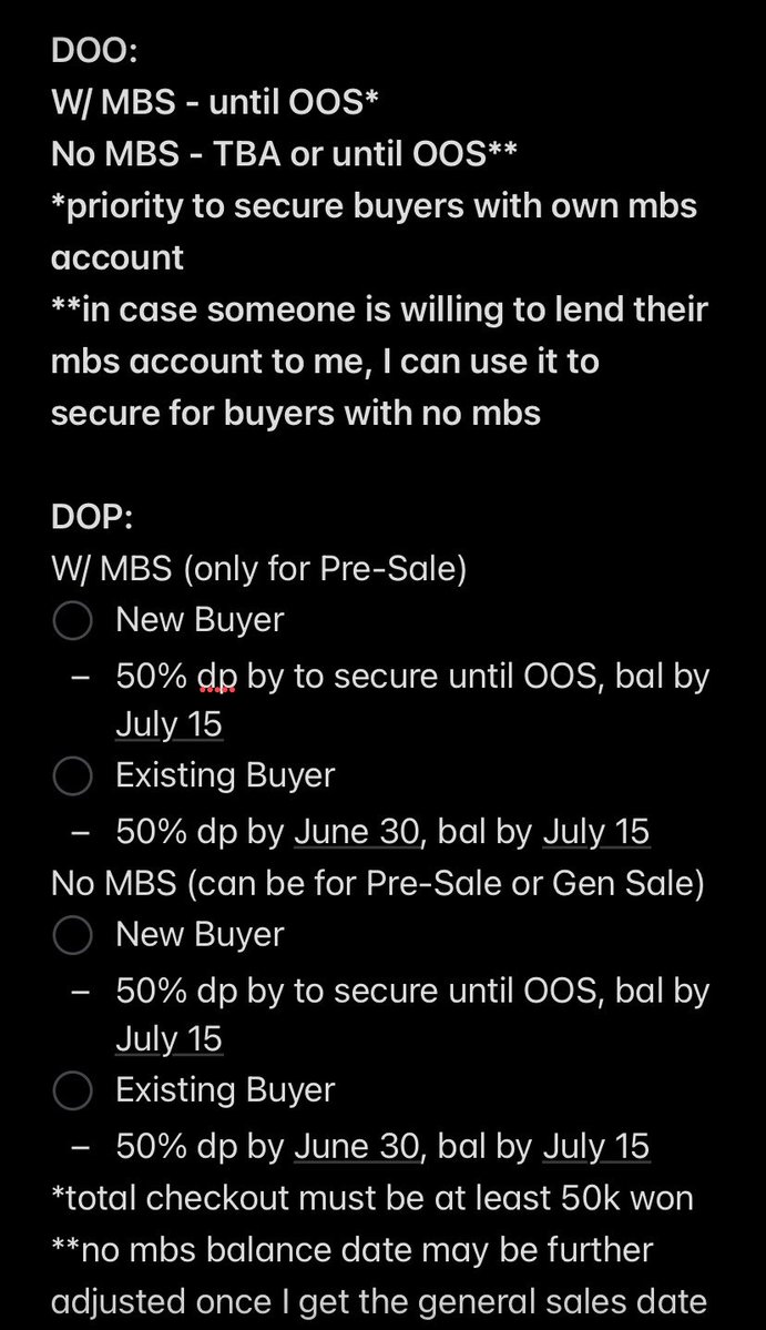
DOO & DOP: check photo
Form: bit.ly/SFPHOrders - look for LCK LoL Teams Dropdown


1
10
554

@Tesla Hi just leased a new Model 3 but getting stuck at the step for the license plate transfer. I’m in Florida and there’s no option for a Gadsden Flag (Don’t Tread on Me) specialty plate. Can you add to the dropdown? 🙏🏼
6
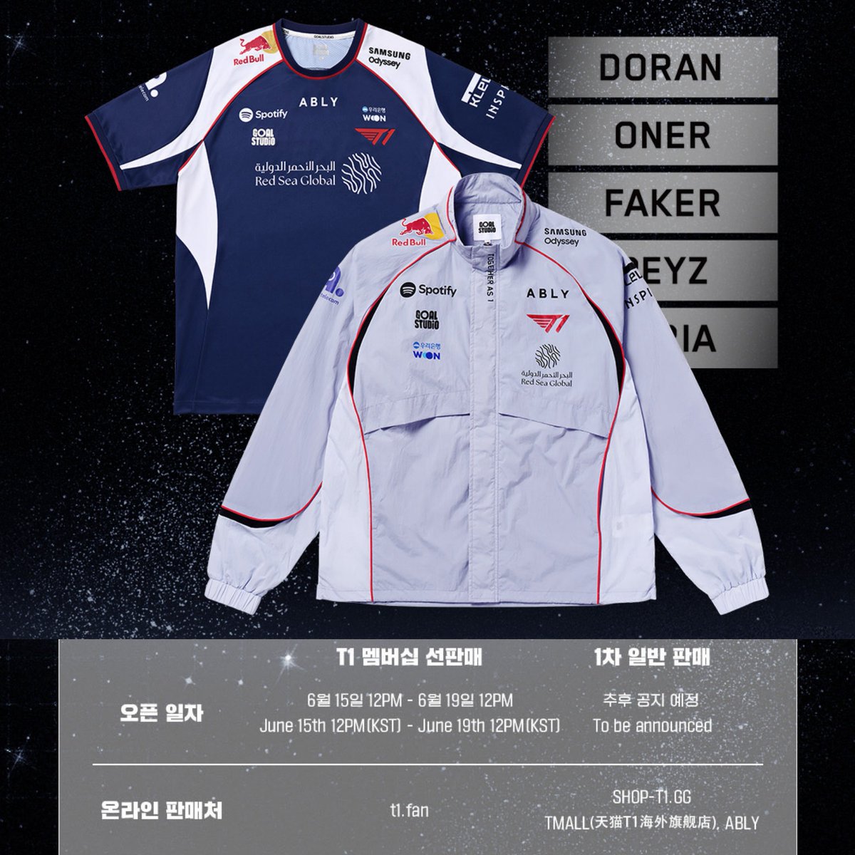
#SFPHGO
2026 T1 International Uniform MD
💸Php 590~7760 lsf
DOO & DOP: check photo
Form: bit.ly/SFPHOrders - look for LCK LoL Teams Dropdown
Address rental also available only for this pre-sale!
1
2
9
925


5h
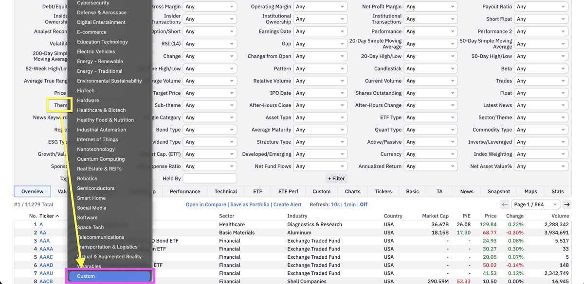
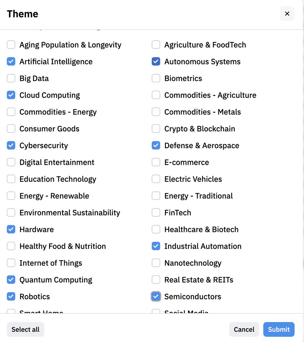
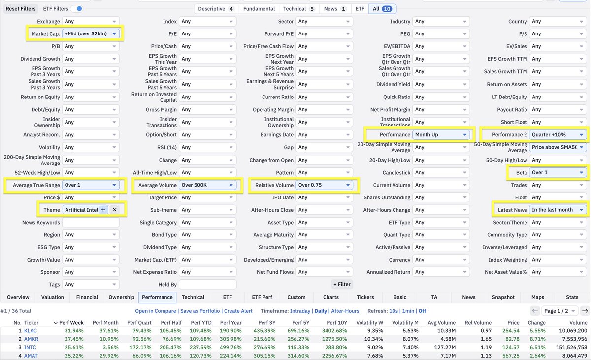
My high-level workflow for finding the strongest themes scanning for which stocks to actually enter:
1)
- go to finviz, click maps in the nav bar
- click "themes" in the left panel
- select 1-week (or month) from the dropdown
- observe what's strongest/greenest
2)
- go back to the nav bar
- click screener
- click "theme" box
- scroll all the way down, click custom
- select the strongest themes from step 1
3)
- add supporting filters
- performance
- market cap
- relationship with moving avgs
-etc (see mine attached)
Super high level, but this should give you a good starting point.
- Luc
7
15
160
6,568

"Why doesn't the SystemHardener Forensics Lab have a dropdown with the details explaining every single aspect?"
7

Sunday build at ZU2B: worked on website templates, tightened up the dropdown menus, and mapped out strategy for what's coming next.
The visible stuff gets attention. This is the work that makes it possible.
@iZU2B | ZU2B.com | #SundayBuild

3

I am just fixing the planning and thinker so it outputs well with ablity to do dropdown like here
i have all complex logic and exotic designs and effects all providers and connectors in exotic orchestration systems not in wild yet this is the biggest deal to me.
1
12

(Anna did the same. Her expression had gone to a neutral one. She was focused. This part of the training was quickly over, and another announcement came.)
[QUEST UPDATE. BATTLEFIELD TRAINING. PLEASE CHOOSE YOUR BATTLEFIELD AND MODE OF COMBAT.]
(A digital window appeared between the two of them. It had two dropdown menus, one for the battlefield and one for the mode. Anna started scrolling through them.)

🍄
"okay"
[ it dissapears in the blink of an eye, they pull out their gun from their pocket. ]
[ aiming again.. ]
[ they should speed this up ]
[ they fire the first 3 shots almost back to back ]
1
28

You can also see hourly for up to two weeks out. It’s in the dropdown too
1
1
37

claude 4.9 opus isn't a real model. it appeared in a dropdown for about 30 seconds while someone explained how beginners sell $2,000 websites using a photo of their fridge. the fridge was working as intended.
24


Gustavo Ripa channel (a legitimate Uruguayan musician/guitarist with older albums like Calma from ~2010 and ~12K subscribers) is currently (June 14 2026) being used to host live streams about “Elon Musk’s First Trillion-Dollar Interview: SpaceX IPO & SPCX Target Price.”
I don't know anything about him other than Youtube put his hijacked channel and livestream onto my stream. If his channel had his regular content it would never have been forwarded. Youtube is giving more platform for rando starting to give elon musk live streams than regular actual channels show an actual Elon Musk live stream.
This guy has never had any live streams before and his first live stream is about Elon Musk. If he did do a livestream for his music he would have a few hundred views. Somehow the AI scammers pumped it up to 16000 supposedly on the livestream. This video creator account is going to get banned and it will take weeks, months or years or never to get it back.
Tens of thousands of creators are similarly hacked. AI is making this easier for the criminals.
What is wrong with the recommendation engine? Legitimate sites hosting the same Elon Musk interview when it was happening would get less engagement. Youtube is over engaging bad content.
A creator should be able to lock out live streams and other features that do not plan to use. The default should be normal operation and make it harder to convert into a platform for the scammers. This is like putting a credit freeze on credit reports to prevent opening new loans.
The crypto/investment scam pattern that has been rampant for years. In 2021, Google’s Threat Analysis Group publicly detailed a large-scale phishing cookie-theft malware campaign specifically targeting YouTube creators. They identified over 1,000 malicious domains built for this purpose and associated ~15,000 attacker email accounts.
Thousands of creators (particularly gaming, tech, and news channels) reported hijackings between 2023–2025. Creators and those fooled by the scams are both victims.
High-profile examples include Linus Tech Tips channels (2023), a major Australian news channel and countless smaller ones including Nextbigfuture last month. @YouTubeCreators @youtube @Youtubesupoo @TeslaBest @RandyWKirk1 @CuriousPejjy @MrBeast @LinusTech
Hijackers frequently repurpose channels for live crypto scams, often featuring deepfakes or impersonations of Elon Musk, Tesla, or SpaceX — exactly as shown in your screenshot. These streams can pull in thousands of viewers quickly because the channel already has an established audience and trust signals. I would note that I have never had a livestream with more than 300-1000 viewers and I rarely do livestreams.
For music/guitarist channels like Gustavo Ripa’s: They are less frequently targeted than high-engagement gaming or tech channels, but they are still vulnerable.
Any channel with subscribers, watch time, or monetization history has value to hijackers — either for running scam lives or selling access. Small-to-mid-size channels (10K–100K subs) get hit when owners fall for phishing, reuse passwords, or have session cookies stolen via malware.
I get that Youtube cannot have the large live human team to address so making the processes more secure and efficient is what needs to be done. This is a big problem that deserves some development resources.
Why doesn’t YouTube/Google require 2FA specifically for video uploads?
They say it is hassle they do not want to impose. BUT I have to fill out 5 screens full of settings and descriptions for every upload. Adding a final authentication step is trivial and would add 5% to time. I do it all the time for everything on my bank account and on things in my stock trading account. Protecting youtube revenue can be larger than bank accounts or loan scams. It can be optional the youtube channel that is monetized have an admin setting for 2FA for uploads.
This is not just security on the login but the upload.
There are occasional “Verify it’s you” prompts on suspicious activity.
The real weaknesses that hijackers exploit. Phishing sites that steal passwords session cookies and bypass login 2FA.
Malware that steals active sessions.
Users who never enable 2FA or use weak/SMS-based 2FA (vulnerable to SIM-swapping).
Social engineering (“You won a brand deal — click here to verify”).Youtube and google need to put in the effort align with how banks and other high-value platforms handle risk.1. Stronger verification on critical actions (uploads user additions)Require re-authentication (password 2FA/passkey) for first upload of the day or live stream of the day. Enable lockouts on livestream and other features. Enable accounts to opt for higher security.Sudden major content shifts (detected by AI comparing to channel history).
Adding or changing channel managers/collaborators on Brand Accounts.Freeze mode for user additions: When someone tries to add a new manager, put a 24–48 hour pending period. Notify the primary owner via email in-app notification recovery phone. New managers have limited permissions during this window (no name/banner changes, no monetization edits, etc.). This is very similar to how banks handle adding authorized users or large transfers.
2. Better hijacking detection using account historyYouTube already has behavioral signals. They should weight them more heavily for long-history channels
Consistent niche upload style for years → high “trust score.”Sudden deletion of old videos, name/banner changes, or completely different content (guitar music → Elon Musk crypto live) → strong red flag.
IP/location changes new live streams at odd hours.Long clean history should trigger priority owner recovery and temporary restrictions on the hijacker (elive streams paused, new uploads reviewed before going public) instead of immediate strikes or termination that punish the victim.
3. Improve the reporting dropdown (simple change)
Add a clear option:
“This channel appears hijacked or taken over” (with sub-reasons: sudden unrelated content, scam live stream, old videos deleted, name changed without warning, etc.).
When multiple reports come in on a channel with a long clean history. Auto-flag for human AI review. Temporarily limit new lives/uploads.
Attempt to contact the original owner via all known recovery methods.
Quarantine the suspicious content instead of immediately punishing the entire channel.Banning/striking the channel hurts the victim, not the hijacker.Hijackers don’t care if the channel gets terminated — they just move to the next compromised account.
4. Community history signals to reduce overreactionsInternally track a “Creator Trust Score” based on Channel age and consistency.
History of positive engagement from long-term subscribers.
No prior violations.Long-trusted creators get faster recovery paths and more protection against hasty termination.
Allow verified long-time subscribers (or a “channel alumni” system) to flag suspicious activity on channels they follow, adding another signal without opening it to abuse.What creators (and viewers) should do right nowFor channel owners:Enable 2-Step Verification today with a passkey or authenticator app (not SMS)
Use a strong, unique password password manager.
Never click links in emails/DMs claiming to be from YouTube, brands, or “support.”
Regularly check your channel from another device/browser.
Back up your videos locally.If your (or someone’s) channel is hijacked
Go to Google’s hacked account recovery flow immediately.
YouTube’s official recovery page has a form, but support is limited to incidents within the last 9 months. The Form is sent to automated responses and human responses can take weeks or there might never be human response.
The core issue is that hijackers treat channels as disposable tools for quick scams. Better prevention at login smarter detection that protects long-history creators easier reporting focused on “hijacking” rather than just “spam” would go a long way.

3
14
1,262