
Thanks, Lucide.dev ❤️
Get yours too, only at somethingmedia.in
#SomethingMedia #FrontendDesign #LucideIcons #WebsiteInspiration #WebDesign #UIUXDesign #WebDevelopment #ModernWebDesign #CreativeAgency #BusinessGrowth #DigitalCreators
2
3

Jun 8
🌟Such a good taste landing page for Ferrari Luce. Made by taste skill and Claude Code on 302 AI Studio.
👉Try it here: g8utexzrpo.302ai.app
#tasteskill #302ai #frontenddesign #vibecoding

1
1
45
Jun 3
Brand hero page designed by Qwen3.7 Max.
More mature control of typography, layout, and color.
What's you rate from⭐to⭐⭐⭐⭐⭐
#qwen #llm #frontenddesign
3
2
127

Jun 2
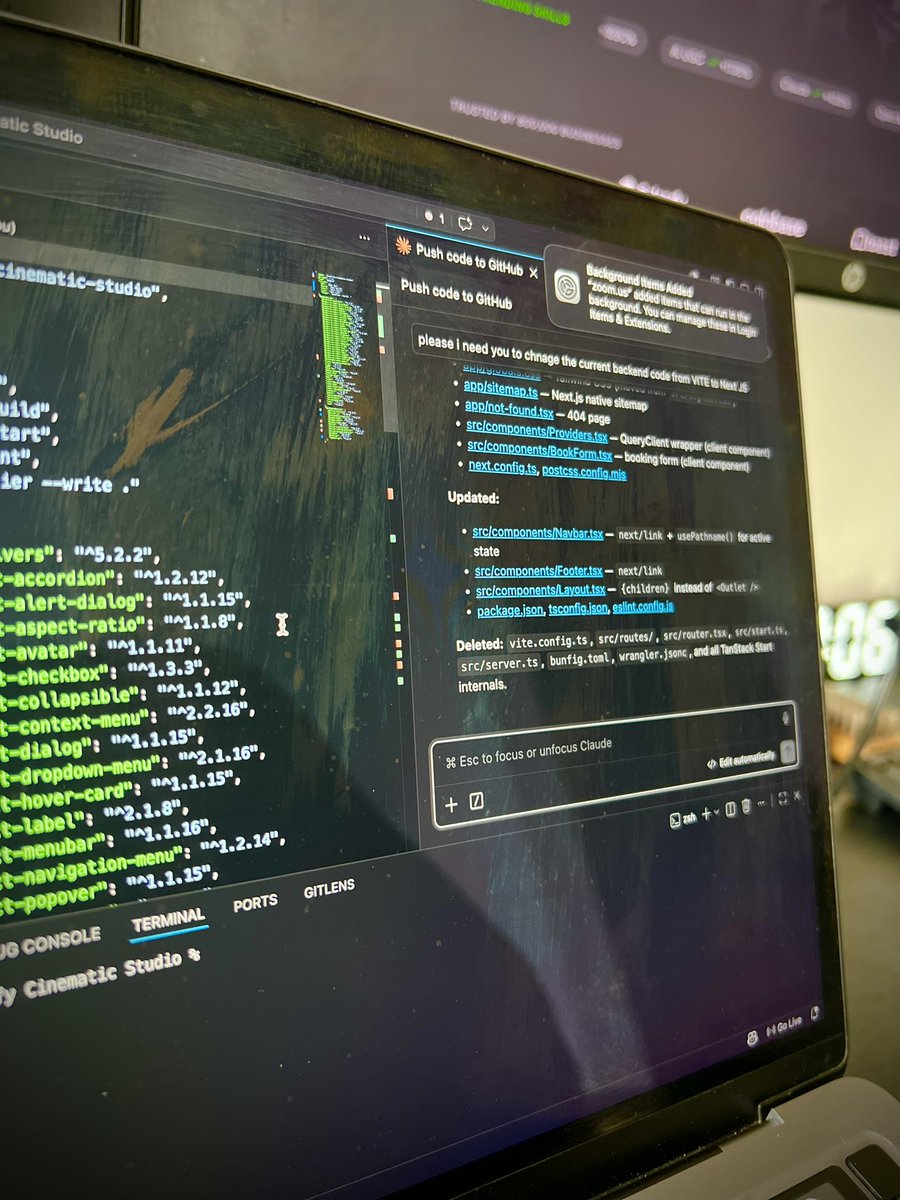
Shipped this front-end CSS animation using Claude for a client project.
This animation would have taken a week had I tried to make them on Jitter. Not to mention video/gif will be slow to load!
Engineering wasn't too happy (asked me to create a video walkthrough and resubmit with less lines of code...). Understand their concern and wonder how I can ship a good front end code.
#vibecoding #designengineer #frontenddesign #frontend #claudedesign
2
6
230

I launched my new portfolio and it's not a normal site.
It's a Windows 98 PC running in the browser.
Boot screen. Folders. Draggable windows. DOOM.exe. A music player with Sinatra and Hendrix. And my case studies inside as files.
Built it with Next.js Claude Code as a UX designer who doesn't code for a living.
atgc.design
Desktop experience is the real one. Mobile version exists too.
Feedback welcome! 👇
#UXDesign #Portfolio #WebDesign #AIDesign #ClaudeCode #Nostalgia #Windows98 #ProductDesign #DesignSystems #NextJS #BuildInPublic #AITools #DesignerLife #UXPortfolio #FrontendDesign
2
2
136

May 21
𝗖𝘂𝗿𝗿𝗲𝗻𝘁𝗹𝘆 𝘃𝗶𝗯𝗲𝗰𝗼𝗱𝗶𝗻𝗴 𝗮 𝗽𝗵𝗼𝘁𝗼𝗴𝗿𝗮𝗽𝗵𝘆 𝗽𝗼𝗿𝘁𝗳𝗼𝗹𝗶𝗼 𝘄𝗲𝗯𝘀𝗶𝘁𝗲 𝗳𝗼𝗿 𝗮 𝗰𝗹𝗶𝗲𝗻𝘁 💻✅
I have been building a website for a client in the photography space, and my workflow has been a mix of AI-assisted product thinking hands-on UX refinement.
Started by streamlining the product scope and structure with Claude, mapping out the user flow, content direction, and overall experience the brand needed.
From there, I used Lovable to generate a stunning website foundation that aligned with the client’s visual identity and photography style.
Then I exported the codebase into Visual Studio Code and used Claude Code to refine layouts, interactions, and overall UX flow.
The goal was simple:
• Instantly showcase the photography portfolio
• Create a premium visual experience
• Give users a smooth path to “Book Now”
What I enjoy most about vibecoding is this:
AI helps speed up execution, but good design thinking is still what makes the product feel intentional.
Still polishing this project, but I genuinely love how it’s coming together.
#VibeCoding #WebDesign #UXDesign #AIWorkflow #Lovable #ClaudeAI #UIDesign #CreativeDevelopment #PhotographyWebsite #FrontendDesign

1
2
63

May 20
📢We're shipping a design mode in ALwith.
Not a toy. Think Claude Design-level — but running in your local workspace.
Coming very soon.
🦾 alwith.ai/
#alwith #claudedesign #frontenddesign #ai #design

4
118

May 3
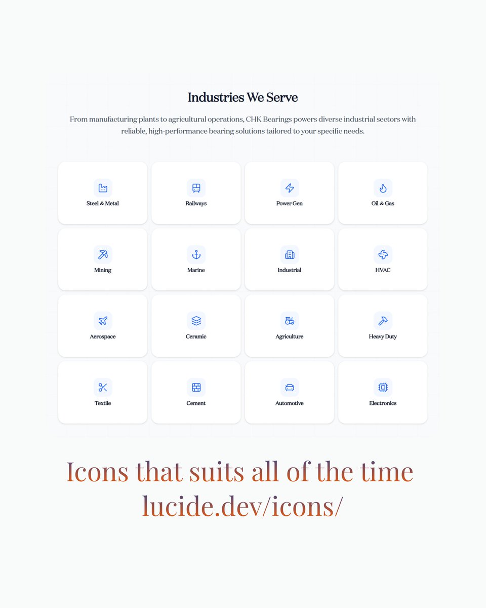
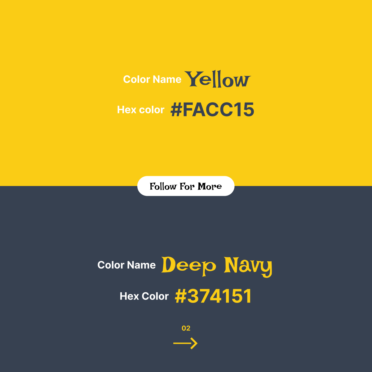
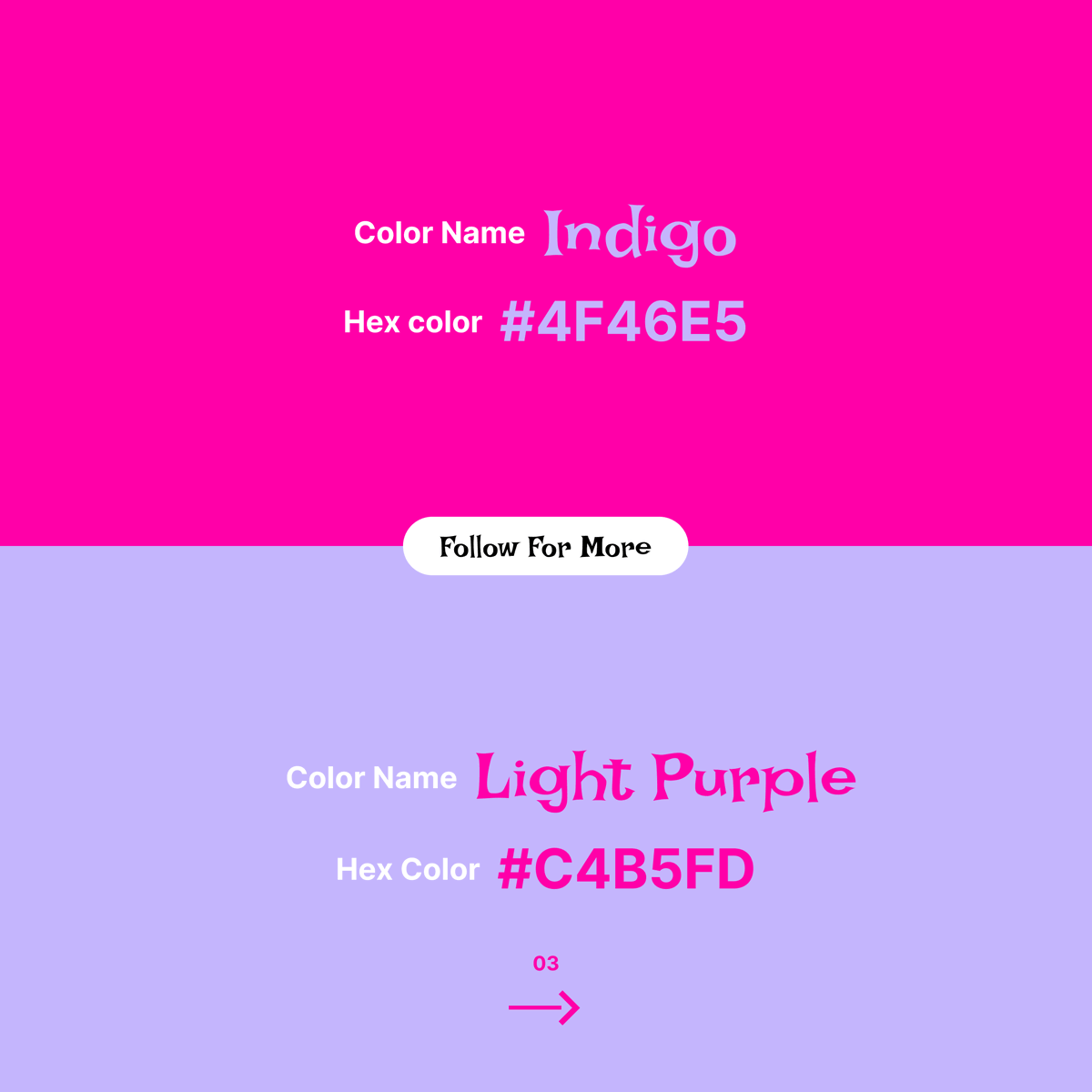
Color combinations are more than just visual choices—they define mood, emotion, and user experience. A powerful palette can instantly elevate a design from ordinary to premium.#FrontendDesign #DesignTips #DigitalDesign #AestheticDesign #ColorInspiration #DesignTrends
1
3
33

Designing a modern profile card UI with a clean layout, smooth spacing, and a professional look. Simple, elegant, and user-friendly.
#UIDesign #UXDesign #WebDesign #ProfileCard #UIUX #FrontendDesign #WebDeveloper #CreativeDesign #DesignInspiration #ModernUI #UserInterface #PortfolioDesign #FigmaDesign #CleanDesign #TechDesign
4
75


Mar 30
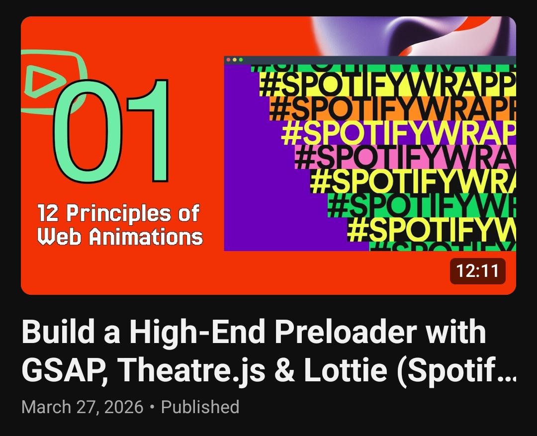
この動画では、私の「Webアニメーション12の原則」シリーズの第一の原則を掘り下げ、2022年の素晴らしいSpotify Wrapped for Artistsのプレローダー(読み込み画面)を再現します。単なるローディングバーの枠を超え、Theatre.jsやLottieといった業界標準のツールを使用して、本当に魅力的なユーザーエクスペリエンスを作成する方法を学びます。
学べる内容:
スタッガー(時間差)を用いた数字のアニメーションによる、ダイナミックな0から100へのカウンターの構築方法。
プロ仕様のモーションデザインツールとしてTheatre.jsを統合し、HTML要素を直接アニメーション化する方法。
高品質なアニメーションのためのLottieの活用。
インタラクティブなUI要素のための、マウス追従型の傾き(ティルト)エフェクトを含む、高度なCSSおよびJSエフェクト。
紹介したリソース:
記事:Webアニメーション12の原則 (12 Principles of Web Animation)
ツール:Theatre.js、LottieFiles、GSAP。
動画のタイムスタンプ
0:00 – はじめに:Webアニメーション12の原則
0:45 – Spotify Wrapped 2022のプレローダーの解説
1:50 – プロジェクトのセットアップ:アセット、スクロールロジック、コンポーネント
2:45 – カウンターの作成:数字の操作とフェーズベースの配色
4:15 – カウンターと実際のアセットのプリロードの連携
5:30 – トランジションシーケンス:年とハッシュタグのアニメーション
6:45 – Theatre.jsの深掘り:キーフレーム、Studio GUI、状態(ステート)のエクスポート
8:15 – Lottieの統合:2.5DパターンとWebコンポーネント
9:30 – 最終的な表示:テキストとアーティスト情報のスタッガー表示
11:00 – 高度なインタラクション:ホバー時の傾きエフェクトの実装
12:15 – おわりに:ユーザーに魅力的な体験を提供するための準備
#WebDevelopment #TheatreJS #LottieFiles #SpotifyWrapped #FrontendDesign #JavaScript #12PrinciplesOfAnimation
Webアニメーション, Theatre.jsチュートリアル, Lottieアニメーション, Spotify Wrappedクローン, フロントエンド開発, JavaScriptアニメーション, CSSスタッガー, UI/UXデザイン
Mar 28

2
5
30
2,499

Mar 9
LovableLabs Website Clone ✨This is where I started caring about details, not just structure.
This project taught me why UI polish matters.
Github : github.com/Dev1822/LovableLa…
#HTML #CSS #FrontendDesign #PixelPerfect
2
18

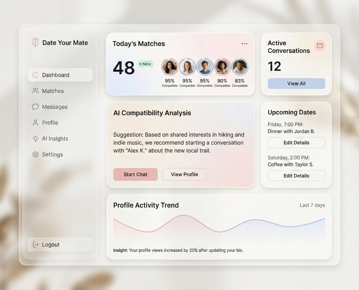
This dashboard gets modern product design right, QUIETLY.
What works well here (100 words, bullets):
✅ Clear hierarchy: key numbers surface first, details follow naturally
✅ Soft glassmorphism adds depth without hurting readability
✅ Smart use of cards keeps information scannable
✅ AI insights feel assistive, not intrusive
✅ Actions are contextual, not overwhelming
✅ A calm color palette builds trust and focus
✅ Metrics are human-readable, not data-heavy
✅ Navigation stays out of the way
✅ Personalization feels intentional
✅ Visual rhythm guides the eye smoothly across sections
Ready-to-use prompt to create a similar dashboard:
“Design a modern SaaS dashboard with a soft glassmorphism UI. Use an off-white background, subtle blur layers, rounded cards, and gentle shadows. Create a left sidebar for navigation and a main content area with modular cards. Highlight key metrics at the top with friendly typography and small profile visuals. Include an AI insight card that offers contextual suggestions in plain language. Add sections for active conversations, upcoming events, and performance trends using minimal charts. Maintain generous spacing, calm gradients, and a neutral color palette with light accent tones. Focus on clarity, scannability, and trust. Avoid clutter, heavy contrast, or aggressive colors. The overall feel should be premium, human, and quietly intelligent, designed for daily use without cognitive fatigue.”
#UIDesign #DashboardDesign #SaaSDesign #ProductDesign #UXDesign #AIDesign #DesignSystems #ModernUI #WebAppDesign #FrontendDesign #DesignInspiration
3
75

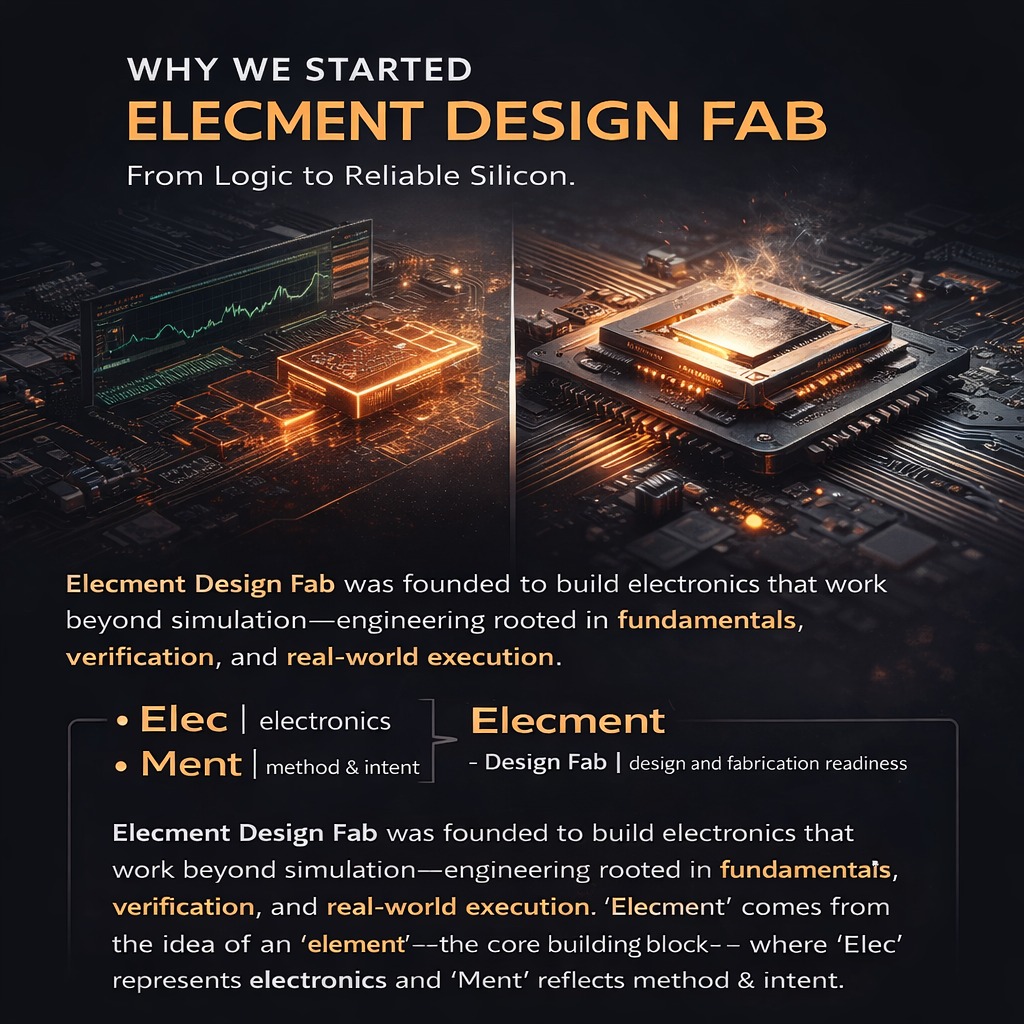
Why we started Elecment Design Fab?. From Logic to Reliable Silicon. #frontenddesign #rtldesign #logicsynthesis #fpgadesign #vlsi #simulation #Electronics #Element #elecment
2
3
50

16 Dec 2025
Clean. Bold. Purpose-driven. A modern landing page UI designed to turn ideas into meaningful digital experiences.#UIDesign #UXDesign #LandingPageDesign #WebDesign #FrontendDesign #ProductDesign #DesignInspiration #CreativeUI #DigitalExperience #ModernWeb

4
10
330

10 Dec 2025
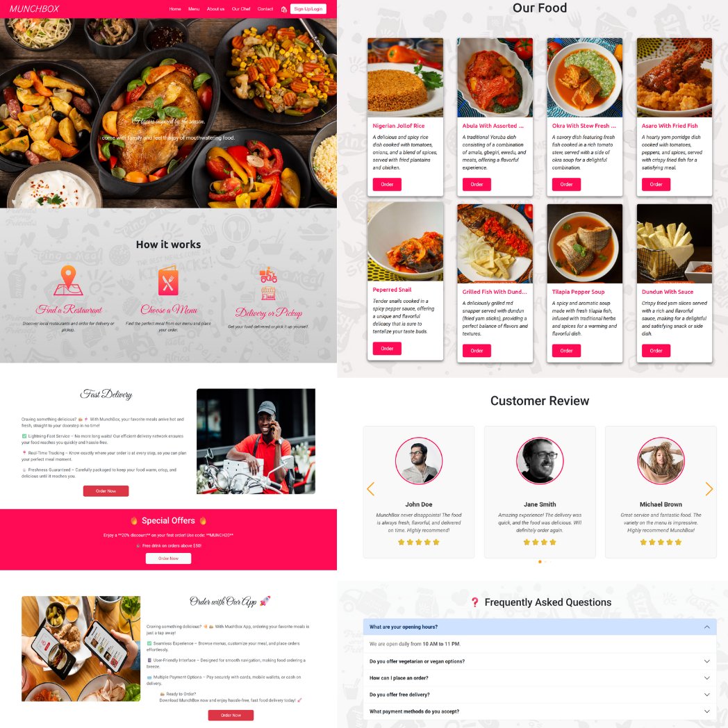
Another day, another reminder that I build beautiful, functional websites 😎💻
Clean design, tasty layout — just like this food website frontend I cooked up 🍽️
Let’s build something amazing together!
#WebDeveloper #FrontendDesign #UIUX #PortfolioDrop #TechCreatives
1
4
140


28 Nov 2025
✨ Just finished designing a new animated service section for a client’s WordPress website!
Check out the design live: anthrowebs.com/design-demo/
#websesign #wordpressdeveloper #UIDesign #css #webdevelopment #frontenddesign #wordpressexpert
#anthrowebs #mohiuddinmunna
2
94

27 Nov 2025
Fullscreen navigation built for motion and flexibility.
Smooth GSAP animation, clean flow, and easy customization.
Edit colors, fonts, animation timing, and burger styles in seconds.
#ClaPatFramework #GSAP #FrontendDesign #CreativeCoding #WebDev #WebDesign
1
2
4
170
19 Nov 2025
Classic Menu is the standard top navigation bar option inside ClaPat Framework. Fully responsive with dropdown support, hover and click interactions, optional sticky behavior, and light/dark option modes.
#ClaPatFramework #GSAP #FrontendDesign #CreativeCoding #WebDev #WebDesign
1
2
4
182