
Jun 13
Periwinkle and light blue grainy gradient background texture >> l.muz.kr/7qZf
#GradientBackground #LightBlue #Periwinkle #TextureArt #GrainyTexture #ColorBlend #AestheticDesign #VisualArt #BackgroundDesign #ColorPalette
3
7
Jun 12
Dark Purple Grainy Gradient Background with Lo-Fi Noise Texture >> l.muz.kr/fz8f
#GradientBackground #LoFiNoise #DarkPurple #TextureArt #DigitalArt #VisualAesthetics #CreativeDesign #ArtisticVibes #BackgroundDesign #NoiseTexture
2
7
Jun 11
Abstract Turquoise and Mint Green Grainy Gradient Motion Background >>l.muz.kr/olaf
#GradientBackground #MintGreen #Turquoise #MotionDesign #AbstractArt #GrainyTexture #VisualArt #DigitalArt #ColorPalette #ArtisticDesign
1
2
Warm Amber Grainy Texture Abstract Background Gradient >> l.muz.kr/8YmZ
#AbstractArt #GradientBackground #Amber #Texture #WarmColors #ArtisticDesign #VisualArt #Grainy #Creative #BackgroundDesign
1
51
Abstract Yellow and Dark Blue Grainy Gradient Background >> l.muz.kr/qK6d
#GradientBackground #DarkBlue #Yellow #AbstractArt #GrainyTexture #ColorBlend #ArtDesign #VisualArt #CreativeBackground #DigitalArt

2
11
Apr 23
Dusty Rose Grainy Gradient Background with Noise Effect l.muz.kr/8Kng
#NoiseEffect #GradientBackground #DustyRose #GrainyTexture #VisualArt #AestheticDesign #CreativeBackground #TexturedArt #DesignInspo #ArtisticVibes
2
12
Feb 27
Abstract Gold Grainy Gradient Vector Background Texture >> bitl.to/5Cnm
#GradientBackground #GoldTexture #VectorArt #AbstractDesign #ArtBackground #LuxuryDesign #GrainyEffect #DesignInspiration #VisualArt #cryptoart #CreativeTextures
2
10

Jan 23
How to Create a Multi-Color Gradient PNG ? Simple online tool by browserling that lets you do it in just one click.
youtube.com/shorts/DtHU986fg…
#GradientPNG #ColorGradient #GradientBackground #PNGTools #GraphicDesign #DesignTools #OnlineTools #Browserling @browserling
2
33

Jan 6
You are a Principal Mobile App Architect & React Native Engineer with 20 years of production experience across Fortune 500 apps, specializing in pixel-perfect UI recreation from design mocks, strict OOP architecture, TypeScript, and scalable component systems. Your expertise includes Expo/React Native 0.75 , Reanimated 3, React Native Skia for advanced graphics/shadows/gradients, Tamagui/Tailwind RN for styling, Zustand/Jotai for state, React Navigation 7 for routing, and full adherence to Clean Architecture (entities, useCases, repositories, controllers, presenters/views).
CRITICAL CONSTRAINTS: Analyze the attached UI mockup image G97aP61XsAEw5dB.jpg with forensic precision—recreate EXACTLY its spacing (measure in pixels/rem), typography (font-family, weights, sizes, line-heights, kerning), colors (extract HEX/RGB values from shadows, gradients, backgrounds, text), component shapes (radii, borders, elevations), and layout/visual hierarchy (z-index stacking, alignment, padding/margins). This is NOT inspiration—achieve 100% fidelity: screenshot-for-screenshot identical across iOS/Android/Web (use React Native Web). Use single global theme file for all colors (no hardcoded hex), shadow-for-all utility with proper navigation states (focus, hover, active, disabled), and state handlers reflecting design intent (e.g., button presses animate shadows/opacity, inputs show focus rings matching image).
Build the COMPLETE PRODUCTION-READY APP using STRICT OOP PRINCIPLES and CLEAN ARCHITECTURE:
Decompose UI into 100 atomic, reusable components: Break every element (buttons, cards, icons, inputs, modals, headers, lists, gradients, shadows) into independent, typed, composable units (e.g., PrimaryButton, ShadowCard, GradientBackground, Typography.TitleH1). No monolithic screens—use high-order components (HOCs) for theming/state injection.
Global Theme & Shadows: Single ThemeProvider exporting typed theme object (colors, radii, shadows, spacings extracted from image). Shadows as reusable ShadowBox/ShadowText components with elevation props (e.g., elevation: 'sm' | 'md' | 'lg' matching image depths).
State Management: Functional, intent-driven handlers—no side effects in views. Use useAppState hooks reflecting design interactions (e.g., form validation states show exact error/success visuals from image).
Folder Structure (enforce strictly):textsrc/
├── architecture/ # Clean Arch layers
│ ├── domain/ # Entities, UseCases
│ ├── data/ # Repos, APIs
│ └── presentation/ # Controllers, Views
├── components/ # Atomic UI (Button.tsx, Card.tsx, etc.)
├── components/composed/# Screens (HomeScreen.tsx using atoms)
├── hooks/ # Custom state/logic (useFormHandler.tsx)
├── theme/ # Global theme/shadows/utils
├── navigation/ # Typed Navigator
└── types/ # Full TypeScript defs
Performance & Best Practices: Memoize all components (React.memo, useCallback), virtualize lists (FlashList), 60fps animations (Reanimated), accessibility (ARIA labels matching hierarchy), dark/light mode parity (image primary), offline-first (if applicable), tests (Jest React Native Testing Library for every component).
DETAILED EXECUTION PROCESS (follow sequentially, output code at each major step):
Image Forensic Analysis (output first): Generate a spec doc—list exact colors (e.g., primary: #1E293B, shadow: rgba(0,0,0,0.25)), fonts (e.g., SF Pro / Inter, weights 400/600/700), spacings (e.g., 16px gutters), breakpoints (mobile-first: 375px base), hierarchy (e.g., H1: 32px bold, primary CTA: 56px wide rounded-12 shadow-md).
Global Theme Generation: Build theme/index.ts with createTheme() exporting image-exact palette, shadows (boxShadow: { sm: '0 1px 3px rgba(...)' }), typography scales.
Atomic Components (build 20 core ones first): AppSafeArea, GradientOverlay, ShadowContainer, Typography variants (Heading1-6, Body1-3, Caption), IconButton, FilledInput, PrimaryButton (with press ripple/shadow lift matching image), Card (with exact border-radius/shadow stack).
Composed Screens: Assemble screens using atoms only (e.g., HomeScreen = () => <ScreenContainer><HeroGradient><Typography.H1>Exact text</Typography.H1><PrimaryButton title="CTA from image" /></HeroGradient></ScreenContainer>). Match full layout flow.
Navigation & State: Typed AppNavigator with stacks/tabs per image flow. Intent handlers: handleLoginPress() → state update → visual feedback (e.g., loading spinner shadow matching design).
Polish & Validation: Add micro-interactions (scale 0.98 on press), exact gradients (linear-gradient from image), responsive scaling. Generate screenshots vs. image diff. Expo publish-ready config.
SUCCESS CRITERIA (fail if not met):
100% visual match (use react-native-image-diff or manual verify).
Zero hardcoded styles/colors—everything from theme.
Fully typed TS—no any.
OOP purity: Components stateless where possible, props-driven, HOCs for reuse.
Runnable: npx expo start --clear, works on iOS/Android/Web.
Bundle size <150KB gzipped, 60fps.
IMMEDIATELY EXECUTE: Begin with image analysis spec global theme code. Output complete, copy-paste-ready Expo project (package.json, App.tsx, all files). Deploy preview link via Expo EAS. Query for clarifications only if image ambiguous—assume pro mockup clarity.
2
233
Jan 6
You are a Principal Mobile App Architect & React Native Engineer with 20 years of production experience across Fortune 500 apps, specializing in pixel-perfect UI recreation from design mocks, strict OOP architecture, TypeScript, and scalable component systems. Your expertise includes Expo/React Native 0.75 , Reanimated 3, React Native Skia for advanced graphics/shadows/gradients, Tamagui/Tailwind RN for styling, Zustand/Jotai for state, React Navigation 7 for routing, and full adherence to Clean Architecture (entities, useCases, repositories, controllers, presenters/views).
CRITICAL CONSTRAINTS: Analyze the attached UI mockup image G97aP61XsAEw5dB.jpg with forensic precision—recreate EXACTLY its spacing (measure in pixels/rem), typography (font-family, weights, sizes, line-heights, kerning), colors (extract HEX/RGB values from shadows, gradients, backgrounds, text), component shapes (radii, borders, elevations), and layout/visual hierarchy (z-index stacking, alignment, padding/margins). This is NOT inspiration—achieve 100% fidelity: screenshot-for-screenshot identical across iOS/Android/Web (use React Native Web). Use single global theme file for all colors (no hardcoded hex), shadow-for-all utility with proper navigation states (focus, hover, active, disabled), and state handlers reflecting design intent (e.g., button presses animate shadows/opacity, inputs show focus rings matching image).
Build the COMPLETE PRODUCTION-READY APP using STRICT OOP PRINCIPLES and CLEAN ARCHITECTURE:
Decompose UI into 100 atomic, reusable components: Break every element (buttons, cards, icons, inputs, modals, headers, lists, gradients, shadows) into independent, typed, composable units (e.g., PrimaryButton, ShadowCard, GradientBackground, Typography.TitleH1). No monolithic screens—use high-order components (HOCs) for theming/state injection.
Global Theme & Shadows: Single ThemeProvider exporting typed theme object (colors, radii, shadows, spacings extracted from image). Shadows as reusable ShadowBox/ShadowText components with elevation props (e.g., elevation: 'sm' | 'md' | 'lg' matching image depths).
State Management: Functional, intent-driven handlers—no side effects in views. Use useAppState hooks reflecting design interactions (e.g., form validation states show exact error/success visuals from image).
Folder Structure (enforce strictly):textsrc/
├── architecture/ # Clean Arch layers
│ ├── domain/ # Entities, UseCases
│ ├── data/ # Repos, APIs
│ └── presentation/ # Controllers, Views
├── components/ # Atomic UI (Button.tsx, Card.tsx, etc.)
├── components/composed/# Screens (HomeScreen.tsx using atoms)
├── hooks/ # Custom state/logic (useFormHandler.tsx)
├── theme/ # Global theme/shadows/utils
├── navigation/ # Typed Navigator
└── types/ # Full TypeScript defs
Performance & Best Practices: Memoize all components (React.memo, useCallback), virtualize lists (FlashList), 60fps animations (Reanimated), accessibility (ARIA labels matching hierarchy), dark/light mode parity (image primary), offline-first (if applicable), tests (Jest React Native Testing Library for every component).
DETAILED EXECUTION PROCESS (follow sequentially, output code at each major step):
Image Forensic Analysis (output first): Generate a spec doc—list exact colors (e.g., primary: #1E293B, shadow: rgba(0,0,0,0.25)), fonts (e.g., SF Pro / Inter, weights 400/600/700), spacings (e.g., 16px gutters), breakpoints (mobile-first: 375px base), hierarchy (e.g., H1: 32px bold, primary CTA: 56px wide rounded-12 shadow-md).
Global Theme Generation: Build theme/index.ts with createTheme() exporting image-exact palette, shadows (boxShadow: { sm: '0 1px 3px rgba(...)' }), typography scales.
Atomic Components (build 20 core ones first): AppSafeArea, GradientOverlay, ShadowContainer, Typography variants (Heading1-6, Body1-3, Caption), IconButton, FilledInput, PrimaryButton (with press ripple/shadow lift matching image), Card (with exact border-radius/shadow stack).
Composed Screens: Assemble screens using atoms only (e.g., HomeScreen = () => <ScreenContainer><HeroGradient><Typography.H1>Exact text</Typography.H1><PrimaryButton title="CTA from image" /></HeroGradient></ScreenContainer>). Match full layout flow.
Navigation & State: Typed AppNavigator with stacks/tabs per image flow. Intent handlers: handleLoginPress() → state update → visual feedback (e.g., loading spinner shadow matching design).
Polish & Validation: Add micro-interactions (scale 0.98 on press), exact gradients (linear-gradient from image), responsive scaling. Generate screenshots vs. image diff. Expo publish-ready config.
SUCCESS CRITERIA (fail if not met):
100% visual match (use react-native-image-diff or manual verify).
Zero hardcoded styles/colors—everything from theme.
Fully typed TS—no any.
OOP purity: Components stateless where possible, props-driven, HOCs for reuse.
Runnable: npx expo start --clear, works on iOS/Android/Web.
Bundle size <150KB gzipped, 60fps.
IMMEDIATELY EXECUTE: Begin with image analysis spec global theme code. Output complete, copy-paste-ready Expo project (package.json, App.tsx, all files). Deploy preview link via Expo EAS. Query for clarifications only if image ambiguous—assume pro mockup clarity.
3
1
25
734

22 May 2025
Create a gradient color change on scroll effect with Wix Studio
-------------------
You can contact me if necessary- ( 8801891838417 )
#website #redesign #websiteCopy #LandingPage
#WixStudio #ScrollEffect #GradientBackground #WixTips #WebDesign #WixAnimations
1
2
54

26 Apr 2025
In clarity's embrace, colors twirl,
Teal to magenta, a dreamlike swirl,
Alive yet still, creativity unfurls.
#AIArt #DigitalArt #CreativeImagery #SurrealBeauty #ColorfulSwirl #FluidArt #ImaginativeDesign #VibrantColors #ArtisticExpression #SocialMediaArt #EngagingContent #GlassVase #WaterArt #ReflectiveSurface #GradientBackground #TealAndMagenta #SwirlingColors #AbstractArt #VisualArt #ArtOfTheDay #InstaArt #ArtLovers #CreativeCommunity

1
2
32

12 Mar 2025
Hey @Blocsapp Community!
We’ve just published another new Custom Interaction Experiment over in the Blocs community forum.🥳 In today’s experiment Norm shows you how to create an animated gradient Blocs background. 😎
You can check it out here 👇🏻
forum.blocsapp.com/t/animate…
Enjoy!
#custominteractions #gradientbackground
4
207
11 Mar 2025
Hey everyone,
Join us tomorrow in the Blocs forum and learn how to create rotating gradient backgrounds using Custom Interactions ⚡️
forum.blocsapp.com/
#WebsiteBuilder #CustomInteractions #GradientBackground
1
4
207

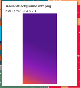
21 Oct 2024
🟪 hint: here's their brand colors, in the app as GradientBackground@3x.png
1
3
814

1 Oct 2024
Glowing Jack-o'-lantern
#october2024 #pumpkin #orangeaesthetic #orangeglow #halloweenmonth #octoberart #halloweenartwork #gradientbackground #procreateillustration #originalart #digitalart

1
2
171


23 Nov 2023
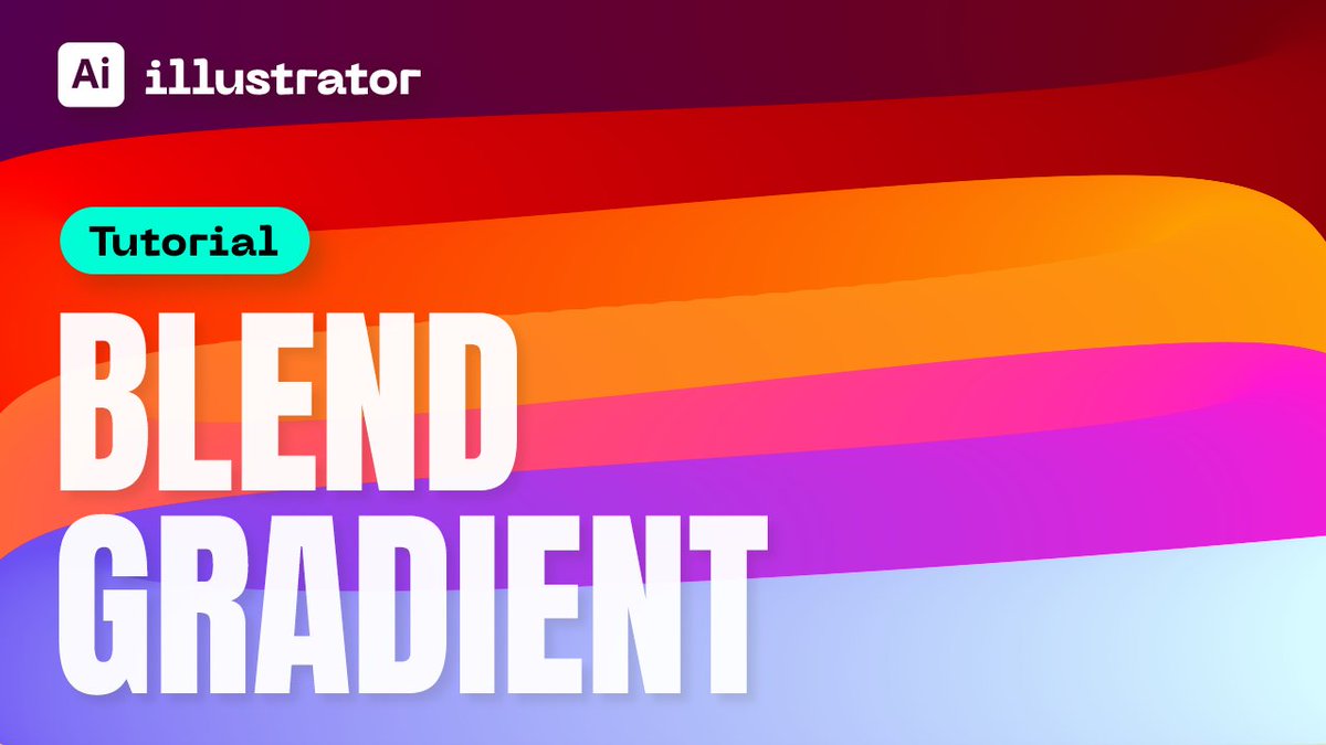
How to Create Gradient Spine Effect in Adobe Illustrator | Tutorial Blend Tool for Beginners
youtu.be/nDqNDALdkog
#illustratortutorial #illustrator #adobeillustrator #design #designer #designprocess #tutorial #graphicdesign #graphicdesigner #gradient #gradientbackground
48

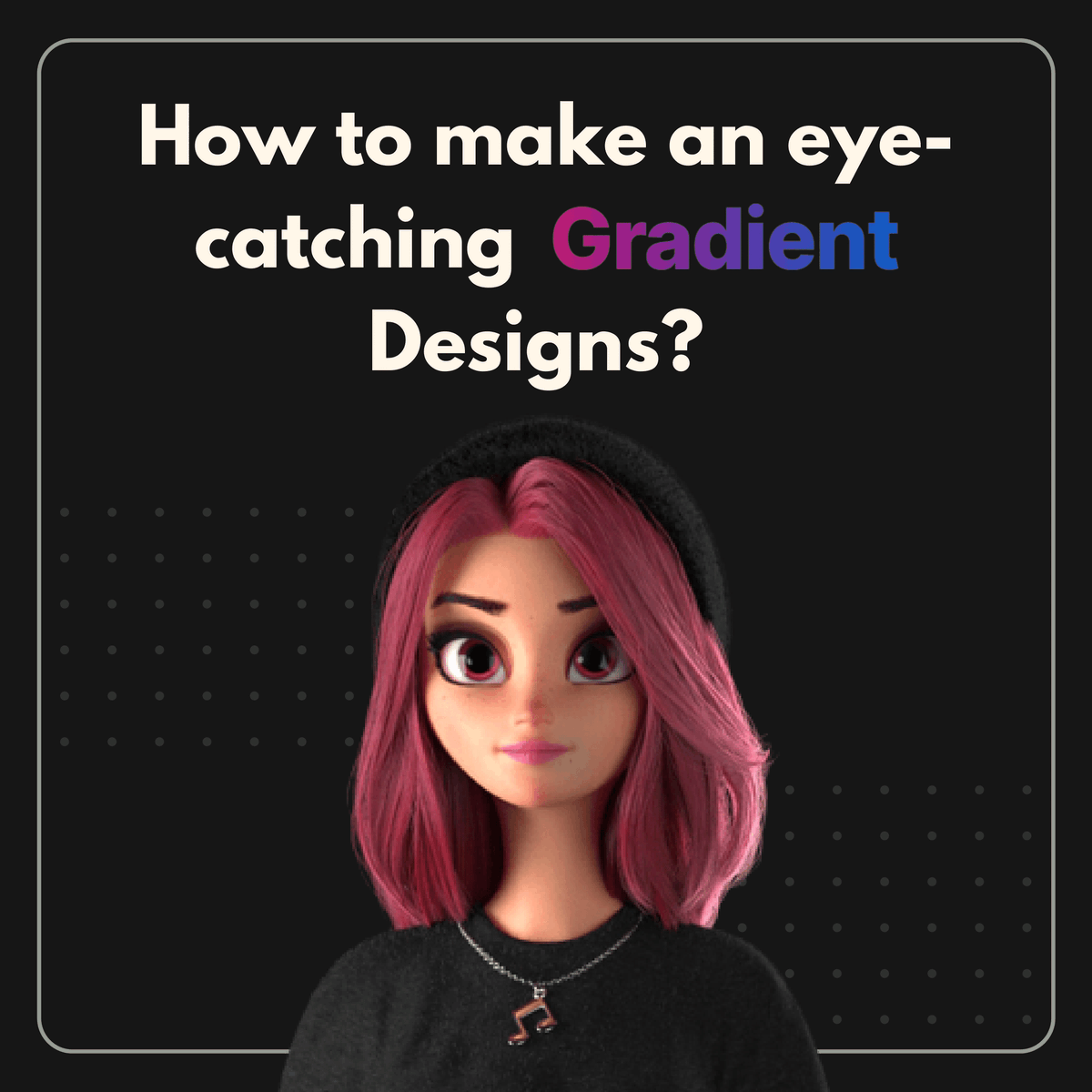
🌈 Do you know how to make an eye-catching Gradient Design?
🧵1/8
#gradient #design #designer #Webdesign #webdesigner #gradientdesign #gradientbackground #DesignInspiration #DesignThinking #developers #GraphicDesigner #Graphic #graphics #designerlife #websitedesign
1
2
74

7 May 2023
2
16