
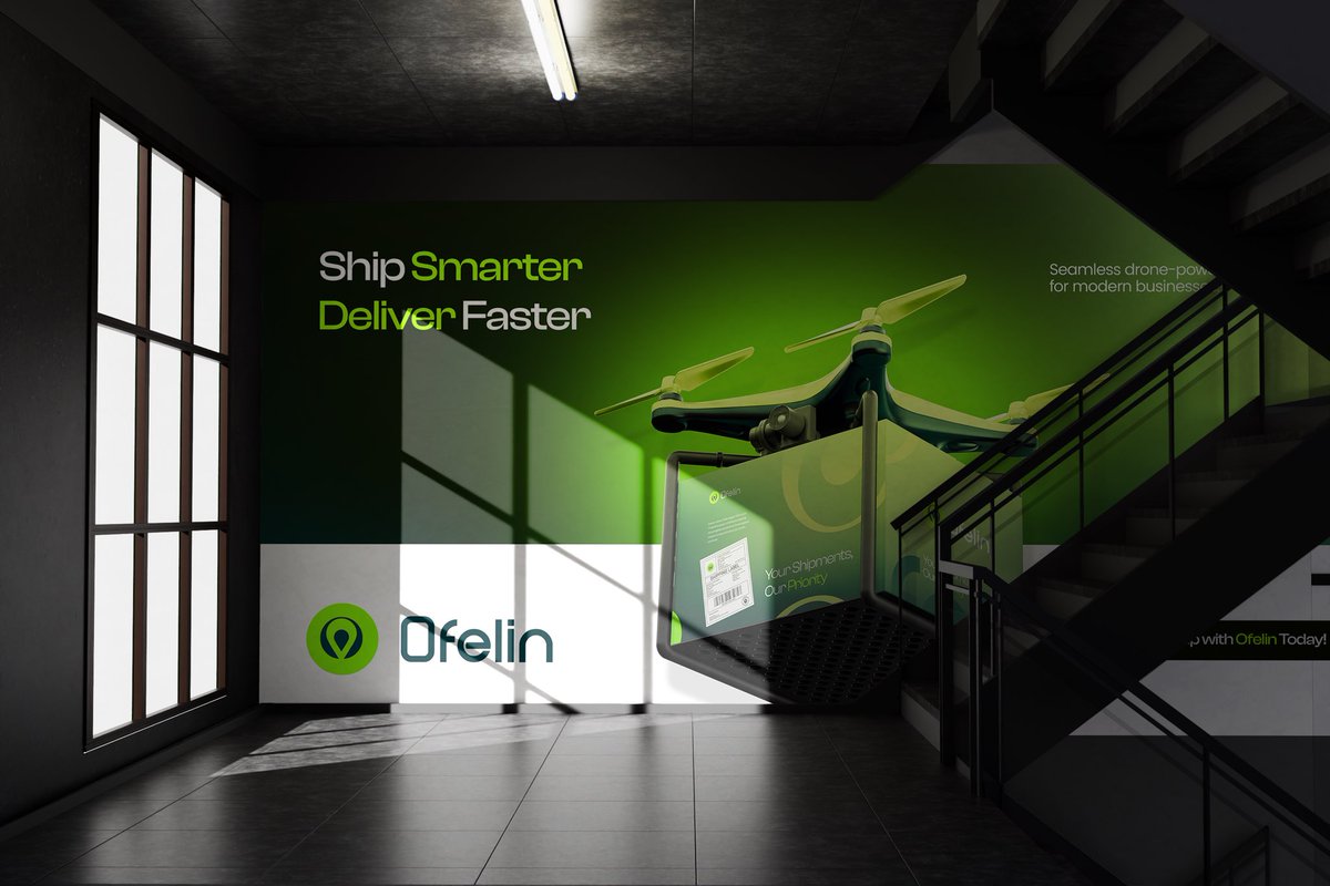
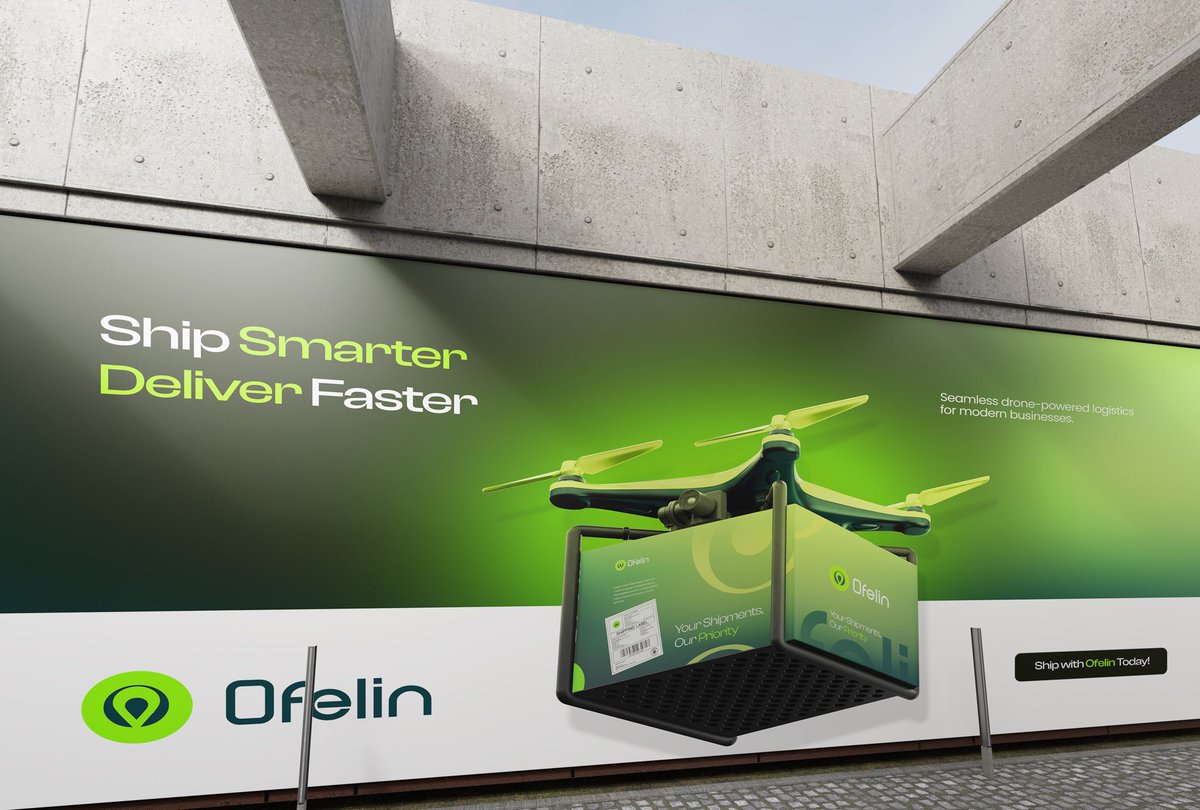
Drone shipment is no longer the future, it’s the new standard.
As a brand designer, the goal was to create a visual identity that feels fast, reliable, and innovative at first glance.
The bold green tones, clean packaging, and modern drone concept were designed to reflect speed and trust in delivery.
Brands that adapt to smarter logistics stand out faster in today’s market. 🚀📦
#BrandDesign #DroneDelivery #LogisticsDesign #CreativeDirection #VisualIdentity #PackagingDesign #Ofelin


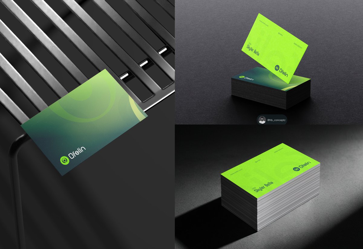
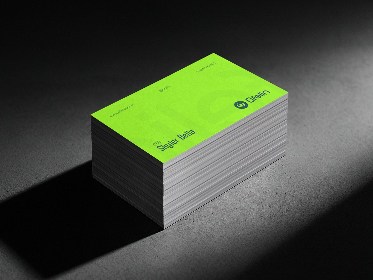
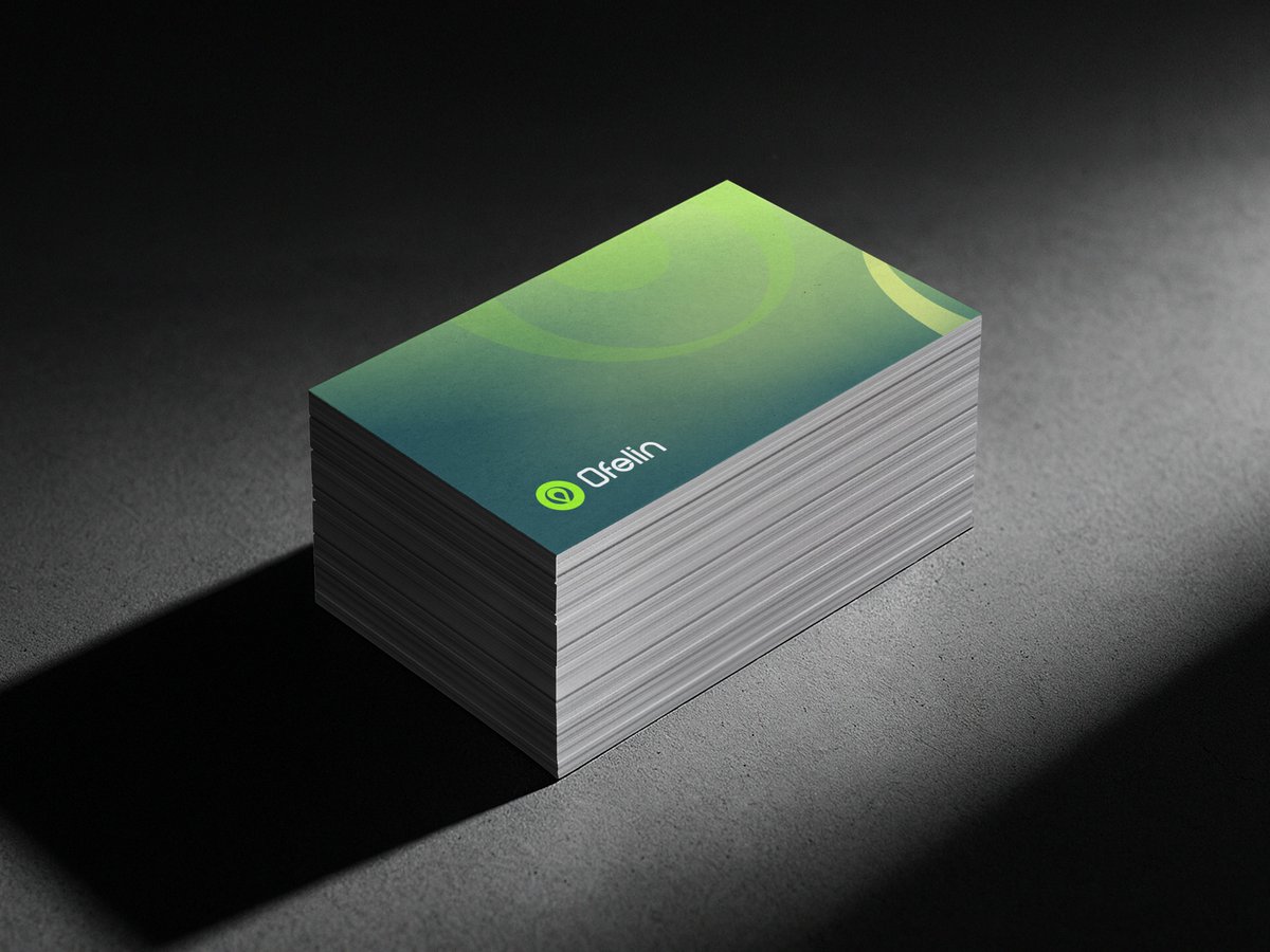
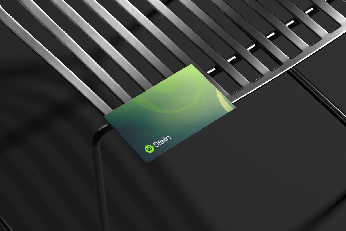
A business card is more than contact information — it’s often the first physical interaction people have with a brand.
While designing Ofelin’s identity, the goal was to create a card that feels clean, modern, and memorable while still reflecting the brand’s professionalism.
Small brand touchpoints like this help build trust and consistency across every customer interaction.
17
20
34
59,345
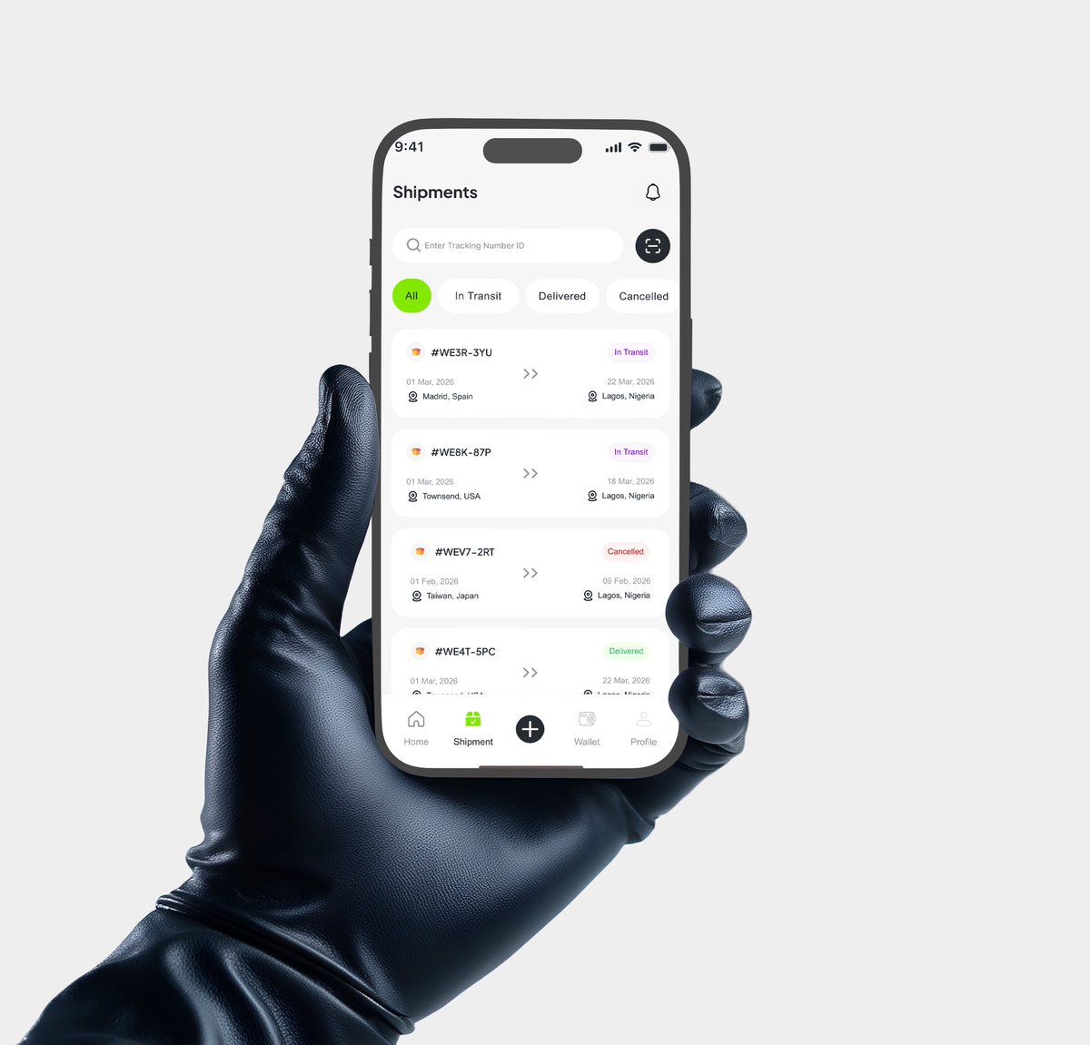
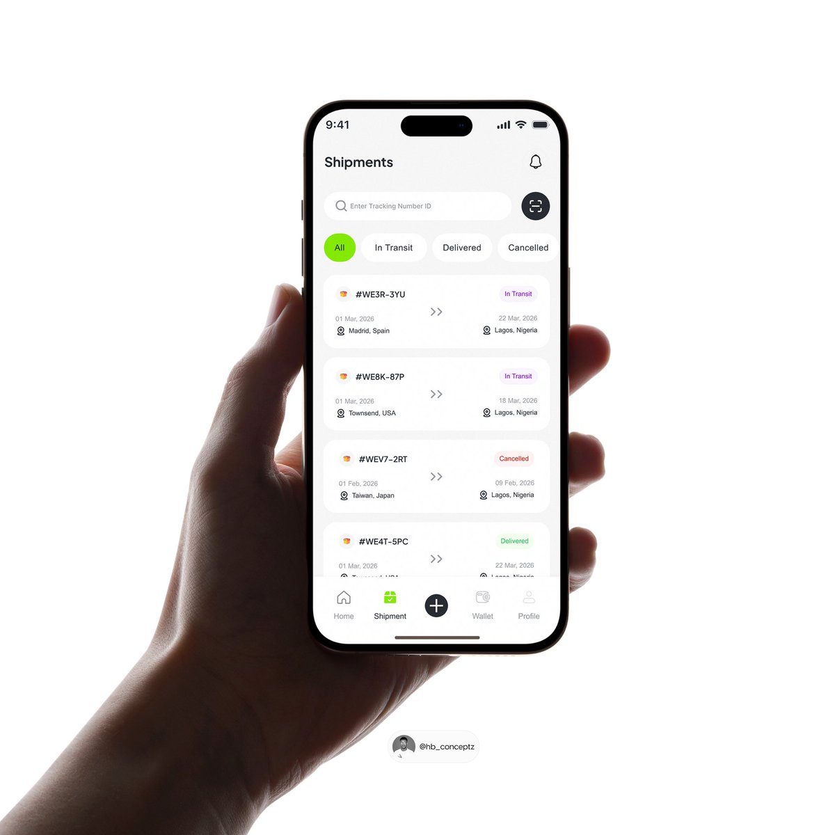
One thing users never want to feel during delivery is confusion.
While designing this shipment screen for Ofelin, the goal was simple:
make tracking feel clear, fast, and stress-free.
From shipment status filters to tracking IDs and delivery timelines, every section was designed to help users stay informed without digging through multiple screens.
Good shipment UX isn’t just about aesthetics — it builds trust.
When users can easily track where their package is and what stage it’s in, the entire experience feels more reliable.
Designing products that reduce uncertainty will always matter. 📦✨
#UIUX #UIDesign #UXDesign #MobileDesign #ProductDesign #ShippingApp #LogisticsDesign
Designing the Ofelin onboarding wasn’t about introducing features — it was about earning trust instantly.
Shipping already comes with uncertainty, so the first screen uses a real container visual to make things feel familiar and reliable. The message, e.g “Your Go-To Shipment Solution,” keeps it simple and clear, while the subtle “ 2,500 successful deliveries” reassures users without overwhelming them.
Clean layout, strong CTA, zero noise.
In real life, this is that moment a frustrated user opens the app hoping for something better — and within seconds, they feel like they’ve found it.
12
10
21
6,324

Jan 30
What if"روبابيكيا" had a UX mindset? 😅
A fast, straightforward delivery flow with clear UX for drivers on the go 👀
#DesignDaily #CreativeProcess #DesignLife #UIUXDesigner #ProductDesigner #DeliveryApp #LogisticsDesign #CourierApp #DriverApp #MapUX #NavigationDesign
2
6
120

SwiftDrop Logistics — a modern brand identity concept built around speed, trust, and efficiency.
Designed for a fast-moving delivery brand 🚚
-
-
Follow @GoodluckCh44580
-
#BrandIdentity #LogisticsDesign #GraphicDesign

19
14
17
7,148

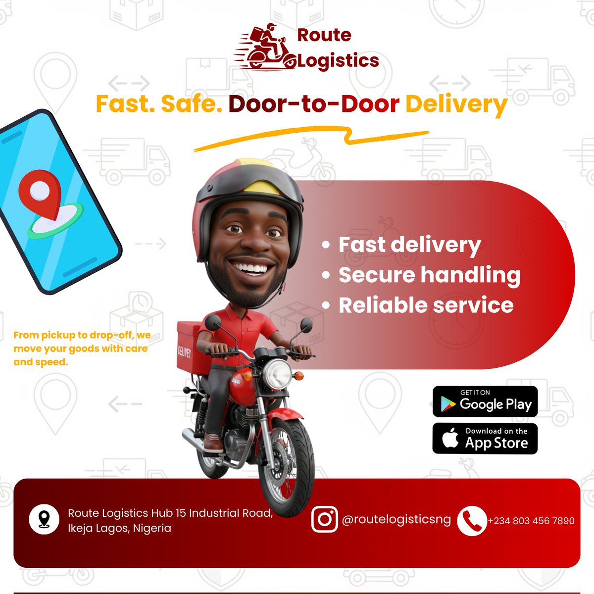
For Day 12/21 Design Route Logistics, Fast. Safe. Door-to-Door Delivery #UntitledPixels #21DaysDesignChallenge #GraphicDesign #LogisticsDesign #BrandIdentity
16
74

30 Oct 2025
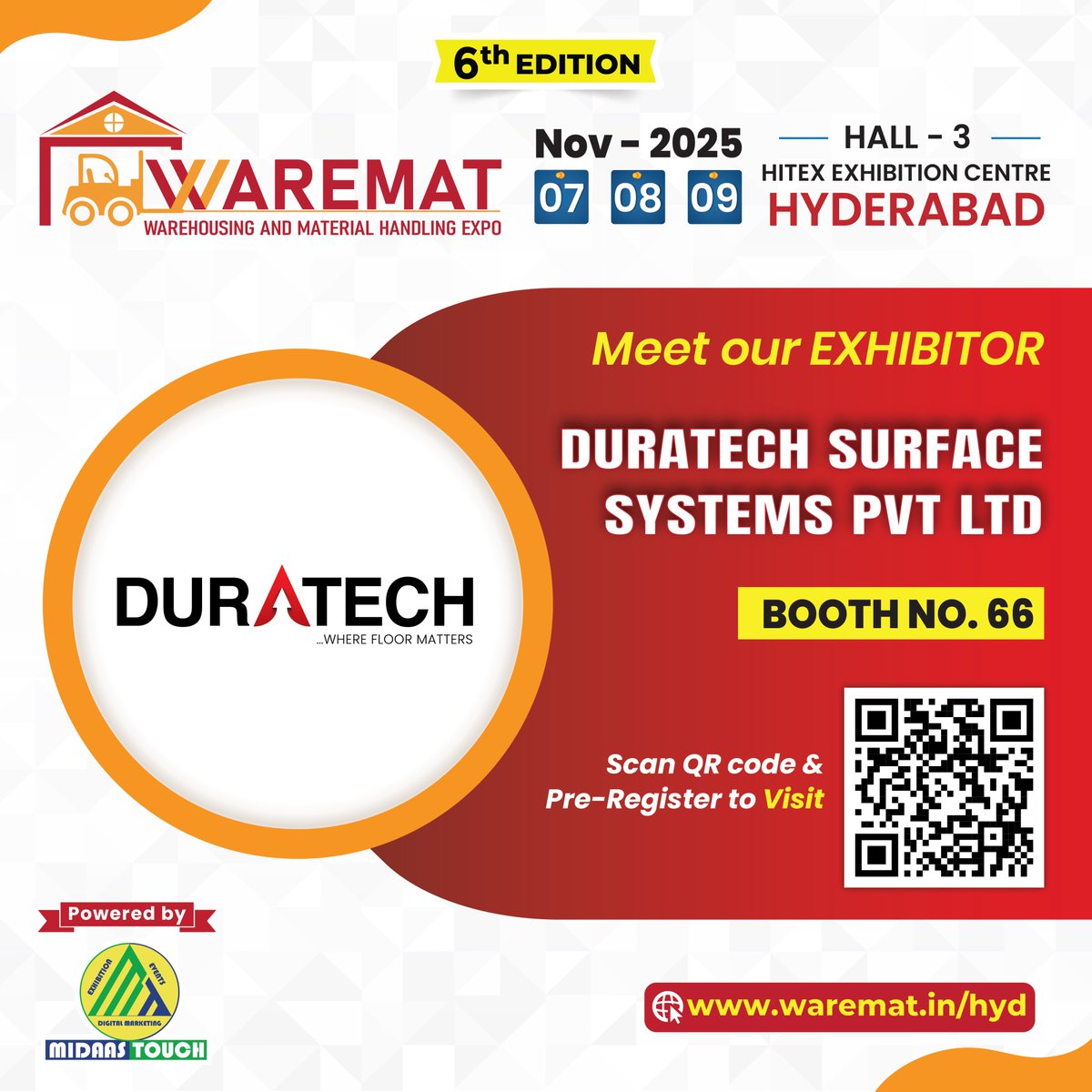
🏗️ Building Strength from the Ground Up — with DURATECH Surface Systems!
We’re delighted to welcome DURATECH Surface Systems Pvt. Ltd. to WAREMAT Hyderabad 2025, where innovation meets industrial strength. 💪
Experience next-gen flooring technologies engineered for heavy-duty warehouses, logistics parks, and manufacturing hubs — ensuring durability, safety, and long-term efficiency that every modern facility deserves.
💡 Discover how the right surface can redefine your operational excellence and support seamless material flow.
📍 Booth No. 66 | Hall–3, HITEX Exhibition Centre, Hyderabad
📅 7–9 November 2025
🔗 Pre-Register Now: waremat.in/hyd/visit
#WAREMAT #DuratechSurfaceSystems #IndustrialFlooring #WarehouseInfrastructure #LogisticsDesign #SmartWarehousing #MaterialHandling #IndustrialInnovation #HyderabadExpo #MIDAAS #PoweredByMidaasTouch
3
3
51

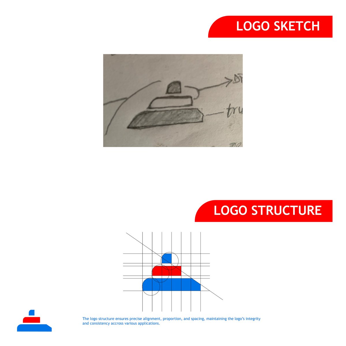
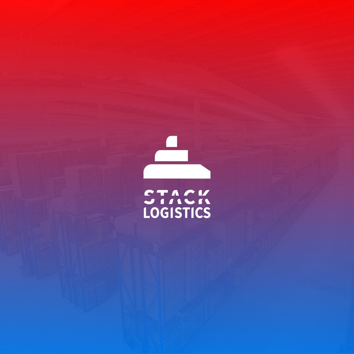
Brand identity design for Stack Logistics — a modern logistics company built on speed, structure, and trust.
🔗 View full project → behance.net/gallery/22109525…
#LogoDesign #BrandIdentity #LogisticsDesign #GraphicDesign #DesignTwitter #Behance #VisualIdentity


3
112

28 Jul 2025
Designed for the sky, built for trust.
A high-stakes interface for high-altitude logistics.
Precision, clarity, and confidence — just like aviation demands.
#UIDesign #WebDesign #AviationTech #UXUI #DesignerPortfolio #InterfaceDesign #LogisticsDesign
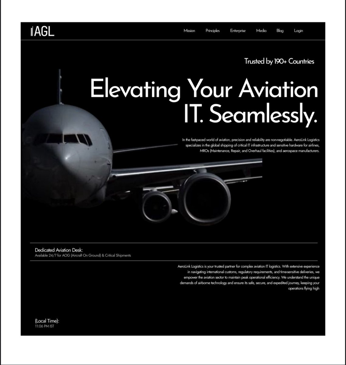
1
7
103

20 Jul 2025
💯💯Social Media Designs for @dexhaul a fantasy Logistics company based in Lagos
#GIEKDesigns #Logistics #LogisticsDesign


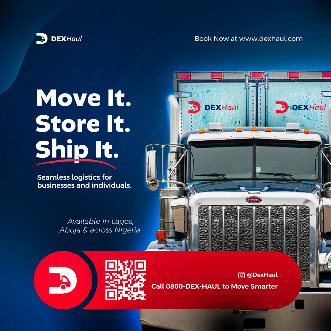

1
2
7
102

18 Jul 2025
Crafted this bold & global-ready design for Botgistics 🌍📦
From visuals to clarity, everything says “we deliver.”
Want your brand to look this premium? Let’s talk ✨
#GraphicDesign #NobleproGrafikx #LogisticsDesign #FlyerDesign #AkureCreatives #SocialMediaMarketing
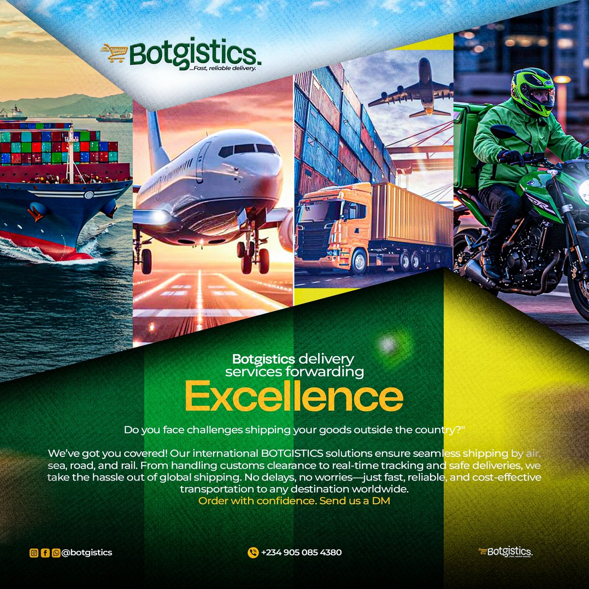
7
72

15 Jul 2025
The "Reliable Transport. On Time. Every Time." messaging hits perfectly. #WebDesign #LogisticsDesign #UXDesign
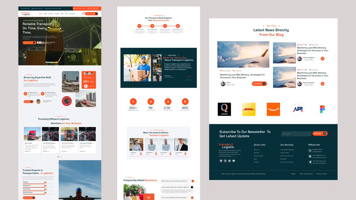
1
4
62

14 Jul 2025
🚚 Currently designing the flow for the Shipment Module in a logistics web app I'm working on.
Making sure every step from pickup to delivery is smooth, intuitive, and clear for users.
Here’s a sneak peek at one of the sections 👇
#ProductDesign #uiuxdesign #LogisticsDesign

13
4
26
443

2 Jul 2025
Started this 30-day poster challenge to show how strong visuals can drive real business value.
Today’s target: logistics brands.
Would you trust a dispatch brand that looks this good?
#PosterDesign #BrandDesign #LogisticsDesign #30DayDesignChallenge

2
4
403

23 Apr 2025
🚚 Meet the most minimal & modern Webflow template for logistics!
Clean design. Smooth transitions. Fully responsive.
Perfect for:
✅ Transportation
✅ Moving Services
✅ Shipping & Delivery Companies
Live Preview → homeshift-tnc.webflow.io/
#Webflow #LogisticsDesign #UIUX #TransportTemplate #WebDesign #viral #trending #explorepage #explore #instagram #fyp #instagood #love #reels #like #tiktok #follow #viralpost #foryou #viralvideos #photography #likeforlikes #fashion #followforfollowback #memes #music #instadaily #indonesia #india #trend #reelsinstagram #likes #photooftheday #viralreels #foryoupage
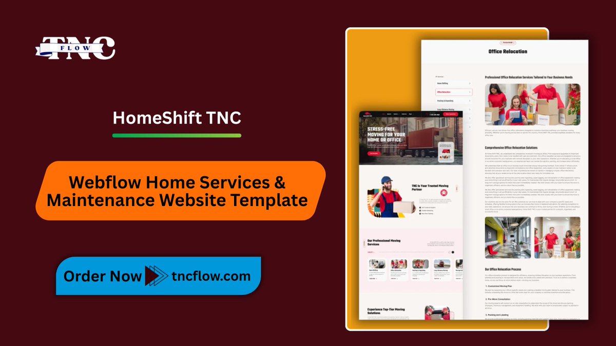
ALT HomeShift TNC - Webflow Home Services & Maintenance Website Template
2
73

17 Jan 2025
I created an animation for a logistics website using the Figma pen tool.
Illustrated with the Figma pen and brought to life with Figma prototyping!
#Figma #Animation #UIUXDesign #Prototyping #LogisticsDesign #CreativeProcess
14 Nov 2024

Yesterday was a rollercoaster, abi shades of shege. I started designing a bicycle animation in Figma, then took a break to enter a crypto trade.
Lo and behold, I was sent back home😂. Heartbroken, I opened my system again and started designing a rider animation with the Figma pen

1
7
404

10 Jan 2025
🚛✨ Brand Identity Reveal! ✨🚛
Excited to share a sneak peek of the brand identity I designed for Verified Express Logistics (VEL)!
Bold. Reliable. Efficient. Just like VEL.
Swipe through to see them
#BrandIdentity #LogisticsDesign


3
1
10
76

9 Dec 2024
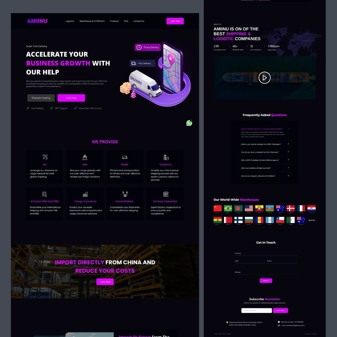
🌐 Excited to share this sleek, intuitive UI design created for a logistics service platform! 🚀 In this project, I focused on making complex logistics operations easy to navigate for users. #UIDesign #UXDesign #LogisticsDesign #WebDesign #UserExperience #DigitalDesign #UI #UX
1
7
187

24 Oct 2024
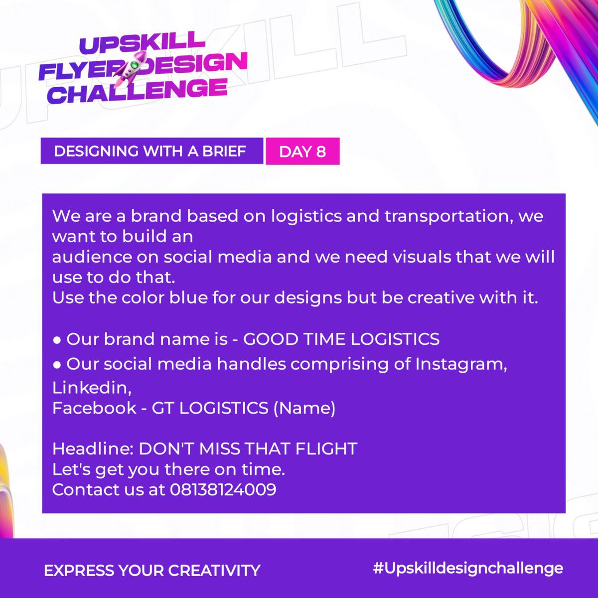
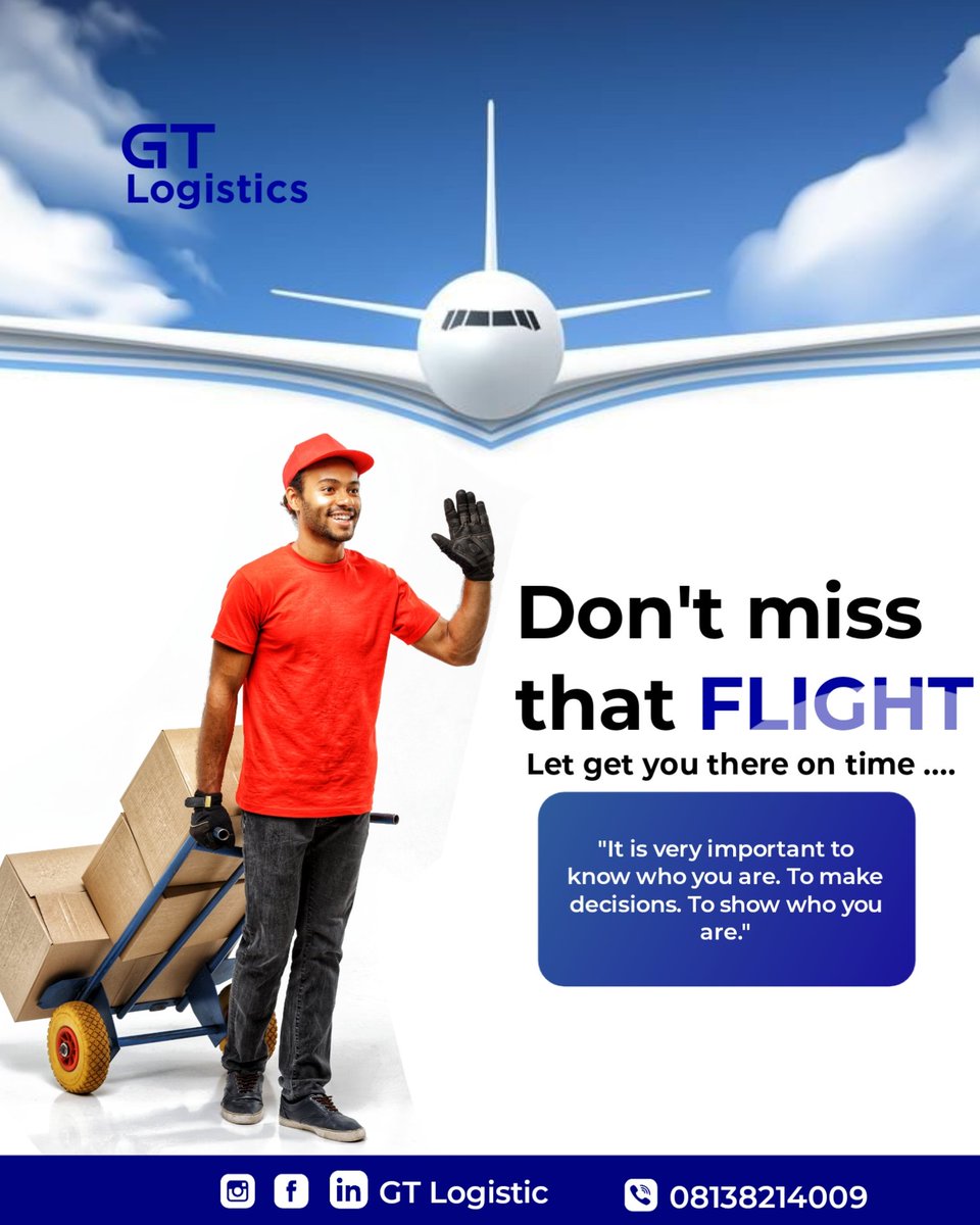
I joined a design challenge
And I would be dropping my work
Day 8
#designs #logistics #logisticsdesign #GraphicDesign
2
1
5
71

18 Jun 2024
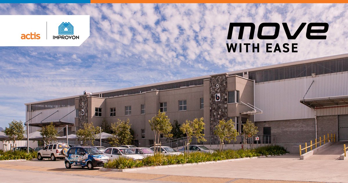
Good #logistics & #warehouse design enable the easy flow of goods inside & trucks around the facility. Our parks offer flexible loading solutions at dock height & on grade, saving time & money. More at improvon.co.za
#logisticsdesign #vehicleloadingsolutions
3
39

10 Jan 2024
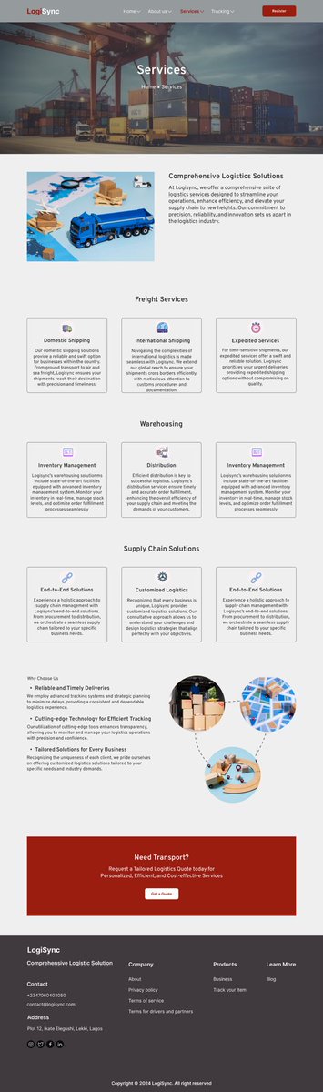
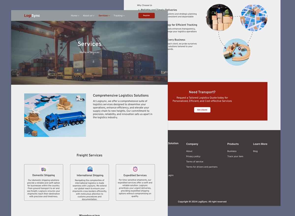
Service page of the Logistics website exploration
#Servicepage #logisticsdesign
2
11
216