

Jun 7
i know i should’ve asked this before i watched it but are we getting a season 3 of the newreader?

3
15
1,349

May 29
I’d say it’s more about the vibe you want to give. But some free fonts I’ve been enjoying for interface work recently would be;
🏀 Helvetica Neue - My all time favorite
I think helvetica is like the happy guy in the room that tries to get along with everyone.
It’s perfect for headings and I particularly like it because it looks good without any any extra work (unlike inter for example)
Tip: if you’re using a serif typeface and you are in doubt what San-serif to pair it with, helvetica neue is a very good bet.
The only problem with is that; it was not particularly made for ui work in mind. Maybe print.
I’d say Geist is just like helvetica neue, but for made with screens in mind.
🎱 Inter Tight
I really like how this font look on websites because It has a dense structure.
Inter, by default, is kinda loose. You can hardly use it on a headline without having to adjust the tracking. Inter tight fixes that.
It looks like the characters are slimmer too. That gives it a more minimal and modern feel.
🎾 Archivo
San serifs generally look very friendly. Most, a little too friendly.
Whenever you’d like to have that clean San serifs feel but with a more corporate/serious vibe, archivo is definitely your pick.
Most other fonts I’ve seen that pass off this vibe are tall fonts. But somehow, archivo maintained the average x-height:cap-height ratio while giving a more corporate feel still.
🏈 PT-Serif
If you’ve ever used merriweather, PT serif is just a more polite version. Just a little more polite.
Merriweather has a lot of character, and sometimes you don’t need all that much character, that’s when I use PT serif.
That said, they are two of my favorite serif fonts because they sit pretty on the page without so much work, and they look great on title and body.
They both have a lot of weights which makes them suitable for interface work.
Merriweather, not only has various weight but various widths.
Notable mentions
SF Mono
Kaisei decol
Gochi hand (for scribble)
Newreader
Roboto Condensed
⚾️🥎🏐⚽️🧶
I tried to mention typefaces with minimal personality.
In some cases you may need some typefaces with so much personality. Like Wise, Discord, and others have done.
But one thing to keep in mind is, the more personality a typeface has to fit in a particular scenario, the less it can fit into other scenarios.
So I tried to mention typefaces that can almost fit into every scene with a couple of adjustments.
2
1
5
166

Ready to dive into this #darkromance ?
If you love stories about:
*grief that refuses to die
*lonely people finding each other
*love turning into #obsession
*blurred lines between devotion and obsession
#book
#newreader
#brokensouls
#trending
#bookrecommendations


1
1
2
70


Apr 15
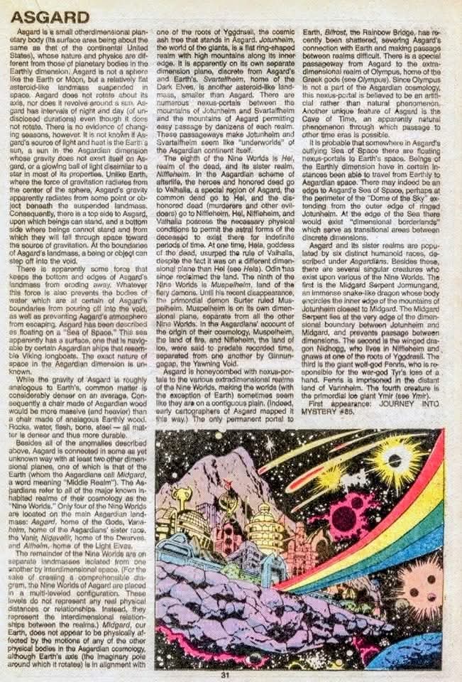
Ever wondered how **Thor** actually gets around? It’s a lot more complicated than just spinning a hammer! ⚡️🌌
Check out these vintage blueprints to the **Marvel Multiverse** from 1985. Think of it as a GPS for Gods. 🗺️✨
### 🌈 3 Things Every New Fan Should Know:
1. **It’s Not a Planet:** Asgard isn't a round globe like Earth. It’s a flat, floating "continent" in space about the size of the USA. If you walk too far in one direction, you’ll literally fall off the edge! 😱
2. **The "Big Three" Regions:** * **Asgard:** Where the party (and the mead) is. 🍻
* **Midgard:** That’s us! Earth is tucked right in the middle of the cosmic tree. 🌍
* **Hel:** The frozen land of the dead. Not exactly a vacation spot. ❄️💀
3. **The Tree That Holds It All:** Everything is connected by **Yggdrasil**, a massive "World Tree." Its roots reach into different dimensions, making reality one giant, cosmic houseplant. 🌿
### 🎨 The Dream Team:
These gorgeous maps were drawn by the goat **Walt Simonson**—the man who defined Thor for a generation—and written by Marvel’s ultimate lore-keeper, **Mark Gruenwald**.
**Which realm would you visit first?** (We’re voting for the Rainbow Bridge, assuming it’s not broken today...) 🌈👇
#MarvelComics #Thor #NewReader #Asgard #ComicBooks #Lore #WaltSimonson #MarvelUniverse


3
15
450

Apr 2
I used to think that I would dislike reading non-fiction books but it turned out I was wrong. It turned out both interact with each other; both shaped each other. #newreader
2
1
26
1,068

Feb 24
CBC newreader said there were two people injured with non life threatening injuries, and no information about how they were injured. Why do you spread these outright, provable lies and disinformation? What do you get out of it? You are disgusting.
1
6
485

17 Dec 2025
Ye bhi sahii hey...
There are many
Akshay Khiladi = Twinkle
Paan Masala = Cajole
Tall Boy bacchan = ANGRY Shorty Aunt
Palki Newreader = Newsreader Hubby
😂😂😍😍
Public ko chomuuu banaoo & ₹$₹₹
3
70

12 Dec 2025
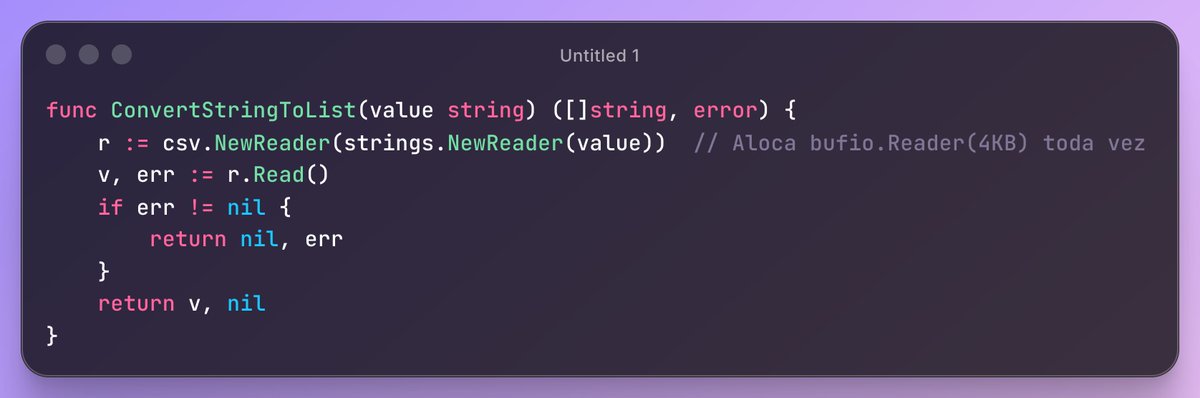
go, usei o pprof pra comparar alocações, tinha uma lib q usava o csv.NewReader e uma rota de 4k rpm chamava esse metodo criando um NewReader toda vez, o certo seria usar um sync.Pool com um Reader reusável.
2
1
10
1,426


14 Nov 2025
This is the precise reason Marathi journalists are despised.
Get a grip of yourself young lady.
You're a newreader not opposition spokesperson.
No wonder you folks are referred to as HMV journalists.
Shame on you.
6
163

11 Nov 2025
wait omg you're watching newreader... good luck!
14
701

29 Oct 2025
@MartinDaubney is the loveliest newreader ive ever seen.His sadness today is so raw.It made me cry.Its so frightening for all children who are terrorised at the hands of supposed "humans"ive got a granddaughter.A beautiful yorkshire rose & im terrified for her.
3
71

10 Oct 2025
Don't slow down I'm already caught up and I NEED MORE /newreader

2
83
20 Aug 2025
From understanding story arcs to learning the lingo, our site is the ultimate resource for new comic book fans. Welcome to the community! 👋 startercomicbooks.net/ #ComicFam #NewReader #GetStarted #PopCulture
1
3
184

24 Jul 2025
WHERE CAN I WATCH THE 3 SEASONS OF THE NEWREADER PLEAAAAAASE AND LAMBS OF GOD PLEAAAAASE AND HIS OTHER PROJECTS PLEASE I CANT FIND THEM ANYWHERE
1
3
132

16 Jul 2025
mpreg po ba rexvi? (sorry po if naask na #newreader) — yes poh revospring.net/@slvrcascade/…
2
583