
New theme UI. Color palettes without losing your custom settings. Custom themes now control page size. Theming moving into the Format Pane — live preview as you edit. Style presets in one click.
🎬 youtube.com/shorts/PuMGL0e9L…
#PowerBI #PowerBIThemes #CustomThemes #ReportDesign #MicrosoftFabric #PowerBITips #FabricInsider
1
1
1
254

New theme UI. Color palettes without losing your custom settings. Custom themes now control page size. Theming moving into the Format Pane — live preview as you edit. Style presets in one click.
🎬 youtube.com/shorts/PuMGL0e9L…
#PowerBI #PowerBIThemes #CustomThemes #ReportDesign #MicrosoftFabric #PowerBITips #FabricInsider
1
3
618
Learn the principles behind impactful Power BI report design 🚀
Next cohort starts 3 September
Early bird ends 31 May
#powerbi #reportdesign #analytics
1
1
448
Thank you for this amazing feedback 🚀
The next Power BI Design Transformation cohort starts September 3.
#PowerBI #reportdesign #analytics

1
375
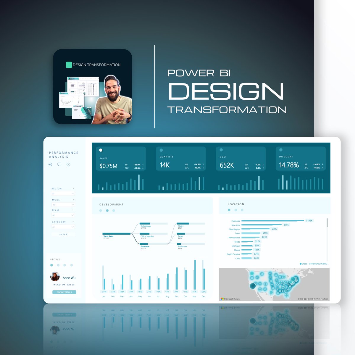
Better dashboards start with better report design
Learn how to transform cluttered reports into clear, high-impact analytics ✅
Next live Power BI sessions start 3 September
#powerbi #data #analytics #reportdesign

1
2
390
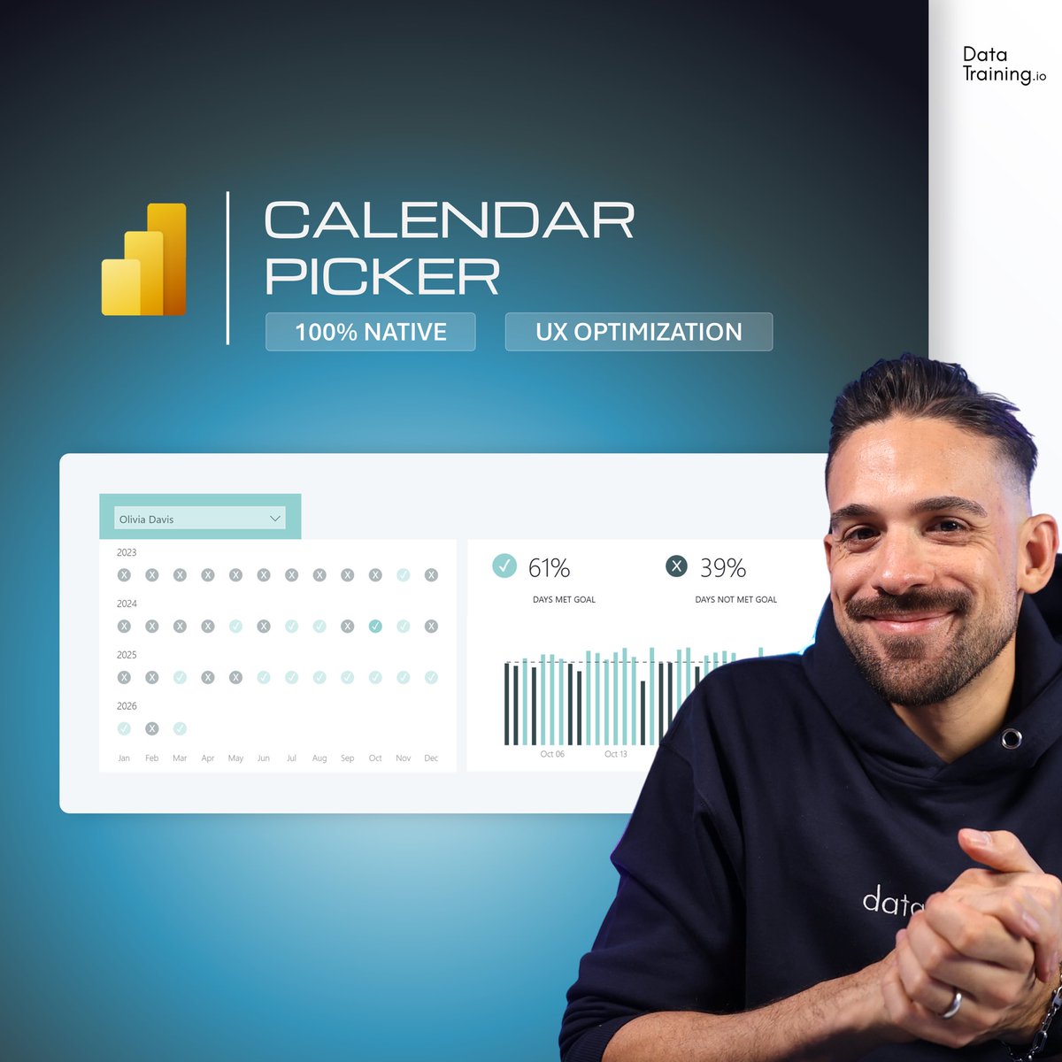
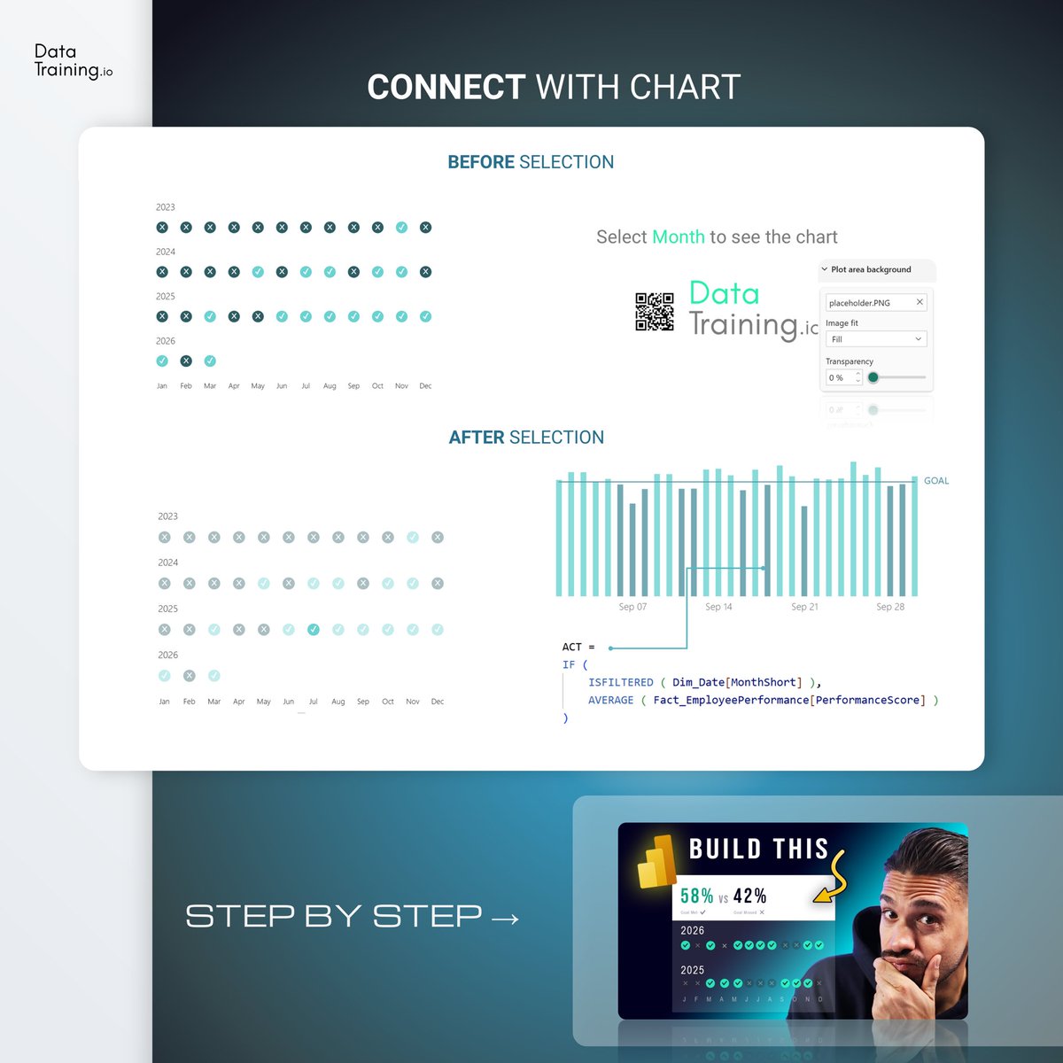
Build this Calendar Picker in Power BI
100% Native ✅
Follow for more Power BI tips & tricks 🙌🏻
#powerbi #dataviz #ux #reportdesign

2
2
10
728
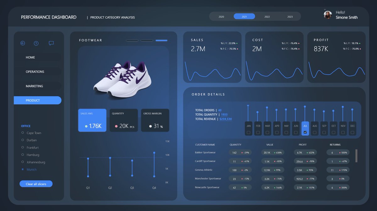
10 things I wish I knew EARLIER about report DESIGN
1. The first 5 seconds matter a lot, but the useful report will not stop being useful because it’s ugly.
2. There is nothing wrong or boring about simple visuals.
3. Fitting the visuals into the layout is a really bad idea.
4. Users do not READ text until they are confused by what they SEE.
5. Analytical report design doesn’ mean only UI.
6. In-visual design matters more than fancy page background.
7. Double down on users’ short-term memory and use it to your advantage. Example: Once they learn where the filter button is on one page, keep it consistent elsewhere.
8. Every extra chart type adds more mental load and potentially makes users feel insecure.
9. Spacing and padding are the easiest ways to make the report more readable.
10. Watching real people use your report tells you everything you need to know.
Omg… Could easily make this list 20 points long 😅 what would you add?
If you want to create dashboards people actually use, follow me.
#powerbi #dashboarddesign #ux #dataanalytics #reportdesign
3
1
21
960
Better dashboards start with better report design
Learn how to transform cluttered reports into clear, high-impact analytics.
Next live Power BI Design Transformation starts 3 September 🚀
#powerbi #data #analytics #reportdesign
1
9
671
Step-by-step guide on how to add a Drill-Through button to your Power BI reports ✅
#powerbi #drillthrough #reportdesign #analytics #dataviz
Follow for more Power BI content
2
2
11
1,004
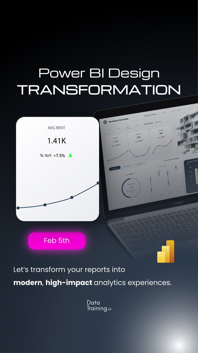
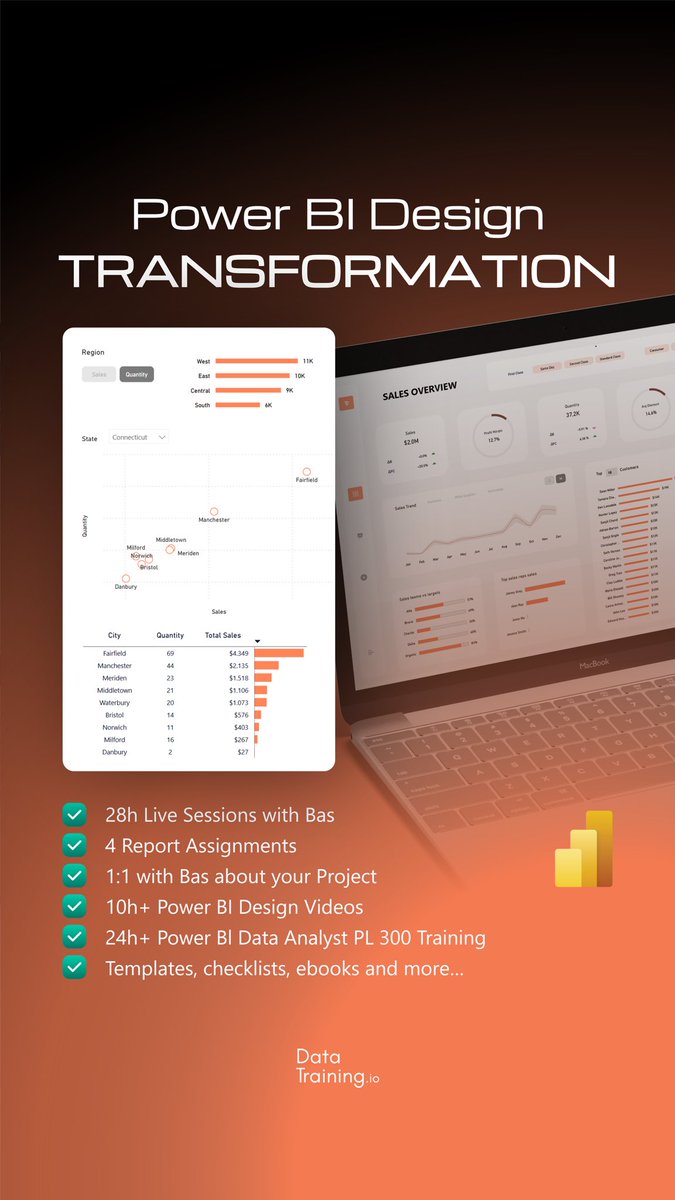
Build Power BI reports people actually want to use ✅
Join our Power BI Design Transformation
Next start: February 5th, 2026
#powerbi #reportdesign #dataviz #analytics

1
2
402
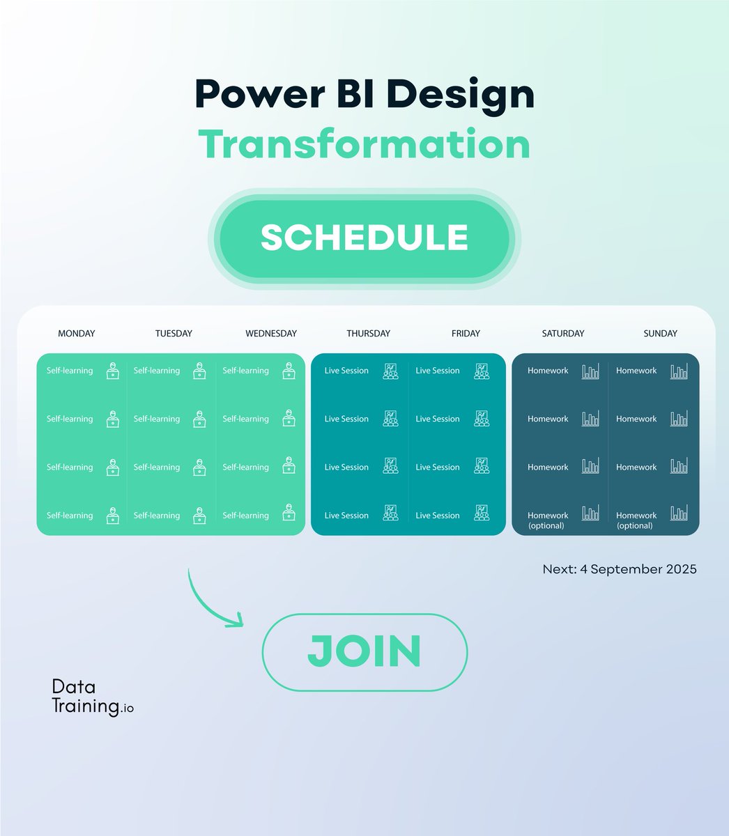
Our typical schedule for the Power BI Design Transformation 🚀
Next one starts February 5th, 2026
#powerbi #analytics #reportdesign #datavisualization #skills
1
4
494
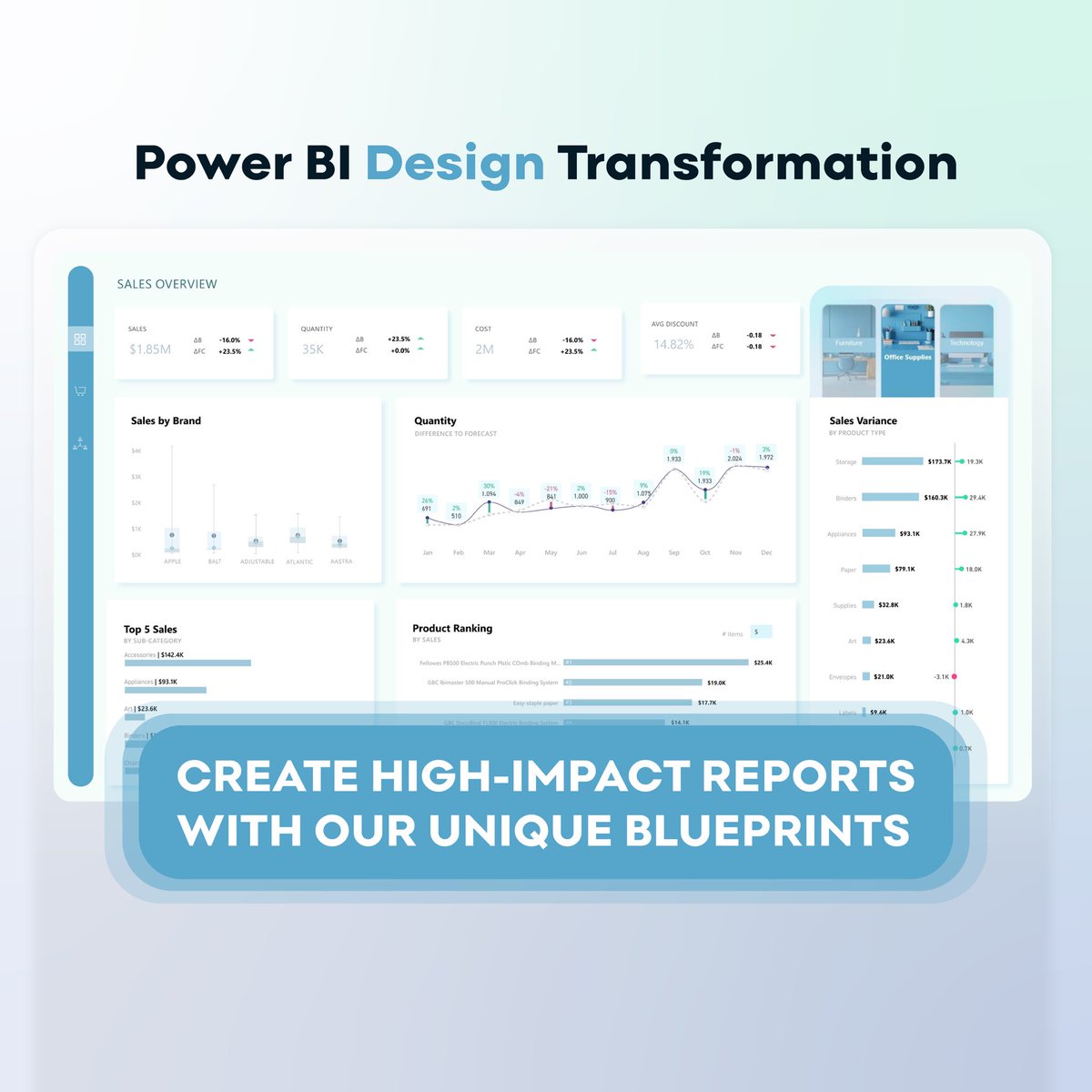
Design better. Think clearer. Deliver impact 🚀
Join the Power BI Design Transformation.
Next cohort starts February 5th, 2026
#powerbi #analytics #reportdesign #datavisualization #skills
1
6
442
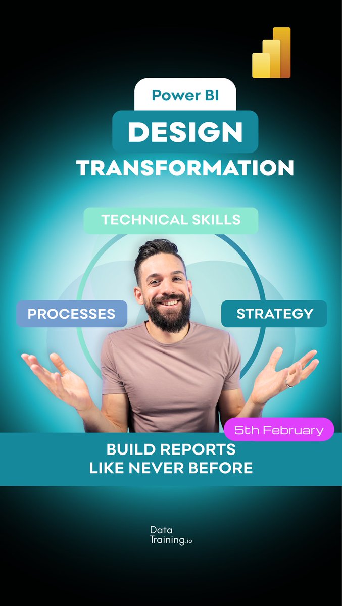
Great reports change careers.
Learn the complete design process, strategic thinking, and technical skills to build outstanding Power BI reports.
Join the next live Design Transformation starting 5th of February 🚀
#powerbi #analytics #reportdesign #skills #levelup #careergrowth #businessintelligence
2
4
454
Learn how to design reports that truly stand out!
Master the processes, strategy, and technical skills needed for outstanding Power BI reports.
Next live Design Transformation starts on February 5th 🚀
#powerbi #analytics #reportdesign #skills #levelup #datavisualization #bi
1
4
781

26 Dec 2025
Reviews that speak for themselves 🚀
Join our next live Design Transformation starting February 5, 2026
#powerbi #analytics #reportdesign #datavisualization #skills

1
5
746
24 Dec 2025
Ready to level up your report design?
Learn all the processes, strategy, and technical skills you need to create outstanding Power BI reports that actually drive impact.
Next live training starts on February 5th, 2026 - save your spot now!
#powerbi #reportdesign #analytics #skills #levelup #datastorytelling #bi
1
3
503
23 Dec 2025
Learn all the processes, strategy, and technical skills you need to design outstanding reports 🚀
Join the next live training starting 5th of February 2026.
#powerbi #analytics #reportdesign #datavisualization #skills #levelup #businessintelligence

1
2
7
585

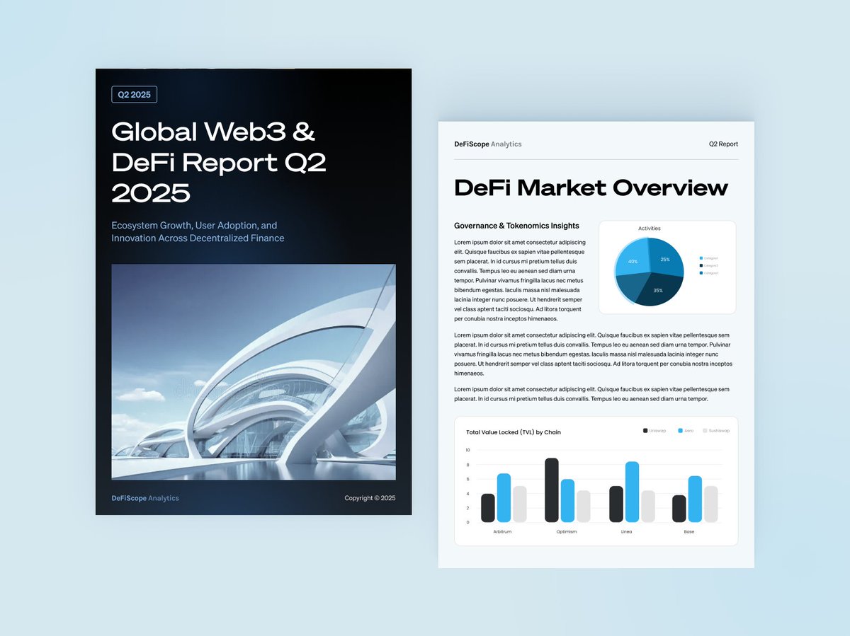
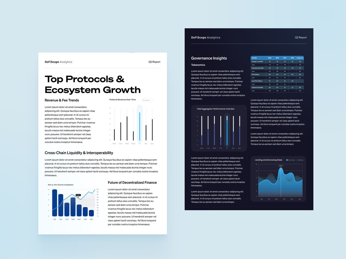
Just wrapped up a concept for a Global Web3 & DeFi Quarterly Report - excited about how it balances insight, aesthetics, and usability.
- This layout brings together on-chain liquidity, trading volume, yield trends, and market sentiment into a clear, unified visual narrative - where charts don’t just sit next to text, they work with it.
- Designed to help crypto research firms, VCs, and digital asset boutiques communicate complex insights with confidence and clarity.
- Striking the right balance between data depth and visual storytelling is key - and that’s exactly what I focus on.
If you’re looking to elevate your research reports, dashboards, or investor decks, let’s talk.
#ReportDesign #DataVisualization #DeFi #FintechDesign #UXforCrypto #FinancialReports #DashboardDesign
3
63

2 Sep 2025
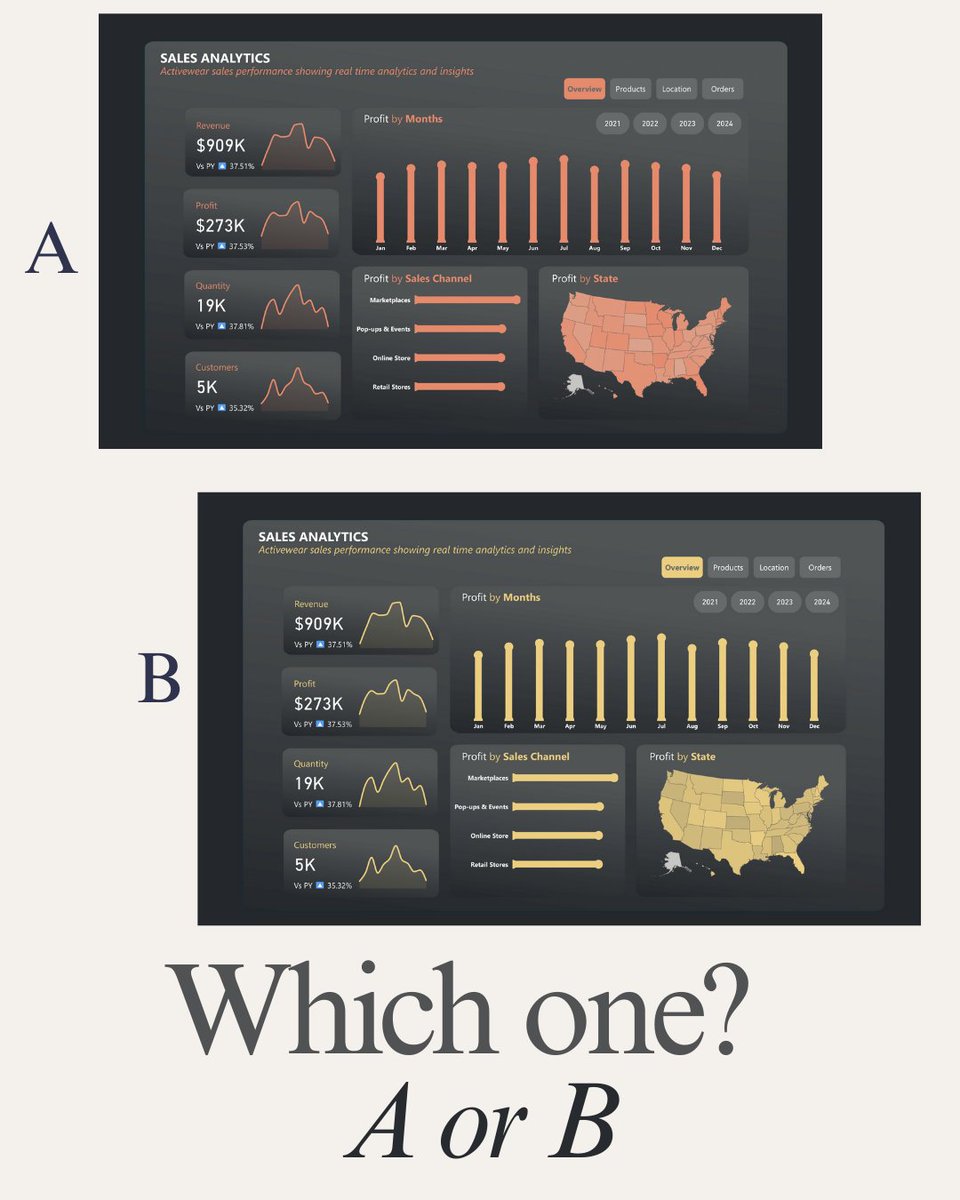
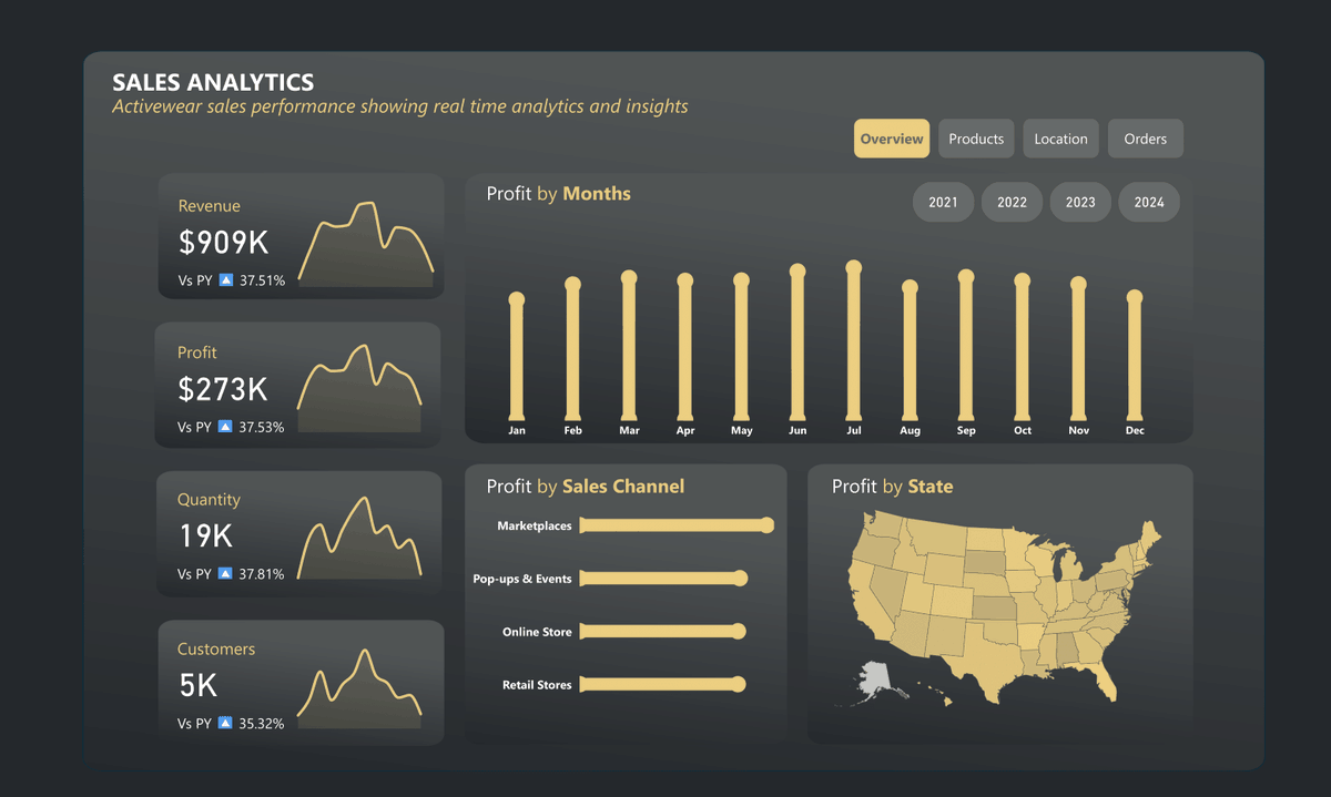
Which one?
A or B
#PowerBI #DataViz #DataVisualization #DashboardDesign #BI #DataAnalytics #Data #DataStorytelling #UI #UX #ReportDesign

2
7
392

19 May 2025
Need to power up its design needs? Purveyors and producers of the intelligent and informative are here to transform your brand. Pongo & Matelot offer the complete art direction and graphic design resource.
#DigitalDesign #Infographics #Magazine #ReportDesign #Whitepaper
1
2
23