
1 Feb 2024
Even a temperaturemap from 1980 would show more red than the top map. You know why? The top map isn’t a temperature map. The picture isn’t really a prove of climate change being fearmonger/hoax but it does show how easy people swallow misinformation when it fits their narrative.
1
13
13,938

یه چیز باحال توی #استراوا که از @mehrdad یاد گرفتم، #هشتگ گذاشتن بود که روی مپ مشخص میشه
#PaceMap یا #SpeedMap برای سرعت
#HeartrateMap برای ضربان قلب
#Elevationmap یا #GradientMap تغییر ارتفاع
#PowerMap برای قدرت (دوچرخه سواری)
#TimeMap برای زمان
#TemperatureMap برای تغییر دما

3
10


13 Jul 2020
Add this option > PlotLegends ->
Placed[BarLegend[{"TemperatureMap", {min, max}}, 9], Right]
2

15 Aug 2019
Hello to our new followers: @GoJumboGo @LogisticsSec @RHATCornwell @TemperatureMap @EndolineUK @AdelphiGroup @HSSmagazine @kmgloballtd

1
2

29 Aug 2017
@TemperatureMap @ZozoNoel @TravelersLuxury - Happy to connect, have a great day :) (insight by commun.it)
1

15 Mar 2017
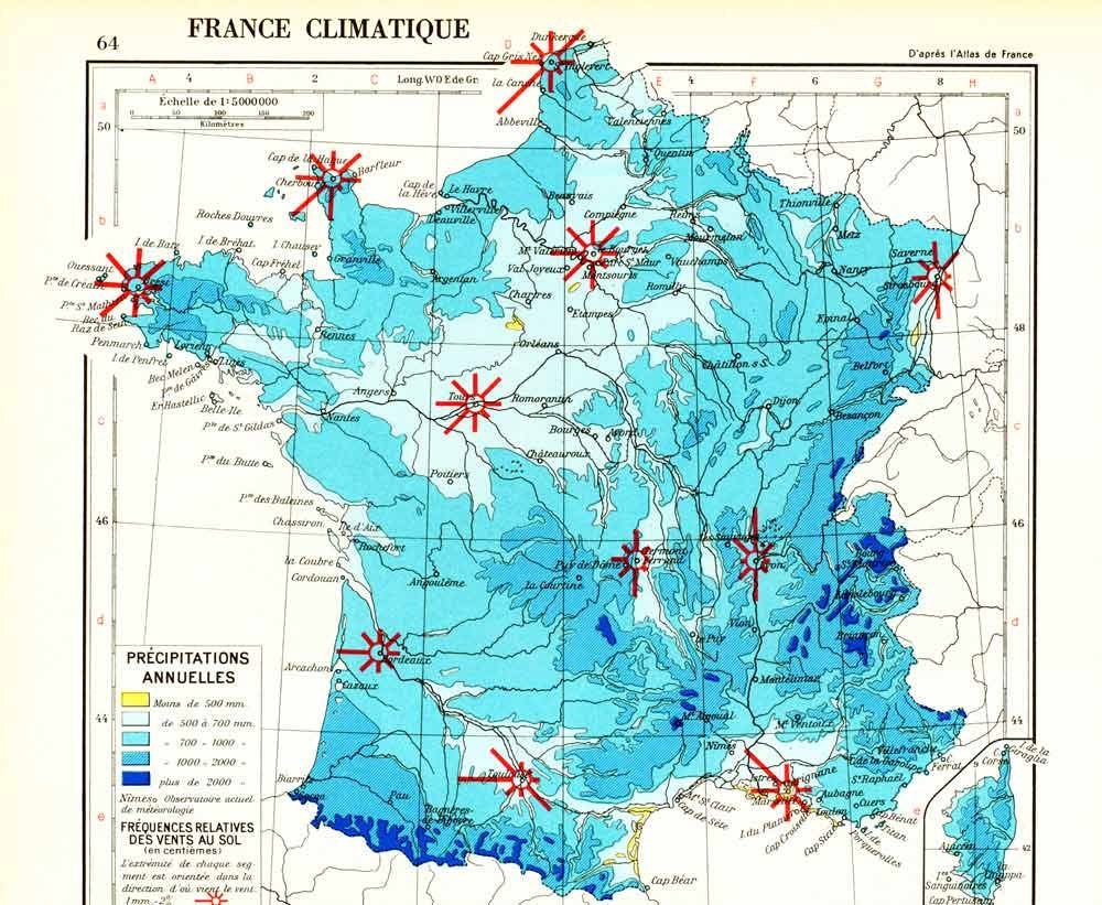
1965 French climate map. Original Antique Print. Vintage. … tuppu.net/2179704e #sofrenchvintage #TemperatureMap
1


2 Aug 2016
Obrigado! TY for following! Gracias por seguirnos! @MaterialDirecto @AlcolockCO @tecminagroup @dianazuluaga @GenteNoticias @TemperatureMap
1
2

18 Jul 2016
@TemperatureMap Thank you for following us. We are looking forward to all of your tweets
1
1

@TemperatureMap TemperatureMapping Thank you for following us! It's great to have you in our network! We look forward to your tweets!
1


15 Jul 2016
#FollowFriday Welcome new followers (8) @Sinansonlab @Sorbtech @SSalesLabEquip @TemperatureMap @WessexLifeSci – Have a good weekend! ^ib #FF
1
1

