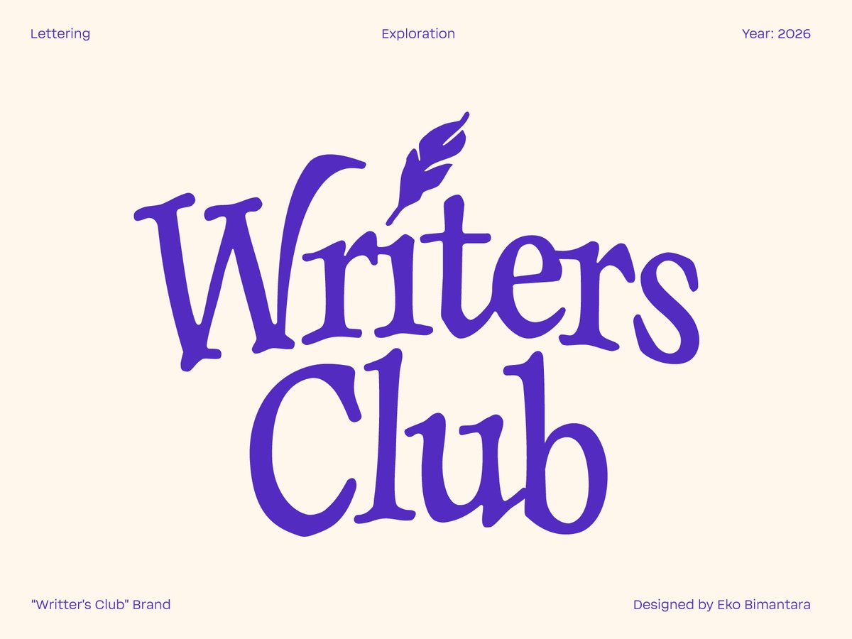
New lettering exploration: Writers Club ✨
A warm, literary identity built around:
• Vintage-inspired letterforms
• Quill symbolism
• Rich royal violet palette
• A sense of community and creativity
The goal was simple: make typography feel like opening your favorite book.
Thoughts? 👇
#LetteringArtist #TypeDesign #LogoInspiration #TypographyLovers #VisualIdentity


9

Jun 13
across headings, body text, and UI labels. Search by name → View details → Download. #Typography #FontFamily #BrandConsistency #TypeDesign #GraphicDesign

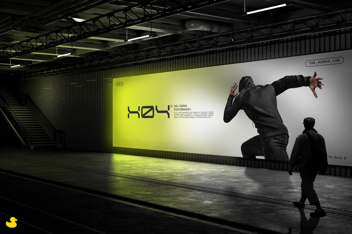
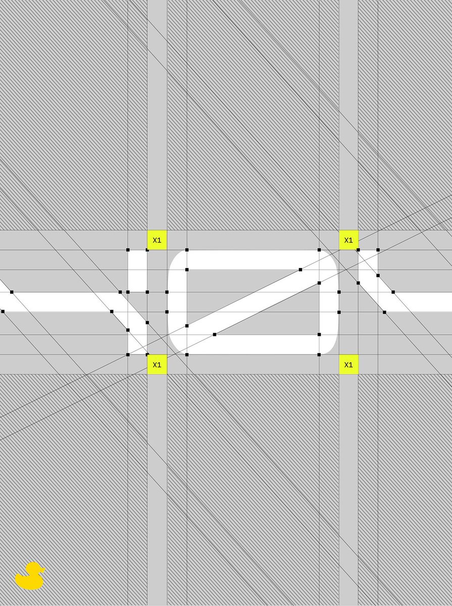
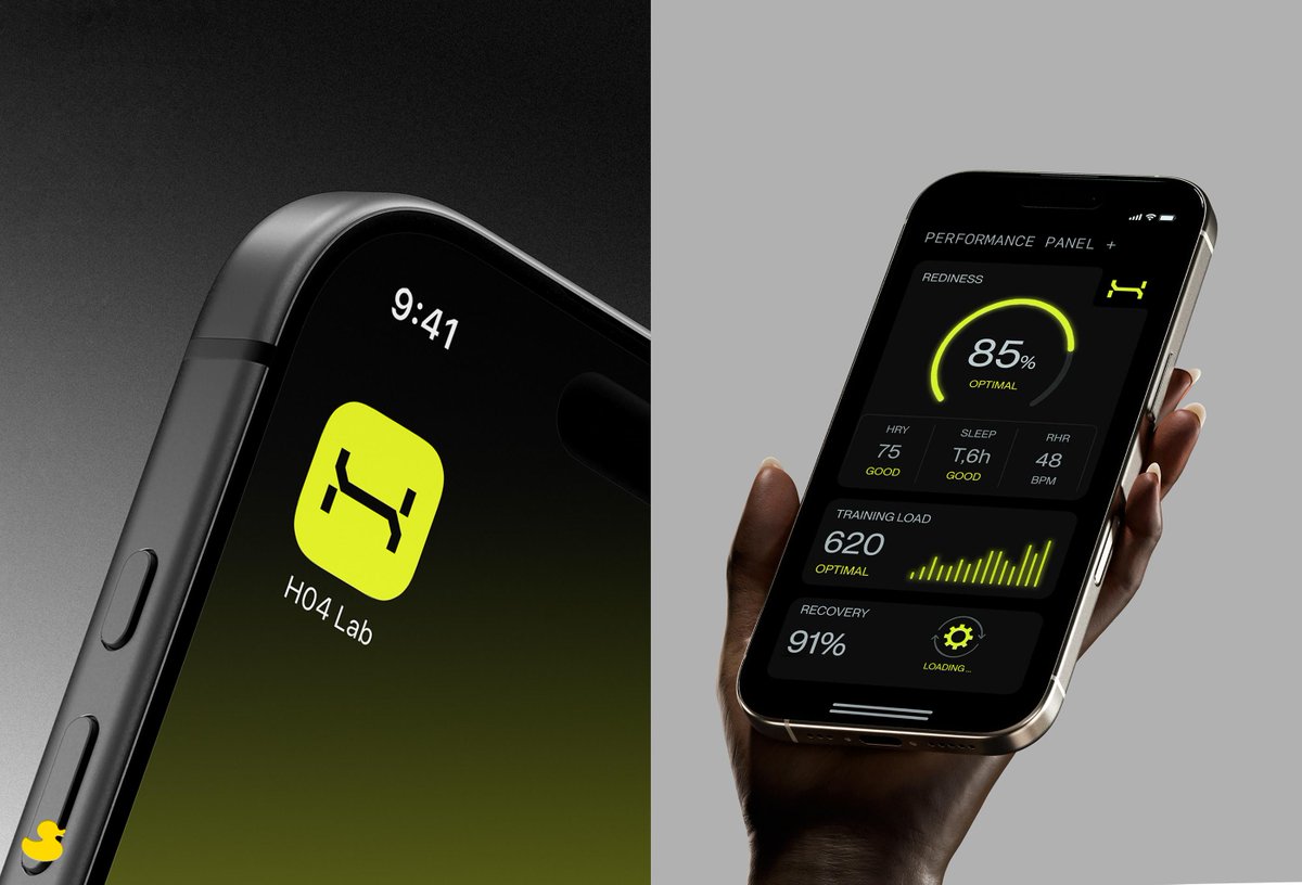
AGrafix Design - H04—Human Lab Branding
.
#branding #branddesign #brandidentity #logo #logodesignawards #lda #logodesign #logotype #logodesigns #logos #logotype #logodesigns #logomaker #graphicdesigner #logoideas #logobrand #logoinspire #logonew #logoplace #typo #typedesign

1
1
57
1,095

Jun 12
Urbolyt Variable, designed by Olivier Gourvat of Mostardesign Type Foundry, wins Silver Award in Professional Group / D Typography / D-1-a Latin Type Design at Hiiibrand Awards 2025.
hiiibrand.com/s/H0WnpT
#Hiiibrand #HiiibrandAwards2025 #TypeDesign #VariableFont

19

череп3
I'm working on something new. Here's a teaser on what it does
#art #ascii #asciiart #ansi #ansiart #bbs #computer #computerart #demoscene #digital #digitalart #text #textart #textmode #typedesign #design #skeleton #skull

11
148

Jun 11
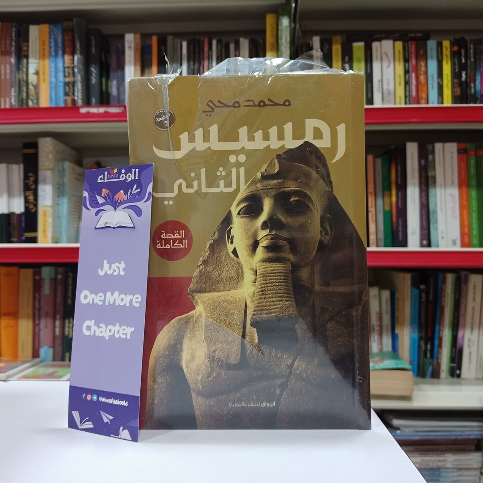
Just stumbled upon this creative book cover design featuring my Zahey Arabic font!
Learn more about Zahey font:
mostafa-abasiry.com/b/zahey-…
#arabic
#font
#typeface
#typography
#typedesign
#calligraphy
#graphicdesign
#procreate
#عربي
#تايبوغرافي
#خط
#خطوط_عربية
#تايبوجرافي
53

Jun 11
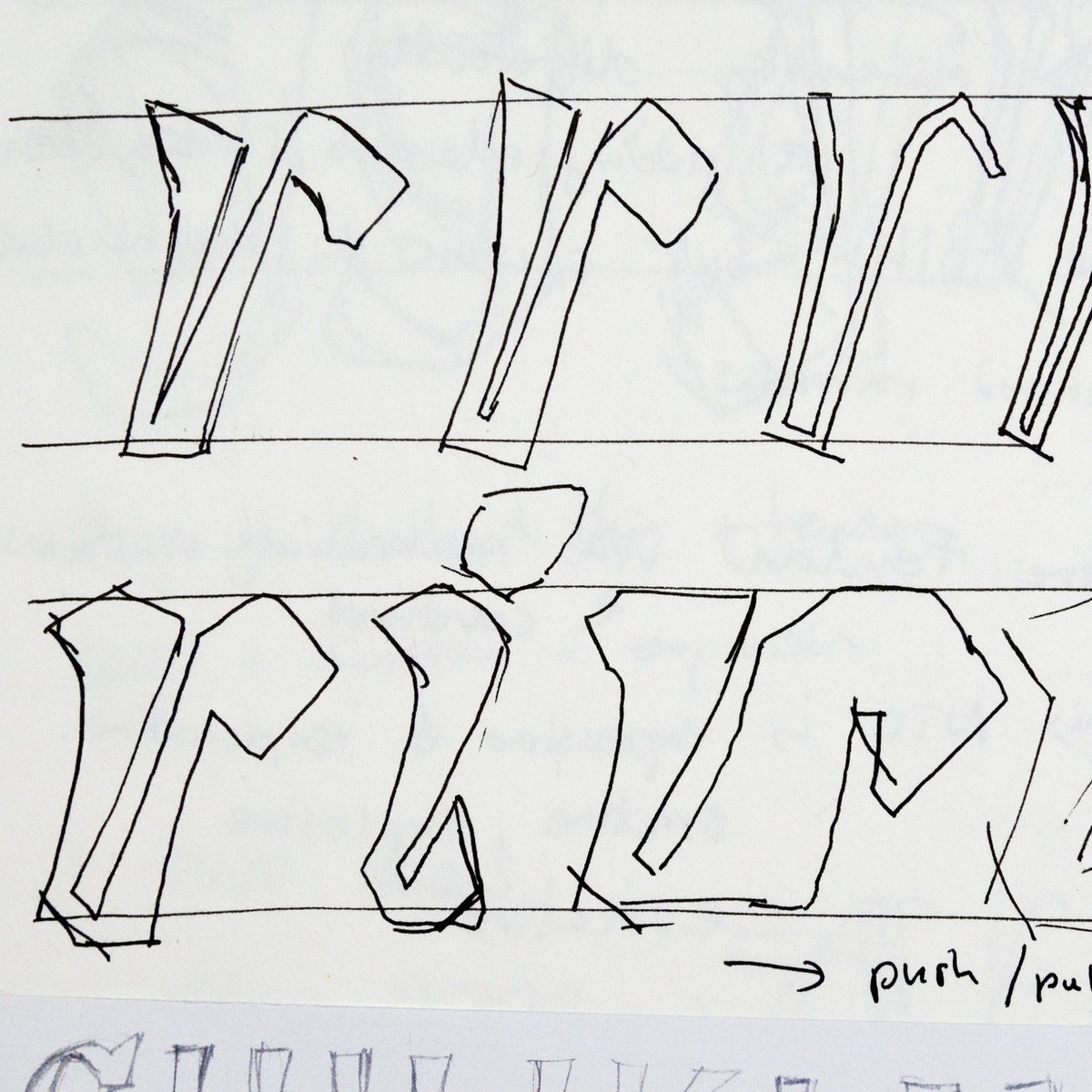
Part of the process
Early sketch and thoughts for Brucker
See the final type at typography.net
#type #fonts #typedesign #typography #art #design #graphicdesign #branding #language #letters #advertising #communications #image #calligraphy #typespecimens
3
207

✏️Designer Shelby Osbourn, Senior Graphic artist @uamshealth, uses SheCreative.xyz to showcase her creative work.
Learn more about this @squarespace customer on our blog.
#Branding #TypeDesign #WW
gen.xyz/blog/shecreative-xyz…

1
146


dance
I'm working on something new. Here's a teaser on what it does
#art #ascii #asciiart #ansi #ansiart #bbs #computer #computerart #demoscene #digital #digitalart #text #textart #textmode #typedesign #design #skeleton #skull #skateboarding #skater #freestyleskateboarding

7
94

Jun 10
Your message deserves more impact🔥
Dashes delivers bold shapes and unique cuts that instantly grab attention.
Free to Try: behance.net/gallery/25079425…
#Boldfont #Displayfont #Font #Typedesign #Graphicdesign
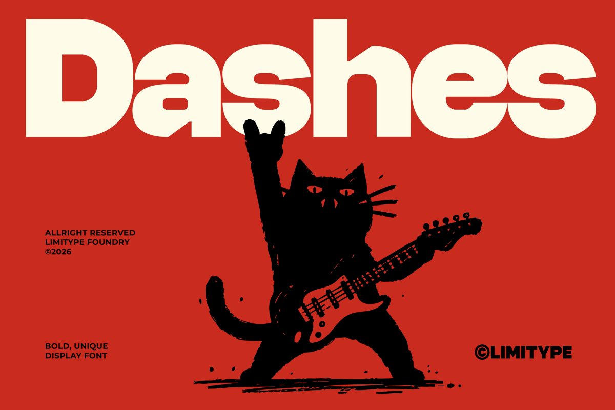


8
Jun 9
with a neutral preview In View details, toggle the tagged traits (Rounded vs Display/Horror/Ornamental) Use the actual trait row shown there to confirm what’s eligible Search by trait → verify the exact trait row in View details → Download. #Typography #FontTraits #TypeDesign
1
3
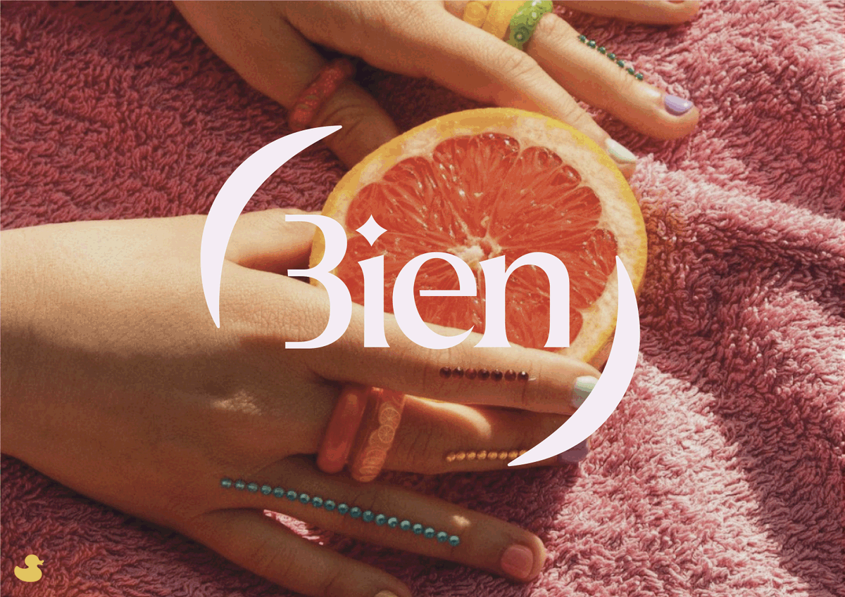
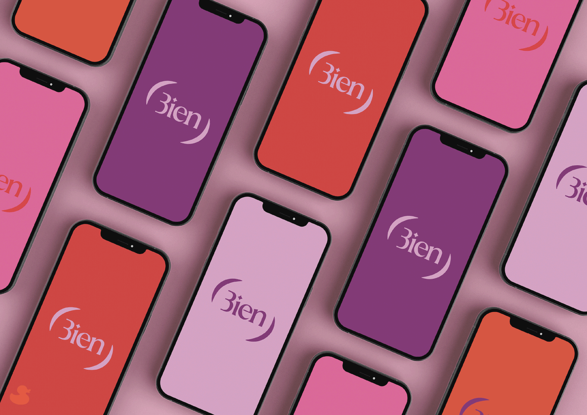
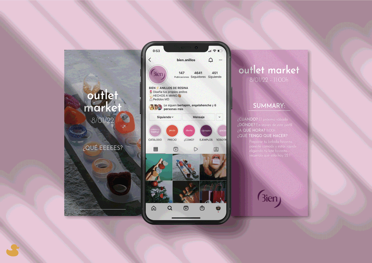
The Cloud Studio - Bien.anillos Project
.
#logo #logodesignawards #lda #logodesign #logotype #logodesigns #logodesigner #logodesigns #logomaker #logoinspirations #logomark #logoideas #vector #logobrand #logoinspire #logodesinger #typography #typo #typedesign

83
Jun 8
restrictive license/usage notes (and in some cases different file type/traits) that can block commercial use. We keep tone matching fast—but permissions have to match, too. Search by Category → View details (traits license) → Download. #TypeDesign #FontLicensing #Typography
1
2

Jun 8
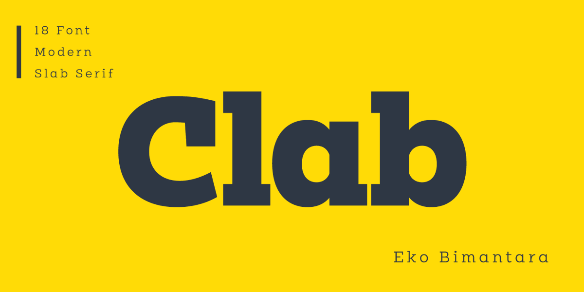
Your brand deserves a voice that’s both strong and versatile.
Introducing Clab — a bold slab serif, contemporary font family built for identity systems that need to stand out.
→ Low caps balanced proportions → maximum personality
→ Italics with real flow → unexpected elegance
→ 9 weights per style → hierarchy made easy
Perfect for logos, packaging, posters, and digital campaigns.
Make every letter work for the brand.
#Clab #BrandingType #AgencyTools #TypeDesign
Check it out: ekobimantara.com/product/cla…
66
sigils3
I'm working on something new. Here's a teaser on what it does
#art #ascii #asciiart #ansi #ansiart #bbs #computer #computerart #demoscene #digital #digitalart #text #textart #textmode #typedesign #design #typography #graffiti #modulardesign #modular #blackletter

7
141

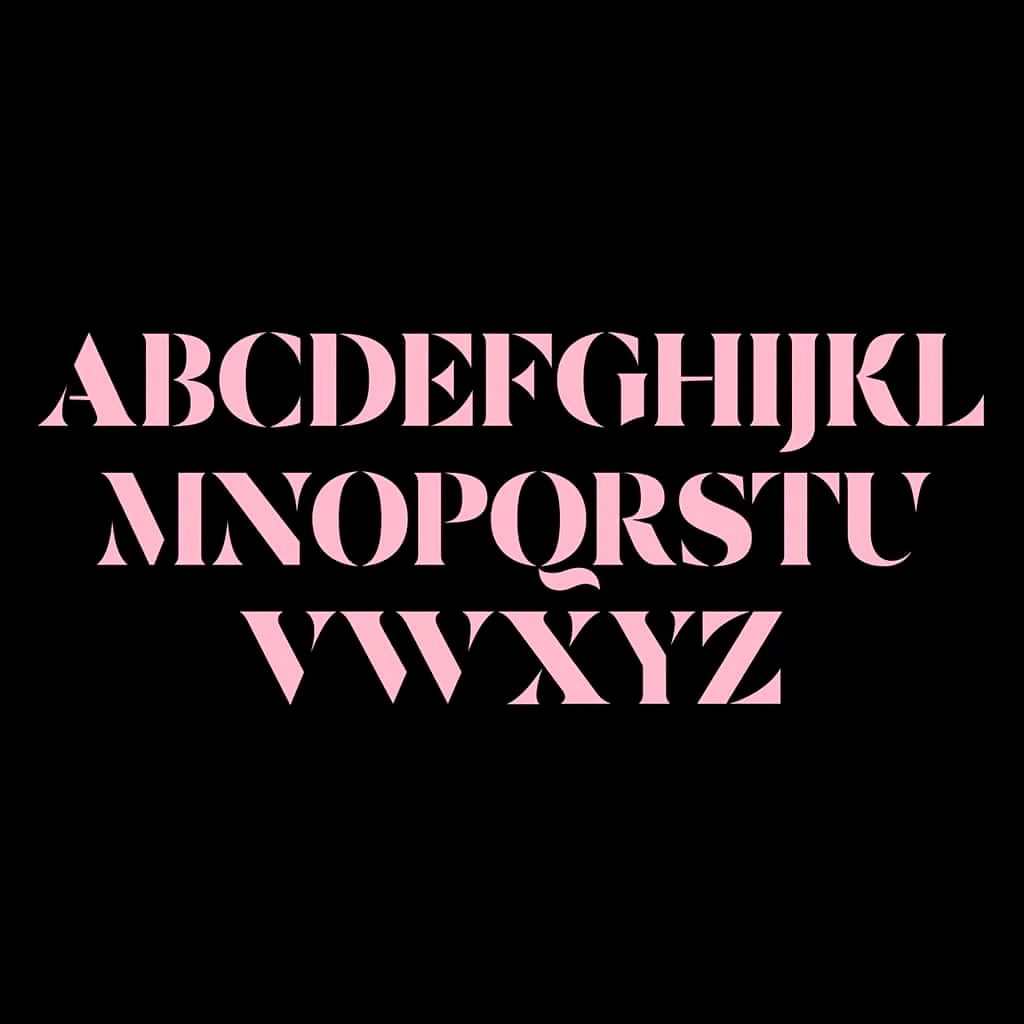
Céline #stencil
Ideal for crafting playful typographic identities, Céline excels in layouts, posters, and distinctive logotypes.
Ignite your next project
Free trials available
🔗 type-department.com
#typedepartment #typedesign #typeface #graphicdesigner #graphicdesign


1
1
220
Jun 7
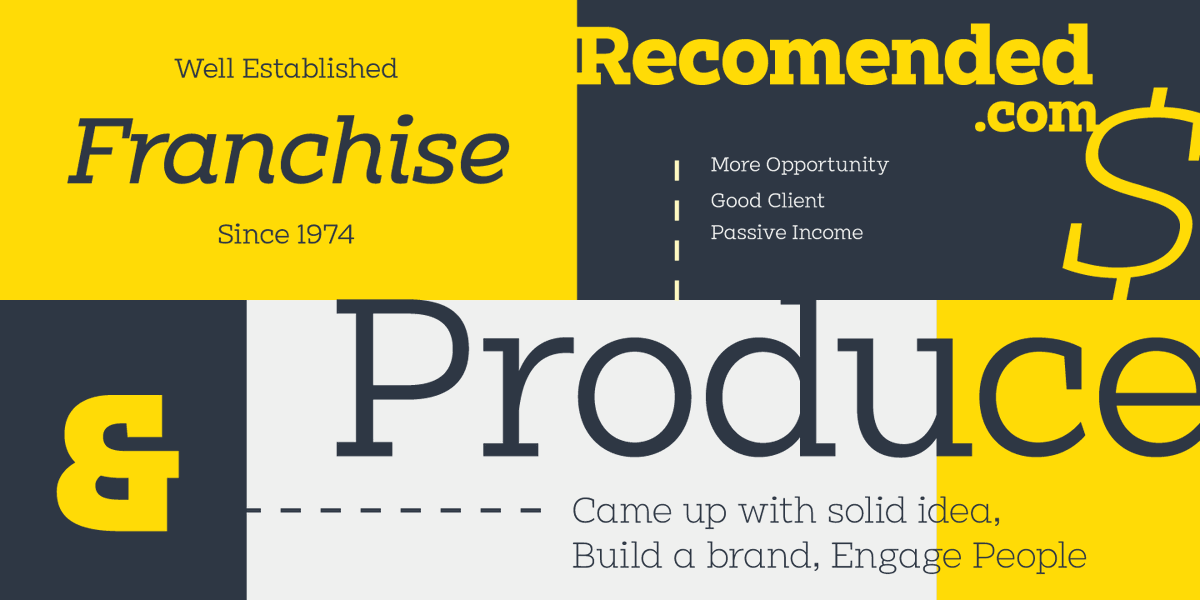
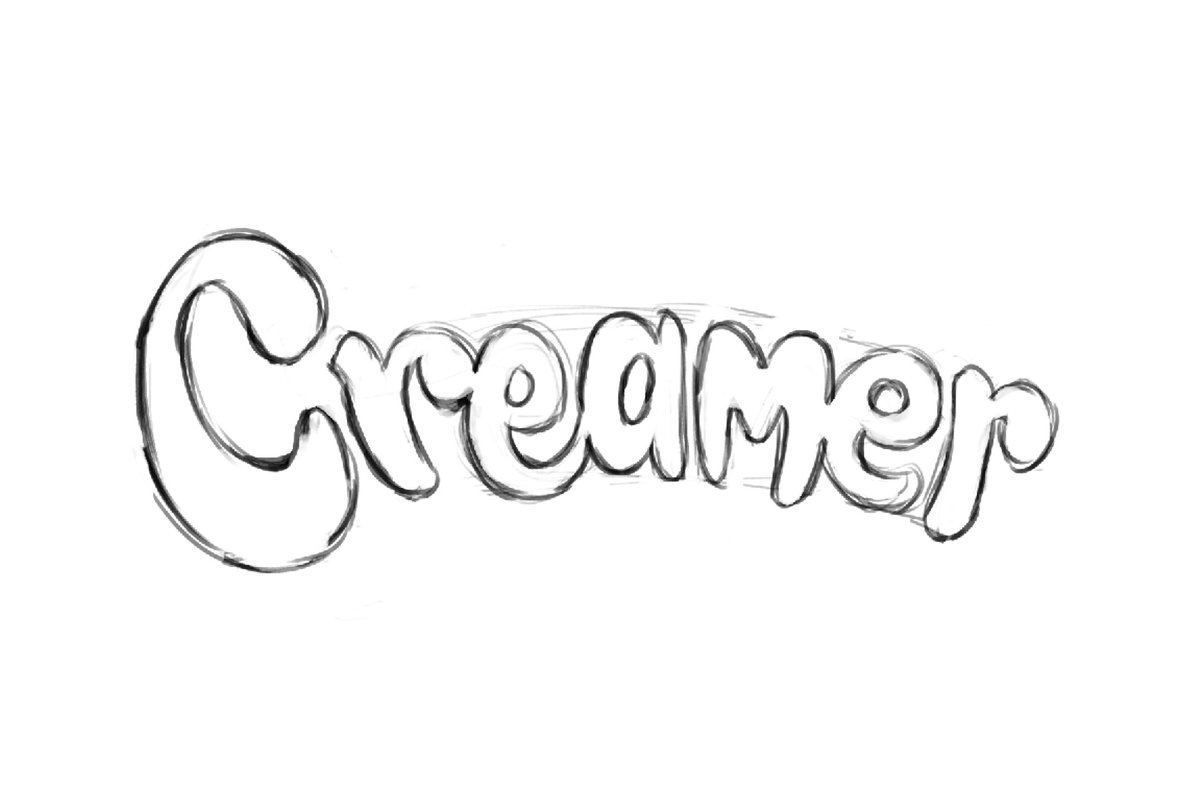
Creamer, a lettering exploration by Eko Bimantara (2026), finds warmth in simplicity. Soft curves. Easy readability.
For designers and agencies: notice how "Smooth & Delicious" lives inside the form, not just the message.
Need custom type?
ekobimantara.com/custom-type…
#typedesign #coffee #brand


123

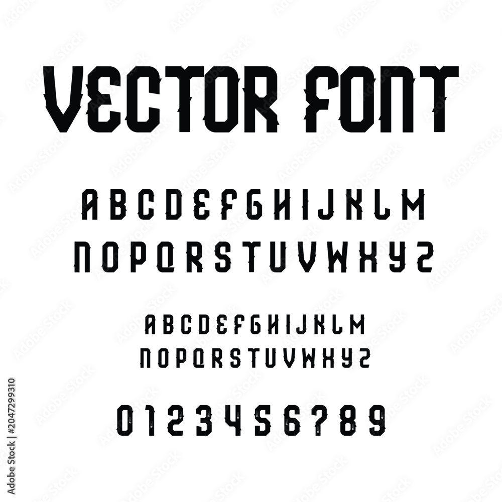
Futuristic Cyberpunk Vector Font Typography on White >> l.muz.kr/eQyE
#Typography #VectorFont #Futuristic #Cyberpunk #Design #Art #Creative #TypeDesign #GraphicDesign #WhiteBackground
2
7
sigils1
I'm working on something new. Here's a teaser on what it does
#art #ascii #asciiart #ansi #ansiart #bbs #computer #computerart #demoscene #digital #digitalart #text #textart #textmode #typedesign #design #typography #graffiti #modulardesign #modular

7
159