
Jun 13
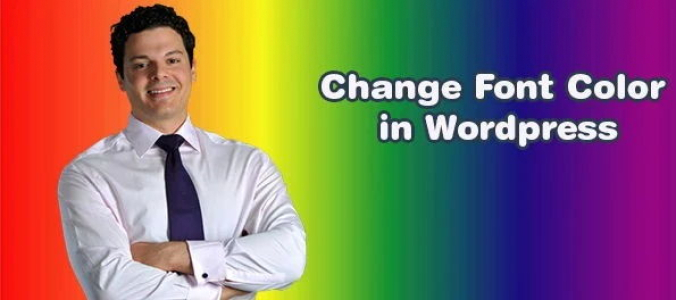
Make Your WordPress Text Pop! How to Adjust Font Colors 🏗️ webstick.blog/how-to-change-… #ChangeFontColor #WordPressDesign #TextStyling #WPCustomization #TypographyTips #WebsiteBranding #WPBeginner

2
Jun 10
Step-by-Step Guide to Changing Font Colors in WordPress 🎯 webstick.blog/how-to-change-… #ChangeFontColor #WordPressDesign #TextStyling #WPCustomization #TypographyTips #WebsiteBranding #WPBeginner

4
Jun 8
Customizing WordPress Fonts: How to Modify Text Color in Minutes 🖍️ webstick.blog/how-to-change-… #ChangeFontColor #WordPressDesign #TextStyling #WPCustomization #TypographyTips #WebsiteBranding #WPBeginner

Get in touch with us for your next UI/UX design project.
#uidesign #uxdesign #typographytips #uiux #productdesign #designtips #webdesign #uxbestpractices #Interfacedesign #designforusers #summitech
5
14

29 Oct 2025
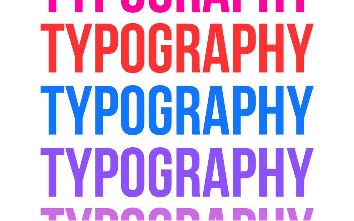
Want your website to be more readable and accessible? ✨ Typography matters—here are smart tips to boost clarity and user experience.
TypographyTips #WebAccessibility #DesignMatters #UXDesign #FrontendDev #TechTok #NigeriaTech #ReadableWeb #WebDesignBasics
2
34

27 Sep 2025
Stop using generic fonts, 3 premium font free sites every designer should know.
#TypographyTips
4
52

9 Sep 2025
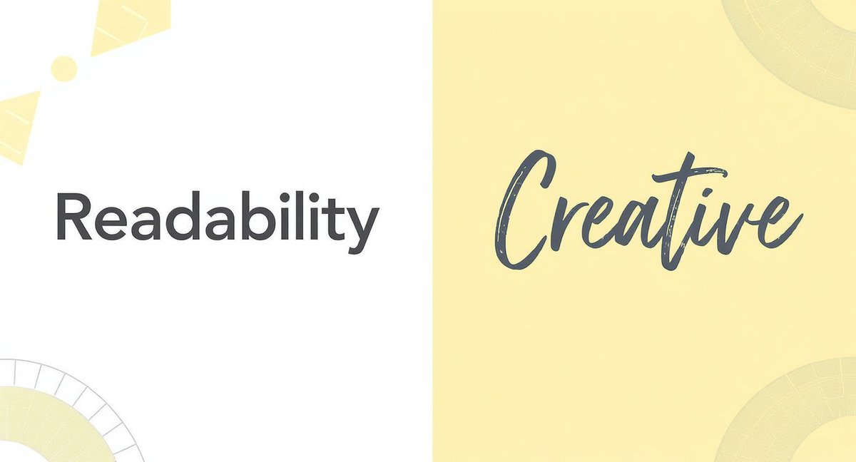
Typography = Readability
A beautiful website means nothing if people can’t read it.
Here are 5 quick tips for better typography:
✅ Clear fonts
✅ Proper size
✅ Consistent hierarchy
✅ Good spacing
✅ 2–3 fonts max
Good design = easy to read.
#WebDesign #TypographyTips
2
58

27 Jul 2025
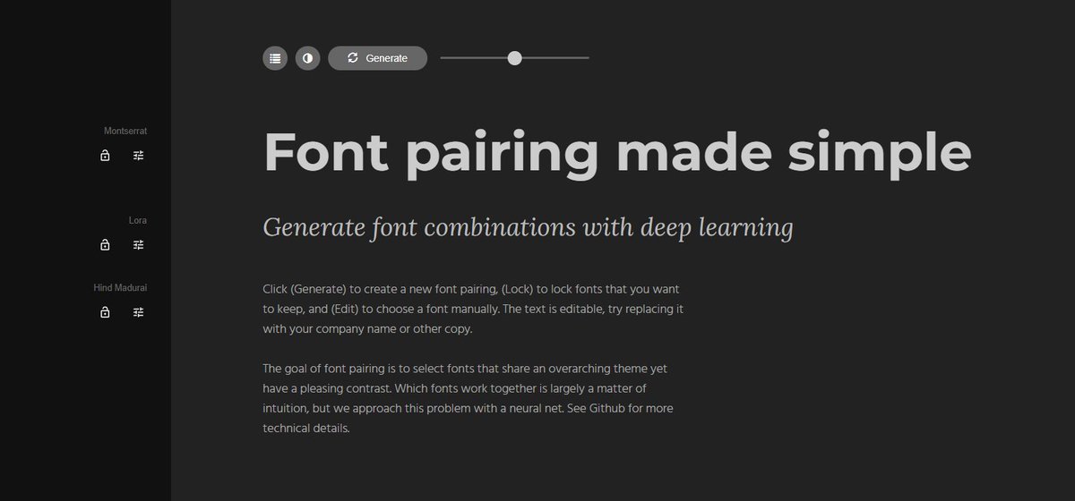
✦ FONT PAIRING TIP ✦
Unsure which fonts go well together? Use fontjoy.com find perfect Google Font combinations.
Pro tip — Pair a bold header font with a clean body font.
— Design smarter, not harder // #TypographyTips #DesignTools
2
133

21 Jul 2025
“Don’t skip typography.
Good design isn’t just about images — it’s about readability.
🔹 Use fewer font sizes
🔹 Align text consistently
🔹 Use 16–18px for body text
Clean text = clean UI.”
#TypographyTips #UIDesign #DesignTips
4
64

17 Jul 2025
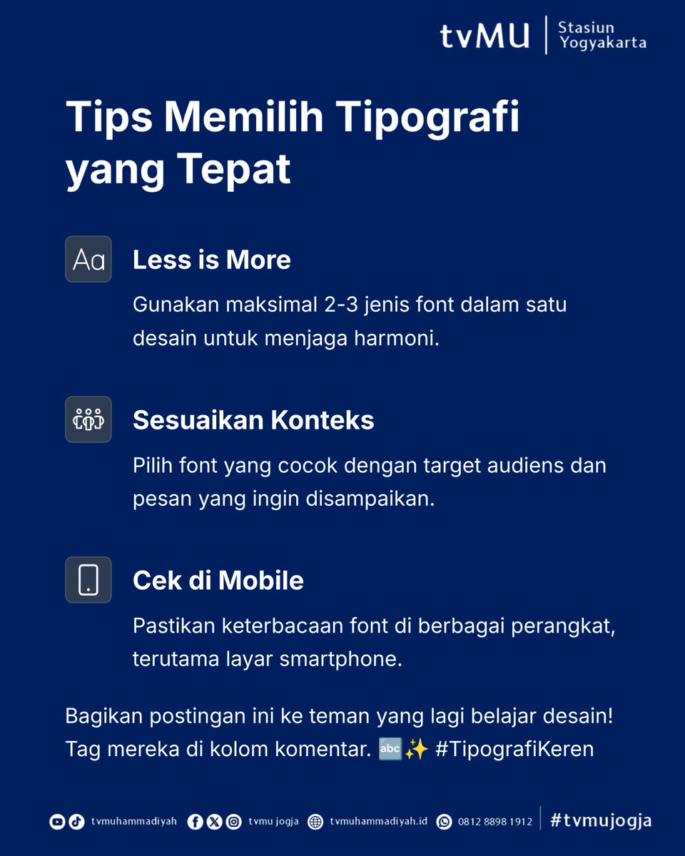
Typography yang rapi bikin desain kamu keliatan profesional, meski simpel.
Cek 3 prinsip dasar ini dulu sebelum publish/post!
⠀
#TypographyTips #DesainKonten #BroadcastingDesign #TVMuJogja


4
5
47

10 Jul 2025
Typography isn’t just about choosing fonts.
It’s how your design speaks before anyone reads a word.
It sets the mood, builds hierarchy, and gives your visuals rhythm.
👀 I’m dropping a typography related thread soon. Stay close.
#GraphicDesign #TypographyTips #DesignTwitter
7
1
20
1,184

27 Jun 2025
Balance in typography = readability creative impact.
Use hierarchy, spacing & contrast the smart way. ✨
Read guide → 🔗 Learn more: magipik.com/blog/balance-typ…
#TypographyTips #DesignBalance #ReadableDesign #VisualImpact #MagipikTips #DesignHack #ContentDesign #SocialDesign
3
13

1 Jun 2025
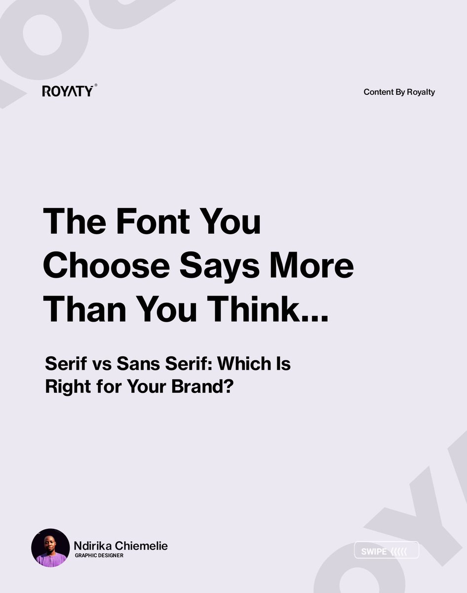
Fonts do more than just look pretty they speak for your brand.
A serif font might whisper elegance and legacy, while a sans serif font shouts modern and minimal. Choosing the right one can make or break your brand perception.
#BrandFonts #TypographyTips #LogoDesign
1
3
133

25 May 2025
Day 18 of 100 Days Design Tips is live!
Today’s thread is all about how to choose the right font — without guessing or wasting time.
If you’ve ever struggled with font pairings or choosing the right vibe, this will help a lot.
#TypographyTips #DesignTips #100DaysOfDesign
25 May 2025

Day 18 of 100 Days of Design Tips →
:)
Today’s topic:
How to Choose the Right Font — and Stop Guessing
Thread🧵
1
66
25 May 2025
Day 18 of 100 Days Design Tips is live!
Today’s thread is all about how to choose the right font — without guessing or wasting time.
If you’ve ever struggled with font pairings or choosing the right vibe, this will help a lot.
#TypographyTips #DesignTips #100DaysOfDesign
25 May 2025
Day 18 of 100 Days of Design Tips →
:)
Today’s topic:
How to Choose the Right Font — and Stop Guessing
Thread🧵
6
74
25 May 2025
Day 18 of 100 Days Design Tips is live!
Today’s thread is all about how to choose the right font — without guessing or wasting time.
If you’ve ever struggled with font pairings or choosing the right vibe, this will help a lot.
#TypographyTips #DesignTips #100DaysOfDesign
25 May 2025
Day 18 of 100 Days of Design Tips →
:)
Today’s topic:
How to Choose the Right Font — and Stop Guessing
Thread🧵
3
70
25 May 2025
Follow me @paragoncreatio — this is Day 18 of 100.
Bringing you bite-sized design wisdom every day.
#TypographyTips #DesignTips #100DaysOfDesign #FontPairing
2
18
25 May 2025
Typography can make or break your design.
So don’t just pick what “looks nice” — pick what works.
#TypographyTips #DesignTips #100DaysOfDesign #FontPairing
1
2
22
25 May 2025
5. Use font pairings tools
Sites like FontPair or Google Fonts help find good combos.
→ Save time and avoid bad mixes.
#TypographyTips #DesignTips #100DaysOfDesign #FontPairing
1
3
27
25 May 2025
4. Mind readability
Decorative fonts might look nice but often fail in legibility.
→ Prioritize clarity, especially for small text.
#TypographyTips #DesignTips #100DaysOfDesign #FontPairing
1
2
22