
May 5
Build a high-end, responsive, full-stack landing page for a productivity SaaS called "Slate" using the exact specifications below.
### Tech Stack
- Vite React TypeScript
- Tailwind CSS
- lucide-react (for icons)
- gsap @gsap/react (for heading text animations via a reusable `SplitText` component)
### Global Typography & CSS
In `index.css`, use the following global resets, typography, Liquid Glass utilities, and 3D Card styles:
```css
@import "tailwindcss";
@layer base {
* {
font-family: 'Helvetica Neue', Helvetica, Arial, sans-serif;
font-weight: 200;
-webkit-font-smoothing: antialiased;
-moz-osx-font-smoothing: grayscale;
box-sizing: border-box;
}
body { background: #000; color: white; margin: 0; padding: 0; }
h1, h2, h3, h4, h5, h6 { font-weight: inherit; }
}
@layer utilities {
.liquid-glass {
background: rgba(255, 255, 255, 0.01);
background-blend-mode: luminosity;
backdrop-filter: blur(4px);
-webkit-backdrop-filter: blur(4px);
border: none;
box-shadow: inset 0 1px 1px rgba(255, 255, 255, 0.1);
position: relative;
overflow: hidden;
}
.liquid-glass::before {
content: '';
position: absolute;
inset: 0;
border-radius: inherit;
padding: 1.4px;
background: linear-gradient(180deg,
rgba(255,255,255,0.45) 0%, rgba(255,255,255,0.15) 20%,
rgba(255,255,255,0) 40%, rgba(255,255,255,0) 60%,
rgba(255,255,255,0.15) 80%, rgba(255,255,255,0.45) 100%);
-webkit-mask: linear-gradient(#fff 0 0) content-box, linear-gradient(#fff 0 0);
-webkit-mask-composite: xor;
mask-composite: exclude;
pointer-events: none;
}
.hero-fade-up {
opacity: 0;
animation: heroFadeUp 0.9s cubic-bezier(0.22, 1, 0.36, 1) forwards;
will-change: transform, opacity;
}
}
@keyframes heroFadeUp {
from { opacity: 0; transform: translateY(20px); }
to { opacity: 1; transform: translateY(0); }
}
/* 3D Glass Card Section Styles */
.section {
position: relative; min-height: 100vh; padding: 4vh 40px;
display: flex; align-items: center; justify-content: center;
overflow: hidden; background: #050607;
}
.section::before {
content: ""; position: absolute; inset: 0;
background:
linear-gradient(rgba(255,255,255,0.04) 1px, transparent 1px),
linear-gradient(90deg, rgba(255,255,255,0.04) 1px, transparent 1px);
background-size: 145px 145px; opacity: 0.45;
}
.section::after {
content: ""; position: absolute; inset: 0;
background:
radial-gradient(circle at center, transparent 35%, rgba(0,0,0,0.72)),
linear-gradient(to bottom, rgba(0,0,0,0.25), rgba(0,0,0,0.9));
}
.container { position: relative; z-index: 2; max-width: 1100px; width: 100%; margin: 0 auto; }
.header { margin-bottom: 24px; }
.header h1 { font-size: 38px; line-height: 1.1; letter-spacing: -1px; margin-bottom: 14px; font-weight: 600; }
.header p { font-size: 14px; line-height: 1.45; color: rgba(235,240,255,0.65); margin-bottom: 24px; max-width: 440px; }
.header p:last-child { margin-bottom: 0; }
.cards {
display: grid; grid-template-columns: repeat(3, 1fr); gap: 26px;
perspective: 1200px; transform-style: preserve-3d;
}
.card {
position: relative; height: 300px; border-radius: 42px; padding: 24px;
overflow: hidden; isolation: isolate;
background: linear-gradient(180deg, rgba(22,26,38,0.96) 0%, rgba(12,15,25,0.98) 48%, rgba(5,7,12,1) 100%);
border: 1px solid rgba(255,255,255,0.1);
box-shadow:
inset 0 1.5px 1px rgba(255,255,255,0.22),
inset 0 -18px 38px rgba(0,0,0,0.55),
inset 0 0 28px rgba(255,255,255,0.035),
0 2px 1px rgba(255,255,255,0.08),
0 18px 25px rgba(0,0,0,0.38),
0 42px 85px rgba(0,0,0,0.78);
transition: transform 0.45s ease, box-shadow 0.45s ease;
}
.card::before {
content: ""; position: absolute; inset: 0; border-radius: inherit; padding: 1.8px;
background: linear-gradient(145deg, var(--edge-bright) 0%, rgba(255,255,255,0.38) 9%, rgba(255,255,255,0.08) 32%, rgba(255,255,255,0.025) 58%, var(--edge-soft) 100%);
-webkit-mask: linear-gradient(#fff 0 0) content-box, linear-gradient(#fff 0 0);
-webkit-mask-composite: xor; mask-composite: exclude;
z-index: 5; pointer-events: none;
filter: drop-shadow(0 0 12px var(--edge-bright));
}
.card::after {
content: ""; position: absolute; left: -8%; right: -8%; bottom: -32px;
height: 138px; background: var(--bottom-glow); filter: blur(13px);
opacity: 1; z-index: 1;
}
.glass {
position: absolute; inset: 0; border-radius: inherit; z-index: 2;
background:
linear-gradient(115deg, rgba(255,255,255,0.18) 0%, rgba(255,255,255,0.05) 22%, transparent 45%),
radial-gradient(circle at 7% 5%, var(--corner-glow), transparent 45%),
radial-gradient(circle at 50% 112%, var(--base-glow), transparent 47%),
linear-gradient(180deg, rgba(255,255,255,0.055), rgba(255,255,255,0.01) 48%, rgba(255,255,255,0.04));
backdrop-filter: blur(32px); -webkit-backdrop-filter: blur(32px); pointer-events: none;
}
.glass::before {
content: ""; position: absolute; top: 0; left: 18px; right: 18px; height: 1px;
background: linear-gradient(90deg, transparent, rgba(255,255,255,0.55), transparent); opacity: 0.45;
}
.glass::after {
content: ""; position: absolute; inset: 0; border-radius: inherit;
background: linear-gradient(to bottom, rgba(0,0,0,0.02), rgba(0,0,0,0.28) 55%, rgba(0,0,0,0.08));
}
.depth {
position: absolute; inset: auto 18px -18px 18px; height: 38px; border-radius: 0 0 42px 42px;
background: linear-gradient(to bottom, rgba(255,255,255,0.12), rgba(0,0,0,0.65));
filter: blur(16px); opacity: 0.75; z-index: 0; pointer-events: none;
}
.card-content { position: relative; z-index: 6; display: flex; flex-direction: column; height: 100%; }
.icon-box {
width: 48px; height: 48px; border-radius: 12px; margin-bottom: 32px;
display: flex; align-items: center; justify-content: center;
background: linear-gradient(145deg, rgba(255,255,255,0.15), rgba(255,255,255,0.03)), rgba(8,10,16,0.72);
border: 1px solid var(--icon-border);
box-shadow: inset 0 1px 0 rgba(255,255,255,0.22), 0 0 22px var(--icon-glow), 0 10px 28px rgba(0,0,0,0.45);
}
.icon-box svg { width: 24px; height: 24px; stroke: white; stroke-width: 1.8; fill: none; filter: drop-shadow(0 0 8px var(--icon-glow)); }
.card h2 { font-size: 24px; line-height: 1; letter-spacing: -0.8px; margin-bottom: 13px; font-weight: 600; }
.card p { font-size: 15px; line-height: 1.32; color: rgba(235,240,255,0.68); max-width: 280px; margin-bottom: 18px; }
.card a { color: white; font-size: 14px; font-weight: 700; text-decoration: none; margin-top: auto; }
.card:hover {
transform: rotateX(3deg) rotateY(-3deg) translateY(-8px) translateZ(28px);
box-shadow:
inset 0 1.5px 1px rgba(255,255,255,0.26), inset 0 -22px 42px rgba(0,0,0,0.62), inset 0 0 34px rgba(255,255,255,0.045),
0 3px 1px rgba(255,255,255,0.08), 0 28px 35px rgba(0,0,0,0.48), 0 60px 110px rgba(0,0,0,0.88);
}
.orange {
--edge-bright: rgba(255,131,45,0.95); --edge-soft: rgba(255,247,151,1);
--corner-glow: rgba(255,115,35,0.32); --base-glow: rgba(255,89,30,0.82);
--icon-border: rgba(255,108,39,0.55); --icon-glow: rgba(255,88,24,0.75);
--bottom-glow: linear-gradient(to bottom, transparent 0%, rgba(255,61,20,0.25) 25%, rgba(255,76,24,0.85) 58%, rgba(255,247,155,1) 100%);
}
.blue {
--edge-bright: rgba(97,145,255,1); --edge-soft: rgba(214,255,255,1);
--corner-glow: rgba(91,139,255,0.34); --base-glow: rgba(89,120,255,0.84);
--icon-border: rgba(92,139,255,0.6); --icon-glow: rgba(84,130,255,0.75);
--bottom-glow: linear-gradient(to bottom, transparent 0%, rgba(75,106,255,0.25) 25%, rgba(86,118,255,0.85) 58%, rgba(218,255,255,1) 100%);
}
.green {
--edge-bright: rgba(73,255,139,1); --edge-soft: rgba(212,255,244,1);
--corner-glow: rgba(73,255,139,0.34); --base-glow: rgba(52,255,126,0.88);
--icon-border: rgba(74,255,143,0.6); --icon-glow: rgba(74,255,143,0.78);
--bottom-glow: linear-gradient(to bottom, transparent 0%, rgba(52,255,126,0.25) 25%, rgba(48,255,118,0.86) 58%, rgba(217,255,247,1) 100%);
}
.features { margin-top: 24px; display: flex; gap: 34px; color: rgba(235,240,255,0.65); font-size: 14px; }
.feature { display: flex; align-items: center; gap: 8px; position: relative; }
.feature:not(:last-child)::after {
content: ""; position: absolute; right: -17px; top: 50%;
transform: translateY(-50%); height: 12px; width: 1px;
background: rgba(255,255,255,0.15);
}
@media (max-width: 950px) {
.section { padding: 80px 24px; }
.cards { grid-template-columns: 1fr; max-width: 430px; }
.features { flex-wrap: wrap; }
}
Components & General Rules
Create a reusable VideoBackground component to handle <video autoPlay muted loop playsInline> strictly covering its container (absolute inset-0 w-full h-full object-cover).
It must accept a src prop, and an optional flip boolean prop (which applies style={{ transform: 'scaleX(-1)' }}).
1. Navbar
Layout: Absolute positioning to the top (absolute top-0 left-0 right-0 z-50), transparent (no fixed background bar, stroke, or overlay).
Padding: px-4 sm:px-6 lg:px-10 py-4 lg:py-5.
Left side: Contains an inline 22x22 SVG logo (Chevron diamond mark: d="M 256 256 L 128 256 L 0 128 L 128 128 Z M 256 128 L 128 128 L 0 0 L 128 0 Z") and wordmark "Slate".
Center: Navigation links.
Right: "Start today" button utilizing .liquid-glass class.
2. Hero Section
Has the primary VideoBackground positioned at z-0 using this source URL (must be horizontally flipped using flip prop):
d8j0ntlcm91z4.cloudfront.net……
Content z-10 container is aligned entirely to the LEFT side of the screen (flex-col items-start text-left).
Features a Notification Badge (Liquid Glass Pill).
Features a GSAP SplitText animated heading ("Grow Your Team <br /> Thriving") with an explicit textShadow: '0 2px 20px rgba(0,0,0,0.3)' styling.
Features subtext animated with CSS .hero-fade-up and staged staggered CTA buttons.
3. "How We Keep You Ahead" Section (3D CardSection)
Use the CSS .section logic and .card styling strictly as provided in index.css.
Three GlassCard components (theme="orange", theme="blue", theme="green").
Contains text: "How We Keep You Ahead®".
Has no background videos strictly built on the CSS backdrop-filters and animated 3D perspective transforms on hover.
4. Features Section
Layout is pure black background.
Holds a grid of 4 cards containing Lucide icons.
Hover interaction: The cards themselves use .liquid-glass. Inside each card container, there is an absolute VideoBackground with opacity-0 by default. On hover only, the video smoothly transitions to opacity-40 (group-hover:opacity-40).
Video Source for card backgrounds:
d8j0ntlcm91z4.cloudfront.net……
5. Benefits Section
pure black background section split into two columns.
Left column: Text content, bulleted list of benefits.
Right column: Large Statistics Block (liquid-glass). Inside this specific glass block, it contains a persistent VideoBackground constrained strictly inside the card with opacity-50.
Video Source strictly inside the Stats Card:
d8j0ntlcm91z4.cloudfront.net……
6. Testimonials Section
Grid of 3 testimonials (liquid-glass cards).
Hover interaction state: Track hover states using React useState(0). The VideoBackground exists in all three cards. By default, Card 0 (the first card) has its target video visible (opacity-50). As the user hovers over another card, the video smoothly shifts (opacity-0 -> opacity-50) to the currently hovered card exclusively.
Video source for these cards:
d8j0ntlcm91z4.cloudfront.net……
7. Pricing Section
Two large liquid-glass comparison cards (Starter & Pro).
Both pricing cards contain a persistent VideoBackground constrained exactly to the card borders with opacity-40 acting as an animated background behind the text.
Video source strictly inside the Pricing Cards:
d8j0ntlcm91z4.cloudfront.net……
8. Final CTA Section
Single, massive centered liquid-glass container holding the header "Ready to start building?".
Has a VideoBackground rigidly attached just inside the rounded card.
Video Source strictly inside the Final CTA Glass Card:
d8j0ntlcm91z4.cloudfront.net……
9. Footer Section
Minimal, multi-column standard layout logic.
Entirely solid #000 / bg-black background. No videos, no glass effects.
9
362

May 3
Access ALL prompts for stunning animated websites in one click: motionsites.ai
Build a high-end, responsive, full-stack landing page for a productivity SaaS called "Slate" using the exact specifications below.
### Tech Stack
- Vite React TypeScript
- Tailwind CSS
- lucide-react (for icons)
- gsap @gsap/react (for heading text animations via a reusable `SplitText` component)
### Global Typography & CSS
In `index.css`, use the following global resets, typography, Liquid Glass utilities, and 3D Card styles:
```css
@import "tailwindcss";
@layer base {
* {
font-family: 'Helvetica Neue', Helvetica, Arial, sans-serif;
font-weight: 200;
-webkit-font-smoothing: antialiased;
-moz-osx-font-smoothing: grayscale;
box-sizing: border-box;
}
body { background: #000; color: white; margin: 0; padding: 0; }
h1, h2, h3, h4, h5, h6 { font-weight: inherit; }
}
@layer utilities {
.liquid-glass {
background: rgba(255, 255, 255, 0.01);
background-blend-mode: luminosity;
backdrop-filter: blur(4px);
-webkit-backdrop-filter: blur(4px);
border: none;
box-shadow: inset 0 1px 1px rgba(255, 255, 255, 0.1);
position: relative;
overflow: hidden;
}
.liquid-glass::before {
content: '';
position: absolute;
inset: 0;
border-radius: inherit;
padding: 1.4px;
background: linear-gradient(180deg,
rgba(255,255,255,0.45) 0%, rgba(255,255,255,0.15) 20%,
rgba(255,255,255,0) 40%, rgba(255,255,255,0) 60%,
rgba(255,255,255,0.15) 80%, rgba(255,255,255,0.45) 100%);
-webkit-mask: linear-gradient(#fff 0 0) content-box, linear-gradient(#fff 0 0);
-webkit-mask-composite: xor;
mask-composite: exclude;
pointer-events: none;
}
.hero-fade-up {
opacity: 0;
animation: heroFadeUp 0.9s cubic-bezier(0.22, 1, 0.36, 1) forwards;
will-change: transform, opacity;
}
}
@keyframes heroFadeUp {
from { opacity: 0; transform: translateY(20px); }
to { opacity: 1; transform: translateY(0); }
}
/* 3D Glass Card Section Styles */
.section {
position: relative; min-height: 100vh; padding: 4vh 40px;
display: flex; align-items: center; justify-content: center;
overflow: hidden; background: #050607;
}
.section::before {
content: ""; position: absolute; inset: 0;
background:
linear-gradient(rgba(255,255,255,0.04) 1px, transparent 1px),
linear-gradient(90deg, rgba(255,255,255,0.04) 1px, transparent 1px);
background-size: 145px 145px; opacity: 0.45;
}
.section::after {
content: ""; position: absolute; inset: 0;
background:
radial-gradient(circle at center, transparent 35%, rgba(0,0,0,0.72)),
linear-gradient(to bottom, rgba(0,0,0,0.25), rgba(0,0,0,0.9));
}
.container { position: relative; z-index: 2; max-width: 1100px; width: 100%; margin: 0 auto; }
.header { margin-bottom: 24px; }
.header h1 { font-size: 38px; line-height: 1.1; letter-spacing: -1px; margin-bottom: 14px; font-weight: 600; }
.header p { font-size: 14px; line-height: 1.45; color: rgba(235,240,255,0.65); margin-bottom: 24px; max-width: 440px; }
.header p:last-child { margin-bottom: 0; }
.cards {
display: grid; grid-template-columns: repeat(3, 1fr); gap: 26px;
perspective: 1200px; transform-style: preserve-3d;
}
.card {
position: relative; height: 300px; border-radius: 42px; padding: 24px;
overflow: hidden; isolation: isolate;
background: linear-gradient(180deg, rgba(22,26,38,0.96) 0%, rgba(12,15,25,0.98) 48%, rgba(5,7,12,1) 100%);
border: 1px solid rgba(255,255,255,0.1);
box-shadow:
inset 0 1.5px 1px rgba(255,255,255,0.22),
inset 0 -18px 38px rgba(0,0,0,0.55),
inset 0 0 28px rgba(255,255,255,0.035),
0 2px 1px rgba(255,255,255,0.08),
0 18px 25px rgba(0,0,0,0.38),
0 42px 85px rgba(0,0,0,0.78);
transition: transform 0.45s ease, box-shadow 0.45s ease;
}
.card::before {
content: ""; position: absolute; inset: 0; border-radius: inherit; padding: 1.8px;
background: linear-gradient(145deg, var(--edge-bright) 0%, rgba(255,255,255,0.38) 9%, rgba(255,255,255,0.08) 32%, rgba(255,255,255,0.025) 58%, var(--edge-soft) 100%);
-webkit-mask: linear-gradient(#fff 0 0) content-box, linear-gradient(#fff 0 0);
-webkit-mask-composite: xor; mask-composite: exclude;
z-index: 5; pointer-events: none;
filter: drop-shadow(0 0 12px var(--edge-bright));
}
.card::after {
content: ""; position: absolute; left: -8%; right: -8%; bottom: -32px;
height: 138px; background: var(--bottom-glow); filter: blur(13px);
opacity: 1; z-index: 1;
}
.glass {
position: absolute; inset: 0; border-radius: inherit; z-index: 2;
background:
linear-gradient(115deg, rgba(255,255,255,0.18) 0%, rgba(255,255,255,0.05) 22%, transparent 45%),
radial-gradient(circle at 7% 5%, var(--corner-glow), transparent 45%),
radial-gradient(circle at 50% 112%, var(--base-glow), transparent 47%),
linear-gradient(180deg, rgba(255,255,255,0.055), rgba(255,255,255,0.01) 48%, rgba(255,255,255,0.04));
backdrop-filter: blur(32px); -webkit-backdrop-filter: blur(32px); pointer-events: none;
}
.glass::before {
content: ""; position: absolute; top: 0; left: 18px; right: 18px; height: 1px;
background: linear-gradient(90deg, transparent, rgba(255,255,255,0.55), transparent); opacity: 0.45;
}
.glass::after {
content: ""; position: absolute; inset: 0; border-radius: inherit;
background: linear-gradient(to bottom, rgba(0,0,0,0.02), rgba(0,0,0,0.28) 55%, rgba(0,0,0,0.08));
}
.depth {
position: absolute; inset: auto 18px -18px 18px; height: 38px; border-radius: 0 0 42px 42px;
background: linear-gradient(to bottom, rgba(255,255,255,0.12), rgba(0,0,0,0.65));
filter: blur(16px); opacity: 0.75; z-index: 0; pointer-events: none;
}
.card-content { position: relative; z-index: 6; display: flex; flex-direction: column; height: 100%; }
.icon-box {
width: 48px; height: 48px; border-radius: 12px; margin-bottom: 32px;
display: flex; align-items: center; justify-content: center;
background: linear-gradient(145deg, rgba(255,255,255,0.15), rgba(255,255,255,0.03)), rgba(8,10,16,0.72);
border: 1px solid var(--icon-border);
box-shadow: inset 0 1px 0 rgba(255,255,255,0.22), 0 0 22px var(--icon-glow), 0 10px 28px rgba(0,0,0,0.45);
}
.icon-box svg { width: 24px; height: 24px; stroke: white; stroke-width: 1.8; fill: none; filter: drop-shadow(0 0 8px var(--icon-glow)); }
.card h2 { font-size: 24px; line-height: 1; letter-spacing: -0.8px; margin-bottom: 13px; font-weight: 600; }
.card p { font-size: 15px; line-height: 1.32; color: rgba(235,240,255,0.68); max-width: 280px; margin-bottom: 18px; }
.card a { color: white; font-size: 14px; font-weight: 700; text-decoration: none; margin-top: auto; }
.card:hover {
transform: rotateX(3deg) rotateY(-3deg) translateY(-8px) translateZ(28px);
box-shadow:
inset 0 1.5px 1px rgba(255,255,255,0.26), inset 0 -22px 42px rgba(0,0,0,0.62), inset 0 0 34px rgba(255,255,255,0.045),
0 3px 1px rgba(255,255,255,0.08), 0 28px 35px rgba(0,0,0,0.48), 0 60px 110px rgba(0,0,0,0.88);
}
.orange {
--edge-bright: rgba(255,131,45,0.95); --edge-soft: rgba(255,247,151,1);
--corner-glow: rgba(255,115,35,0.32); --base-glow: rgba(255,89,30,0.82);
--icon-border: rgba(255,108,39,0.55); --icon-glow: rgba(255,88,24,0.75);
--bottom-glow: linear-gradient(to bottom, transparent 0%, rgba(255,61,20,0.25) 25%, rgba(255,76,24,0.85) 58%, rgba(255,247,155,1) 100%);
}
.blue {
--edge-bright: rgba(97,145,255,1); --edge-soft: rgba(214,255,255,1);
--corner-glow: rgba(91,139,255,0.34); --base-glow: rgba(89,120,255,0.84);
--icon-border: rgba(92,139,255,0.6); --icon-glow: rgba(84,130,255,0.75);
--bottom-glow: linear-gradient(to bottom, transparent 0%, rgba(75,106,255,0.25) 25%, rgba(86,118,255,0.85) 58%, rgba(218,255,255,1) 100%);
}
.green {
--edge-bright: rgba(73,255,139,1); --edge-soft: rgba(212,255,244,1);
--corner-glow: rgba(73,255,139,0.34); --base-glow: rgba(52,255,126,0.88);
--icon-border: rgba(74,255,143,0.6); --icon-glow: rgba(74,255,143,0.78);
--bottom-glow: linear-gradient(to bottom, transparent 0%, rgba(52,255,126,0.25) 25%, rgba(48,255,118,0.86) 58%, rgba(217,255,247,1) 100%);
}
.features { margin-top: 24px; display: flex; gap: 34px; color: rgba(235,240,255,0.65); font-size: 14px; }
.feature { display: flex; align-items: center; gap: 8px; position: relative; }
.feature:not(:last-child)::after {
content: ""; position: absolute; right: -17px; top: 50%;
transform: translateY(-50%); height: 12px; width: 1px;
background: rgba(255,255,255,0.15);
}
@media (max-width: 950px) {
.section { padding: 80px 24px; }
.cards { grid-template-columns: 1fr; max-width: 430px; }
.features { flex-wrap: wrap; }
}
Components & General Rules
Create a reusable VideoBackground component to handle <video autoPlay muted loop playsInline> strictly covering its container (absolute inset-0 w-full h-full object-cover).
It must accept a src prop, and an optional flip boolean prop (which applies style={{ transform: 'scaleX(-1)' }}).
1. Navbar
Layout: Absolute positioning to the top (absolute top-0 left-0 right-0 z-50), transparent (no fixed background bar, stroke, or overlay).
Padding: px-4 sm:px-6 lg:px-10 py-4 lg:py-5.
Left side: Contains an inline 22x22 SVG logo (Chevron diamond mark: d="M 256 256 L 128 256 L 0 128 L 128 128 Z M 256 128 L 128 128 L 0 0 L 128 0 Z") and wordmark "Slate".
Center: Navigation links.
Right: "Start today" button utilizing .liquid-glass class.
2. Hero Section
Has the primary VideoBackground positioned at z-0 using this source URL (must be horizontally flipped using flip prop):
d8j0ntlcm91z4.cloudfront.net…
Content z-10 container is aligned entirely to the LEFT side of the screen (flex-col items-start text-left).
Features a Notification Badge (Liquid Glass Pill).
Features a GSAP SplitText animated heading ("Grow Your Team <br /> Thriving") with an explicit textShadow: '0 2px 20px rgba(0,0,0,0.3)' styling.
Features subtext animated with CSS .hero-fade-up and staged staggered CTA buttons.
3. "How We Keep You Ahead" Section (3D CardSection)
Use the CSS .section logic and .card styling strictly as provided in index.css.
Three GlassCard components (theme="orange", theme="blue", theme="green").
Contains text: "How We Keep You Ahead®".
Has no background videos strictly built on the CSS backdrop-filters and animated 3D perspective transforms on hover.
4. Features Section
Layout is pure black background.
Holds a grid of 4 cards containing Lucide icons.
Hover interaction: The cards themselves use .liquid-glass. Inside each card container, there is an absolute VideoBackground with opacity-0 by default. On hover only, the video smoothly transitions to opacity-40 (group-hover:opacity-40).
Video Source for card backgrounds:
d8j0ntlcm91z4.cloudfront.net…
5. Benefits Section
pure black background section split into two columns.
Left column: Text content, bulleted list of benefits.
Right column: Large Statistics Block (liquid-glass). Inside this specific glass block, it contains a persistent VideoBackground constrained strictly inside the card with opacity-50.
Video Source strictly inside the Stats Card:
d8j0ntlcm91z4.cloudfront.net…
6. Testimonials Section
Grid of 3 testimonials (liquid-glass cards).
Hover interaction state: Track hover states using React useState(0). The VideoBackground exists in all three cards. By default, Card 0 (the first card) has its target video visible (opacity-50). As the user hovers over another card, the video smoothly shifts (opacity-0 -> opacity-50) to the currently hovered card exclusively.
Video source for these cards:
d8j0ntlcm91z4.cloudfront.net…
7. Pricing Section
Two large liquid-glass comparison cards (Starter & Pro).
Both pricing cards contain a persistent VideoBackground constrained exactly to the card borders with opacity-40 acting as an animated background behind the text.
Video source strictly inside the Pricing Cards:
d8j0ntlcm91z4.cloudfront.net…
8. Final CTA Section
Single, massive centered liquid-glass container holding the header "Ready to start building?".
Has a VideoBackground rigidly attached just inside the rounded card.
Video Source strictly inside the Final CTA Glass Card:
d8j0ntlcm91z4.cloudfront.net…
9. Footer Section
Minimal, multi-column standard layout logic.
Entirely solid #000 / bg-black background. No videos, no glass effects.
1
18
6,115
Apr 9
Access ALL prompts for stunning animated websites in one click: motionsites.ai
RECREATION PROMPT
PROMPT:
Build a React Vite TypeScript Tailwind CSS landing page for a creative studio called "Aethera". The site is light-mode only (no dark mode). It uses two Google Fonts: Instrument Serif (display/headings) and Inter (body text). Use lucide-react for all icons. The site has a cinematic video hero and 7 additional sections below it. All sections use scroll-triggered reveal animations via an IntersectionObserver hook.
GLOBAL SETUP
Fonts (src/styles/fonts.css)
Import from Google Fonts:
Instrument Serif (italic variants: 0 and 1)
Inter (weights: 300, 400, 500, 600)
Tailwind Config (tailwind.config.js)
Extend theme with:
fontFamily.display: "Instrument Serif", serif
fontFamily.body: Inter, sans-serif
colors.background: #FFFFFF
colors.foreground: #000000
colors.muted: #6F6F6F
CSS Animations (src/styles/theme.css)
Define these keyframe animations:
fade-rise: opacity 0 -> 1, translateY(20px -> 0), 0.8s ease-out
fade-in: opacity 0 -> 1
slide-up: opacity 0 -> 1, translateY(40px -> 0)
count-up: opacity 0 -> 1, scale(0.8 -> 1)
Utility classes:
.animate-fade-rise: 0.8s ease-out forwards
.animate-fade-rise-delay: same but 0.2s delay, starts opacity:0
.animate-fade-rise-delay-2: same but 0.4s delay, starts opacity:0
Scroll-reveal system:
.reveal: starts opacity:0, translateY(32px), transitions opacity and transform 0.7s ease-out
.reveal.visible: opacity:1, translateY(0)
.reveal-stagger-1 through .reveal-stagger-6: transition-delays from 0.1s to 0.6s in 0.1s increments
Global CSS (src/index.css)
Import fonts.css and theme.css, then Tailwind directives. Reset margin/padding/box-sizing. Enable antialiased font smoothing.
Scroll Reveal Hook (src/hooks/useReveal.ts)
A custom React hook that:
Takes a generic type constraint <T extends HTMLElement = HTMLElement>
Creates a ref to attach to a section container
Uses IntersectionObserver with threshold: 0.15
Queries all .reveal children inside the ref element
Adds visible class when entry is intersecting
Cleans up observer on unmount
Returns the ref
SECTION 1: NAVBAR (src/components/Navbar.tsx)
Top navigation bar with:
Left: Brand name "Aethera" with a registered trademark superscript, using font-display text-3xl
Center: Hidden on mobile (hidden md:flex). Nav items: Home (active), Studio, About, Journal, Reach Us. Active item is text-foreground, others text-muted. All text-sm with hover to foreground.
Right: "Begin Journey" CTA button -- rounded-full bg-foreground text-white px-6 py-2.5 text-sm with hover:scale-[1.03] transition.
SECTION 2: VIDEO HERO (src/components/VideoBackground.tsx src/components/HeroSection.tsx)
VideoBackground:
Absolutely positioned container starting at top: 300px, filling right/bottom/left.
Plays this video: d8j0ntlcm91z4.cloudfront.net…
Video is muted, playsInline, autoPlay, NOT looped via HTML attribute.
Custom fade logic using requestAnimationFrame:FADE_DURATION = 0.5 seconds
During the first 0.5s of playback, opacity ramps from 0 to 1
During the last 0.5s before ending, opacity ramps from 1 to 0
Between those, opacity is 1
On ended event: set opacity to 0, wait 100ms, reset currentTime to 0, play again (manual loop with fade)
object-cover video filling container
Gradient overlay on top: bg-gradient-to-b from-background via-transparent to-background
HeroSection:
Centered text content, relative z-10, top padding: calc(8rem - 75px), bottom padding: pb-40
Heading: font-display text-5xl sm:text-7xl md:text-8xl, lineHeight: 0.95, letterSpacing: -2.46px, max-width 7xlText: Beyond silence, we build the eternal.
The italic words use <em className="text-muted">
Animation class: animate-fade-rise
Subheading: text-base sm:text-lg text-muted, max-width 2xl, animate-fade-rise-delayText: "Building platforms for brilliant minds, fearless makers, and thoughtful souls. Through the noise, we craft digital havens for deep work and pure flows."
CTA: "Begin Journey" button -- rounded-full bg-foreground text-white px-14 py-5 text-base, animate-fade-rise-delay-2, hover scale 1.03
App.tsx wraps VideoBackground, Navbar, and HeroSection inside a relative min-h-screen div.
SECTION 3: SERVICES (src/components/ServicesSection.tsx)
id="studio", white background, py-32 px-6, max-width 7xl
Top: "Services" pill badge (rounded-full border, uppercase tracking-widest, text-xs text-muted)
Below: Two-column header row (md:flex-row). Left: large heading font-display text-4xl sm:text-5xl md:text-6xl with lineHeight 1.05: "Crafting digital experiences with purpose" (italic word in text-muted). Right: short paragraph text-muted max-w-md.
Service rows: 4 items in a divide-y divide-foreground/10 grid. Each row is a 12-column grid (md:grid-cols-12) with:Col 1: service number ("01"-"04") in text-sm text-muted
Col 3: title in font-display text-3xl md:text-4xl
Col 5: description in text-base text-muted
Col 3: right side with tag pills (bg-foreground/5 rounded-full px-3 py-1 text-xs text-muted) and a circular arrow button (h-10 w-10 rounded-full border border-foreground/10) that inverts to bg-foreground text-white on group hover
Icons: ArrowUpRight from lucide-react, size 16
Services data:"Brand Identity" -- "We distill your vision into a living brand system -- logo, typography, palette, and voice -- that resonates across every touchpoint." Tags: Strategy, Visual Identity, Guidelines
"Digital Experiences" -- "Immersive web and mobile platforms engineered for performance, built with meticulous craft and obsessive attention to detail." Tags: Web Design, Development, Interaction
"Content Direction" -- "From editorial strategy to art direction, we shape narratives that move audiences and elevate your presence." Tags: Art Direction, Copywriting, Photography
"Growth Systems" -- "Data-informed marketing architectures that compound over time -- SEO, analytics, and conversion frameworks built to scale." Tags: SEO, Analytics, Automation
SECTION 4: CASE STUDIES / SELECTED WORK (src/components/CaseStudiesSection.tsx)
Dark section: bg-foreground, py-32 px-6, max-width 7xl
Header row: Left side has "Selected Work" pill badge (border-white/20, text-white/50), heading in white font-display text-4xl sm:text-5xl md:text-6xl: "See how we've shaped others". Right side: "View All" link in text-white/50 uppercase tracking-widest text-sm.
Two project cards in a grid md:grid-cols-2 gap-6. Each card:rounded-2xl overflow-hidden, group hover
aspect-[4/3] container with a <video> element: muted, loop, playsInline, autoPlay, object-cover, transition-transform 700ms, scale-105 on group-hover
Gradient overlay: bg-gradient-to-t from-black/80 via-black/20 to-transparent
Bottom content area (absolute, p-8): category label (text-xs uppercase tracking-widest text-white/60), stat in font-display text-5xl md:text-6xl text-white (lineHeight: 1), stat label in text-sm text-white/60 max-w-xs, and a white circular button h-12 w-12 rounded-full bg-white text-foreground with ArrowUpRight icon
Project 1: "Meridian Health", "Brand & Web Platform", stat "553K ", label "Monthly active users across digital channels", video: d8j0ntlcm91z4.cloudfront.net…
Project 2: "Coastal Living", "E-Commerce Redesign", stat "96%", label "Improvement in conversion rate after launch", video: d8j0ntlcm91z4.cloudfront.net…
SECTION 5: TESTIMONIALS (src/components/TestimonialsSection.tsx)
White background, py-32 px-6, max-width 7xl, centered
"Testimonials" pill badge centered
Heading: font-display text-4xl sm:text-5xl centered, max-w-lg: "Trusted by growing companies"
Dot navigation: 3 dots, h-2.5 w-2.5 rounded-full border. Active: border-foreground bg-foreground. Inactive: border-foreground/20 bg-transparent hover:border-foreground/40.
Testimonial card: max-w-4xl, grid md:grid-cols-5 gap-8Left (col-span-2): rounded-2xl overflow-hidden containing a <video> element playing: d8j0ntlcm91z4.cloudfront.net… -- muted, loop, playsInline, autoPlay, h-72 md:h-full w-full object-cover. This same video plays for all testimonial slides.
Right (col-span-3): blockquote in text-lg md:text-xl leading-relaxed text-foreground, then a bottom bar with border-t border-foreground/10 pt-6 containing name (text-sm font-medium), role company (text-sm text-muted), and prev/next buttons using ChevronLeft/ChevronRight icons (size 16) in h-10 w-10 rounded-full border border-foreground/10 circles that invert on hover.
State management: useState(0) for active index, prev/next wrap around.
Testimonial data (3 entries):Carolyn Chapman, People & Culture Operations Manager, Meridian Group -- quote about collaborative problem-solving
Marcus Reid, Chief Product Officer, Coastal Living Co. -- quote about digital presence transformation
Lena Okafor, Brand Director, Solaris Ventures -- quote about operating as team extension
Logo strip below: border-t border-foreground/10 pt-12 mt-20, 5 text logos in font-display text-xl text-foreground/20: Meridian, GFS, Solaris, Coastal, Vertex
1
24
4,792

Inspiro Premium is a professional WordPress theme created specifically for portfolios and company websites.
#wordpress #photography #portfolio #multipurpose #startersites #businesswebsite #videobackground
wpgamut.com/inspiro-premium-…
1
4
20

1 Dec 2024
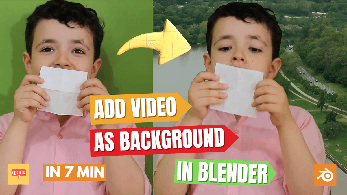
How to Add a Video as a Background in Blender? youtu.be/RJYRcTeG9Gk?si=utVE… #Blender #VideoBackground
#BlenderVideoEditing #AddVideoAsBackgroundBlender
#BlenderTutorial #BlenderVideoBackground
#BlenderVSE #HowToAddVideoBackground
4
21

12 Oct 2024
Amazing neon glow background. Music, science, party, gaming video background
Buy link: shutterstock.com/video/clip-…
#Video #Neon #videobackground #backgroundvideo #background #GamingVibes #digitalart
1
1
1
70

26 Jun 2024
UPDATE: The Supreme Court of Canada acknowledged receipt of my Application for Leave to Appeal and sent me reference number FD-05264. Jesus Did That! For Details of my Charter rights Case> lorencehud.com and CHARTER RIGHTS HEARINGS givesendgo.com/GCAF8 VideoBackground
1
11
19
5,065

21 Jun 2024
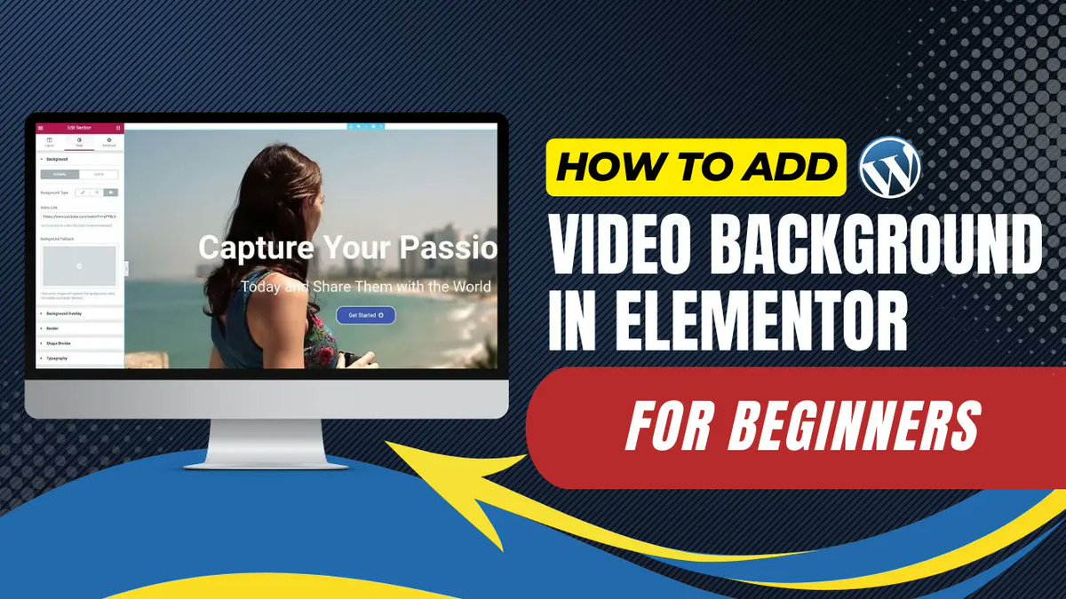
How To Add Video Background In Elementor For Beginners youtu.be/O8tmE_7xFZs?si=xqjr… via @YouTube
#Elementor #WordPress #VideoBackground #ElementorTutorial #WPTrackIt #MyContentCreatorPro #WordPressTraining #BeginnerFriendly #WPPlugins #ChatGPT #SEOTools
4
5
47

1 Jun 2024
2
7
457

4 Mar 2024
Create Wow-Worthy Videos with our Video Background Removal Service!
#VideoBackground #BackgroundRemoval #WowVideos #VideoMarketing #VideoEditing #EditingServices #GraphicDesign #teamPCR
Email: info@photoclippingretouching.com
Link: photoclippingretouching.com/…

1
15

21 Feb 2024
WPBakery Mega Pack - Addons and Templates
stylelib.org/visual-composer…
#adtheme #addons #addons #codecanyon #extendedrow #icons #parallax #sliderbackground #templates #timeline #videobackground #woocommerceaddons #wordpress
1
18

9 Feb 2024
Green #liquidglass #background for #motiondesign with sphere that moves dynamically. Perfect for subtitles #videobackground. #StockVideo | #AdobeStock stock.adobe.com/stock-photo/…
2
37
