
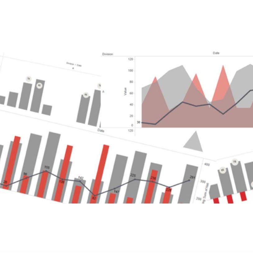
Make your notes even more effective with XNote's charting feature. Whether you're tracking progress, organizing data, or visualizing ideas, XNote offers multiple chart types to help you get a clear view of your information.
🔹 Pie charts for clear breakdowns
🔹 Bar charts to compare data
🔹 Line charts to track changes over time
No more messy notes. Keep everything organized and visually appealing! With just a few clicks, you can turn your data into a meaningful chart.
Start organizing smarter with XNote today!
#xnote #charting #productivitytools #visualizeyourdata #notetaking #worksmart #organizednotes #efficiency

4
81

Not only ATLAS.ti desktop is new, we also added some new features to #ATLAStiWeb. You can now add images to text documents and visualize your code distribution in two new beautiful ways. Visit: atlasti.com
#VisualizeYourData #QDAS

1
1
6
Not only ATLAS.ti desktop is new, we also added some new features to #ATLAStiWeb. You can now add images to text documents and visualize your code distribution in two new beautiful ways. Visit: atlasti.com
#VisualizeYourData #QDAS


1
7

4 Jun 2021
fun Friday night - learning more about data visualisations with cool folks from all over the 🌎 at @isls2021 workshop “Leveraging the Power or Visualisation in the Analysis of Classroom Audiovisual Data”. thanks for the opportunity!! #edresearch #LETOulu #visualizeyourdata
7

30 Apr 2021
Want to track habits? Here’s my how and why! 🤩 Shout outs to @klbeasley and @JamesClear in the vid. #visualizeyourdata #habittracking
29 Apr 2021

Need some inspiration? Check out this short interview with @carrie_zimmer about habit tracking and goal setting. I’m planing out the things I would like to track for the month of May and I am excited to get started!
youtu.be/6qeu00ZwQTM
1
1
6

31 Jan 2020
.@Laserfiche president @KarlChan does an excellent job in @insideBigData conceptualizing how software #bots let you #visualizeyourdata. #DataAnalytics #DigitalTransformation @KirkDBorne @AndrewYNg @Ronald_vanLoon @SpirosMargaris @MikeQuindazzi insidebigdata.com/2020/01/24…
1
1
3

#Kineviz would like to share our gratitude for @ARealityEvent & @VRWorldSociety for the #nextantaward & moderating #XR4good track at #AWE2018. None of this would have been possible without our partners @ADL_National for allowing us the opportunity to #visualizeyourdata in #WebVR
17 Jul 2018

The Hidden Story Behind Hate Crimes: @ADL_National Enters WebVR. CTS and Kinevitz discuss using data visualization in VR at @ARealityEvent. Thanks to @VRWorldSociety for hosting -- and for presenting us with the Nexant Medal for this work! youtu.be/d6iv0LbGXsI
1
2
5

26 Jun 2018
With significant Dashboard updates and new product controls, you won't want to miss this Thursday's webinar @ 11 A.M EDT. Sign up now: bit.ly/2K7Eole #VisualizeYourData #WebDevelopment

2
3

21 Jun 2018
With Veritas Information Map your data is visible actionable intelligence. #visualizeyourdata

2
2

5 Jan 2018
7 tips and tricks from the dashboard experts. #Reallycool ! #Analytics #VisualizeYourData tabsoft.co/2ESEhnf
1

8 Nov 2017
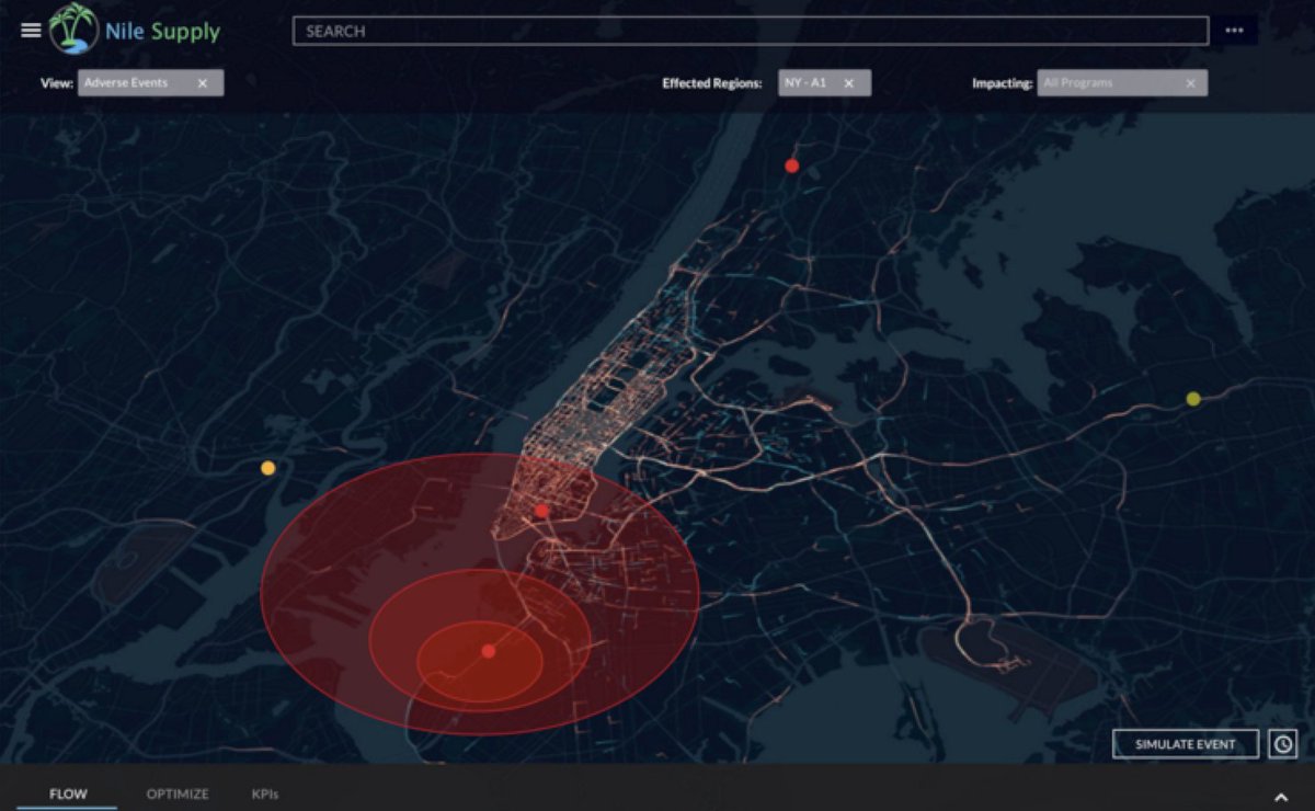
View your alternatives in real-time, change the outcome, and take control of your #supplychain when events happen that are out of your control. #supplychain_expero #graphdb #nosql @uxchrislacava #visualizeyourdata #savemoney

2

7 Nov 2017
Protocol for data, focus on students. #data #visualizeyourdata Thanks @JordanGBenedict for making data beautiful! nctm.org/Publications/Teachi…
1
2

20 Oct 2017
#Microsoft #PowerBI - the power to #visualizeyourdata - what story is your #data telling you? linkedin.com/pulse/power-bi-…
1

12 Oct 2017

2

CDISC Europe Interchange Day 2 / Program Overview #IVIDATAStats #CDISCEurope #CDISC #VisualizeYourData #ividata

2

2 Feb 2016
2 Feb 2016

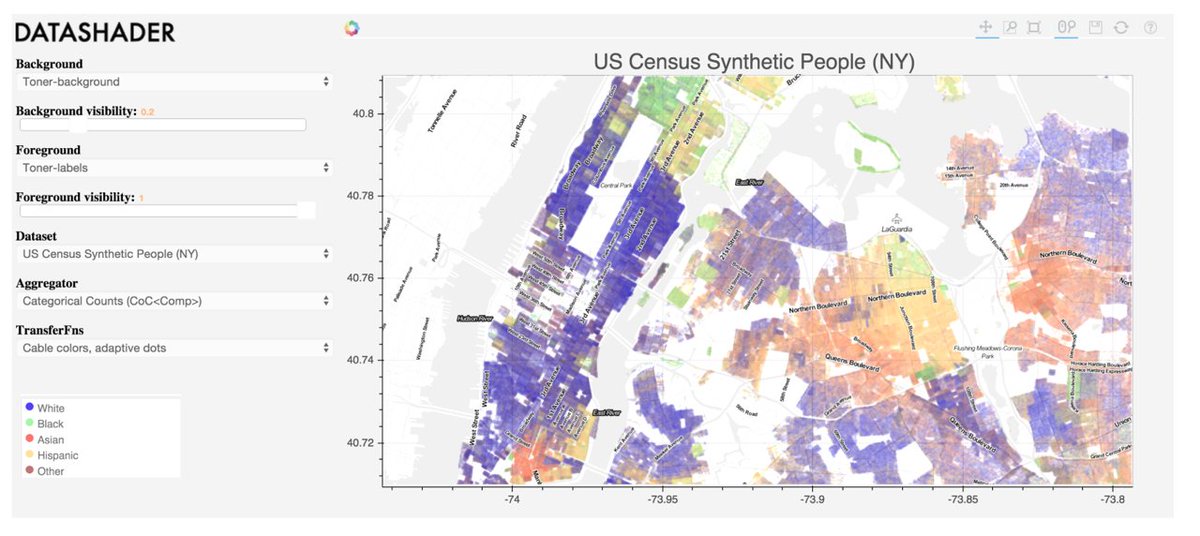
Visualize 1B points of data with our new #BigData approach via @pwang @JamesABednar on 2/9 bit.ly/1nJ9O1O
3
6

@MaxCRoser I keep a copy of Anscombe's quartet on my phone and in my office as a response to "we'll the average is..." # visualizeyourdata

13 Apr 2015
Enthusiasm about how @Domotalk will change the face of our decision making at @restorationm following #DP15 is exciting #visualizeyourdata
1
5