
This meme gets it exactly right.
Bernie and a lot of politicians want you to imagine Elon sitting on a massive pile of cash like some cartoon villain hoarding gold. That’s not how it works.
His net worth is almost entirely tied up in Tesla and SpaceX stock. He’s said himself that less than 0.1% of it is actual cash. The rest is ownership in real companies that build things.
Tesla has over 100,000 employees making electric cars, batteries, and energy systems. SpaceX has thousands of people working on rockets and Starlink. These aren’t abstract numbers on a spreadsheet. They’re factories, engineers, technicians, and workers who get paid and, in a lot of cases, own stock themselves.
Just recently SpaceX’s valuation turned more than 4,400 of those employees into millionaires. Not just executives — regular people who helped build the rockets.
The money isn’t sitting idle either. It gets poured back into the companies. That’s how they dropped rocket launch costs dramatically and got Starlink internet out to millions of people who never had decent access before. Customers actually choose to buy Teslas and use Starlink. Investors and employees choose to put their money and time into these companies because they see the value.
Most of Tesla isn’t even owned by Elon. A huge chunk belongs to regular retail investors, index funds, pension funds, and the employees. When the value goes up, a lot of normal people benefit too.
Politicians know this isn’t liquid cash sitting in a vault. They just hope enough people don’t understand the difference so they can score points by pretending it is.
You can’t just grab a “trillion dollars” that mostly exists as shares in operating companies without hurting the actual businesses, the jobs, and the progress they’re making. This is what wealth creation looks like when it’s working — not some fixed pile of money getting stolen from everyone else.


12

Honestly, very smart move. We should be rapidly changing education here, but we aren’t. The old curriculum model of memorizing and spitting it out in a rigid format is something AI has overtaken.
We need to teach abstract creativity and visionary thinking—both of which AI lacks. When a person with those traits works with AI, that’s when magic happens.

CHINA ELIMINATES 12,000 ‘OBSOLETE’ UNIVERSITY DEGREES IN PUSH TO PREPARE FOR THE AI ERA
CHINESE UNIVERSITIES SCRAP 12,000 DEGREE PROGRAMS AS AI RESHAPES JOB MARKET DEMANDS
2

@navado8 has had no stable @MTNNG internet for two weeks. The consequences are not abstract: they have lost jobs because of it. They are walking around with their laptop at 3am looking for a connection strong enough to work.
When a telecom provider's infrastructure failure directly causes someone to lose income, the impact has gone beyond inconvenience. It is economic harm.
@MTNNG please urgently investigate the coverage issue affecting this subscriber and provide a concrete restoration timeline. @NgComCommission this consumer's situation illustrates exactly why QoS standards exist. @fccpcnigeria
#EthosReviews #TelecomAccountability

1

English translation:
The result of voting for someone because "it feels like they'll get things done":
- The coalition partner Komeito, long regarded as a moderate governing party, leaves the coalition.
- Foolish Nippon Ishin no Kai joins the coalition.
- High school education, including private schools, becomes taxpayer-funded.
- A reduction in House of Representatives proportional-representation seats that benefits the LDP and Ishin.
- Jumping up and down beside President Trump.
- Forcing a dissolution of the House despite it not being part of the agreement with the Democratic Party for the People.
- Skipping an important party leaders' debate before an election.
- Dissolving the House and then causing delays to the budget process.
- Making budget passage within the fiscal year more difficult and then blaming the opposition.
- Significantly shortening budget deliberations.
- The shortest and most chaotic budget deliberation period since 2000.
- Only 59 hours of deliberation—the shortest since 2000.
- Reducing intensive committee sessions.
- Reducing subcommittee sessions as well.
- No budget subcommittee meetings held for the first time in 37 years.
- A wave of criticism for showing disrespect toward the Diet.
- Questions raised about the legitimacy of the so-called National Conference.
- Criticism that participants were selected arbitrarily.
- Tax and social security issues effectively outsourced to the "National Conference."
- Prioritizing election campaigning even during times of crisis.
- Campaigning in Ishikawa even amid the Iran crisis.
- Worsening relations with China.
- Increasing concerns over supply-chain instability.
- Missing important diplomatic engagements in the Middle East because of illness.
- Offering abstract theories instead of concrete policies in Diet debates.
- Failing entirely to fulfill accountability obligations.
- No meaningful progress on measures to address shortages and rising prices of petroleum-derived products.
- The "National Conference" ultimately appears meaningless, while the ruling parties seem poised to push through a 1% food consumption tax on their own.
- Likely to force through a proposal to cut 45 proportional-representation seats in the House of Representatives.
- Inviting criticism that smaller parties are being marginalized.
- Attempting electoral-system reform without opposition-party agreement—something many consider unacceptable.
- Changing the subject whenever faced with inconvenient questions.
- Rarely holding press conferences or informal press scrums.
- Taking only a single question from reporters.
- Leaving after only two or three minutes.
- Giving false testimony in the Diet.
- Repeatedly accused of dishonesty; many promises made before becoming prime minister—such as visiting Yasukuni Shrine—remain unfulfilled.
- Almost never engaging in substantive debates with opposition leaders; when debates do occur, they are so brief as to be meaningless.
- Using strong approval ratings among devoted supporters to justify a forceful style of governance in virtually every area.
- With Ishin now part of the coalition, critics fear that plans such as the Osaka Metropolis concept may also be pushed forward aggressively.
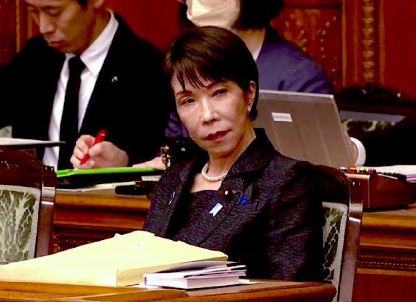
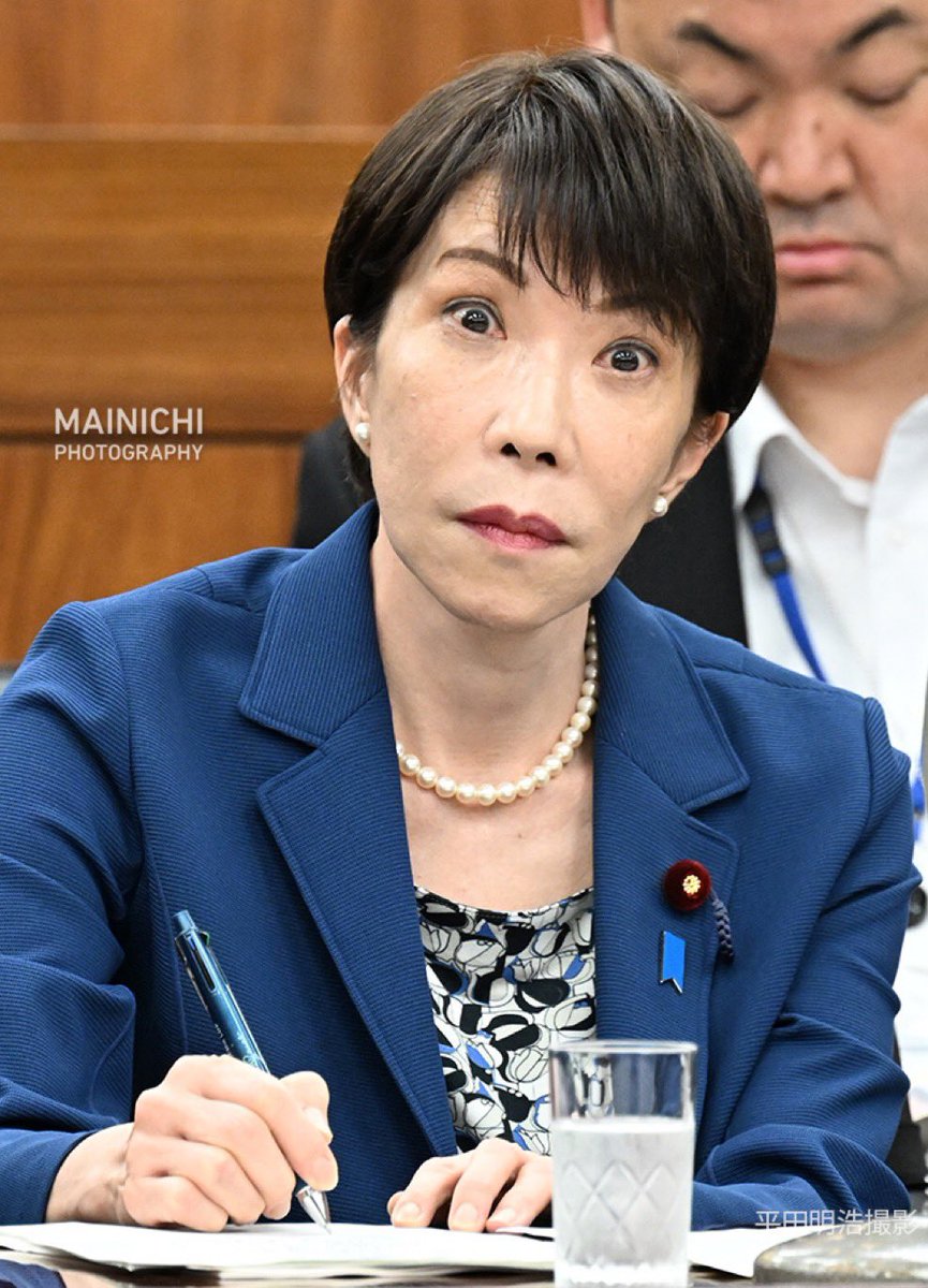
- Beyond being "Japan's first female prime minister" and the vague impression that "she seems like she'll get things done," there appears to be little else on which her supporters base their evaluation.
I can state without hesitation that Takaichi lacks the ability to govern this country.
#拡散希望 #RPご協力お願い致します #拡散希望
#RepostPlease #PleaseShare
@bbcnewsjapan @BBCWorld @France24_en @France24_fr @afpbbcom @afpfr @nhk
16h

「なんかやってくれそう」の結果
・良識の与党公明党が連立離脱
・アホの維新が連立入り
・私立含む高校の税金化
・自民維新に有利な衆院比例のみ議員定数削減
・トランプの横でぴょんぴょん跳び跳ね
・国民民主党との合意の前提にない解散強行
・選挙前の大事な党首討論を欠席
・自分で解散して予算遅延
・年度内成立を自ら困難化して野党のせいに
・予算審議を大幅短縮
・2000年以降で最短の無茶苦茶
・2000年以降で最短の59時間
・集中審議を削減
・分科会も削減
・予算分科会は37年ぶりに開催なし
・国会軽視との批判噴出
・国民会議の正統性に疑義
・恣意的人選との批判
・税や社会保障は「国民会議」に丸投げ
・危機時でも選挙応援を優先
・イラン有事でも石川の選挙応援演説
・対中関係を悪化
・供給不安を拡大
・大事な中東との外交日程を体調不良で飛ばす
・国会答弁では具体策でなく観念論が先行
・説明責任はまったく果たさない
・石油由来製品の供給不足・価格高騰対策はまったく進まない
・結局「国民会議」なるものは無意味で、勝手に与党だけで食料品消費税1%を強行しそう
・衆院比例45議席削減案を強行しそう
・少数政党切り捨てとの批判を招く
・選挙制度改革を野党の合意を得ずに強行はあり得ない
・都合の悪い質問には論点ずらし
・記者会見やぶら下がり会見はほとんどやらず
・質問は全体で1問のみ
・2〜3分で逃げる
・国会では虚偽答弁
・とにかく嘘つき。総理になる前にやると言っていたことはまったくやらず(靖国神社参拝など)
・野党との党首討論をまったくやらない。やってもわずかな時間すぎて意味なし。
・狂信者による高支持率を背景に、あらゆる面で強引な政権運営を強行
・維新も連立入りしたことで高市内閣の高支持率を背景に大阪都構想を強行しそう
・「日本初の女性総理」、「なんかやってくれそう」以外の評価軸がまったく見当たらない
高市にわが国を統治する能力は皆無と断言できます。


9

In your product:
Never hard-wire one model.
→ Abstract the model layer
→ Swap providers with a config change
→ Keep a local fallback for tasks it can cover
No directive can take down what runs on your own machine.
1
2

It was rejected because art galleries actually want to sell art. Most popular contemporary art have abstract or secular themes. Museums that have religious paintings are because the artist was famous, not the religious themes.
305

"modal realism"-- (r-w)
Modal reasoning is central to human cognition, since it is pervasive both in philosophy and in everyday contexts. It involves investigating and evaluating claims about what is possible, impossible, essential, necessary, and contingent. Some things could have been different from what they actually are; other things could not have been.
The term "modal realism" is most widely associated with David Lewis, who contends that all possible worlds are equally real and exist outside of our own. Additionally, unlike the real world, we should consider all imaginable worlds as real and actual rather than treating them as, say, abstract or linguistic entities that exist only in our minds. Stated differently, there is a <"dark"> counterpart to you.
We speak in counterfactuals all the time—something that could have happened but did not. What are they referring to? "Counterfactuals" refers to possible worlds. Things that didn’t happen and things that don’t exist, like a life free of regrets.
But if we don’t know what these sentences are referring to, how do we know that they are true?
Modal realists like David Lewis will tell you that every possible world happened or is happening. Because all possible worlds are equally real, the only thing that makes this possible world any different is that you are in it. Unfortunately, possible worlds aren’t spatially or temporally connected, so you can’t jump into the very near possible world.
But if you buy into any of this modal realism stuff, perhaps you could be happy that your counterpart took the plunge. You see, with possible worlds, there are good ones and bad ones, the best and the worst.
So the next time you’re considering what could have being, think of modal realism. You will be glad you did. Then, you will realize that this is not the worst of all possible worlds. You're just sitting at home or working on X (Twitter) bemoaning your fate! How bad is that?

1
8


🖤 ✄ LesbianScissorLegs 🌈💜 retweeted

Jun 12
i really do think she had to abstract there was no other way


6
2
165
4,292
Nico5D.Kongz retweeted

Looks like people on Abstract are finally finding out what Ronin Network users have been experiencing for years. 😂

If they no longer serve a purpose because the game is shut down then the utility of the NFT was rugged. These skins were collected by people because we were told they were the first of many.
1
1
4
334
Rosy retweeted

It's my pleasure, Marc . have a wonderful day. I am always appreciate your talent as an abstract artist. 🌹🌼🌻
1
1
3

Can you think in sound? Can you think in other abstract ways? More than language. The brain is a wonderful things
6
Matt S retweeted

Jun 12
Aesthetics can change the world.
They take an ideal from the realm of the abstract
and bring it down to earth,
for you to grasp and contemplate it.
Think of the impact Whiplash had on hustle culture.
See how David Goggins personifies, literally, an ideal.
Past movement understood this:
nationalism, communism & fascism
thrived on aesthetics.
This has made classical liberals allergic
to a higher aesthetic vision,
thinking it's only for unthinking hordes.
What a great mistake.
We need more stories…and we have so many.
Our ideas ended slavery,
took humanity from the gutter to skyscrapers,
and yet we are boring and uninspiring.
Or think of how much we could be doing
with the heroes Ayn Rand gave us.
We have the best ideas in the world,
and sell them with the excitement one would sell
fax machines.
The joke is on us.

4
16
88
1,471

Got lost in the vibrant abstract brushstrokes at the street art pop-up tonight! The way color and movement blend Pure magic for the soul #ArtVibe #UrbanCreativity,
Rosy retweeted
It is my pleasure, Marc. I am the one who should say thank you for sharing wonderful abstract paintings and giving me positive energy. Thank you so much Marc 🌹 💓
1
1
3

17m
My 2nd concept submission.
After completing my first concept for @Internetmoneyio, I wanted to explore another side of the brand.
The first direction was more institutional and system-based. This second concept carries more character while still keeping the logo simple, scalable, and usable as an app icon.
The idea is a wizard hat over a coin.
1. The spark behind the idea
A coin is already a clear symbol of money, value, and ownership. But in crypto, coin-based logos can easily feel expected. Circles, shields, chains, arrows, and abstract tokens are everywhere.
I wanted this concept to stay connected to finance, but with a stronger memory.
The wizard hat brings that extra layer. It suggests knowledge, creation, protection, and the ability to understand systems that seem complex from the outside. That connects naturally to crypto, where understanding the system changes how much control a person has.
This is not fantasy used as decoration.
It is fantasy used as a metaphor.
2. Why it fits Internet Money
Internet Money represents self-custody, permissionless access, privacy, and financial independence. Those ideas require more than simply using a wallet. They require the user to understand what they hold and why control matters.
That is where the wizard direction fits.
A wizard is culturally tied to intelligence, creation, and shaping outcomes through knowledge. In the context of @Internetmoneyio, that becomes a symbol for people who choose to move outside traditional financial gates and hold control directly.
I also noticed that @BrotherKDG has shared design ideas with a fantasy, wizard, or mage-like direction before. That made this concept feel even more relevant to explore, because it connects with a visual language that already feels close to the personality around the brand.
The hat gives the mark character. The coin keeps it grounded in money. The star adds a small point of clarity and signal.
Together, the logo becomes simple, recognizable, and different from the usual crypto mark.
3. The app icon test
I imagined this logo where users would actually see it every day: on a phone screen.
At that size, people do not study details. They recognize shapes.
The wizard hat creates a clear silhouette. The coin gives the icon context. The blue accent ties it back to Internet Money’s visual identity. Even when reduced, the mark still feels readable and distinct.
Internet Money is something people open, use, and trust. The logo has to work beyond a presentation board. It needs to survive as an app icon, favicon, browser mark, and social profile image.
4. Light and dark mode
The concept is built for both light and dark mode.
In dark mode, the mark feels more private, secure, and focused. In light mode, it becomes cleaner and more accessible. The mood changes, but the identity stays the same.
It's important for a digital brand. Internet Money lives across apps, websites, browser extensions, and social platforms, so the logo should adapt without losing recognition.
5. The philosophy
The deeper idea behind this concept is simple:
• Money becomes more powerful when the person holding it understands it.
Traditional finance often asks people to trust the system. Crypto gives people a chance to understand the system. Self-custody brings that control closer to the user.
That is the reason this concept felt worth exploring. The wizard brings knowledge and creation. The coin brings ownership. The full mark becomes a compact symbol for people who want control instead of permission.
6. Final view
This second concept is built around character, recognition, and meaning.
It keeps the financial connection through the coin, adds personality through the wizard hat, and uses the star and blue accent to align with the Internet Money identity.
The idea is bigger than "money on the internet".
It is about understanding your value, holding it directly, and moving without waiting for permission.
🪄 💰


1
15
rulerjam's archnemesis, the gay version retweeted

those who are abstract and a tragedy

7
78
473
3,677
Rosy retweeted

Jun 13
Abstract work by Marc Cuypers 800x1100
(1996) Trinity. 🇧🇪

10
51
158
1,212