
14m
kak kalau buang outlier tuh harus pake metode tertentu kah? misal boxplot,z-score, tp harus dibuang dr output angka yg paling tinggi kah atau boleh dipilih2 lagi ya yg mana yg mau dibuang gtu datanya?
2

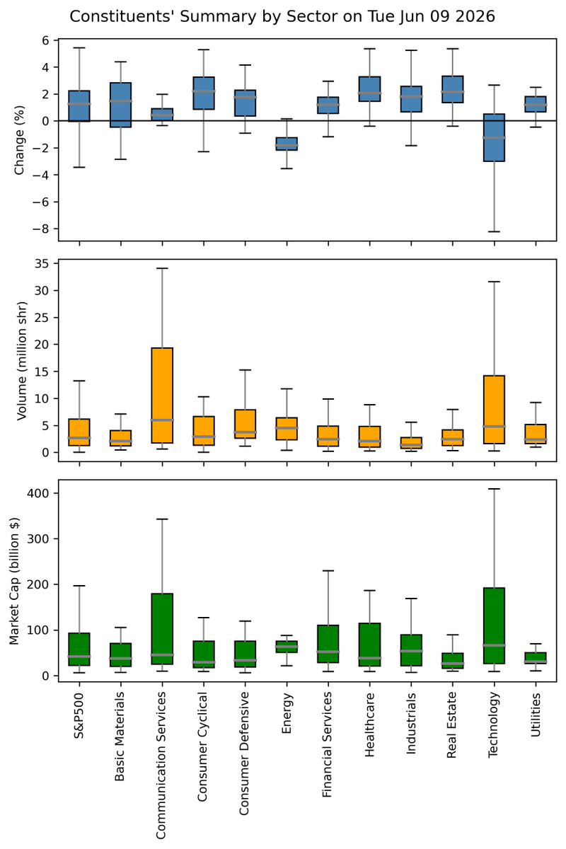
Can you make a similar overview of Campaign?
How many exiles made it through each act (eg funnel chart)
Exile kills per super unique boss (so we can see monkey vs viper etc)
Plot time spent on campaign (eg histogram or boxplot)
51

This analysis explores electricity consumption, water usage, infrastructure capacity, and sustainability metrics across AI data centers. The boxplot visualization reveal that while most facilities operate within moderate resource ranges and a small number of hyperscale facilities

📊 AI Data Center Deep Analysis using Python ⚡💧
Analyzed:
• electricity usage
• water consumption,
• capacity
• PUE and WUE
Through statistical boxplots to uncover operational variability, resource-intensive facilities, and sustainability insights.
#DataScience #AI

1
1
5


Jun 13
The "Grammar of Graphics" is a powerful concept that ggplot2 in R is built on. It breaks down the process of data visualization into layers, making it easier to customize and understand how to build effective charts.
The visualization illustrates the essential layers used to create a plot:
1️⃣ Data: The foundation, where you start by defining the dataset.
2️⃣ Aesthetics: Map variables to visual aspects like color, size, and position.
3️⃣ Geometries: Specify the type of plot you want, such as bar, line, or scatter.
4️⃣ Facets: Create subplots for different subsets of your data.
5️⃣ Statistics: Add statistical transformations, like mean lines or trend lines.
6️⃣ Coordinates: Control the plot’s coordinate system, such as flipping axes.
7️⃣ Theme: Adjust the overall appearance, like grid lines, font styles, and background.
In the code example shown, each of these layers is combined to produce the boxplot visualization. The process starts with defining the data and aesthetics, then moves through geometries, adding facets to split the data by groups, and even applying statistical transformations to highlight the mean value of each group. Finally, it configures the coordinates and finishes with a clean theme.
Want to dive deeper into creating beautiful and informative visuals with ggplot2? Check out my online course on "Data Visualization in R Using ggplot2 & Friends!" Learn more by visiting this link: statisticsglobe.com/online-c…
#DataScience #RStats #VisualAnalytics #Rpackage #tidyverse #database #Data #programming #datavis
4
68
1,592


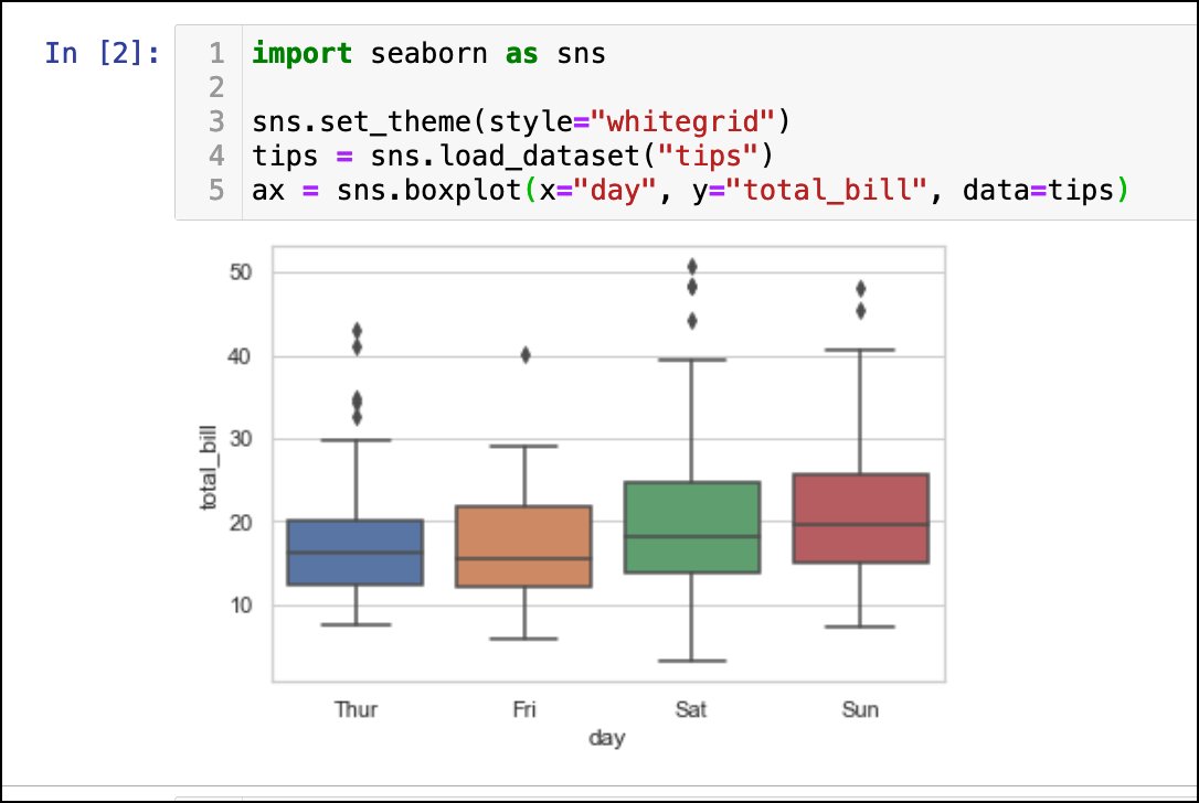
📊 A boxplot shows data distribution with a box for the middle 50%, lines for min/max values, and dots for outliers.
Outliers are values much higher or lower than most.
They help us spot unusual data points!
1
4


Jun 11
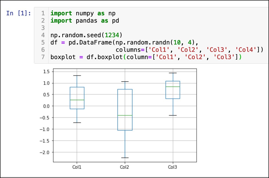
Import pandas as pd
Import numpy as np
np.random.seed(1234)
df= pd.DataFrame(np.random.randn(10,4), columns=['col1','col2','col3','col4'])
boxplot= df.boxplot(column=['col1','col2','col3'])
Kudos Sir.✔️

2
14

Jun 10
Is there an explanation for why the median T-grammar predicted activity for activating primed generations remains the same regardless of giving Evo2/EVA 2 examples or 256? Not looking at the difference here, just "blue" boxplot medians
85

Dá uma olhada de usar boxplot/candle pra mostrar latência
Candle (tipo de bolsa) é basicamente boxplots lado a lado em janelas de tempo, só muda o dado que tá trackeando (latência vs preço de negociação de algo)
55

1/ Can you trust a boxplot with a small sample size?
Not always. The median might lie to you.
Let’s simulate why, with R code.

1
1
27
6,129

Oder je ein Boxplot je Jahrzehnt und ziehen eine Linie von mittlerem Wert zu mittlerem Wert für den Verlauf. Dann ist das auch komplett dargestellt.
Habe leider kein minitab mehr, damit ist soetwas sehr schnell und 100 % nachvollziehbar erstellt.
1
5
114

Segue o passo a passo de como fazer 10 diferentes tipos de gráficos no R, incluindo histograma, boxplot, dispersão, dispersão com reta de regressão, gráfico de coeficientes, gráfico com valores preditos e mapas. Pronto, agora é contigo.
youtu.be/T7x0_qDHF_o
2
14
1,014

New @tale_shape Visualization Option: Confidence Bands
Allows you to show a band for a line chart which is great to show extra statistical context
(the confidence of a prediction, the spread of a distribution, etc)
Nnice middle ground between only a line and a full Boxplot.

1
1
2
60
4/
Know your plots:
Barplot. Scatterplot. Histogram. Boxplot. Lineplot. Heatmap.
They're not decoration.
They're how you think with data.
1
2
247