

Jun 8
I mean its just like how people tend to only learn react cause their job forces em into it and due to that they never look outside of the box,everyone outside of that box just uses modified chartjs of some sorts paying for trading views chart would be wild especailly in 2026
26

Jun 8
just use chartjs and modify that solid foundation for whatever
1
1
397

𝟓 𝐁𝐞𝐬𝐭 𝐉𝐒 𝐂𝐡𝐚𝐫𝐭 𝐋𝐢𝐛𝐫𝐚𝐫𝐢𝐞𝐬 𝐟𝐨𝐫 𝐃𝐚𝐭𝐚 𝐕𝐢𝐬𝐮𝐚𝐥𝐢𝐳𝐚𝐭𝐢𝐨𝐧 𝐢𝐧 𝟐𝟎𝟐𝟔
Most developers do not struggle to find a chart library. They struggle to choose the right one.
Chart.js, D3.js, Apache ECharts, Highcharts, and AnyChart each solve different problems. The best choice depends on your data volume, customization needs, performance requirements, and development stack.
A practical comparison of the top JavaScript chart libraries shaping data visualization in 2026.
#JavaScript #DataVisualization #ChartJS #D3JS #ApacheECharts #Highcharts #analyticsinsight #analyticsinsightmagazine
Read More 👇
zurl.co/ldb5C

33

JSONデータ読み込んでChart.js で円グラフかくサンプル。グラフ以外と簡単に作れるな。
#Chartjs #データ可視化 #フロントエンド
copipe-de-ui.net/examples/ch…
1

Jun 5
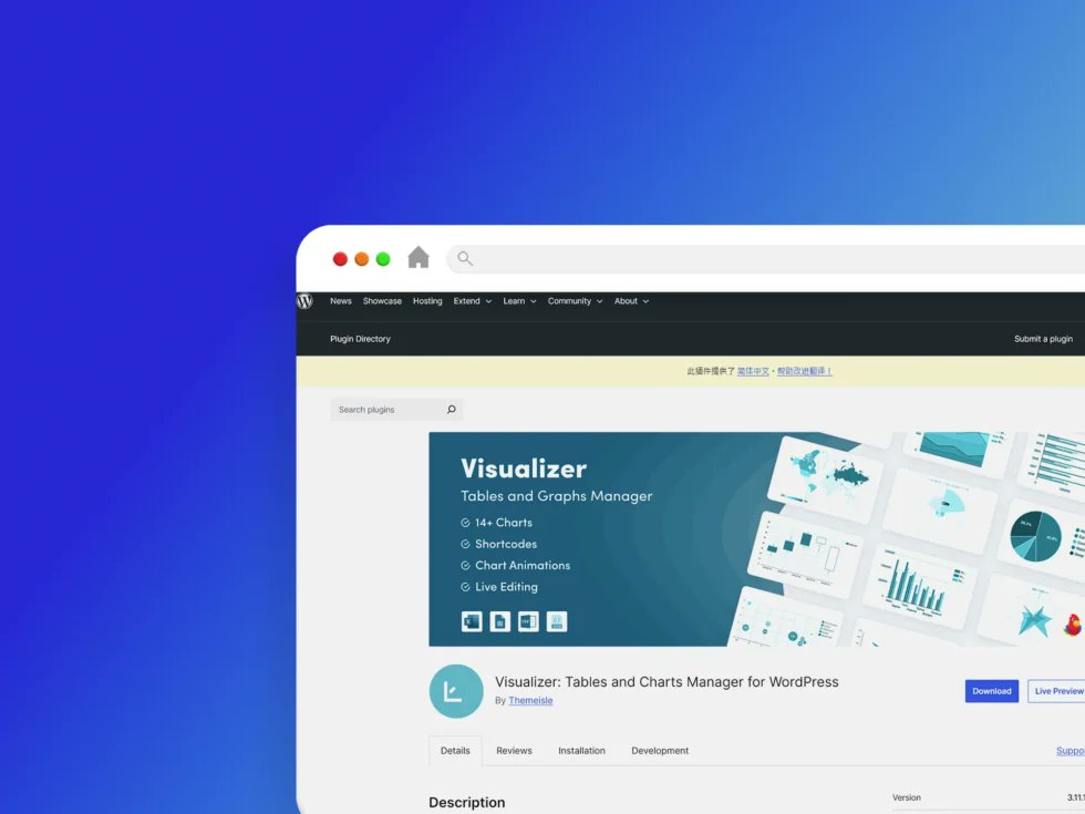
❤️ Visualizer 是一款功能強大且易於使用的 WordPress 外掛,能在文章與頁面中創建、管理並嵌入互動式、響應式圖表與表格。它融合了 Google Visualization API、DataTables. net 及 ChartJS,確保跨瀏覽器相容與完善的行動裝置體驗。
Visualizer 外掛程式:blog.tw/visualizer-外…
1
7
Jun 4
Upd AJAX/ #PHP template Version 3.444 - 06-Jun-2026 (CU-plugin) update cumx5/chartjs-main.js V1.01 to add tick marks to Rainfall graph bit.ly/gLdrTq
48

Jun 2
Built a Multi-Page Freelance Dashboard using Tailwind and Chart.js.
Designed an admin interface with project tracking, profile settings, and data visualizations.
Focused on dynamic layouts, notification systems, and UI consistency.
#Dashboard #WebDev #ChartJS #Internship
6
144


the actual stack I build on in 2026:
device: samsung s20 with dex docked to monitor
mobile dev: termux (full linux env on android)
editor: vim mostly, vscode when on the windows PC
runtime: node.js
storage: mongodb atlas (free tier still goes far)
infra: railway for deploys
AI: groq for inference (fastest you can get)
charts: chartjs-node-canvas (server-side rendering)
constraints made me find tools nobody talks about. that became my edge.

half my dev work happens on a samsung s20
samsung dex turns it into a desktop. termux runs node. ssh into my server when I need real compute.
the "you need a $3k macbook to build" thing is mostly cope
constraints force creativity
the bot doesn't care what device you wrote it on
ship from wherever you are
2
119

Igual llevo 15 años haciéndolas en html. Pero es que tenía que preparar un informe rápido la semana pasada con mucho gráfico y por comodidad opté por html, chartjs e imprimirlo en pdf
107

May 18
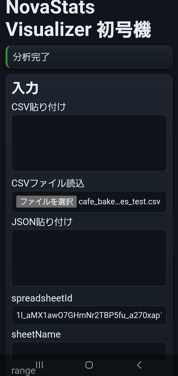
GPT総括→Grok用
結論:
NovaStats Visualizer 実装時間は1時間40分。
目的:
数値列1列を選択し、基本統計量・ヒストグラム・箱ひげ図・外れ値一覧を表示する統計可視化アプリを作成する。
既存のカイ二乗分析アプリ、単回帰アプリ、NovaGraph Liteには統合せず、統計可視化専用アプリとして分離した。
作業A:GASスタンドアロン構成の新規作成
対象:
Code.gs
Index.html
Styles.html
JavaScript.html
変更内容:
GASスタンドアロンWebアプリとして新規構成。
doGet / include を実装。
SPREADSHEET_ID は Script Properties から取得。
DRIVE_FOLDER_ID は任意設定とし、未設定時は DriveApp.createFile にフォールバック。
getActiveSpreadsheet は使用しない構成にした。
作業B:入力処理
実装内容:
CSV貼り付け
CSVファイル読込
JSON貼り付け
Google Sheets範囲読込
ヘッダー行指定
ヘッダーなしモード
CSV処理:
簡易 split(',') ではなく、ダブルクォート対応のCSVパーサを実装。
カンマ入り値、全角数字、欠損、N/Aをテスト可能にした。
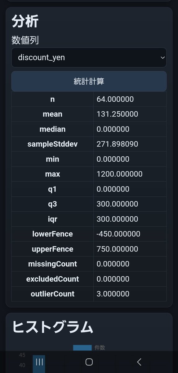
作業C:統計処理
実装内容:
数値列候補抽出
数値正規化
欠損数
除外数
件数 n
平均
中央値
標本標準偏差
最小値
最大値
Q1
Q3
IQR
lowerFence
upperFence
外れ値件数
外れ値判定:
IQR = Q3 - Q1
lowerFence = Q1 - 1.5 × IQR
upperFence = Q3 1.5 × IQR
範囲外を外れ値として判定。
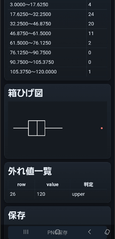
作業D:可視化
実装内容:
ヒストグラム
箱ひげ図
外れ値一覧
ヒストグラム:
Chart.js barで描画。
bin数は sqrt(n) ベース、最小5・最大30。
箱ひげ図:
外部箱ひげ図プラグインは使わず、Canvas 2D APIで自前描画。
表示要素:
左ひげ
Q1
中央値
Q3
右ひげ
外れ値赤点
修正内容:
箱ひげ図PNG保存時に透明背景で見えにくかったため、canvasに背景色を塗ってから描画するよう修正。
線色を白、lineWidthを2に変更。
スマホ表示で箱ひげ図が大きすぎ、外れ値一覧を潰したため、boxplot-wrapを追加し、boxplotCanvasの高さを180pxに固定。
overflow:hiddenも指定して表示崩れを止めた。
作業E:保存処理
実装内容:
ヒストグラムPNG保存
箱ひげ図PNG保存
Drive保存
Androidスマホ本体保存
Sheetsログ保存
Drive保存:
histogram_png_url
boxplot_png_url
を保存。
Sheets保存:
stats_visualizer_logs シートに保存。
保存項目:
log_id
created_at_jst
source_type
column_name
n
missing_count
excluded_count
mean
median
sample_stddev
min
max
q1
q3
iqr
lower_fence
upper_fence
outlier_count
stats_json
histogram_bins_json
outliers_json
histogram_png_url
boxplot_png_url
Android保存:
AndroidBridge.savePng(dataUrl, fileName) をJavaScript側から呼び出し。
保存先は Pictures/NovaStatsVisualizer。
Drive保存とスマホ保存を両立。
作業F:スマホ実機対応
実装内容:
Android WebViewでCSVファイル読込確認。
スマホ表示確認。
画像保存確認。
ピンチズーム確認。
クリア確認。
Android WebView設定:
javaScriptEnabled = true
domStorageEnabled = true
databaseEnabled = true
allowFileAccess = true
allowContentAccess = true
setSupportZoom(true)
builtInZoomControls = true
displayZoomControls = false
useWideViewPort = false
loadWithOverviewMode = false
検証データ:
飲食系売上CSVを作成。
パン・ケーキ・焼菓子の売上データ風。
列:
date
weekday
product_category
product_name
units_sold
unit_price_yen
gross_sales_yen
discount_yen
net_sales_yen
waste_units
temperature_c
weather
foot_traffic
staff_hours
note
テスト用に含めたもの:
外れ値候補
欠損値
N/A
全角数字
雨の日
曜日差
客数差
イベント販売
テスト結果:
units_sold列で分析成功。
n = 62
missingCount = 1
excludedCount = 1
outlierCount = 1
最大値120が上側外れ値として検出された。
discount_yen列で分析成功。
n = 64
mean = 131.25
median = 0
max = 1200
outlierCount = 3
1200円割引の3件が上側外れ値として検出された。
確認済み:
CSV読込 成功
ヘッダー認識 成功
数値列抽出 成功
基本統計量表示 成功
ヒストグラム表示 成功
箱ひげ図表示 成功
外れ値一覧表示 成功
Drive PNG保存 成功
AndroidスマホPNG保存 成功
Sheetsログ保存 成功
クリア 成功
スマホピンチ 成功
発生した問題:
1. WebViewの初期表示が小さくなった
原因:
useWideViewPort = true がフォーム中心アプリに不適切だった。
対応:
useWideViewPort = false に変更。
2. 箱ひげ図PNGが見えにくい
原因:
canvas背景が透明で、白系線だけ保存されていた。
対応:
canvas背景を #161b21 で塗ってから描画。
3. 箱ひげ図がスマホ上で大きすぎた
原因:
ヒストグラム用の chart-wrap height:320px を箱ひげ図にも使っていた。
対応:
boxplot-wrapを追加し、height:180pxに分離。
boxplotCanvasもheight:180pxに固定。
4. 外れ値一覧が潰れた
原因:
canvas本体の高さが固定されず、外れ値一覧側にはみ出していた。
対応:
#boxplotCanvas に width:100%; height:180px; display:block; を追加。
保持した構造:
既存のカイ二乗アプリには統合しない。
既存の単回帰アプリには統合しない。
NovaGraph Liteにも統合しない。
NovaStats Visualizerは数値列単体の分布確認専用として維持。
未実装:
AI評価
p値概念図
カイ二乗
単回帰
複数列比較
グループ別箱ひげ図
エラーバー
chartjs-plugin-zoom
外部箱ひげ図プラグイン
判断:
NovaStats Visualizer の役割は「分析前の数値列検査装置」。
数値列の欠損・除外・分布・ばらつき・外れ値をスマホで即確認できる。
カイ二乗、単回帰、NovaGraph Liteの前段として使える。
1
246


May 13
this chart above is my creation made with Claude by the way. you can recreate/ verify it for yourself with this prompt:
--- prompt starts ---
Create an interactive 50-state scatter plot visualizing the "carefare" thesis: home care employment vs. Medicaid budget share, with dots colored by elderly population share.
CHART:
- Title: "Home care employment and Medicaid budget share, by state"
- X-axis: "Aides per 1,000 residents aged 65 " (range 0-180)
- Y-axis: "Medicaid as % of state-funded budget" (range 0-32, percentage format)
- Dashed national-average reference lines at x=65 and y=14.2%, labeled "nat. avg 65 aides" and "nat. avg 14.2%"
- Color dots by % age 65 on a 5-bin blue ramp (lightest <16%, darkest >21%); include a horizontal color-bin legend
- Larger dots (radius 9) and full-name labels for focus states: New York, California, Texas, Florida
- Smaller dots (radius 6) for the rest, with state abbreviation labels for the top/bottom outliers and mid-quadrant carefare cluster; show all states on hover with tooltip "{State}: {x} aides per 1k elderly · {y}% Medicaid share · {age}% age 65 "
- Use Chart.js with chartjs-plugin-datalabels
DATA — please look up all 50 state values yourself from these sources, no estimates:
- X-axis (aides per 1,000 residents aged 65 , 2024): America's Health Rankings, "Home Health Care Workers" indicator, derived from BLS LAUS. URL: americashealthrankings.org/e…
- Y-axis (Medicaid as % of state-funded budget, SFY 2022): MACPAC MACStats Exhibit 5, derived from NASBO State Expenditure Report. URL: macpac.gov/wp-content/upload…
- Color (% population age 65 , 2024): America's Health Rankings, "65 Population" indicator, derived from Census Bureau population estimates. URL: americashealthrankings.org/e…
Verify each value against the source before plotting; flag any state you couldn't source. Cite the three sources in a small footer line beneath the chart. Omit DC.
1
2
10
3,713


May 7
Google Docs 里的 Gemini 也是依托答辩
我上次整理了一个 csv 文档, 先让它绘制一个折线图, excel 传统艺能了吧;
然后 gemini 画出来, 要么是工具报错, 要么是不知道为什么整个 tab 都卡死了
然后让 claude code chartjs 硬是画 html 画出来的...
1
1
661

😅 I’m starting react this month.
I use Nuxt and chartjs lib
1
1
7
Apr 29
Upd AJAX/ #PHP template Version 3.441 - 29-Apr-2026 - (Base-*) update wxgraphs.php V1.09 to fix CSS for CumulusMX ChartJS graphs bit.ly/gLdrTq
1
59