
Puedes explorar la ruta interactiva 3D de las 48 selecciones y el ranking de emisiones aquí:
🔗 seisvueltasalatierra.vercel.…
Un proyecto desarrollado con #Svelte, #D3js y #Mapbox. 📊⚽️
🙏¡Se agradece muchísimo la difusión!
#WorldCup2026 #DataViz #Mundial2026
1
1
59

🏏 Back2Back Champions 🇮🇳
A data-driven tribute to India's historic championship journey.
🎥 Sneak peek below.
🚀 Full project coming soon.
#DataViz #D3js #CricketAnalytics #TeamIndia
3

An experiment with D3 and Observable as a way to make complex data more browsable. Turns EPBC threatened fauna data into a radial field-guide structure.
Project page:
quillshadow.com/infographics…
#DataVisualization #InformationDesign #TechnicalWriting #D3js #Observable @observablehq
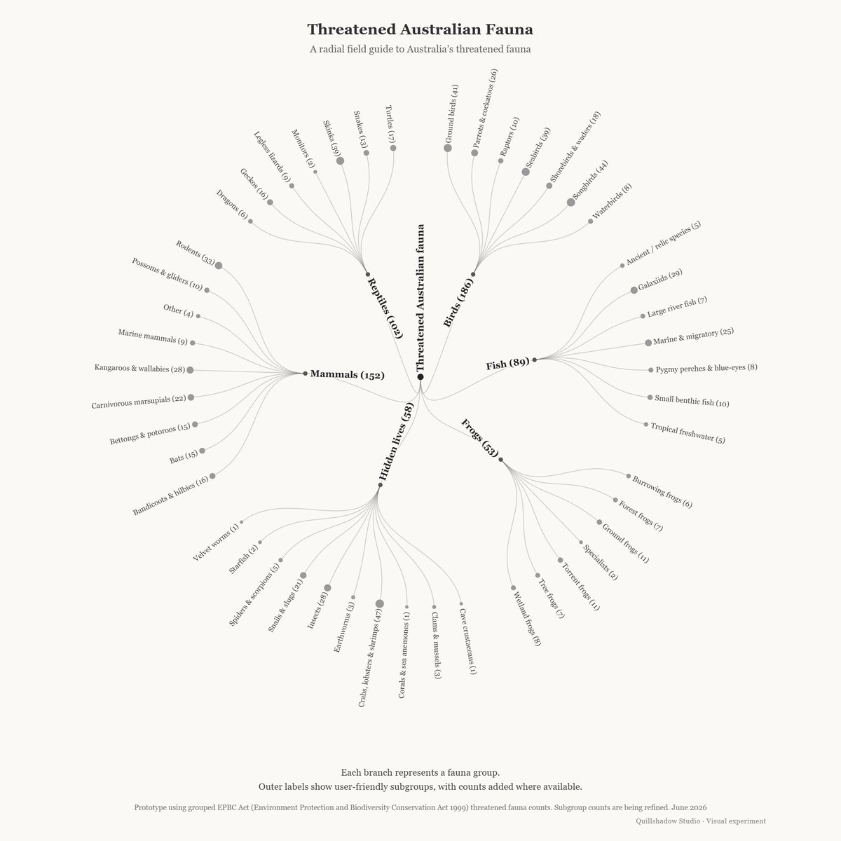
ALT Radial tree diagram titled “Threatened Australian Fauna”. The centre node branches into major fauna groups including Birds, Mammals, Reptiles, Fish, Frogs, and Hidden lives. Each group branches into smaller user-friendly subgroups such as Skinks, Shorebirds, Bats, Tree frogs, and Insects. The visual uses fine grey lines, small circular nodes, and a pale background.
16

Jun 11
Atención recruiters:
Comparto otro perfil muy recomendado de dev React. Sabrina trabajó conmigo 3 años, es una persona muy confiable y trabaja muy bien.
LN: linkedin.com/in/sabrina-alva…
CV: filebin.net/cm225icw7o19ourc…
#ReactJS #Typescript #Vite #Javascript #D3js #Redux #Python
3
332

Jun 9
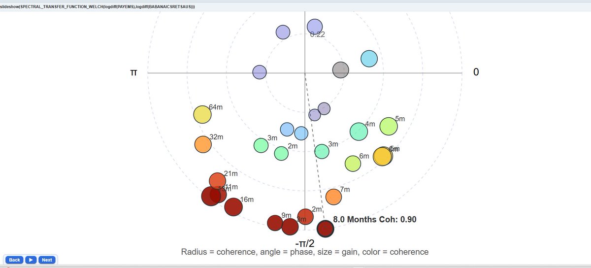
Why did I spend yesterday improving RainbowStats' spectral analysis?
Friday's employment report showed a remarkable increase in Leisure and Hospitality employment. That got me thinking about business formation. Were we missing an important signal? It also helped that it is raining in Seattle so no cycling!!
Using a new polar-coordinate transfer-function visualization, I examined the relationship between U.S. Business Applications and Nonfarm Payroll Employment.
The result was striking: an exceptionally strong relationship at the 8-month cycle frequency (coherence ≈ 0.90). The analysis suggests that business formation and hiring are tightly linked at short economic horizons, consistent with the idea that new business creation precedes employment growth.
The polar chart combines:
• Radius = relationship strength (coherence)
• Angle = lead/lag timing (phase)
• Bubble size = response magnitude (gain)
Once again, the entire analysis required just a single line of script.
I'll be away for a week. Let me know if you enjoy my posts!! Cheers and have a great trading week.
rainbowstats.com/simulations…
#Economics #Employment #Jobs
#Entrepreneurship #SmallBusiness
#DataScience #Statistics
#SpectralAnalysis #D3js
#FRED #DataVisualization
#FinTech
128
Jun 9
Coders just code. Yes, that code might be sloppy at first, but the structure is there.
I update my spectral transfer function using Industrial Production and Core CPI as my test case, I added:
• Log-scale coherence charts
• Gain and phase diagnostics
• Polar-coordinate transfer-function plots
• Dominant-cycle annotations
• Animated D3 visualizations
The result was unexpected.
At the dominant business-cycle frequency (~43 months), Industrial Production exhibits a strong relationship with future inflation. Rather than supporting a simple "more goods = lower prices" narrative, the data suggest a classic overheating cycle:
Production rises → economic activity strengthens → labor markets tighten → inflation emerges later.
The new polar chart combines:
• Radius = coherence (relationship strength)
• Angle = phase (lead/lag timing)
• Bubble size = gain (response magnitude)
• Color = coherence
The visualization makes it easy to identify which economic cycles matter and how they propagate through the economy.
All this with one line of script. Just be sure to hit the focus button. Use the back-and-forth buttons appreciate Box-Jenkins signal processing techniques. Engineers can mouse over the bubble points for signal information.
rainbowstats.com/simulations…
Interesting how often new visualizations reveal relationships that are difficult to see in the time domain.
#Economics #Inflation #IndustrialProduction
#DataScience #Statistics #D3js
#TimeSeries #SpectralAnalysis
#MachineLearning #FRED
#DataVisualization #FinTech

3
1
1,041

Top 10 game publishers and distributors for films based on video games.
Plot made using D3js
Dashboard: dataviz.manishdatt.com/posts…
#TidyTuesday #dataviz #Javascript

1
20

Jun 8
15 Claude skills worth installing. What each one does, and where to get it.
>
docx — writes Word docs and keeps every tracked change and comment intact github.com/anthropics/skills…
>
pptx — builds real slide decks instead of walls of bullet points github.com/anthropics/skills…
>
frontend-design — stops Claude from shipping the same generic layout everyone else gets github.com/anthropics/skills…
>
web-artifacts-builder — writes working React and Tailwind apps, not mockups github.com/anthropics/skills…
>
mcp-builder — helps you wire up an external API correctly through MCP github.com/anthropics/skills…
>
webapp-testing — runs Playwright on your app and shows you what's actually broken github.com/anthropics/skills…
>
skill-creator — the skill that builds skills. It just walks you through the whole thing github.com/anthropics/skills…
>
superpowers — 94k stars. 20 skills on TDD, debugging, and actually working with Claude on a codebase github.com/obra/superpowers
>
andrej-karpathy-skills — someone turned Karpathy's rant about AI coding into a single file and it hit 144k stars in weeks github.com/forrestchang/andr…
>
loki-mode — runs 37 agents across 6 swarms to take a product from idea to revenue. Worth installing just to watch it work github.com/asklokesh/claudes…
>
playwright-skill — drives a real browser for you github.com/lackeyjb/playwrig…
>
claude-d3js-skill — builds the actual chart in d3.js instead of describing what one could look like github.com/chrisvoncsefalvay…
>
trail-of-bits security skills — static analysis with CodeQL and Semgrep, from people who do this for a living github.com/trailofbits/skill…
>
Skill Seekers — point it at any docs site and it turns the whole thing into a skill github.com/yusufkaraaslan/Sk…
Smithery — the directory where you go to see what everyone already built before building your own version smithery.ai


3
470


Jun 5
おはようございます、土曜日です!😊
ゆったり気分転換したいですね。
【今日のDX占い】
本日の1位星座:うお座♓
ラッキーデータ可視化ライブラリ:#D3js
イメージを形にすると運気アップ。自由な発想を楽しみましょう✨
#情シス #DX
#企業公式つぶやき部
7
79

May 27
D3js. Works on my cheap laptop, not sure why you experience lag.
1
2
15
May 18
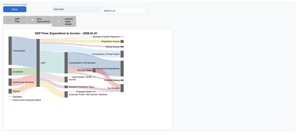
There is always a weekend project, and understanding the flows of the economy benefits everyone.
I’ve started building Sankey charts on RainbowStats to visualize how money moves through the economy — GDP flows, taxes, government spending, industry value added, and more.
Still a work in progress, but the visualizations are already revealing relationships that are difficult to see in tables alone. Over time I hope to expand these into animated historical views and more detailed sector breakdowns.
rainbowstats.com/simulations…
#Economics #DataVisualization #MacroEconomics #DataScience #D3js
2
55
Day 84. OSM Buildings - tiles with D3 🏢
Hybrid pipeline: D3 computes tile coverage, OSM Buildings serves geometry, and MapLibre renders live 3D extrusions (height base_height).
#100DayMapChallenge 84/100
#MapLibre #D3js #Geospatial
1
9
95
5,473
Apr 25
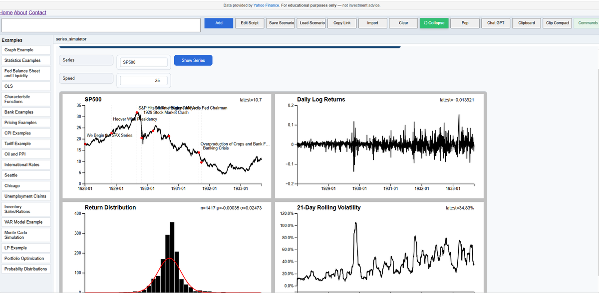
Today’s project lets you animate any FRED time series—or even a custom formula of series—and watch how it evolves over time.
You can see:
the raw series
daily log returns
the return distribution as it builds
rolling volatility
And layer in historical annotations to give real context to what’s happening.
It turns a static chart into something closer to a story unfolding in time.
Here’s the link:
rainbowstats.com/simulations…
@stlouisfed
#FRED #DataVisualization #TimeSeries #Economics #Finance #Quant #D3js #Analytics #Macro #MachineLearning #FinTech #Statistics #DataScience
1
3
203

Apr 16
Day 67. Power Grid SLD ⚡
Client project: interactive Single Line Diagram for utility topology. 600 nodes, voltage filtering, Tree↔Geospatial transitions, sticky popups, and coordinated state in D3.js React TypeScript Mapbox GL JS.
#100DayMapChallenge 67/100 #D3js
5
441

Apr 11
This is as undeniable of a fact of reindustrialization as can be, and you're the only one who's put real numbers behind it.
Has your team used D3js? It's a great way free way to visualize data
d3js.org/
A 30-60 sec video w/compelling visuals would be SO GOOD
7
815


Feb 27
Reorgs break org charts.
Recursive SQL doesn’t care.
I built an interactive org chart with:
• Java Quarkus
• PostgreSQL recursive CTEs
• Hibernate Panache
• D3.js
It survives restructures.
buff.ly/CYMf4Hl
#Java #Quarkus #Postgres #D3js #BackendDev
2
3
14
1,522

