
Dropdowns are small components, but they can have a huge impact on how users navigate a product.
See more...
#Day15 #UIUX #UIDesign #UXDesign #DropdownMenu #MegaMenu #NavigationDesign #EcommerceUI #DailyUI #100DaysOfDesign #Figma
3
2
3
47

May 26
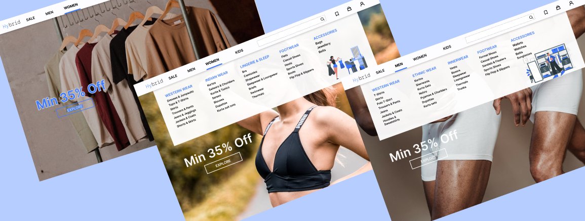
Daily UI #027 — Dropdown Menu
.
Designed a modern dropdown menu focused on clean interaction, smooth animations, and minimal visual hierarchy.
Tool: Figma
Style: Minimal • Modern
#DailyUI #DropdownMenu #UIDesign #UXDesign #Figma #UIComponents #AppDesign #MinimalUI
2
51

Stac 1.5.0 is out ⚡
What’s new:
🧭 Material 3 NavigationBar/View controller parsers
✅ Form validation via flutter_validators
🎭 Mask input formatter support
✨ TextDecoration floating label parsing
🧩 Safer DropdownMenu parsing
#ServerDrivenUI #SDUI #Flutter
pub.dev/packages/stac
2
1
15
778

Compose Unstyled 1.49.7 is now available
🤖 Apply visualTransformation when TextField is non-editable
✍️ Add textDecoration parameter to Text & TextField
🎯 Automatically focus dialog panel content when displayed
🍎 Fix iOS DropdownMenu enter animations
🪟 Fix Modals updating System UI appearance
tl;dr: a lot of bug fixes
github.com/composablehorizon…
4
36
1,823


Onze nieuwste CP-feature al geprobeerd? Je zet hem aan op cp.transip.nl! Kies je taalinstellingen in het dropdownmenu.

2
221
Nieuw bij TransIP! Zet hem zelf aan op transip.nl/cp. Kies je taalinstellingen in het dropdownmenu.

1
1
4
547

/
Nuxt UI v4.6.0 リリース🎉
\
📁 新しいSidebarコンポーネント
🤖 AIチャット向けChatReasoning/ChatTool/ChatShimmer
🔍 DropdownMenuのfilterプロパティ
✏️ InputMenuのautocompleteプロパティ
詳しくはリリースノートをご覧ください👇
github.com/nuxt/ui/releases/…
2
4
136

Mar 23
Nuxt UI v4.6 is here! 🚀
📁 Sidebar component inspired by @shadcn
🤖 ChatReasoning, ChatTool & ChatShimmer for AI chats
🔍 DropdownMenu filter prop
✏️ InputMenu autocomplete prop
🧩 Prose components in Vite plugin
...and more on:
github.com/nuxt/ui/releases/…
9
26
255
14,018

Mar 12
Yo bro, nice aesthetic with the laptop and code 😏
But... you might wanna delete/blur this ASAP. 🤣
Even though you cropped it, everything's still visible:
- full project structure (src → node_modules → public → types → utils → dropDownMenu → renderCardList → productCard.ts etc.)
- file paths & names (productCard.ts, render.ts, main.ts, vite.config.ts, tsconfig.json)
- dependencies (Vue/Vite stack, Tailwind classes like 'group relative bg-white')
- productCard logic: truncateDescription, document.createElement, image.src = product.image, price.textContent = `$${product.price}`, appendChild chain
I literally recreated the full component 1:1 from this crop in 30 seconds — it's that easy to reverse.
Be careful next time, man — this is basically handing over your project structure core logic for free. Accidental opsec fail 😅
Delete it before someone screenshots it for "inspiration" 😁😁😁
4
1,470
/
Reka UI v2.9.0 リリース🎉
\
12個の新コンポーネントが追加!
🎨 Color関連コンポーネントでフルカラースイートに対応
🔍 オートコンプリートコンポーネントを追加
⏰ タイム&デートピッカーを追加
🔽 DropdownMenuにフィルターコンポーネントを追加
詳しくはリリースノートをご覧ください👇
github.com/unovue/reka-ui/re…
2
3
112

Un problema clásico al vibecodear es que uno no sabe una mierda (es la verdad, lo siento), uno dice "hazme un modal” en vez de usar el nombre real del componente (el nombre se lo saben los devs fastidiosos, nosotros no).
Pero weno, mejoremos eso, a partir de hoy, hazlo así:
- Entra a component.gallery/
- Busca el componente que necesitas (Sheet, Command, DropdownMenu, DataTable, Popover, etc.)
- Copia el nombre EXACTO.
- Luego pegas directo a Claude:
“Agrega el componente [insertar componente] en [x parte].”
Resultado:
Claudinho: "AHHH FDP AGORA SIM ENTENDO."
15
90
1,399
78,424

Feb 19
Nieuw cliëntendossier GGzE.
Aanvraag via website indienen: er staan twee verschillende GGzE in het dropdownmenu.
Beide mogelijkheden geven aan dat je je niet via de website moet aanmelden. Mailadres en telefoonnummer worden gegeven.
1/2
1
3
200

Feb 7
Build a modern e-commerce admin dashboard UI for a platform called Shopall, focused on analytics and sales management. This dashboard should closely match a clean, premium SaaS layout with a left sidebar, top utility bar, KPI cards, charts, and a data table.
Visual success means a white, spacious interface with soft borders, rounded cards, purple accent branding, and a highly readable analytics-first layout.
2. Design System
Color Palette
•Primary: #5B5AF7 (brand purple)
•Secondary: #7C7AF9
•Background: #F8F9FC
•Surface / Card: #FFFFFF
•Text Primary: #111827
•Text Muted: #6B7280
•Border: #E5E7EB
•Accent Success: #22C55E
•Accent Warning: #F59E0B
•Accent Error: #EF4444
Typography
•Font Family: Plus Jakarta Sans (fallback: Inter, sans-serif)
•H1: 28px / 700
•H2: 22px / 600
•H3: 18px / 600
•Body: 14–15px / 400–500
•Caption / Meta: 12px / 400
Spacing & Layout
•App layout: Sidebar (260px fixed) main content
•Max content width: 1200px
•Card padding: 20–24px
•Section spacing: 24–32px
•Grid: 12-column system
•Breakpoints: Mobile <640px, Tablet <1024px, Desktop ≥1280px
Borders & Radius
•Border: 1px solid #E5E7EB
•Card radius: 12px
•Buttons / inputs: 10px
Shadows & Effects
•Cards: subtle shadow 0 4px 12px rgba(0,0,0,0.04)
•Hover: slight translateY(-1px) shadow increase
•Focus: purple ring using primary color at 30% opacity
⸻
3. Page Structure
1.Sidebar Navigation
•Logo at top (“Shopall”)
•Store selector dropdown (“Capstore”)
•Navigation groups: General, Tools, Profile
•Icons text, active item highlighted with purple background
•Footer user profile with avatar and email
2.Top Bar
•Breadcrumb: “Pages / Dashboard”
•Global search input centered/right
•Icons: notifications, settings, avatar menu
3.Upgrade Banner
•Full-width purple gradient banner
•Text: “Upgrade to Pro for unlimited analytics & real-time insights”
•Right-aligned “Upgrade Now” button
4.Overview KPI Cards
•4 cards in a grid
•Metrics: Revenue, Total Sales, Total Orders, Profit
•Each card includes icon, value, and percentage change indicator
5.Charts Section
•Left: Bar chart card (Total Sales over dates)
•Right: Line chart card (Total Revenue)
•Date filter dropdown (“Last 30 days”)
6.Last Sales Table
•Tabs: All tasks, Completed, In Progress, Pending Approval, Cancelled
•Data table with columns:
•Client Name, Date, Price, Category, Product, City, Status, Actions
•Status shown as colored badges
•Pagination controls bottom-right
⸻
4. Component Specs (shadcn/ui)
•Button
•Variants: default (primary), outline, ghost
•Sizes: sm, default
•Card
•Used for KPI cards, charts, and table container
•Badge
•Status variants: success, warning, info, destructive
•Tabs
•Used above the sales table
•Table
•With checkbox column, hover rows, actions menu
•DropdownMenu
•Filters, date selectors, row actions
•Input
•Search bar
•Avatar
•User profile and table client avatars
•Separator
•Sidebar section dividers
Ensure KPI cards and table rows are reusable components with consistent spacing and typography.
⸻
6. Images and Icons
•Use Lucide icons for all UI icons (home, chart, cart, user, settings)
•Avatars: realistic Unsplash headshots
•Charts: rendered via a chart library (Recharts or similar)
⸻
8. Implementation Notes
•Mobile-first responsive approach
•Sidebar collapses on small screens
•Ensure color contrast meets accessibility standards
•All inputs and buttons must have visible focus states
•Use realistic dummy data for metrics, names, products, and cities
•Do not leave empty placeholders or lorem ipsum text
2
80
11,603

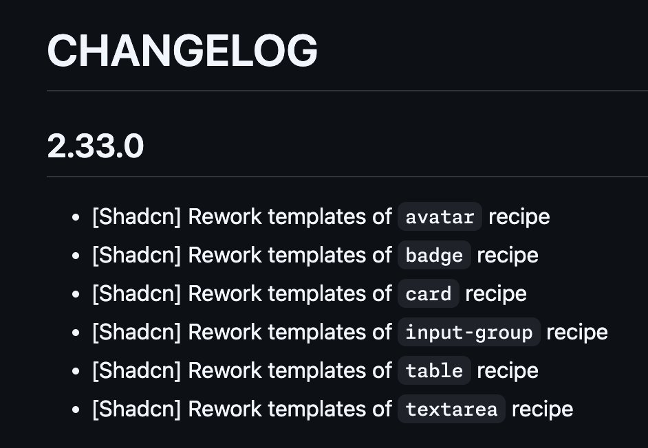
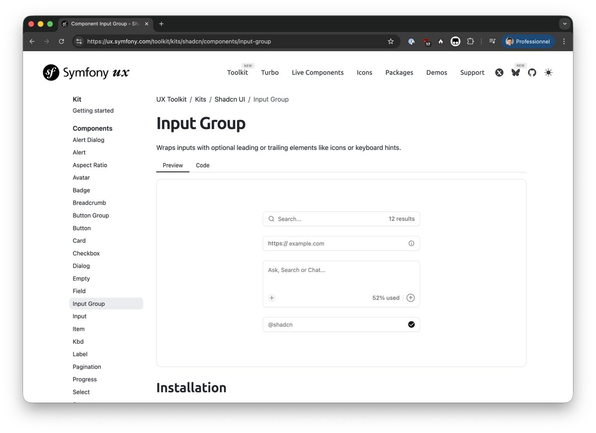
The next #SymfonyUX release 2.33 will also ship:
- React 19 support
- new Toolkit recipes for Shadcn (Accordion, DropdownMenu and Tooltip)
🏔️👨💻

🛠️ The next #SymfonyUX Toolkit release 2.33 will ship some reworked recipes!
You can already found them in `2.x-dev`, or on ux.symfony.com/toolkit/kits/… (with freshly reworked examples too!) 🚀

2
17
565


19 Dec 2025
Prompt
Build a modern SaaS admin dashboard – Customers page.
The interface is clean, minimal, and data-dense, designed for managing customer accounts. It includes a left sidebar navigation, a top-level page header, analytics summary cards, filters, and a detailed customer table with actions.
This page represents a Customers Overview inside a larger admin product.
⸻
Overall Layout
•Full-width desktop layout
•Two main sections:
1.Left Sidebar Navigation (fixed width)
2.Main Content Area (fluid, scrollable)
Use Next.js App Router and ShadCN UI components throughout.
⸻
Color Palette
•Background (app): #F9FAFB (light gray)
•Sidebar background: #FFFFFF
•Card background: #FFFFFF
•Primary brand color (buttons, highlights): #4F46E5 (indigo)
•Primary hover state: #4338CA
•Text primary: #111827
•Text secondary: #6B7280
•Border color: #E5E7EB
•Success / positive indicator: #16A34A
•Muted badge background: #F3F4F6
⸻
Typography
•Font: Inter (or default ShadCN font stack)
•Page title: text-2xl font-semibold
•Card numbers (metrics): text-3xl font-bold
•Table headers: text-sm font-medium text-gray-500
•Body text: text-sm text-gray-700
⸻
Sidebar Navigation
•Left-aligned vertical sidebar
•Logo at the top: “Untitled UI” with a cube icon
•Navigation items with icons:
•Home
•Dashboard (active state)
•Projects
•Tasks (with badge count)
•Reporting
•Users
•Bottom section:
•Notifications
•Support
•Settings
•User profile at bottom:
•Avatar image
•Name: “Frankie Sullivan”
•Username: @frankie
Active item styling
•Light indigo background #EEF2FF
•Indigo icon/text
⸻
Main Header Section
•Page title: “Customers”
•Sub-navigation tabs below title:
•Overview (active)
•Table
•List view
•Segment
•Custom
•Right-aligned actions:
•“Import” button (outline style)
•“Add customer” button (primary, indigo)
⸻
Metrics Cards (Top Summary)
Three cards in a horizontal grid:
1.Total customers
•Value: 2,420
•Growth badge: 20% (green arrow)
2.Members
•Value: 1,210
•Growth badge: 15%
3.Active now
•Value: 316
•Small overlapping avatar group on the right
Each card:
•Rounded corners
•Subtle border
•Padding: p-6
•Three-dot menu icon in top-right
⸻
Filters & Search
•Filter pills:
•“All time” (with close icon)
•“US, AU 4”
•“More filters”
•Right-aligned search input:
•Placeholder: “Search”
•Rounded input with search icon
⸻
Customers Table
Use a ShadCN Table component.
Columns:
1.Checkbox
2.Company
•Logo avatar
•Company name (bold)
•Domain below (muted text)
3.Status
•Badge:
•Customer → green badge
•Churned → gray badge
4.About
•Title
•Short description
5.Users
•Overlapping user avatars
•“ X” overflow indicator
6.License use
•Horizontal progress bar (indigo)
7.Actions
•Edit (pencil icon)
•Delete (trash icon)
Table Styling:
•Row hover effect: light gray background
•Vertical spacing: comfortable, not dense
•Icons aligned center vertically
⸻
Pagination
•Bottom of table:
•“Previous” button (left)
•Page indicator: “Page 1 of 10”
•“Next” button (right)
⸻
UI Components to Use (ShadCN)
•Button
•Card
•Badge
•Table
•Avatar
•Progress
•Input
•Tabs
•DropdownMenu
•Checkbox
⸻
Interactivity
•Hover states on rows and buttons
•Active sidebar item highlight
•Clickable table actions
•Responsive grid for cards
⸻
Images
•Use Unsplash images for:
•User avatars
•Company logos (generic tech-style logos)
•Images should be relevant and realistic
•Always use dummy images, never empty placeholder
Design Style
•Modern SaaS
•Minimal shadows
•Clear visual hierarchy
•Consistent spacing (gap-4, gap-6)
•Rounded corners (rounded-lg)
•Professional, clean, enterprise-ready
1
3
212

19 Dec 2025
Have you ever built a drop-down menu that causes a layout shift when it opens, because the scrollbar goes away?
If you are using Radix (including ShadCN), do this:
<DropdownMenu modal={false} />
1
2
175

21 Nov 2025
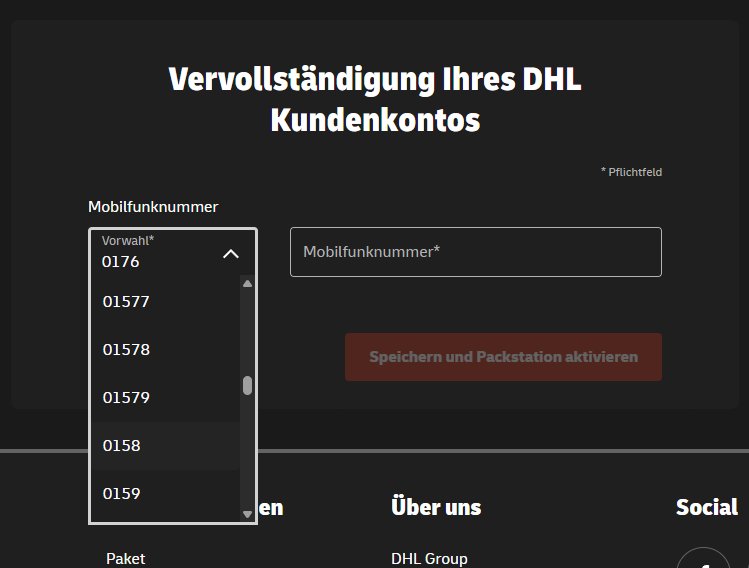
@DeutschePostDHL ist das euer Ernst, dass ich meine Handynummer über ein Dropdownmenu eingeben muss?!
1
5
96