
Valkyrie, SVG/XML to Compose ImageVector converter
Generates Kotlin ImageVector code with KotlinPoet formatting via IDEA plugin, CLI tool, or Gradle plugin
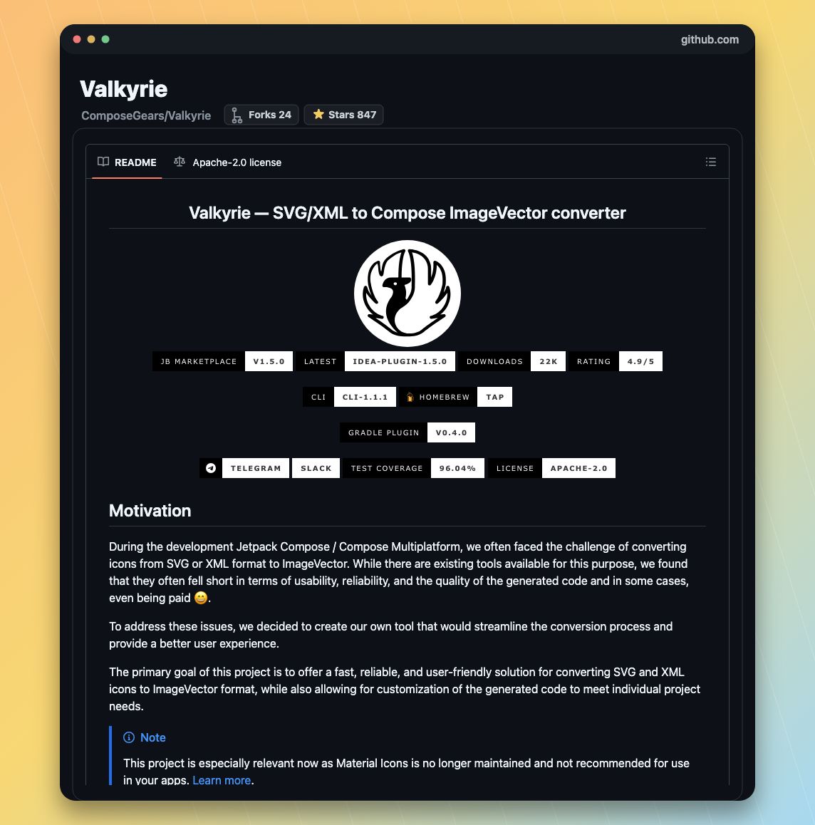
ALT GitHub README screenshot for ComposeGears/Valkyrie
1
14


Feb 24
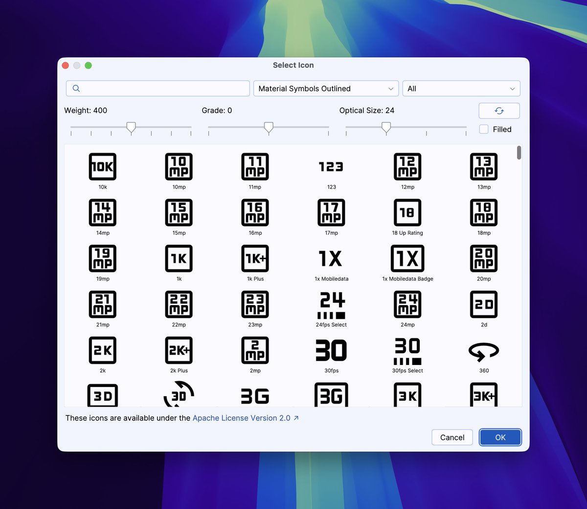
Import into ImageVector already available in Valkyrie plugin: github.com/ComposeGears/Valk…
1
43
#13: Icons - Material Icons
Compose includes the Material Icons library. Use the Icon composable to display them.
```kotlin
@Composable
fun IconExample() {
Icon(
imageVector = Icons.Filled.Favorite,
contentDescription = "Favorite icon",
tint = Color.Red,
modifier = Modifier.size(48.dp)
)
}
```
Access icons via Icons.Filled, Icons.Outlined, etc. Always provide a contentDescription for accessibility.
8


Jan 21
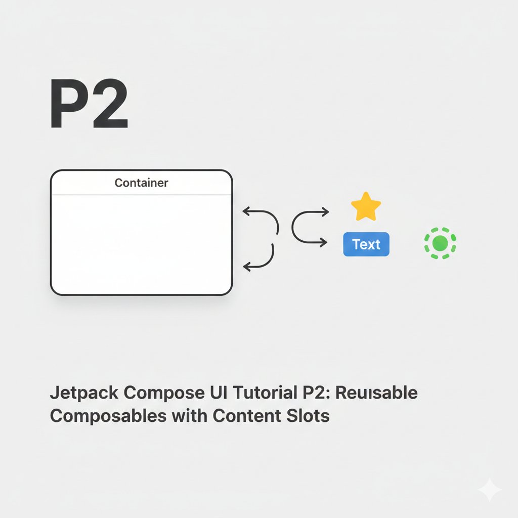
Compose Pattern #2: Slot API Pattern
Don't restrict your reusable composables to specific content. Instead, provide "slots" (lambda parameters) where the caller can insert any UI.
Restrictive Approach (Avoid):
```kotlin
@Composable
fun FancyButton(text: String, icon: ImageVector) {
Button(onClick = {}) {
Icon(icon, contentDescription = null)
Spacer(Modifier.width(8.dp))
Text(text)
}
}
// Limited to icon text.
```
Slot API Pattern (Recommended):
```kotlin
@Composable
fun FancyButton(
onClick: () -> Unit,
modifier: Modifier = Modifier,
content: @Composable RowScope.() -> Unit // <-- The SLOT
) {
Button(
onClick = onClick,
modifier = modifier,
colors = ButtonDefaults.buttonColors(/*...*/)
) {
content() // Caller decides content here
}
}
// Usage - Total flexibility:
FancyButton(onClick = {}) {
Icon(Icons.Filled.Star, null)
Text("Favorite")
}
FancyButton(onClick = {}) {
CircularProgressIndicator(modifier = Modifier.size(16.dp))
}
```
This pattern is used everywhere in Material3 (e.g., Card, TopAppBar). It maximizes reusability.
#AndroidDev #Kotlin #JetpackCompose #Programming #MobileDev
3
29
Jan 20
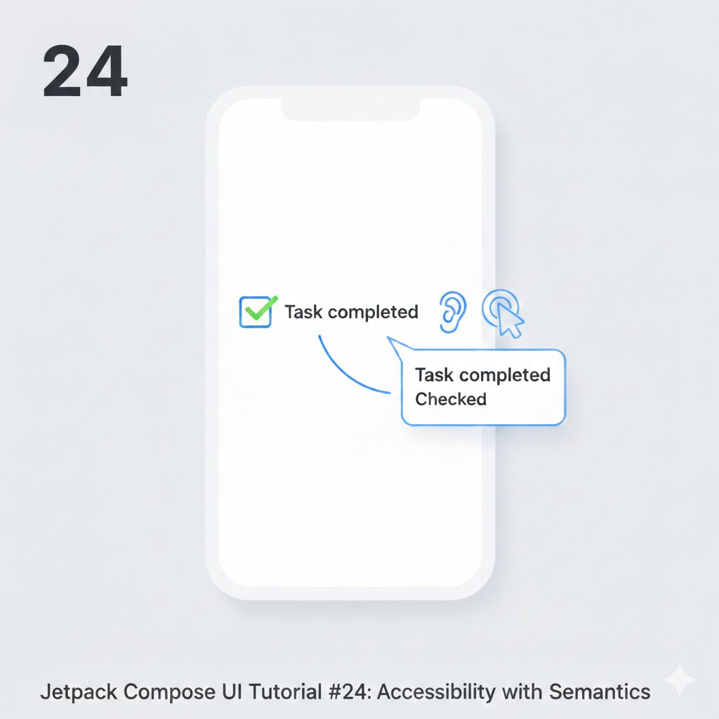
Compose Bite #24: Building for Everyone - Accessibility Basics.
Make your app usable by everyone. Key practices:
1. Content Description: For icons or images without text, use contentDescription.
```kotlin
Icon(
imageVector = Icons.Filled.Check,
contentDescription = "Task completed" // Read by TalkBack
)
```
2. Semantic Properties: Group related elements and specify their role.
```kotlin
Row(modifier = Modifier.semantics {
isTraversalGroup = true
isSelectable = true
}) {
// Selectable items
}
```
3. State Descriptions: Describe state changes (e.g., toggle).
```kotlin
var checked by remember { mutableStateOf(false) }
Checkbox(
checked = checked,
onCheckedChange = { checked = it },
modifier = Modifier.semantics {
stateDescription = if (checked) "Checked" else "Unchecked"
}
)
```
Accessibility isn't a feature; it's a requirement.
#AndroidDev #Kotlin #JetpackCompose #MobileDev #Programming
4
22
Jan 20
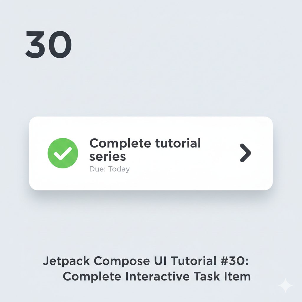
Tutorial #30: Putting It All Together - A Complete Task Item
Let's build a polished, interactive task list item combining: state, theming, icons, interaction, and visual feedback.
```kotlin
data class Task(
val id: Int,
val title: String,
val dueDate: String,
var isCompleted: Boolean
)
@Composable
fun TaskItem(
task: Task,
onToggleComplete: (Int) -> Unit,
onTaskClick: (Int) -> Unit,
modifier: Modifier = Modifier
) {
Card(
modifier = modifier
.fillMaxWidth()
.clickable { onTaskClick(task.id) },
elevation = CardDefaults.cardElevation(defaultElevation = 2.dp),
colors = CardDefaults.cardColors(
containerColor = if (task.isCompleted)
MaterialTheme.colors.surface.copy(alpha = 0.5f)
else MaterialTheme.colors.surface
)
) {
Row(
modifier = Modifier.padding(16.dp),
verticalAlignment = Alignment.CenterVertically,
horizontalArrangement = Arrangement.SpaceBetween
) {
// Checkbox and Content
Row(verticalAlignment = Alignment.CenterVertically) {
// Custom Checkbox
Box(
modifier = Modifier
.size(24.dp)
.border(
width = 2.dp,
color = if (task.isCompleted) Color.Green else Color.Gray,
shape = CircleShape
)
.clickable { onToggleComplete(task.id) }
.background(
if (task.isCompleted) Color.Green.copy(alpha = 0.2f)
else Color.Transparent
),
contentAlignment = Alignment.Center
) {
if (task.isCompleted) {
Icon(
Icons.Filled.Check,
contentDescription = "Completed",
tint = Color.Green,
modifier = Modifier.size(16.dp)
)
}
}
Spacer(modifier = Modifier.width(16.dp))
// Task Details
Column {
Text(
text = task.title,
style = MaterialTheme.typography.body1,
modifier = Modifier.fillMaxWidth(0.8f),
maxLines = 1,
overflow = TextOverflow.Ellipsis,
textDecoration = if (task.isCompleted)
TextDecoration.LineThrough
else TextDecoration.None,
color = if (task.isCompleted)
Color.Gray
else MaterialTheme.colors.onSurface
)
Text(
text = "Due: ${task.dueDate}",
style = MaterialTheme.typography.caption,
color = Color.Gray
)
}
}
// Action Icon
IconButton(onClick = { onTaskClick(task.id) }) {
Icon(
imageVector = Icons.Outlined.ArrowForwardIos,
contentDescription = "View Details",
tint = MaterialTheme.colors.primary
)
}
}
}
}
```
Final Synthesis: This component uses: Card for elevation, Row/Column for layout, MaterialTheme for consistency, clickable for interaction, conditional styling for state, and icons for affordance. #Android#UI #UX #JetpackCompose #FinalProject #ComponentDesign
1
27
Jan 20
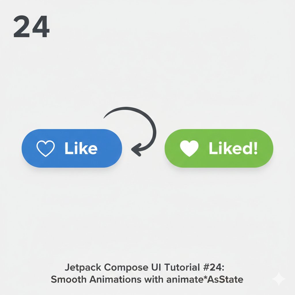
Tutorial #24: Smooth Transitions with animate*AsState
For fluid UI reactions, use animate*AsState (like animateColorAsState, animateFloatAsState). It automatically animates a value change between states.
```kotlin
@Composable
fun AnimateColorButton() {
var toggled by remember { mutableStateOf(false) }
// Animates COLOR
val animatedColor by animateColorAsState(
targetValue = if (toggled) Color(0xFF4CAF50) else Color(0xFF2196F3),
animationSpec = tween(durationMillis = 300)
)
// Animates SIZE (as a Float for scale)
val animatedScale by animateFloatAsState(
targetValue = if (toggled) 1.1f else 1f,
animationSpec = spring(dampingRatio = 0.5f)
)
Box(
contentAlignment = Alignment.Center,
modifier = Modifier.fillMaxSize()
) {
Button(
onClick = { toggled = !toggled },
colors = ButtonDefaults.buttonColors(containerColor = animatedColor),
modifier = Modifier.graphicsLayer {
scaleX = animatedScale
scaleY = animatedScale
}
) {
Icon(
imageVector = if (toggled) Icons.Filled.Favorite else Icons.Outlined.FavoriteBorder,
contentDescription = null,
modifier = Modifier.padding(end = 8.dp)
)
Text(if (toggled) "Liked!" else "Like")
}
}
}
```
Key Takeaway: Choose your animationSpec. tween for simple duration/easing. spring for bouncy, physics-based motion. The compiler infers the type (animateDpAsState, etc.). #Android#UI #UX #JetpackCompose #Animation #Motion
19
Jan 19
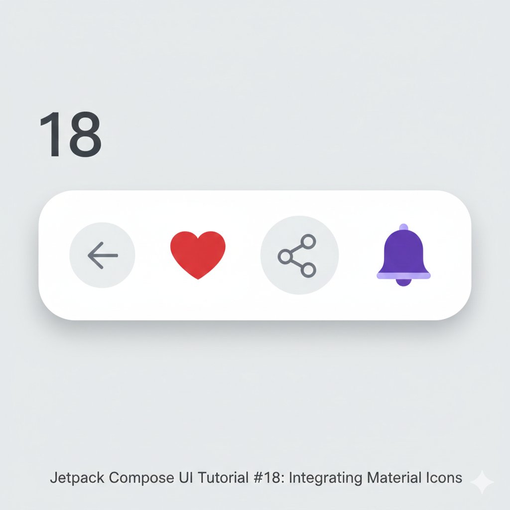
Tutorial #18: Using Material Icons in UI
Icons are visual shorthand. Jetpack Compose provides the Material Icons library out of the box. Use them for actions, status, and navigation.
```kotlin
@Composable
fun IconRow() {
Row(
horizontalArrangement = Arrangement.SpaceEvenly,
modifier = Modifier
.fillMaxWidth()
.padding(24.dp)
) {
IconButton(onClick = { /* Handle back */ }) {
Icon(Icons.Filled.ArrowBack, contentDescription = "Back")
}
Icon(
imageVector = Icons.Filled.Favorite,
contentDescription = "Favorite",
tint = Color.Red
)
IconButton(onClick = { /* Handle share */ }) {
Icon(
imageVector = Icons.Outlined.Share,
contentDescription = "Share",
modifier = Modifier.size(32.dp)
)
}
Icon(
imageVector = Icons.TwoTone.Notifications,
contentDescription = "Notifications",
tint = Color(0xFF6200EE)
)
}
}
```
Key Points:
1. IconButton for clickable icons.
2. contentDescription is mandatory for accessibility.
3. Use tint for color and .size() modifier to resize.
4. Choose from Filled, Outlined, Rounded, TwoTone, Sharp variants. #Android#UI #UX #JetpackCompose #Icons #Accessibility
1
23
Jan 19
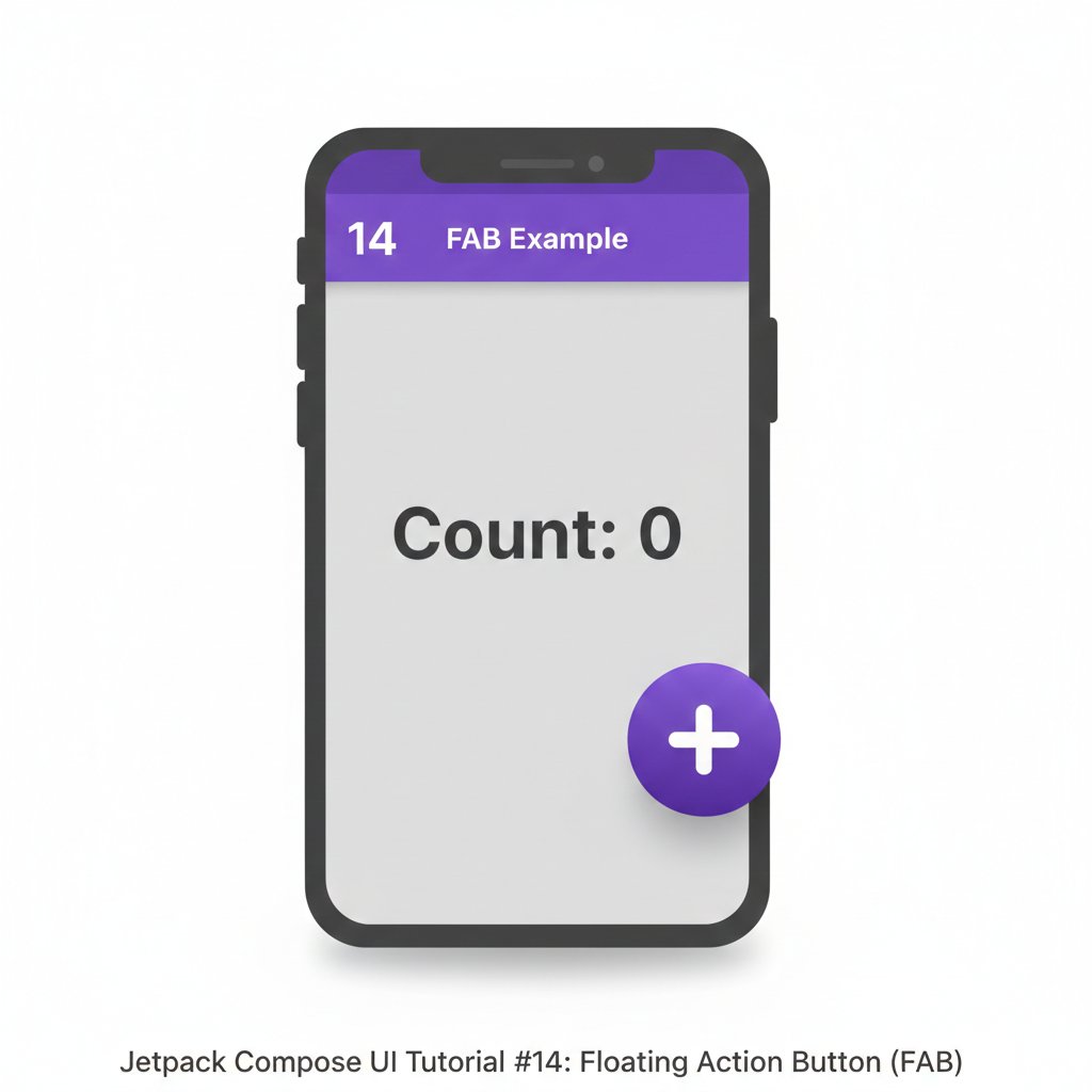
Tutorial #14: Adding a Floating Action Button (FAB)
The FAB is a key Material Design component. Scaffold has a dedicated slot for it, handling positioning and elevation automatically.
```kotlin
@Composable
fun ScaffoldWithFAB() {
var counter by remember { mutableStateOf(0) }
Scaffold(
topBar = {
TopAppBar(title = { Text("FAB Example") })
},
floatingActionButton = {
FloatingActionButton(
onClick = { counter },
containerColor = Color(0xFF6200EE)
) {
Icon(
imageVector = Icons.Default.Add,
contentDescription = "Increment"
)
}
},
floatingActionButtonPosition = FabPosition.End,
content = { innerPadding ->
Box(
modifier = Modifier
.fillMaxSize()
.padding(innerPadding),
contentAlignment = Alignment.Center
) {
Text(text = "Count: $counter", fontSize = 24.sp)
}
}
)
}
```
UI/UX Tip: The FabPosition parameter allows for End or Center alignment. The FAB should trigger a primary action on the screen. #Android#UI #UX #JetpackCompose #MaterialDesign #ComposeTutorial
28
Jan 10
@Composable
fun CoolBlueHapticButton(
isSelected: Boolean,
onClick: () -> Unit
) {
// 1. Get the haptic feedback provider
val haptic = LocalHapticFeedback.current
Box(
modifier = Modifier
.size(56.dp)
.clickable(
interactionSource = remember { MutableInteractionSource() },
indication = rememberRipple(bounded = false, radius = 28.dp),
onClick = {
// 2. Trigger the haptic "tick" on click
haptic.performHapticFeedback(HapticFeedbackType.LongPress)
// 3. Execute the navigation logic
onClick()
}
),
contentAlignment = Alignment.Center
) {
Icon(
imageVector = Icons.Rounded.Add,
contentDescription = "Add",
tint = if (isSelected) Color(0xFF00F5FF) else Color.White,
modifier = Modifier.size(30.dp)
)
}
}
15
Jan 10
@Composable
fun CoolBlueHomeButton(
isSelected: Boolean,
onClick: () -> Unit
) {
// Smoothly animate the scale when selected
val scale by animateFloatAsState(
targetValue = if (isSelected) 1.2f else 1.0f,
animationSpec = spring(dampingRatio = Spring.DampingRatioMediumBouncy),
label = "HomeScale"
)
// Define your theme colors
val deepBlue = Color(0xFF0D1B2A)
val coolBlue = Color(0xFF3A86FF)
val cyanGlow = Color(0xFF00F5FF)
Box(
modifier = Modifier
.size(56.dp)
.clickable(
interactionSource = remember { MutableInteractionSource() },
indication = null, // Remove default ripple for custom feel
onClick = onClick
),
contentAlignment = Alignment.Center
) {
// Subtle Glow behind the icon if selected
if (isSelected) {
Box(
modifier = Modifier
.size(24.dp)
.graphicsLayer {
shadowElevation = 20f
spotColor = cyanGlow
ambientColor = cyanGlow
}
.background(cyanGlow.copy(alpha = 0.2f), CircleShape)
)
}
Icon(
imageVector = Icons.Rounded.Home,
contentDescription = "Home",
modifier = Modifier
.size(28.dp)
.scale(scale),
tint = if (isSelected) coolBlue else Color.White.copy(alpha = 0.6f)
)
}
}
11
Part 3: Translucent Inputs 🧵
To keep the theme consistent, the input fields should also be semi-transparent.
// 3/5: Minimalist Inputs
@Composable
fun GlassInput(label: String, icon: ImageVector) {
OutlinedTextField(
value = "", onValueChange = {},
leadingIcon = { Icon(icon, null, tint = Color.White) },
placeholder = { Text(label, color = Color.White.copy(0.5f)) },
modifier = Modifier.fillMaxWidth(),
shape = RoundedCornerShape(16.dp),
colors = OutlinedTextFieldDefaults.colors(
unfocusedContainerColor = Color.White.copy(alpha = 0.05f),
focusedContainerColor = Color.White.copy(alpha = 0.1f),
unfocusedBorderColor = Color.White.copy(alpha = 0.2f),
focusedBorderColor = Color.White
)
)
}
1
11
// 3/5: Input Fields
@Composable
fun GreenInput(label: String, icon: ImageVector) {
OutlinedTextField(
value = "", onValueChange = {},
label = { Text(label, color = LightMist.copy(0.5f)) },
leadingIcon = { Icon(icon, null, tint = MintNeon) },
7
26 Oct 2025
First version direct import of Material Symbols into ImageVector! 🌚
#androiddevelopment #compose
1
51
26 Sep 2025
Everyone feel free to convert into ImageVector using this plugin github.com/ComposeGears/Valk…
16
866

