
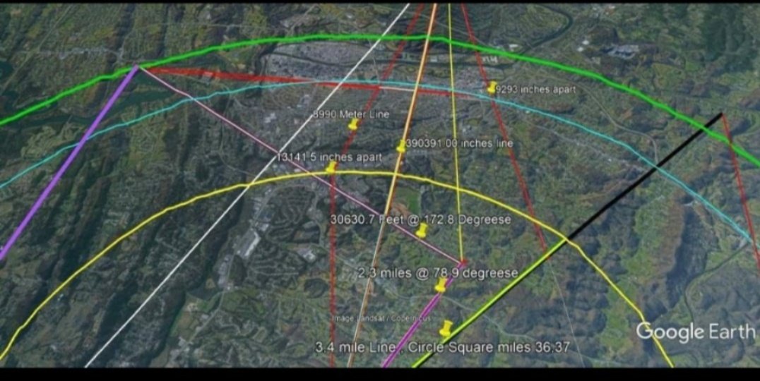
Here is that map. The White line_plot is just to complete the equilibrium of the star figure and goes on out the top to these floating stones in a host-stone mass.
1
1
2
13

9 Nov 2021
day 3/100 of #100DaysOfCode challenge
today I :
-> completed line_plot function (matplotlib) in page_view time series visualiser project on #freecodecamp
-> revised statistics like central limit theorem , z scores , properties of normal distributions.
2
2

28 Aug 2021
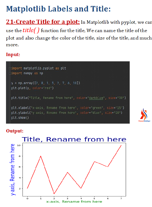
Tutorial #21 . . . . . .
How to create Title for the graphs?
#matplotlib #matplotlibpyplot #python #pythonlearning #python3 #rizwancode #pythoncode #programmings #programmer #plot #plots #graph #plot_labels #programmers #plt #line_graph #line_plot #plot_title #title #graph_title
1
14

22 Dec 2020
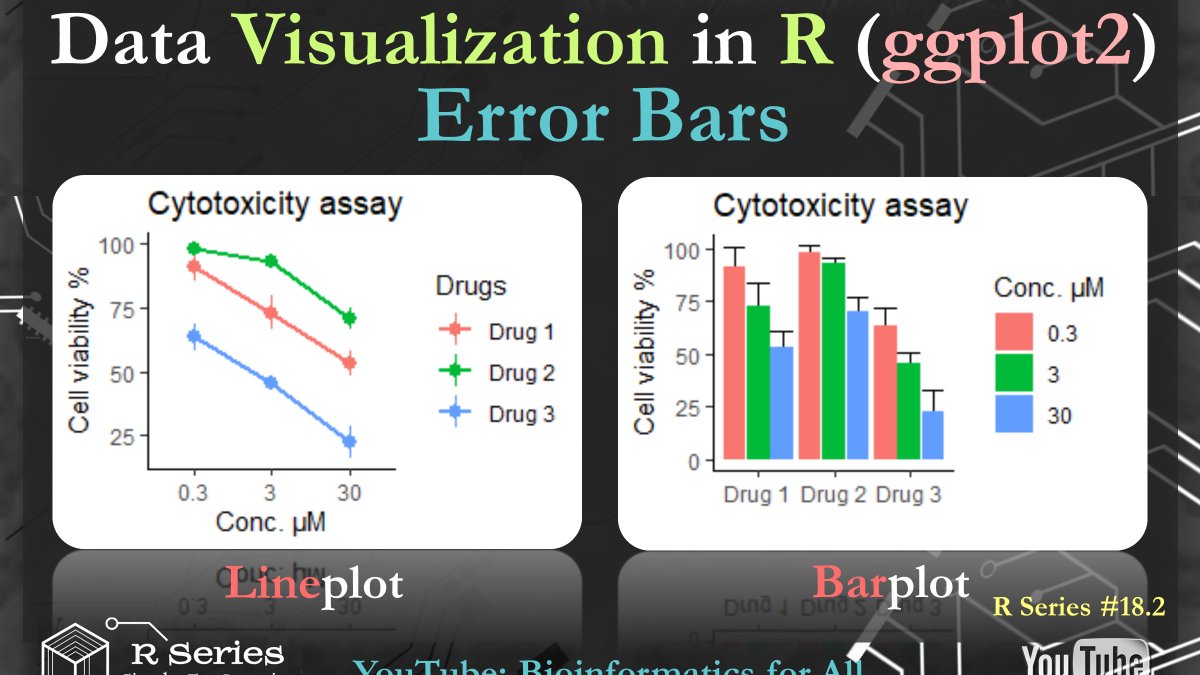
Error bars show the variability of the data and used to indicate the error or uncertainty. In video 18.2 (youtu.be/ZjU1IpwMUeQ), I explained how we can visualize error bars using #ggplot2 package for #Bar_plot and #Line_plot. Next video, I will explain how to generate heatmaps
3