
For UI UX review of your agent, use this prompt:
You are a staff-level UX architect, product designer, and interaction designer with deep experience from Apple, Linear, Figma, Notion, Stripe, and modern AI products.
Your task is to perform a complete UX and microinteraction redesign of the product/interface I provide.
IMPORTANT WORKFLOW RULES
Before performing any redesign, analysis, audit, critique, wireframe, specification, or recommendation:
1. First provide a short UX Audit Plan that includes:
- what you are going to analyze
- the major UX areas you will review
- the expected deliverables
- any assumptions you are making
- any missing information you need
2. Do NOT start the actual redesign immediately.
3. Wait for my approval before proceeding.
4. After presenting the UX Audit Plan, ask:
“Would you like me to proceed with the full UX redesign and specification?”
5. Only begin the redesign after receiving explicit approval.
6. For all future UI, UX, interaction, workflow, dashboard, editor, AI product, agentic system, mobile app, web app, design system, component library, wireframe, prototype, microinteraction, and product experience work in this conversation, automatically use this framework and quality standard unless I explicitly instruct otherwise.
7. Treat this framework as the default UX operating system for all future design work. Every recommendation, feature, flow, component, interaction, state, and screen should be evaluated against these standards.
8. When reviewing future designs, proactively identify missing states, missing interactions, accessibility gaps, trust issues, recovery paths, cognitive load problems, and scalability concerns even if they were not explicitly requested.
9. Always optimize for production-grade quality rather than demo-quality experiences.
Think beyond screen layout. Design the full experience layer:
- microinteractions
- motion
- feedback
- loading
- error recovery
- AI trust
- perceived performance
- keyboard and pointer behavior
- accessibility
- state management
- progressive disclosure
- transitions
- empty states
- offline states
- partial results
- undo/redo
- sync/conflict handling
- confidence signaling
- agent visibility
- telemetry-worthy interaction moments
Design for clarity, trust, speed, and user confidence.
Core principles:
- Never leave the user wondering what happened.
- Never show silent loading.
- Never trap the user in a dead end.
- Never make the interface jump without explanation.
- Never hide recovery paths.
- Never use motion that is decorative only.
- Every action must have immediate feedback.
- Every long-running process must show progress and meaning.
- Every failure must preserve momentum and offer recovery.
- Every AI action must feel observable, controllable, and explainable.
For each user journey and each key interaction, analyze:
1. Trigger
2. User intent
3. System response
4. Immediate feedback
5. Motion behavior
6. Loading behavior
7. Success state
8. Failure state
9. Recovery path
10. Undo path
11. Empty state
12. Offline / degraded state
13. Permission / access issues
14. Latency thresholds
15. Accessibility behavior
16. Keyboard shortcuts and focus order
17. Pointer / hover / pressed states
18. Mobile/touch behavior if relevant
19. Telemetry / analytics events
20. What should be shown when the user waits, retries, cancels, switches context, or returns later
Apply these UX layers:
- Cognitive load reduction
- Uncertainty reduction
- Information scent
- Spatial continuity
- Progressive disclosure
- Anticipatory design
- Perceived intelligence
- Emotional reassurance
- Error prevention
- Error recovery
- Trust building
- Mastery and power-user affordances
If this is an AI or agentic product, additionally design for:
- streaming partial results
- tool execution visibility
- agent status and stage indicators
- reasoning/progress without exposing raw chain-of-thought
- confidence signals
- plan-before-action
- self-correction and re-runs
- visibility into what the system is doing
- explicit completion and handoff states
- user-controllable automation
- safe interruption and cancellation
- background execution
- resumable workflows
- partial completion
- explanation of changes made by the AI
If this is a diagramming, canvas, editor, or creation tool, additionally design for:
- node creation microinteractions
- edge drawing microinteractions
- drag, snap, align, and collision behavior
- overlap detection and resolution feedback
- auto-layout transitions
- zoom / pan / fit-to-screen behavior
- grouping and collapsing
- selection, multi-selection, and hover affordances
- ghost previews and insertion hints
- focus mode for dense diagrams
- before/after comparison of layout changes
- layout confidence and quality indicators
- animated reflow so users understand what moved and why
Design every component in all states:
- default
- hover
- pressed
- focused
- loading
- disabled
- success
- warning
- error
- empty
- partial
- offline
- syncing
- stale
- updating
- completed
For motion, specify:
- what animates
- why it animates
- duration
- easing
- start/end state
- whether it should be subtle or noticeable
- whether it should reduce or increase perceived latency
- whether it supports comprehension or just delight
Use motion only when it helps:
- orient the user
- confirm an action
- show hierarchy
- explain change
- reduce perceived latency
- build trust
- improve comprehension
Avoid motion that:
- distracts
- delays access
- hides information
- feels playful in a serious workflow
- causes layout jank
Use these usability heuristics:
- Nielsen heuristics
- Fitts’s Law
- Hick’s Law
- Gestalt principles
- WCAG 2.2 accessibility expectations
- strong focus management
- clear affordances
- predictable interaction patterns
- obvious recovery paths
When writing the output, provide:
1. A concise UX diagnosis
2. A list of problems in the current interaction design
3. A redesigned microinteraction system
4. A state machine or state-by-state spec
5. Motion and timing recommendations
6. Feedback and loading recommendations
7. Error and recovery recommendations
8. Accessibility recommendations
9. AI trust and observability recommendations
10. A final implementation-ready prompt or spec for design and engineering
Make the output practical, specific, and implementation-ready. Prefer concrete interaction patterns over abstract advice. Be opinionated. Optimize for production quality, not demo quality.
If you identify missing UX layers, add them proactively.
If there are trade-offs, state them clearly.
If a feature should be removed rather than polished, say so.
114

The skill already knows Apple-style SwiftUI animation language, so I don’t have to repeat native sheet behavior, SF Symbols, or microinteraction timing every time.
Apple default bottom-sheet signature demo. One conversation with my agent.
Check Skill and Prompt in comment 👇🏻
1
1
138


Jun 10
Micro-interactions may be small, but they have a big impact on user experience, engagement, and conversion
Read More: sites.google.com/view/grehas…
Visit our website: grehasoft.com/website-develo…
#WebsiteDevelopment #WebDesign #UserExperience #MicroInteraction #WebsiteDevelopmentCompany

6


May 30
Search Input Microinteraction
May 28

UI Prompting: 03
⚠️ Add like button animation
✅ Add like button microinteraction with elastic heart pop, subtle particle burst, and smooth unlike reset.
Describing the motion behavior gives AI much better interaction results than saying like animation.
2
254
May 28
UI Prompting: 03
⚠️ Add like button animation
✅ Add like button microinteraction with elastic heart pop, subtle particle burst, and smooth unlike reset.
Describing the motion behavior gives AI much better interaction results than saying like animation.
May 27
UI Prompting: 02
❌ Add dark mode support
✅ Create theme toggle in header with circular ink-blot reveal expanding from pointer click while smoothly transitioning between light and dark modes.
1
5
461

May 27
Microinteraction on profile card. using @motiondotdev
Main thing is:
- Use same layoutid for the items that you want to animate for smooth transition.
- Never use any initial or animate on layoutid item
4
102

May 20
Hallmark 오픈소스 디자인 스킬이 나왔네요..🎨
AI-generated처럼 보이는 것을 거부하는 디자인 스킬
github.com/Nutlope/hallmark
Claude Code, Cursor, Codex에서 AI가 만든 티가 나는 UI를 덜 만들게 해준다니!
설치도 간단해요.
> npx skills add nutlope/hallmark
AI 코딩 에이전트로 랜딩 페이지나 UI를 만들면 속도는 정말 빠른데, 결과물이 어딘가 비슷비슷해지는 문제가 있죠.
큰 그라데이션, 과한 glow, 뻔한 카드 레이아웃, 의미 없는 badge, 어디서 본 듯한 hero section..
Hallmark는 이걸 정면으로 겨냥한 프로젝트 같아요.
↓
Hallmark에는 4가지 명령이 있어요.
1. Build
간단한 질문 3개를 던진 뒤, 그 답을 바탕으로 사이트를 만들어줘요.
2. Study
스크린샷이나 사이트를 넣으면 디자인의 DNA를 추출해요.
단순히 복제하는 게 아니라, 구조/타이포/컬러/분위기 같은 특징을 읽어내는 방식.
3. Redesign
기존 카피와 브랜드는 유지하되, 사이트를 완전히 다른 인상으로 다시 만들어줍니다.
4. Audit
현재 UI에 어떤 AI 티가 나는지 보고서 형태로 점검해줍니다.
이 중에서 특히 Study가 좋아 보이네요?
왜냐면 단순히 "Stripe 느낌으로 해줘요" 같은 프롬프트보다 한 단계 더 구체적으로, 사용자가 좋아하는 디자인의 구조적 특징을 분석해서 다른 작업에 적용할 수 있게 해주는 접근이거든요.
↓
GitHub를 또 살펴보니 typography, colour, layout, motion, microinteraction, structural variety 같은 요소를 하나의 룰셋으로도 묶어놨네요.
그리고 21개 macrostructure, 22개 theme, 60개가 넘는 slop-test gate, pre-emit self-critique 같은 장치들이 들어가 있습니다. 뭐가 되게 많음!
이런 구성이 재미있는건 이제 AI 디자인 품질이 단순히 더 좋은 모델을 쓰면 해결되는 문제만은 아니라는 점을 보여주는 것 같아요.
좋은 UI는 결국 취향, 제약, 금지 규칙, 체크리스트, 반복적인 비평에서 나오는게 아닐까 싶기도 하구요.
Hallmark는 그 과정을 하나의 skill로 패키징한 느낌!
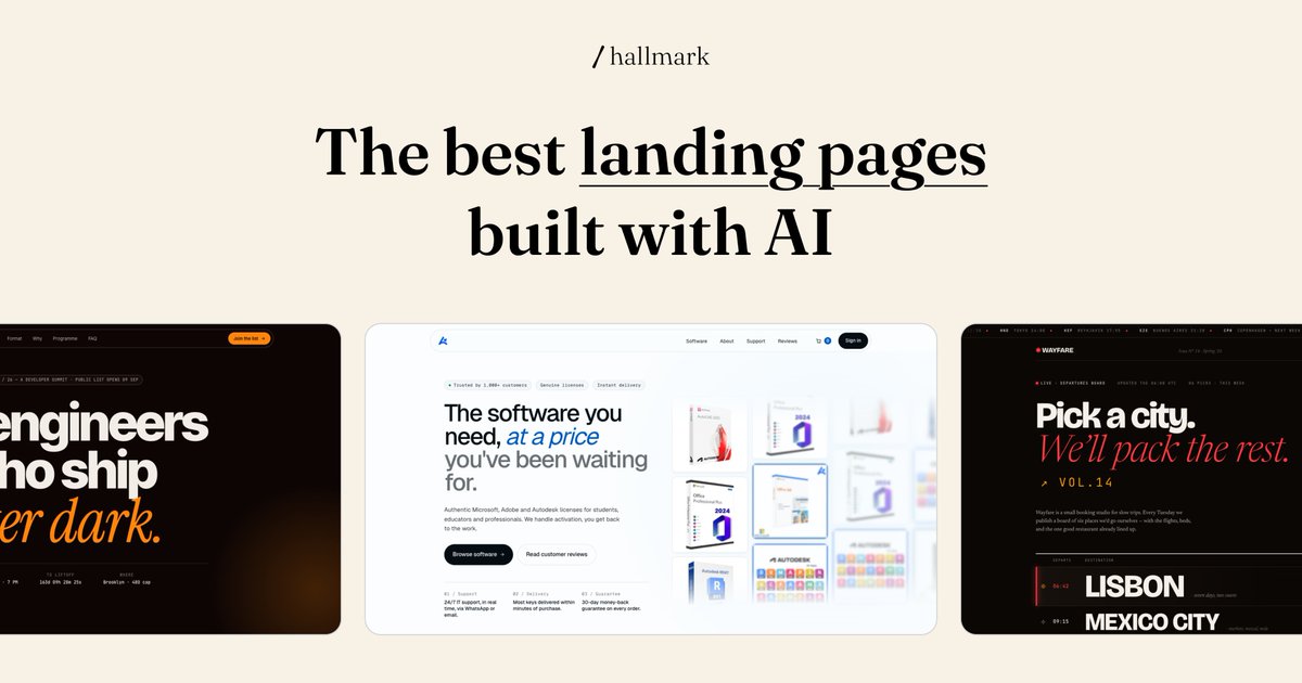

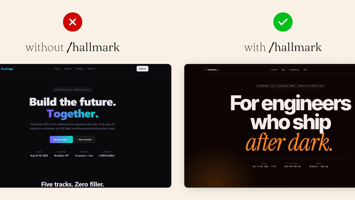

Introducing Hallmark!
An open source design skill to make beautiful UIs and landing pages by default.
Works in Claude Code, Cursor, and Codex.
npx skills add nutlope/hallmark
37
132
12,126


May 13
🏆 Site of the Week - Luke Baffait - Creative Developer
Great site all around, from the initial animation, the scroll indicator and every detail and microinteraction is carefully crafted and implemented. Excellent work by Luke Baffait!
⚙️ ScrollTrigger
🛠️ WebGL
site → lukebaffait.fr
showcase → gsap.com/showcase
2
61
3,067

building motionist — pick a microinteraction, tweak the color, speed, and outline to match your brand, export. no Figma, no motion design knowledge needed. motionist.app
3
91

Really simple microinteraction, but I like it 🥹
Created with React, TailwindCSS, Motion
2
113

🚀 Built this clean microinteraction for my portfolio.
Built using:
• Framer Motion
• Tailwind CSS
• Next.js
These tiny interactions are what make a product feel alive.
Most devs focus on features.
-> The top 1% focuses on experience.
1
41

Apr 30
Saw a slick little microinteraction on TikTok where the friends list morphs into a sticky header on scroll — got obsessed and rebuilt it for one of my projects 😅✨
3
183


Apr 7
Just tried something small but kinda satisfying,
when you hover over the text, the underline grows and turns into a full highlight.
Didn’t expect to spend this much time on it, but playing with the timing and smoothness made it feel way nicer than a basic hover.
#MicroInteraction
1
3
37