
❤️🔥Access ALL prompts for stunning animated websites in one click: motionsites.ai
Build a dark, cinematic single-page landing site for an AI product called NOVA_AI using Vite React TypeScript Tailwind CSS, with icons from lucide-react only. No other UI packages.
Global setup
- `index.html` title: `NOVA_AI — Today AI Aligns With Bold Dreams`. Load this font in `<head>`:
`<link href="db.onlinewebfonts.com/c/4556…" rel="stylesheet" />`
- `index.css`: Tailwind base/components/utilities; `body { font-family: 'Flexo Soft Medium', system-ui, sans-serif; background-color: #0a0a0a; color: #fff; -webkit-font-smoothing: antialiased; }`; `::selection { background-color: rgba(255,255,255,0.2); }`
- `tailwind.config.js`: extend `fontFamily` so BOTH `sans` and `mono` map to `['"Flexo Soft Medium"', 'system-ui', 'sans-serif']`.
- `App.tsx` renders, inside `<div className="relative">`: `<ScrollVideo />`, `<Navbar />`, then `<main>` containing `<SectionOne />`, a spacer `<div aria-hidden className="h-[80vh]" />`, and `<SectionTwo />`.
Component 1 — ScrollVideo (scroll-scrubbed video background)
Fixed full-viewport background (`fixed inset-0 -z-10 bg-[#0a0a0a]`) that scrubs a video based on total page scroll progress. Video URL (exact):
`d8j0ntlcm91z4.cloudfront.net…`
Implementation details:
1. On mount, `fetch` the video as a blob, create an object URL, and pre-extract frames into `ImageBitmap[]`: create an off-DOM `<video>` (muted, playsInline, preload auto), wait for metadata, scale to max width 1280, frame count = `clamp(round(duration * 24), 30, 120)`, seek evenly across `duration - 0.05` and `createImageBitmap` each frame (with resize). Support cancellation; close bitmaps and revoke the object URL on unmount.
2. Render a `<canvas className="absolute inset-0 h-full w-full">`. While frames aren't ready, render a fallback `<video>` element (same URL, muted, playsInline, `object-cover`, absolute inset-0 full size) and scrub it by setting `currentTime` (guard with a `seeking` flag `seeked` listener; only seek when delta > 0.001s).
3. Animation loop (`requestAnimationFrame`): target progress = `window.scrollY / (scrollHeight - innerHeight)` clamped 0–1, smoothed each tick via `smoothed = (target - smoothed) * 0.1`. Map smoothed progress to a frame index and only redraw when the index changes. Draw with "cover" math (scale = max of canvas/frame ratios, center the overflow). Canvas resolution = clientWidth/Height × devicePixelRatio capped at 2; re-size on window resize. Passive scroll listener.
4. Overlay `<div className="absolute inset-0 bg-black/20" />` for text contrast.
Component 2 — Reveal (staggered scroll animation wrapper)
Reusable component: props `children`, `delay?: number` (ms), `className?: string`, `as?: 'div' | 'span'` (default `'div'`). Uses an IntersectionObserver (threshold 0.15) and sets visible = `entry.isIntersecting` — i.e., animations REPLAY when elements leave and re-enter the viewport. Renders:
`transition-all duration-700 ease-out will-change-transform`, visible → `translate-y-0 opacity-100`, hidden → `translate-y-8 opacity-0`, plus `style={{ transitionDelay: `${delay}ms` }}` and the passed className. Disconnect observer on unmount.
Component 3 — Navbar (fixed corners)
- Top-left (`fixed left-5 top-5 z-50 sm:left-8 sm:top-7 md:left-12`): wordmark link `(NOVA_AI)` in `font-mono text-lg font-medium tracking-tight text-white drop-shadow-md sm:text-xl md:text-2xl` wrapped in `<Reveal>`; below it (delay 150) `[ v.01b ]` in `mt-6 font-mono text-[10px] text-white/60 sm:mt-8 sm:text-xs`.
- Top-right `<nav>` (`fixed right-5 top-5 z-50 sm:right-8 sm:top-7 md:right-12`): vertical right-aligned `<ul>` (`flex flex-col items-end gap-1.5 sm:gap-2`) with links `main`, `tiers`, `features`, `talk to us`. Each `<li>` wraps a `<Reveal delay={100 i * 120}>` containing an anchor: `group flex items-center gap-1 font-mono text-xs text-white/80 drop-shadow-md transition-colors duration-300 hover:text-white sm:text-sm` plus an `ArrowUpRight` icon (size 14) that translates up-right on group hover (`group-hover:-translate-y-0.5 group-hover:translate-x-0.5`).
Component 4 — SectionOne (hero, bottom-anchored)
`<section className="relative flex min-h-screen flex-col justify-end supports-[height:100svh]:min-h-[100svh]">`. Content row: `relative flex flex-col gap-10 px-5 pb-16 sm:flex-row sm:items-end sm:justify-between sm:gap-8 sm:px-8 md:px-12 md:pb-20`.
- Left: `<h1 className="max-w-xl text-4xl font-medium uppercase leading-[1.05] tracking-tight text-white drop-shadow-lg sm:text-5xl md:text-6xl lg:text-7xl">` with four staggered lines, each a `<Reveal as="span" className="block ...">`:
1. delay 100, `pl-6 sm:pl-12`: `Today AI`
2. delay 220, no indent: `Aligns ` `<span className="normal-case italic font-light">with</span>`
3. delay 340, `pl-10 sm:pl-20`: `// Bold`
4. delay 460, `pl-16 sm:pl-32`: `Dreams`
- Right column (`flex w-full max-w-xs flex-col items-start` — visible on ALL breakpoints, stacks under the headline on mobile):
- Reveal delay 400: row `mb-6 flex w-full items-center justify-between font-mono text-white sm:mb-8` with `( A )` (text-lg) and `[ 001 /004 ]` (`text-xs text-white/70`).
- Reveal delay 520: paragraph `mb-6 text-sm leading-relaxed text-white/85 drop-shadow-md sm:mb-8`: "NovaAI is where your bravest work finds its true expression. We hand you the means not only to form the future."
- Reveal delay 640: full-width pill CTA `Begin Today`: `block w-full rounded-full border border-white/60 px-8 py-3 text-center font-mono text-xs uppercase tracking-[0.15em] text-white transition-all duration-300 hover:bg-white hover:text-black`.
- Absolute bottom-left (Reveal delay 760, `bottom-5 left-5 sm:bottom-6 sm:left-8 md:left-12`): `Share2` icon button (size 18, `text-white/80 hover:text-white`, aria-label "Share").
- Absolute bottom-center (Reveal delay 760, `bottom-5 left-1/2 -translate-x-1/2 sm:bottom-6`): `ArrowDown` size 18 with `animate-bounce text-white/80`.
Component 5 — SectionTwo
`<section className="relative flex min-h-screen flex-col supports-[height:100svh]:min-h-[100svh]">`.
- Middle row: `relative flex flex-1 flex-col justify-center gap-10 px-5 pt-24 sm:flex-row sm:items-center sm:justify-between sm:gap-8 sm:px-8 sm:pt-0 md:px-12`.
- `<h2 className="max-w-sm text-4xl font-medium uppercase leading-[1.05] tracking-tight text-white drop-shadow-lg sm:text-5xl md:text-6xl">`, two Reveal lines: delay 100 `Learn ` italic `<span className="normal-case italic font-light">to see</span>`; delay 220 `Brilliantly`.
- Reveal delay 340: `flex items-center justify-between font-mono text-white sm:justify-start sm:gap-16 md:gap-24` with `( B )` (text-lg) and `[ 002 /004 ]` (`text-xs text-white/70`).
- Bottom block: `relative flex flex-col gap-10 px-5 pb-16 sm:px-8 md:px-12 md:pb-20`.
- Reveal delay 460 paragraph (`max-w-xs text-sm leading-relaxed text-white/85 drop-shadow-md`): "Our AI doesn't just respond — it interprets, sharpens, and delivers. From outline to final render, it supplies the insight you want."
- Reveal delay 580 CTA `Run The Demo`, in-flow full-width on mobile, absolutely bottom-centered on sm : wrapper `w-full max-w-xs sm:absolute sm:bottom-16 sm:left-1/2 sm:w-auto sm:max-w-none sm:-translate-x-1/2 md:bottom-20`; anchor `block rounded-full border border-white/60 px-10 py-3 text-center font-mono text-xs uppercase tracking-[0.15em] text-white transition-all duration-300 hover:bg-white hover:text-black`.
- Reveal delay 700, absolute bottom-left (same classes as Section 1): `Share2` icon button.
Responsiveness rules
Mobile-first: hero and section content stack vertically (`flex-col`) and switch to side-by-side (`sm:flex-row`) at 640px; horizontal padding scales `px-5 → sm:px-8 → md:px-12`; headline sizes scale `text-4xl → sm:text-5xl → md:text-6xl (→ lg:text-7xl hero)`; headline indents shrink on mobile; Section 2 gets `pt-24` on mobile to clear the fixed nav. All text must remain readable over the video (drop shadows black/20 overlay).
3
759

May 19
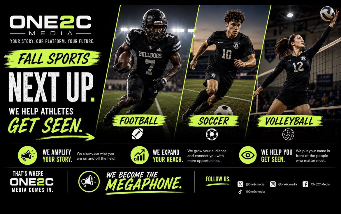
FALL SPORTS. NEXT UP.
Football • Soccer • Volleyball
• Increase impressions
• Grow engagement
• Improve visibility to coaches & recruiters
• Build athlete-focused content that works with today’s social algorithms
• Amplify your story across X and
Instagram
Most athletes are posting content. Very few are maximizing visibility. While athletes focus on the grind — ONE2C Media helps amplify the story.
DM us to get started.
#GetSeen #StudentAthlete #SectionOne #Content #ONE2CMedia
5
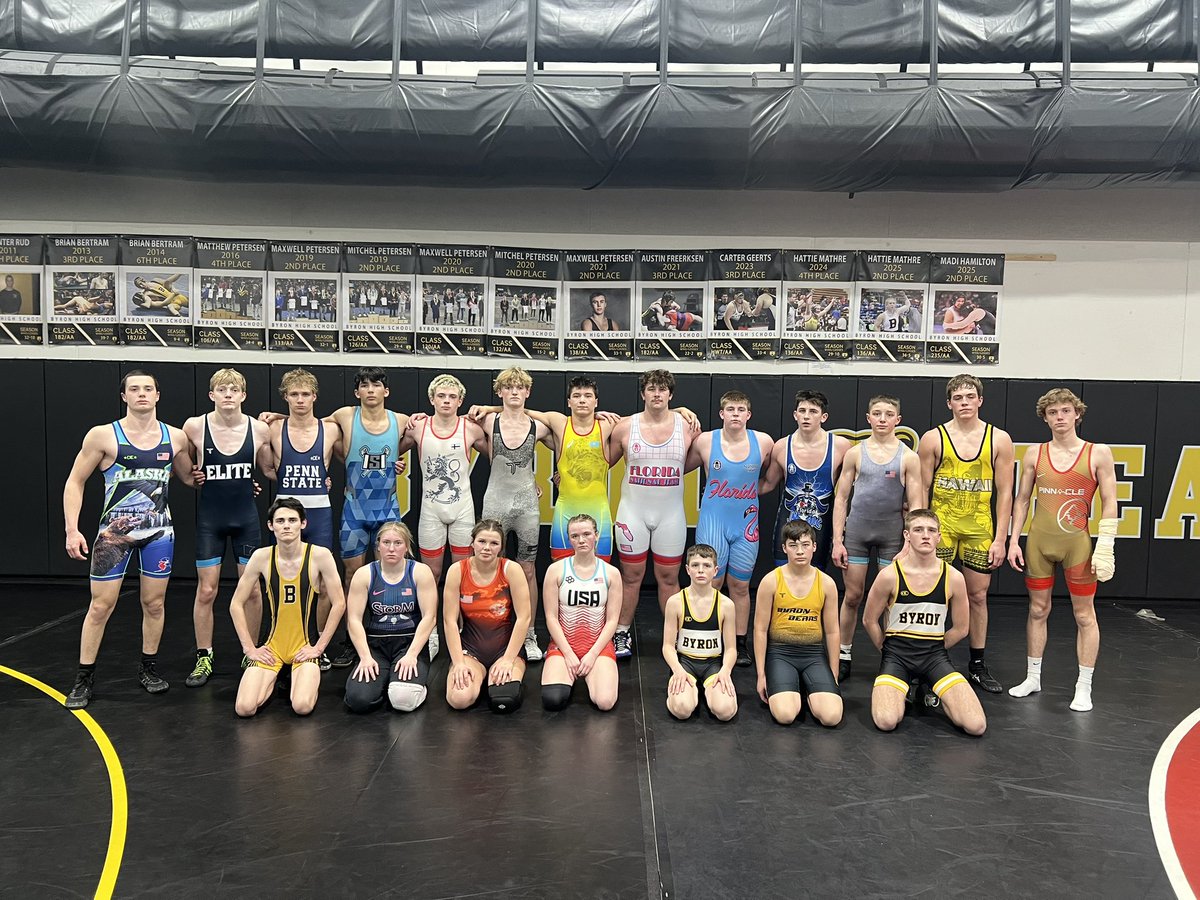
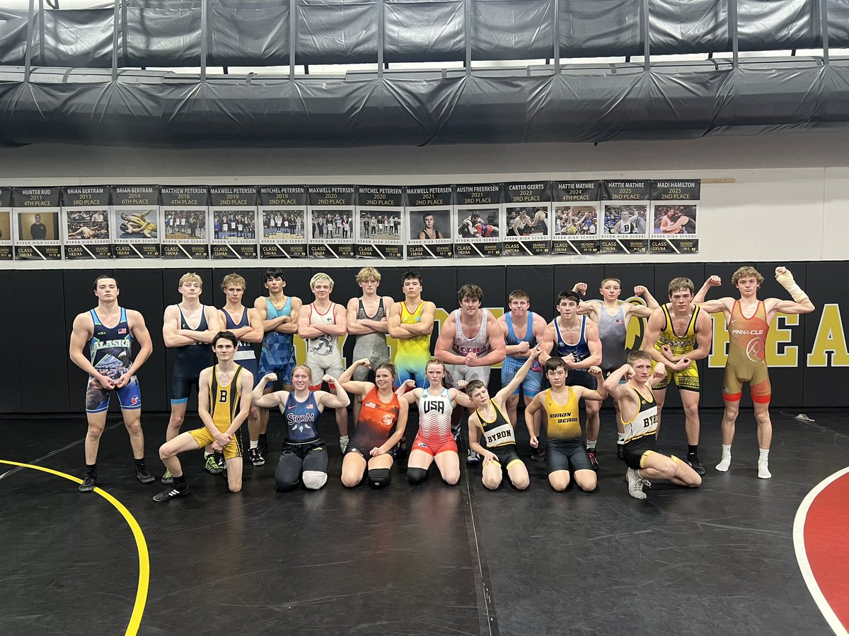
613

Favorite practice of the year! Annual Singlet Practice the week of Individual Sections💪 Getting ready for the best weekend of the year. #SectionOne
#ByronBears @ByronBears
4
17
1,008

14 Dec 2025
Come see us at Booth 2018
at the NIAAA Conference!
We look forward to connecting with you.
@NFLFoundation @Giants #sectionone
@jodyredman24 @JoeEhrmann76

1
3
1,304

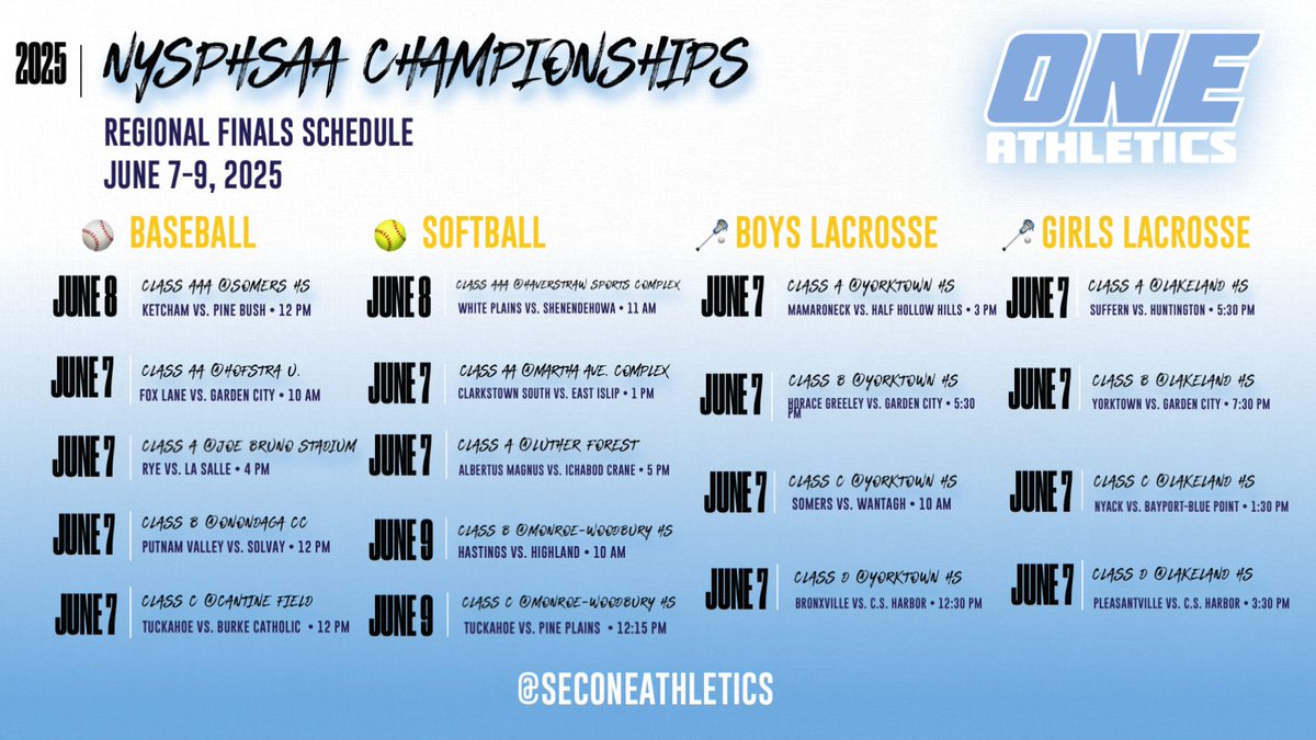
7 Jun 2025
It’s a busy weekend for our Section One champions! All 18 baseball, softball and lacrosse winners will be in action in the @NYSPHSAA Regional Finals — with 10 of those games being hosted by SectionOne! The road to the NYSPHSAA Final Four continues!
1
4
7
7,750


6 Mar 2025
Tough semifinal loss to a talented New Rochelle team. Good luck the rest of the way to New Rochelle/Mamaroneck/North Rockland #sectionone
5
15
2,578

15 Feb 2025
The Bears finished off the season with a bang, securing a 59-34 victory over Rye Neck today! We caught up with our Big Mac Player of the Game and one of the latest KDJ Five Stars, Xavier Prekelezaj. He was joined on the court by two of his teammates, who also played key roles in the win.
#Bears #Sectionone
@KDJmedia1 @cdrops3 @Briarcliffbball @SecOneAthletics
12
1,043

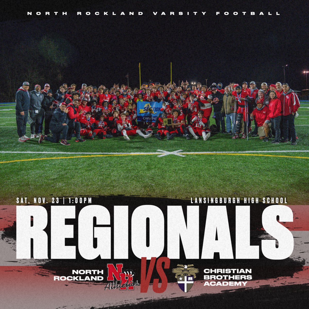
19 Nov 2024
The #RedRaiders advanced to Regionals after winning the #SectionOne title over the weekend‼️Tickets are only available for purchase ONLINE! The ticket link is below.🔗
gofan.co/event/1658982?schoo…
8
405

14 Jun 2024
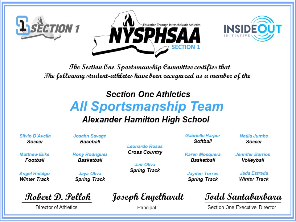
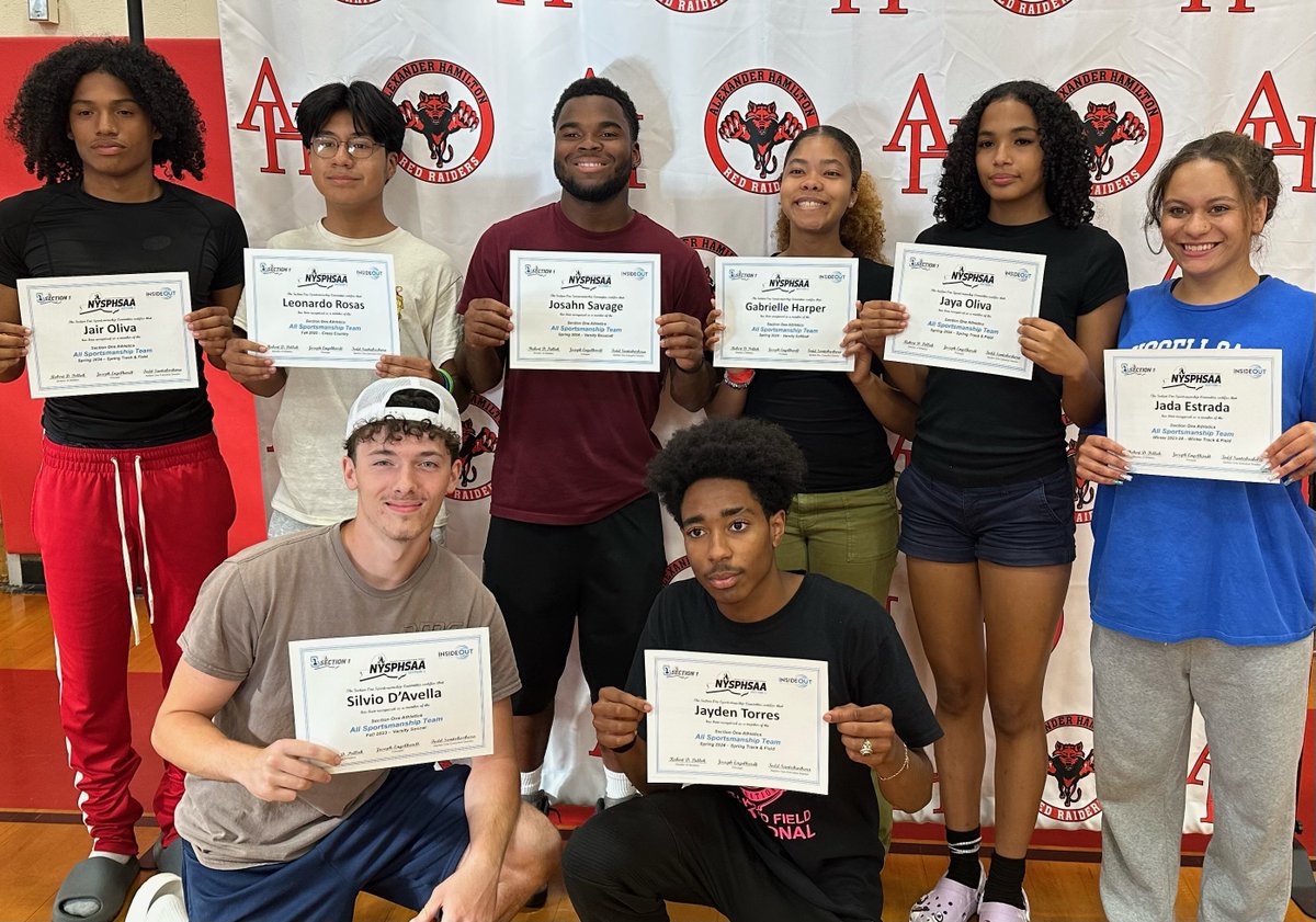
Congratulations to the 2023-24 @SecOneAthletics All Sportsmanship Team of @hamiltonhs! This is quite an honor to be selected for & it speaks to the type of student-athlete you are & the character you demonstrate on a daily basis! #Congrats #SectionOne #SportsmanshipTeam @eufsd
2
2
11
1,244

21 Mar 2024
“I knew streaming High School sports was going to be the future…”
@KDJmedia1
Kevin Devaney Jr.’s story about being laid off from his job to becoming one of the most prominent voices in Local High School sports is something you need to hear right now. His mindset and vision that he had during a tumultuous time in his life led to something big…really big!
You have to listen to E106 of the #UUPotential Stories Show with Kevin. So much inspiration and wisdom. Never lose sight of your vision…especially when it means you are supporting the stories High School athletes!
Listen and learn…👇👇
BrandonBeckEDU.com/podcast
#edupodcast
.
.
.
#locallive
#coacheshelpingcoaches
#nysphsaa
#sectionone
#highschoolathlete
#highschoolbasketball
7
483

11 Mar 2024
DAY ONE.
Best of luck to all Section One coaches on today, day one ☝️ of the 2024 lacrosse season.
Looking forward to this afternoon.
#KeioAcademy #Lacrosse #SectionOne #SectOneLax #Coaches #DoTheWork #TrustTheProcess #WINatLIFE

3
168
3 Mar 2024
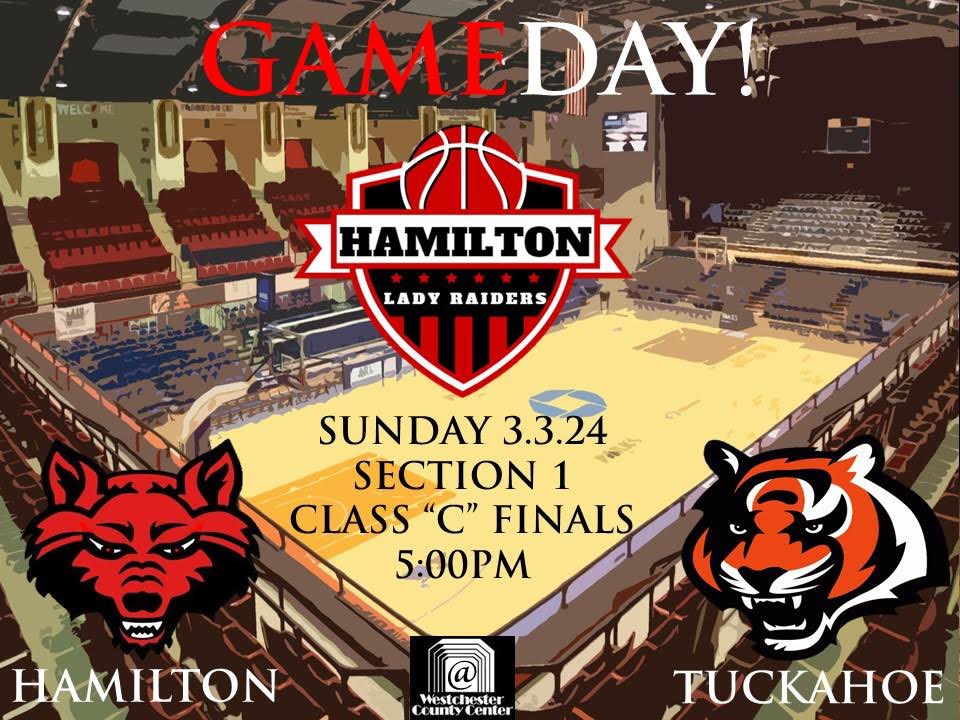
LADY RAIDER #GameDay COME OUT AND PACK THE COUNTY CENTER TODAY, SUNDAY AT 5:00PM AS THE GIRLS TAKE ON TUCKAHOE IN THE CLASS C SECTION ONE CHAMPIONSHIP GAME! #RedRaiderNation #SectionOne #GoldBallSzn #Playoffs #AHHS @AHHSstudent_gov @AHHSGBasketball @eufsd
1
9
590
1 Mar 2024
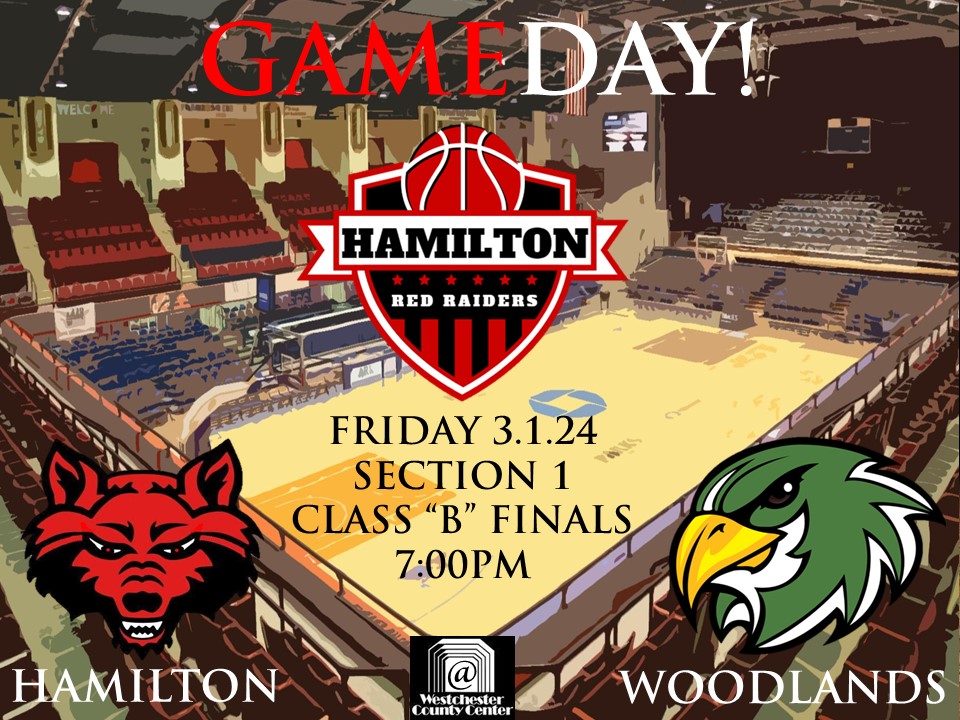
Red Raider #GameDay COME OUT AND PACK THE COUNTY CENTER TONIGHT AT 7:00PM AS THE BOYS TAKE ON WOODLANDS IN THE CLASS B SECTION ONE CHAMPIONSHIP GAME! #RedRaiderNation #SectionOne #GoldBallSzn #Playoffs #AHHS @AHHSstudent_gov @KeithWr55548677 @eufsd
2
6
1,649


29 Feb 2024
Great seeing all the Section 1 coaches tonight at the meeting prior to the start of the 2024 season. Being there felt like go time! #SectionOne #SectOneLax #Coaches

1
6
268

23 Feb 2024
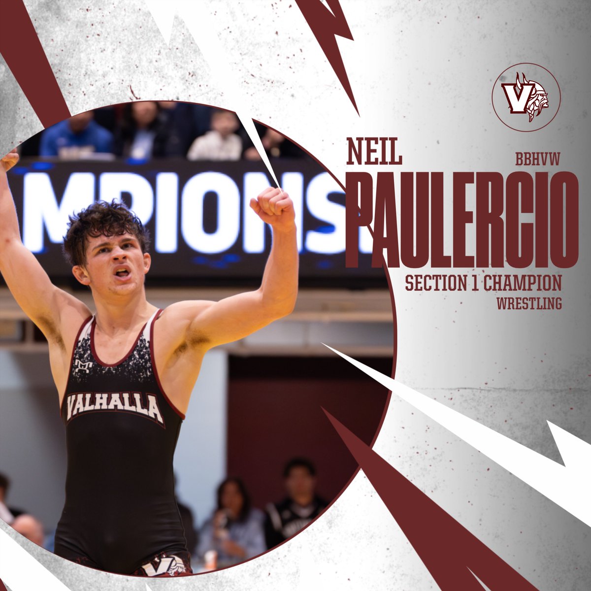
Viking Nation today is day one of state competition for Neil P. follow along for updates throughout the day or make an account on flowsrestling.org to watch all the action live! #itsagreatdaytobeaviking #sectionone #mergedteamlife
1
3
19
1,234

22 Jul 2023
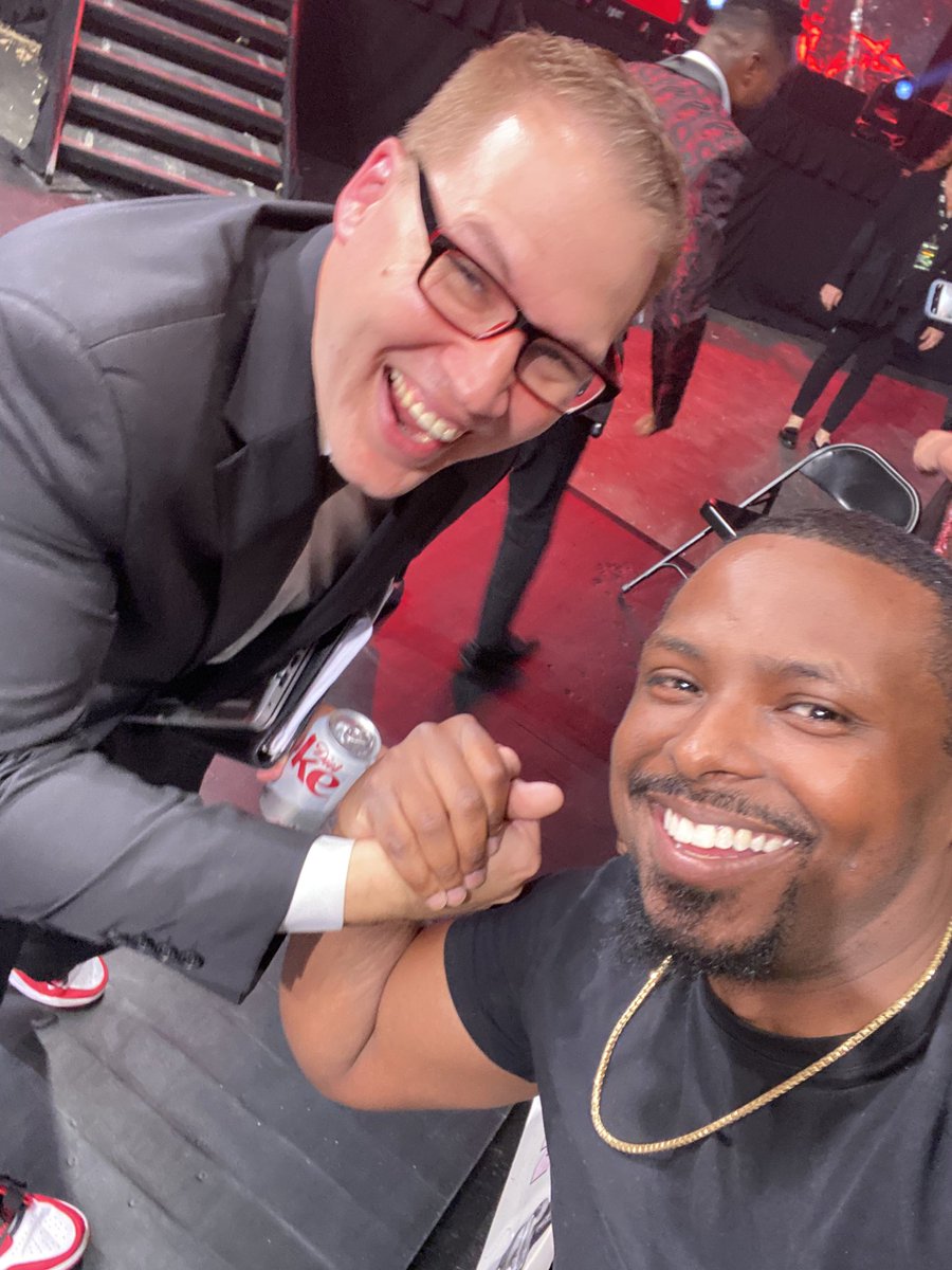
Show was lit. Very happy to have been in attendance for such a monumental moment. Fire match by both women as well.
S/n appreciate you taking time to greet us fans and taking a pic #SectionOne
1
7
628


24 Jun 2023
Todd Oldham Spring 1995 Ready-to-Wear #looks #lookbook #projectcasting #dubai #sectionONE @OneWTC @OneWorldNYC @onewm @traveloneworld @BBCNews @OneWorldCNN @OneWorldTrips @LucyLiu #boardwalk vogue.com/fashion-shows/spri…
2
58