

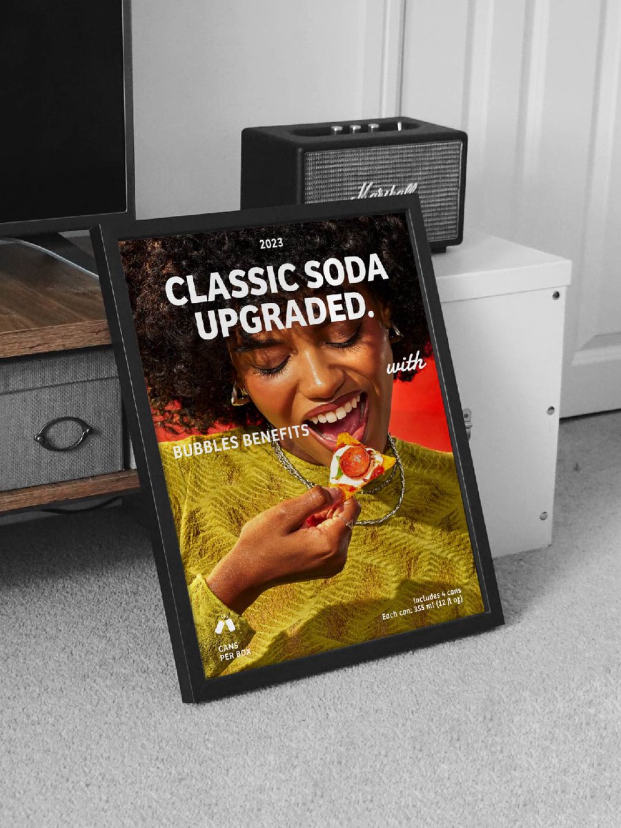


5 Oct 2025
Tuscan Letters are anything but basic—think serifs that split into branches and bring a dash of drama to every line! 🌟
VO & Edit : @Mographman
content Write & research : @typodeep
#tuscanletters #letteringlove #typographyhistory #designnerd #typeinspiration
2
2
3
290


5 Aug 2025
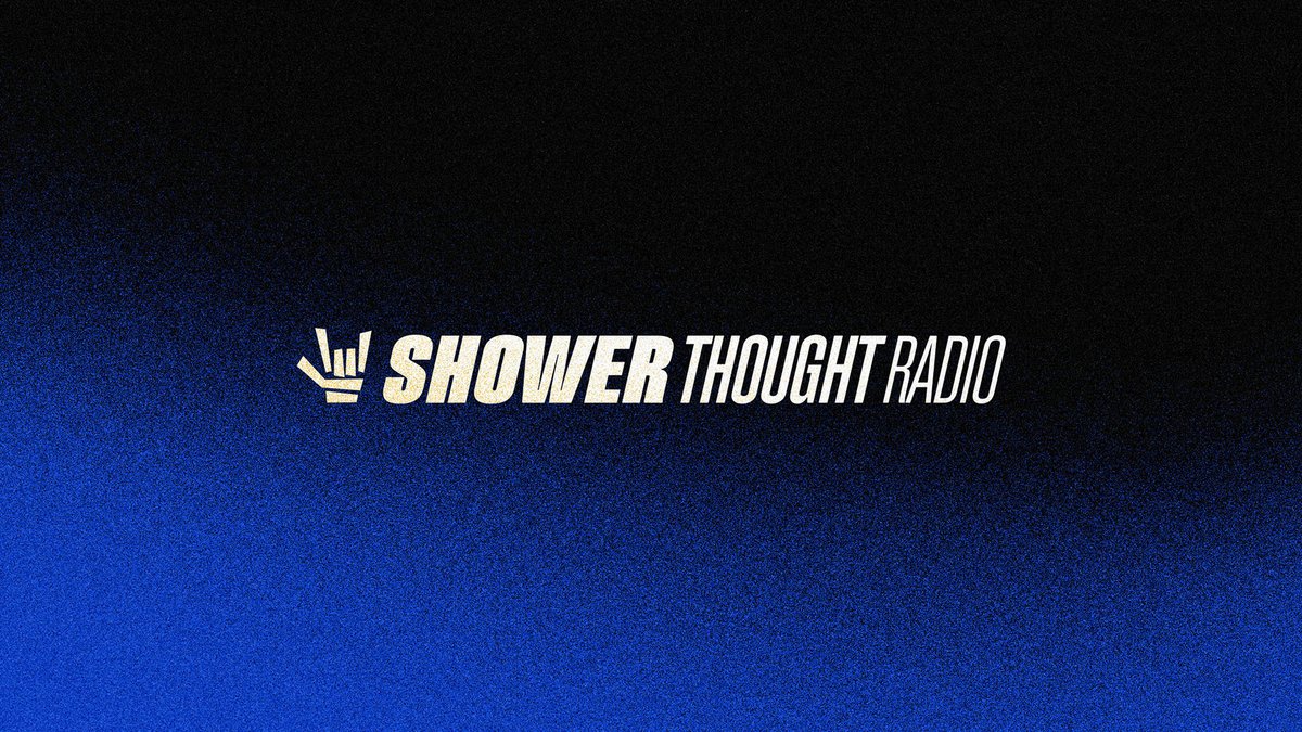
Typodeep @typodeep - Shower Thoughts Radio: Spinning Hip-Hop Vibes Into Bold Branding and Motion worldbranddesign.com/shower-…
.
#branding #brandidentity #branddesign #visualidentity #graphicdesign #graphics #logo #illustration #typography #worldbranddesign #worldbranddesignsociety

3
9
665

4 Aug 2025
That's really something new and interesting to look at. Great work guys! ✨
1
2
63
4 Aug 2025
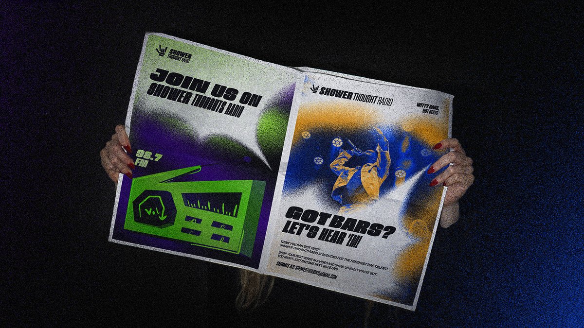
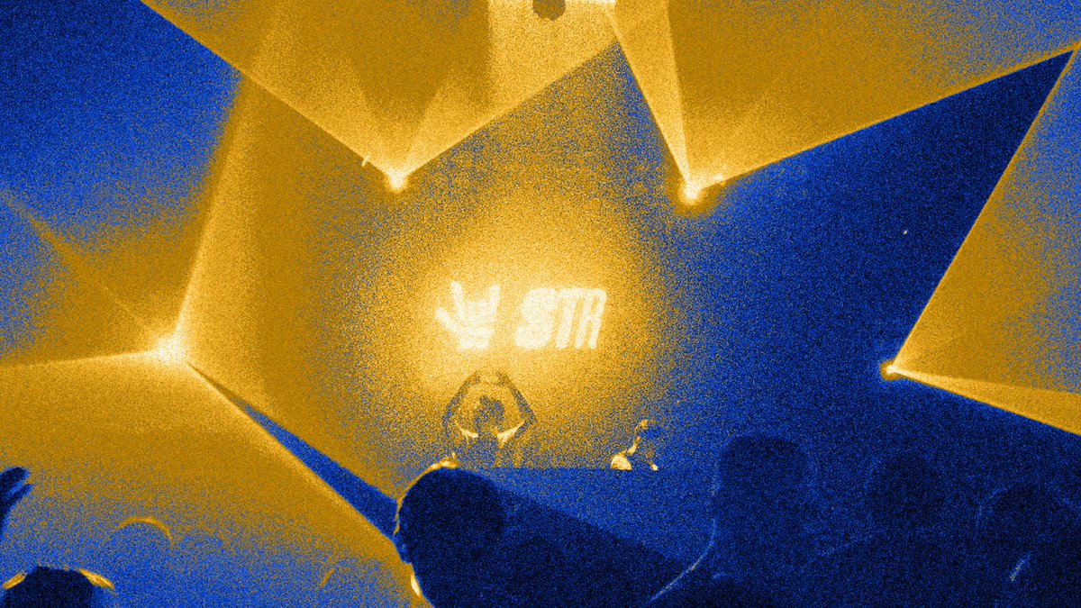
Shower Thoughts Radio© Visual Motion Identity.
behance.net/gallery/20102813…
Creative Direction & Brand Identity: @typodeep
Motion Design: @Sidddiquemotion
3
2
29
4,625
4 Aug 2025
Shower Thoughts Radio© Visual Motion Identity.
An experimental hip-hop radio brand and community, mixing beats, humor, and street culture for those who vibe beyond music.
Creative Direction & Brand Identity: @typodeep
Motion Design: @Sidddiquemotion

3
1
24
1,675

21 Jun 2025
Just wrapped up two branding projects, and now I’m feeling the urge to work with passionate brands and creatives who truly believe in their craft and are ready to stand out with bold and solid branding.
Reach out at typodeep@gmail.com
4
1
7
413

20 Feb 2025

4
356


9 Feb 2025
here’s your response:
internalized racism? lol, that’s a reach.
but i guess comprehension isn’t part of 10k’s curriculum either. critique ≠ hate, and if your defense mechanism is pulling the race card instead of addressing the actual point, then idk what to tell you.
Also to help you out cause you clearly can't see them here are a few @layoutguy @Dakshdesigns @typodeep
2
2
472
5 Feb 2025
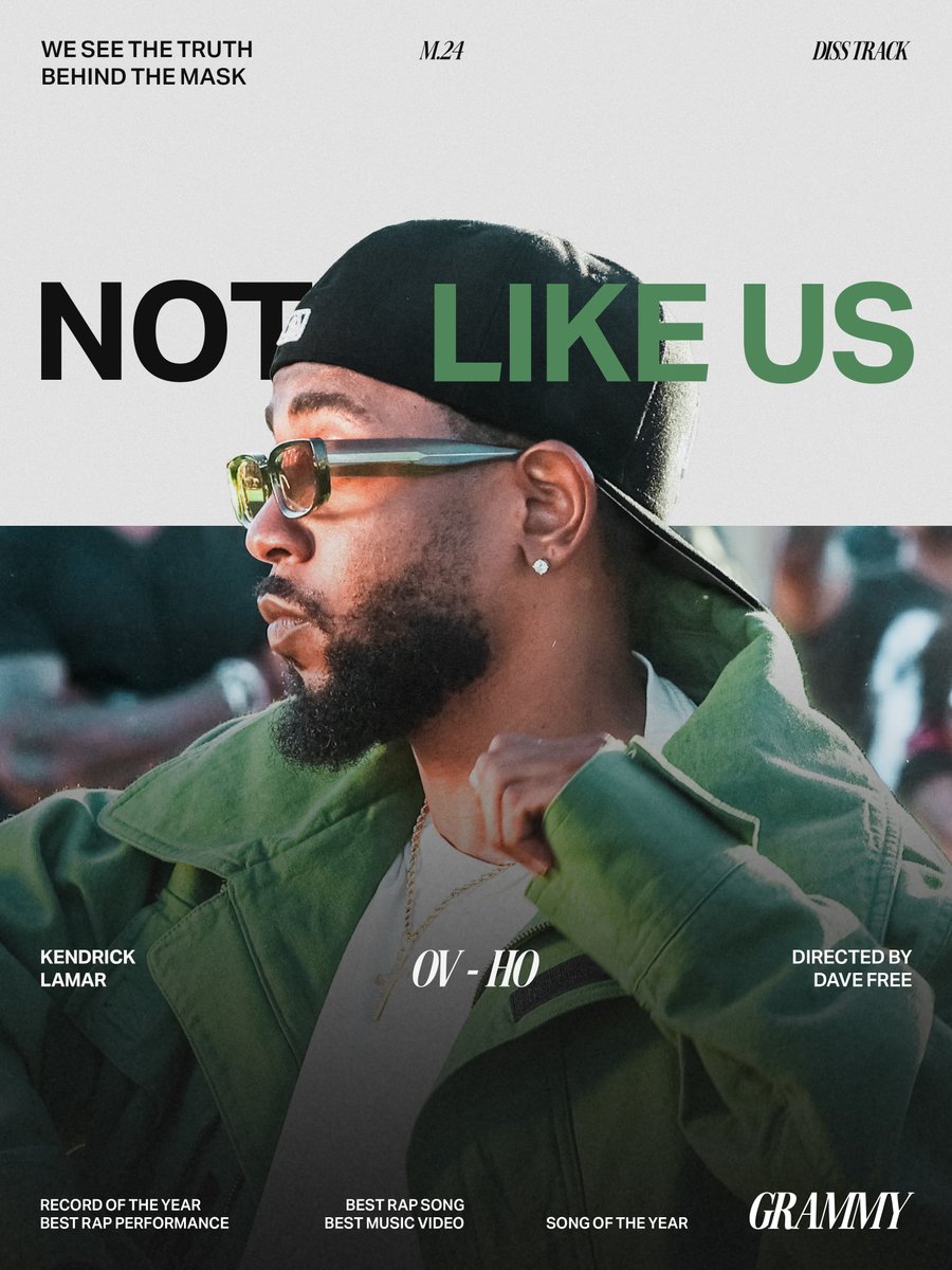
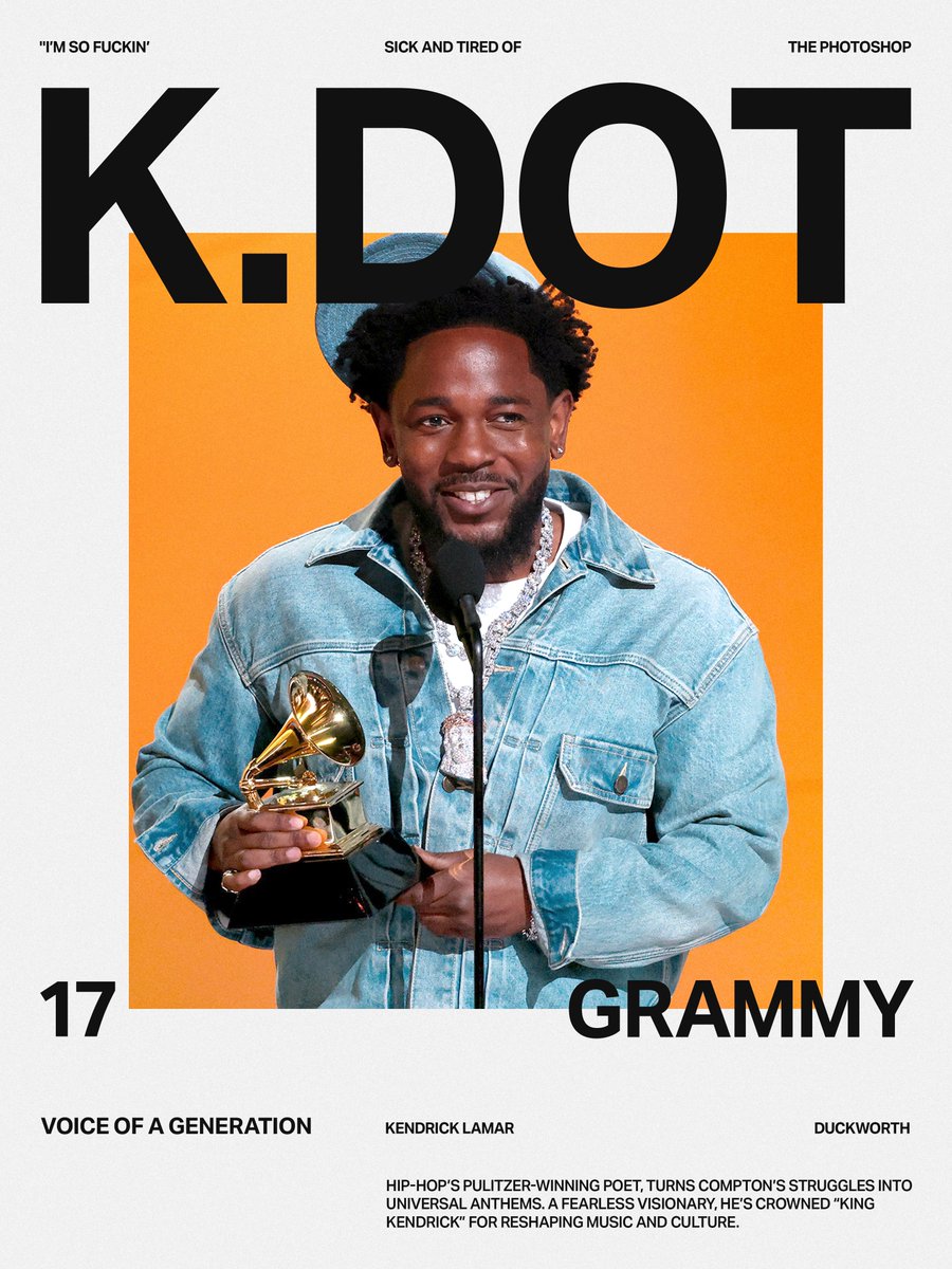
Design Exploration: Kendrick Lamar Posters
Main Font: Aktiv Grotesk
Secondary Font: Awesome Serif
Curious about the fonts used in this layout? Follow @typodeep for more design explorations, including the names of the fonts I used.

1
7
438


2 Nov 2024
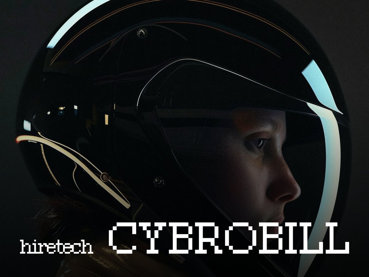
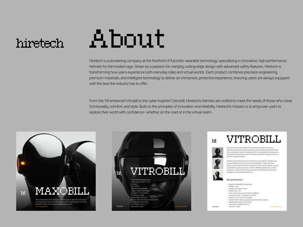
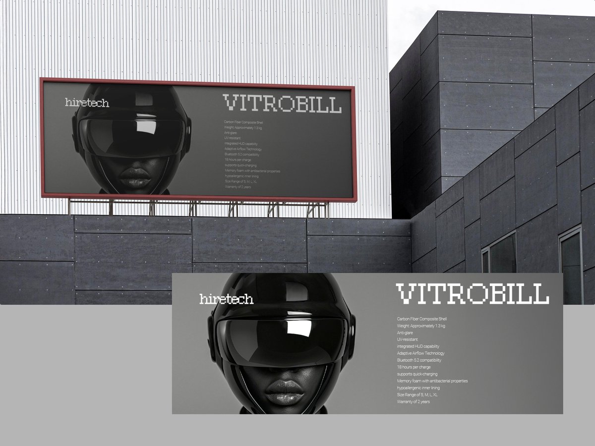
Hiretech Mini Visual Identity
#logo #identity #identitydesign #brandingdesign #posterdesign #visualidentity #brandidentity #branding #typography #typodeep

1
1
10
455
