
❤️🐱 | Soy de disertar y hablar de todo | Obrera del Diseño | Pesimista con careta de optimista
Joined July 2011
- Tweets 29,322
- Following 1,661
- Followers 3,400
- Likes 5,685
2,198 Photos and videos


Izaskun Saez retweeted

28 Oct 2024
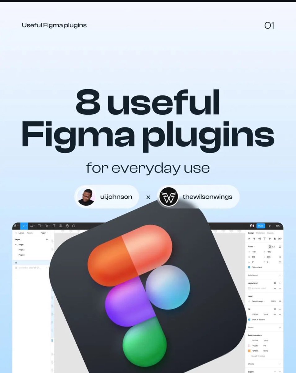
Hey designers! Here are 08 useful Figma plugins you shouldn't miss out on.
Resources contents include:
✅ Typescales
✅ Wirefirame
✅ Supa Palette
✅ Mapsicle
✅ Mockup
✅ Writer for Figma
✅ TeleportHQ
✅ Convertity
Credit: @uijohnson
3
36
158
9,474

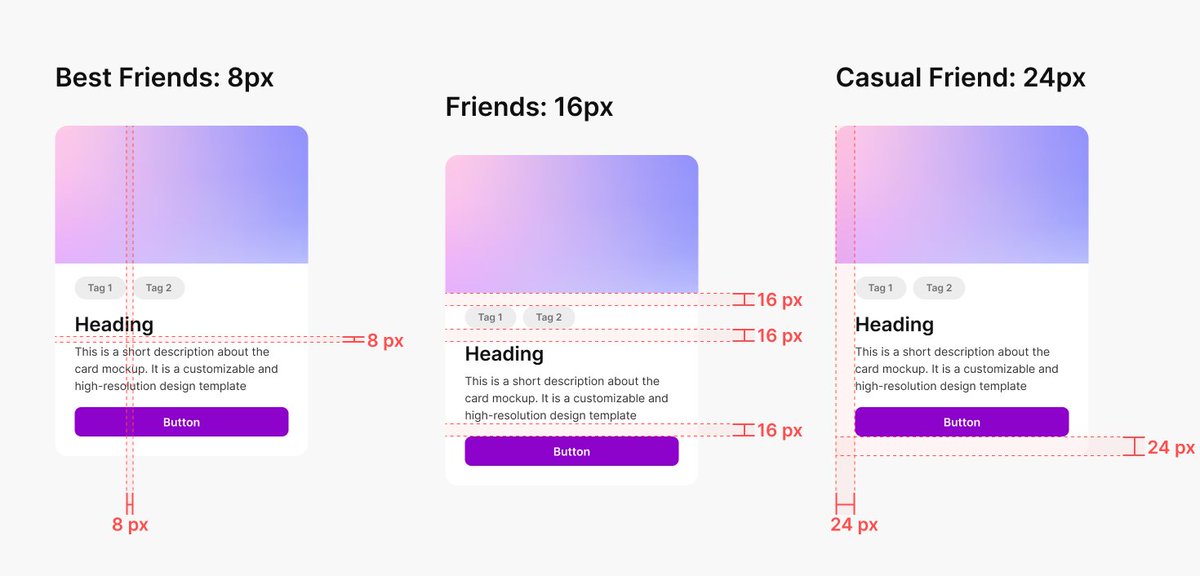
Excellent UI Spacing Cheat sheet: A complete guide, to Boost Your Next Design Project! 🤜
Overview
The 8-point grid system
The 8-point grid system is a precise and flexible method UX designers use to establish consistent spacing and alignment between elements. It involves dividing the layout into a grid, with each unit of measurement equal to 8 pixels or points. By adhering to this grid, designers can maintain a sense of balance throughout their designs.
The beauty of the 8-point grid lies in its versatility. Designers can easily create spacing increments by multiplying or dividing 8, such as 8, 16, 24, 32, etc. This system provides a reliable framework for spacing elements, ensuring consistency and visual cohesion across different screen sizes and devices.
Spacing friendship
If you are in the design business, whether graphic or digital painting,… you must have heard about the principle of proximity.
This principle suggests that when elements are positioned close together, we perceive them as belonging to the same group. Conversely, we categorize elements into separate and distinct groups when they’re far apart.
The closeness between elements implies a certain level of “Friendship”. This concept, referred to as “Spacing Friendship” by the UX collective, allows us to categorize spacing based on the perceived relationship between elements.
Spacing is relative
You can understand spacing better if you look at the bigger picture. There’s a reason why 8-point spacing is so popular: it’s based on the most fundamental elements: the texts.
The spacing may need to be adjusted when you’re using a font size other than 16 pixels.
Solution for dynamic spacing
For dynamic spacing, the spacing should be built around a constant, which I call x or in some design systems like Atlassian calls “base unit”:
You can make X 0.75 – 1.25 times the size of your smallest element (usually the text). In most cases, you should use a ratio of 1. Sometimes, when you want the design to have more breathing room, like in the hero section, you can use a 1.25 ratio.
Try to be consistent
Like I said before, there are no correct answers. But you still need to be consistent and try your best to limit your spacing options.
That’s why I recommend sticking with the 8-pixel grid system instead of a smaller system like the 4-pixel grid system. Believe me, in the future, you will thank me so much for that.
Conclusion
In a nutshell, by using the 8-point grid system, and considering spacing friendships, designers can create balanced designs.
#ux #ui #userexperience #uidesign #uxdesign #spacing #visualdesign #uxlaws #design #mobile #web #webdesign #appdesign #webdevelopment #react #css #js #html #startup #business
5
44
293
16,365
Izaskun Saez retweeted

21 Sep 2024
Antes me he topado con un tuit de una persona que decía estar "harta" de la nueva generación de mujeres divulgadoras que destacan por ser unas mamarrachas y gesticular mucho. ¿Sabéis qué significa esto? ¡Allá va un resumen de quién son estas reinas y por qué son tan importantes!
67
1,836
9,671
667,682
Izaskun Saez retweeted

17 Sep 2024
Stop designing custom icons
45
290
3,754
279,699

5 Sep 2024
Lo que cuesta hacer y mantener un portafolio de trabajos es que no está escrito 🥲
1
137
3 Sep 2024
¡Aupa Septiembre!
Tras una temporada centrada en aprender 🙇🏻♀️ y mejorar algunas habilidades, y a punto de cerrar mi portfolio, es la hora de zambullirme 🏊♀️ a explorar proyectos o empresas interesantes donde poder aportar. 🙋🏻♀️
Deseadme suerte. 🍀
#UX #UI #GraphicDesign
4
2
7
823
Izaskun Saez retweeted

26 Jun 2024
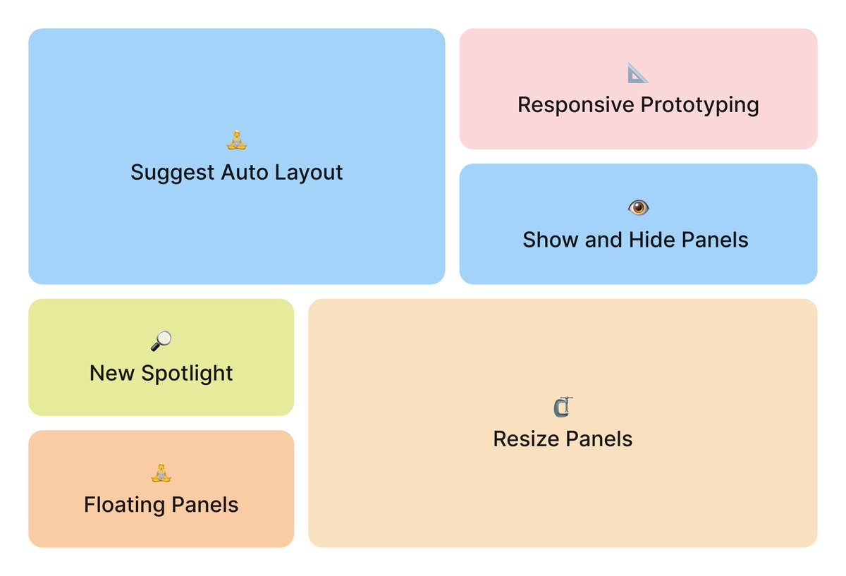
Whoa, @figma announced so many big features today, but few people are mentioning the little details. So, let’s talk about them!
#Config2024 #FigmaAmbassador
24
213
1,840
264,552
27 Jun 2024
Estoy bastante en shock con todo lo nuevo de @figma #Config2024
Cada vez veo más tiempo para analizar usuarios, idear y conceptualizar y menos para ejecutar un diseño

1
3
375
23 May 2024
Un problema grave es el diseño de los envases y otro es el método de extracción o apertura de pastillas, que además son muy pequeñas y poco manejables.
No se tiene en cuenta a personas mayores pero tampoco a personas con movilidad reducida de manos, poca visión… etc
#ux
22 May 2024

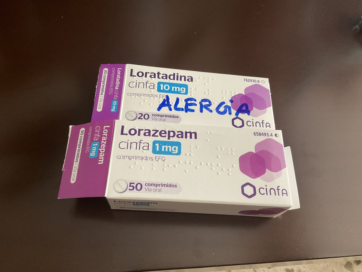
Mi madre durante cinco días tomando el doble de lorazepam y sin tomar las pastillas de la alergia.
Cambio de diseño de los envases.
Los envases para una persona de 77 años.
Ahora lo escribe con rotulador.
4
19
2,078
3 May 2024
Cada revista mensual de @eljueves es una maravilla, PERO este mes es 🤩. Y vaya portada se ha marcado @JJCuerda ¡Y los autores están en el @COMIC_bcn firmando! Ale ya tenéis plan 🙂
ALT La portada de la revista mensual de humor “el jueves” Especial Cómics
2
8
39
10,835
Izaskun Saez retweeted

17 Apr 2024
😱 A Diana Aceves le han bloqueado la cuenta, le quieren hacer callar. Diana es una divulgadora tecnológica y defensora de la igualdad.
Seguid a @diana_aceves__. Apollad su tiempo, su lucha y sus ganas de aportar.
🔁Difundid, ayudad y seguid a Diana x.com/diana_aceves__
2
36
54
11,084
27 Mar 2024
Un vino blanco y unos pintxo mientras escucho la radio, HE TRIUNFAO.
4
296
27 Mar 2024
Yo ya he pringado en varias ocasiones por no tener hijos hasta que me planté.
Eso sí, se debería estudiar a la gente que piensa que porque no tienes hijos no tienes vida. Dice mucho de ellos.
26 Mar 2024

Alfredo Ramos, especialista en masculinidades: "Me parecería interesante que cuando se vayan a distribuir las vacaciones en una empresa el criterio deje de ser la antigüedad y sean las necesidades de conciliación"
eldiario.es/sociedad/alfredo…
1
12
953
Izaskun Saez retweeted

14 Mar 2024
Aprende diseño y CRO con Renfe.
Renfe siempre nos ayuda a mejorar como diseñadores y CROs.
Acompañadme en este viaje por el infierno del diseño, los contrastes imposibles y las instrucciones incomprensibles para conseguir una clave que permita acceso a una wifi.
#CRO #UX
🧵👇

5
21
86
17,532
14 Mar 2024
¿Cómo lleváis la crisis existencial de los 40 (o de los 41, 42, 43…)?
1
3
270
8 Mar 2024
Banoa hemendik zeru goian zehaaaaar!
No sé mucho euskera, pero la intro de Dragoi Bola siempre la tengo en mente.
#AkiraToriyama
2
215
28 Feb 2024
Para aquellas personas que tendéis a sobrecargaros de tareas y proyectos, solo os quiero decir que de eso también se sale y que no pasa nada por tener que frenar y recalcular el camino.
El descanso y el tiempo libre es MUY importante porque si no petas 🥴 y petar no mola.
4
312