
Joined February 2011
- Tweets 2,665
- Following 135
- Followers 10,477
- Likes 7
695 Photos and videos


Lost Type Co-op retweeted

21 Sep 2021
It turns out that this is one of those pesky optical illusions. Let’s abstract this to circles/squares for a moment. This circle looks much smaller than this square, right? And yet, they match exactly in height and width.
1
1
64
Lost Type Co-op retweeted
21 Sep 2021
The same illusion happens with spacing. For instance, the squares and circles below have literally identical margins between them. But it appears that there is much more space surrounding the circles.
1
3
65
Lost Type Co-op retweeted
21 Sep 2021
For the evening crowd: I published a new thread today! 🔠🔤
21 Sep 2021

What exactly is kerning? What is spacing? How are they different? Let’s talk about it!
THREAD 🧵:
1
4
19
Lost Type Co-op retweeted
21 Sep 2021
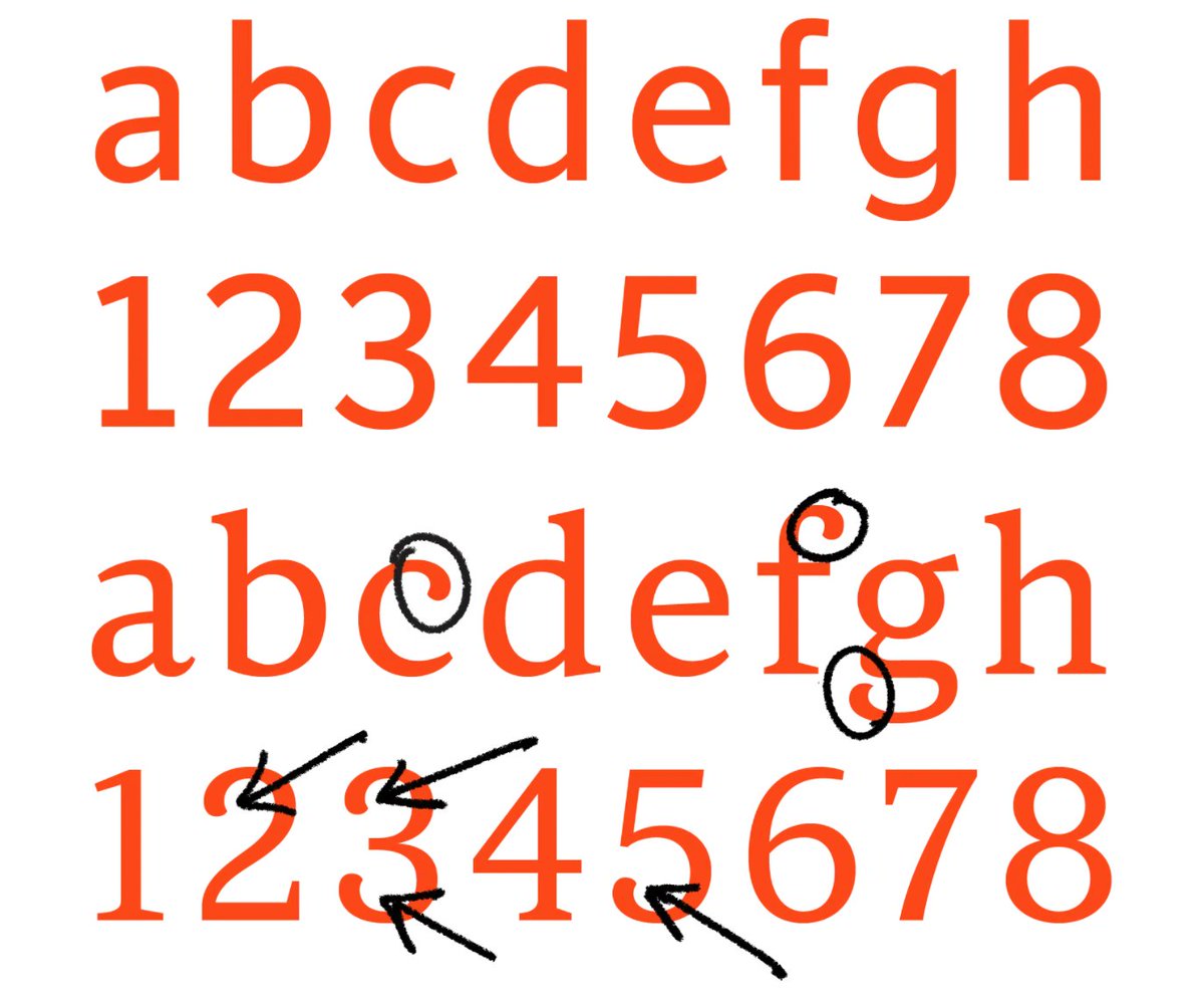
When you adjust ‘tracking’ (also called letter-spacing in CSS), you are modifying the amount of air in between the letters, by adding or subtracting from all margins equally. This is sometimes done for aesthetic reasons, for instance.
1
3
48
Lost Type Co-op retweeted
21 Sep 2021
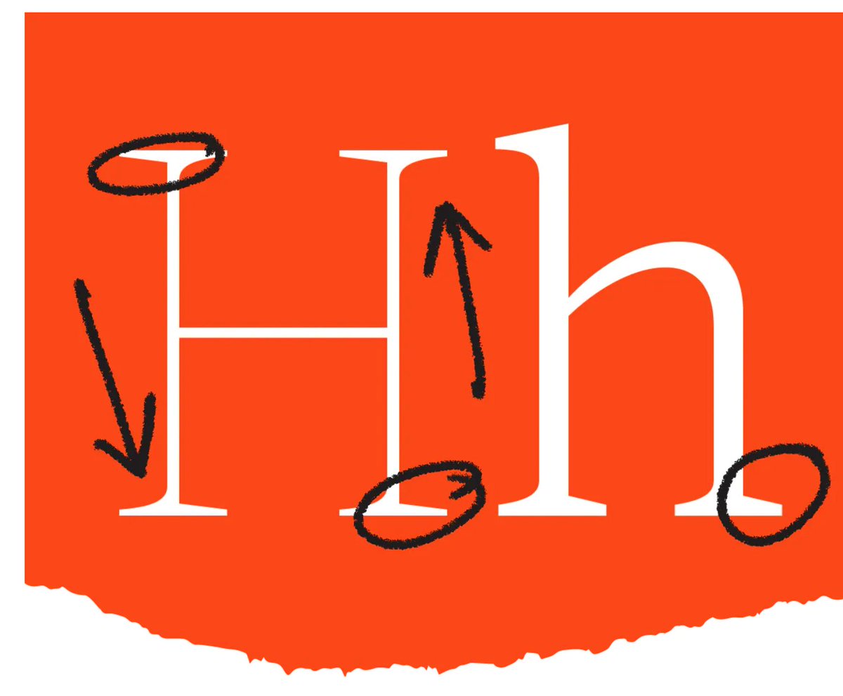
Just as there are counterforms within letters, we can also observe the shapes of the space in between letters. All of these negative shapes need to be balanced, and spacing is a huge part of how we achieve this.
1
2
56
Lost Type Co-op retweeted
21 Sep 2021
What exactly is kerning? What is spacing? How are they different? Let’s talk about it!
THREAD 🧵:
41
764
2,853
Lost Type Co-op retweeted

11 Sep 2021
Who thought bold fonts could be such a fascinating rabbit hole !
This the kind of stuff I’m on Twitter for: learn about a fascinating topic I never spent more than a minute thinking about from someone that dedicated hundreds of hours to it
8 Sep 2021
A recent #fontSunday topic of ‘bold headlines’ made me want to talk about bold letters a bit.
THREAD:
1
6
14
Lost Type Co-op retweeted
8 Sep 2021
At that extreme of weight, the extenders get a bit shorter, to emphasize the way the words set like a BRICK. The lowercase ‘i’ actually gets shorter just so that the ‘dot’ can fit comfortably in relation to the ascender height.
1
3
38
Lost Type Co-op retweeted
8 Sep 2021
Weight also impacts spacing. The spacing of a given weight of a typeface is connected to the amount of space trapped inside the letters. So as the ‘air’ is removed from the counterforms, the amount of space between letters is similarly reduced to maintain balance and rhythm.
2
7
55
Lost Type Co-op retweeted
8 Sep 2021
As letters get bolder, the differentiation between thick and thin (also called contrast) tends to increase. This is primarily to allow the counterforms to be as large as possible, despite the extra weight, because we rely so heavily on counterforms for reading.
1
5
56
Lost Type Co-op retweeted
8 Sep 2021
A recent #fontSunday topic of ‘bold headlines’ made me want to talk about bold letters a bit.
THREAD:
11
105
567
Lost Type Co-op retweeted
31 Aug 2021
Myself and my colleagues at Lettermatic designed custom fonts for @DoubleFine's #Psychonauts2, and I wrote 3000 words about the design process! 🕹🔤
lettermatic.com/custom/psych…
3
11
48
Lost Type Co-op retweeted
27 Jul 2021
One way to visualize the importance of counterforms is a 'blur test.' Adrian Frutiger did tests like this in the 1970s when designing his eponymous typeface (originally for a French airport). See how one set of drawings is easier to distinguish, in these harsh conditions of blur?
2
5
27
Lost Type Co-op retweeted
27 Jul 2021
By drawing different counter shapes, I can make many letters appear without changing the positive shape at all. This is shown here to illustrate the importance of the counterforms, and how they impact our perception of letter shapes.
1
1
15
Lost Type Co-op retweeted
4 Aug 2021
NEW 🧵: Did you know we only started mixing Sans and Serif typefaces in the last 200 years? One genre is much older than the other.
Let’s discuss the birth of sans serif typefaces.
I’ll use @lettermatic_abc fonts for some visuals: Parclo Sans & Serif.
lettermatic.com/fonts
2
31
126
Lost Type Co-op retweeted
18 Aug 2021
If you're interested in how fonts are made, I wrote a case study about making a matching pair of typefaces (Sans and Serif). 🔤
lettermatic.com/custom/root-…

1
19
108
Lost Type Co-op retweeted
17 Aug 2021
The fonts even ended up in Time Square! Photos via @Patrick_Torres !


4
18
Lost Type Co-op retweeted
17 Aug 2021
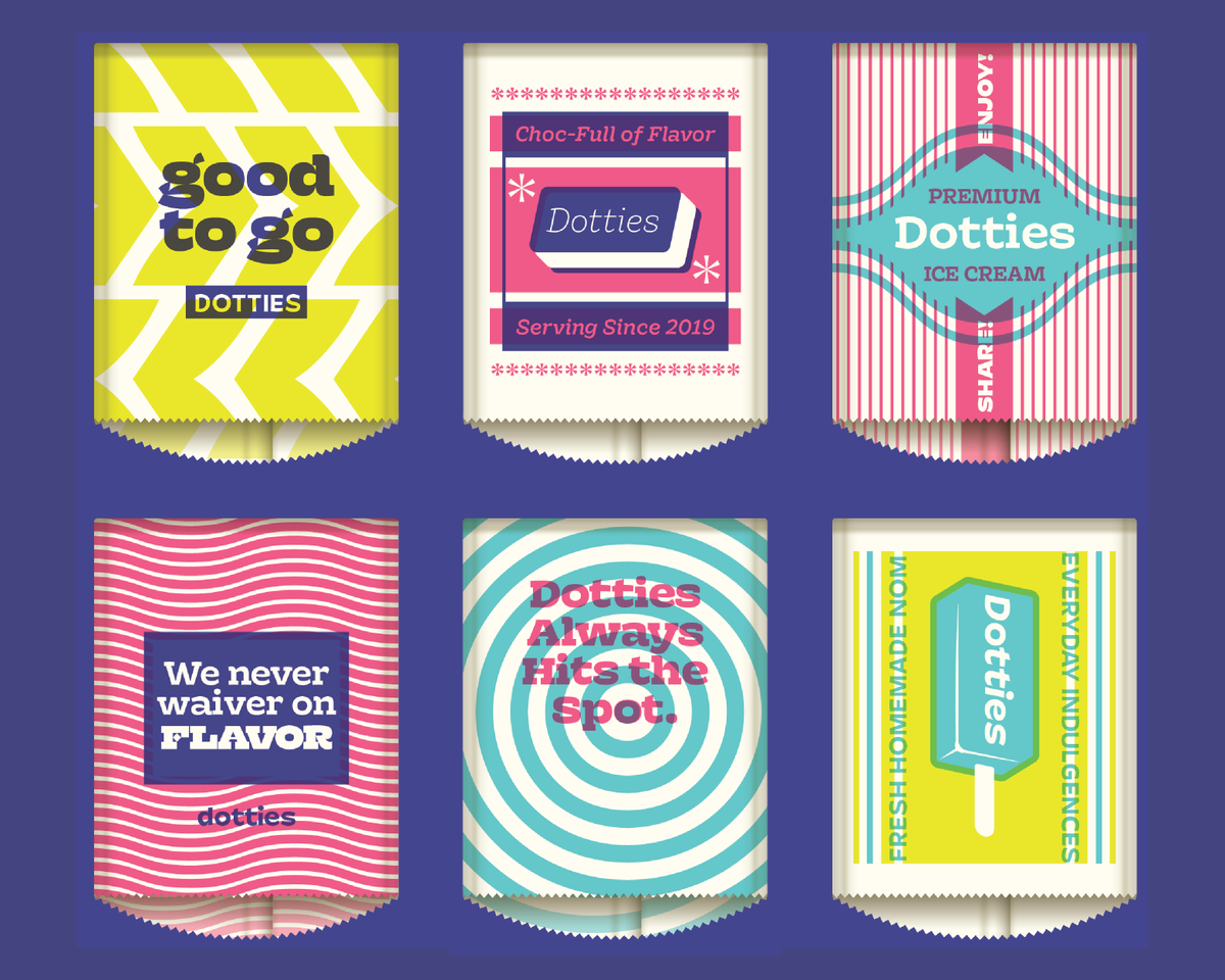
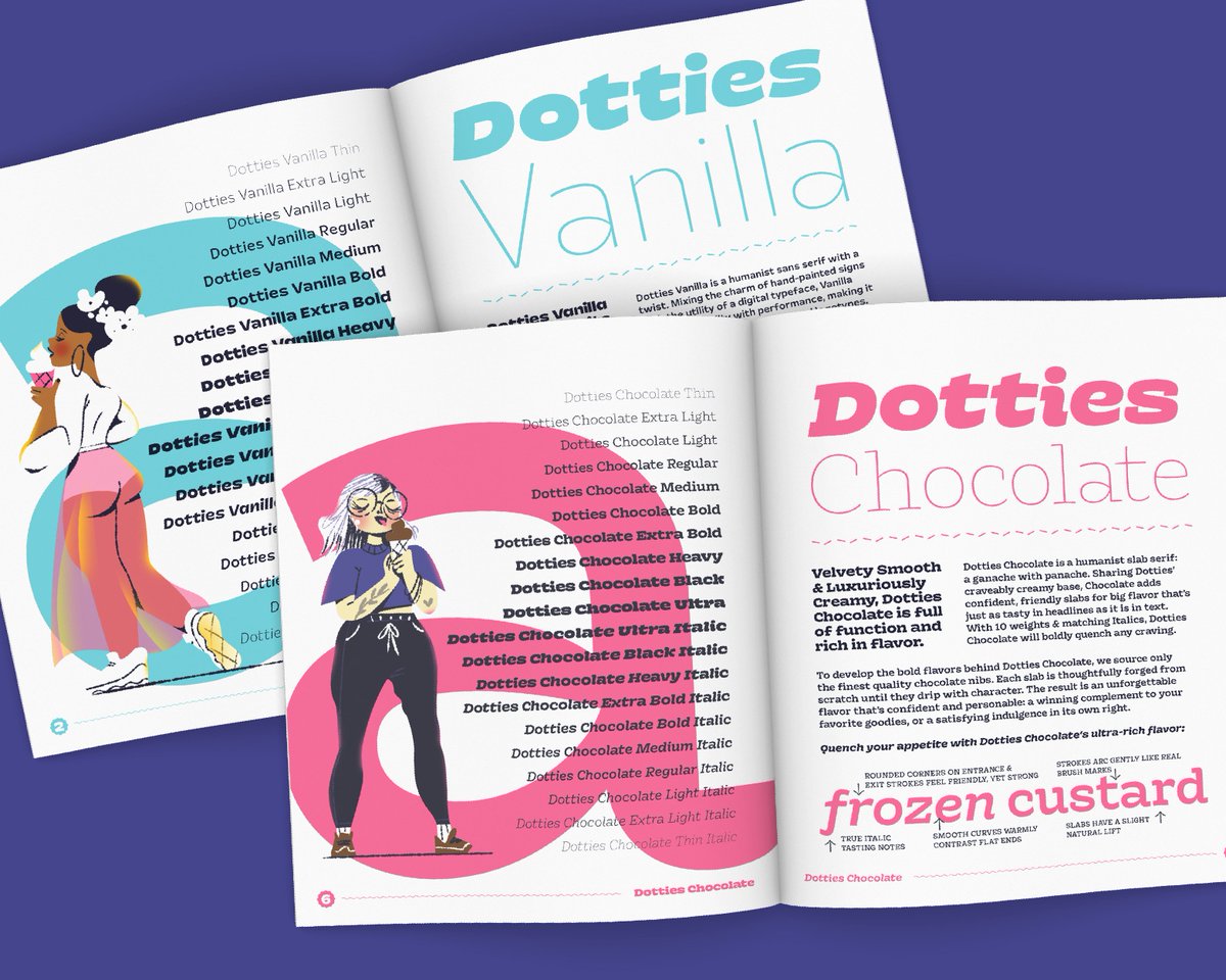
I designed 56 fonts for @RootInsurance with my colleagues at @lettermatic_abc, and I wrote 3000 words about the design process here:
lettermatic.com/custom/root-…
3
8
51
Lost Type Co-op retweeted
6 Aug 2021
I designed 92 fonts for Starbucks, with the team at @lettermatic_abc. If you're interested about the process, I wrote 2000 words about it here:
lettermatic.com/custom/starb…
12
54
366
Lost Type Co-op retweeted
27 Jul 2021
Today I would like to do a thread about 'counterforms.' They are a critical building block of typeface design... but what are they? How do they work?
I'll also talk about how I thought of the counterforms in Really Sans.
11
69
264