
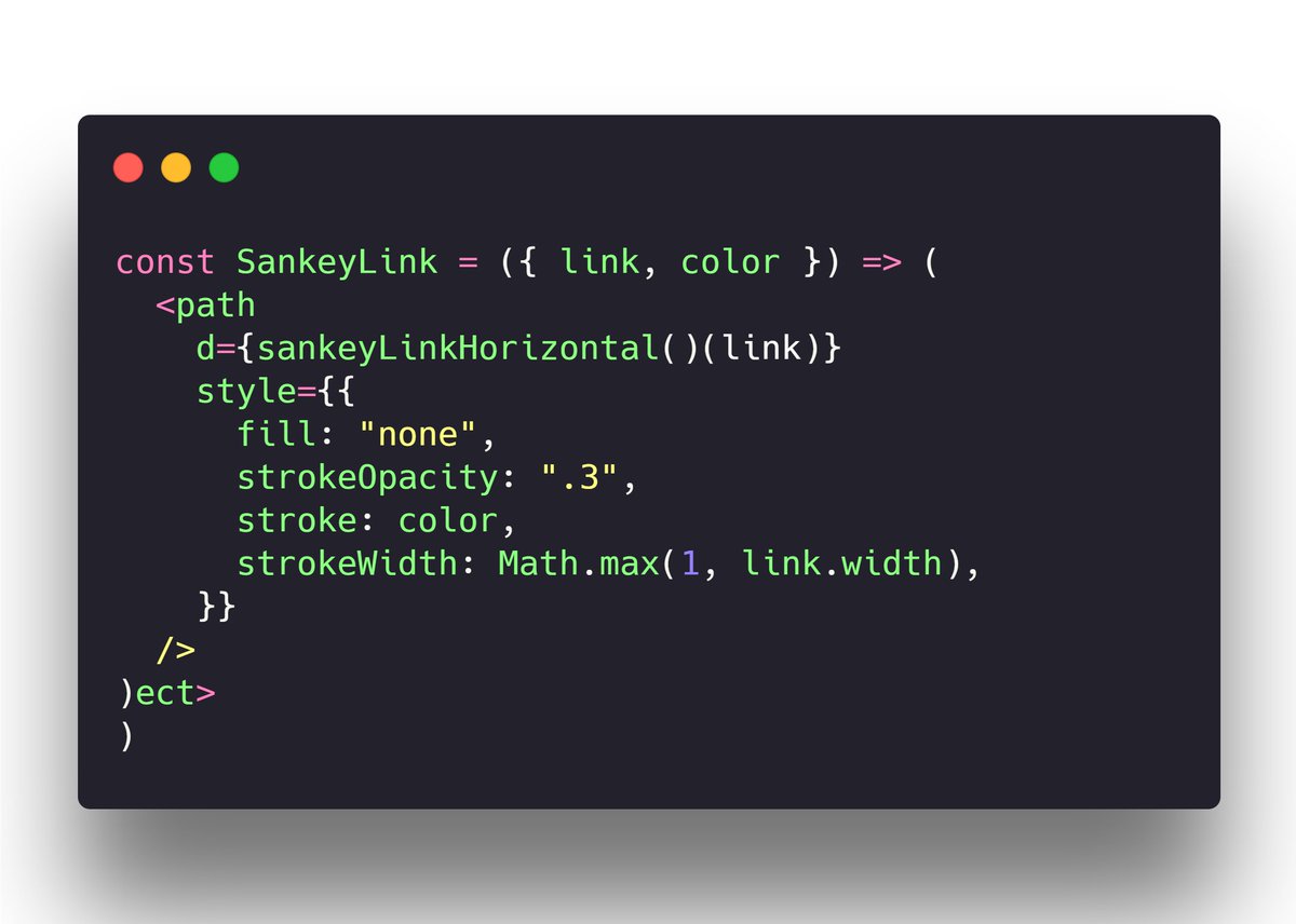
Stop copy-pasting D3 examples, create data visualizations of your own. Learn how with React for Dataviz
Joined August 2020
- Tweets 76
- Following 5
- Followers 39
- Likes 34
35 Photos and videos


Pinned Tweet

21 Sep 2020
Another fun #dataviz project
Did you know more Americans move to Mexico every decade than the other way around? UN data says so.
Colors for intensity of immigration, arcs with flying circles show density, searchable dropdown helps you explore the map.
1
1
7
11 Jun 2021
This is exciting! Looks cite we'll need a massive course update for React 18.
Transitions are changing 🥳
github.com/reactwg/react-18/…
1
21 May 2021
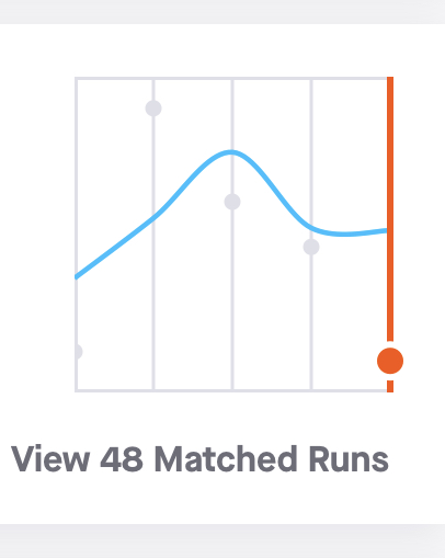
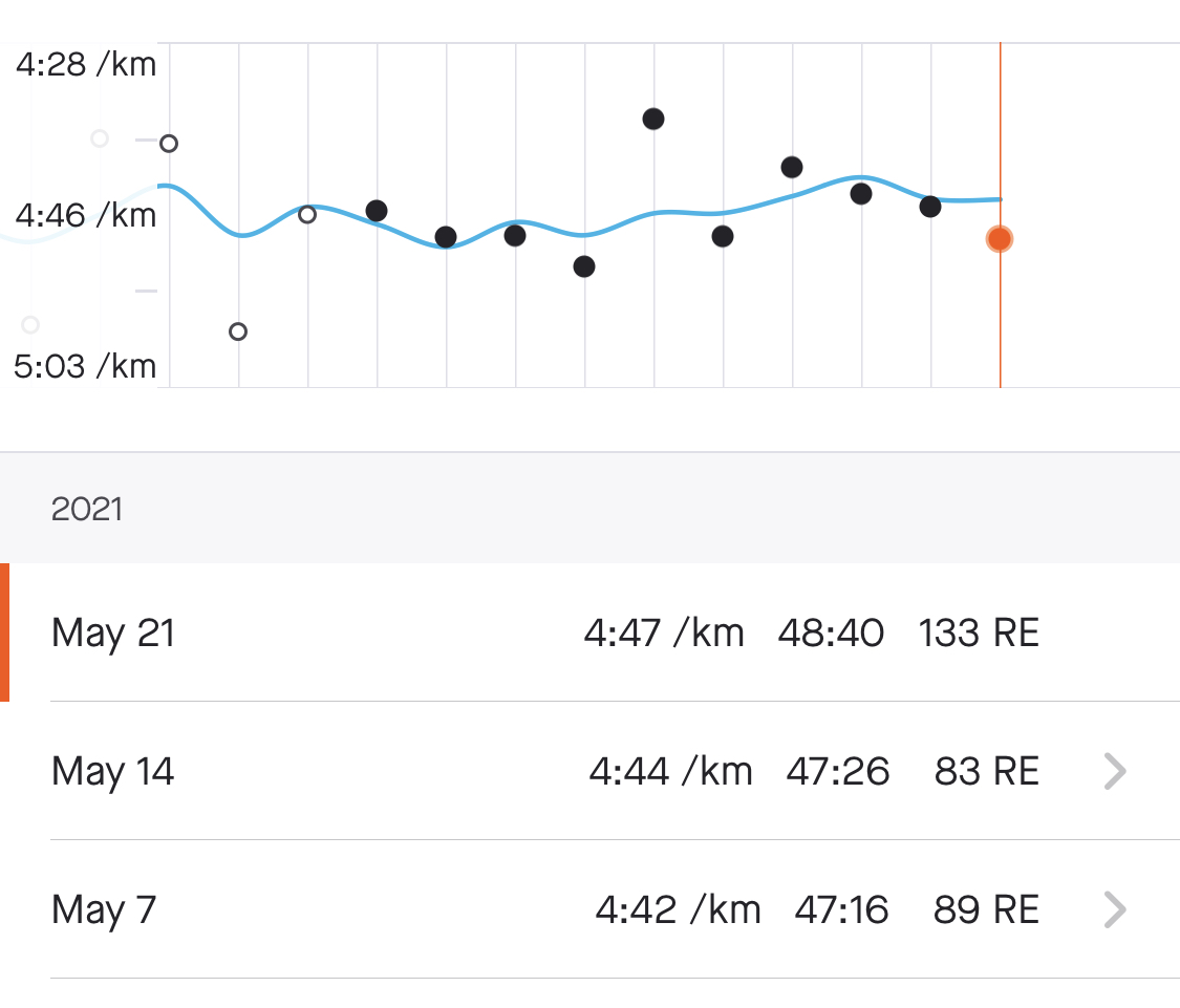
How to lie with data in a nutshell. Compare these graphs on @Strava comparing your runs
1: OMG so slow 😱
2: oh wait you’re only 3s/km slower … 30seconds over the whole run who cares 😇
2
2
26 Nov 2020
made a little example today for a student – drawing a map of Bosnia with 3 cities highlighted
Maybe should be a new chapter 🤔
codesandbox.io/s/vibrant-poi…
16 Nov 2020
Login for reactfordataviz.com has been fixed. Thanks everyone who sent an email, you the best Red heart
1
4
22 Oct 2020
When bigger numbers mean bad invert the scale to make charts intuitive. Interesting trick from the Economist
6 Oct 2020
Readers often ask about the best way to handle mouse events. Use #react or #d3? Does React even work right with SVG? How many events is too many events?
So I built this free-hand drawing app and it's smooth as silk 😍
Full writeup below 👇
reactfordataviz.com/articles…
1
2
6
6 Oct 2020
The key is that each line is thousands of points, 1 per mouse event, but we draw them with a single <path> element.
D3 handles coordinates and the mousemove event. React does mouseDown and mouseUp
1
2
6 Oct 2020
React's diffing algorithm and useMemo make Lines perform great despite looking like this should never work fast

1
2 Oct 2020
Do you know what JavaScripts most popular dataviz library is?
👉 #D3js
D3 is amazing.
D3 can do stuff like below 👇
If you saw an interactive data visualization, chances are it was built with D3.
Check out more d3js awesomeness reactfordataviz.com/articles…
1
2
reactfordataviz retweeted

1 Oct 2020
Drawing with your mouse using D3js and react hooks pscp.tv/w/ckSWdDFtTUVQT2dMZH…
1
1
24 Sep 2020
This is cool! Love the color scheme
24 Sep 2020

@Swizec Enjoying the first couple chapters of @reactfordataviz! Here's my first ever D3 chart where I actually understand what is going on thanks to your course. Stoked to learn more! 🦜
github.com/alexUXUI/D3-React…

2
2
21 Sep 2020
Another fun #dataviz project
Did you know more Americans move to Mexico every decade than the other way around? UN data says so.
Colors for intensity of immigration, arcs with flying circles show density, searchable dropdown helps you explore the map.
1
1
7
21 Sep 2020
👆 Makes people go wow at the dinner table 😛
You can also make people go wow at the dinner table:
reactfordataviz.com/articles…
3
3
17 Sep 2020
Really cool #dataviz by @JanWillemTulp simulating how fast COVID19 is spreading in each country.
Making data come alive and give value to the consumer.
14 Sep 2020

🎉NEW — side project🎉 A simulation to get an intuitive sense of how fast #COVID19 is spreading in each country, see it, and hear it! You can customize the view too! Always loads the latest data from @OurWorldInData covidspreadingrates.org/ #dataviz
1
2
16 Sep 2020
Candy is delicious! But when do people buy the most of it?
Did you know Americans buy $800mm worth of candy on Easter? 🍭
What better way to visualize it than candy falling from the sky into the shape of a bar chart?
👉(incl code) reactfordataviz.com/articles…
#reactjs #d3js
2
15 Sep 2020
2 people reached out today to tell me the cart on reactfordataviz.com is broken. They got a 10% discount and restored my faith in humanity


1
14 Sep 2020
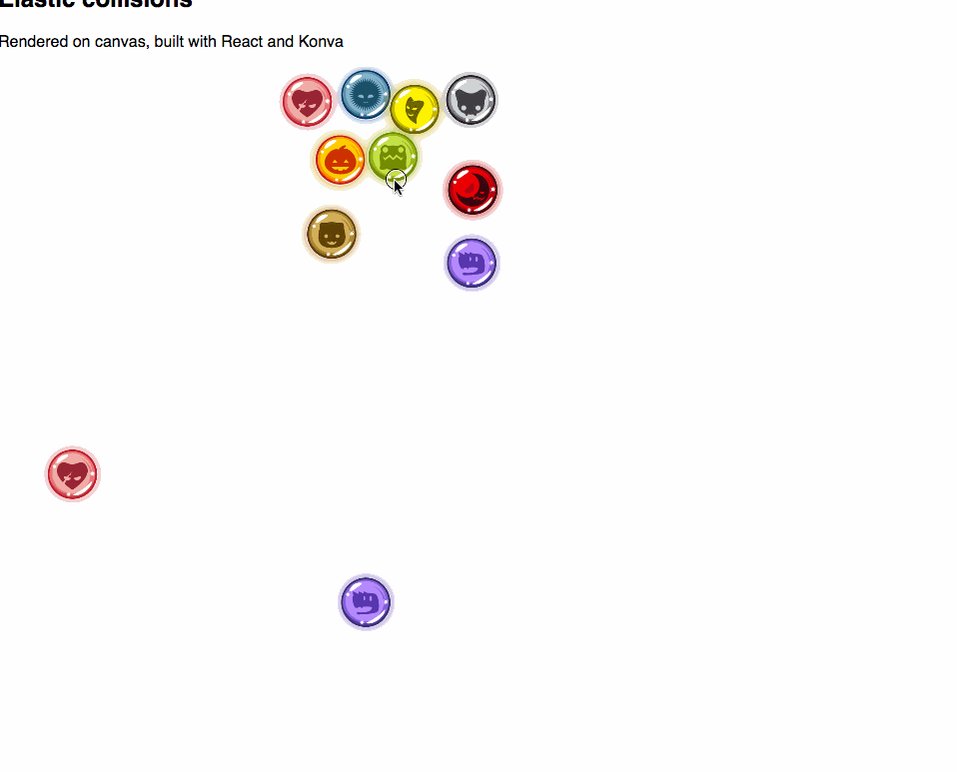
Collision detection is one of those problems that's easy in theory but hard in practice. Even between ideal circles.
But it's really fun to build!
The end result is a decent-looking simulation of billiards.
All of it done with #reactjs, #d3js & MobX
👉 reactfordataviz.com/articles…
2
3
9 Sep 2020
How can you create #dataviz that works well in progressive web apps?
Check out this Learn with Jason episode @Swizec did with @jlengstorf. Where in just an hour, they built an animated scatterplot from scratch with Gatsby!
youtube.com/watch?v=Bdeu-BFi…
1
3