
Joined September 2010
- Tweets 49,490
- Following 359
- Followers 1,152
- Likes 4,719
Photos and videos
Pinned Tweet

30 Jan 2020
"The electric light bulb did not come from the continuous improvement of candles." — Dr Oren Harari
6
64
144
Rich Opara retweeted

In 2024, around 280 million people lived in a different country from the one in which they were born. That’s around 3.5% of the global population.
Where were these international migrants born, and where did they move to?
Our colleague Sophia Mersmann built a new interactive data visualization that lets you answer these questions — for any country you’re interested in.
First, select a country. On the left-hand side of the visualization, you can see the total number of people living in that country who were born elsewhere, and where they were born.
On the right-hand side, you can see the number of people born in that country who have moved away, and where they moved to.

ALT New interactive data visualization by Our World in Data showing data on where migrants live and where they were born. The data source is UN DESA (2024). The chart is licensed CC BY
5
21
56
6,311
Rich Opara retweeted

It's concerning that so many people believe that handing over parental responsibility to the state is a solution, especially when the state have proven, time and again, that they're not to be trusted. There's also a lot of thinly-veiled classism at play here.
3
33
635
36,427

Australia, Canada, and now Britain on social media limits for under 16s.
Should big tech have done more to protect kids online or the onus is on govt.

1
1
27

BREAKING: Prime Minister Sir Keir Starmer has announced a social media ban for under-16s.
Live updates: trib.al/AaXv2Tr
2,963
4,549
17,309
3,476,859
A port so large it’s visible from space, the Singapore Tuas Megaport.
youtu.be/_sqT19vmWpw?is=H3rI…
42
📌

Behind every great Brunson is a Brundad
1
51
🔶🍊🧡🟠

32

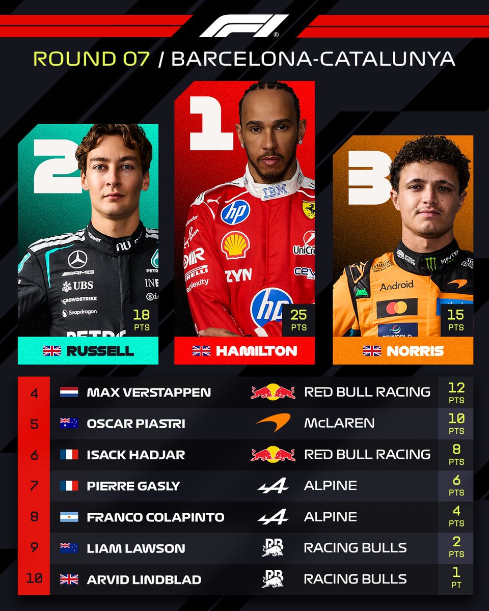
Incredible scenes in parc ferme 😍
#F1 #BarcelonaGP
252
6,043
31,109
703,443
Rich Opara retweeted

Jun 14
How to Earn a Billion Dollars: paulgraham.com/earn.html
531
1,282
10,168
2,652,892
Rich Opara retweeted

Jun 14
Swiss voters reject 10 million population cap, early projections say bbc.in/4uySjSy
426
1,011
5,023
1,648,457
