
9 Photos and videos


New from the specs.md creator —
@fabriqaai
orchestrates Claude Code, Codex, Gemini CLI & more in one workflow. Download development version for free → fabriqa.ai
Mar 3

I just released the <𝗵𝘁𝘁𝗽://𝗳𝗮𝗯𝗿𝗶𝗾𝗮.𝗮𝗶/> alpha version for public testing. It is alpha, and this is the dev channel release. Feel free to test it and provide feedback. <𝗵𝘁𝘁𝗽𝘀://𝗳𝗮𝗯𝗿𝗶𝗾𝗮.𝗮𝗶/>
👉 substack.com/note/c-22263187…

212
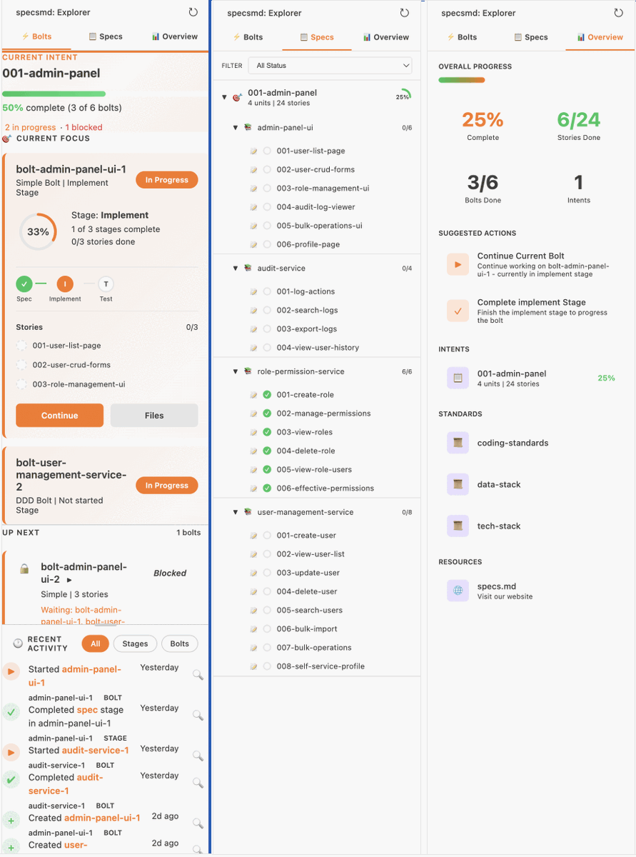
specs.md is the only spec-driven framework with a VS Code (and co.) based dashboard. Considering everyone is moving to ADEs, like Codex and @fabriqaai, I created a web-based dashboard (similar to a VSCode extension) that you can open in any browser. youtube.com/watch?v=1WaIBbWG…
194
specs.md retweeted

Apr 17
what is that? :) face lift in @fabriqaai
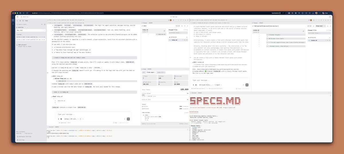
In the updated interface, users with a wide screen can now engage in multiple chats side by side. Specifically, within the specifications workflow, you can open the Inception (business analyst) and Construction (developer) agents simultaneously. Each agent has its own terminal, git changes, and all other relevant panels.
Previously, I scoped these chats to the active worktree path, but I have now decided to use a chat container. This change allows the planner agent within the specifications workflow to display artifacts next to it. You can maximize certain panels, collapse or expand them, or rearrange items within the chat container.
If you choose to use a single chat window, the user experience remains unchanged from before.
One significant change is the removal of the tab bar list, which was cluttering the user interface. The left sidebar now shows active chats and indicates which ones are currently running or have completed their turn. Additionally, you can sort the chat list by activity date, ensuring that the most recent chats are always at the top.
Initially, I considered limiting the layout to just two chats side by side. However, seeing Claude’s code support for four splits has prompted me to rethink this.
Would you prefer the layout to feature four chats arranged in two rows and two columns, or would it make more sense to have four rows, particularly for ultra-wide screens? Please avoid suggesting a Miro-like endless canvas, as that might tempt me! :)
2
4
332
specs.md retweeted
Apr 18
@fabriqa context-aware recent files
fabriqa tracks context and recent file changes across multiple chats. Use CMD P to quickly access relevant files modified or created in your active chat.
2
2
136
specs.md retweeted

Apr 18
todo list as sidebar in fabriqa chat experience, side by side chats gets their own plan panel.

2
3
57
specs.md retweeted
Apr 6
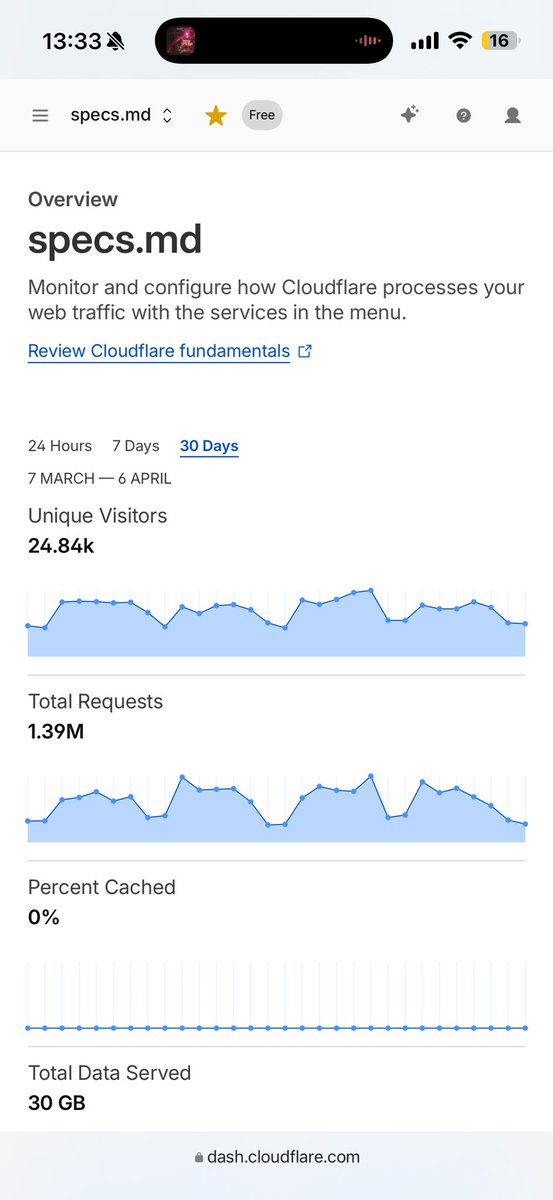
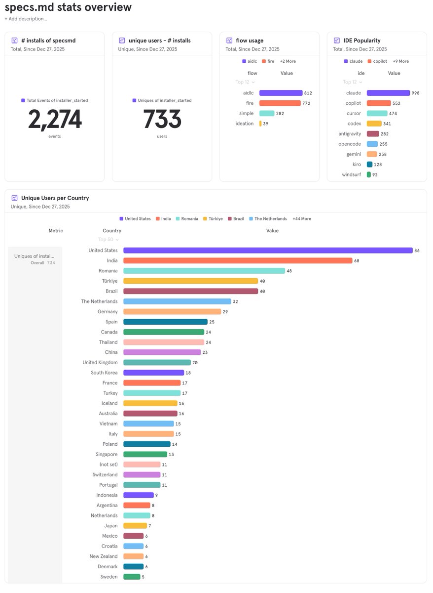
@specsmd was installed 2,274 times by 733 unique users since December 27, 2025.
most popular spec flow is my implementation of AWS's AI-DLC, next is my own design; FIRE flow. Top 3 countries using @specsmd are United States, India and Romania. Turkey comes right after them as 4th.
try it out if you are interested with specs-driven development and help me spread the word. send your feature requests and feedback directly to me or via github issues.
1
2
3
123
New from the specs.md creator — @fabriqaai orchestrates Claude Code, Codex, Gemini CLI & more in one workflow. Download development version for free → fabriqa.ai
3
69
🚀 𝘀𝗽𝗲𝗰𝘀𝗺𝗱 v0.1.49 is out!
👉 specs.md/changelog
33
🚀 𝘀𝗽𝗲𝗰𝘀𝗺𝗱 v0.1.27 is out!
• FIRE: Standardized run IDs to `run-<worktree>-NNN` (for e...
👉 specs.md/changelog
28
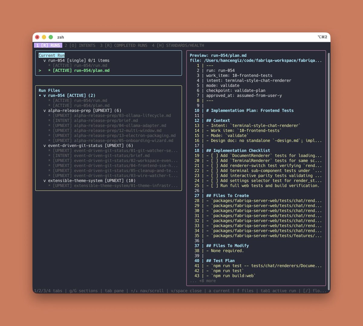
using specs.md CLI Dashboard to track progress while building with Codex... building @fabriqaai youtu.be/tOOoqzAbG1w?si=0QuR…
Introduction - specs.md
AI-native development framework with three flows for every use case
specs.md 2
3
142


🚀 𝘀𝗽𝗲𝗰𝘀𝗺𝗱 v0.1.26 is out!
• FIRE CLI dashboard: `npx specsmd@latest dashboard` for te...
• Tabbed terminal views (Runs, Overview, Health) designed f...
• Keyboard navigation for tabs and filters (`1/2/3`, `Tab`,...
👉 specs.md/changelog
173
🚀 𝘀𝗽𝗲𝗰𝘀𝗺𝗱 v0.1.26 is out!
• FIRE CLI dashboard: `npx specsmd@latest dashboard` for te...
• Tabbed terminal views (Runs, Overview, Health) designed f...
• Keyboard navigation for tabs and filters (`1/2/3`, `Tab`,...
👉 specs.md/changelog
103
🚀 𝘀𝗽𝗲𝗰𝘀𝗺𝗱 v0.1.23 is out!
• Codex installer now creates proper skills instead of flat...
• Commands are transformed into `.codex/skills/<name>/SKILL...
👉 specs.md/changelog
30
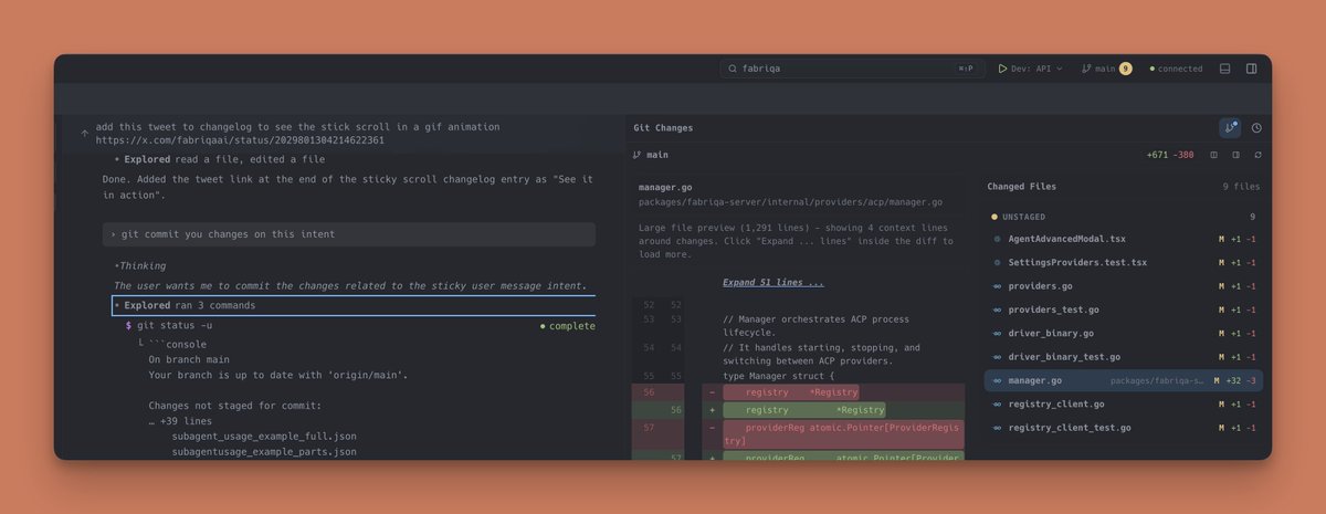
RT @hancengiz: building @fabriqaai using @specsmd #claudcode #specdrivendevelopment #ainative #aicodingtool
1
22