
Type and typography news story tweets from typographer.org. Inherited by Yves Peters a.k.a. @BaldCondensed. Currently dormant.
Joined April 2009
- Tweets 445
- Following 13
- Followers 5,023
- Likes 46
31 Photos and videos


Typographer.org retweeted

1 Apr 2019
Visual in previous tweet set in @djrrb’s Fit Variable.
djr.com/fit
1
4
Typographer.org retweeted
1 Apr 2019
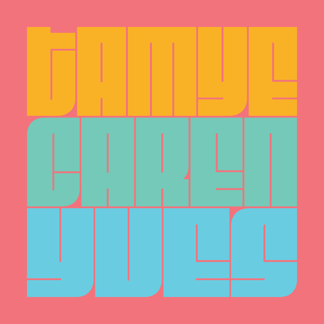
No April Fools’ joke: yesterday was my last day at Type Network. This means the editorial power team of @tamye, @litherland, and myself is now available to work with you. Yes, you!
7
12
55
Typographer.org retweeted
11 Mar 2018
Movie buff, design fan, or typography geek? You can be all three at my #SXSW session about #movieposters tomorrow @ 5pm at the JW Mariott. #SXSW18 #SXSW2018 schedule.sxsw.com/2018/event…
1
5
11

27 Feb 2018
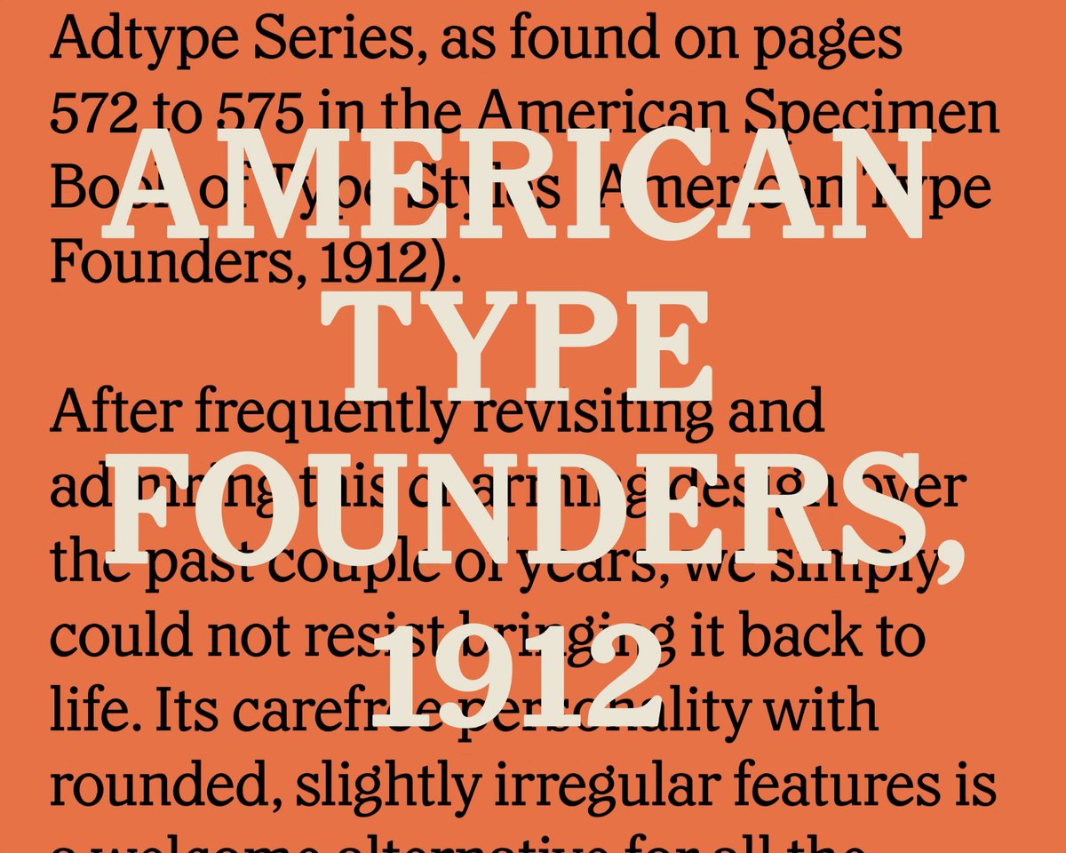
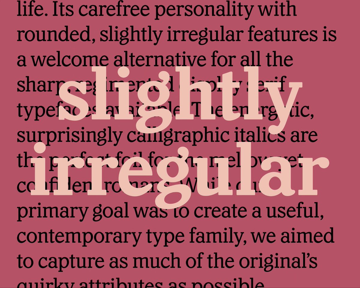
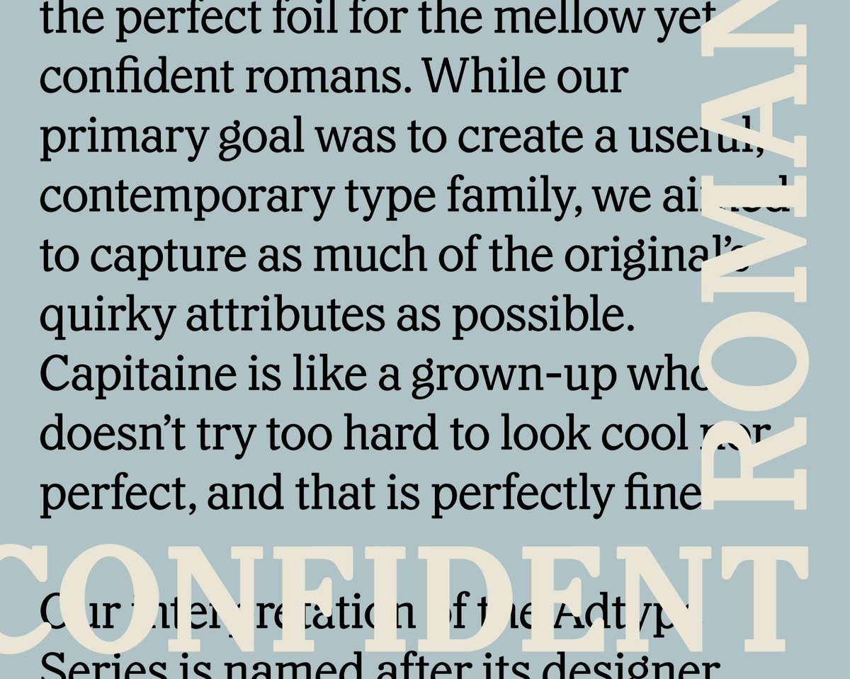
Like a grown-up who doesn’t try too hard to look cool nor perfect, and that’s perfectly fine. x.com/lettersfromswe/status/…
27 Feb 2018

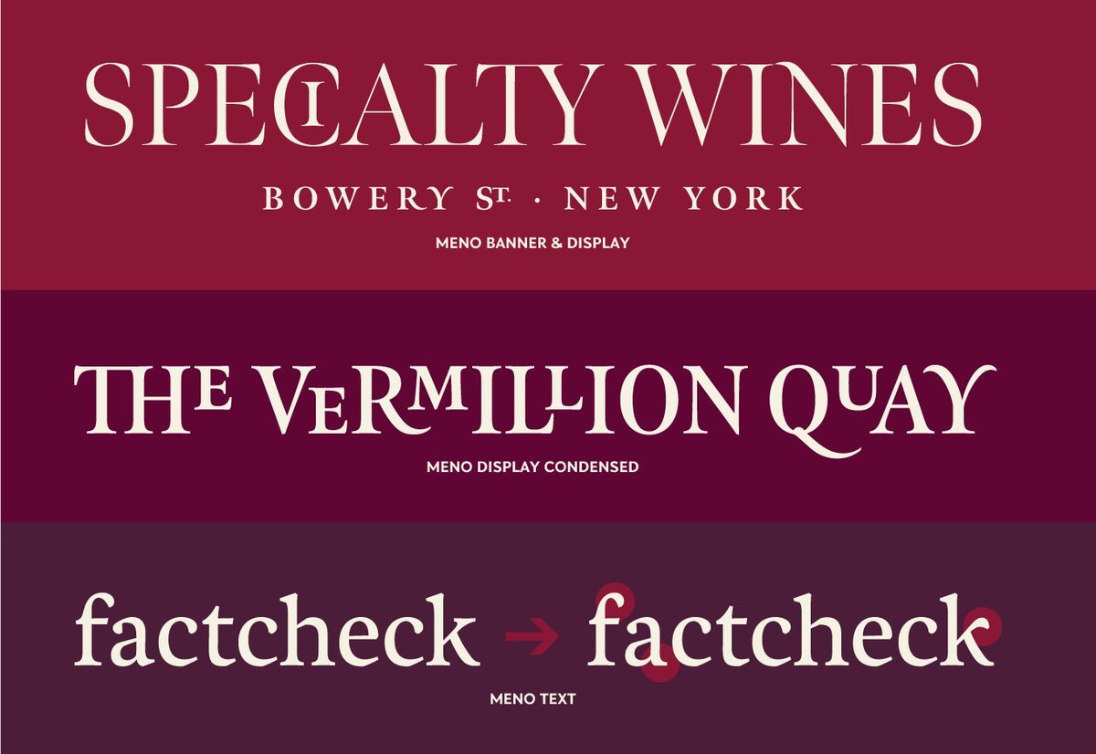
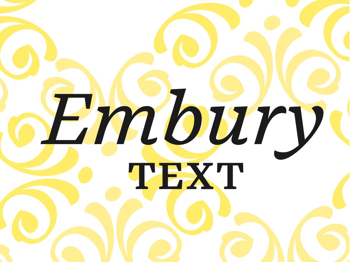
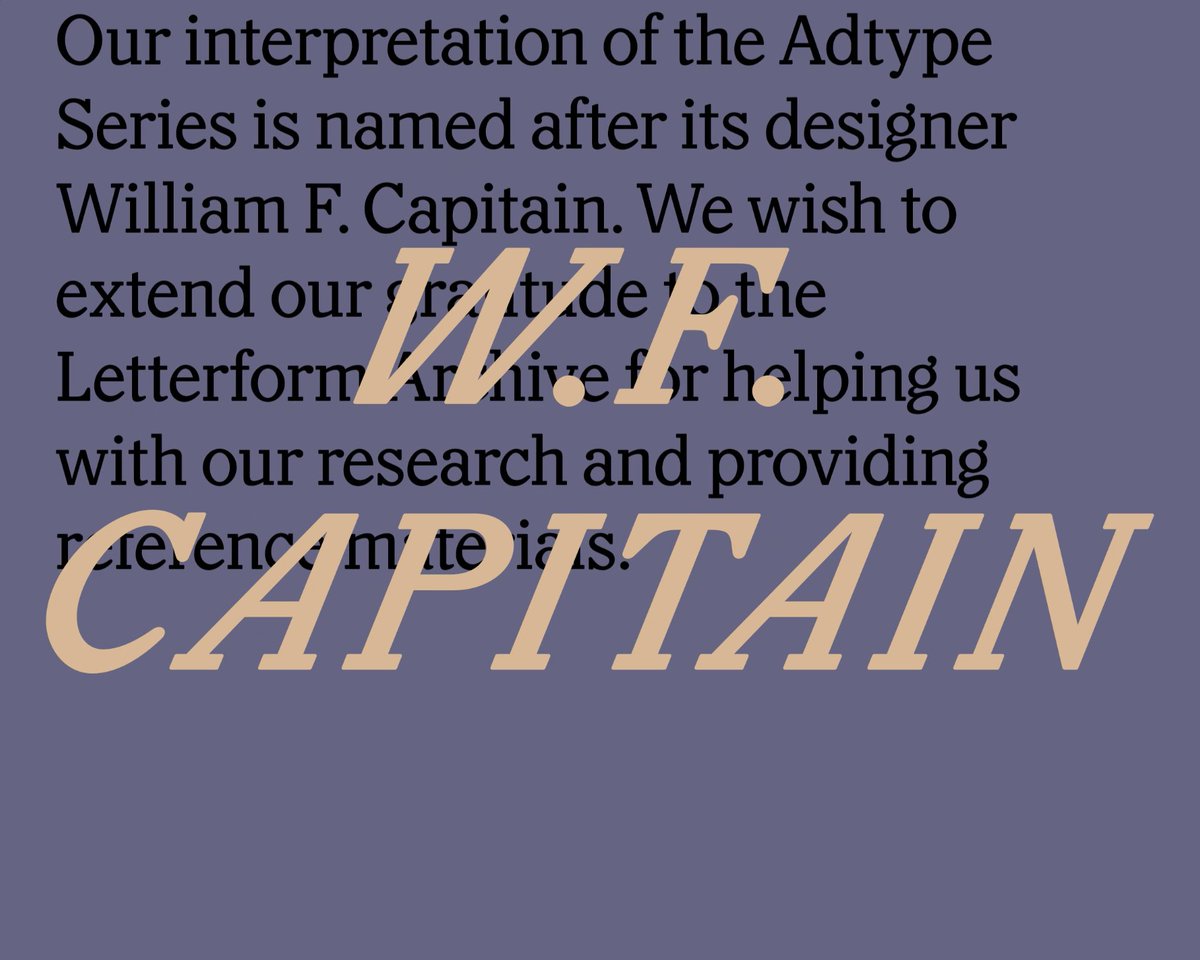
NEW! Capitaine is a good-humoured, chunky slab serif based on the Adtype Series (American Type Founders, 1912).
Samples by @charlesfredrik Thanks to @Lett_Arc for help with research.
lettersfromsweden.se/capitai…
1
1
6
26 Feb 2018
A great resource by the ever-resourceful Christopher Bergmann. x.com/isoglosse/status/96711…
23 Feb 2018

Love monospaced typefaces, but also love your readers? Proportionally spaced typefaces with a monospaced appearance may be what you are looking for. Here is a list I compiled (with the help of many others) ☞ isoglosse.de/2018/02/proport…. Additions are highly welcome.
2
Typographer.org retweeted

11 Feb 2018
The most amazing thing about this absolutely amazing car commercial, is that it doesn’t seem to realize how effectively it makes the point that cars are a huge waste of space in cities. #multimodalcities HT @javiermalagon
54
2,188
3,256
26 Jan 2018
Allow me to send you into the weekend with a huge smile on your face, #typography lovers. Plus it’s a Libre font, so go have fun with it! x.com/jb_morizot/status/9568…
1
1
4
22 Jan 2018
This is #NerdStitch we can get behind! (via @typofonderie) #bitmap #typography x.com/glenda_atom/status/830…
2
16 Jan 2018
For lovers of vernacular letterforms, I highly recommend @anexasajoop’s India Street Lettering.
indiastreetlettering.com/
2
8
16 Jan 2018
A fascinating rugged stressed sans serif, a collaboration by @frerejones and @ninastoessinger. x.com/frerejones/status/9533…
16 Jan 2018

Say hello to Conductor, our next retail release! The design began with a set of vintage lottery tickets, and soon absorbed references from New York and across Europe. Conductor is also the first family I’ve worked on with @ninastoessinger from the start. frerejones.com/families/cond…
21 Dec 2017
Laurence has been the superhero of variable fonts since day 1 (actually day 45) when he made @axis_praxis, a playground for #VariableFonts. x.com/dotcss/status/94379437…

[NEW TALK] Laurence Penney @Lorp at dotCSS 2017 - Variable fonts: a million times the possibilities, in less bandwidth than before dotconferences.com/2017/11/l…

4
11
11 Oct 2017
Ysans by Jean-François Porchez is a razor-sharp sans serif with a remarkable layered chromatic Mondrian style that you can try for free. x.com/typofonderie/status/91…
11 Oct 2017
NEW: #Ysans, fashion style meets typography. Ysans Ysans Mondrian, a new #typofonderie typeface by @jfporchez font.by/-ysans
1
4
4 Oct 2017
Having been able to test and review pre-release versions for our classic TypeCon2005 booklet, this makes me very happy. x.com/futurefonts/status/915…

1
3 Oct 2017
Just spent an irresponsible amount of time admiring Tal Leming’s work on his wonderful new website. I think you should too. x.com/typesupply/status/9152…
3 Oct 2017

Hey everybody! I have an all new website!
typesupply.com
Over there you can learn about, try and £i¢€n$€ my fonts!
2
2
3 May 2017
How absolutely exciting—@jesseragan & @benkiel launch their joint venture xyztype.com with Cortada & 2 brand new type families. x.com/xyz_type/status/859777…

We’re proud to unveil XYZ Type, a new independent type foundry offering fonts by @benkiel and @jesseragan. xyztype.com
1
3
Typographer.org retweeted

9 Mar 2017
Exactly one more year until the next Robothon conference! Write down in your diaries: 8–9 March 2018, KABK, The Hague.
1
19
66
23 Feb 2017
Hey, type designers: dream job opening below. x.com/frerejones/status/8348…
23 Feb 2017
We’re hiring again! If you’re a designer-programmer and pretty much bonkers for type, we should have a chat. frerejones.com/work-with-us
4
20 Feb 2017
Diurnal by @typonine_djurek, a superb sans serif counterpart to the equally wonderful Nocturno.
typotheque.com/blog/diurnal_…
1
1
Typographer.org retweeted

8 Feb 2017
The new website for Typographics 2017 is now live, with an overview of the festival’s schedule: 2017.typographics.com
More coming soon!
7
28
71