
Create great-looking charts and business graphics in seconds. Right from your browser. Or use our PowerPoint or Google Slides integration.
Joined January 2015
- Tweets 1,287
- Following 1,551
- Followers 976
- Likes 1,619
656 Photos and videos


Our next version of Vizzlo for @GoogleWorkspace's Slides is finally here. You can now embed charts directly into the slides without links! 💃 vizzlo.com/blog/vizzlo-for-g…
2
202
Your pixels are not small enough to visualize just how fast Threads is growing: vizzlo.com/gallery/bar-chart…
2
145
Convert your charts to another type easily by using the sidebar in our editor!
Find the best visualization for your dataset to communicate your point effectively.
#DataVisualization #presentationdesign #charts
1
121
Balanced ScoreCard is a popular management tool to manage performance and priorities. This is our #chartoftheweek!
Use different color codes or a theme to highlight the key points.
Create your own BSC at: vizzlo.com/create/balanced-s…
#DataVisualization #presentationdesign
1
89
Store your charts directly in your #GoogleSlides presentation with our new version!
Check out the greatest features of Vizzlo for Google Slides v2 in the link below.
Get in touch with us for a demo or a trial!
vizzlo.com/blog/ten-faqs-abo…
#Datavisualization #presentationdesign
1
67
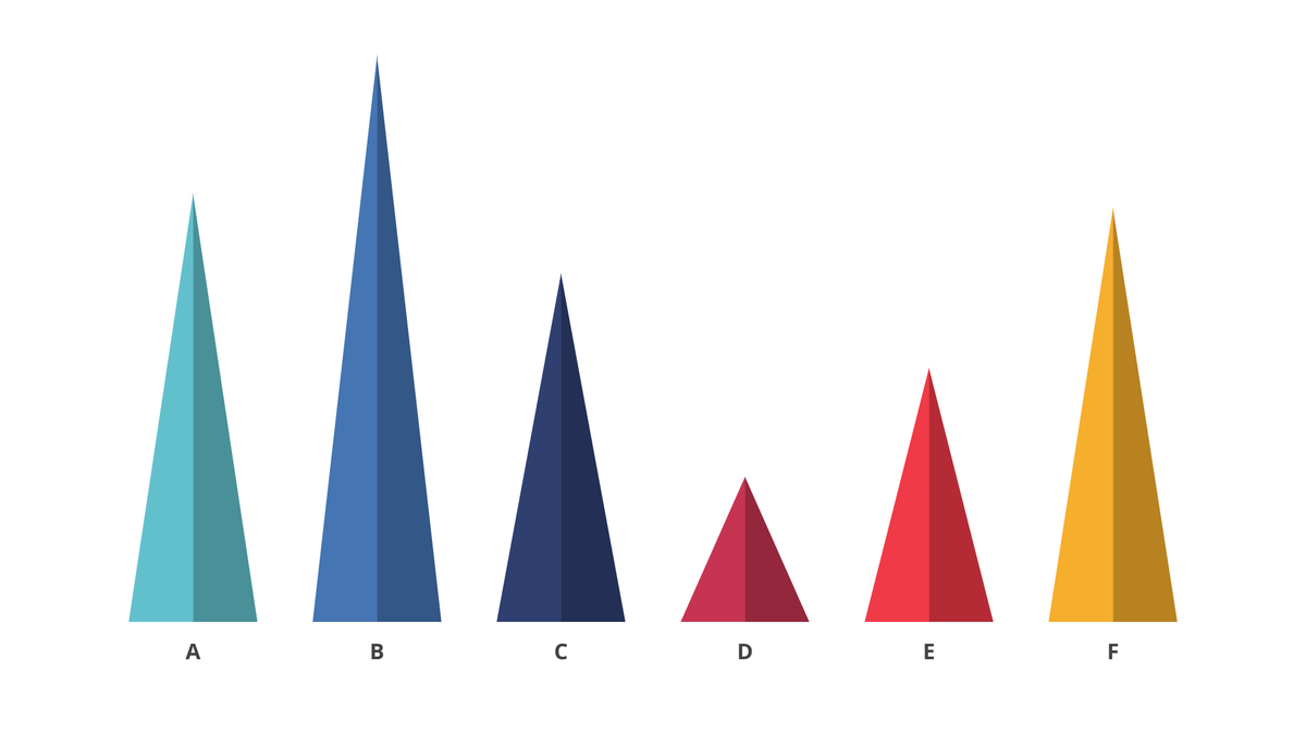
Highlight variable proportions by using our Triangle Bar Chart! The length of each triangle is proportional to the value it represents. This is our #chartoftheweek
Make your own at: vizzlo.com/create/triangle-b…
#Datavisualization #presentationdesign #GoogleSlides
1
72
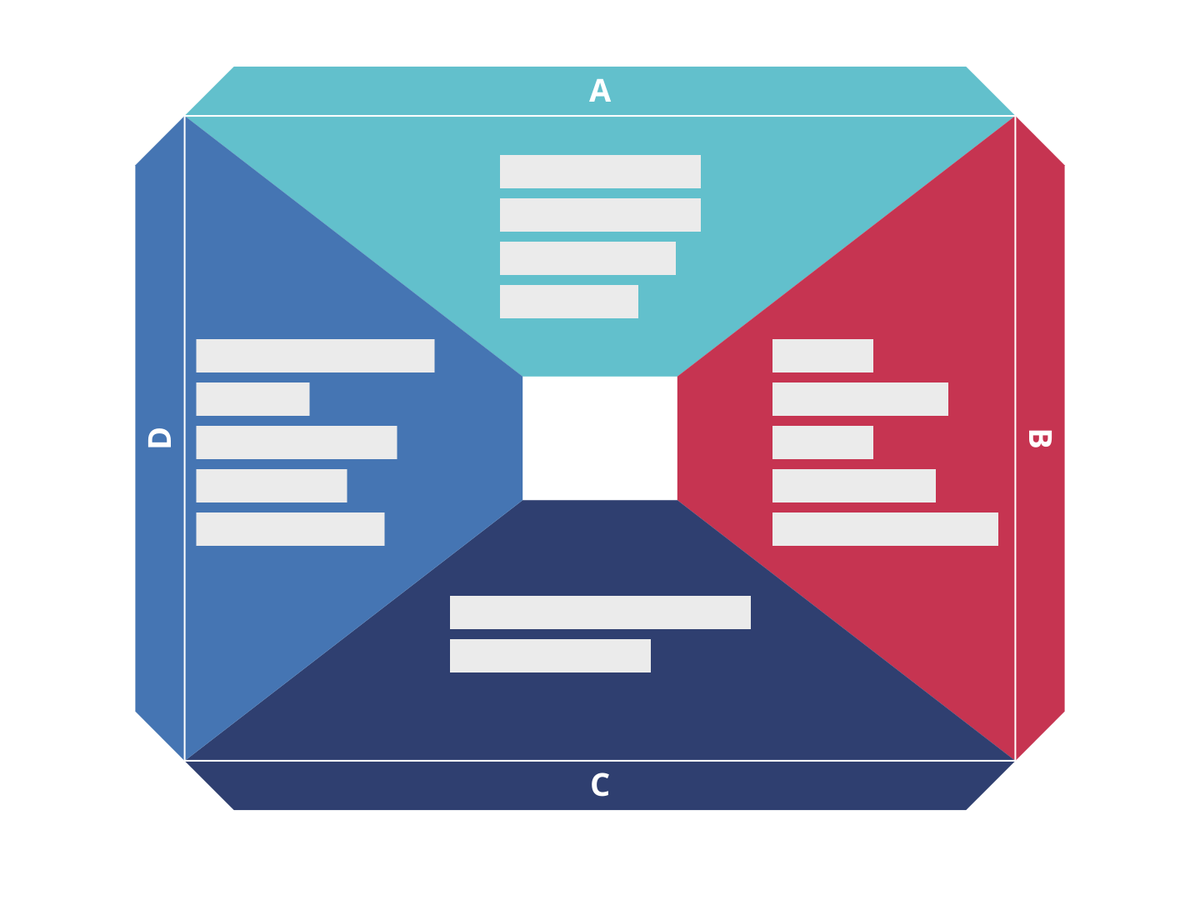
A tool for visionaries, gamechangers and challengers - use our Business Canvas Model to develop new ideas or document existing ones!
Click the link to edit the example below or create your own at: vizzlo.com/gallery/business-…
#presentationdesign
#dataviz #googleslides
1
67
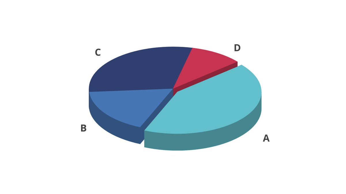
Pop out the best data slice of your Pie Chart with our #chartoftheweek! Make the components stand out using different color codes.
Create your own pie chart at: vizzlo.com/create/pie-chart
#presentationdesign
#Datavisualization
#GoogleSlides
1
54
vizzlo retweeted

2 May 2023
"You can do this in R, and R is free!"
R:
x.com/Figensport/status/1653…
142
963
7,784
1,162,045
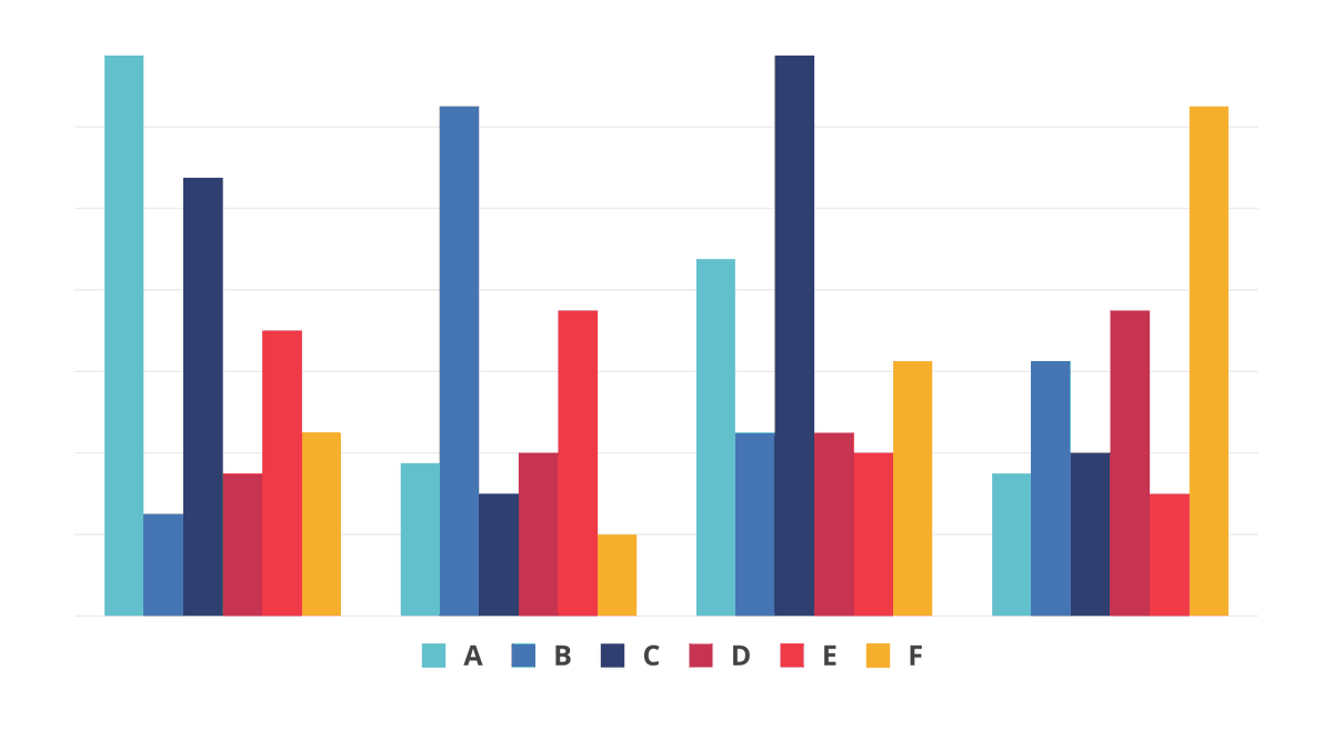
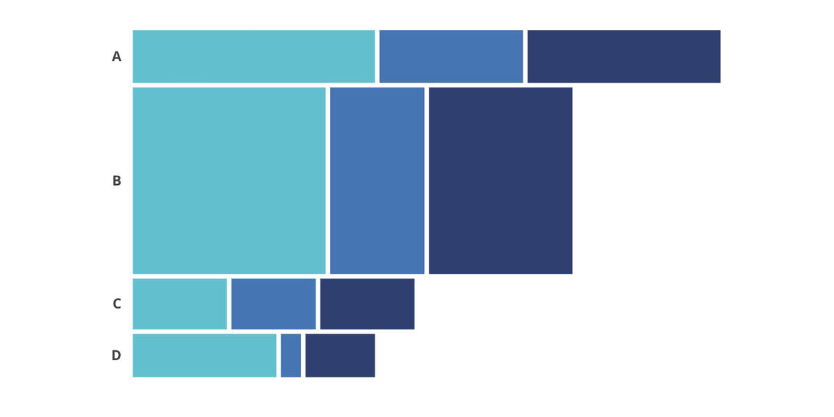
Plot numerical values for multiple variables with our #chartoftheweek! Use different color codes for bars to make the categrories stand out.
Create your own grouped bar chart at: vizzlo.com/create/grouped-ba…
#Datavisualization #presentationdesign #GoogleSlides
1
60
We got your 10 most FAQs answered by our CEO about Vizzlo for #GoogleSlides v2.0! Watch the video to know more about the best features of this version and how to use them.
Contact us for a free demo or a trial account.
youtube.com/watch?v=ZFcOqHSN…
#Datavisualization #consulting
1
91
Our #chartoftheweek is Marimekko Chart or also known as the Mosaic Plot. Visualize categorical data using this chart or choose from over 100 other options.
Create your own at: vizzlo.com/create/marimekko-…
#datavisualization #presentationdesign #GoogleSlides
1
61
Highlight single records of your data sets by using the newly added color codes for individual bars.
Create your own Grouped Bar Chart at: vizzlo.com/create/grouped-ba…
#DataVisualization #presentationdesign #GoogleSlides
1
64
Visualize comparisons between different categories in an elegant way with our Radial Bar Chart! This is our #chartoftheweek
Create your own at: vizzlo.com/create/radial-bar…
#DataVisualization #presentationdesign #GoogleSlides
1
86
Switching from @powerpoint to @GoogleWorkspace Slides? Here's why you'll have to use different font sizes from now on: vizzlo.com/blog/the-curious-…
3
69
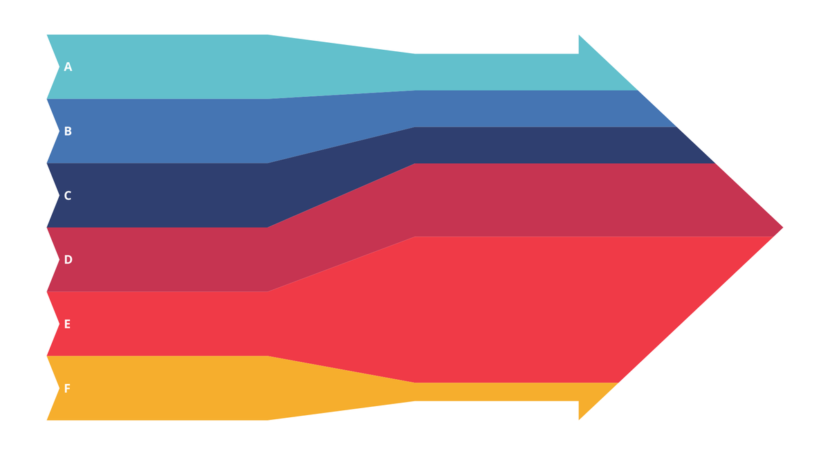
Visualize your input flows from several sources into a beautiful Sankey diagram with our #chartoftheweek
Create your own at: vizzlo.com/create/inbound-sa…
#dataviz #charts #googleslides
2
124
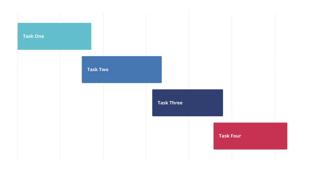
Plan and schedule your projects in an elegant way with the Simple Gantt Chart. This is our #chartoftheweek
Create your own at: vizzlo.com/create/simple-gan…
#dataviz #googleslides #businessgraphics
1
71
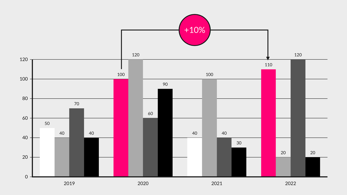
Add more meaning to your Stacked Bar charts by using our extended chart features - benchmarks, trendlines, top arrows or projections!
Available for both PowerPoint and GSlides!
#Datavisualization #GoogleSlides #Businessanalytics
2
74
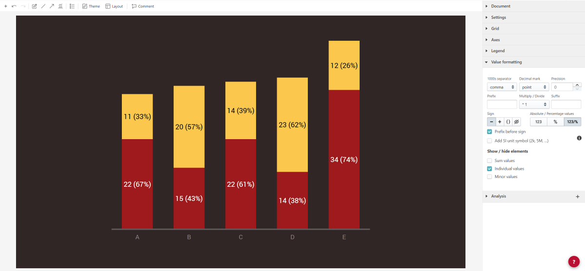
You can now configure the values in your Vizzlo charts in either absolute values or percentages or both! Navigate to the Value Formatting option to access this #featureoftheweek
#businessgraphics #Datavisualization #GoogleSlides
2
Elevate #Security of your Vizzlo account by using the two factor authentication method. Navigate to the option in your settings as shown below to activate it for an added layer of protection.
#2FA #DataVisualization #businessgraphics
1