
Your data deserves better than spreadsheets.
Choose. Customize. Start — in 3 simple steps.
prime-levels.com
#PowerBI #DataVisualization #PrimeLevels #Dashboard


🌳 Where is global tree cover vanishing fastest?
While total deforested acreage often dominates the headlines, looking at tree cover loss by percentage reveals a stark picture for specific regions.
#datavisualization #tree #forest #venngage #infographic
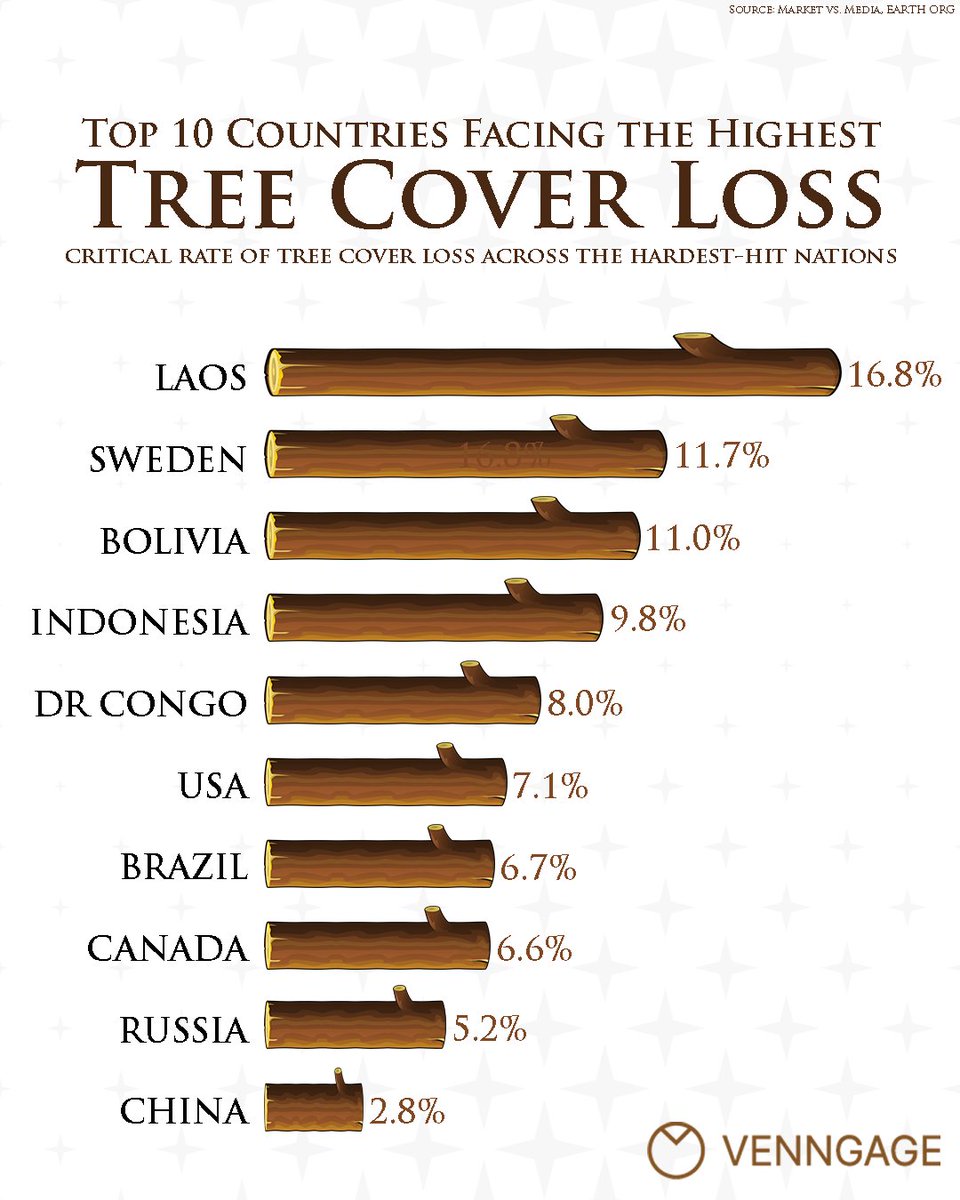
15

Watch this revenue race over time!
Featured: China, United States, India, Russia
67 years of data | 12 entities
Full video: youtu.be/MkuFj7B1nJ8
#DataVisualization #BarChartRace #Data

1
2

Data Visualization - Insights at a Glance
Website: infinitylearning.online
FB/IG: @infinitylearningmumbai
X: @InfinityLearnMu
#DataVisualization #DataAnalytics
1
2


A common mistake in reporting is showing everything. More charts don't always mean more insight.
Sometimes a single KPI supported by the right visual tells a stronger story than an entire dashboard full of charts. #PressingData #DataAnalytics #DataVisualization #PowerBI #Excel
1
2

See how your overall view changes as you add more accounts. With a full year of data, you can observe the significant difference percentages make over time. It truly starts to matter. #DataVisualization #AccountManagement
1
Traditionally, visualization and statistical testing are handled in separate steps. This makes the workflow slower and the results harder to present clearly.
With ggstatsplot in R, both are automatically integrated into a single figure. This helps you work more efficiently and makes your results easier to interpret and communicate.
The graphic below demonstrates this using the relationship between living space and property price. Each point represents one observation, and the line shows the overall trend. In addition, the plot automatically includes key statistical information, such as the correlation coefficient, confidence interval, p-value, and sample size.
This way, you can see the data and the corresponding statistical conclusions in one place, which makes your findings clearer and easier to share.
Looking to improve your data visualizations in R? In my course, Data Visualization in R Using ggplot2 & Friends, I cover ggplot2 and tools like ggstatsplot to help you build clear and effective plots. Check out this link for more details: statisticsglobe.com/online-c…
#StatisticalAnalysis #Rpackage #DataViz #DataVisualization #RStats #ggplot2 #coding #Data

3
43
934

Power BI Mastery: Zero to Hero Data Skills
⏱️ 6.7 hours
⭐ 4.10
👥 51,087
🔄 Sep 2025
💰 $19.99 → 100% OFF
comidoc.com/udemy/power-bi-m…
#PowerBI #DataVisualization #DataScience #udemy

12

…From data wrangling in power query to designing visuals that actually tell a story using power BI.
Every dashboard was a new challenge!
Thank you to @TechSphereAcad @ezekiel_aleke
#DataAnalytics #PowerBI #Excel #Powerquery #Dashboard #DataVisualization #Analytics


6
51
Dynamic Excel Reports for Marketing Analytics
⏱️ 2.7 hours
⭐ 3.77
👥 15,233
🔄 Mar 2025
💰 $17.99 → 100% OFF
comidoc.com/udemy/dynamic-ex…
#Excel #MarketingAnalytics #DataVisualization #udemy

15

and business insights, transforming raw data into meaningful information that supports decision-making.
A big thank you to AnalystLab for providing this practical learning opportunity.
#AnalystLabAfrica #SQL #DataVisualization #internship
1
152

An experiment with D3 and Observable as a way to make complex data more browsable. Turns EPBC threatened fauna data into a radial field-guide structure.
Project page:
quillshadow.com/infographics…
#DataVisualization #InformationDesign #TechnicalWriting #D3js #Observable @observablehq
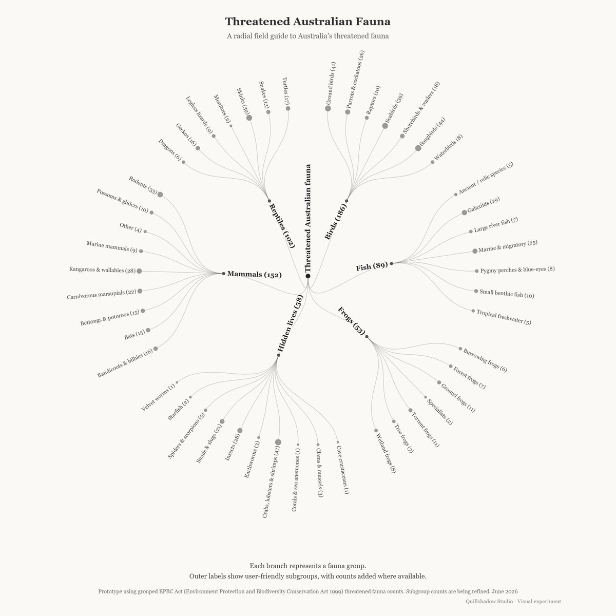
ALT Radial tree diagram titled “Threatened Australian Fauna”. The centre node branches into major fauna groups including Birds, Mammals, Reptiles, Fish, Frogs, and Hidden lives. Each group branches into smaller user-friendly subgroups such as Skinks, Shorebirds, Bats, Tree frogs, and Insects. The visual uses fine grey lines, small circular nodes, and a pale background.
15

Cut Bing Maps License Costs with #Maplytics’ Built-In Mapping Coverage @msdynamicsworld
msdynamicsworld.com/blog-pos…
#BingMaps #Dynamics365 #LocationIntelligence #TerritoryManagement #FieldService #DataVisualization
2
EMILY DESIGNS #Giftadvisor #fun #jewelry #SKEPTIC retweeted

#JeffreyEpstein #EpsteinFlightLogs #LolitaExpress #TrueCrime #DataVisualization #MapPorn #Geopolitics #GeoMapped #InfographicMap #WorldMap #NewsUpdate #DataIsBeautiful #EpsteinFiles #FlightLogs #EpsteinScandal

Epstein ist ein Wissenschaftler, der die Theorie der Relativität der Moral erfunden hat
6
7
53

It keeps truncating all the datasets I try to practice with
Even the smallest data set
Please cos I can't move past this place😔 and it's slowing me down
#DataAnalytics #Buildinginpublic #PowerBI #DataVisualization
@DabereNnamani
@ezekiel_aleke
@joyibe_
1
30

Jun 12
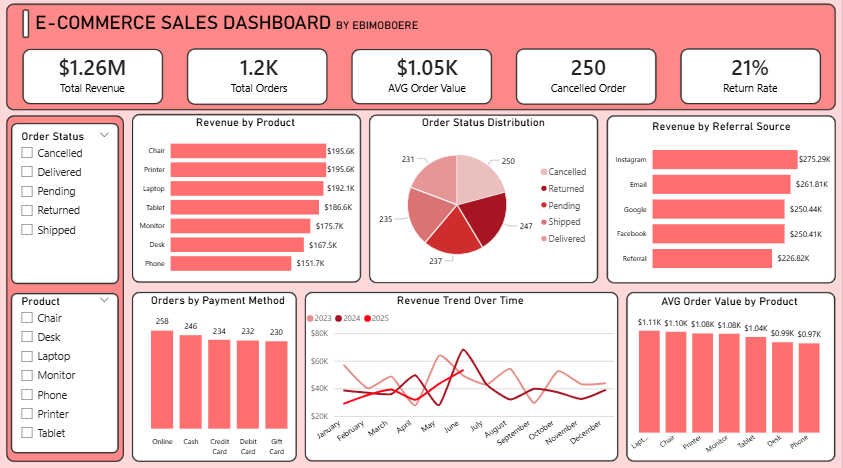
Project 4 done. Built a dashboard at @decodelabs_tech internship.
5 KPIs, 6 visuals and 2 slicers on 1,200 orders. Revenue, trends, order status and referral performance all in one view.
Turning data into insights. 📊
#DataAnalytics #DecodeLabs #DataVisualization
1
17

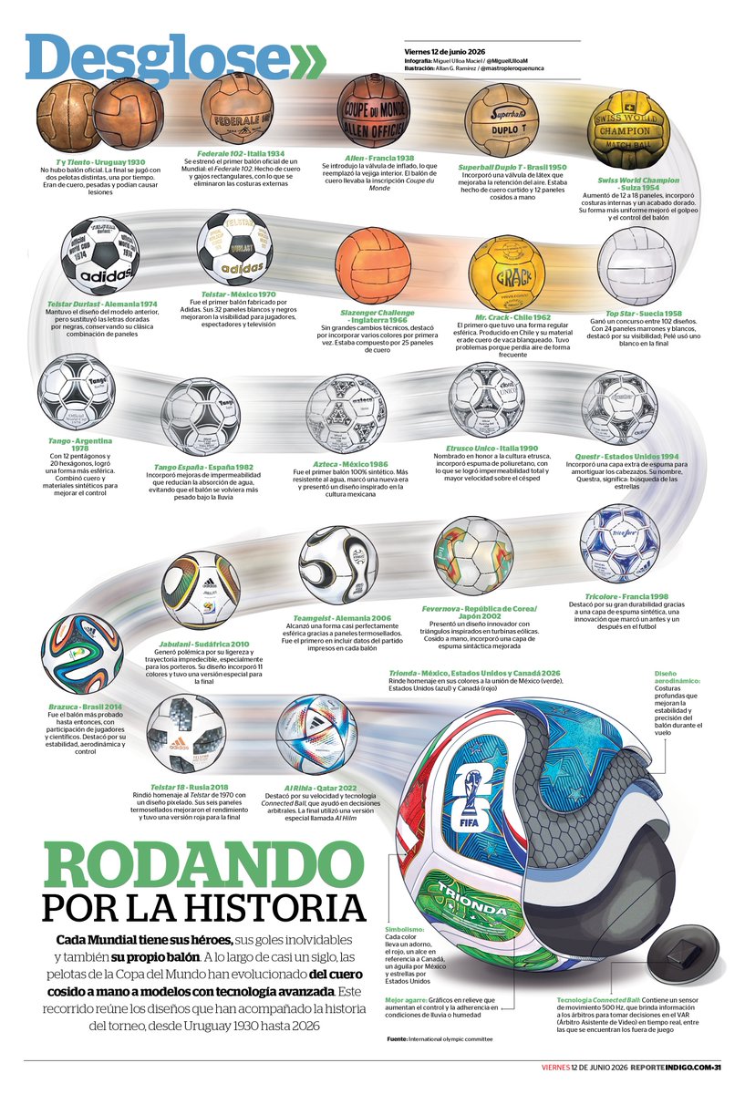
⚽🌎 Cada Copa del Mundo deja momentos inolvidables, pero también un protagonista silencioso: el balón
#Infografia #DiseñoEditorial #DiseñoDeInformación #DataVisualization #FIFAWorldCup #Mundial2026 #Fútbol #VisualStorytelling #PeriodismoVisual #HistoriaDelFútbol #SportsDesign
1
1
19

Jun 12
🎨 IntellGraphic. com – Premium Domain Name For Sale! 🚀
#CreativeAgency #VisualDesign #ContentCreation #DataVisualization #Innovation #FutureTech #TechStartup #SaaS #Brandable #PremiumDomain #DomainForSale #DigitalBrand 🎨🚀🌐
16

Jun 12
Correlation matrix plots are a powerful tool for understanding relationships between variables, but they can become overwhelming with larger data sets. Here’s an example of how to make these plots easier to interpret by displaying only the most relevant parts, created using the corrplot package in R.
❌ In the first image, all correlations are displayed, regardless of significance. This can lead to a cluttered and confusing visualization, where non-significant correlations crowd the space, making it harder to identify meaningful patterns.
✅ In the second image, only the significant correlations are shown, resulting in a much cleaner and more readable plot. By removing the non-significant values, the important relationships stand out clearly. This approach is especially useful for larger data sets, where showing all correlations can make the plot difficult to interpret.
Want to learn more about statistical techniques such as correlation matrix plots? My Statistical Methods in R course covers such topics in more detail!
See this link for additional information: statisticsglobe.com/online-c…
#RStudio #Data #RStats #database #datavis #DataVisualization #Statistics #programmer #Rpackage

6
53
1,143