
Information designer, former Science graphics @nytimes. Find me at: bsky.app/profile/13pt.com
Joined August 2011
- Tweets 743
- Following 532
- Followers 7,048
- Likes 2,312
181 Photos and videos


Jan 1
After 20 years of NYT graphics, I’ve switched back to freelance and personal projects. My farewell talk is here: style.org/talk/
1
13
638
2 Sep 2022
Some personal news: After 17 years (and one pandemic) at the NYT, I’m taking a sabbatical to work on a project with @EdwardTufte
10
7
228
Jonathan Corum retweeted

22 Feb 2022
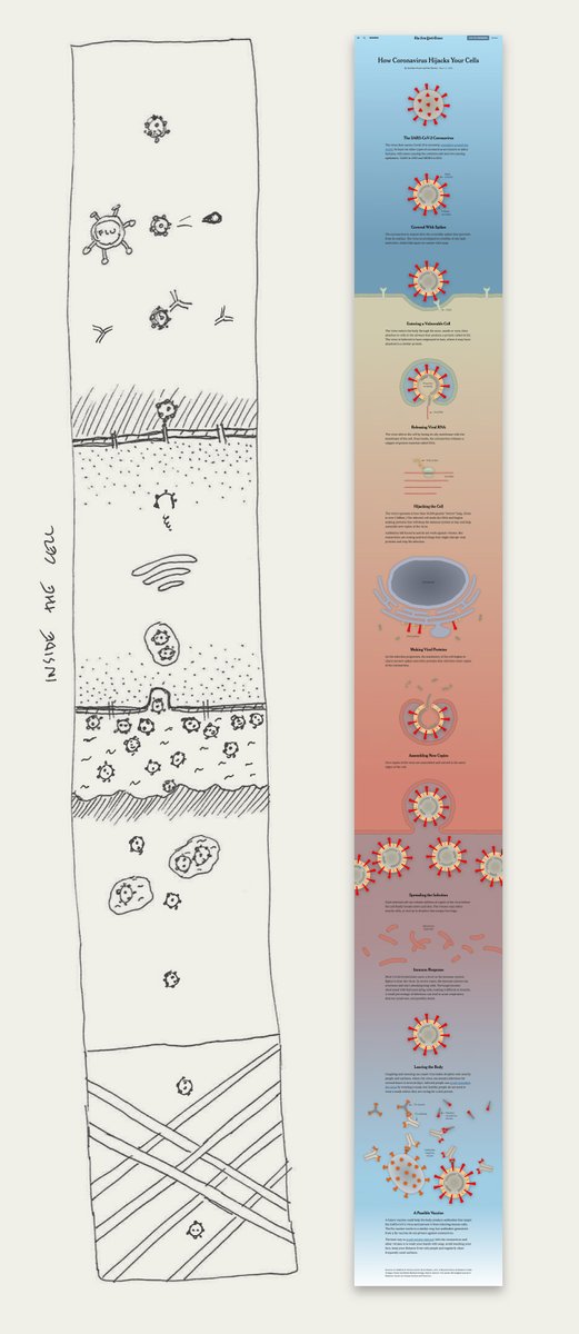
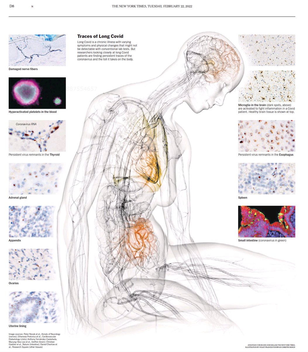
Illustrated traces of #LongCovid in today's @nytimes
See the online version 👇nytimes.com/interactive/2022…
Extraordinary graphic summary, by @joshkellerjosh @NYTScience w/ @13pt @PamBelluck @AmandaMoMorris
48
1,222
2,655
Jonathan Corum retweeted

30 Dec 2021
Visual journalism often reveals what can’t be seen with the naked eye: the microscopic, gigantic, hidden or historical. This year, we examined virus particles, deep ocean currents and partisan segregation. Here are some standout visual stories from 2021.
nyti.ms/3FHjVfH
12
63
258
Jonathan Corum retweeted
1 Dec 2021
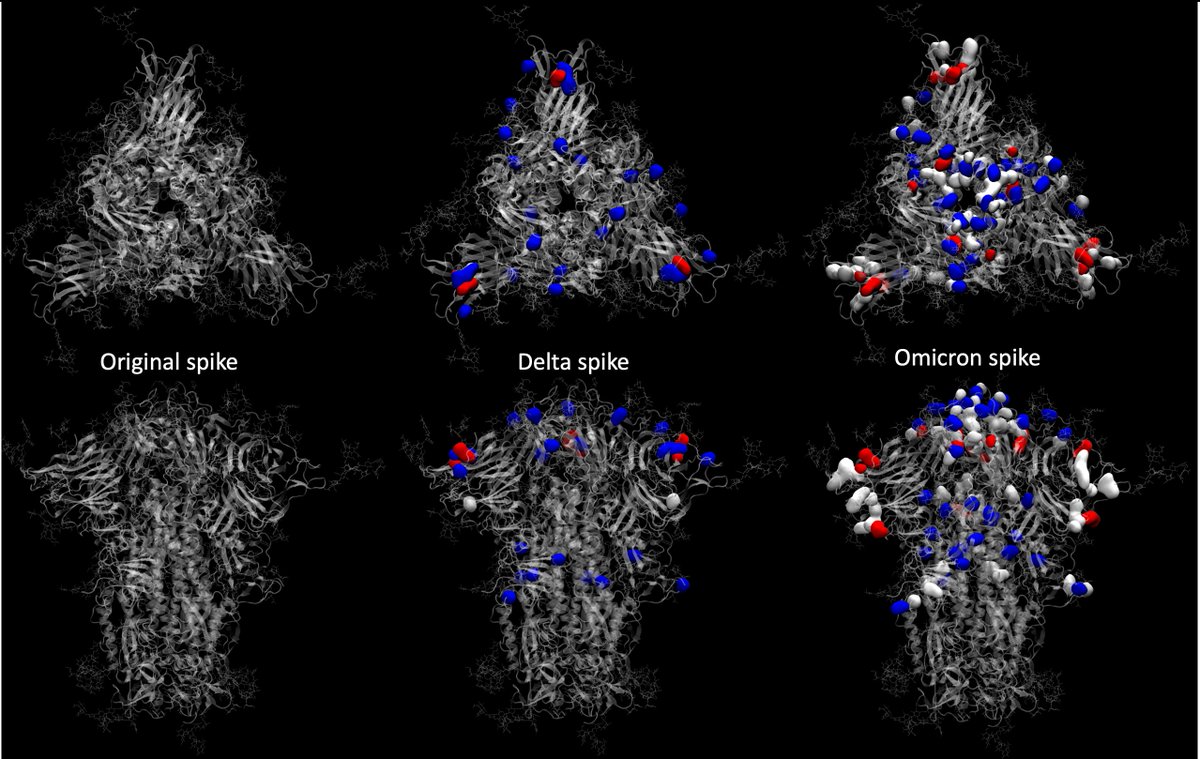
Exceptional and educational #SARSCoV2 graphics on viral biology, aerosols, and variants
nytimes.com/interactive/2021… by @carlzimmer @13pt "assemble 1.3 billion atoms and track all their movements down to less than a millionth of a second" by @RommieAmaro and team; @linseymarr input
14
277
712
Jonathan Corum retweeted

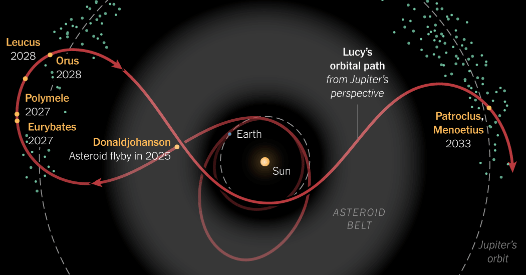
19 Oct 2021
NASA’s Lucy spacecraft launched last week on a 12-year mission to study the Trojan asteroids. Here’s the winding path it will take. nytimes.com/2021/10/16/scien…
11
37
Jonathan Corum retweeted

25 May 2021
For months, my colleagues and I have been immersed in the world of archival maps, photographs, city directories, books, newspapers, survivor accts. and census data to recreate what was lost 100 years ago in Greenwood, also known as the “Black Wall Street”. nytimes.com/interactive/2021…
29
422
1,107
28 Apr 2021
Rest in peace, Michael Collins. He captured all of humanity in one photograph, except himself. nyti.ms/3u4NEta
41
1,196
5,013
Jonathan Corum retweeted

28 Apr 2021
Go behind the scenes at a Pfizer factory to see how mRNA vaccines are made. Very cool video/graphics piece by @EmmaCottNYT @elliotdebruyn @13pt nytimes.com/interactive/2021…
7
65
179
Jonathan Corum retweeted
16 Feb 2021
Everything you want to know on the 3 major #SARSCoV2 variants in 1 page!
by @13pt and @carlzimmer @NYTScience

18
905
2,144
Jonathan Corum retweeted
31 Dec 2020
Visual stories can often express what words alone can't. When information is complex or scarce, reported graphics illuminate.
In 2020, they offered what was essential: scale. How big? How bad? How many? Here’s some of what @NYTGraphics published.
nyti.ms/2L9LrLG
3
63
222
Jonathan Corum retweeted
6 Nov 2020
In the print edition of today’s NYTimes, a full-page map of the presidential results so far showing the margin of victory for each candidate, county by county.

63
1,366
4,791
Jonathan Corum retweeted

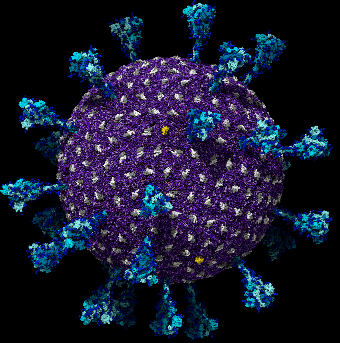
9 Oct 2020
WOW -- the coronavirus has you've never seen it. Stunning work by @13pt and @carlzimmer on what scientists have been learning about our nemesis nytimes.com/interactive/2020…
1
39
65
Jonathan Corum retweeted
6 Oct 2020
A simple, lucid explainer on viral load, tests, and symptoms of covid
nytimes.com/interactive/2020…
by @KatherineJWu and @13pt
Reinforces why Trump's "missing" test results from last week are so important

8
182
410
Jonathan Corum retweeted

6 Oct 2020
The amazing @VirusesImmunity made me an offer I couldn't refuse: to chart out the immune response to the coronavirus... and use the logic to understand why certain treatments work better at certain times.
My latest for @nytimes
nytimes.com/interactive/2020…
19
300
959
Jonathan Corum retweeted
3 Oct 2020
Every coronavirus infection manifests a little differently, but the broad patterns scientists have observed can help us strategize how and when to test — and how to minimize risk when it matters most.
My latest for @nytimes with @13pt
nytimes.com/interactive/2020…
44
492
1,259
Jonathan Corum retweeted

3 Oct 2020
(Another) Incredibly informative piece of work by the great @KatherineJWu
and colleagues.
"Charting a Coronavirus Infection"
nytimes.com/interactive/2020…
3
13
28
Jonathan Corum retweeted

3 Aug 2020
Buenas noches... y, tal como están las cosas, mejor si soñáis con otros mundos...
nytimes.com/interactive/2020…
3
11
36