Design firm Two-N convened a fantastic data salon last night in Chinatown to talk about the future of data visualization. Heard from speakers Hermann Zschiegner from @2nfo; Matt Macomber from Franklin Templeton and Clara Vydyanath. @MattMacomber@zschiegner
Time to get that vaccine!
We are so proud, honored and excited to share that our TWO-N team worked with the amazing digital data journalism team at NBC News to create this piece. We have a long way to go but things are looking hopeful. @elliefrynbcnews.com/specials/plan-yo…
Nearly every county in NBC News' 13 battleground states increased turnout from the 2016 election, according to an analysis of NBC News election results nbcnews.com/politics/2020-el…
ALT Scatterplot showing NYC subway ridership by Per Capita Income. The x-axis shows the % ridership during the peak of COVID-19 pandemic, and the y-axis shows Per Capita Income ($) from the latest American Communities Survey.
Ridership in lower income neighborhoods significantly higher than that of higher income neighborhoods.
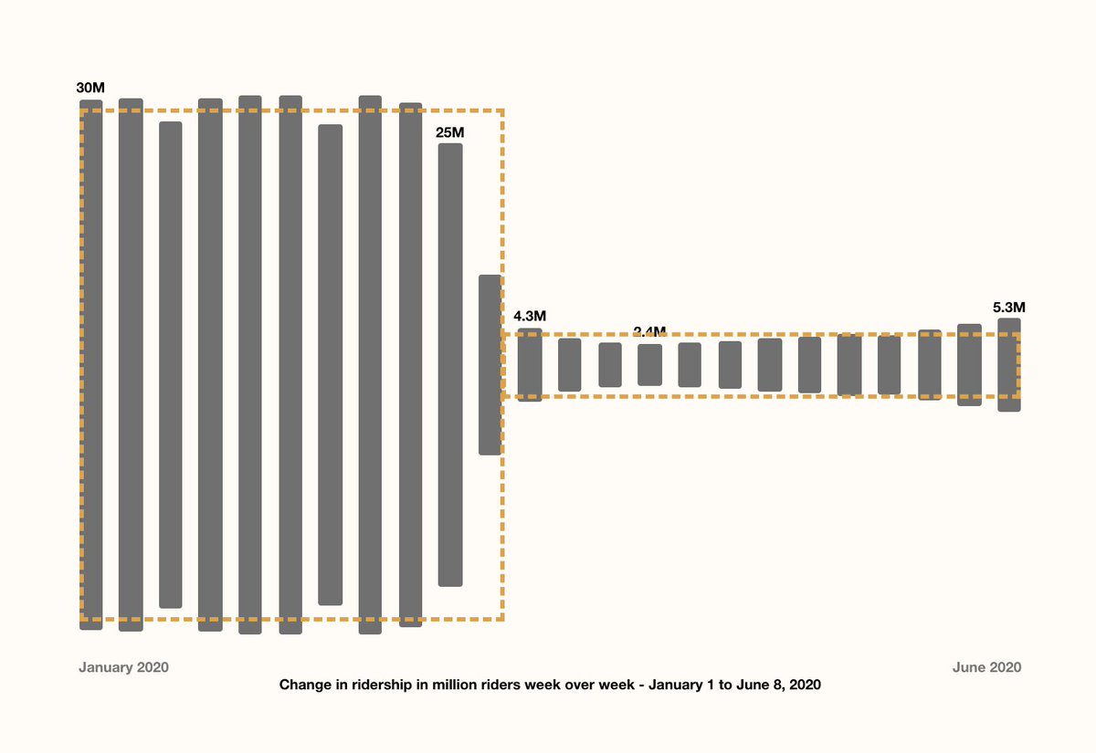
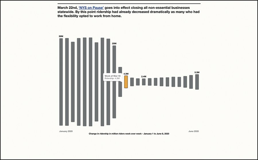
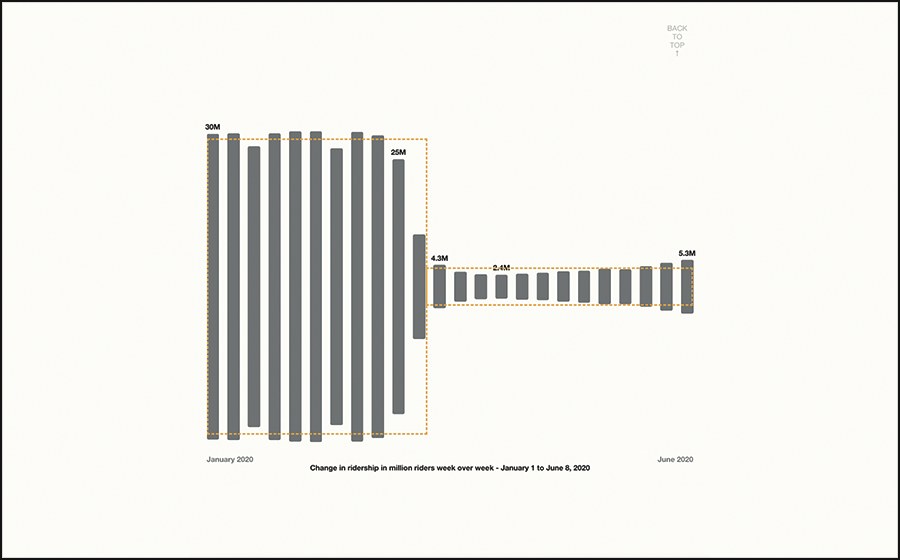
ALT Bar chart showing weekly NYC subway ridership from January to June 2020. Chart highlights the 87% drop in overall subway ridership.
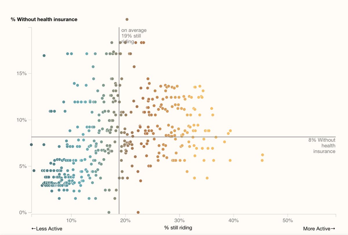
ALT Scatterplot of MTA stations showing subway ridership and percent of population without health insurance. The x-axis shows the % ridership during the peak of COVID-19 pandemic, and the y-axis shows the percent of the population without any health insurance from the latest American Communities Survey.
Neighborhoods with higher ridership during the pandemic tend to also have a higher percent of uninsured individuals (sometimes up to 15%!).
Are you still riding the #subway? With our new interactive #DataVisualization project, you can learn more about #COVID19's affect on subway ridership, and explore the changes to your neighborhood or favorite subway lines. Explore here: projects.two-n.com/mta/
Check out our new interactive visualization project looking at how @MTA subway ridership changed during the first few months of COVID-19 and what we can learn from that about our city.
#DataVisualization#Covid_19#nycsubway#SocialDisparities
Who is Still Riding the Subway? Our design technologist @aucher_serr looks at MTA data to answer questions such as ‘who is able to stay at home?’, ‘who has to work the front lines?’, and ‘which communities are at greater risk for exposure?’ Check it out: projects.two-n.com/mta/