Text might be the most neglected part of #dataviz. We talk a lot about how the right chart type and colors can improve visualizations – but not enough about how to use words well.
So I wrote about that in my latest article: blog.datawrapper.de/text-in-…
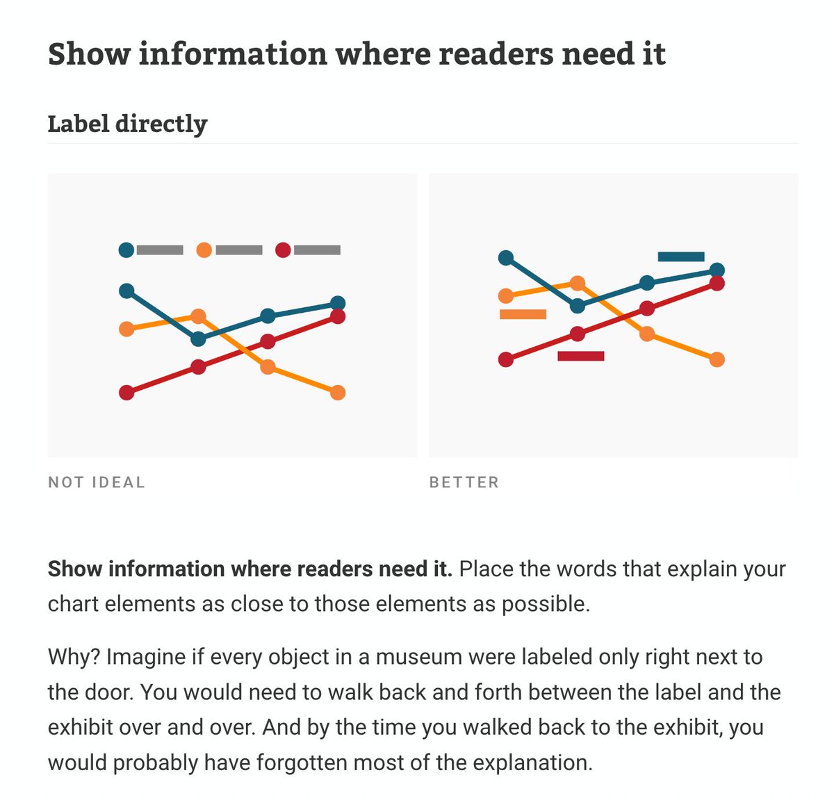
ALT Screenshot of the article stating: "Show information where readers need it. Place the words that explain your chart elements as close to those elements as possible. Why? Imagine if every object in a museum were labeled only right next to the door. You would need to walk back and forth between the label and the exhibit over and over. And by the time you walked back to the exhibit, you would probably have forgotten most of the explanation."
ALT Screenshot of the article stating: "Ok, enough with the small tricks. Here's a big one: Use annotations. Annotations are an extremely powerful tool in your visualizations. If you're creating an explanatory chart or map, it will likely be better with annotations in it."
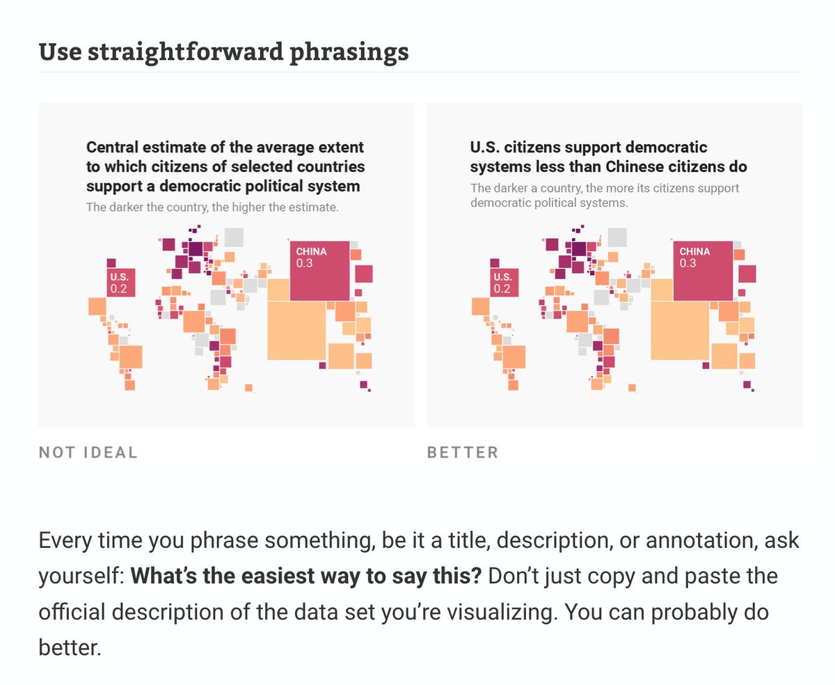
ALT Screenshot of the article stating: "Every time you phrase something, be it a title, description, or annotation, ask yourself: What's the easiest way to say this? Don't just copy and paste the official description of the data set you're visualizing. You can probably do better."
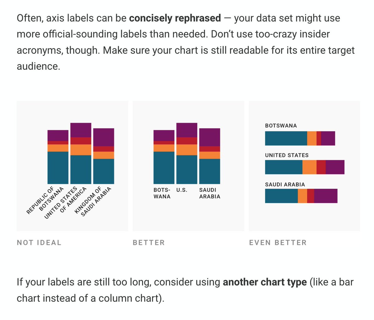
ALT Screenshot of the article stating: "Often, axis labels can be concisely rephrased - your data set might use more official-sounding labels than needed. Don't use too-crazy insider acronyms, though. Make sure your chart is still readable for its entire target audience."
We just released an exploration I've been wanting to do for a while:
✨✨
Can we visualize a codebase?
✨✨
We always look at our code in a file/folder list - what would a bird's-eye-view look like, and how could that enhance our understanding of code?
octo.github.com/projects/rep…
Thank you so much to everyone who joined our book launch yesterday 💖 and thank you @AlbertoCairo@tamaramunzner for joining our celebration and @jlengstorf for managing our stream 🙏
ICYMI → youtu.be/qkoEN0P29Q0
P.S. I made flower earrings specially for the launch 😆🌸
🚀 Happy to release tidy.js today on npm. Inspired by the tidyverse and dplyr, tidy.js aims to bring the ergonomics of data wrangling from #Rstats to the js (and typescript) community.
site: pbeshai.github.io/tidy/ ( playground)
repo: github.com/pbeshai/tidy
New: British & Exotic Mineralogy. A collage of all 2,242 of James Sowerby’s illustrations (1802–1817) from his compendium of knowledge about mineralogy in Great Britain and beyond arranged by color.
Explore: c82.net/mineralogy
How it was made: c82.net/blog/?id=84
ALT Screenshot of introduction to the site with collage in background and links to explore, learn about the project, get a poster, and index.
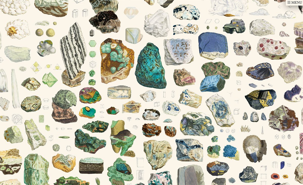
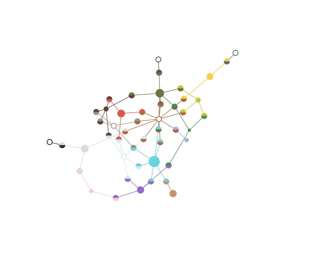
ALT Closeup of a section of the collage showing detail of minerals of green, teal, and blue colors.
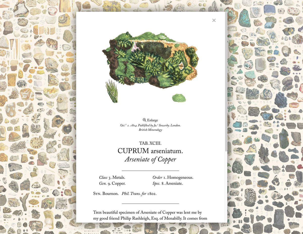
ALT Popup showing details and picture of Arseniate of Copper.
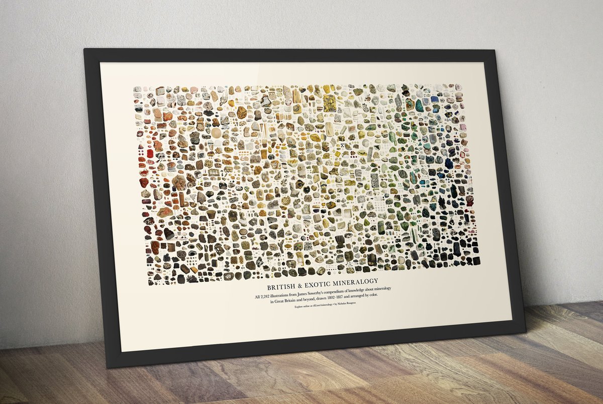
ALT Framed poster of entire collage on the floor leaning against a wall.
Every month we’ll be hosting a live Q&A with experienced dataviz practitioners answering questions from early career professionals. Here’s our first, focused on resumes and portfolios, featuring a panel of @DataToViz, @Jasonforrestftw & @Elijah_Meeks.
youtube.com/watch?v=SnPxMjJV…
I don’t know if you heard but a year ago today we founded the @DataVizSociety and Hajra surprised me with this DVS birthday bear to wish DVS a happy bearthday.
You can see it on insta here: instagram.com/p/B80chOLHXmC/#bearthday
I worked w/ @stinadacanay@tomyumnoodz@ITP_NYU on a physical #dataviz of 16 incredible but often unknown women in computing, represented as orbs that glow brighter as they're read✨
It's our love letter to all the women & we hope you enjoy reading it 🥳
oneamongstmany.com
Put together a little #dataviz proof of concept during a hack week at work last week. It's a 3D faceted search UI using #reactjs, #threejs, and react-three-fiber. 50,000 objects at 60 FPS in the browser is pretty sweet!!
Love this quote from @DataToViz' great talk at @d3unconf! :D -> "The farther away you get from the data points the more "landmarks" you should leave to find your way back"
Check out her full retrospective on dataviz here: youtube.com/watch?v=BaLPkuWR…
The visFest 2019 keynote videos are online! Here's Susie's talk on visualization systems featuring Pokémon, receipts, color tools and more! @DataToVizyoutube.com/watch?v=BaLPkuWR…
Data Visualization Retrospective
Abstractions: The role of data visualization abstractions and the importance of creating landmarks between layers of abstraction in data visualization. (Part 1 of 3)
susielu.com/data-viz/abstrac…
From #visfest2019@d3unconf
My article on uncertainty vis in SciAm is open for a few days! I hope it makes the research on this topic more accessible. My summary includes work by MU Collective (me & @mjskay) @LacePadilla @birdbassador & @nytgraphics among others scientificamerican.com/artic…
It was really special to hear @defilippovale speak about her design process and projects this morning at #visfestunconf thanks @d3unconf for bringing her to the conference!
I'm beyond excited to give the opening talk at
@d3unconf
next week. I'm currently in the pit of slide-making but have emerged momentarily bearing gifts: