
Physicist, love natural sciences | #KlimaVor8 | 🏃♂️🏊♂️🚴♂️ | Scientific method youtu.be/EYPapE-3FRw | feynmansmethod.bsky.social
Joined January 2018
- Tweets 56,268
- Following 1,371
- Followers 3,365
- Likes 49,523
7,352 Photos and videos


Pinned Tweet

5 Jul 2020
"Intelligenz ist die Fähigkeit, den Raum des Nichtwissens nicht mit Vorurteilen zu füllen, sondern mit Neugier."
(Zitat von Unbekannt)
15
81
343
Michael Craiss retweeted

20 Jun 2025
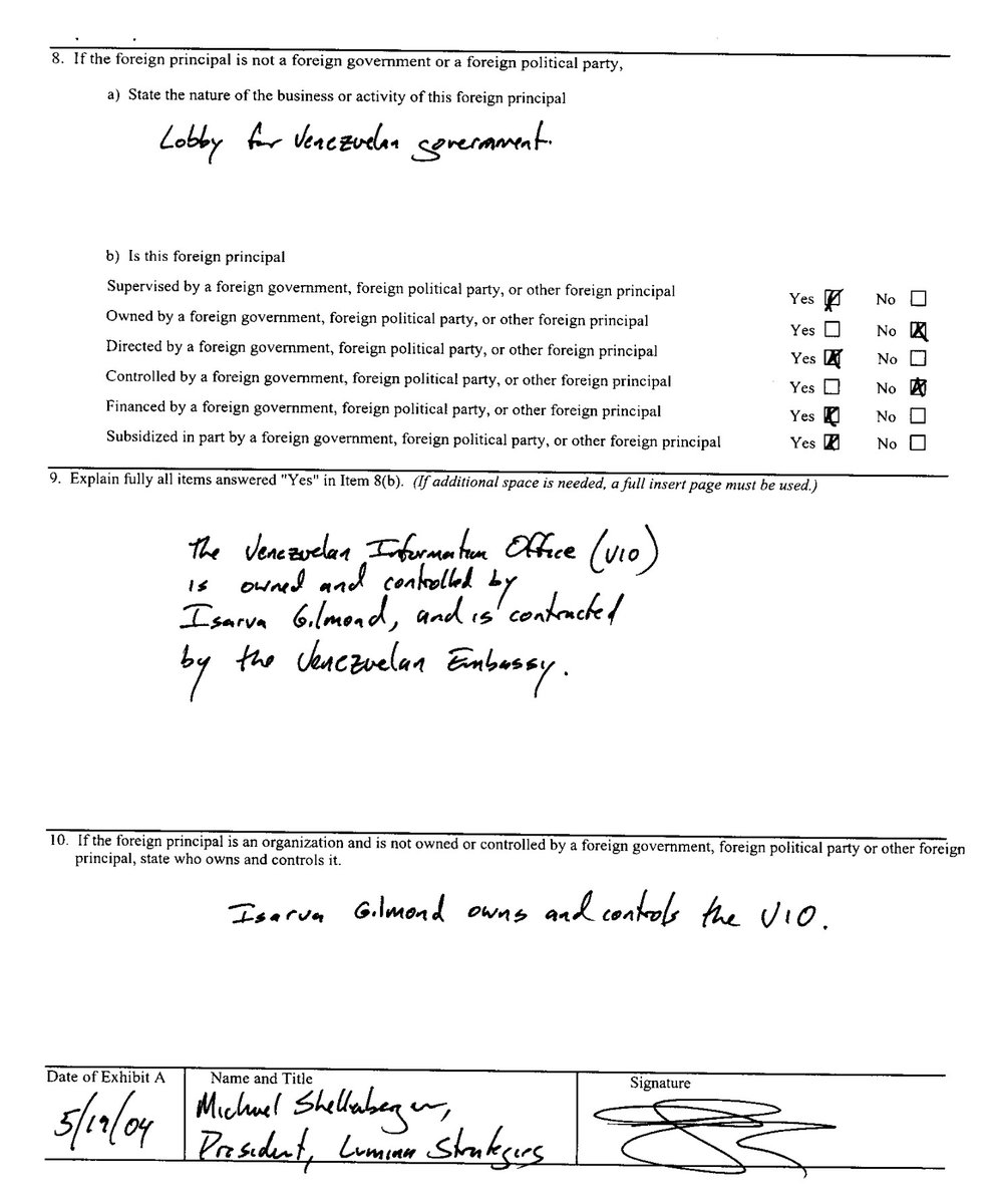
A suspicious group calling itself the "Fact Check Alliance" has popped up on my radar. They are heavily linked to former Hugo Chavez govt PR guy Michael Shellenberger. The website appears to be a front to further the misleading work of Shellenberger and his astroturfing. Also...
4
25
84
9,213
Michael Craiss retweeted

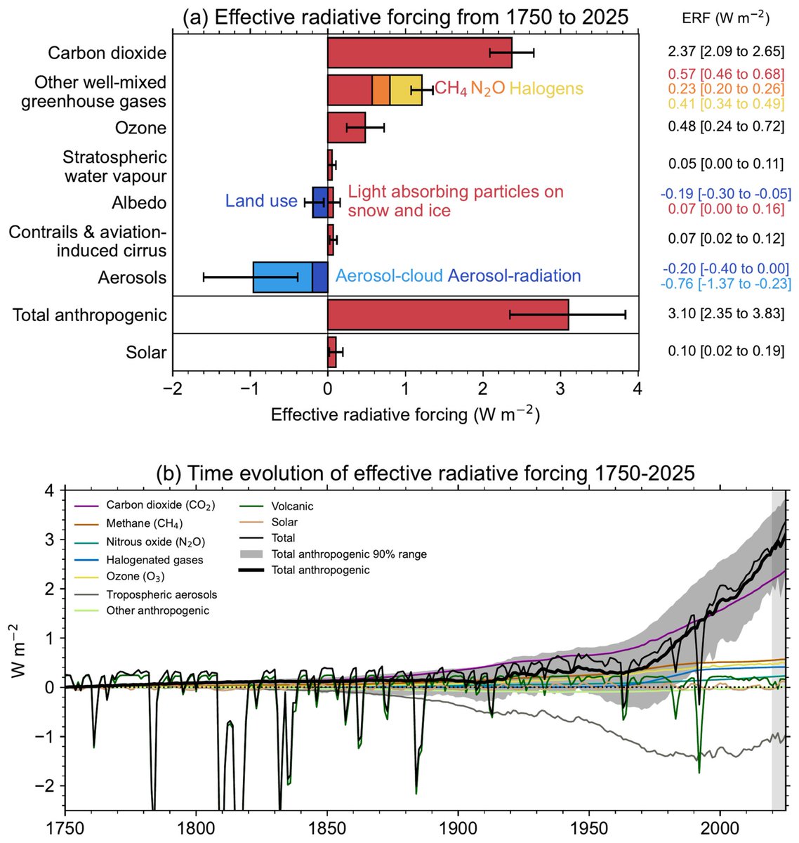
The annual update of "Indicators of Global Climate Change" by Forster et al was published today.
essd.copernicus.org/articles…

1
4
22
364
Michael Craiss retweeted

Jun 9
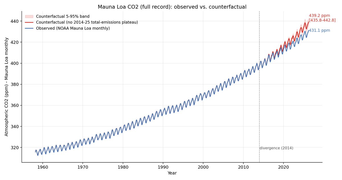
Global CO2 emissions have plateaued since 2013, leading to a slower growth in atmospheric CO2 than would have otherwise been the case. In a new analysis at The Climate Brink, I've taken look at what would have happened if emissions had continued to grow.
55
125
451
100,714
Michael Craiss retweeted

Jun 7
Das sind die Fragen zu ihren Aussagen, die Fossillobbyisten nicht beantworten wollen und können, damit ihre Desinformation nicht auffliegt.
Sehr euch die Diagramme erst an, dann die Fragen von Ceist und ihr versteht dann, wie ihr von Fossilisten veräppelt wird.
Wie stets, nutzen Populisten die Komplexität der Sache aus, indem Sie durch Weglassen ein Framing erzeugen, welches sehr einfach ist und daher für die Masse nachvollziehbar und Wissenschaftlern gelingt es kaum die komplexe Realität rüberzubringen.
Das Dilemma kann nur mit grundsätzlichen Vertrauen in die Wissenschaft gelöst werden, wir sind nun mal meist keine Fachleute, so wie das in vielen Feldern ja auch der Fall ist und wir enorm davon profitieren, unser ganzer Wohlstand basiert darauf.
Nur bei zwei Dingen, Klima und Impfung wollen uns Scharlatane einreden und bei vielen erfolgreich, die Wissenschaftsgemeinschaft sei korrupt. Diffamierung von Forschern und Institutionen steht ganz oben auf der Liste!
Bekloppt nicht wahr, wenn an mit etwas Flughöhe darüber nachdenkt?
Für mich sind die bekloppt, die darauf reinfallen, denn Scharlatane gibt es aus Gründen überall.

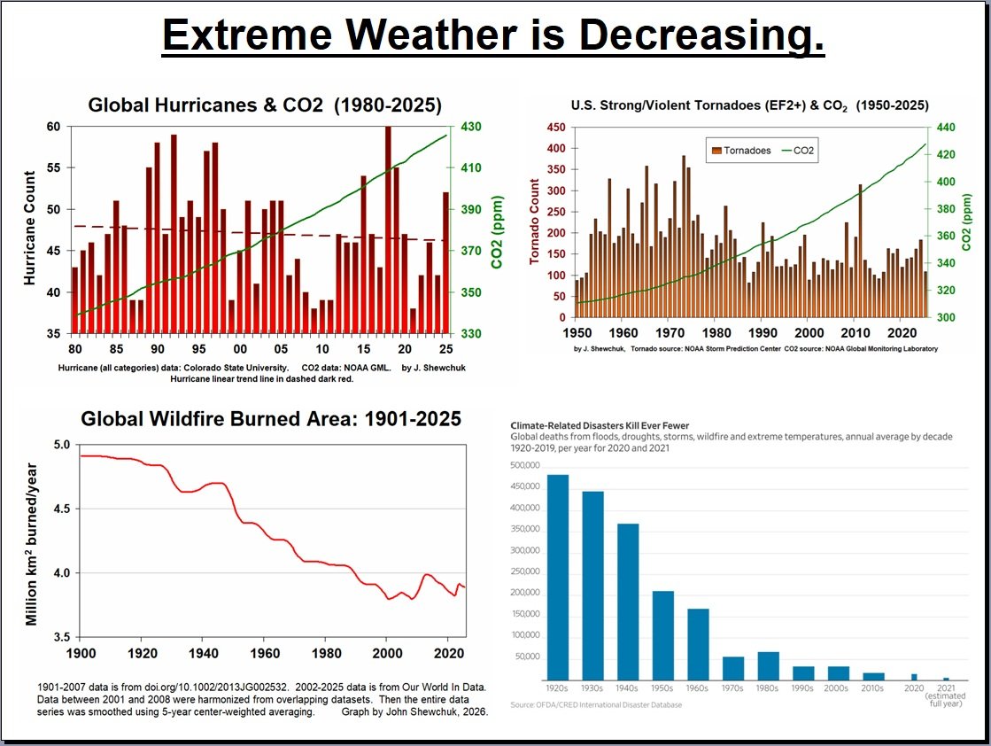
Shewchuk, please answer these question about your graphic:
If your goal is scientific accuracy, why does your graphic consistently choose metrics, baselines, and visual framing known to downplay or obscure well-established climate trends?
On hurricanes (top-left panel):
-Why did you plot total global hurricane counts rather than intensity (Category 3–5), which is the metric climate science expects to change with warming?
-How do you account for improved satellite detection since the 1970s, which artificially inflates earlier undercounts?
-Why does your graph exclude Accumulated Cyclone Energy (ACE), a standard metric used by NOAA and the IPCC?
-Can you explain why you used a simple linear trendline on highly variable data without showing uncertainty or statistical significance?
-Are you aware that the IPCC reports low confidence in long-term trends in total cyclone counts but higher confidence in increasing intensity and rainfall? Why is that omitted?
On tornadoes (top-right panel):
-Why did you use EF2 tornado counts starting in 1950, when reporting practices and radar technology changed dramatically (especially post-1990 Doppler radar)?
-How do you correct for non-climatic inhomogeneities in the tornado record that NOAA explicitly warns about?
-Why not show normalized or environment-based metrics (e.g., convective available potential energy, shear trends) instead of raw counts?
-Can you point to any major scientific body that uses this dataset to claim tornado risk is decreasing?
On wildfires (bottom-left panel):
-Why are you presenting global burned area without clarifying that the decline is largely due to agricultural expansion and land management, not climate effects?
-Why omit data showing that fire weather conditions (heat, drought, vapor pressure deficit) have increased significantly?
-Why not show regional trends, such as the well-documented increase in extreme fires in places like western North America or Australia?
-Do you agree that burned area ≠ fire severity or ecological impact? If so, why present it as evidence of “less extreme weather”?
On disaster deaths (bottom-right panel):
-Why are you using raw death totals rather than deaths per capita, given global population growth?
-Why omit the role of improved infrastructure, forecasting, and disaster response, which are the primary drivers of reduced mortality?
-Are you suggesting that fewer deaths means hazards are decreasing, or just that humans are better at surviving them?
-Why include 2020–2021 as partial data points, which visually exaggerate the decline?
On CO₂ comparison (across panels):
-What is the scientific justification for visually comparing CO₂ (a smooth upward curve) with highly variable hazard data without any causal analysis?
-Why do you imply a relationship using dual-axis graphs, a technique widely criticized for creating misleading visual correlations?
-Can you provide a peer-reviewed attribution study showing that rising CO₂ should reduce these hazards?
On selective omission:
Why does your meme omit:
-Heatwaves (one of the most robustly increasing extremes)?
-Extreme rainfall and flooding intensity?
-Marine heatwaves?
-How did you decide which indicators to include versus exclude?
On methodology and transparency
Can you provide:
-The full datasets used (not just sources)?
-The code or method used to generate the graphs?
-Any uncertainty ranges or statistical tests?
-Why are these figures presented without error bars, confidence intervals, or methodological caveats?
6
19
90
4,209
Michael Craiss retweeted

Jun 3
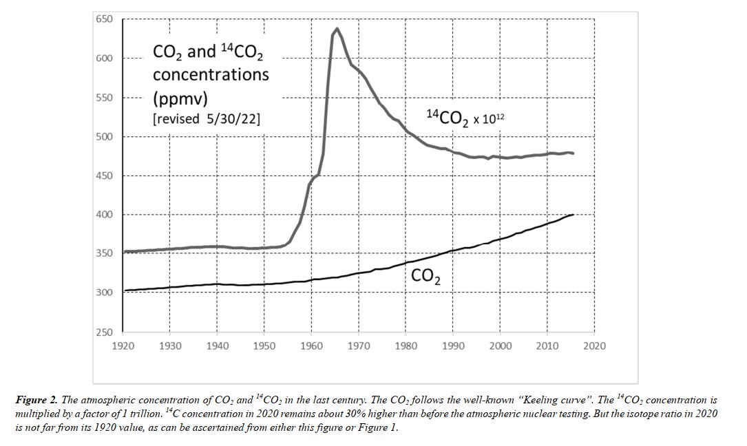
🧵Nach dem wenig erfreulichen Geplänkel mit @FPerrefort über Ganteförs (et al.) ¹⁴CO₂ "Konzentrations" Trick, hier mal eine wunderbare Arbeit von @Gavin_Cawley (15 Jahre alt) die den Zuwachs von anthropogene CO₂ an einem Beispile erklärt 1/n ...
4
6
50
3,583
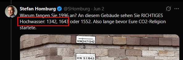
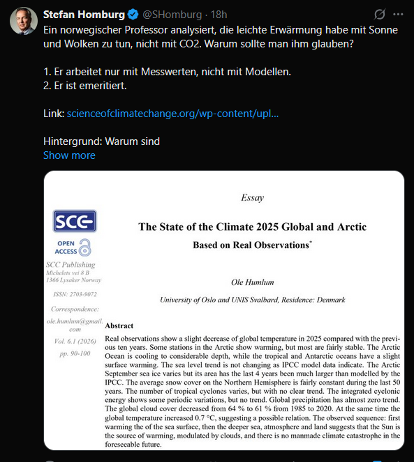
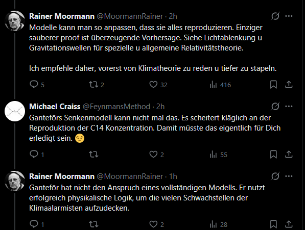
Offenbar kann man @SHomburg sehr leicht hinter die Fichte führen. 😄
Humlum schreibt eine Rede nieder, die er bei einem Treffen von Klimawandelleugnern gehalten hat und veröffentlicht diese in seinem eigenen Leugnerblog, der als wissenschaftliche Publikation getarnt ist. ->
5
9
66
2,184
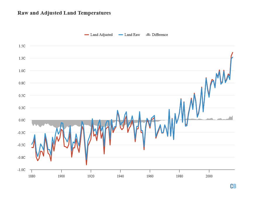
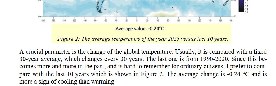
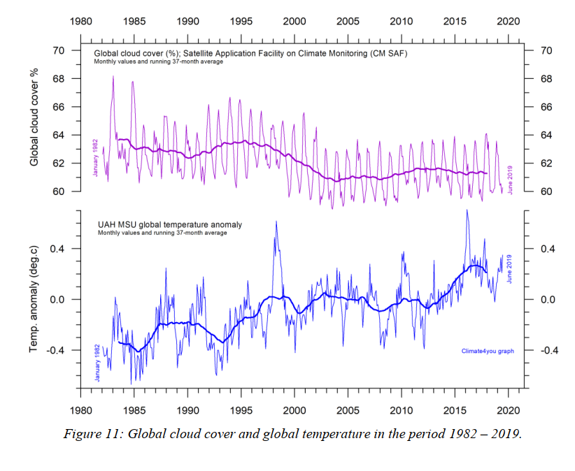
Am Anfang behauptet Humlum, die globale Mitteltemperatur sei in den letzten 10 Jahren um 0,24°C *gesunken*, nur um ein paar Minuten später die *ansteigende* Kurve hinzumalen. 🤦♂️
2
1
25
384
Die Leugner sind mittlerweile so dreist, dass Sie nicht mal mehr versuchen, Ihren Unsinn zu tarnen und die Homburgs dieser Welt schämen sich nicht, das zu verbreiten.
1
23
294
Man kann das nicht oft genug posten. #NetZero ist einfach nur das Ende des Temperatur*anstiegs*. Um die Temperaturen wieder zu senken wären erheblich größere Anstrengungen nötig. Besser den Anstieg gleich rechtzeitig stoppen.
May 29

If we can get global CO2 emissions to zero, we generally expect the world to stop warming.
But why this occurs is fascinating: cooling from falling atmospheric CO2 is more or less perfectly counterbalanced by warming from ocean temperature equilibration.

3
4
24
1,582
Michael Craiss retweeted

May 28
I hate days when decades of science are dismissed with → I did my own research.
It’s the worst.
Science is hard. It takes proof, testing, and reproducibility.
Pseudoscience? Easy. Just make it up, add fear, and watch it spread.
Am I the only one? ♻️ Pass it on.
220
379
1,529
21,335
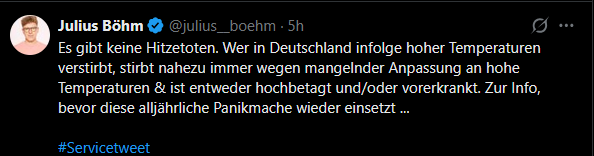
Aha. Alte Menschen können also nicht an einem Hitzschlag oder Kreislaufkollaps sterben, weil sie ja bereits *alt* sind. Man lernt immer wieder neue, erstaunliche Dinge über diesen Julius. 😄
13
8
102
2,653
Michael Craiss retweeted
May 26
The problem isn't the availability of scientific research.
It's the flood of people misinterpreting complex data with zero training and full confidence.
Access to information is no longer the barrier. Understanding it is.
84
251
1,178
21,963
Wenn Regeln mal wieder nur für die Anderen gelten. Die eigenen Protagonisten sind natürlich davon ausgenommen. 🙄
10
1
60
2,412
Michael Craiss retweeted
May 22
A scientific consensus isn't a group of scientists agreeing.
It's repeated results from independent studies all pointing the same way.
We don't agree vaccines saves lives.
We know - because study after study shows it.
Consensus = consistent evidence.
Not collective opinion.
204
1,138
3,952
49,112
😮
Der Prüfbericht zur Berechnung der deutschen Treibhausgasemissionen des Expertenrats für Klimafragen ist eine einzige, große, schallende Ohrfeige.
expertenrat-klima.de/publika…
1
8
29
666
Die optimistischen Annahmen der Bundesregierung werden vom Expertenrat offenbar nicht geteilt.

1
6
87