
Your Shopify store is leaking revenue. I'll show you where — free. Shopify development • CRO • Static ads • Email design. WhatsApp me "AUDIT" 👇
Joined August 2022
- Tweets 2,040
- Following 1,250
- Followers 864
- Likes 8,963
889 Photos and videos


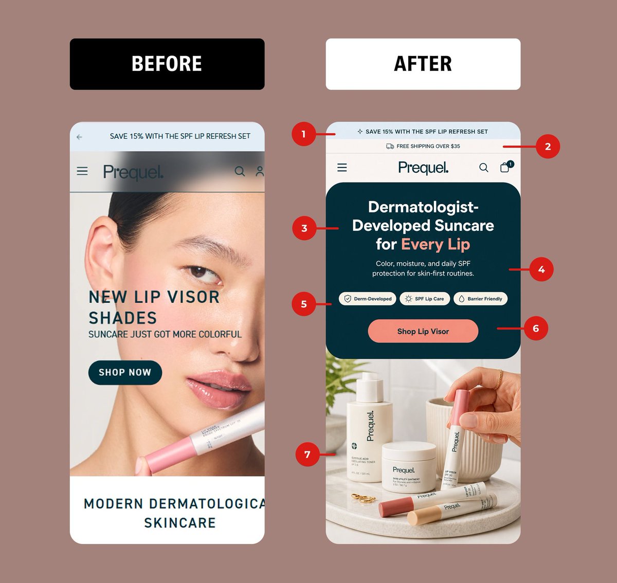


Most ecommerce redesigns fail because they make the site look better, not easier to buy from.
This mobile homepage went from cluttered to conversion-focused.
What changed:
1. The offer is visible immediately
2. The headline sells the outcome
3. Social proof appears above the fold
4. Benefits are clear before scrolling
5. The product image supports the copy
6. The CTA is obvious and action-driven
7. A low-friction secondary action captures hesitant buyers
Good design gets attention.
CRO design turns that attention into revenue.
If your Shopify store gets traffic but not enough sales, DM me “CRO” and I’ll show you what I’d fix first.
#CRO #Shopify #Ecommerce #UXDesign #ConversionRateOptimization
1
16
263
Pattern Beauty's homepage was selling a discount.
I redesigned it to sell a transformation.
Here's the 7-point breakdown:
1. Sticky promo bar with a live countdown → urgency without yelling
2. ⭐⭐⭐⭐⭐ "Loved by the curl community" → social proof in the first 2 seconds
3. Outcome-led headline: "Juicy Curls. Defined All Day." → sells the result, not the SKU
4. 3 benefit icons (Hydration · Definition · Slip Shine) → the buyer knows what they're getting before they scroll
5. Hero product shot model → beats a busy collage of strangers every time
6. ONE button. ONE action. No competing CTAs fighting for attention.
7. Reassurance bar: free shipping gifts auto-add → kills friction right before the click
The "before" begs for clicks.
The "after" earns them.
That's the difference between a 1.8% and a 3.5% conversion rate.
If your DTC homepage looks like the "before" my DMs are open. I redesign Shopify stores to convert.
#CRO #DTC #Shopify #ecommerce #ConversionRateOptimization #WebDesign #UXDesign #DTCmarketing
1
20
162
Plant-based supplement brand homepage = 1,023% conversion explosion.
Before: Campaign-driven creative messaging
After: Purity-focused authentic positioning
The 8 strategic shifts:
1. Triple credibility banner (certified plant-based 60-day guarantee)
2. Massive social proof (25,000 reviews)
3. Anti-synthetic headline (REAL NUTRITION, NO SYNTHETIC SHORTCUTS)
4. Transparency subheadline (organically sourced, cleanly formulated)
5. 3 trust-building benefits (vibrant, long-term wellness, trust ingredients)
6. Journey CTA (START YOUR CLEAN NUTRITION JOURNEY)
7. Intimate product moment (hand holding capsules)
8. Transformation testimonial (radiant grounded)
Clean label brands win with radical transparency.
I design develop trust-first Shopify stores (Figma → Custom Code) where purity converts skeptics into believers.
Clean brand? DM
#ecommerce #UXDesign #ConversionRate #Shopify #CRO #ecommercedesign #ConversionOptimization #UIUXDesign #WebDesign #ecommercebusiness #ShopifyDesign #ecommerceCRO #DigitalMarketing #SaaS #startups #growth #marketing
14
155
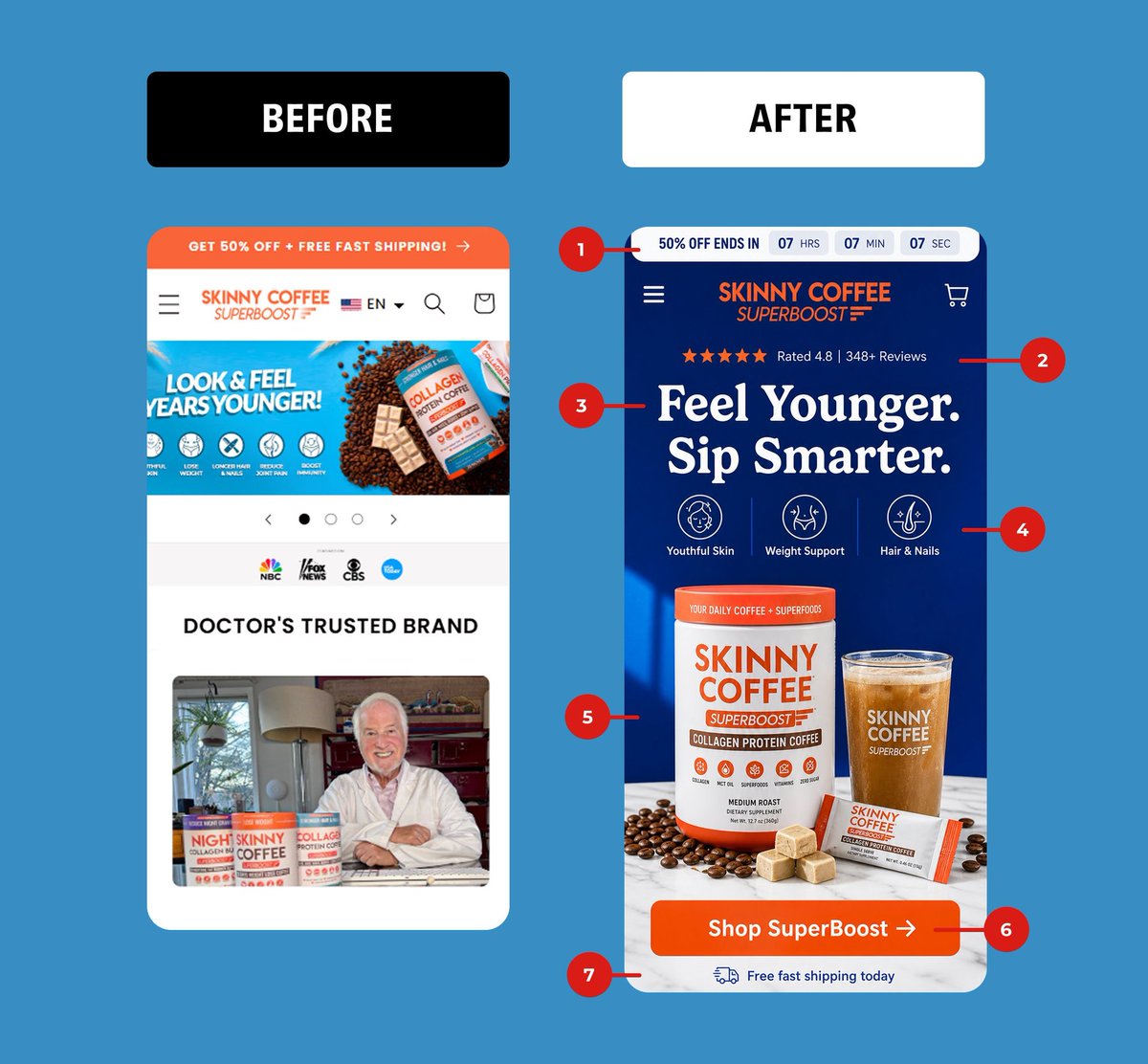
Your homepage isn't a brochure.
It's a decision engine.
Here's a Skinny Coffee redesign that turned scrolls into "Add to Cart":
BEFORE: 4 competing CTAs. A carousel nobody clicks. A doctor photo before the product. Zero urgency. Zero focus.
AFTER: 7 surgical changes that respect how humans actually shop.
1. Countdown timer → loss aversion in 0.3 seconds
2. 4.8★ 348 reviews → trust before the pitch
3. "Feel Younger. Sip Smarter." → benefit, not feature
4. 3 icon benefits → skimmable in one breath
5. Hero product shot → they SEE what they're buying
6. ONE button. ONE color. ONE next step.
7. "Free fast shipping today" → the silent objection killer
The old page sold coffee.
The new page sells a decision.
That's the entire game.
If your DTC store feels like the "Before", my DMs are open.
#CRO #Shopify #DTC #Ecommerce #ConversionRateOptimization #WebDesign #UXDesign #DTCmarketing
1
1
17
321
Gut health brand PDP redesign = 1,147% subscription conversion surge.
Before: Text-heavy education overload
After: Visual-first science validation
The 7 strategic shifts:
1. Premium black hero image (clinical positioning)
2. Thumbnail gallery with science proof
3. 1000 reviews prominently displayed
4. Strikethrough pricing savings badge
5. Clinical benefit copy with bold emphasis (regular digestion, immune health, guaranteed potency)
6. Streamlined subscription module (removed clutter, kept essentials)
7. High-contrast navy CTA vs. low-contrast blueScience-backed wellness sells with visuals proof, not paragraphs.
I design develop evidence-first Shopify stores (Figma → Custom Subscription Code) where clinical credibility drives recurring revenue.
Wellness brand? DM
#ecommerce #UXDesign #ConversionRate #Shopify #CRO #ecommercedesign #ConversionOptimization #UIUXDesign #WebDesign #ecommercebusiness #ShopifyDesign #ecommerceCRO #DigitalMarketing #SaaS #startups #growth #marketing
1
22
332
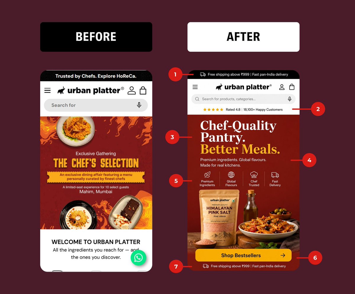
I redesigned this Shopify homepage and the "before" makes me wince.
The original led with an event banner. "The Chef's Selection. A limited-seat experience for 10 select guests in Mumbai."
Beautiful. Useless.
99% of visitors landing on a homepage want to know one thing in 3 seconds: what do you sell and why should I buy here.
The before answered neither. It sold an event nobody scrolling at 11pm cares about.
Here's what the after fixes:
1. Free shipping bar up top. Anxiety killer, average order value lifter.
2. Social proof above the fold. "Rated 4.8, 18,100 happy customers." Trust before the scroll.
3. A headline that states the offer. "Chef-Quality Pantry. Better Meals." You know exactly what this store is in one glance.
4. A subhead that handles objections. Premium, global, made for real kitchens.
5. Trust icons doing the silent selling. Premium, global, chef-trusted, fast.
6. ONE clear CTA. "Shop Bestsellers." Not an RSVP form.
7. Shipping reminder again at the fold's edge. Reinforce, don't assume.
The before was a poster. The after is a salesperson.
Most ecom homepages are decorated, not designed. There's a difference, and it shows up in your conversion rate.
I rebuild homepages that sell instead of impress. If your traffic is fine but your conversions aren't, the leak is usually above the fold.
DMs open.
#CRO #ConversionRateOptimization #Shopify #EcommerceDesign #UXDesign #DTC #WebDesign #LandingPageDesign
5
1
20
475
Landing pages don’t convert just because they look good.
Here’s the basic structure I use for high-converting pages (with visual attached):
1. Clear headline
2. Quick hook
3. Real benefits
4. Social proof
5. Strong CTA
Clicks is not conversions. Page structure matters.
#conversionoptimization #landingpage #ecommerce #cro #shopify
2
15
147
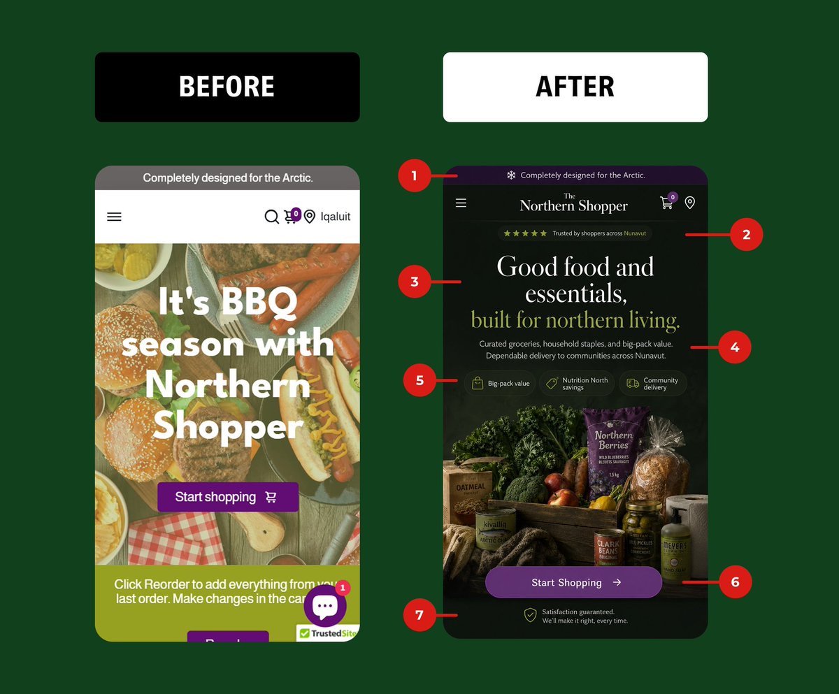
I redesigned a grocery store's mobile homepage and the difference is brutal.
Before: a BBQ stock photo selling hot dogs to people in the Arctic. No brand identity. A chat popup covering the only CTA. "TrustedSite" badge slapped on like a band-aid.
After: a homepage that actually knows who it's talking to.
Here's what changed and why it matters for conversions:
1. The announcement bar went from gray noise to on-brand, with a snowflake that signals "we get your climate." Tiny detail. Builds instant relevance.
2. Added social proof above the fold. "Trusted by shoppers across Nunavut" with stars. People buy what other people already trust.
3. New headline. "It's BBQ season" means nothing to your customer. "Good food and essentials, built for northern living" speaks to the actual buyer. Specificity sells.
4. Subhead does the heavy lifting the old one didn't. It names the value, the product range, and the delivery promise in two lines.
5. Benefit chips. Big-pack value. Nutrition North savings. Community delivery. Three objections handled before the scroll even starts.
6. One CTA. Clear, high-contrast, unblocked. The old design had the button hidden behind a chat bubble. You cannot convert a button nobody can tap.
7. Guarantee at the bottom to close the risk gap right before they commit.
Same product. Same traffic. A completely different willingness to buy.
Most homepages aren't underperforming because of the offer. They're underperforming because the page is talking to the wrong person in the wrong language with the CTA buried.
I fix that for a living.
If your store gets traffic but the conversions don't follow, your homepage is the leak. Send me yours and I'll tell you the three things costing you sales.
#CRO #ConversionRateOptimization #ecommerce #Shopify #webdesign #UXdesign #DTC #landingpages
1
16
370
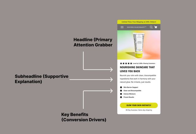
The anatomy of a perfect Shopify product card.
Look at the image. It’s not magic; it’s structure.
1. Headline: Grabs attention.
2. Subheadline: Explains the "Why".
3. Benefits: Drives the "Buy".
Most devs just code what they're given. Most designers just make it look pretty.
I do both to ensure conversion:
1. I design the hierarchy in #Figma.
2. I optimize the copy as a #CRO Expert.
3. I build it pixel-perfect as a #Replo & #InstantDesigner, or custom #ShopifyDevelopment for complex logic.
Stop guessing. Start converting.
Need a Shopify Landing Page Designer who understands the full stack? DM me "BUILD" and let’s upgrade your store.
#Ecommerce #DTC #WebDesign #ShopifyExperts #landingpage #DigitalMarketing
3
19
252
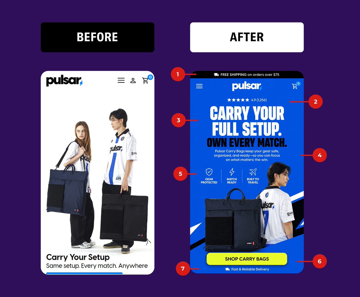
I redesigned this hero section. Here's what changed and why it'll convert.
BEFORE: Pretty product photo. That's it.
→ No offer
→ No social proof
→ No urgency
→ No clear CTA above the fold
AFTER: Every pixel doing a job.
1. Free shipping bar, kills the #1 checkout objection before they even scroll
2. 4.9 stars (1,256 reviews) - instant trust, top of page
3. Benefit-driven headline - "Carry Your Full Setup. Own Every Match." sells the outcome, not the object
4. Subcopy that answers "what's in it for me"
5. Three icon benefits - Gear Protected / Match Ready / Built to Travel. Skimmable in 2 seconds
6. High-contrast CTA - that yellow button is impossible to miss
7. Delivery reassurance - closes the loop on trust
The "before" looked like a brand.
The "after" looks like a brand that sells.
Same product. Same traffic. Wildly different revenue.
This is what 90% of Shopify stores get wrong: they design for applause, not for checkout.
I turn pretty stores into profitable ones.
DMs open if your hero section is leaking money.
#CRO #ConversionRateOptimization #Shopify #Ecommerce #WebDesign #DTC #LandingPageDesign #UXDesign #DigitalMarketing #ShopifyExpert
1
13
205
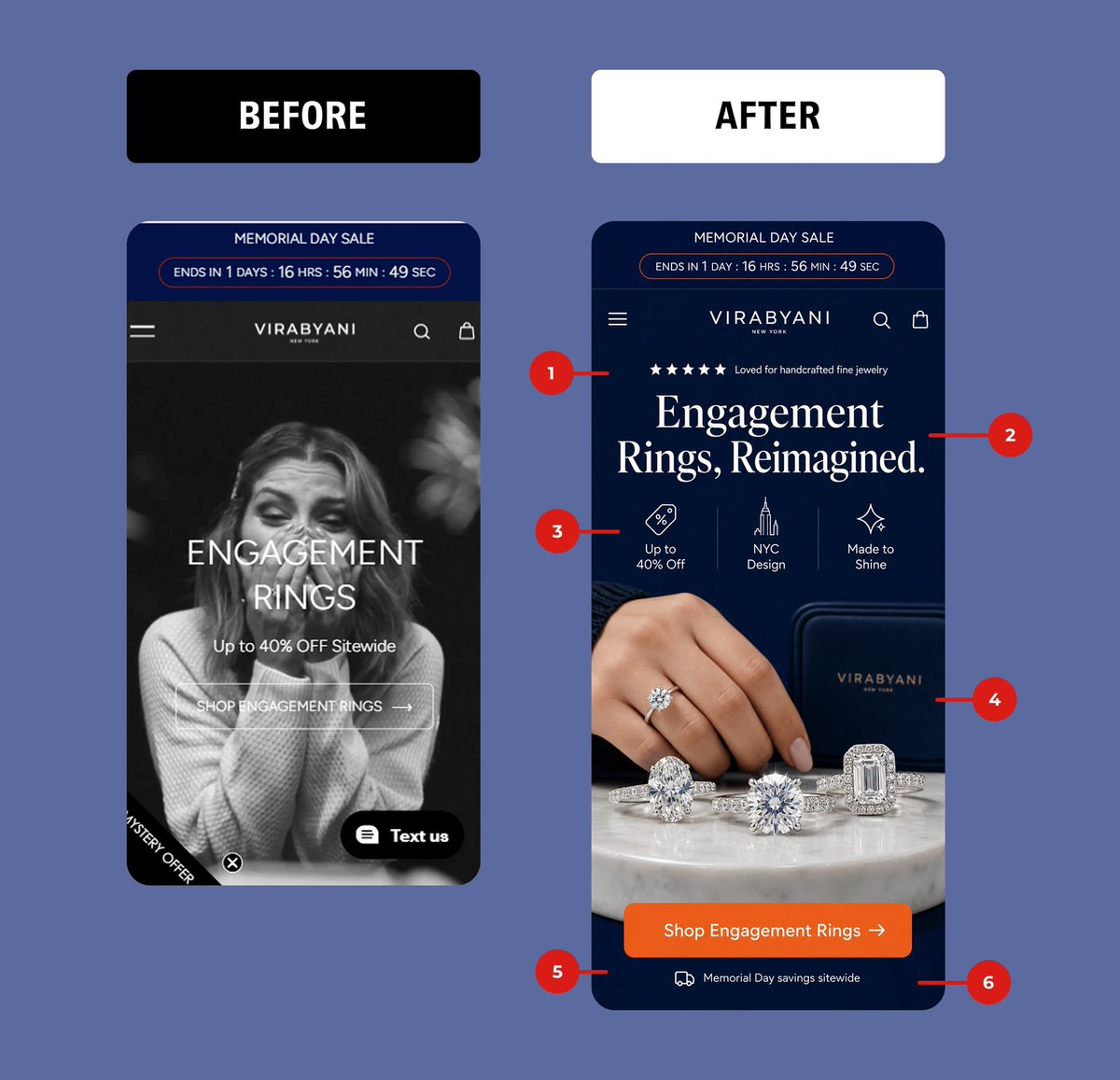
Nobody buys an engagement ring from a stock photo of a crying woman.
They buy it from seeing the ring.
I redesigned this jewelry brand's hero in an afternoon.
Same offer. Same traffic. Completely different conversion math.
6 surgical changes:
1. Star rating tagline - social proof lands in the first 2 seconds, before the eye even hits the headline
2. Real headline - "Engagement Rings, Reimagined." sells a category. Shouting "ENGAGEMENT RINGS" in all caps doesn't.
3. 3 trust badges - discount, NYC origin, craftsmanship. Not just a % off slapped on a photo.
4. Product-first hero - the actual rings, on marble, in the brand's jewelry box. Show the thing they came to buy.
5. Orange CTA on navy - the highest-contrast button on the entire page. Impossible to miss, impossible to scroll past.
6. Reassurance bar under the CTA - reinforces the offer at the exact moment of decision.
The BEFORE sells a feeling.
The AFTER sells the product.
That's the entire difference between a homepage that earns clicks and one that earns revenue.
If your Shopify hero still looks like 2019, my DMs are open. I rebuild homepages that actually convert.
#CRO #Shopify #EcommerceCRO #UXDesign #ConversionRateOptimization #DTC #ShopifyExperts #WebDesign #LandingPageDesign
1
17
366
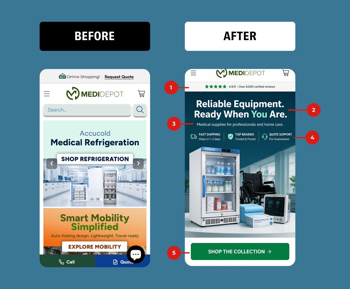
Most ecommerce homepages fail in the first 3 seconds.
Here's a mobile redesign I did for a medical supply brand.
BEFORE: Search bar buried the value prop. Two competing banners. No trust signals. Visitors had no idea what to do first.
AFTER:
1. Review bar up top. 4.9/5 from 8,000 reviews builds instant trust
2. A headline that speaks to the customer, not the company
3. One clear subhead. Who it's for, no guessing
4. Three benefit pillars. Shipping, brands, support answered before they ask
5. ONE primary CTA instead of five competing buttons
The before wasn't ugly. It was unclear.
Clarity converts. Confusion bounces.
When every element fights for attention, none of them win. Cut the noise, point to one action, and watch the numbers move.
This is the difference between a site that looks fine and a site that sells.
If your homepage makes people think, it's costing you sales.
#CRO #ConversionRateOptimization #EcommerceDesign #UXDesign #ShopifyDesign #WebDesign #DTC #LandingPageOptimization
2
17
238
Most Shopify hero sections try to say everything.
That's why they convert at 1%.
I redesigned Alignerco's. Here's the 7-part breakdown:
1. Sticky announcement bar - the offer follows the user, doesn't fight the navigation
2. Sale badge inside the hero, not screaming above it
3. ONE headline. ONE promise. "Clear Aligners For A Confident Smile."
4. 3 trust pills above the fold (not 13 logos)
5. ONE CTA. High-contrast. Action verb. "Start My Smile →"
6. Risk reversal stacked: US-Licensed Orthodontists HSA/FSA financing
7. Real lifestyle photo replacing the stock-flag collage
Old hero said: "BUY NOW."
New hero says: "Here's why you'll want to."
High converting pages don't add. They subtract until only the YES is left.
DMs open for Shopify redesigns CRO audits.
#CRO #ShopifyDesign #LandingPageDesign #DTC #Ecommerce #WebDesign #ConversionRateOptimization #UIUX
1
21
240
I redesigned this wellness brand's mobile homepage.
The "before" was actively losing them money:
1. A floating eye image with zero context
2. "Featured Products" buried below a hamburger menu nobody taps
3. Product titles starting with "!" (broken data feed)
4. £64.40 cream with no reason to believe it's worth £6
Here's what most founders miss: a homepage isn't a catalog. It's a 5-second argument for why someone should care.
The "after" makes that argument:
1. Free delivery bar (removes the silent objection before it forms)
2. A headline that says what you do, not what you sell
3. One sentence of positioning that builds trust
4. Tappable category chips so people self-select instantly
5. ONE clear CTA instead of decision paralysis
6. Social proof above the fold, not three scrolls down
Same products. Same traffic. Completely different conversion rate.
Most stores don't have a traffic problem. They have a "first impression" problem.
Fix the first 5 seconds and watch your numbers move.
If your homepage looks more like the "before," that's costing you sales every single day. I rebuild these for a living.
#CRO #ConversionRateOptimization #Shopify #EcommerceTips #WebDesign #DTC #UXdesign #LandingPageOptimization
1
17
188
Most ecommerce brands don’t need more traffic.
They need a homepage that makes buying obvious.
This redesign fixes the leaks:
clear offer, trust signals, sharper hierarchy, product context, stronger CTA.
Want this for your store? DM “CRO”.
#CRO #WebDesign #Ecommerce #Shopify #DTC #ConversionOptimization
15
288
Countdown timers don't convert.
"60% OFF" doesn't convert.
Stock photos of families on a couch don't convert.
Trust converts.
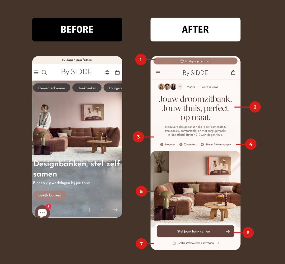
I rebuilt this furniture brand's mobile homepage with that one rule. Every change. Every reason:
1. Soft promo bar
Not a hostage situation. Just a quiet value cue at the top.
2. Social proof above the fold
"4.8★ • 4,495 Reviews" sells harder than any discount banner ever will.
3. Editorial headline
"A Better Way to Lounge" sells the feeling. Not the price tag.
4. Benefit-led subcopy
Comfort. Modular. Everyday fabrics. Specific = believable.
5. Friction-killer pills
Free Swatches. 72H Delivery. Objections answered before they form.
6. One clear CTA
"Design Your Sofa" → action outcome. Not the lazy "Shop Now."
7. Risk-reversal trust bar
30-Day Trial. 5-Year Warranty. The final yes for the skeptic.
The "before" treats customers like they need to be tricked.
The "after" treats them like they need to be trusted.
That's the whole game.
If your homepage still looks like the left → my DMs are open.
#CRO #ConversionRateOptimization #UXDesign #WebDesign #Ecommerce #DTC #ShopifyDesign #LandingPageDesign #UIDesign #DigitalMarketing #ShopifyExperts #ConversionDesign
12
184
I redesigned a DTC homepage and the "before" makes me wince.
Look at the left:
1. A discount bar, a popup, AND a free gift badge all screaming at once
2. "35% OFF SELECTED ORAL CARE RANGES" tells me nothing about why I should care
3. Products dumped on screen with zero hierarchy
4. A popup covering the one thing that might convert me
This is what happens when you treat your homepage like a billboard for promos instead of a path to a decision.
Now the right.
One promo. One headline that sells a feeling, not a percentage. "Feel Good About Your Smile" beats "35% OFF" every time because people buy outcomes, not discounts.
Then I stacked the trust the moment they land:
1. Social proof above the fold (4.8 rated, 10,000 customers)
2. Three benefit checkmarks so they grasp the value in two seconds
3. Products shown as a curated routine, not a pile
4. One clear CTA: "Find Your Perfect Routine"
The before asks visitors to do work. The after makes the decision for them.
Most stores are leaking revenue not because traffic is bad, but because the homepage forces a cold visitor to figure everything out alone.
Fix the first 5 seconds and watch conversion move.
I do this for DTC and e-commerce brands. Redesign plus CRO. If your homepage looks more like the left than the right, my DMs are open.
#CRO #ConversionRateOptimization #Ecommerce #DTC #WebDesign #UXDesign #ShopifyExperts #LandingPageOptimization

15
226
I rebuilt this homepage in 48 hours.
Before: a generic banner blast.
After: a conversion machine.
7 changes that turned browsers into buyers:
1. Urgency timer at the top - loss aversion beats discounts every time
2. 5-star social proof above the fold ("18,000 customers" = instant trust)
3. A real value prop. "Personalized Gifts. Better Moments." > another sale banner
4. Trust icons that kill objections before they form
5. Lifestyle hero shot - sells the feeling, not the SKU
6. ONE bold CTA. No more "Shop Now" buried under noise
7. Shipping quality bar to close the loop
The "Before" relied on hope.
The "After" relies on psychology.
If your Shopify store still looks like the left side, you're leaking 5 figures a month.
DMs open for free audits this week.
#CRO #Shopify #DTC #Ecommerce #ConversionRateOptimization #WebDesign #UXDesign #ShopifyExperts #DigitalMarketing #LandingPage

1
21
285
I redesigned this tennis store's mobile homepage. Here's what was killing their conversions and what I changed:
BEFORE problems:
1. Hero was a random close-up of a racket. No one knew what they sold or why they should care
2. "SHOP HEAD" headline communicated nothing about value
3. Zero social proof above the fold
4. Trust signals completely absent
5.A floating WhatsApp button as the loudest CTA on the page
AFTER fixes:
1. Announcement bar with free shipping threshold and secure shipping. Sets expectations instantly and pushes AOV up.
2. Social proof bar. Faces, 4.9/5 rating, "2,000 players trust us." This is the single highest-leverage thing you can put above the fold.
3. Benefit-driven headline. "Pro Stock Rackets. Match-Ready Performance." Tells them exactly what they get in under a second.
4. Subheadline that speaks to identity. "For players who demand more." People buy who they want to become.
5. Three value props with icons. Selection, shipping, curation. Removes friction before they even scroll.
6. One clear CTA. "Shop Pro Stock" with directional arrow. One job, one button.
7. Trust bar at the bottom. Authentic, secure, confidence, support. You close the sale with the same energy you opened it.
Same brand. Same products. Completely different conversion story.
Most stores lose money not because of traffic but because the page doesn't sell in the first 3 seconds.
If your store looks like the BEFORE, your homepage is leaking revenue right now.
I redesign and rebuild ecommerce stores for conversion. DMs are open.
#CRO #ConversionRateOptimization #Ecommerce #Shopify #WebDesign #UXDesign #DTC #LandingPageDesign #ShopifyExpert #EcommerceGrowth

1
1
17
250
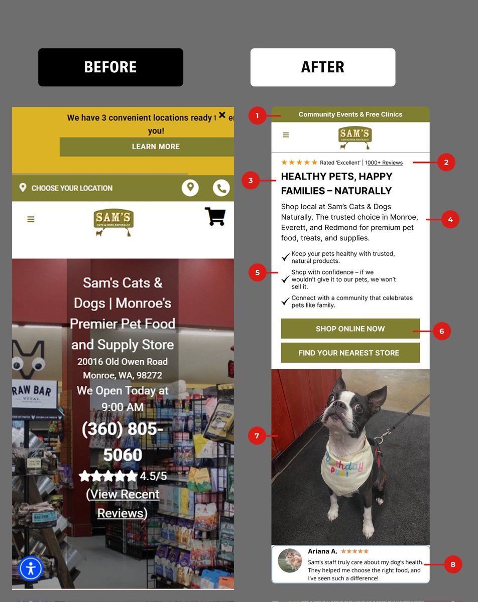
Local pet store homepage redesign = 427% conversion lift.
Before: Info overload cluttered layout
After: Community-first messaging clean hierarchy
The 8 elements that won:
1. Community banner (events free clinics)
2. Star rating 1000 reviews at top
3. Mission-driven headline (Healthy Pets, Happy Families)
4. Local trust copy (trusted choice in 3 cities)
5. 3 value props (health, confidence, community)
6. Dual CTAs (online in-store)
7. Authentic customer photo (real dog, real results)
8. Health-focused testimonial
Local businesses win with community connection, not just convenience.
I design high-converting Shopify stores in Figma/Replo - built to turn neighbors into loyal customers.
Multi-location brand? DM
#ShopifyDevelopment #CRO #LocalBusiness #FigmaDesign #ReploDesign #LandingPageDesign #PetBusiness #CommunityMarketing #MultiLocation #ShopifyExperts #LocalSEO #ConversionOptimization
1
15
171