
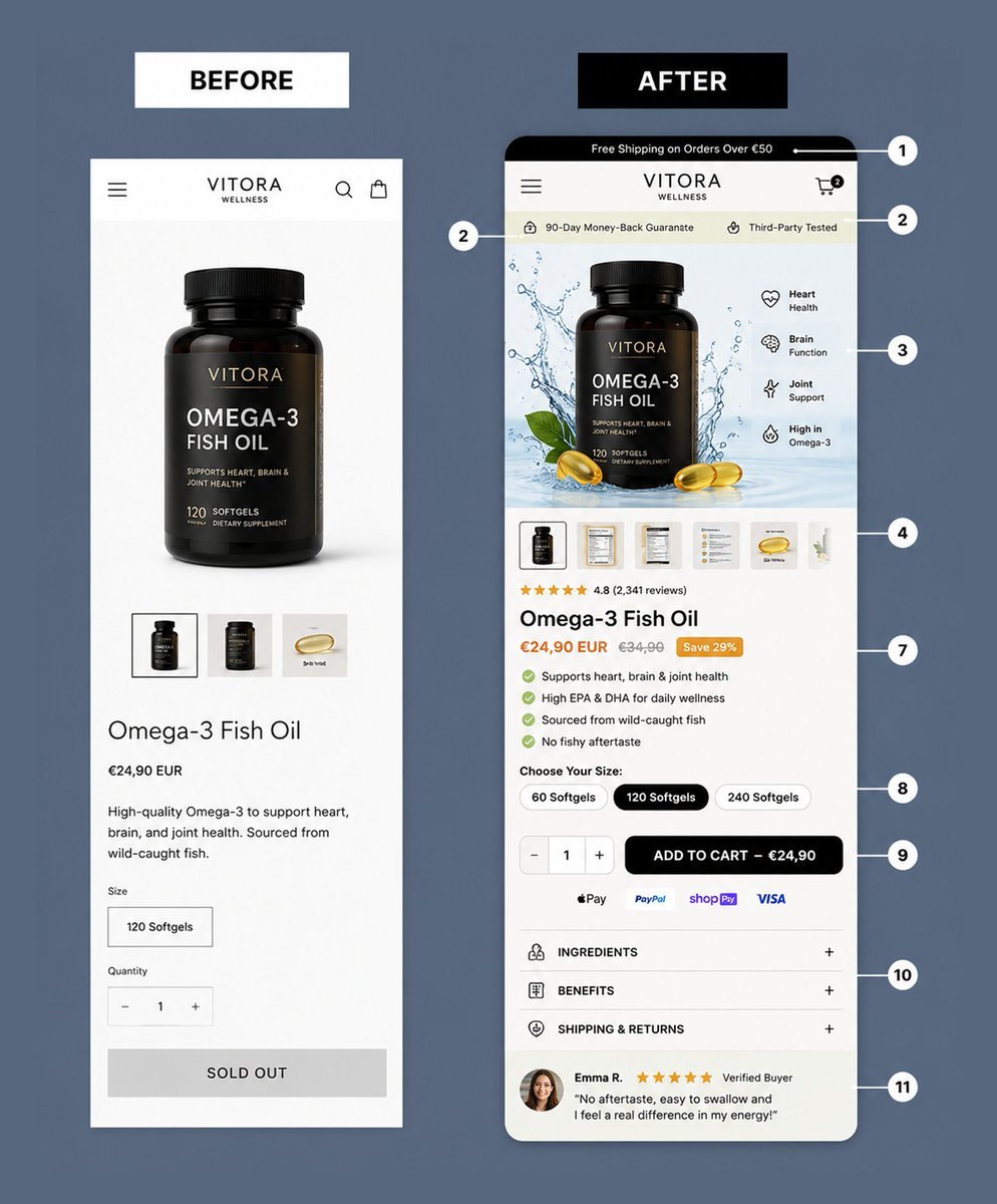
Before: a product page that showed the product.
After: a product page that sells the product.
Clear offer, stronger visuals, trust above the fold, and a smoother path to checkout.
That’s how design supports conversion.
#UIUX #ConversionRate #FigmaDesign #Shopify
7
BEFORE
1. Poor mobile responsiveness
2. No trust badge and credibility
3. Block of generic texts
AFTER:
1. Mobile responsive
2. Trust badge displayed and clearly seen
3. Scannable benefit-driven bullet list
#UIUX #Figma #ConversionRate #FigmaDesign #ProductDesign #Shopify

2
45

The businesses that thrive longest learn to think in decades
linkly.link/2BNYZ
#listingoptimization #productlistingtips #fbabeginners #newamazonseller #etsyforbeginners #shopifynewbies #ppcstrategy #acostips #keywordresearch #aiforsellers #listingcopy #conversionrate
1
BEFORE
1. No headline and sub-headline
2. No trust and credibility bar
3. No star reviews
AFTER:
1. Added headline and sub-headline
2. Added trust and credibility bar
3. Added reviews
#ProductDesign #UIUX #ConversionRate #FigmaDesign #ProductDesign #Shopify

7
52

@OlaHawatmeh
WE NEED TO TAP INTO CONVERSION GRANTS!
Federal Grants Are Available!
I've been working on it since last August, and it's my top priority in my first 90 days.
So many for sale signs are going up, and locals are moving out.
I'm going to get it done for the people!
Residents receive a letter; if they don't convert, they are fined.
NEVER GIVE UP! NEVER GIVE IN!
#olahawatmeh #olaflcd19 #Olaforcongress #olaflcd19 #VOTEOLA
#florida19 #district19 #southwestflorida #FloridaFamilies #capecoral #fortmyers #bonitasprings #Bonita #fortmyersbeach #capecoralbeach #ConversionRate #conversion
@CapePD @CityofBonita @FortMyersBeach
DONATE TO MY CAMPAIGN TODAY AND HELP ME REACH OUR COMMUNITY TO LET THEM KNOW I WILL PUT THEM FIRST.
DONATE TO MY CAMPAIGN NOW BY CLICKING THE LINK BELOW:
secure.anedot.com/ola-victor…

35

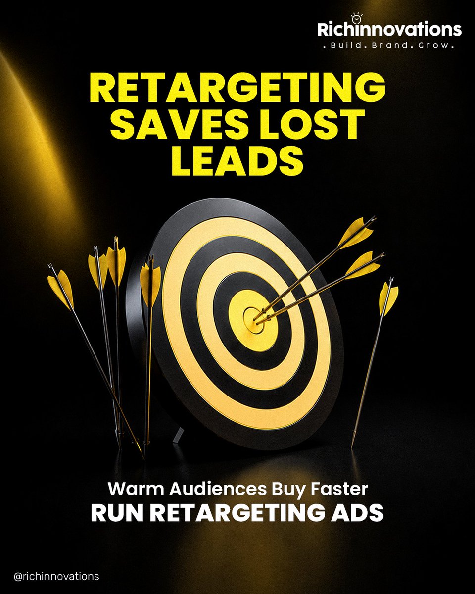
RETARGETING SAVES LOST LEADS
Most visitors don't convert the first time.
Retargeting brings them back when they're ready to buy.
Build. Brand. Grow.
@richinnovations
#RetargetingAds #MetaAds #LeadGeneration #DigitalMarketing #ConversionRate #MarketingStrategy #Richinnovations
2

Pretty homepages get attention.
High-converting ones build trust and drive action.
Clear messaging proof strong CTAs = higher CVR.
#CRO #Ecommerce #Shopify #ConversionRate #DTC
7
78

Getting traffic but no enquiries?
You're not alone.
these could be the reasons:
❌ Slow website speed
❌ Poor mobile experience
❌ No clear Call-to-Action (CTA)
❌ Weak trust signals
#websiteoptimization #leadgeneration #seotips #digitalmarketing #businessgrowth #conversionrate

2

Jun 13
Traffic isn't your problem. The leaky system after the click is. 📉
Rohit spent ₹20,000/month on ads for 500 clicks, but a slow website and zero follow-ups killed his conversions. We plug the leaks.
👉 grownerds.net
#PaidAds #ConversionRate #GrowNerds

7
The strongest growth comes from increasing business intelligence
linkly.link/2BNYZ
#listingoptimization #productlistingtips #fbabeginners #newamazonseller #etsyforbeginners #shopifynewbies #ppcstrategy #acostips #keywordresearch #aiforsellers #listingcopy #conversionrate

Jun 12
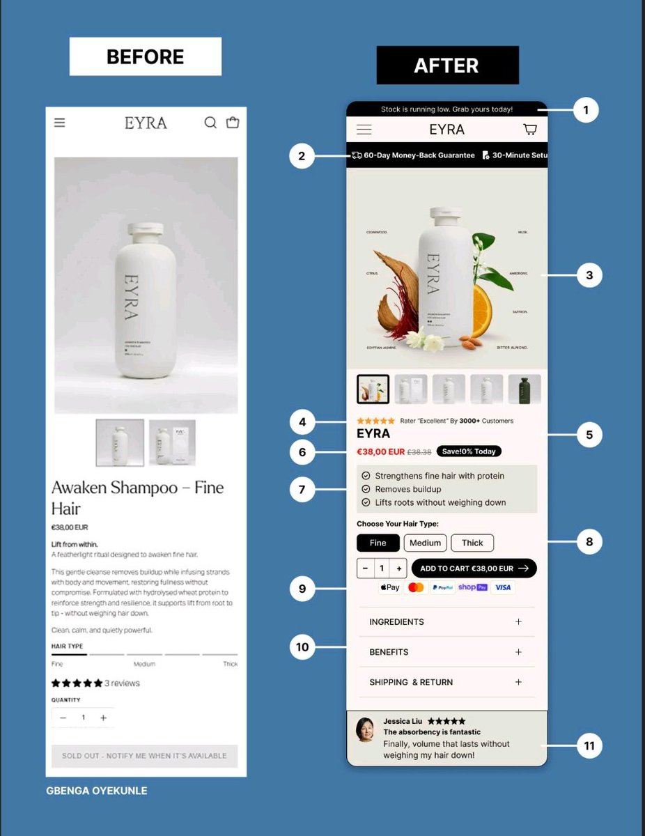
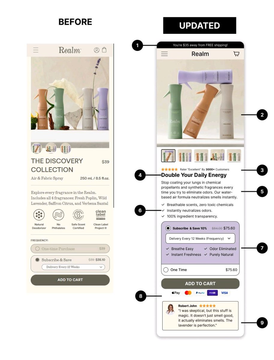
BEFORE:
1. No offer
2. Product visual not benefit driven
3. Lacked credibility
AFTER:
1. Offer-led entry
2. Upgraded product visuals
3. Credibility cues above the fold
#UIUX #ConversionRate #FigmaDesign #ProductDesign #Shopify
14
119

Jun 12
You might be investing in SEO, Google Ads, or social media...
👉 Read our blog: siddhistech.com/why-solar-in…
#SolarInstallers #SolarLeads #WebsiteAudit #SolarMarketing #LeadGeneration #SolarBusiness #DigitalMarketing #ConversionRate #SiddhisTech

1
16

Jun 12
Nearly 70% of online carts are abandoned.
Most drop-offs happen during checkout, where friction slows decisions and stops purchases.
Simplify the buying journey.
#Ecommerce #ConversionRate #UXDesign
1
Jun 12
BEFORE
1. Only one product option shown
2. Feature-focused sub-healine
3. Not optimized for easy checkout
AFTER:
1. Shows a subscription option with savings
2. Benefit-driven sub-healing
3. Optimized for easy checkout
#UIUX #ConversionRate #Figma #ProductDesign #Shopify
1
14
203
BAD UX LOSES CUSTOMERS
When users get confused, they leave.
A smooth experience turns clicks into conversions.
Build. Brand. Grow.
@richinnovations
#UXDesign #UserExperience #WebsiteDesign #ConversionRate #DigitalMarketing #WebDevelopment #BusinessGrowth #Richinnovations

The strongest businesses learn how to make better second decisions
linkly.link/2BNYZ
#listingoptimization #productlistingtips #fbabeginners #newamazonseller #etsyforbeginners #shopifynewbies #ppcstrategy #acostips #keywordresearch #listingcopy #conversionrate

Jun 12
Most designers fix the layout.
Nobody fixes the copy. 🤦
FlowAudit flags weak CTAs and headlines — and suggests rewritten alternatives as part of the audit.
First flow free 👇
👉 flowaudit.site
#ProductDesign #UXDesign #ConversionRate
2
9

Jun 12
Traffic looks great until you check the orders.
#WooCommerce
#StoreOwnerLife
#OnlineStore
#ConversionRate
#StoreApps

5

Jun 12
FOMO, automated. ⏳
Set triggers to add 'Low Stock' or 'Last Chance' tags when inventory hits a specific threshold. Drive urgency without lifting a finger. 👆
Boost conversion: xco.agency/blog/product-maes… #ConversionRate #ShopifyExpert #FOMO

2

Jun 12
Over 70% of your e-commerce traffic is buying on a mobile device. Yet, legacy subscription widgets are still built like massive desktop plugins, taking up vital vertical screen space and forcing your primary Add to Cart button completely below the fold.
If a mobile user has to scroll past three blocks of text just to buy your product, your conversion rate drops instantly. That is why we built Aon Subscriptions. 📱📉
In mobile e-commerce, above the fold screen real estate is your most valuable asset.
Every single millimeter of space determines whether a customer takes action or leaves your store completely.
When a user lands on your mobile product page, they should instantly see your product title, clear pricing, and a thumb friendly buy button.
But legacy subscription tools completely crush this layout. They force giant, multi layered borders, massive explanatory text paragraphs, and stacked selection blocks onto the screen.
The result is that your buy button gets pushed down into the mobile abyss. You are not giving your customers options, you are forcing them to work just to complete a transaction.
The Mobile Conversion Drain
A bulky, poorly optimized mobile layout introduces immediate friction to your storefront.
The Forced Scroll: If a user cannot see the Add to Cart or Buy Now button when the page loads, your conversion probability drops with every pixel they have to scroll.
Layout Shifts and Lag: Heavy javascript plugins take seconds to fully render on mobile networks. Right as a user goes to tap a button, the subscription box pops in late, shifting the whole layout and causing accidental clicks.
Complex Multi Step Friction: Mobile buyers demand a flat, lightning fast interaction flow. Confusing, multi step selection layers inside a tiny mobile viewport cause instant cart abandonment.
If your subscription software treats mobile design like a secondary afterthought, it is actively costing you money.
The Solution: High Performance Compact Layouts with Aon
We engineered Aon Subscriptions to be mobile first and strictly minimalist. We stripped away the unnecessary padding, eliminated the blocky borders, and optimized the vertical height so your storefront layout stays perfectly compact.
Here is how Aon's native architecture protects your mobile conversion funnel:
Sleek Above The Fold Integration: Aon’s flat design is incredibly compact.
It allows your pricing, variant choices, and checkout options to fit together perfectly, keeping your call to action button highly visible without scrolling.
Zero Theme Shift: Built directly on Shopify’s modern infrastructure, Aon renders instantly alongside your theme code. No late loading spinners, no disruptive layout jumps, and no broken mobile frames.
Thumb Friendly Simplicity: We designed our selection blocks for easy, intuitive mobile navigation. Buyers can toggle between a one time purchase and a subscription with a quick tap, making the entire checkout pipeline effortless.
Code for mobile. Scale without friction.
Stop sacrificing your mobile storefront speed and layout balance to outdated, desktop era software.
Give your mobile shoppers an ultra clean, lightning fast experience that keeps their journey moving straight toward the checkout line.
Super clean UX. Mobile first rendering.
Pure Aon growth. 🟩
👉 Ready to optimize your mobile storefront layout and secure your conversions?
Search Aon Subscriptions on the Shopify App Store to deploy a clean native widget today. 🚀
Install Free Today!!
apps.shopify.com/aon-subscri…
#Shopify #ShopifyPlus #MobileCommerce #PageSpeed #AonSubscriptions #RecurringRevenue #MobileUX #ZeroCode #EcommerceGrowth #D2C #ShopifyApp #ConversionRate #Ecommerce2026 #ShopifyFounder #MRR

1
54