
I like talking about data visualisation and actionable insights in Power BI, and pushing for better vis & UI/UX. See my sample file here: bit.ly/3A0kXmG
Joined July 2019
- Tweets 23,191
- Following 546
- Followers 4,715
- Likes 16,701
6,943 Photos and videos


Pinned Tweet

Hey y'all...I'm looking for my next Datavis gig with the *exact* right mix of "I won't professionally compromise" and "but that's quite the hourly rate".
1
1
13
1,517
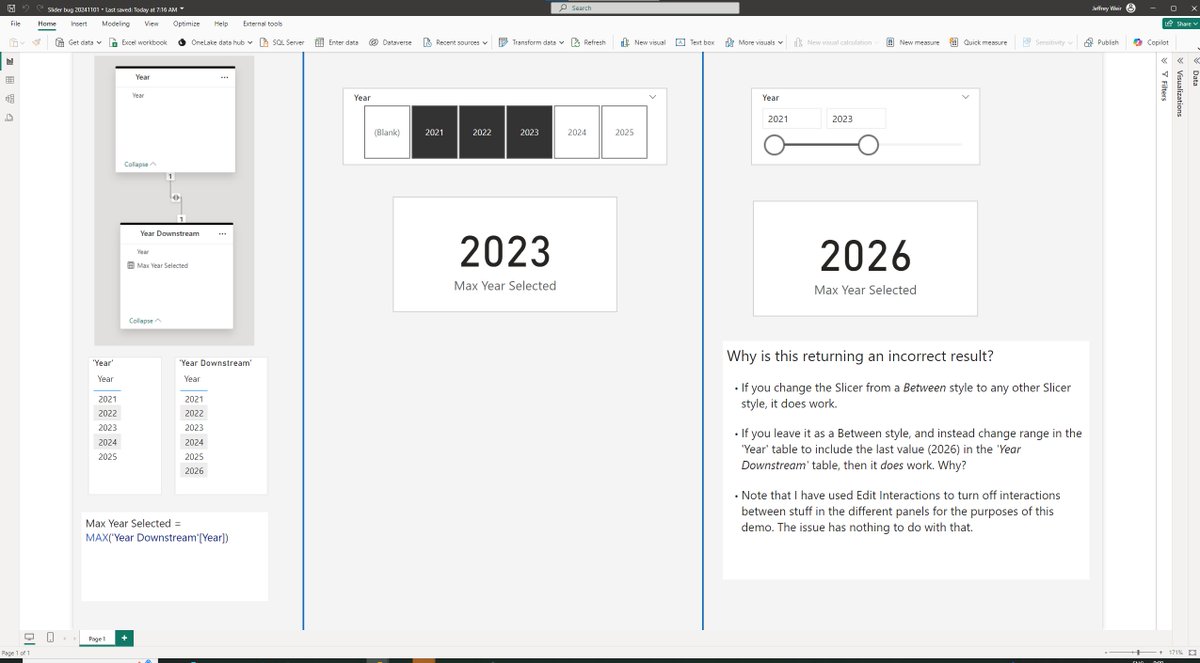
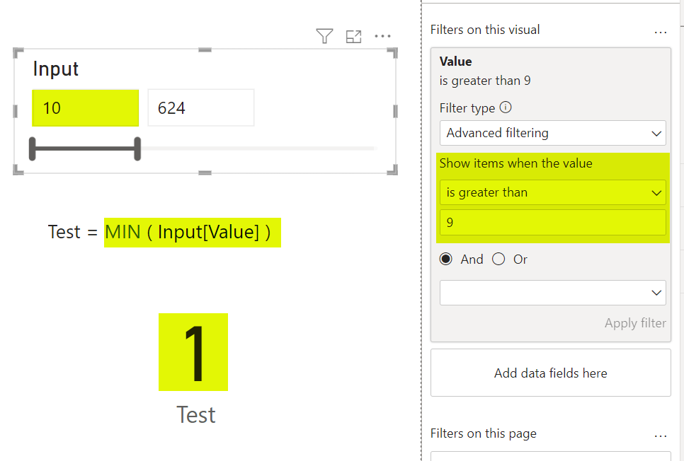
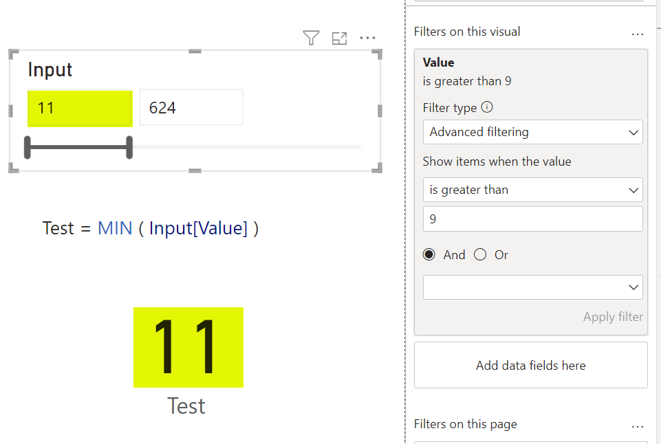
I found what appears to be a bug when using the Advanced Filter on a numerical slicer.
@myersmiguel
2
4
1,079
^ @marcorus I wonder if you can confirm whether this is a DAX issue, or as i suspect a bug in Slicers in "Between" mode (and not the first potential bug I've raised regarding "Between" Slicers with Microsoft that has gone nowhere)
2
1
335
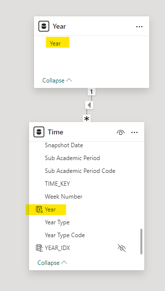
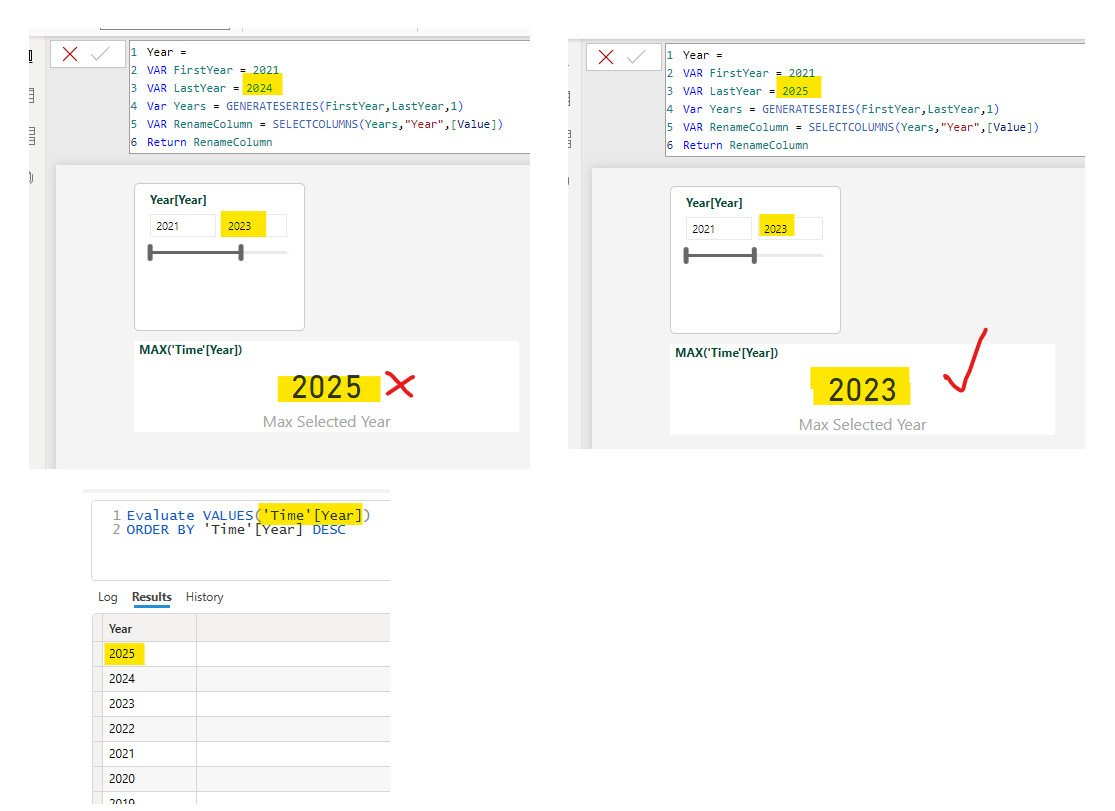
Here's the relevant tables. Note that Year[Year] has a different max value (2004) than Time[Year], and this seems to cause the DAX to return the wrong result when a "Between" slicer used
336
I REALLY enjoy reading “The Robotic Overlord’s New Fabric” by @kurtbuhler.
(Pity he didn’t actually call it that)
data-goblins.com/power-bi/co…
13
630
Jeff “This is your Copilot speaking” Weir retweeted

28 Aug 2024
Degree of New Zealand by Country

77
216
3,510
304,678
#PowerBI #PBICoreVisuals
@myersmiguel you’re missing out, brother.
Hopefully see you there soon. Most everyone else is there, and we miss you!

1
2
628
You're also missing out on incredible datavis.
1
257

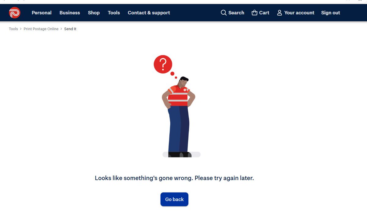
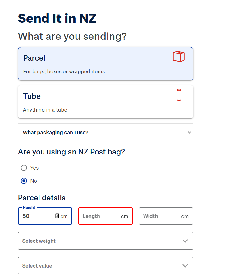
Hey @nzpost What's up with your new post portal? I just put in all info and paid, but then got this
2
337
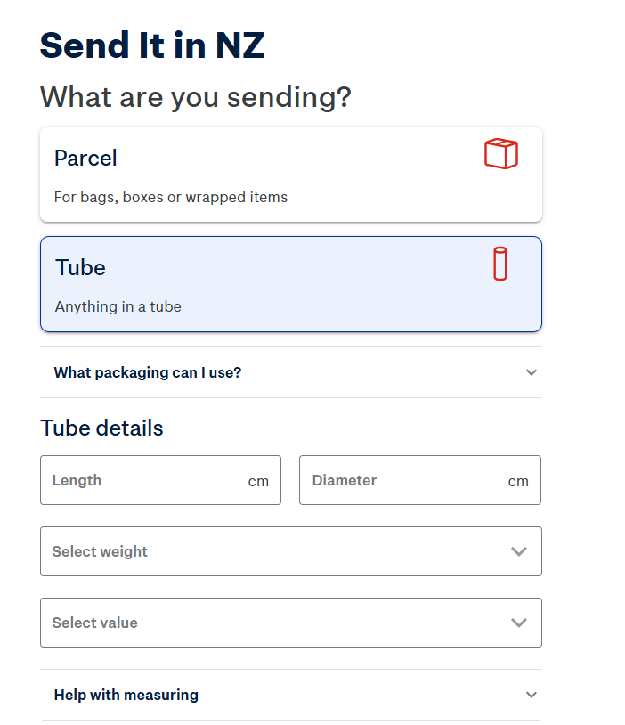
The UI is maddening! I'm entering Parcel Details. If I put 50 under Height, and push Tab, does it move me to Length? Nope...it changes the view to "Tube".
Terrible experience.
1
215
I've tried twice now...both times I get the "Something's gone wrong" screen after payment.
Plus the new UX is just maddening. Much harder to input multiple pickups by the look of it.
191
Jeff “This is your Copilot speaking” Weir retweeted

Thanks to everyone for your feedback on #Deneb 1.7 for #PowerBI! Just a quick heads-up that 1.7.1 has been submitted and should be available soon - further details can be found here:
deneb-viz.github.io/blog/1-7…
3
12
841
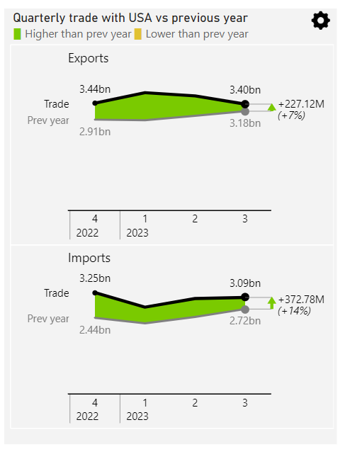
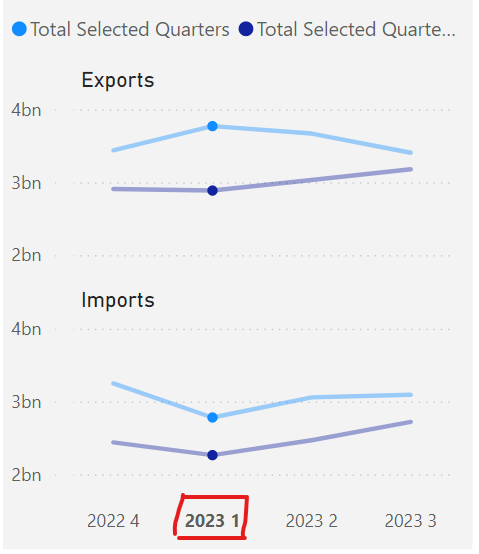
hey @ZebraBI If I want to crossfilter OTHER visuals on say Q2 2023, how do I do it from THIS visual *without* passing through the clicked panel's Small Multiple facet context ie. if I click on Q2 in the top panel, all the other visuals on the page get filtered on Q2 EXPORTS.
1
623
In #PowerBI native core visuals, clicking on the axis lables selects that range for ALL multiplesmeaning "Q1 2023" gets passed to the other visuals on the page, without also sending "Exports" or "Imports". Which is what I want.
2
1
430
So @the_d_mp kindly explained to me today that this is because the custom visual is using the Matrix CV API, which doesn’t allow the developer to choose what the click on the axis filters. Or something like that.
1
235
I've found it! The perfect analogy of what happens when people use #PowerBI without understanding how the engine works!
(Sorry, no subtitles)
@PhilSeamark @marcorus: There's still time to include this clip in your deck for SQL Saturday.
youtu.be/fxCJL6GGsdE?si=AeWq…
1
1
450
And this for Context Transition
171