
Sexy Fontent.™ Lead font engineer and foundry growth @WELTEKRN. Helped at @Calcom, @BuzzFeed, @FontBureau, @GoogleFonts. Idiot Savant. He/him.
Joined December 2007
- Tweets 12,373
- Following 857
- Followers 1,796
- Likes 35,008
1,378 Photos and videos


Pinned Tweet

Mar 12
Open source font update 1.5, and a @calcom font mini-site to celebrate!
Thanks to @peer_rich, @meewgumi for @Framer development, @tmthyluke for concepting
9
14
240
19,069

Jun 11
My life has gotten so much less tedious.
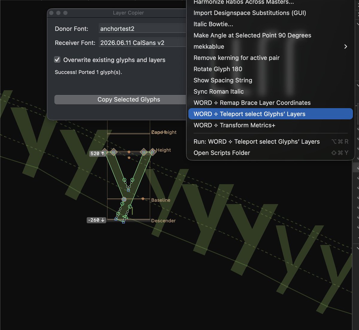
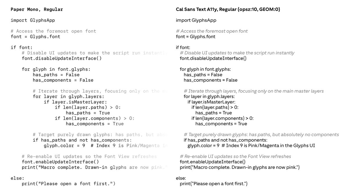
Used claude to one-shot python scripts, duping glyphs (and all 16 of their master layers / sparse layers!) makes manipulating 6-axis, 8-master variable fonts a breeze.
3
112
Jun 10
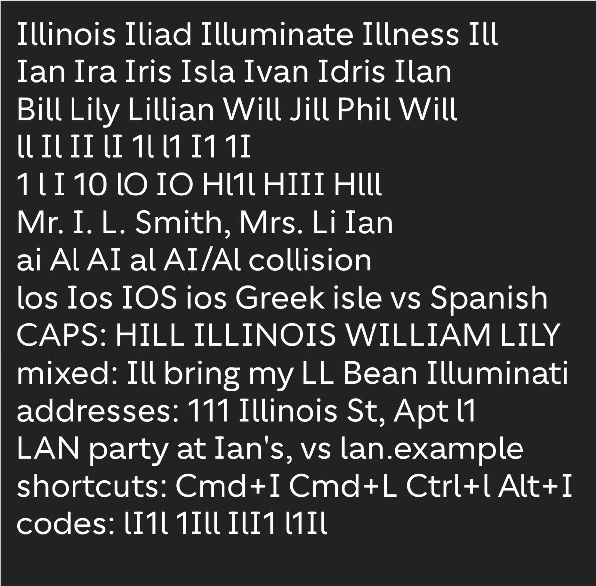
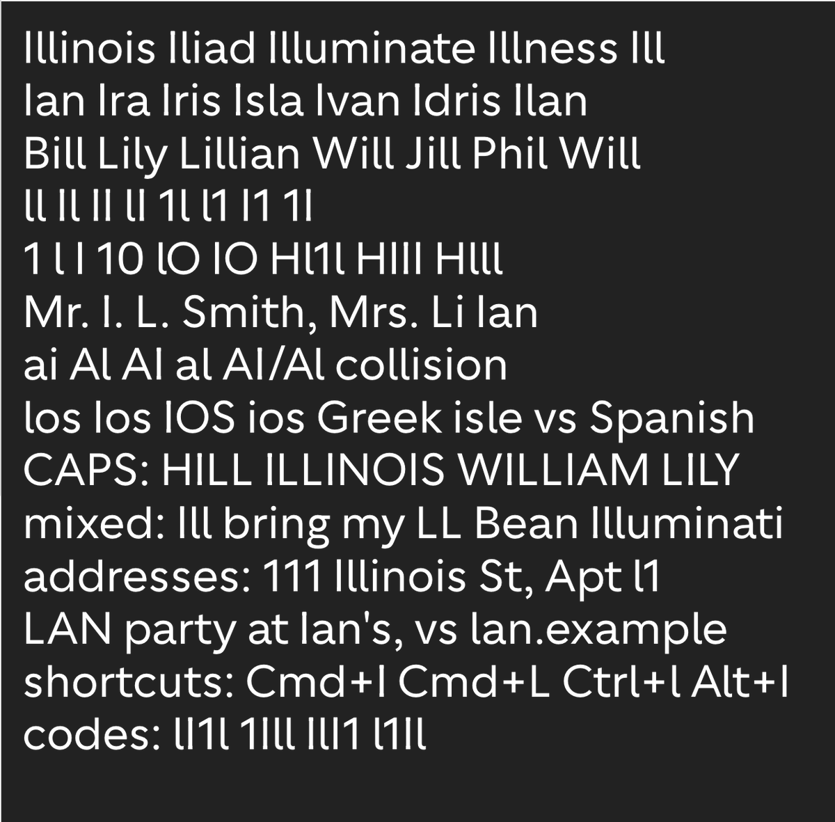
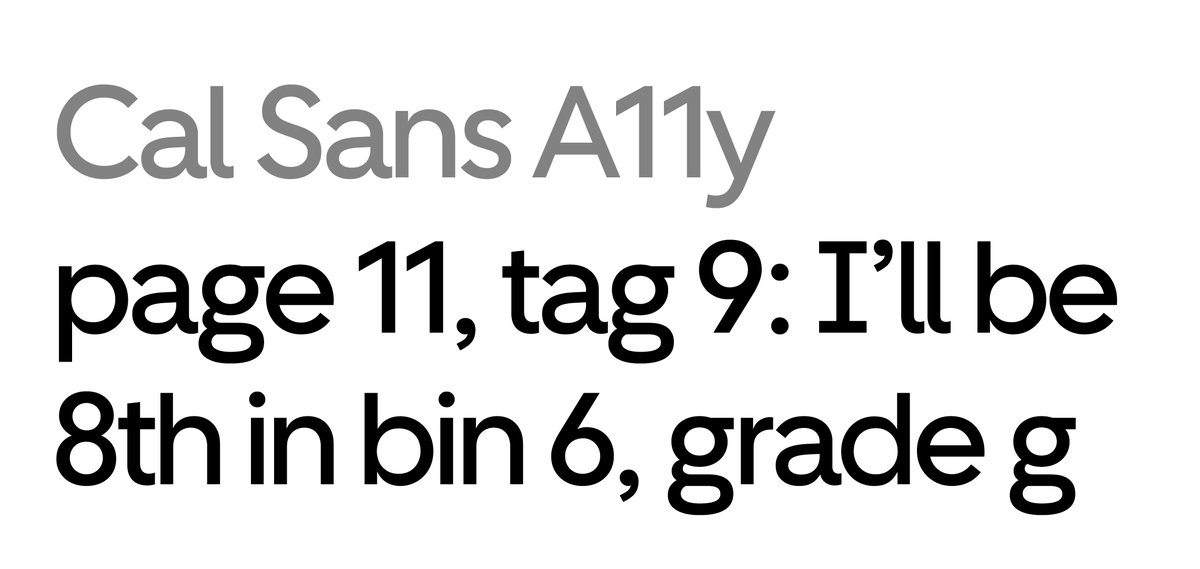
everyone ships a mono alongside their brand font, mostly just for on-brand product docs. and a lot of that use is really about disambiguation — in code or contextless strings you must tell I/l/1 and O/0 6/9/8/g apart; in sentences they could read fine.
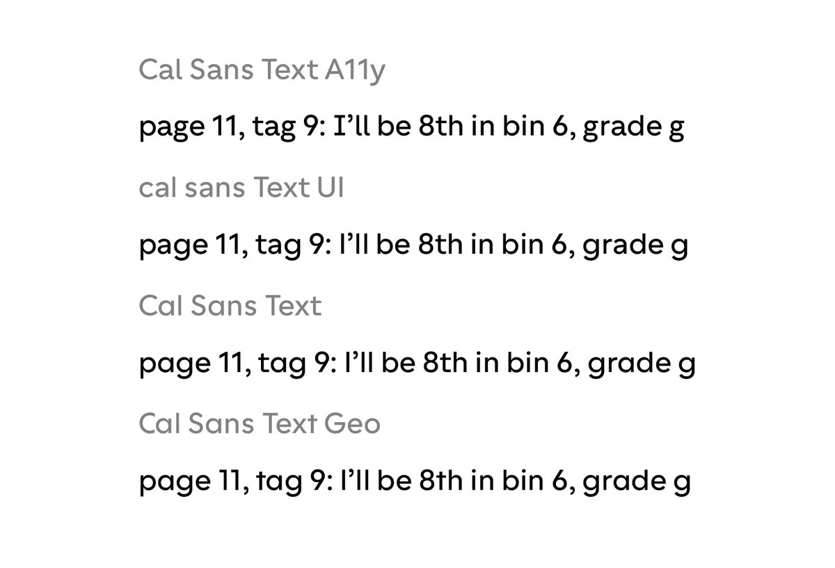
@Calcom San’s new A11y glyphset (the low end of the GEOM axis, shipping in Cal Sans v2.000) is high-differentiation by design.
works alright here in place of a mono for python, i think. would you miss a true monospace? It would be pretty impossible to debug as code indenting with spaces but you could use tabs!
1
1
5
278
Jun 10
It makes the 4th glyphset Cal Sans can do, all through easily swapping through concerted swaps by the GEOM variable axis. They all work from 8pt–32pt, through size-specific masters and post-processing that are just automatic for you.
1
4
250
Mark Davis retweeted

Jun 8
creative systems are thinking systems
3
2
29
925
Mark Davis retweeted

Jun 8


font licensing is kinda broken? screen-recording of my new workflow: when I find a font, instead of paying literally $2,221 USD, I screenshot a few words, ai generate the typeface, and then download & use the new TTF. now just need to figure out how embed the model into design processes better...
1
2
53
6,846
Mark Davis retweeted

Jun 2
New work: Introducing Fable Security!
Fable is a modern security platform focused on one of the most overlooked—and most critical—parts of cybersecurity: human behavior.
I partnered with Fable to help pull together their new brand to life.
Link in comments for full case study.

10
1
63
3,455
Jun 1
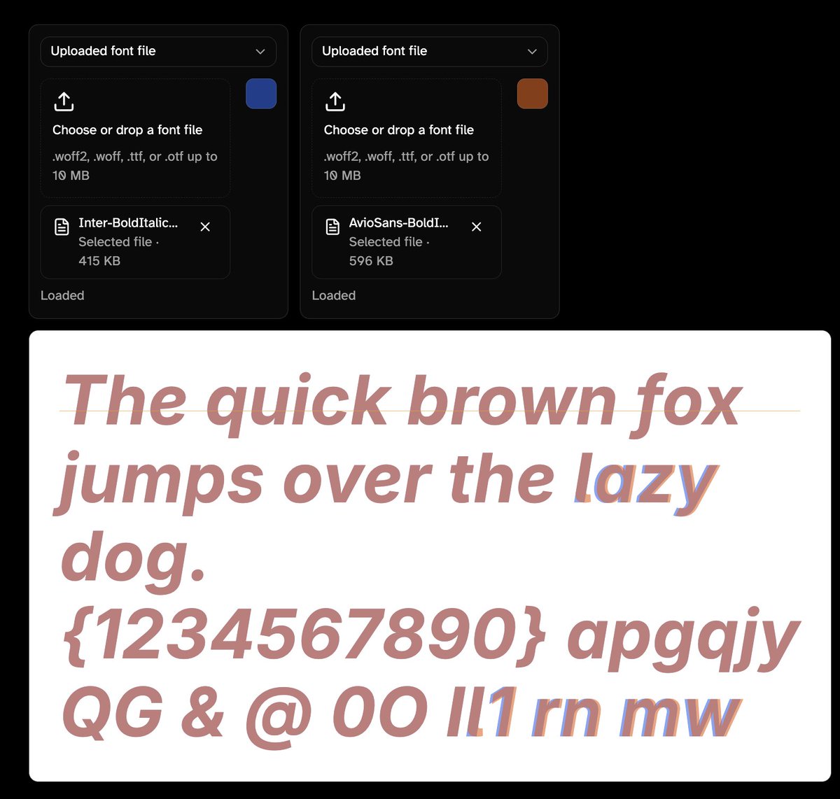
Try these live yourself :D wordmark.nyc/font-proofer/ca…
Jun 1

This is because the quieter, default designs, Cal Sans UI and Cal Sans UI Text, play the background support role.
3
142
Jun 1
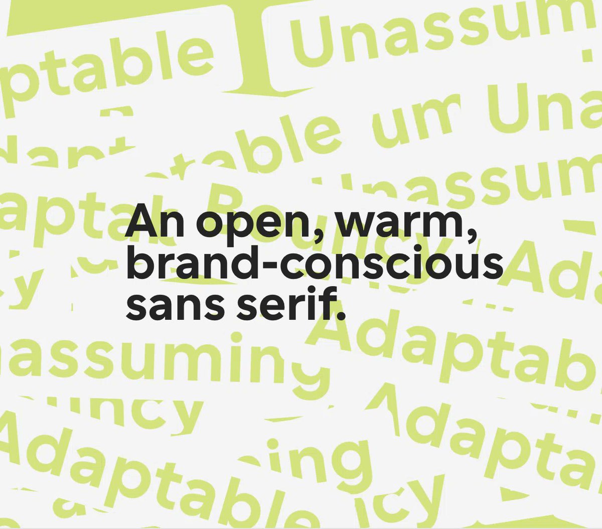
Cal Sans (what is on google fonts) has a new small-size variant, with bolder extenders/benders à la TikTok Sans, OpenAI Sans (Favorit), Anthropic Sans. @calcom @peer_rich @pacovitiello
2
5
295
Jun 1
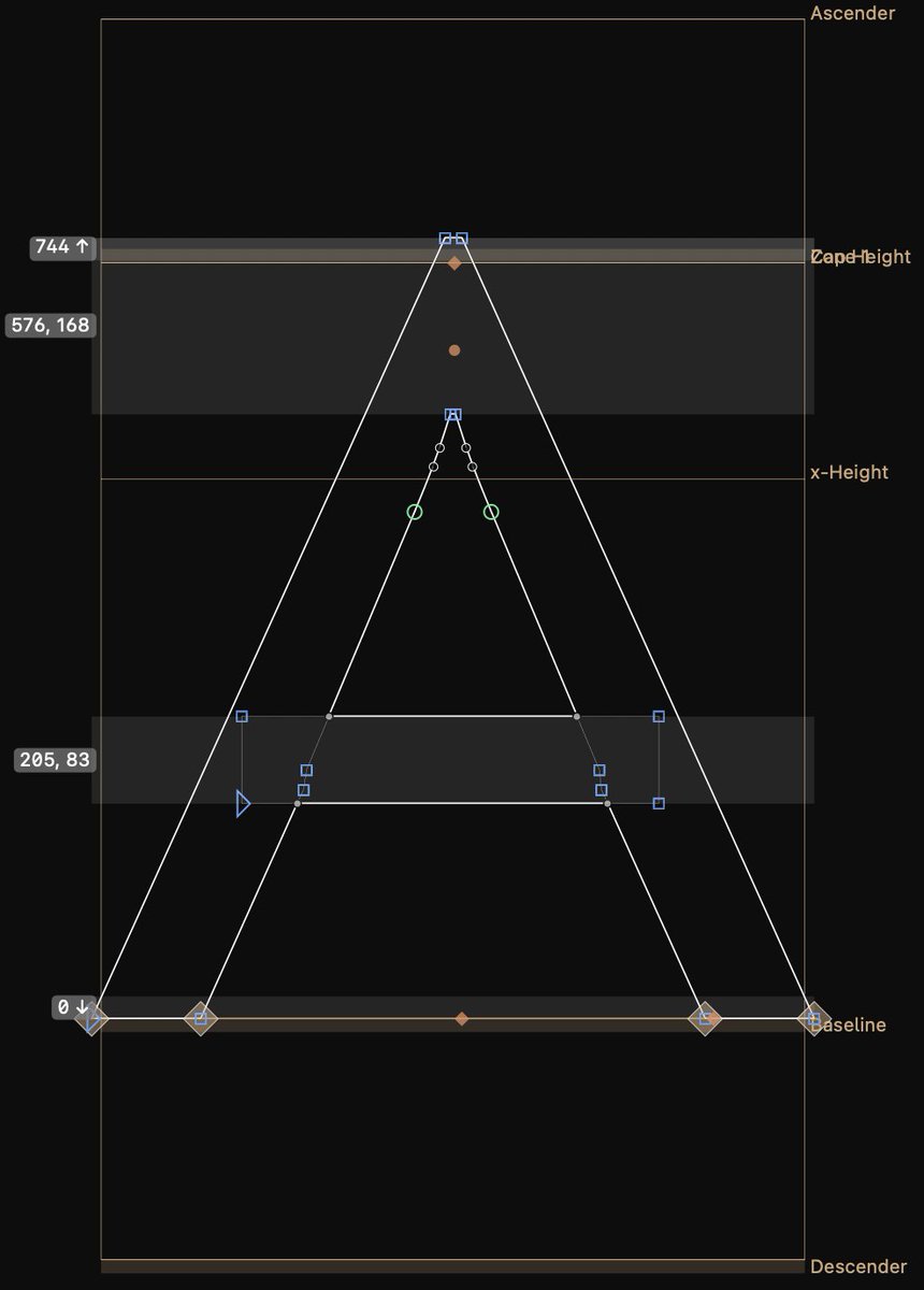
My new favorite version might be the tailed lowercase-l version and/or serifed capital-I version, Cal Sans A11y & Cal Sans A11y Text. I kept thinking contextually you can tell the two apart but puts your eyes at ease at some cognitive level, I’d say. GEOM: 0 @googlefonts
1
108
Jun 1
This is because the quieter, default designs, Cal Sans UI and Cal Sans UI Text, play the background support role.
2
254
May 29
Gemini got confused when I was trying to ask it to show me a UI ideas. It made up an image working on Cal Sans UI with my girlfriend with a dupe of her mechanical keyboard. Also… referred to a @espiekermann and @connordavenpo meme in my camera roll?
1
3
225
Mark Davis retweeted
May 29
design is ending the same way it started: annoyingly
17
5
137
16,575
May 27
we go for gimmicks too much, yeah!
*checks notes* the future is skeuomorphic physical interaction things for a binary button
May 26

Writing an article on the future UI trends, and made a prototype of plasticity-type button - fully reactive to how hard and WHERE you press it.
Our devices are increasingly powerful, yet we go for gimmicks like camera-based-reflections.
This is dope! Article drops tonight!
1
2
279
May 27
I don’t know how I could describe @round’s new project @anew. but it brings “no code” to a new level. execution & writing by @claudeai anew.page/XQAAAAT__________w…
1
1
6
850
Mark Davis retweeted

May 26
I love reading about these details, looking forward to seeing 2.0!
And I haven’t gotten to use Neutraface in too long, I miss it 🥲
1
73
May 25
Testing Cal Sans v2.000
It slots in perfectly for branding where I used Allium and Neutraface №2 before. The sharpness of Futura is one of the reasons it isn’t suited for UI design often, but if you can choose how much, it can look epic. (Excited to show more about its blunt to sharp variable axis!)
Icon design by Brandon Cabassa, logotype by myself.

2
9
659
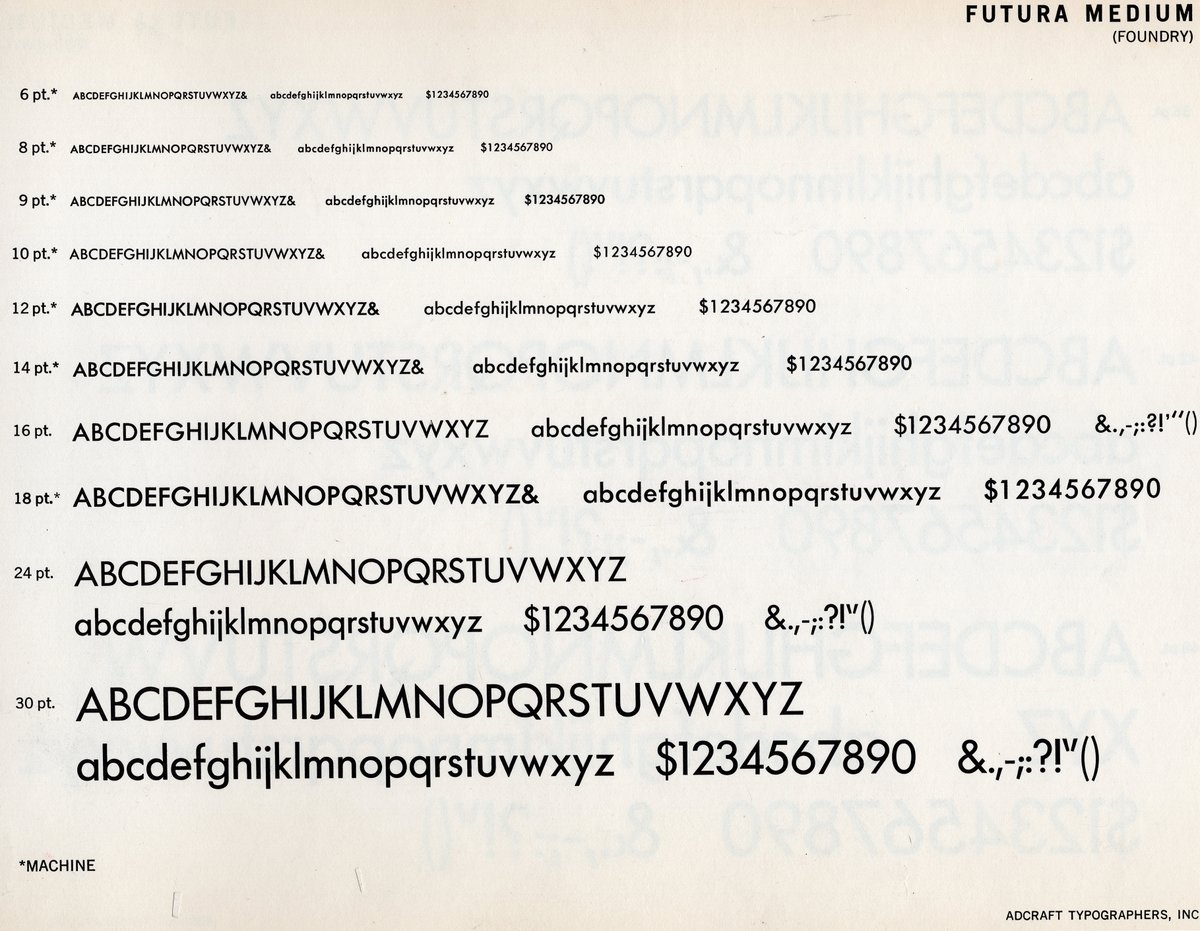
May 25
Since Cal Sans 2 @calcom has optical sizes, we are able to imitate how metal Futura handles its sharp apexes, blunter at 8pt and sharp as possible at 32pt and beyond.

1
6
182
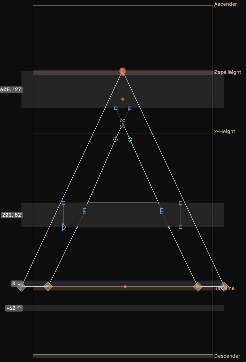
May 25
A type design’s sensitivity to sharpness, or lack thereof, is one of the things I have been looking the longest for in a Futura design. Why I felt Futura Now and The Future left a little more conversation unspoken about the typeface.
6
157