
PhD, geodetic engineer; map projections, cartographic tools; Opinions are my own.; It is good to live on the ellipsoid, because on the sphere would be too easy!
Joined January 2014
- Tweets 1,861
- Following 402
- Followers 1,454
- Likes 5,606
427 Photos and videos


Pinned Tweet

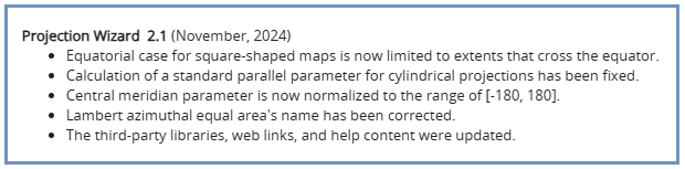
22 Nov 2024
📣A new version of #ProjectionWizard v2.1 🗺️🌐🪄 is now live as of this morning.
Visit projectionwizard.org
#mapprojection #mapprojections #webMercator #endMercator #mapprojectionsarehard #projectionsarehard #gischat #geospatial
1
13
61
13,725
Bojan Šavrič retweeted

Jun 1
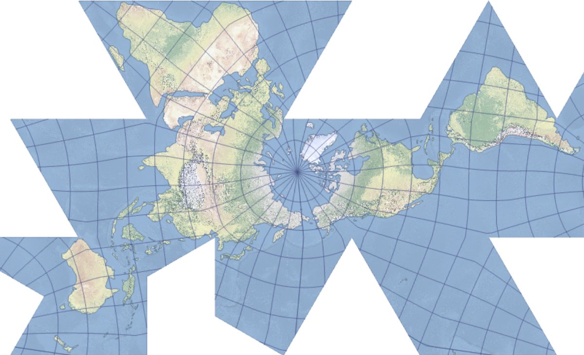
I am pleased to announce that the Equal Earth world map is now available in Macedonian, thanks to Daniel Evrosimoski, plus 18 other languages. You can download them for free here: equal-earth.com

18
98
8,848
May 22
Think you know #WGS84? Think again.
New #ArcGIS Blog on datum ensembles 👇
esri.com/arcgis-blog/product…
#GIS #Geodesy #CoordinateSystemsa #Geospatial #gischat
1
4
1,067
Apr 19
Apr 19

Day 109 of #365DaysOfMaps. April 19th is National Hanging Out Day. A day to extol the benefits of air-drying your laundry. Yep. Really. Allows me to give a nod to a famous mapping quote, and AI to miscount an entire continent.
Hung Out to Dry 109/365
mapdesign.icaci.org/2026/04/…

81
Bojan Šavrič retweeted

Apr 19
Day 109 of #365DaysOfMaps. April 19th is National Hanging Out Day. A day to extol the benefits of air-drying your laundry. Yep. Really. Allows me to give a nod to a famous mapping quote, and AI to miscount an entire continent.
Hung Out to Dry 109/365
mapdesign.icaci.org/2026/04/…
3
6
456
Apr 17
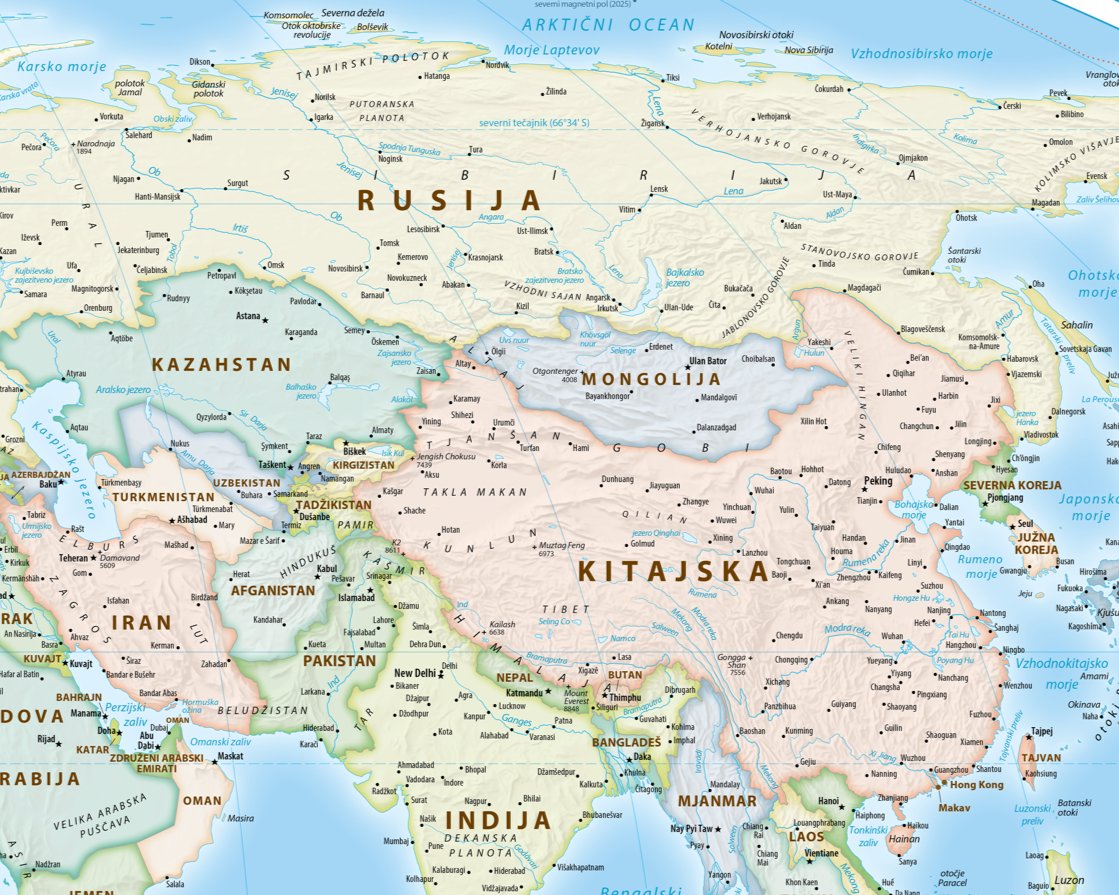
O ekvivalentni Zemljini projekciji ter o prevodu in priredbi Pattersonovega političnega zamljevida sveta na
@RadioOgnjisce. 👇🌍 #EqualEarthProjection
avdio.ognjisce.si/oddaja/don…
1
74
Bojan Šavrič retweeted
Mar 2
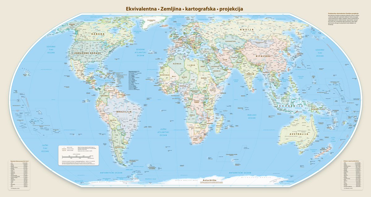
I am pleased to announce that the Equal Earth world map is now available in Slovenian, plus 17 other languages. You can download them for free here: equal-earth.com

123
624
2,796
233,733
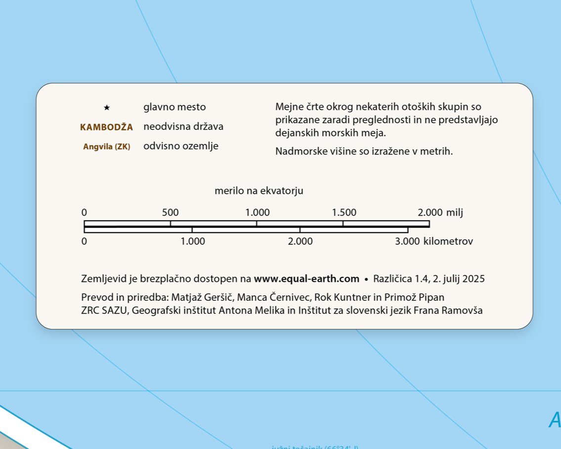
.@MtnMapper's politični zemljevid sveta v ekvivalentni Zemljini projekciji je zdaj na voljo tudi v slovenskem jeziku! 🤩🌍 #EqualEarthProjection
👉🔗 equal-earth.com
1
1
4
729
Iskrena hvala Matjažu Geršiču ter ekipi z @ZrcSazu, Geografskega inštituta Antona Melika @geoinstitut in Inštituta za slovenski jezik Frana Ramovša za prevod. 👏👏
72
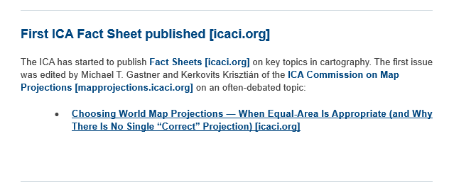
Wait, there is no single #mapprojection that shows true world? 🌎🌍🌏🤔
@icawebsite's first fact sheet is on #mapprojections!
👉🔗icaci.org/files/documents/fa…
#mapprojectionsarehard #projectionsarehard #mapprojections #mapping #map #cartography #geospatial #GIS #gischat
1
1
3
155
Bojan Šavrič retweeted

🌍 Surprised that Africa is 14× larger than Greenland? This StoryMap provides helpful resources on Coordinate Systems and Transformations to explain why maps often distort the true size of countries:
👉 ow.ly/9vPM50XZBRL
#WorldGeography #MapProjections #CoordinateSystems
1
3
139
Bojan Šavrič retweeted
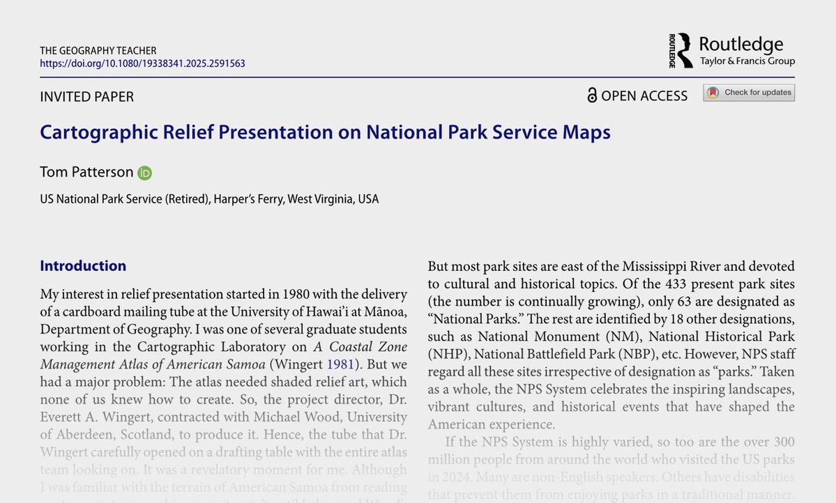
Jan 12
My latest article on terrain presentation. Lots of illustrations. No paywall. tandfonline.com/doi/full/10.…
1
10
70
6,364
🎧 Check out the latest @geomob podcast — Steven was grilling some #mapprojection nerd, and things got super geeky way too fast. 🤓🤣👉 thegeomob.com/podcast/episod… 🌍 #EqualEarthProjection
1
3
364
Bojan Šavrič retweeted
12 Dec 2025
I am pleased to announce that Equal Earth wall maps are now available in print. You can order them here: equal-earth.com/#maps

8
46
4,964
Bojan Šavrič retweeted
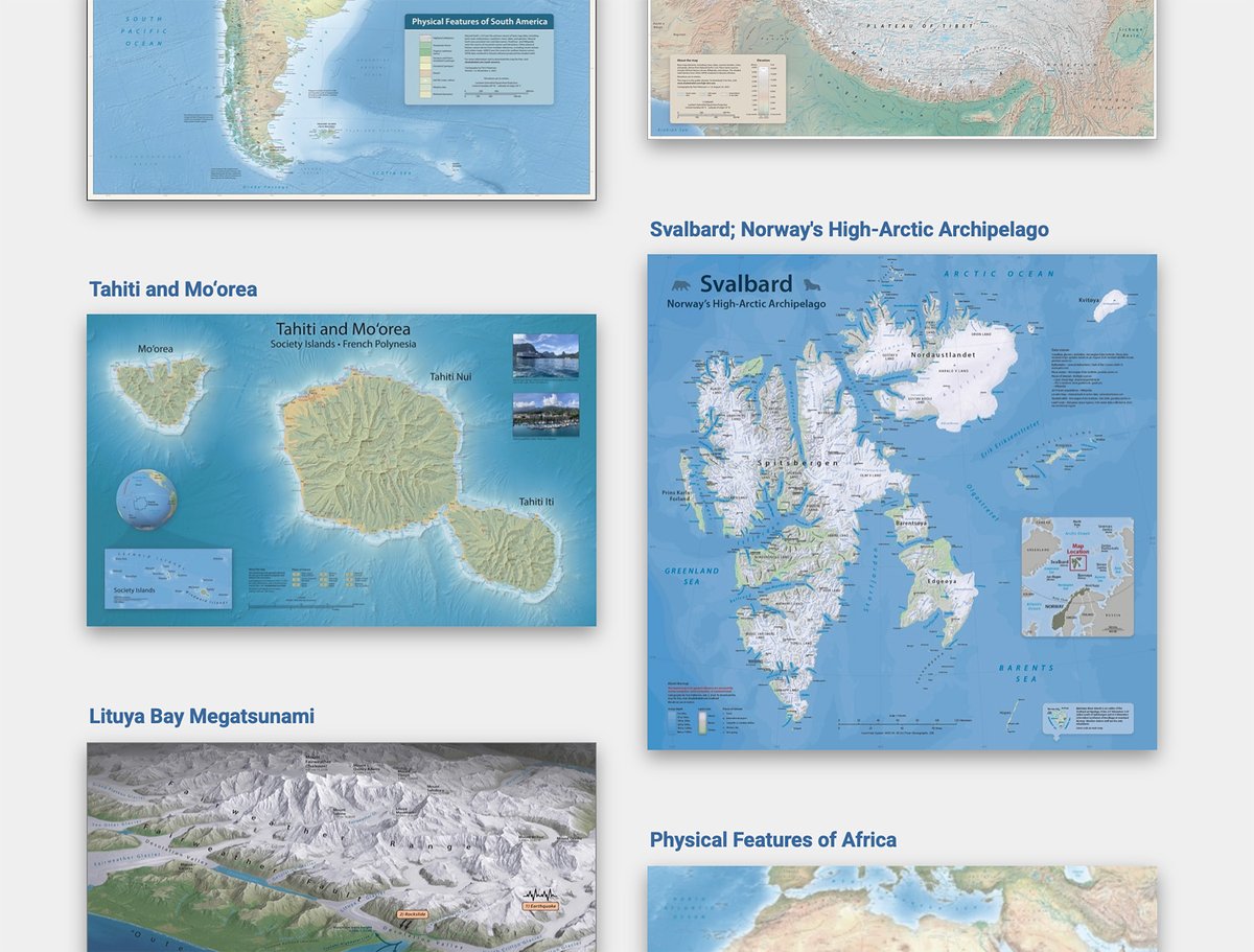
2 Dec 2025
A gallery of my free-for-the-taking maps. You are invited to stop by and scroll around. shadedrelief.com/map-gallery…
8
65
449
33,377
Bojan Šavrič retweeted

19 Nov 2025
What if you project a projection? 🤔🌎Created in #ArcGISPro using picture markers and a creative twist on the View Dome tool, @nathancshephard’s animation “pushes” each map projection out from the place it was invented.
#30DayMapChallenge day 19: ow.ly/CUjr50Xua5g
5
26
1,381
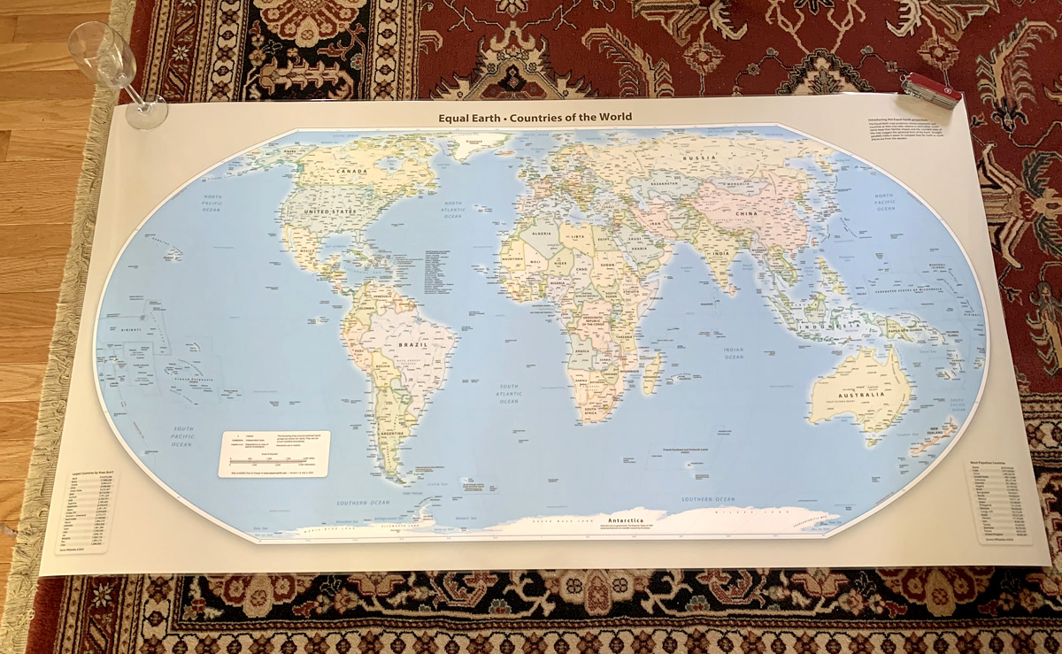
16 Nov 2025
16 Nov 2025

A test print on my living room floor. Direct-to-print Equal Earth wall maps in multiple languages will be available soon. Stay tuned.
3
193
Bojan Šavrič retweeted

11 Nov 2025
Eduard update 1.4.15 can replace void values with smooth feathering, export grids to small 16-bit GeoTIFF files with decimeter precision, and includes various improvements and bug fixes.
eduard.earth
5
35
3,127
Bojan Šavrič retweeted
4 Nov 2025
Using #ArcGISPro, Aubri Otis mapped the “Made In” labels from items in her house, creating a visual representation of her home’s global connections for the “My Data” theme.
Check out day 4 of the #30DayMapChallenge: ow.ly/WFHz50Xm8Bm

13
55
2,439
Bojan Šavrič retweeted
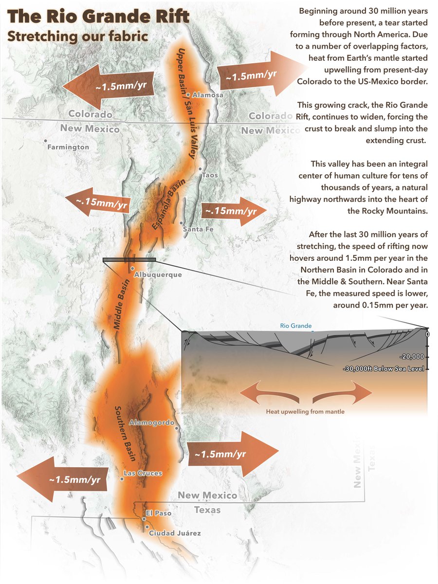
7 Nov 2025
Map accessibility conversations often stop at contrast ratios and text sizes. Jakob Ruffner created this Rio Grande Rift map to demonstrate that the key is to consider every aspect of the map design process.
Check out day 7 of the #30DayMapChallenge: ow.ly/VU1X50Xo6wa
1
13
81
2,848
Bojan Šavrič retweeted
9 Nov 2025
Inspired by 19th-century cartography, Edie Punt mapped Montreal in 1815, swapping out engraved hachures for stitches.
Check out day 9 of the #30DayMapChallenge: ow.ly/4cur50XoBY1


8
51
3,112