
Mapping the world with Python. Buy my book here - locatepress.com/book/pymaps
Joined January 2021
- Tweets 2,301
- Following 514
- Followers 78,005
- Likes 7,741
827 Photos and videos


Pinned Tweet

31 Dec 2023
Ending 2023 with my favourite map. South American forests. See you next year!

16
422
2,756
224,360
Jun 12
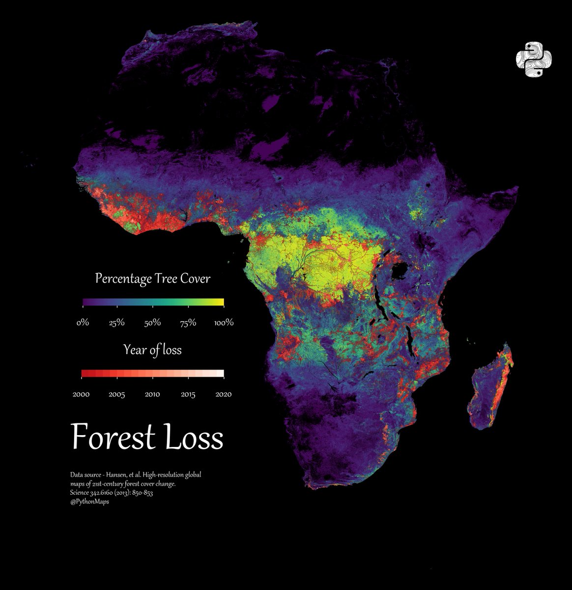
Forest Loss. This map shows forest loss since 2000 in Africa. Defined as a stand-replacement disturbance, or a change from a forest to non-forest state.
1
15
65
3,311
Jun 11
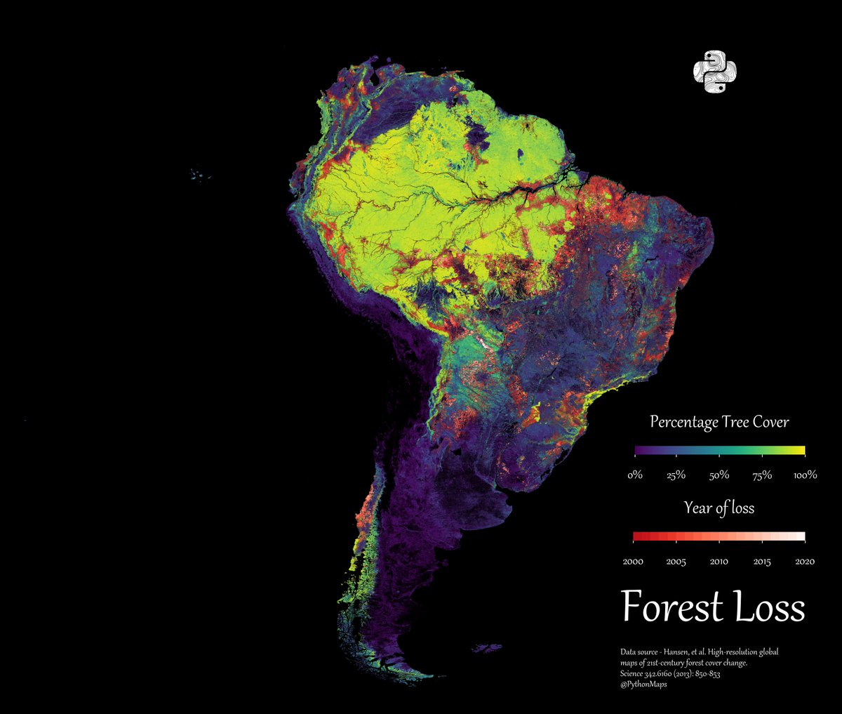
Forest Loss. This map shows forest loss since 2000 in South America. Defined as a stand-replacement disturbance, or a change from a forest to non-forest state.
2
18
78
3,823
Jun 10
Forest Loss. This map shows forest loss since 2000 in Asia. Defined as a stand-replacement disturbance, or a change from a forest to non-forest state.
For those who care - projection is EPSG:27703 is WGS 84 / Equi7 Asia
2
6
30
3,910
Jun 9
Forest Loss. This map shows forest loss since 2000 in Oceania. Defined as a stand-replacement disturbance, or a change from a forest to non-forest state.
1
12
27
30,201
Jun 8
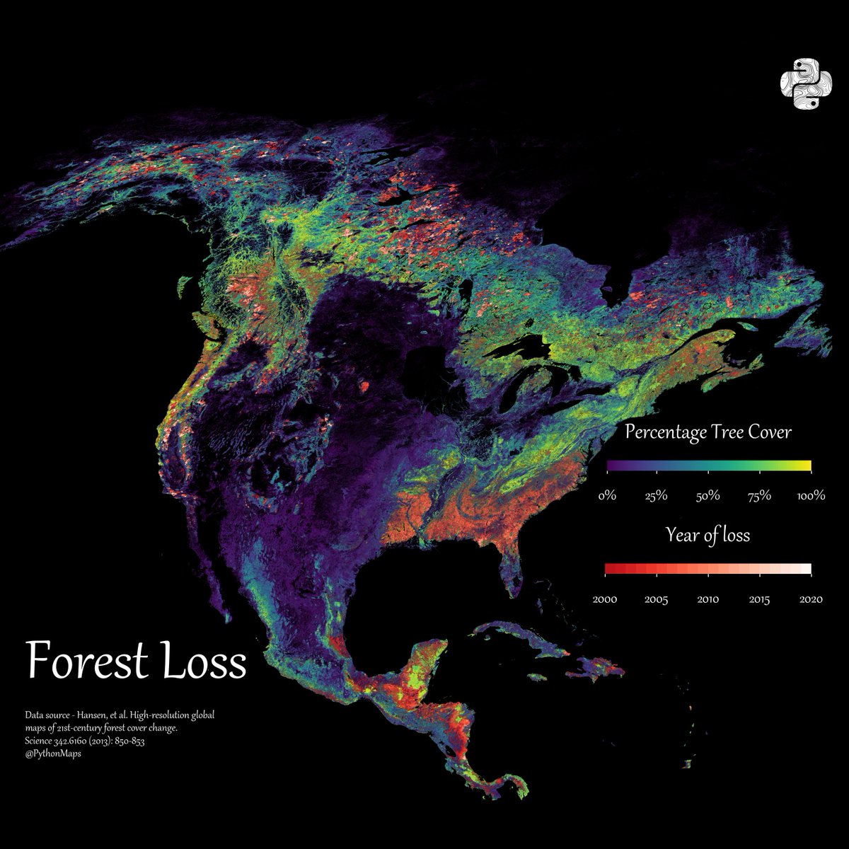
Forest Loss. This map shows forest loss since 2000 in North America. Defined as a stand-replacement disturbance, or a change from a forest to non-forest state.
1
10
44
4,009
Jun 7
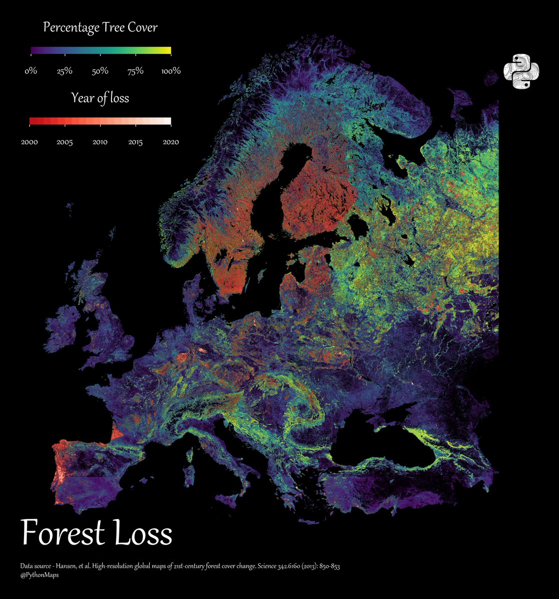
Forest Loss. This map shows forest loss since 2000 in Europe. Defined as a stand-replacement disturbance, or a change from a forest to non-forest state.
10
22
106
22,617
Jun 5
This bivariate map uses WRI's Aqueduct 4.0 data to show projected gross water demand (white→orange) vs. blue water availability (blue→purple) under a business-as-usual scenario by 2065–2095.
1
22
102
6,097
Jun 4
This bivariate map uses WRI's Aqueduct 4.0 data to show projected gross water demand (white→orange) vs. blue water availability (blue→purple) under a business-as-usual scenario by 2065–2095.
1
1
21
2,449
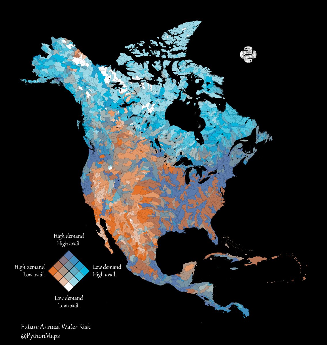
Jun 3
This bivariate map uses WRI's Aqueduct 4.0 data to show projected gross water demand (white→orange) vs. blue water availability (blue→purple) under a business-as-usual scenario by 2065–2095.
2
18
88
5,542
Jun 2
This bivariate map uses WRI's Aqueduct 4.0 data to show projected gross water demand (white→orange) vs. blue water availability (blue→purple) under a business-as-usual scenario by 2065–2095.
2
14
66
5,174
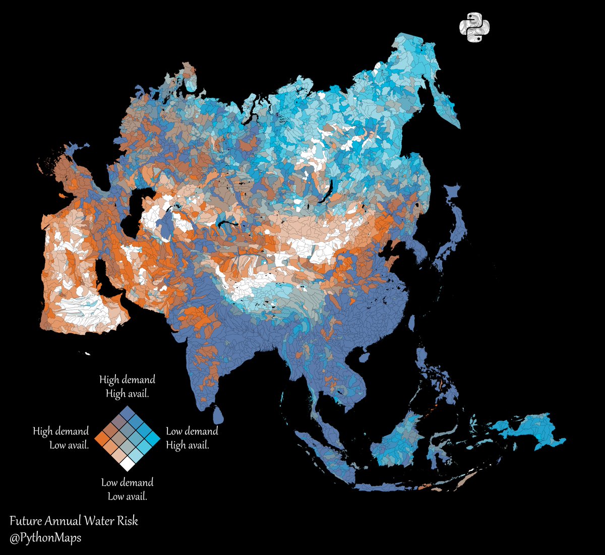
Jun 1
This bivariate map uses WRI's Aqueduct 4.0 data to show projected gross water demand (white→orange) vs. blue water availability (blue→purple) under a business-as-usual scenario by 2065–2095.
For those who care - projection is EPSG:27703 is WGS 84 / Equi7 Asia
20
86
6,959
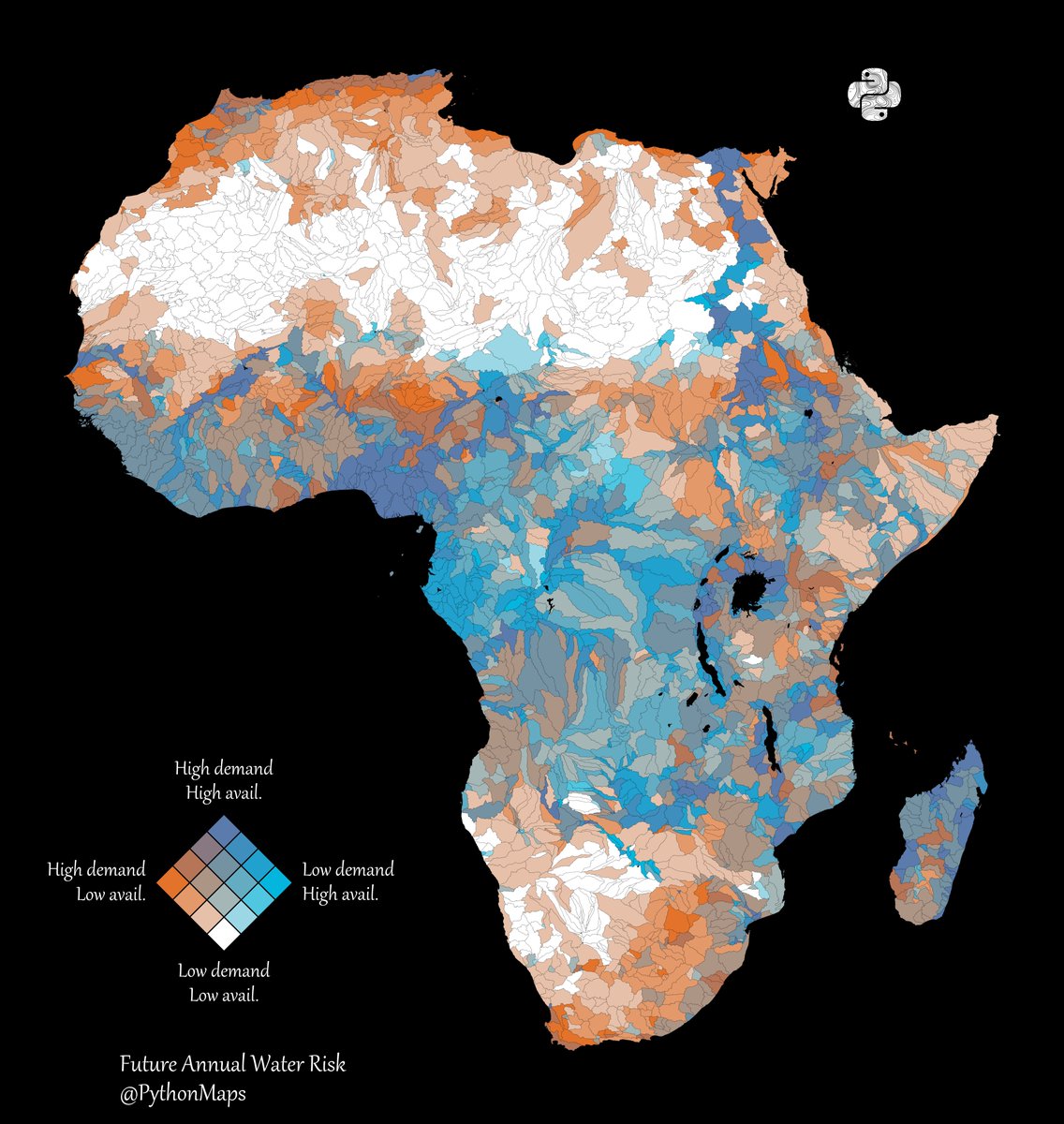
May 31
This bivariate map uses WRI's Aqueduct 4.0 data to show projected gross water demand (white→orange) vs. blue water availability (blue→purple) under a business-as-usual scenario by 2065–2095.
Inspiration came from this post from @Esri - esri.com/arcgis-blog/product…
1
18
93
6,029
May 24
Got to have your critics I guess

That's not 70% you fucking fag
1
8
2,648
May 24
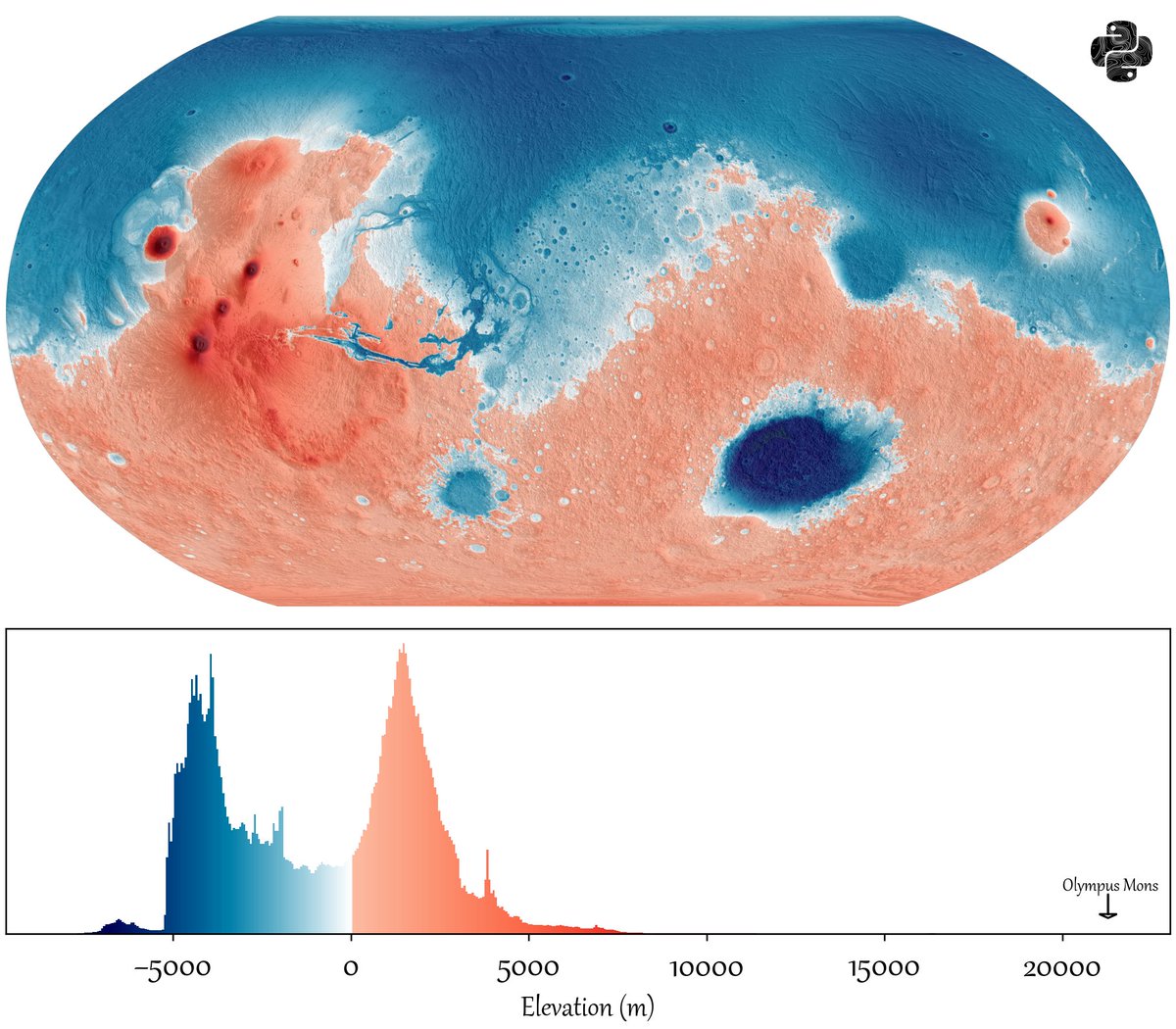
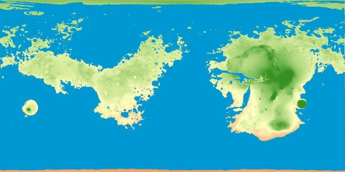
Dunno where the green came from. Mars is called the red planet for a reason.
May 22

Here's a map of Mars if, like Earth, it were covered by water on 71% of its surface.
17
26
1,884
60,106
Python Maps retweeted

May 9
Average colors of the USA from satellite imagery, by Erin Davis
7
69
999
48,551
May 4
Mercury! We may as well continue the series and explore the rest of the rocky worlds in the Solar System.
5
12
176
5,649
May 4
Apr 19

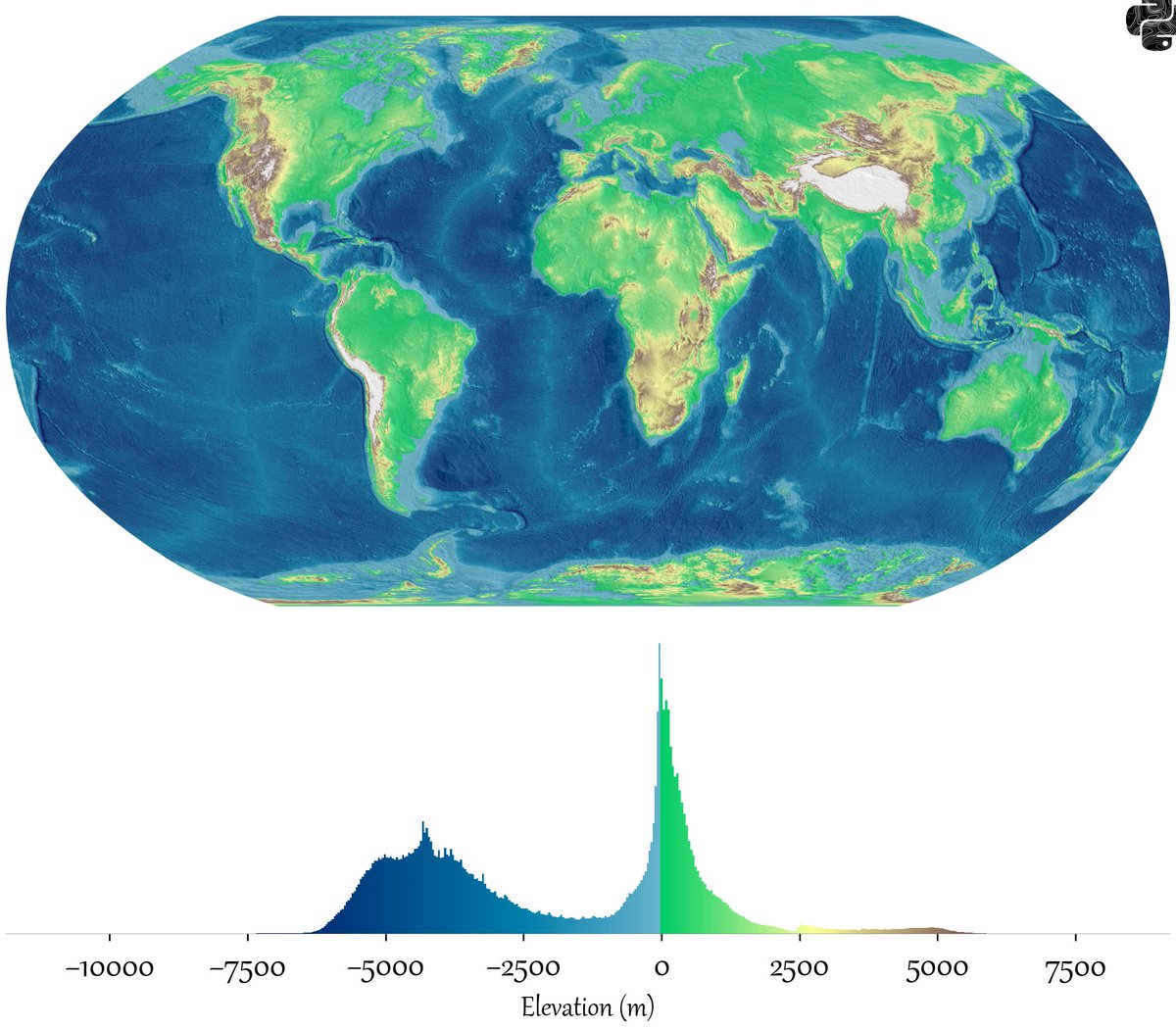
Fun concept, the distribution of elevation levels on the earths surface
1
2
13
2,235
May 4
Apr 29
I made this map for Earth last week and you seemed to like it so here is it for Mars, the distribution of elevation levels on the earths surface. I have used a blue-red colourmap to give it the illusion of oceans. Negative values indicate terrain below the Mars areoid — a gravitational reference surface defined where atmospheric pressure equals 610.5 Pa (the triple point of water) — which serves as the zero-elevation datum in place of a sea level.
1
4
1,733