Full stack web developer. HTML, CSS, JavaScript. github.com/rsensenig She/her
- Tweets 32
- Following 70
- Followers 30
- Likes 463


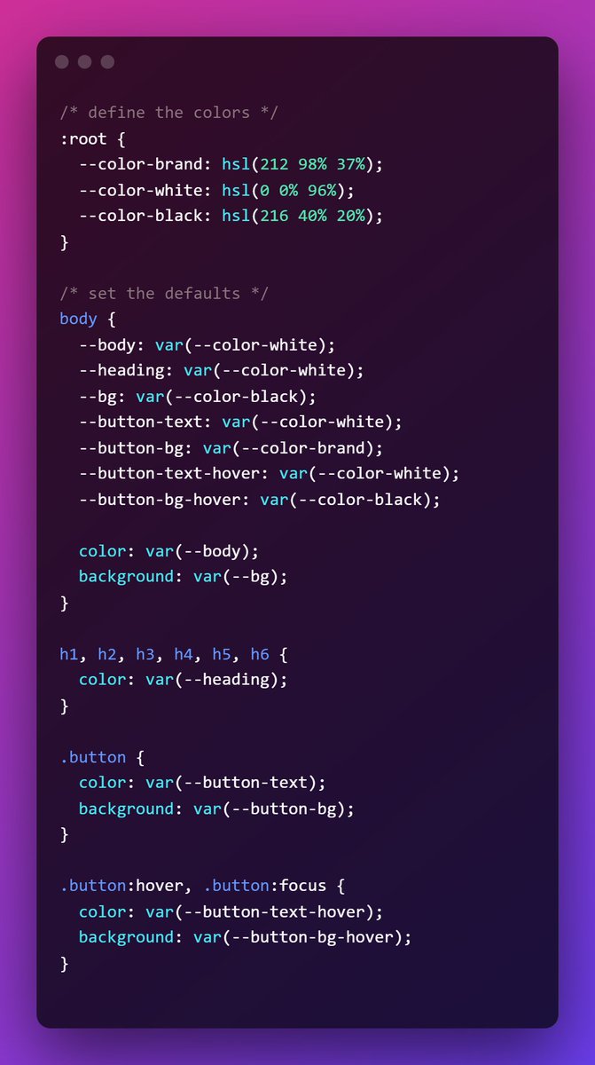
ALT /* define the colors */ :root { --color-brand: hsl(212 98% 37%); --color-white: hsl(0 0% 96%); --color-black: hsl(216 40% 20%); } /* set the defaults */ body { --body: var(--color-white); --heading: var(--color-white); --bg: var(--color-black); --button-text: var(--color-white); --button-bg: var(--color-brand); --button-text-hover: var(--color-white); --button-bg-hover: var(--color-black); color: var(--body); background: var(--bg); } h1, h2, h3, h4, h5, h6 { color: var(--heading); } .button { color: var(--button-text); background: var(--button-bg); } .button:hover, .button:focus { color: var(--button-text-hover); background: var(--button-bg-hover); }
![/* create themes */ class*="theme-"] {
background: var(--bg);
color: var(--body);
}
.theme-inverted {
--bg: var(--color-white);
--body: var(--color-black);
--heading: var(--color-brand);
}
.theme-brand {
--bg: var(--color-brand);
--body: var(--color-white);
--heading: var(--color-white);
--button-text: var(--color-brand);
--button-bg: var(--color-white);
}
.theme-headache {
--bg: linear-gradient(yellow, blue);
--body: red;
--heading: purple;
--button-bg: orange;
--button-text: black;
--button-bg-hover: green;
--button-text-hover: red;
}](https://venexa.site/media/FN6rTJBWQAkEO2q.jpg)
ALT /* create themes */ class*="theme-"] { background: var(--bg); color: var(--body); } .theme-inverted { --bg: var(--color-white); --body: var(--color-black); --heading: var(--color-brand); } .theme-brand { --bg: var(--color-brand); --body: var(--color-white); --heading: var(--color-white); --button-text: var(--color-brand); --button-bg: var(--color-white); } .theme-headache { --bg: linear-gradient(yellow, blue); --body: red; --heading: purple; --button-bg: orange; --button-text: black; --button-bg-hover: green; --button-text-hover: red; }

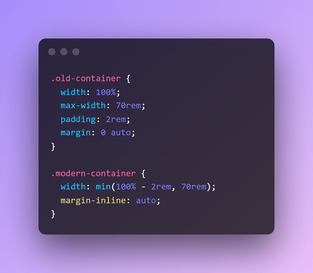
ALT .old-container { width: 100%; max-width: 70rem; padding: 2rem; margin: 0 auto; } .modern-container { width: min(100% - 2rem, 70rem); margin-inline: auto; }