
Joined June 2016
- Tweets 21,995
- Following 310
- Followers 19,768
- Likes 27,155
1,144 Photos and videos


Pinned Tweet

Jan 2
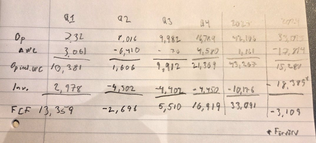
CAGR 18 yrs 2008-2025: 18,9%
2025: -16,9%
2024: -44,2%
2023: -36,7%
2022: -34,5%
2021: 16,7%
2020: 339,6%
2019: -15,6%
2018: 25,7%
2017: 124,8%
2016: 90,6%
2015: 105,0%
2014: -7,9%
2013: 18,6%
2012: 143,6%
2011: -24,2%
2010: 5,6%
2009: 43,2%
2008: -20,1%
27
1
314
63,984
ValueGARP retweeted
The UK graph is one of the most interesting because the historical graph with the correct denominator — % of total wealth rather than % of GDP — from the World Inequality Database, Piketty’s lab, looks so different.
There is a clear upward trend since the 1980s, but:
1⃣ The levels are far less impressive, since the top 0.001% owns roughly 2% of the nation’s wealth.
2⃣ In retrospect, levels remain much lower than the average for the 20th century.
This, of course, does not take into account that the UK has since developed a large welfare state. In particular, these graphs leave out the value of accrued pension claims from the UK state pension, something that most workers in the early 20th century could not count on.
If, instead of looking specifically at the top 0.001%, we look at the top 1%, which is more relevant for 99% of people, there was a huge collapse in wealth inequality in the UK between 1900 and 1980, and basically no change since then. And that is before taking state pensions into account. The same thing is true when you look at the top 10%.
Again, these are not my numbers, but those reported by Piketty and Zucman’s lab. The only difference is that I compute the shares correctly: the wealth of the top 1% as a share of total wealth of the UK rather than its GDP.
Every group’s wealth has increased as a percentage of GDP since 1980 because asset prices have increased: house prices notably. Using GDP as the denominator does all the heavy lifting here and is a fallacy.

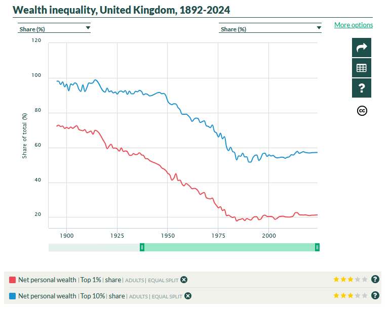

In the 1980s, the 0.001% wealthiest families living in the UK — roughly 200 families — owned wealth equivalent to 5% of UK GDP.
Today: 20% of GDP.
If they spent all their wealth, these 200 families could buy ~1/5 of all the goods & services produced in a given year in the UK.

11
38
156
17,854

I've no idea whether or not the ban of Fable 5 was justified. But the European walkover in AI is alarming. Why risk becoming crazy dependent?
👉Sovereign AI models
👉Sovereign datacenter capacity
Wake up @SwedishPM @BuschEbba . Nebius $NBIS picked Finland over Sweden. Why?
5
4
28
5,252
ValueGARP retweeted

Jun 13
🎯
Jun 13

If she wasn’t working for Elon Gwynne Shotwell would be hailed as an incredible success story and the most powerful woman in aerospace.
Instead it’s radio silence from the media

1
12
4,443
ValueGARP retweeted

Jun 13

Jun 13

The US government, citing national security authorities, has issued an export control directive to suspend all access to Fable 5 and Mythos 5 by any foreign national, whether inside or outside the United States, including foreign national Anthropic employees.
The net effect of this order is that we must abruptly disable Fable 5 and Mythos 5 for all our customers to ensure compliance.
Access to all other Claude models is not affected.
We apologize for this disruption to our customers. We believe this is a misunderstanding and are working to restore access as soon as possible.
Read our full statement: anthropic.com/news/fable-myt…
1
1
5
7,396
ValueGARP retweeted

Jun 11
BREAKING: The UK is drafting a law to scan every photo, video and message on every phone in the country.
Tech CEOs who refuse to implement this could face up to 5 years in prison.
The proposal would force companies to build device level scanners that inspect content before encryption.
That means:
• Every image scanned
• Every message inspected
• Every video analyzed
All directly on your phone.
Governments and companies pushing these safety” systems already have a terrible track record protecting user data.
Last month, Europe’s new age verification app, promoted as a way to "keep children safe," was hacked in under 2 minutes.
In another case, over 70,000 IDs and selfies linked to online verification systems were exposed in a major breach.
Now the UK wants even deeper access directly inside your device.
Once governments force surveillance tools into every phone, they can expand what gets monitored at any time.


4,138
7,730
24,428
10,544,230
ValueGARP retweeted

Jun 10
Expressen hittade 100 fall där vänsterpartister hyllat terrororganisationer, spridit rasism och antisemitism eller förnekat Förintelsen.
Men bara 25 av dessa fall uppmärksammades i publiceringen. Det är också främst där Vänsterpartiet har agerat. De övriga 75 kandidaterna tycks fortfarande finnas kvar.
Hur kan ett parti som säger sig ha nolltolerans mot rasism och antisemitism samtidigt blunda för de fall som inte hamnat i mediernas strålkastarljus?
Svaret är att V inte agerar mot extremismen som sådan, utan mot den publicitet extremismen skapar. Man reagerar på mediedrev, men saknar vilja att göra upp med problemet i grunden, eftersom partiet fortfarande tycks se ett värde i att attrahera de väljargrupper där sådana uppfattningar förekommer.
Det framstår inte som nolltolerans. Det framstår som skademinimering.

28
317
1,298
20,583
ValueGARP retweeted

Jun 10
Vårdköerna har minskat med 36% i Sverige sedan regeringen tillträdde. I det S-styrda Region Stockholm har de istället ökat med 22%.
När vi kapar köer bygger Socialdemokraterna nya. Skillnaden mellan att kapa och skapa vårdköer är ett S.
svd.se/a/L4jjpR/kd-sa-mycket…
75
298
1,922
46,231
Jun 9
RT @Lou_Mannheim: Vi riskerar på fullaste allvar att Sveriges säkerhet de närmsta fyra åren ligger i händerna på Magda, Nooshi och MP. 😬
6
Jun 8

Träffsäkert av @sofius
”Uteslut Sveriges mest extrema parti: Vänsterpartiet”. kristianstadsbladet.se/ledar…
2
11
65
9,989
ValueGARP retweeted

Jun 8
Så @TobiasBaudin, som alltså har fixat topprenoverade paradvåningar åt sig själv både i Luleå och i Stockholm, samt även lägenheter till sina döttrar, via facket, tycker det är en bra idé att prata om korruption

Kristerssons fiffelkultur måste få ett slut. Vänner handplockas till toppjobb, ministrar fattar beslut som gynnar deras aktieportföljer och volontärer hos statsministerparet belönas med fina uppdrag. Vi kräver därför att det tillsätts en extern granskning. aftonbladet.se/nyheter/a/V6G…
Community note
Tobias Baudin har själv flera gånger ertappats med att fiffla till sig fördelar i mångmiljonklassen, till exempel dyrbara våningar.
svt.se/nyheter/lokalt…
arbetet.se/2011/03/25/mil…
33
288
1,682
36,907
ValueGARP retweeted

Jun 7
CCP keeps trying new sketchy information operations.
Be wary what narratives you consume, especially if they’re against the west or paint authoritarian China in a positive light!

A careless code blunder just blew the lid off Beijing’s multi-million dollar AI propaganda operation targeting the West. France's digital interference watchdog, Viginum, has officially exposed "Fawn Mianju," a covert network of 13 multilingual fake news sites running on advanced automation and generative AI. The sophisticated network was completely compromised after a computer engineer working as a Senior Project Manager at China's state-run CGTN Digital accidentally left his login credentials exposed in the code.
This operation, which expanded on findings first uncovered by U.S. cybersecurity firm Graphika in 2025, operated with deep financial backing. The domains were registered in Beijing, hosted on Alibaba Cloud, and utilized expensive infrastructure alongside paid plugins to artificially manipulate search engine rankings. Using digital keys linked directly to AI language models, the network automatically scraped CGTN articles, lightly rewrote them, and republished over 2,300 articles, often within less than an hour of the original state media broadcast.
Sites like the French-language "Actu Méridien" were weaponized to manipulate public opinion across 89 countries, heavily targeting Western audiences and Francophone African youth. The articles aggressively peddled pro-Beijing narratives, painting China as the undisputed leader of the Global South and green energy transition while explicitly telling Western readers that aligning with Chinese interests would bring them massive benefits.
Despite the cutting-edge tech and heavy state funding, the operation was an organic flop. The articles struggled to breach 15,000 views, with nearly 40 percent of its top social media engagement traced back to fake accounts in Burundi whose sole purpose was to artificially inflate the content. While the reach was limited, French authorities warn that the operation exposes Beijing’s rapidly escalating capability to launch fully automated, stealth disinformation campaigns designed to quietly erode Western democratic alignment.
#Disinformation #CyberSecurity #France #China #AIPropaganda #Geopolitics #Viginum #NationalSecurity

15
93
492
70,652
Jun 8
RT @Lou_Mannheim: De körde fri invandring och slapp kriminalpolitik. Det ledde till krig på våra gator. De lade ner försvaret och stängde h…
32
ValueGARP retweeted

Jun 8
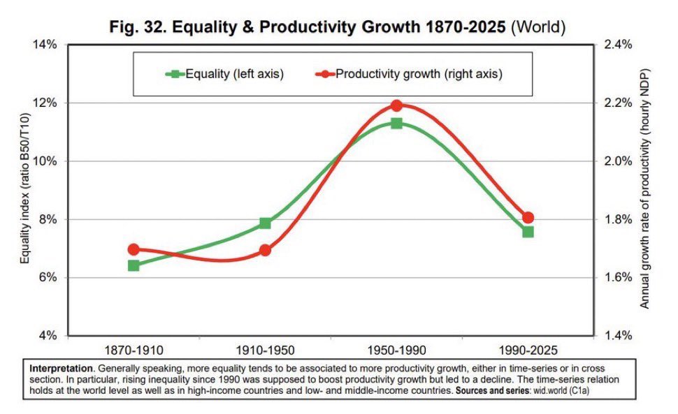
The notion that the world is less equal today than it was between 1910 and 1950 is just historically ridiculous and really makes the point that all these metrics should take much more seriously the vast welfare state systems that emerged during and in the immediate aftermath of this period.
This is the main blind spot of Piketty, Saez and Zucman’s empirical view of the world. They consider the distribution of tax rates, of which a substantial part fund social insurance, without considering the distribution of transfers and benefits. They consider the distribution of wealth without considering the value of entitlements…
This approach creates inequality metrics that would improve if we were to dismantle the welfare state. Which is exactly what this graph suggests by implying that the world is just as unequal today as it was during a period that saw two world wars and the greatest economic depression since the Industrial Revolution.
You cannot celebrate Roosevelt, Attlee and so on and use inequality metrics that make social insurance programs look like they foster inequality


9
100
421
57,975
ValueGARP retweeted

Träffsäkert av @sofius
”Uteslut Sveriges mest extrema parti: Vänsterpartiet”. kristianstadsbladet.se/ledar…
59
479
2,916
44,164
ValueGARP retweeted
Jun 7
Piketty, Zucman, etc. are unserious economists. They’re activists who are stuck on the same out of date chant.
Jun 7

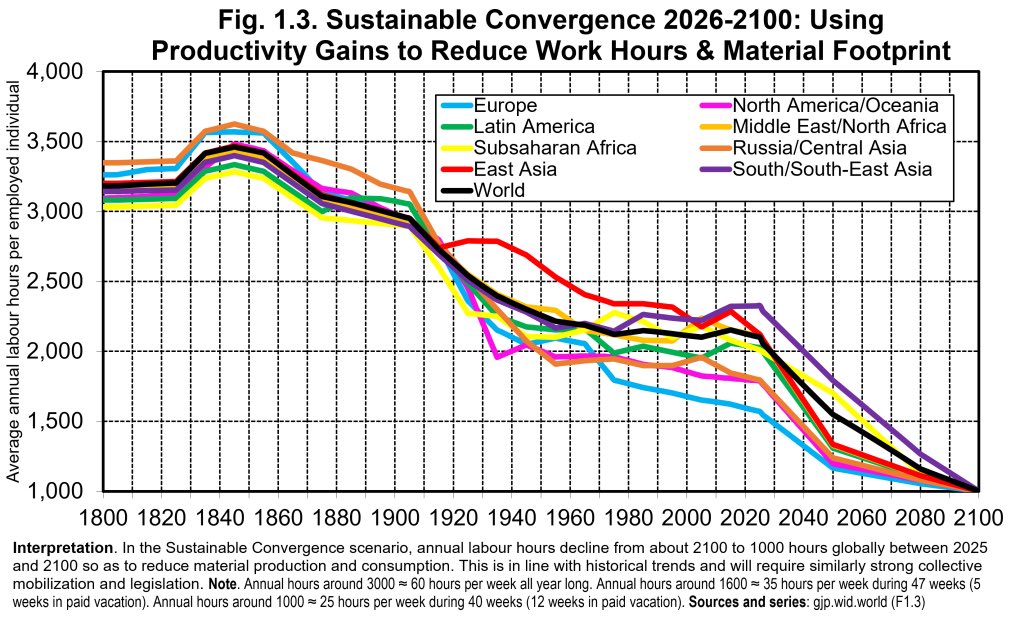
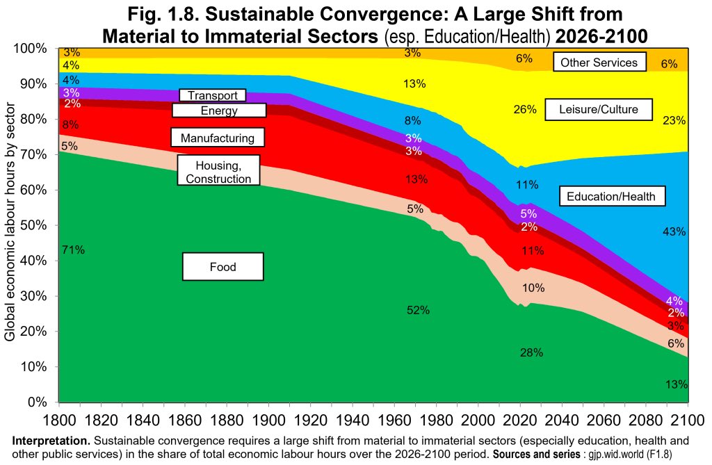
This report proposes:
- Limiting developed world annual economic growth to 0–0.5%
- Capping GDP per capita at $69k in every country
- Requiring a three-day working week
- Reducing construction hours worked by 70%, manufacturing by 87%, and leisure by 58% (in absolute terms)
1
2
4
4,964
ValueGARP retweeted

Jun 5
never waste a good crisis

1,086
3,187
66,556
3,211,979
ValueGARP retweeted

Jun 5
90% of the soldiers on the first boats to hit the beach didn't live to see the end of the day. Look at those faces. Some of them never made it to 18.
Never forget that they paid the ultimate price for our freedom. We live our lives the way we do because of them.

2,166
14,633
62,193
1,662,763
ValueGARP retweeted
Jun 5
21 av 25 nu.., 84%. Skaplig hit rate… och då har man nog bara siktat in sig på toppen av detta isberg.
Jun 5

21 av 25 granskade har nu lämnat V:s kandidatlistor.
expressen.se/nyheter/politik…
14
31
376
21,055
ValueGARP retweeted

Expressen listar 25 kandidater för Vänsterpartiet i valet i höst som hyllar terrorister, firar terrorattacker, ifrågasätter Förintelsen samt sprider konspirationsteorier och hat mot judar. Det som Nooshi Dadgostar avfärdade som ”en handfull”. Genomvidrigt.
expressen.se/nyheter/politik…
41
184
737
10,329