ALT Animation of polar stereographic maps showing annual mean 2-m air temperature anomalies in the Arctic for every year from 1950 through 2021. Red shading is shown for warmer anomalies, and blue shading is shown for colder anomalies. The anomalies are compared to a 1951-1980 climate baseline using ERA5 reanalysis and range from -5°C to 5°C. There is large interannual variability, but an overall long-term warming trend across all areas.
Join #ClimateCentral for the next Monthly Climate Brief!
We’ll explore the latest climate trends – including an outlook for El Niño and the 2026 hurricane season.
📅Tuesday, June 16, 2026
⏰12 PM ET / 9 AM PT
Register ➡️ climatecentral-org.zoom.us/w…
Sea surface temperatures are already surging to record high levels for this time of year in a key El Niño monitoring area
➡️ Sign up for our next monthly state of the climate webinar to learn more: climatecentral-org.zoom.us/w…. We'll also be talking about the hurricane season outlook
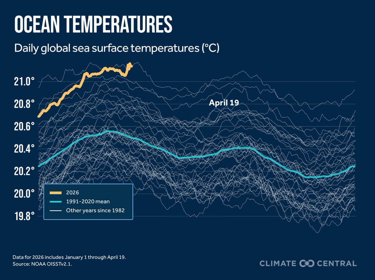
ALT Line graph time series of daily Nino 3.4 sea surface temperatures from 1982 to 2026. This year is currently a record high for this time of year. Data is from NOAA OISSTv2.1, and the graphic is created by Climate Central.
El Niño is here (cpc.ncep.noaa.gov/products/a…), and it's going to be a highly impactful event! We'll cover what this means in our briefing early next week. Sign up above in my previous post!
Enjoyed attending the Black River Watershed Conference this week & learning more about the work being done across the Tug Hill region. Thanks to the organizers for the opportunity to deliver the keynote on communicating climate change & the impacts already being felt across NY.
ALT Photo of the conference program for the 2026 Black River Watershed Conference.
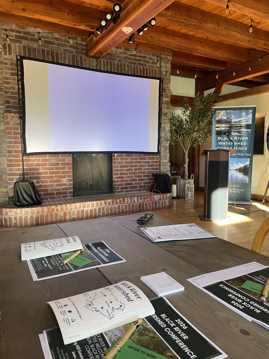
ALT Photo of the front of the venue at the 2026 Black River Watershed Conference in Lewis County, New York.
Continuing to expand my list of climate data indicators for the United States. What additional suggestions do you have?
Check it out at zacklabe.com/united-states-c…. As always, the graphics are free to use and share (click on each one to download in high-resolution).
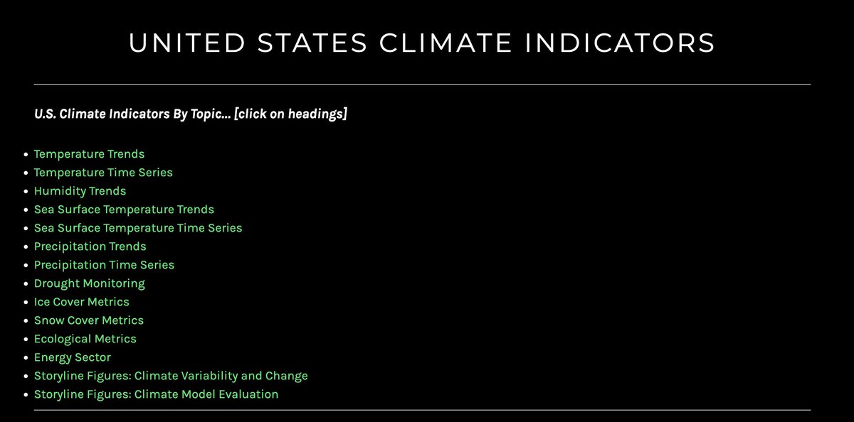
ALT Screenshot of a webpage titled “United States Climate Indicators" from https://zacklabe.com/. Below the title is a navigation section followed by a bulleted list of subjects. These topics include Temperature Trends, Temperature Time Series, Humidity Trends, Sea Surface Temperature Trends, Sea Surface Temperature Time Series, Precipitation Trends, Precipitation Time Series, Drought Monitoring, Ice Cover Metrics, Snow Cover Metrics, Ecological Metrics, Energy Sector, Storyline Figures: Climate Variability and Change, and Storyline Figures: Climate Model Evaluation.
A lot of the United States is dealing with drought at the same time extreme rainstorms are becoming more common.
The two trends are connected:
Warmer temperatures are causing heavier downpours, while also drying out the land faster between storms.
theconversation.com/the-us-i…
I swear I really do listen to all of your comments (good & bad), and this new blog features a data viz many of you requested. In my latest entry, I share an animation of temperature departures by latitude for every month from 1950 to 2025.
Check it out! zacklabe.com/climate-viz-of-…
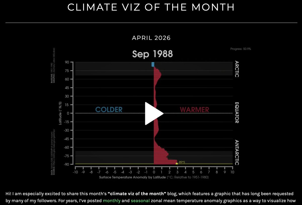
ALT Screenshot of the a data visualization video for zonal mean temperature anomalies on my climate viz of the month blog page at https://zacklabe.com/climate-viz-of-the-month/.
The video player here includes options to slow down or speed up the animation, pause, enlarge the display, and download it. Hopefully this makes it easier to explore compared to my traditional GIF-style animation.
We have a new book chapter out: doi.org/10.1201/978100356733…. Here, we overview how extreme event attribution assessments & improved decadal prediction can support resilience planning & decision-making around climate risks.
If you are interested in it, don't hesitate to reach out 🙂
Slowly but surely, I am adding more metrics for monitoring the Relative Oceanic Niño Index (RONI) on my climate indicators page (monthly): zacklabe.com/climate-change-…. It could be quite a year for El Niño 😬
"As spring arrives 10 days earlier on average than four decades ago, growers pay the price with total crop losses." via @farmdaily at farmprogress.com/orchard-cro…
In case you missed our latest climate science briefing, check out the recording from today: youtube.com/watch?v=rNYSgGkN…
After overviewing the latest global statistics, we did a deep dive on the newest data around drought conditions and the growing likelihood of a strong El Niño.
For downloadable graphics, new interactives on greenhouse gases, and a climate data summary globally and across the U.S., check out our monthly reports: climatecentral.org/climate-b…. There's also a special feature on attribution and the record warm global sea surface temperatures.
I just added a new graphical timeline of our rapidly changing planet (through 2025)...
This high-resolution visualization is now permanently featured at the very bottom of my climate change indicators webpage.
➡️ Check it out here: zacklabe.com/climate-change-…
Two new studies reveal the complex ways in which the ocean and atmosphere are interacting with Antarctic ice, potentially spurring even more melting. bit.ly/4dc1zXl
The data comes from the National Oceanic and Atmospheric Administration's Mauna Loa Observatory, which may soon be shut down due to proposed government budget cuts
spklr.io/6013Ez8Fv