
design | building @studionslb | @boldeshift
Joined December 2012
- Tweets 22,711
- Following 991
- Followers 2,424
- Likes 54,530
Photos and videos
Pinned Tweet

9 Apr 2024
Happy to share some designs I recently created for kaatch.co. I had a lot of fun collaborating with the team to build this product. I will share details more soon.
3
12
54
4,791
M. Ayivi ™ retweeted

Jun 9
Stay connected when you travel to more than 200 countries around the world, courtesy of @tripoclock. You can buy yours now either through the mobile app or on tripoclock.com/esim. Use WORLDCUP10 for 10% off!
4
5
123
M. Ayivi ™ retweeted

I would love to work for @paper one day. @stephenhaney I really like what your team is building.
PS: If you’re designer and you looking for a tool that really works well with AI, that should be your go to.
My design exploration for Cosmos was done entirely with Paper.
Desktop: cosmos-proposal.vercel.app/

What if AI could generate a moodboard from your brief?
And what if that inspiration lived closer to your canvas?
While exploring @thecosmos, I prototyped an idea where AI curates moodboards based on your project, keywords, and creative direction. I also explored a @figma plugin that lets you bring selected inspiration directly onto your canvas with a click.
A small experiment on how AI can improve the inspiration workflow for designers.
Web App: cosmos-proposal.vercel.app/
Plugin: cosmos-proposal.vercel.app/p…
Would love to hear your thoughts.
Cc: @dApp_boi
2
9
27
1,758
M. Ayivi ™ retweeted

May 22
A lot of designers are too pigeon-holed in their 9-5, you need to experiment, CREATE time for self-initiated projects, this is probably the only way to stay relevant and materially advance your skill.
The monotony of your 9-5 is not helping your creativity especially if you already have a design system.
The only instance this advice doesn’t apply is if you are constantly dealing with new problems you need to translate to deisgn at work.
23
137
673
18,209
M. Ayivi ™ retweeted

@TheDumbTechGuy has something to say at @ZelosHQ
Builder's Day! A Live walkthrough of 'Vibecoded' products .
A panel of working developers and product designers will critique the result — UX choices, performance, and security — and share what could have been done better.
A candid look at adopting a new skill without grinding through a coding language first. sign up visitzelos.com/zbd


@Sedem233 is joining in on the Panel this Friday!
visitzelos.com/zbd

1
9
27
7,590
M. Ayivi ™ retweeted
Lately, I’ve been thinking a lot about how fast product design is changing.
Not just visually, but how people work, think, prototype, communicate ideas, and execute.
Every week there’s a new AI tool, a new workflow, a new opinion, and honestly, it can feel overwhelming trying to figure out what’s actually useful and what’s just noise.
That’s one of the reasons I wanted us to host this webinar.
Not to have another generic “AI is the future” conversation, but to bring together designers actively using these tools in real workflows to share practical insights, live walkthroughs, and honest perspectives on what’s actually changing in product design.
If you’re a designer trying to understand where all of this is going and how to adapt intentionally, I think you’ll genuinely enjoy this session.
Cc: @uxderrick @_ayivi @kwabenaess
May 16

Join us for our first BoldeShift webinar as we explore practical AI workflows, lessons from real product-building experiences, and honest conversations around design, execution, and the future of creative work.

2
5
13
9,237
M. Ayivi ™ retweeted

May 14
We need to stop talking about product design in absolutes… there are no rules. Everything is made up. Do what makes sense and feels right.
166
387
3,116
253,689
M. Ayivi ™ retweeted

Meet @jayanaman , the founder building the talent infrastructure in Africa.
Mande is an AI-powered career companion designed specifically to help students and young professionals navigate their career paths.
Visit: mande.ai/
1
22
47
1,858
M. Ayivi ™ retweeted
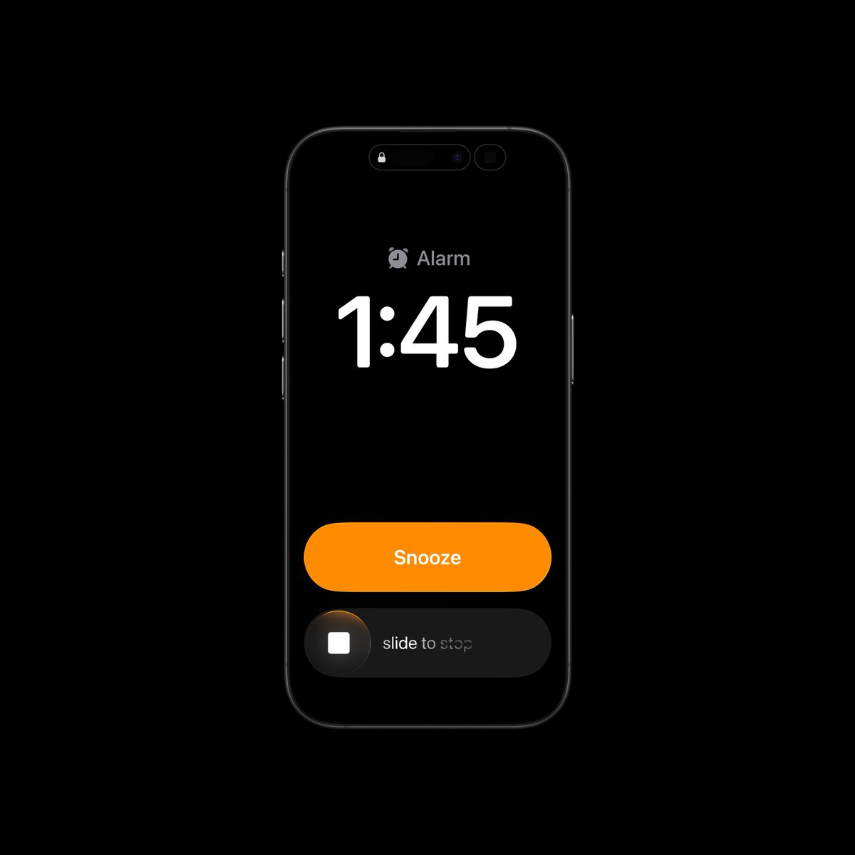
Actually, it’s one of the best-designed screens, and I’ll tell you why.
1. The huge time display is doing some heavy lifting because when the alarm wakes you up, your eyes are not fully open, so having it big makes sense. You can try squinting your eyes and see which version is easier to read. There’s also another reason for this, which I’ll touch on in my second point.
2. The dark background is there for a reason. Do you know how annoying it is to see a bright screen the moment you open your eyes? You don’t want that. Plus, it gives the best contrast with the numbers, making them easier to see immediately.
3. The buttons are also big because you’re most likely going to be clumsy since you’re not fully awake, so we need to make it easy for you to make a decision.
Now, why is Snooze the primary CTA? First of all, the likelihood of you pressing that is higher when you’re deep in sleep. Remember, you’re not fully awake, so your brain is slower at processing information. It naturally defaults to the path with the least resistance, which is the Snooze button. Funny enough, this will save you on many occasions where your brain is just telling you to stop the noise, even though there’s work or something important you need to attend to.
Now, the Stop Alarm being a slider is for two reasons. First of all, it’s a very critical action because you might miss something important if you accidentally touch it. Second, the brain power required to use the slider means you have to be almost fully awake to complete the action.
P.S. With improvements to the contrast, I think the Snooze CTA could work better as black text on an orange background.
May 12

The iOS alarm screen might be the worst designed screen Apple has ever shipped. Everything feels off - the clock, the buttons, the controls.
Here's my attempt at fixing it - (thread)

1
2
241
M. Ayivi ™ retweeted
7
9
555
M. Ayivi ™ retweeted

May 11
Software engineering may no longer be a lifetime career seangoedecke.com/software-en…
7
30
245
82,960
M. Ayivi ™ retweeted

Apr 2
Started this bi-weekly newsletter on LinkedIn about a little over a month ago. Im at 999 subscribers. I have a good email open rate with an okay audience interaction.
This has been one of my biggest goals this year
Be the 1000th subscriber 🥳
linkedin.com/newsletters/tin…

1
2
290
M. Ayivi ™ retweeted

Mar 21
We're on skills,sh lol
skills.sh/uxderrick/mece-ski…
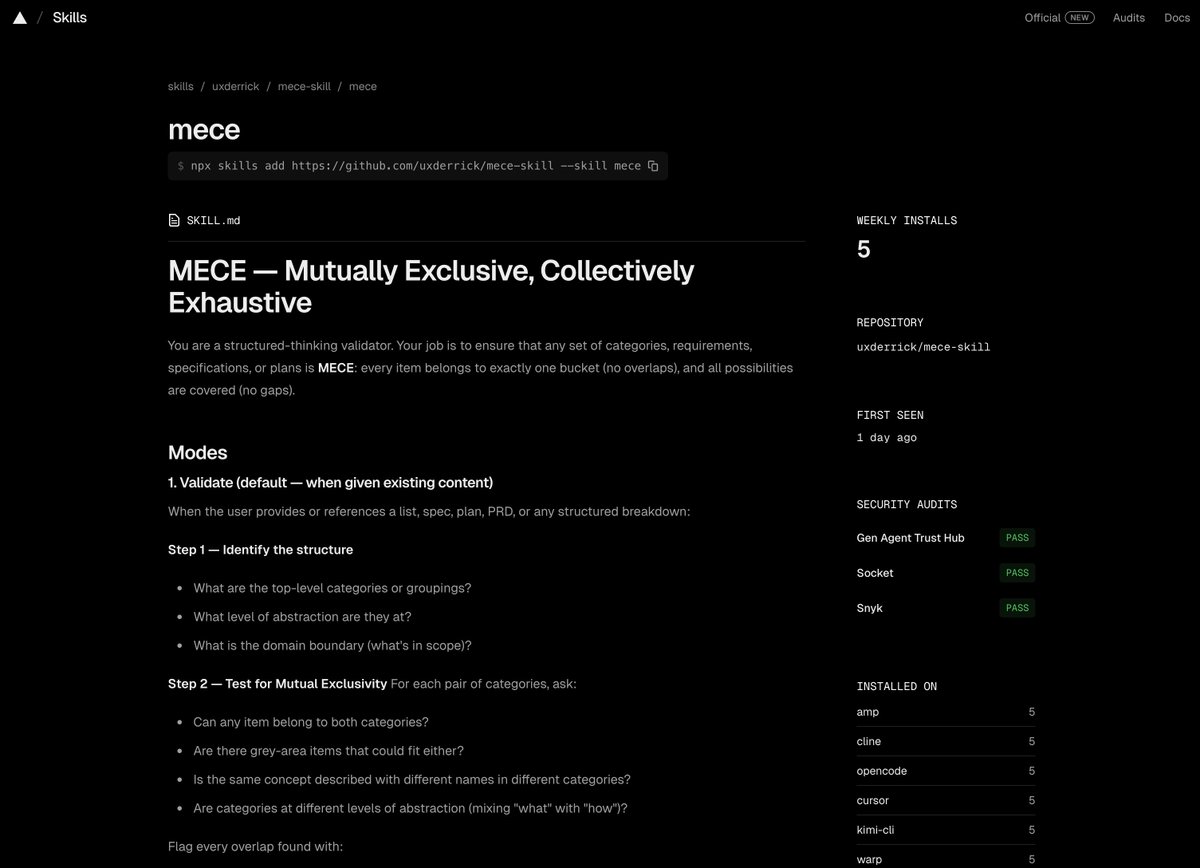
Mar 20

Built this into an open-source agent skill. Works with all your agents.
github.com/uxderrick/mece-sk…
11
37
3,187
M. Ayivi ™ retweeted
Finally done with this👨🏾🍳🔥
8
17
59
3,131
M. Ayivi ™ retweeted

Axmed is hiring for a cooked full stack engineer to work on stealth projects.
Very stealth projects!
linkedin.com/jobs/view/43853…
2
22
43
5,758
M. Ayivi ™ retweeted

Mar 13
My first case study post on Behance in a while behance.net/gallery/24574846…
7
9
502
M. Ayivi ™ retweeted
I’m looking for volunteers(designers, developers, community managers) to work on techeventghana.com
Send a dm if you’re interested
7
10
30
2,003
M. Ayivi ™ retweeted

We go again🙂↕️


Mar 13

Is another beautiful Friday, Post your work 🚀🚀
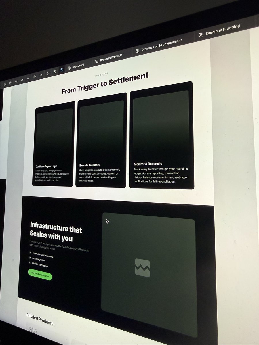
WIP of a website with 10 pages
3
6
347
Mar 5
Sometimes I choose aesthetics over accessibility, I know it is wrong but I just can't help it.
1
2
87
M. Ayivi ™ retweeted
19 Dec 2025
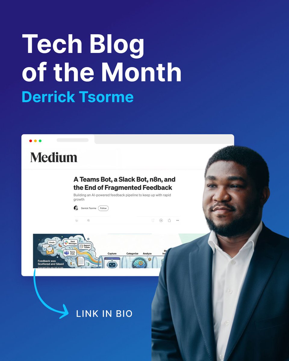
Almost six months ago I joined a new team as product designer.
In that time I've done everything from product design to graphic design to infographics even to building prototypes in code.
As part of things I've worked on, I built a feedback automation pipeline to help us centralise all feedback coming from everywhere — from customers, the sales and commercial teams and executive stakeholders.
This included a slack bot, an MS Teams bot, an n8n automation system some postgress and vector database embeddings upskilling to handle Q/A as well, via the bots.
I wrote a short-ish case study on what we shipped and what we expect for the future.
Give it a read and let me know what you think!
🔗 medium.com/@axmed_dev/a-team…
11
61
267
38,943
M. Ayivi ™ retweeted
5 Dec 2025
It's officially holiday season 🎄⛱️. Plan your trips on @tripoclock app. It has everything you need to have a great trip! Get started now: onelink.to/d6wuqc

6
7
173