May 28
Access ALL prompts for stunning animated websites in one click: motionsites.ai
Recreate a high-fidelity, premium interactive landing page named "Reverie" using React, TypeScript, and a combination of Tailwind CSS and inline styles. The project must have a smooth, hardware-accelerated scroll-linked animation system, 3D/parallax mouse-tracking effects, responsive layouts, and elegant micro-animations.
---
1. Typography & Global Styles
- Fonts:
- Load the following Google Fonts:
- Headers: `'Viaoda Libre', serif` (elegant serif font).
- Body, nav links, and captions: `'Imprima', sans-serif` (clean, sleek sans-serif font).
- Global Reset & Base CSS:
- `html, body { margin: 0; padding: 0; background: #0a0608; scroll-behavior: auto; }`
- Body font should default to `'Imprima', sans-serif`.
- Add `scrollbar-gutter: stable;` to the `html` tag to prevent layout shifts.
- Include an animation utility:
```css
@keyframes bobUp {
0%, 100% { transform: translateY(0); }
50% { transform: translateY(-6px); }
}
```
---
2. Assets Asset Mapping
Define these exact asset constants at the top of the file:
```typescript
const PORTAL_BG = 'res.cloudinary.com/dsdhxhhqh…';
const CURTAIN_LEFT = 'res.cloudinary.com/dsdhxhhqh…';
const CURTAIN_RIGHT = 'res.cloudinary.com/dsdhxhhqh…';
const WORLD_BG = 'res.cloudinary.com/dsdhxhhqh…';
// The cards MUST remain in this exact order (Card 3, Card 1, Card 2)
const CARD_IMAGES = [
'res.cloudinary.com/dsdhxhhqh…',
'res.cloudinary.com/dsdhxhhqh…', // Representing Card 1
'res.cloudinary.com/dsdhxhhqh…', // Representing Card 2
];
```
---
3. State Management & Mathematical Helpers
- Math Utilities:
- Easing curve: `easeInOut(t) = t < 0.5 ? 2 * t * t : -1 (4 - 2 * t) * t`
- Linear Interpolation: `lerp(a, b, t) = a (b - a) * t`
- Constraint: `clamp(val, min, max) = Math.max(min, Math.min(max, val))`
- Parallax Magnitudes:
- `MAG.world = 6`, `MAG.portal = 7`, `MAG.curtainL = 14`, `MAG.curtainR = 14`
- Hook for Responsiveness:
- Implement a `useIsMobile()` hook responding to media query max-width of `767px` to dynamically update layouts.
- Scroll Tracking:
- The page height must be exactly `480vh`. Inside, a single sticky container spans `100vh`.
- Calculate normalized `scrollProgress` from `0` to `1` by reading window scroll position relative to the scrollable height.
- Smooth Mouse Tracking (Parallax):
- Normalize coordinates `rx`, `ry` between `-1` and `1` relative to the center of the viewport.
- Implement a `requestAnimationFrame` render loop (`tick`) to smoothly interpolate current position towards target cursor position (lerp step speed: `0.07`) to eliminate frame-rate stutters.
- Entrance Animation Delays:
- On mount, transition curtains open after `100ms`, fade UI in after `600ms`. Disable entry CSS transitions after `2200ms` so mouse movement doesn't experience lag or delay.
---
4. Animation Timelines (Scroll & Mouse Parallax)
Apply these precise styling updates in the render loop on every frame:
1. World Layer (`WORLD_BG`):
- Scale: Lerps from `1` (at start) to `1.18` (at maximum scroll).
- Parallax: `transform = scale(${scale}) translate3d(${rx * 6}px, ${ry * 6}px, 0)`
2. Portal Frame (`PORTAL_BG`):
- Scale: Lerps from `1` to `7.5` (creating an immersive zoom-through effect).
- Origin: `52% 38%`
- Opacity: Starts at `1`, fades out after `65%` scroll: `clamp(1 - (scrollProgress - 0.65) / 0.2, 0, 1)`
- Parallax: `transform = scale(${scale}) translate3d(${rx * 7}px, ${ry * 7}px, 0)`
3. Curtain Left (`CURTAIN_LEFT`):
- Initial Opening Offset: `62%` shift left.
- Scroll Offset: Moves further leftward up to `150%` as eased progress goes `0` to `1`.
- Curtain Scroll Scale: Lerps from `1` to `1.3`.
- Parallax & GPU Layer: `transform = translateX(calc(-${totalShift}% ${rx * 14}px)) translateY(${ry * 14 * 0.3}px) scale(${curtainScrollScale}) translateZ(0)`
4. Curtain Right (`CURTAIN_RIGHT`):
- Symmetrically mirrors Curtain Left.
- Parallax & GPU Layer: `transform = translateX(calc(${totalShift}% ${rx * 14}px)) translateY(${ry * 14 * 0.3}px) scale(${curtainScrollScale}) translateZ(0)`
---
5. Layout & Components
Navigation Bar
- Position: Absolute at the top, `zIndex: 50`. Responsive padding: `18px 20px` (mobile), `22px 48px` (desktop).
- Desktop (>=768px): Split navigation.
- Left side: Links `Worlds`, `Atelier`, `Immersions`.
- Center: SVG Star Logo (clean star shape in path `M14 2l2.09 6.42H23l-5.45 ...` inside a `28x28` viewport).
- Right side: Links `Craft`, `Codex`, `Connect`.
- Mobile (<768px): Centered star logo with an `Explore` link on the left and a `Connect` link on the right.
- Link Styling: uppercase, `12px`, letter spacing `0.12em`, white color with `0.9` opacity, no text decoration.
Scene 1: Hero Section (Entrance)
- Opacity: Fades out smoothly on scroll: `clamp(1 - scrollProgress / 0.22, 0, 1)`.
- Entrance Transition: Slide upward by `20px` on mount with opacity transition `0.9s ease` delayed by `300ms`.
- Responsive Layout:
- Mobile (<768px): Center-aligned vertical column. Text is dark brown (`#3b1a0a`). Heading: `FALL › INTO REVERIE` (Viaoda Libre). Subheading paragraph (max-width `280px`). Below it, displays a single card with image `CARD_IMAGES[0]`, showing a rounded white play button icon and "View Reel".
- Tablet (768px - 1099px): Center-aligned column. Text is dark brown (`#3b1a0a`). Headline and paragraph (max-width `400px`). Shows all 3 cards in a horizontal row:
- Card 3: Image `CARD_IMAGES[0]`, Play button "View Reel"
- Card 1: Image `CARD_IMAGES[1]`, "32 World Patrons" in large elegant text
- Card 2: Image `CARD_IMAGES[2]`, Play button "View Reel"
- Desktop (>=1100px): Split-screen horizontal layout. Text is white.
- Left Container: Aligned to the left (top `46%`, left `60px`). Title: `FALL › INTO REVERIE` (Viaoda Libre). Subheading paragraph. Max-width `440px`.
- Right Container: Aligned to the right (top `50%`, right `40px`). Row of 3 card containers (`158px x 158px`) with rounded corners (`28px`), bottom linear gradient, glassmorphic bottom blur (`backdropFilter: 'blur(6px)'`), play icon buttons or patron metrics overlay.
- Card Interactive Styling:
- Backdrop blur filter on bottom labels: `backdropFilter: 'blur(6px)'`, linear gradient to top `rgba(0,0,0,0.72) 0%, rgba(0,0,0,0.18) 60%, transparent 100%`.
- Slider Dots (Bottom Left):
- Absolutely positioned at bottom left (`60px` desktop, centered mobile).
- Renders 4 horizontal pill indicators: first indicator is wide (`28px`), other three are thin (`14px`), colored in white with opacities.
- Scroll Cue (Descend):
- Absolutely positioned at `bottom: 36px`, centered horizontally. Hidden on mobile.
- Text: uppercase "Descend" in `10px`, letter-spacing `0.22em`, color `rgba(255,255,255,0.6)`.
- Icon: A chevron SVG surrounded by a `34px x 34px` round circular border animated with the `bobUp 1.8s ease-in-out infinite` bounce animation.
Scene 2: Call to Action (Forge Beyond)
- Opacity: Fades in on scroll: `clamp((scrollProgress - 0.68) / 0.16, 0, 1)`.
- Layout: Centered vertical flex container (`zIndex: 46`), active only when opacity is visible.
- Content:
- Centered text wrapper.
- Heading: `FORGE BEYOND THE REAL` (Viaoda Libre, size clamp `38px` to `78px`, color `#ffffff`, letter spacing `0.03em`, line-height `1.05`, elegant text shadow `0 2px 20px rgba(0,0,0,0.4)`).
- Paragraph: `Singular voyages to astonishing destinations, shaped for those who seek beauty beyond the ordinary and the known.` (Imprima, size `20px` desktop / `14px` mobile, max-width `480px` desktop / `260px` mobile, line-height `1.6`, color `rgba(255,255,255,0.82)`).
```
1
6
51
6,567

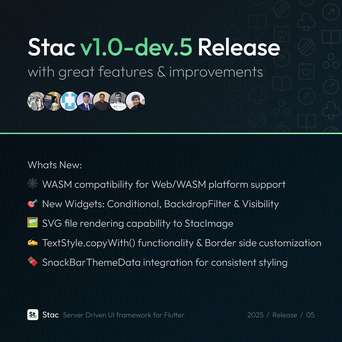
**Lv 4 - BackdropFilter:** Frosted glass effects. The kind iOS charges $1,000 in dev time to pull off.
**Lv 5 - CustomPainter:** You can literally draw anything. Users assume you had a full design team.
[3/3]
1
4
746
May 21
Access ALL prompts for stunning animated websites in one click: motionsites.ai
PROMPT TO RECREATE THIS LANDING PAGE
---
**Create a React Vite Tailwind CSS v4 landing page for "WISA" -- a premium football/soccer organization website. The page has a scroll-driven video background, 3 content sections, and a glassmorphism footer. Use ONLY these dependencies: react 19, motion (framer-motion v12 ), gsap, lucide-react, tailwindcss v4 with @tailwindcss/vite plugin. The design is dark, cinematic, minimal, with Manrope (sans) and JetBrains Mono (mono) fonts.**
---
### GLOBAL SETUP
**package.json dependencies (exact):**
```
react, react-dom ^19.0.0
motion ^12.23.24
gsap ^3.14.2
lucide-react ^0.546.0
tailwindcss ^4.1.14
@tailwindcss/vite ^4.1.14
@vitejs/plugin-react ^5.0.4
vite ^6.2.0
```
**vite.config.ts:** Use `@tailwindcss/vite` plugin `@vitejs/plugin-react`. Alias `@` to project root.
**index.html:** Standard HTML5. Include `<script type="module" src="ajax.googleapis.com/ajax/lib…"></script>` in head.
**src/index.css -- EXACT:**
```css
@import url('fonts.googleapis.com/css2?fa…');
@import "tailwindcss";
@theme {
--font-sans: "Manrope", ui-sans-serif, system-ui, sans-serif;
--font-mono: "JetBrains Mono", ui-monospace, SFMono-Regular, monospace;
}
@keyframes flyOutRight {
0% { transform: translateX(0); }
100% { transform: translateX(250%); }
}
@keyframes flyInLeft {
0% { transform: translateX(-250%); }
100% { transform: translateX(0); }
}
.animate-fly-out {
animation: flyOutRight 0.5s cubic-bezier(0.4, 0, 0.2, 1) forwards;
}
.animate-fly-in {
animation: flyInLeft 0.5s cubic-bezier(0.4, 0, 0.2, 1) forwards;
}
@keyframes flyOutUp {
0% { transform: translateY(0); }
100% { transform: translateY(-150%); }
}
@keyframes flyInUp {
0% { transform: translateY(150%); }
100% { transform: translateY(0); }
}
.animate-fly-out-up {
animation: flyOutUp 0.4s cubic-bezier(0.4, 0, 0.2, 1) forwards;
}
.animate-fly-in-up {
animation: flyInUp 0.4s cubic-bezier(0.4, 0, 0.2, 1) forwards;
}
```
These define 4 keyframe animations:
- `flyOutRight / flyInLeft` (250% translateX, 0.5s) -- for the arrow button hover
- `flyOutUp / flyInUp` (150% translateY, 0.4s) -- for nav text hover
- All use `cubic-bezier(0.4, 0, 0.2, 1)` easing with `forwards` fill mode
---
### COMPONENT: ScrollReveal (`src/components/ScrollReveal.tsx` `ScrollReveal.css`)
**ScrollReveal.css:**
```css
.scroll-reveal { margin: 0; }
.scroll-reveal-text { display: flex; flex-wrap: wrap; margin: 0; }
.word { display: inline-block; white-space: pre; }
```
**ScrollReveal.tsx:** A GSAP-powered word-by-word scroll reveal component.
- Props: `children` (string), `scrollContainerRef?`, `enableBlur` (default true), `baseOpacity` (default 0.1), `baseRotation` (default 3), `blurStrength` (default 4), `containerClassName`, `textClassName`, `rotationEnd` (default "bottom bottom"), `wordAnimationEnd` (default "bottom bottom")
- Splits children text by whitespace into `<span className="word">` elements using `useMemo`
- Three GSAP ScrollTrigger animations:
1. **Rotation**: Container rotates from `baseRotation` degrees to 0, origin "0% 50%", scrub true, trigger start "top bottom", end = `rotationEnd`
2. **Opacity**: Each `.word` fades from `baseOpacity` to 1, stagger 0.05, scrub true, trigger start "top bottom-=20%", end = `wordAnimationEnd`
3. **Blur** (if `enableBlur`): Each `.word` goes from `blur(blurStrength px)` to `blur(0px)`, same stagger/trigger as opacity
- Renders: `<h2 ref={containerRef} className="scroll-reveal {containerClassName}"><p className="scroll-reveal-text {textClassName}">{splitText}</p></h2>`
- Cleanup: kills all ScrollTrigger instances on unmount
---
### COMPONENT: Reveal (inline in App.tsx)
A motion.div wrapper for viewport-triggered fade-in:
```tsx
function Reveal({ children, delay = 0, className = "" }) {
return (
<motion.div
initial={{ opacity: 0, y: 30 }}
whileInView={{ opacity: 1, y: 0 }}
viewport={{ once: true, margin: "-50px" }}
transition={{ duration: 0.8, ease: [0.16, 1, 0.3, 1], delay }}
className={className}
>
{children}
</motion.div>
);
}
```
Easing is `[0.16, 1, 0.3, 1]` (ease-out-expo style).
---
### COMPONENT: NavItem (inline in App.tsx)
A hover-animated navigation link with vertical text fly animation:
- Uses a `cycle` counter state (useState(0))
- On `mouseEnter` and `mouseLeave`: increment cycle
- When `cycle === 0` (initial, no hover yet): render single `<span>` with `text-white/64` and `group-hover:text-white transition-colors duration-300`
- When `cycle > 0`: render TWO spans keyed by cycle -- one with `.animate-fly-out-up` (exits upward), one absolute-positioned with `.animate-fly-in-up` (enters from below)
- Container: `<a>` with `relative overflow-hidden group flex items-center justify-center py-1`
---
### MAIN APP (src/App.tsx) - ARCHITECTURE
**Video URL constant:**
```
const VIDEO_URL = 'd8j0ntlcm91z4.cloudfront.net…';
```
**State & Refs:**
- `arrowCycle` (useState(0)) -- for arrow button hover animation, same pattern as NavItem
- `videoRef` (useRef HTMLVideoElement)
- `videoContainerRef` (useRef HTMLDivElement)
- `isLoaded` (useState false) -- tracks when video is ready
- `screen3Ref` (useRef HTMLDivElement) -- reference to footer section for scroll calculation
- `scrollY` from motion's `useScroll()`
- `headerY` = `useTransform(scrollY, [0, 500, 800], [0, 0, -150])` -- header slides up and out after scrolling past 500px
---
### SCROLL-DRIVEN VIDEO - CRITICAL IMPLEMENTATION
**Effect 1: Video Loading**
```tsx
useEffect(() => {
const video = videoRef.current;
if (!video) return;
const handleCanPlay = () => setIsLoaded(true);
video.addEventListener('canplaythrough', handleCanPlay);
video.load();
return () => video.removeEventListener('canplaythrough', handleCanPlay);
}, []);
```
**Effect 2: Scroll-to-Video-Scrub (with the `video.seeking` guard)**
```tsx
useEffect(() => {
if (!isLoaded) return;
const video = videoRef.current;
if (!video || !video.duration) return;
const handleScroll = () => {
if (!screen3Ref.current || video.seeking) return;
// ^^ CRITICAL: "video.seeking" check tells the browser: "Only update the video
// frame when you've completely finished rendering the previous one."
// Without this guard, rapid scroll events queue up competing .currentTime assignments,
// causing visible frame tearing, flickering, and dropped frames. The browser's
// internal seek operation is asynchronous -- setting .currentTime while a previous
// seek is still in progress gets silently ignored or causes visual glitches.
// By checking video.seeking, we skip scroll events that arrive before the prior
// frame has been decoded and painted, resulting in smooth, tear-free scrubbing.
const rect = screen3Ref.current.getBoundingClientRect();
const absoluteTop = window.scrollY rect.top;
const stopScroll = Math.max(1, absoluteTop - (window.innerHeight * 0.2));
const scrollFraction = Math.max(0, Math.min(1, window.scrollY / stopScroll));
video.currentTime = scrollFraction * video.duration;
};
window.addEventListener('scroll', handleScroll, { passive: true });
handleScroll();
return () => window.removeEventListener('scroll', handleScroll);
}, [isLoaded]);
```
The scroll fraction maps from 0 (top of page) to 1 (when the footer section is 20% of viewport height from top). This means the video plays through its full duration as the user scrolls from top to the footer.
---
### SECTION 0: LOADING SCREEN
Shown when `!isLoaded`. Fixed fullscreen, z-50, black bg, centered:
- "LOADING" text: `text-[10px] font-mono tracking-widest mb-4 text-white/50`
- Progress bar below: `w-64 h-[1px] bg-white/10 mt-8 overflow-hidden` with inner `h-full bg-white w-1/3 animate-pulse`
---
### LAYER STRUCTURE
The entire page is layered:
1. **Fixed video background** (`fixed inset-0 z-0 bg-black`) -- video is absolutely centered with cover behavior using `transform: translate(-50%, -50%)`, `minWidth/minHeight: 100%`, `objectFit: cover`
2. **Fixed header** (z-20) -- animated with motion, slides out via `headerY` transform
3. **Scrollable content** (`relative z-10 pointer-events-none`) -- all sections flow here, with `pointer-events-auto` on interactive areas
---
### SECTION 1: HERO (Screen 1)
Container: `w-[90%] mx-auto h-screen flex flex-col py-8 md:py-12 lg:py-16 pb-12`
Inner main: `flex-1 w-full pointer-events-auto flex flex-col md:grid md:grid-cols-12 md:grid-rows-[1fr_auto] gap-y-8 md:gap-y-0 md:gap-x-8`
**Grid layout (desktop 12-col, 2-row):**
1. **Heading** (bottom-left): `md:row-start-2 md:col-start-1 md:col-span-8 flex items-end`
- H1: `text-[clamp(2.5rem,6vw,5rem)] leading-[1.05] font-medium tracking-tight text-white whitespace-nowrap`
- Text: "Championing" `<br/>` "The Pitch Of Legends"
- Wrapped in `<Reveal delay={0.2}>`
2. **Description paragraph** (center-right): `md:row-start-1 md:col-start-8 md:col-span-5 flex flex-col justify-center items-start md:items-end text-left md:text-right`
- Paragraph: `text-[clamp(1rem,1.6vw,1.375rem)] text-white/64 leading-[1.3] font-normal max-w-[460px] relative -top-[90px]`
- Text: "Advanced preparation and training of world-class football teams for leagues, tournaments, and trophies. **We bring the trophy closer to your cabinet.**" (bold part is `font-semibold text-white`)
- Wrapped in `<Reveal delay={0.3}>`
3. **CTA Button** (bottom-right): `md:row-start-2 md:col-start-8 md:col-span-5 flex items-end justify-start md:justify-end`
- Two-part button with 1px gap (`flex items-stretch gap-1 group cursor-pointer`)
- **Text part**: `px-8 py-5 bg-white/8 backdrop-blur-[80px]` -> on group-hover: `bg-white`. Text: "EXPLORE OUR STADIUMS" in `font-mono text-[12px] tracking-[-0.01em] text-white/90` -> hover: `text-black`
- **Arrow part**: `px-6 bg-white/8 backdrop-blur-[80px]` -> hover: `bg-white`. Contains `<ArrowRight>` (lucide, w-5 h-5) with the same fly-out/fly-in animation pattern as NavItem but horizontal (`.animate-fly-out` / `.animate-fly-in`)
- `arrowCycle` state drives the animation, same increment pattern on mouseEnter/mouseLeave
- Wrapped in `<Reveal delay={0.4}>`
---
### SECTION 1.5: SPACER
`<div className="h-[200px] w-full"></div>` -- 200px empty gap
---
### SECTION 2: SCROLL-REVEAL TEXT 3-COLUMN GRID
Container: `w-[90%] mx-auto min-h-screen flex flex-col justify-center py-8 md:py-12 lg:py-16 pointer-events-auto`
Inner: `max-w-[1200px] w-full`
**ScrollReveal component usage:**
```tsx
<ScrollReveal
baseOpacity={0.1}
enableBlur={true}
baseRotation={3}
blurStrength={4}
textClassName="text-[clamp(2rem,4.5vw,4rem)] leading-[1.1] font-medium tracking-tight text-white w-full"
>
Complete Football Programs For Professional Player Development. We Build The Foundations For Next-Generation Strikers, Midfielders, And Star Defenders.
</ScrollReveal>
```
**3-Column Grid below** (`mt-24 grid grid-cols-1 md:grid-cols-12 gap-12 md:gap-8`):
1. **Col 1 (md:col-span-4)**: Globe SVG (71x43 wireframe globe) WISA logo SVG (157x25, scaled to h-[18px] w-auto) side by side with `gap-4`. Below: tagline "Winning the future on pitch" in `text-[11px] font-mono tracking-widest text-white/60 uppercase leading-relaxed`. Wrapped in `<Reveal delay={0.1}>`
2. **Col 2 (md:col-span-4)**: H3 "Performance Analytics / Facilities" (`text-xl font-medium text-white`), paragraph below (`text-[15px] text-white/80 leading-relaxed`). Wrapped in `<Reveal delay={0.2}>`
3. **Col 3 (md:col-span-4)**: H3 "Matchday Premium / Fan Experiences!" same styling, paragraph same styling. Wrapped in `<Reveal delay={0.3}>`
---
### SECTION 2.5: SPACER
Another `h-[200px]` spacer
---
### SECTION 3: FOOTER (ref={screen3Ref})
This is the scroll endpoint for the video scrub calculation. Wrapped in `pointer-events-auto`.
**Footer container**: `width: 90%, margin: 0 auto, paddingBottom: 64px` (inline styles)
**Inner card** (glassmorphism): `backgroundColor: rgba(26, 26, 26, 0.6)`, `backdropFilter: blur(80px)`, `WebkitBackdropFilter: blur(80px)`, `border: 1px solid rgba(255, 255, 255, 0.1)`, `padding: clamp(32px, 4vw, 64px)` -- all inline styles
**CTA Section** (top of footer card):
- Flexbox wrap, `alignItems: flex-end`, `justifyContent: space-between`, `gap: 40px`
- Bottom border: `1px solid rgba(255, 255, 255, 0.1)`, `paddingBottom: clamp(48px, 4vw, 80px)`
- H2: "Ready To Score / Your Winning Season?" -- `fontSize: clamp(2rem, 4.5vw, 3.5rem)`, `fontWeight: 500`, `letterSpacing: -0.02em`, `lineHeight: 1.05`
- Button: Same two-part pattern (text arrow) but with white bg / black text, `padding: 20px 32px` and `20px 24px`. Text: "START YOUR SEASONS" in `font-mono, 12px, -0.01em tracking, bold 700`
**Footer Links Grid** (`paddingTop: clamp(48px, 4vw, 64px)`):
- CSS Grid: `repeat(auto-fit, minmax(160px, 1fr))`, `gap: clamp(32px, 3vw, 48px)`
- 4 columns:
1. **Brand**: WISA logo SVG (h:14px) tagline paragraph (13px, rgba white 0.4, maxWidth 220)
2. **Company**: Header "COMPANY" (10px mono, 0.1em tracking, rgba white 0.3) links: About, Rosters, Press, Contact (14px, rgba white 0.6)
3. **Services**: Header "SERVICES" same style links: Coaching, Training Camp, Fitness, Tryout
4. **Connect**: Header "CONNECT" same style links: LinkedIn, X / Twitter, YouTube, Newsletter
**Copyright Bar** (`marginTop: 56, paddingTop: 32, borderTop: 1px solid rgba white 0.1`):
- Flex wrap space-between
- Left: "2026 WISA. ALL RIGHTS RESERVED." (11px mono, rgba white 0.25, 0.1em tracking)
- Right: PRIVACY | TERMS links (same styling, gap-24px)
---
### FIXED HEADER
`<motion.header>` with:
- `style={{ y: headerY }}` -- slides out after scroll 500-800px
- `initial={{ opacity: 0, y: 20 }}`, `animate={{ opacity: 1 }}`, easing `[0.16, 1, 0.3, 1]`, duration 0.8
- Classes: `fixed top-0 left-1/2 -translate-x-1/2 z-20 w-[90%] flex items-center justify-between pointer-events-auto py-4 md:py-6 lg:py-8`
**Left: WISA Logo SVG** (157x25, white, 4 paths spelling "WISA")
**Right: Navigation bar** (`hidden lg:flex items-stretch bg-[#1A1A1A]/40 backdrop-blur-[80px]`):
- Nav links container: `flex items-center justify-between px-6 font-mono text-xs tracking-[-0.01em] w-[480px]`
- 5 NavItem components: LEAGUES, STADIUMS, TRAINING, COMPETITIONS, TICKETS
- CTA button: `bg-white text-black px-6 py-5 font-mono text-xs leading-4 font-bold tracking-[-0.01em] hover:bg-gray-200 transition-colors w-[148px]` -- text "BUY MATCH PASS"
---
### SVG ASSETS
**WISA Logo** (used 3 times -- header, section 2, footer): 157x25 viewBox, 4 white paths. The paths spell "W I S A" in a custom typeface.
**Globe icon** (used in section 2 col 1): 71x43 viewBox, wireframe globe with horizontal/vertical/meridian lines, stroke white, no fill.
Both SVGs are inlined directly. They are too detailed to describe -- copy the exact path data from the source code above.
---
### KEY DESIGN TOKENS SUMMARY
| Token | Value |
|-------|-------|
| Font sans | Manrope 300-700 |
| Font mono | JetBrains Mono 400-700 |
| Background | Pure black (#000) |
| Text primary | white |
| Text secondary | white/64 (rgba 255,255,255,0.64) |
| Text muted | white/60, white/50, white/40, white/25 |
| Glass bg | #1A1A1A at 40% opacity |
| Glass blur | 80px |
| Glass border | rgba(255,255,255,0.1) |
| Button bg | white/8 -> white on hover |
| Spacing rhythm | 90% viewport width container, clamp-based responsive values |
| Easing (motion) | [0.16, 1, 0.3, 1] |
| Easing (CSS) | cubic-bezier(0.4, 0, 0.2, 1) |
1
8
61
8,854
Apr 25
Access ALL prompts for stunning animated websites in one click: motionsites.ai
Detailed Prompt to Recreate the Social Media Poster:
Build a self-contained 4:5 portrait social media poster (NOT a website — no navbar, no buttons, no scrolling sections). It should look like an Instagram/social poster card centered on a black page.
Tech Stack
Vite React TypeScript
Tailwind CSS v3
Font: "General Sans" loaded from Fontshare CDN: api.fontshare.com/v2/css?f[]…
Set font-family: 'General Sans', sans-serif globally on html/body/#root
Page Container
Full viewport, pure black #000000 background
Flex center the poster card both axes
Padding: p-4 sm:p-8
Poster Card
width: min(100%, 540px), aspectRatio: 4 / 5
borderRadius: 24px, overflow: hidden, position: relative, background: black
boxShadow: 0 40px 120px rgba(0,0,0,0.6), 0 0 0 1px rgba(255,255,255,0.06)
Background Video (NO overlay)
Absolute inset-0, w-full h-full object-cover
Attributes: autoPlay, muted, loop, playsInline
Source URL: d8j0ntlcm91z4.cloudfront.net…
Decorative Glow Blobs (pointer-events-none, absolute inset-0)
Top-left: -top-24 -left-24 w-72 h-72 rounded-full blur-3xl opacity-40, background radial-gradient(circle, rgba(255,255,255,0.35), transparent 70%)
Bottom-right: -bottom-32 -right-20 w-80 h-80 rounded-full blur-3xl opacity-30, background radial-gradient(circle, rgba(255,255,255,0.25), transparent 70%)
Top Status Bar (absolute, top-5 left-5 right-5)
Flex justify-between, white/90, text-[11px] tracking-[0.3em] uppercase font-medium
Left: EOS / Web3
Right: row with a w-1.5 h-1.5 rounded-full bg-white dot using the pulse-dot animation, then text Live Drop
Sub Status Row (absolute, top-5 left-5 right-5 mt-7)
Flex justify-between, white/50, text-[10px] tracking-[0.25em] uppercase
Left: Issue №017
Right: 04 / 25 / 2026
Corner Frame Brackets (4 absolute divs, 5x5, white/30 borders, rounded corner)
Top-left: top-3 left-3 border-l border-t rounded-tl
Top-right: top-3 right-3 border-r border-t rounded-tr
Bottom-left: bottom-3 left-3 border-l border-b rounded-bl
Bottom-right: bottom-3 right-3 border-r border-b rounded-br
Center Content (absolute inset-x-0 top-1/2 -translate-y-1/2, px-7 sm:px-10, flex-col items-center text-center gap-6)
Glass Pill Badge
inline-flex items-center gap-2 px-3 py-1.5
borderRadius: 20px, background: rgba(255,255,255,0.10), border: 1px solid rgba(255,255,255,0.20), backdropFilter: blur(12px)
Tiny w-1 h-1 rounded-full bg-white dot
Text 13px font-medium: Early access from (white/60) followed by May 1, 2026 (solid white)
Headline (h1)
Class gradient-text font-medium
Style: fontSize: clamp(34px, 7vw, 48px), lineHeight: 1.1, letterSpacing: -0.02em, maxWidth: 420px
Text: Web3 at the Speed of Experience
.gradient-text CSS:background: linear-gradient(144.5deg, #ffffff 28%, rgba(0,0,0,0) 115%);
-webkit-background-clip: text;
background-clip: text;
-webkit-text-fill-color: transparent;
color: transparent;
Subtitle (p)
white/70 font-normal, fontSize: 13px, lineHeight: 1.55, maxWidth: 360px
Text: Powering seamless experiences and real-time connections — EOS is the base for creators who move with purpose.
CTA Divider Row (mt-2 flex items-center gap-2)
Join the Waitlist — white/50, text-[11px] tracking-[0.35em] uppercase
w-8 h-px bg-white/40 line
eos.io — white, text-[11px] tracking-[0.35em] uppercase font-medium
Footer Bar (absolute bottom-5 left-5 right-5, flex justify-between text-[11px] font-medium text-white/80)
Left: Logo cluster
6x6 rounded-full circle with 1px solid rgba(255,255,255,0.3) border, rgba(0,0,0,0.4) background, contains L (10px, font-semibold)
Wordmark: LOGOIPSUM with tracking-wider
Right: Hashtag row (flex gap-3 text-white/60)
#Web3, #EOS, #FutureNow
Decorative Mid-Footer Divider (absolute bottom-14 inset-x-0, flex justify-center)
Row: w-6 h-px bg-white/40 line, w-1 h-1 rounded-full bg-white/60 dot, w-6 h-px bg-white/40 line
Global CSS Animations (in index.css)
@keyframes pulse-dot {
0%, 100% { opacity: 1; transform: scale(1); }
50% { opacity: 0.5; transform: scale(1.4); }
}
.pulse-dot { animation: pulse-dot 2s ease-in-out infinite; }
@keyframes shimmer {
0%, 100% { opacity: 0.7; }
50% { opacity: 1; }
}
.shimmer { animation: shimmer 3s ease-in-out infinite; }
Tailwind Config
Extend theme.fontFamily.sans to ['"General Sans"', 'sans-serif']. Content paths: ./index.html and ./src/**/*.{js,ts,jsx,tsx}.
Notes
No Bolt Database data persistence is used because there is no dynamic data — the poster is a static visual.
No buttons, no anchor tags, no navigation. All elements are decorative/typographic only.
Use semantic black (#000) page background; let the video bleed through inside the poster card with no dimming overlay.
1
2
17
4,937
Apr 3
Access ALL prompts for stunning animated websites in one click: motionsites.ai
Build a scroll-driven hero section landing page using React 19, Vite, Tailwind CSS v4 (using @tailwindcss/vite plugin), GSAP (with ScrollTrigger ScrollToPlugin), hls.js, and react-router-dom (BrowserRouter). The page body is black with white text. The root container is 500vh tall.
SETUP
Dependencies (package.json):
react, react-dom, react-router-dom, gsap, hls.js, lucide-react, motion, tailwindcss v4, @tailwindcss/vite, @vitejs/plugin-react, vite
Vite config: Use @tailwindcss/vite and @vitejs/plugin-react plugins.
Entry point (main.tsx): Wrap <App /> in <StrictMode> and <BrowserRouter>.
Custom headline font: Download the font file from dirtylinestudio.com/wp-conte… and save it to the public/ directory as Dirtyline-36daysoftype-2022.woff2. Then register it via @font-face in CSS.
Google Fonts (loaded via CSS @import): Manrope:wght@400;500;600;700 and Instrument Serif:ital@0;1
Tailwind v4 theme (index.css):
@import url('fonts.googleapis.com/css2?fa…');
@import "tailwindcss";
@theme {
--font-sans: "Manrope", ui-sans-serif, system-ui, sans-serif, "Apple Color Emoji", "Segoe UI Emoji", "Segoe UI Symbol", "Noto Color Emoji";
--font-serif: "Instrument Serif", ui-serif, Georgia, Cambria, "Times New Roman", Times, serif;
--font-dirtyline: "Dirtyline36Daysoftype2022", sans-serif;
--animate-marquee: marquee 20s linear infinite;
@keyframes marquee {
100% { transform: translateX(-50%); }
}
}
@font-face {
font-family: 'Dirtyline36Daysoftype2022';
src: url('/Dirtyline-36daysoftype-2022.woff2') format('woff2');
font-style: normal;
font-weight: normal;
text-rendering: optimizeLegibility;
font-display: swap;
}
body {
background-color: black;
color: white;
}
LAYER 1: BACKGROUND -- ScrollVideo Component
A full-screen fixed video background that scrubs its playback position based on scroll progress (scroll at top = frame 0, scroll at bottom = last frame).
Video source (Mux HLS stream):
stream.mux.com/43NlHXsaMrmyz…
Props: src (string), className (string)
Implementation:
Use hls.js. On MANIFEST_PARSED, force the highest quality level: hls.currentLevel = maxLevel; hls.startLevel = maxLevel. Config: maxBufferLength: 120, maxMaxBufferLength: 600, maxBufferSize: 200 * 1024 * 1024, startPosition: 0, capLevelToPlayerSize: false, startLevel: -1, autoStartLoad: true.
For Safari (native HLS), set video.src = src directly.
Track buffer progress via FRAG_BUFFERED event, calculating (bufferedEnd / duration) * 100.
The <video> element is rendered directly (no canvas). Classes: w-full h-full object-cover scale-[1.35]. Attributes: muted, playsInline, crossOrigin="anonymous".
Scroll-to-seek: Use GSAP ScrollTrigger.create with trigger: document.documentElement, start: 'top top', end: 'bottom bottom', scrub: true. On onUpdate, calculate targetTime = self.progress * duration. Throttle seeking: track a currentTarget variable. If video.seeking is true, set seekPending = true. On the seeked event, if seekPending, call doSeek() again with the latest currentTarget. This prevents hammering the decoder.
Mouse parallax on video wrapper: On mousemove, GSAP tweens the wrapper's x/y by moveX * -30 and moveY * -30, where moveX/moveY are normalized mouse offset from center (-1 to 1). Duration: 1.5, ease: power2.out.
Loading overlay: Show a fixed, z-50, centered black overlay with "Loading... {progress}%" in white, text-2xl font-sans. Hide once canplay fires.
Wrapper div classes: fixed top-0 left-0 w-full h-full z-0 scale-[1.05] origin-center
LAYER 2: HERO TEXT -- ScrollFloat Component
A fixed overlay at z-10, positioned at the bottom of the viewport: fixed inset-0 flex flex-col justify-end p-4 md:p-8 pointer-events-none.
Text content: "Unleash The\nFull Power" (literal newline between the two lines).
ScrollFloat component implementation:
Splits the text string by \n into lines, then by spaces into words, then into individual characters.
Each line is wrapped in <span style="display: block">.
Each word is wrapped in <span style="display: inline-block; white-space: nowrap">.
Each character is wrapped in <span class="char">.
Word separators: between words.
Animation: Uses gsap.fromTo on all .char elements. FROM: {opacity: 1, yPercent: 0, scaleY: 1, scaleX: 1, transformOrigin: '50% 0%'}. TO: {opacity: 0, yPercent: 250, scaleY: 1.2, scaleX: 0.9}. So the text starts fully visible and animates away as you scroll down.
ScrollTrigger config: trigger: document.body, start: 'top top', end: ' =1000', scrub: 1.5.
Stagger: 0.05, ease: power2.inOut, duration: 1.
Typography: Font family: font-dirtyline (the Dirtyline custom font). Font size: clamp(4rem, 15vw, 317px). Line height: 0.85. Letter spacing: 0%. Color: white.
ScrollFloat.css:
.scroll-float-text { display: inline-block; }
.char { display: inline-block; }
LAYER 3: GLASS PANEL -- GlassPanel Component (About Us section)
Positioned absolutely at the bottom of the 500vh container: absolute bottom-0 left-0 w-full h-screen. It slides up from below as you scroll to the bottom.
Slide-up animation: gsap.fromTo on the panel wrapper: from {y: '100%'} to {y: '0%'}, ease: none. ScrollTrigger: trigger is the container div, start: 'top bottom', end: 'bottom bottom', scrub: 1.5.
Panel wrapper: w-full max-w-[1250px] h-[900px] max-h-[85vh] pointer-events-auto with perspective: 1000px inline style.
Panel itself: w-full h-full flex flex-col justify-between rounded-3xl relative overflow-hidden with inline styles:
backgroundColor: 'rgba(0, 0, 0, 0.16)'
backdropFilter: 'blur(160px)'
WebkitBackdropFilter: 'blur(160px)'
border: '1px solid rgba(255, 255, 255, 0.1)'
transformStyle: 'preserve-3d'
willChange: 'transform'
3D mouse parallax on panel: On mousemove, GSAP tweens: x: moveX * 20, y: moveY * 20, rotationY: moveX * 4, rotationX: -moveY * 4. Ease: power3.out, duration: 1.
Content (all centered text):
Subtitle: <p> with font-serif italic text-white/70 text-base md:text-lg mb-4 md:mb-6 -- text: "About Us"
Main heading: <h2> with font-serif text-white text-4xl md:text-6xl lg:text-[96px] leading-[1.1] lg:leading-[92.6px] tracking-tight w-full max-w-[1000px] mx-auto -- text: "We transform sterile concrete into thriving urban jungles. Our innovative designs bring wild nature back to modern cities. Experience the bloom" where the italic words (urban, nature, bloom) are wrapped in <span className="italic">.
All text is centered: the content area uses flex flex-col items-center justify-center px-6 md:px-12 text-center.
Bottom marquee (text-based logos, not images):
Instead of image logos, use text brand names as the marquee items. Use names like "VOICEFLOW", "ZENDESK", "PENDO", "GLIDE", "CANVA". Each name is rendered as white text, opacity-40 hover:opacity-100 transition-opacity duration-300, uppercase, font-sans font-semibold text-sm tracking-widest. The marquee row is duplicated 4x for seamless infinite scroll, using the CSS animate-marquee keyframe (translateX(-50%) over 20s linear infinite). The marquee sits at the bottom of the glass panel, separated by a border-t border-white/10 py-6.
LAYER 4: PILL NAVIGATION -- PillNav Component
Fixed at top center of viewport (position: fixed; top: 24px; left: 50%; transform: translateX(-50%); z-index: 100). Font: Manrope, 600 weight, 14px, uppercase, 0.05em letter-spacing.
Structure:
A circular black logo button (48x48px, border-radius: 50%) containing a 4-petal SVG icon (white fill, 24x24). The SVG paths:
m50,50c0,18.2,14.77,32.98,32.97,32.98,0-18.2-14.77-32.98-32.97-32.98Z
m17.02,82.98c18.2,0,32.98-14.77,32.98-32.98-18.2,0-32.98,14.77-32.98,32.98Z
m82.98,17.02c-18.2,0-32.97,14.77-32.97,32.97,18.2,0,32.97-14.77,32.97-32.97Z
m17.02,17.02c0,18.2,14.77,32.97,32.98,32.97,0-18.2-14.77-32.97-32.98-32.97Z
viewBox: 0 0 100 100. On hover, the SVG container rotates 360deg via GSAP (duration: 0.2).
Nav items container: black background, border-radius: 50px, padding: 4px, border: 2px solid #000. Contains a <ul> with flex layout, gap: 4px.
Each nav pill: padding: 8px 24px, border-radius: 50px, background-color: #f0f0f0, color: #000, font-weight: 600, font-size: 14px, letter-spacing: 0.05em, text-transform: uppercase, overflow: hidden, position: relative.
Pill hover effect (GSAP-powered liquid fill):
Each pill contains a hidden .hover-circle element (absolute, black, border-radius: 50%, scale: 0).
The circle's size is calculated dynamically: R = (w*w/4 h*h) / (2*h), D = 2*R 2, positioned at bottom: -delta where delta = R - sqrt(R*R - w*w/4) 1. Transform origin: 50% ${D - delta}px.
A .label-stack contains two labels: .pill-label (dark text, visible) and .pill-label-hover (white text, hidden below).
On hover enter: a GSAP timeline plays forward -- circle scales to 3, pill-label slides up out of view, pill-label-hover slides up into view (white text over black circle). Timeline tweened to end in 0.3s.
On hover leave: timeline tweened back to 0 in 0.2s.
Nav items: HOME, ABOUT, SERVICES, CONTACT.
HOME onClick: gsap.to(window, { duration: 3, scrollTo: 0, ease: 'power3.inOut' })
ABOUT onClick: gsap.to(window, { duration: 3, scrollTo: document.body.scrollHeight, ease: 'power3.inOut' })
Initial load animation: Logo scales from 0 to 1 (duration 0.6). Nav items container width animates from 0 to auto (duration 0.6).
Responsive: At 768px breakpoint, desktop nav items are hidden and replaced with a hamburger button (two 24x2px lines, gap 4px). On toggle, lines animate to X shape (rotation /-45deg, y /-3px). A popover menu appears below with fade slide animation.
PillNav.css (full):
.pill-nav-container { position: fixed; top: 24px; left: 50%; transform: translateX(-50%); z-index: 100; font-family: 'Manrope', sans-serif; }
.pill-nav { display: flex; align-items: center; background-color: transparent; padding: 0; gap: 0; }
.pill-logo { display: flex; align-items: center; justify-content: center; border-radius: 50%; background-color: #000; width: 48px; height: 48px; flex-shrink: 0; }
.logo-svg-container { display: flex; align-items: center; justify-content: center; }
.pill-nav-items { background-color: #000; border-radius: 50px; padding: 4px; border: 2px solid #000; }
.pill-list { display: flex; align-items: center; gap: 4px; list-style: none; margin: 0; padding: 0; }
.pill { position: relative; display: block; padding: 8px 24px; border-radius: 50px; text-decoration: none; color: #000; font-weight: 600; font-size: 14px; letter-spacing: 0.05em; text-transform: uppercase; overflow: hidden; background-color: #f0f0f0; transition: background-color 0.3s ease; }
.pill.is-active { background-color: #e0e0e0; }
.hover-circle { position: absolute; background-color: #000; border-radius: 50%; pointer-events: none; z-index: 0; transform: scale(0); }
.label-stack { position: relative; display: block; z-index: 1; overflow: hidden; height: 1.2em; }
.pill-label, .pill-label-hover { display: block; line-height: 1.2em; text-align: center; }
.pill-label-hover { position: absolute; top: 0; left: 0; width: 100%; color: #fff; }
.mobile-menu-button { background: none; border: none; cursor: pointer; display: flex; flex-direction: column; gap: 4px; padding: 8px; }
.hamburger-line { width: 24px; height: 2px; background-color: var(--pill-text); display: block; }
.mobile-menu-popover { position: absolute; top: 100%; left: 0; right: 0; margin-top: 8px; background-color: var(--pill-bg); border-radius: 16px; padding: 16px; visibility: hidden; }
.mobile-menu-list { list-style: none; margin: 0; padding: 0; display: flex; flex-direction: column; gap: 12px; }
.mobile-menu-link { color: var(--pill-text); text-decoration: none; font-size: 1.1rem; display: block; text-align: center; }
@media (min-width: 769px) { .mobile-only { display: none !important; } }
@media (max-width: 768px) { .desktop-only { display: none !important; } }
APP COMPONENT ASSEMBLY
<ScrollVideo src="stream.mux.com/43NlHXsaMrmyz…" />
<PillNav />
<div style={{ position: "relative", height: "500vh" }}>
<ScrollFloat>{`Unleash The\nFull Power`}</ScrollFloat>
<GlassPanel />
</div>
1
2
39
5,213

Mar 29
1. Backdrop blur: blurs whatever's behind the button
ClipRRect(
borderRadius: BorderRadius.circular(80),
child: BackdropFilter(
filter: ImageFilter.blur(sigmaX: 4, sigmaY: 4),
child: child,
),
)
2. Semi-transparent gradient: subtle white gradient for depth
gradient: LinearGradient(
colors: [Color(0x12FFFFFF), Color(0x0AFFFFFF)],
)
3. Faint white border: gives it the glass edge
border: Border.all(color: Color(0x1AFFFFFF), width: 2)
3
350
Mar 17
Access ALL prompts for stunning animated websites in one click: motionsites.ai
Prompt to recreate this design:
Create a landing page hero section with the following exact specifications:
Background:
Full-screen background video covering the entire viewport with object-cover, autoplaying, looping, muted, inline playback, and preloaded
Video URL: d8j0ntlcm91z4.cloudfront.net…
A subtle bg-black/5 overlay on top of the video
Fonts:
Import: fonts.googleapis.com/css2?fa…
However, the actual font-family used is the system font stack: -apple-system, BlinkMacSystemFont, 'SF Pro Text', 'SF Pro Display', system-ui, sans-serif for both heading and body
Color Tokens (HSL, in CSS variables):
--background: 213 45% 67%
--foreground: 0 0% 100% (white)
--heading: 205 52% 5% (near-black)
--description: 180 9% 33% (muted dark gray)
--primary: 0 0% 100% (white)
--primary-foreground: 0 0% 0% (black)
--radius: 9999px (fully rounded)
Navbar (fixed, top 30px):
Fixed position, top-[30px], full width, z-50, horizontal padding px-8 lg:px-16, flex row with space-between
Left: Logo text "Railroad.ai" in heading font, text-2xl, white, tight tracking
Center: A liquid-glass pill with rounded-full containing 4 nav links: "Home", "Voyages", "Worlds", "Innovation" — each text-sm font-medium text-foreground/90, hidden on mobile (hidden md:flex)
Right: "Get Started" button with ArrowUpRight icon, bg-primary text-primary-foreground rounded-full px-4 py-2 text-sm font-medium
Hero Content (centered, vertically):
Container: flex-1 flex flex-col items-center justify-center text-center px-4 pt-24 pb-[200px]
Badge: A liquid-glass rounded-full pill with bg-black/10, containing text "10K already subscribed" in text-sm text-foreground/90 px-3 font-body
Heading: "Focus in a Constantly Distracted World" — uses a custom BlurText component that splits text into words and animates each word individually with framer-motion: blur(10px) → blur(0px), opacity 0→1, y 50→0, duration 0.35s, staggered delay of 100ms per word. Styled as text-6xl md:text-7xl lg:text-[5.5rem] font-heading text-heading leading-[0.85] tracking-[-4px] max-w-3xl
Subheading: "Cut through the noise of notifications, endless feeds, and constant interruptions. Learn how to reclaim your attention and do meaningful work that truly matters." — framer-motion animation: blur(10px)→blur(0px), opacity 0→1, y 20→0, duration 0.6s, delay 0.8s. Styled as text-[calc(1rem 3px)] md:text-[calc(1.125rem 3px)] text-description max-w-2xl leading-tight tracking-[-0.05em]
Email Input: framer-motion animated (same blur/fade pattern, delay 1.1s). A liquid-glass rounded-full container with inline styles: backdropFilter: blur(100px), background: rgba(0,0,0,0.25), padding p-1.5 pl-6. Inside: a transparent <input> with placeholder "Enter your email" and a white rounded-full "Join Waitlist" button with ArrowUpRight icon (bg-primary text-primary-foreground rounded-full px-5 py-2.5 text-sm font-medium)
Liquid Glass CSS (critical):
.liquid-glass {
background: rgba(255,255,255,0.01);
background-blend-mode: luminosity;
backdrop-filter: blur(4px);
border: none;
box-shadow: inset 0 1px 1px rgba(255,255,255,0.1);
position: relative;
overflow: hidden;
}
.liquid-glass::before {
content: '';
position: absolute;
inset: 0;
border-radius: inherit;
padding: 1.4px;
background: linear-gradient(180deg,
rgba(255,255,255,0.45) 0%, rgba(255,255,255,0.15) 20%,
rgba(255,255,255,0) 40%, rgba(255,255,255,0) 60%,
rgba(255,255,255,0.15) 80%, rgba(255,255,255,0.45) 100%);
-webkit-mask: linear-gradient(#fff 0 0) content-box, linear-gradient(#fff 0 0);
-webkit-mask-composite: xor;
mask-composite: exclude;
pointer-events: none;
}
Tech Stack: React, Vite, TypeScript, Tailwind CSS, framer-motion, lucide-react (ArrowUpRight icon), shadcn/ui design tokens.
1
5
42
6,977

Feb 28
Rendering an image with an overlay of transitioning div containers.
- Load an image as the base element.
- Over the image (using `absolute`), render a series of divs using map, and use the indices in the motion div configuration, something like this:
```
initial={{ filter: 'brightness(10)' }}
animate={{
filter: 'brightness(1)',
background: 'none',
boxShadow: 'none',
backdropFilter: 'none'
}}
transition={{
type: 'spring',
bounce: 0,
delay: 0.05 * index
}}
```
5
3
62
2,064

Feb 23
Bringing iOS polish to Flutter 3.41 📱✨ We’ve made visual improvements with the new “bounded blur” style.
Translucent widgets using the BackdropFilter no longer suffer from color bleeding at the edges, thanks to improvements in the Impeller rendering engine.

12
21
359
30,305

This is good work. I like it. With the glassmorphic bottom nav bar. Did you use imagefiltered or backdropfilter?
1
2
112

Jan 12
Liquid Glass =
Blur Saturation Light tint Inner glow Thin border Floating shadow Hover magic: lift, scale, colorful shimmer, brighter glow
A CSS ",glassmorphism," style that makes UI elements look like frosted glass.
backdropfilter: blur saturate= Creates the blur effect
webkit backdrop filter= for compatibility
background: linear gradient rgba= Semi transparent colored gradient
box shadow with inset= Inner highlight for depth
transition Smooth hover animations
10
625

22 Nov 2025
knk destekliyor, hazırda widget'ı yok. olmak zorunda da değil bu arada. BackdropFilter ile blur yap, shader yaz, transparan layer kullan hayal gücünü teknik bilgini konuştur ve karşında liquid glass.
birileri çoktaan paketini yazmış bile zaten pub.dev/packages/liquid_glas…
1
2
99


27 Oct 2025
On web you just do "backdropfilter: blur(val)" on the text card and they blend in very well even if the image is same color as text.
1
5
445

22 Aug 2025
🚀 Elevate your Flutter UI!
Here are 6 underrated widgets most devs overlook 👇
✨ BackdropFilter
🎨 CustomPaint
⚡ TweenAnimationBuilder
📱 SliverAppBar
🔍 InteractiveViewer
📂 DraggableScrollableSheet
Read 👉 medium.com/@workflow094093/6…
#Flutter #FlutterDev
6
29
1,156

25 Jul 2025
Widget tip: ClipRRect BackdropFilter = smooth frosted glass UI without 3rd-party plugins. Lightweight and gorgeous. Try it.
1
5
414
21 Jul 2025
From BackdropFilter to CustomPaint, these widgets apply visual effects to children widgets without changing their layout, size, or position.
🎨 Explore painting and effects widgets → goo.gle/44Gw8Pr
3
24
273
13,378