Apr 10
Building a SwiftUI design system: Composition in action
To make the call site simpler, I created this static initialiser that allows us to get a strongly-typed instance of each style using dot-completion:
extension ButtonStyle where Self == CompositionFilledButtonStyle {
static func compositionFilled(
color: ButtonColor = .default,
size: ButtonSize = .large,
icon: ButtonIcon? = nil
) -> CompositionFilledButtonStyle {
CompositionFilledButtonStyle(color: color, size: size, icon: icon)
}
}
Now, we can get our “default” button style in our compositional design library like so, initialising the CompositionFilledButtonStyle with default parameters for colour, size, and icon.
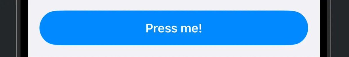
Button("Press me!", action: {})
.buttonStyle(.compositionFilled())
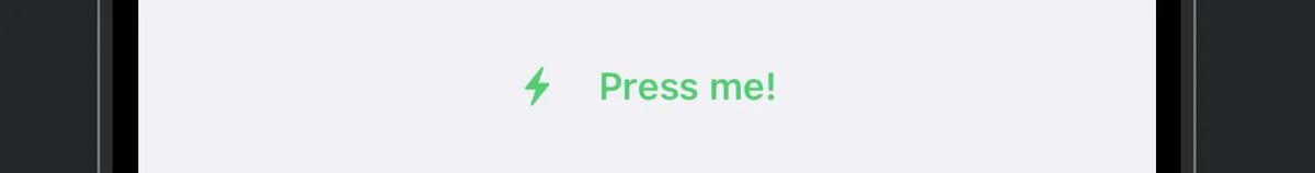
To achieve a more complex style, we can configure all the properties in our ButtonStyle initialiser.
Button("Press me!", action: {})
.buttonStyle(
.compositionText(
color: .accent,
size: .custom(height: 40),
icon: .leading(.AppIcon.bolt)
)
)
…and that’s how compositional idiomatic SwiftUI design systems work. Hey, maybe this isn’t so bad after all.
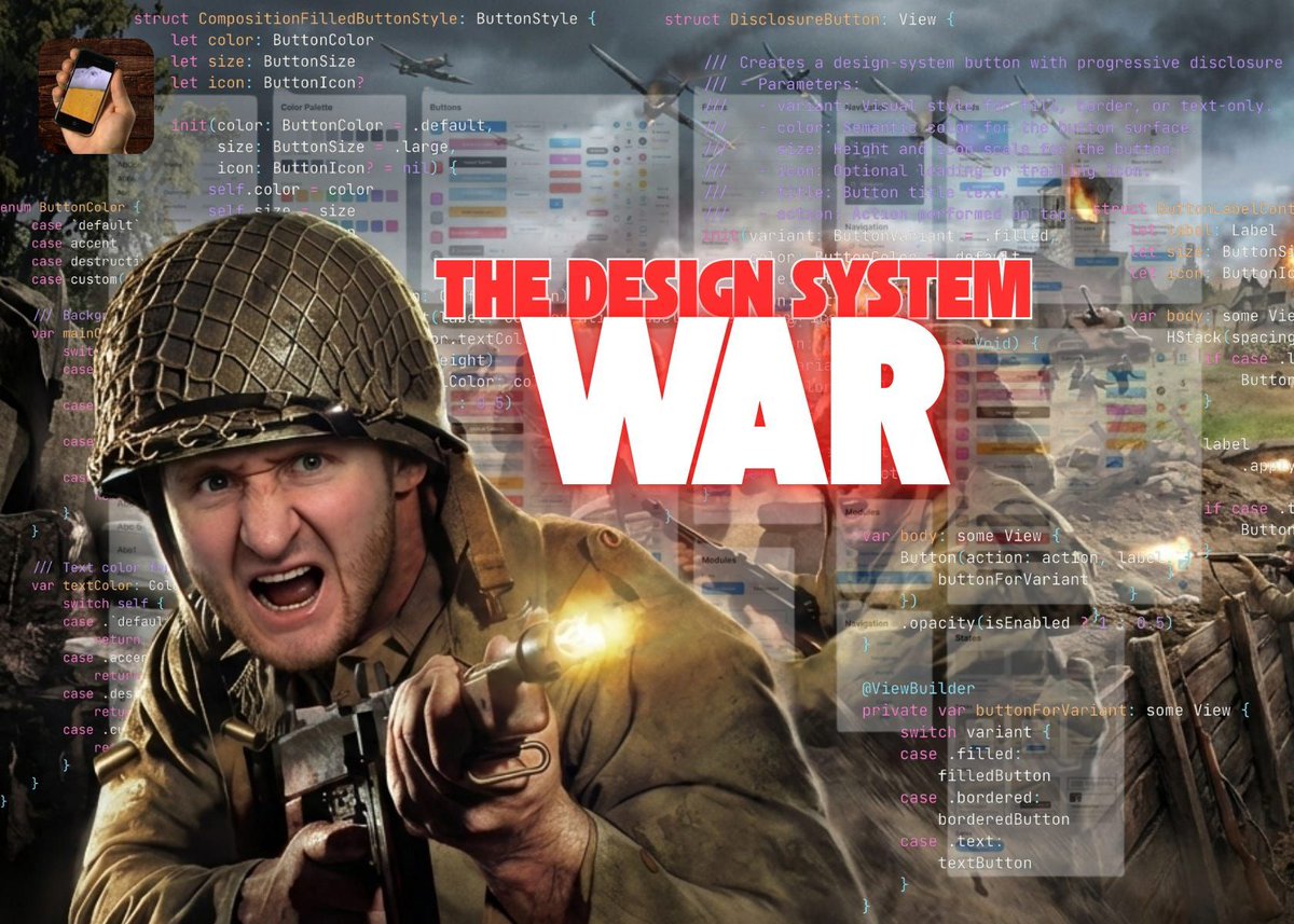
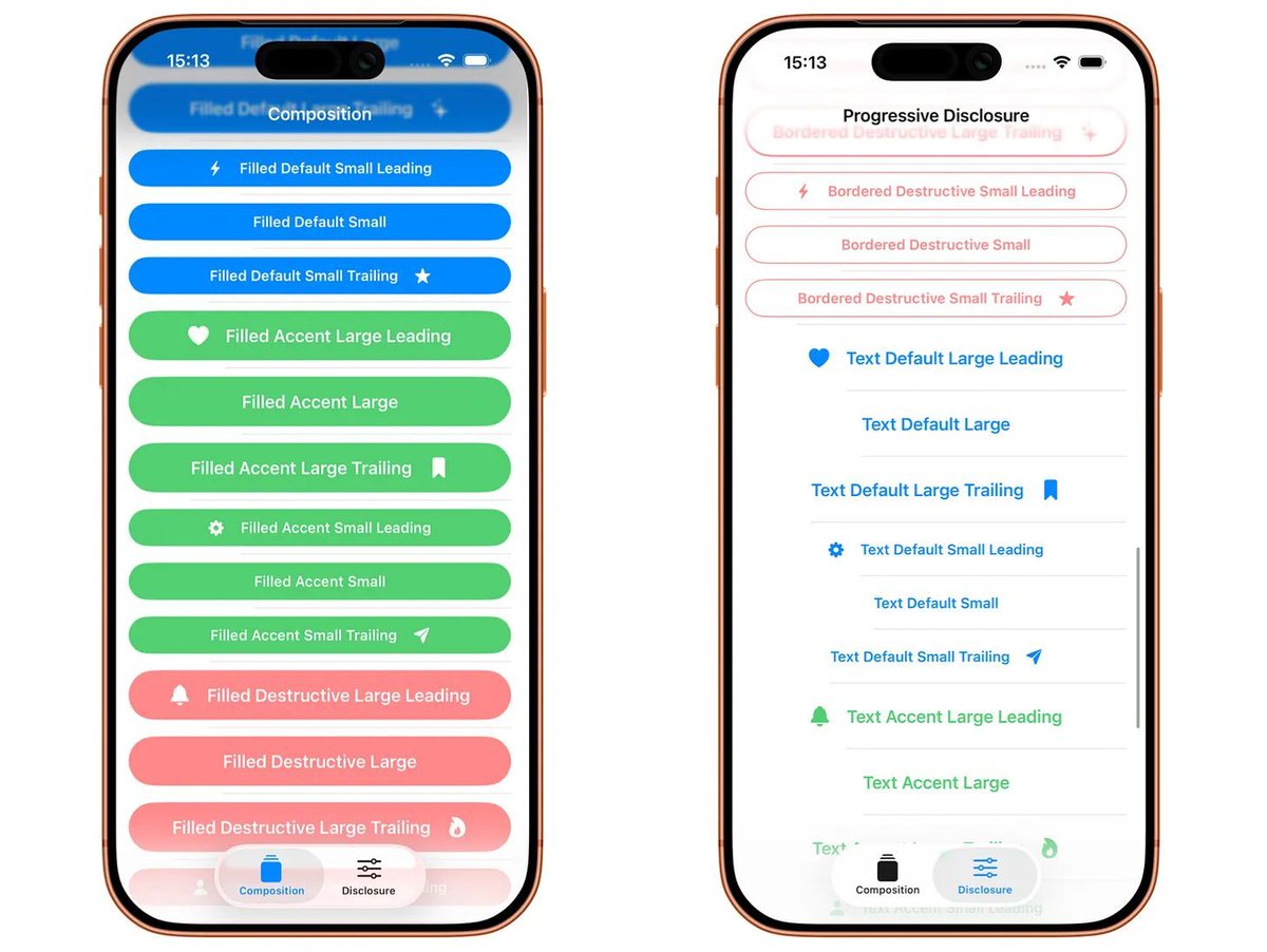
Read “The SwiftUI Design System War: Composition vs Progressive Disclosure” 🎨 blog.jacobstechtavern.com/p/…
1
9
818
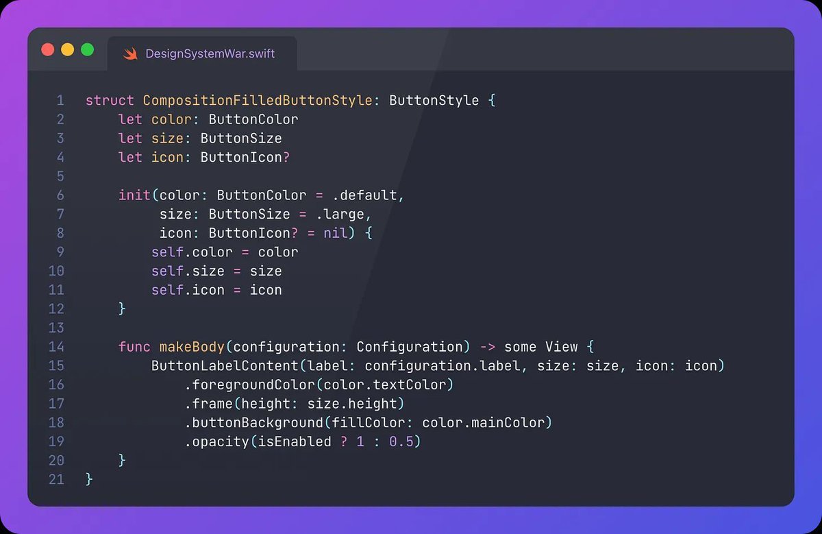
In my sample SwiftUI design system, we are implementing a struct that conforms to the ButtonStyle protocol (screenshot 1):
The protocol method makeBody(configuration: Configuration) is the key here. Configuration contains the labelproperty, of type ButtonStyleConfiguration.Label. This is the label you initialise inside the basic SwiftUI button:
Button(label: <#T##() -> Label#>, action: <#T##() -> Void#>)
Our implementation of makeBody returns a view that wraps the original label, allowing us to apply styling to the view with colour, sizing, background, opacity, shadows, gradients, animation, or anything else we choose.
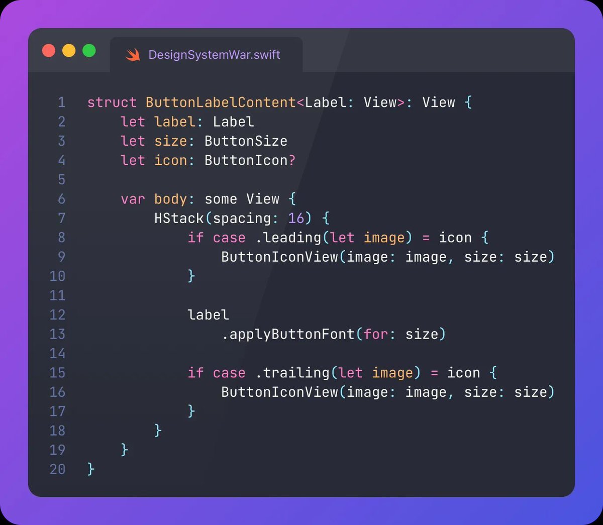
This ButtonLabelContent is a shared generic view (we also use it in the other design system!) that configures the arrangement of the button label view alongside any icon we may want to include. (screenshot 2)
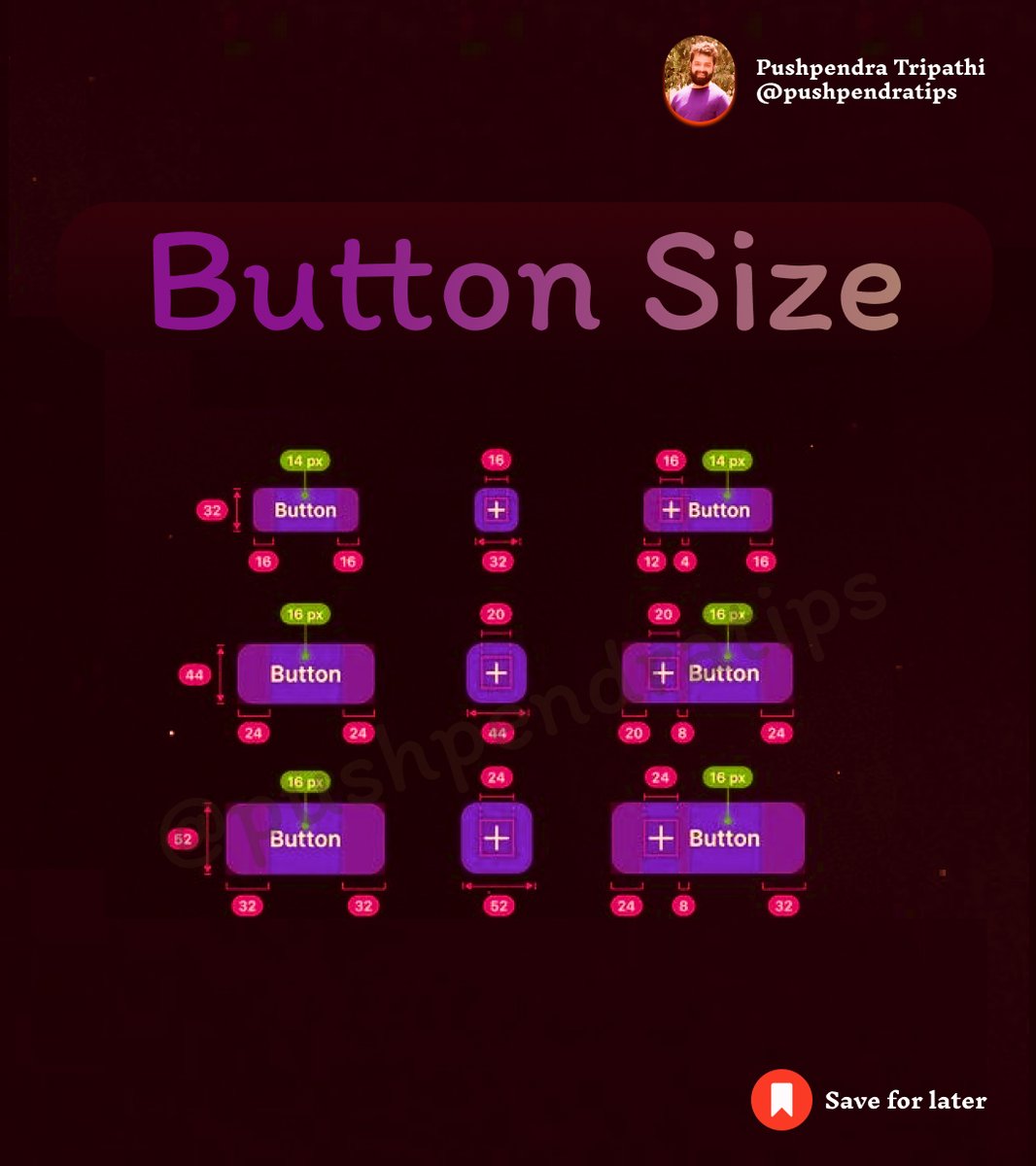
ButtonColor, ButtonSize, and ButtonIcon are some simple enums, also shared between the twin design systems. They use a neat switching approach over each property, while including the ability to configure custom sizes, colours, or icons using enum associated values. (screenshot 3)
Read “The SwiftUI Design System War: Composition vs Progressive Disclosure” 🎨 blog.jacobstechtavern.com/p/…

11
1,334

10 Mar 2025
🎯 Button Size
#ButtonSize #HTMLButton #CSSButton #ResponsiveButton #UIButton #BigButton #SmallButton #CSSStyling #CustomButton #BootstrapButton #TailwindButton #ReactButton #NextJSUIButton #html #css #react #javascript
26
16
91
3,610

30 May 2023
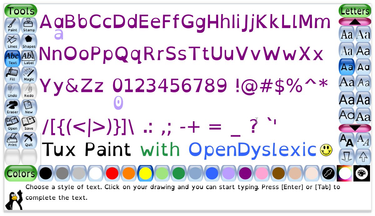
Here's the @OpenDyslexic font in Tux Paint. Version 0.9.31 will allow specifying an alternate font for the UI.
(This is `tuxpaint --1920x1080 --buttonsize=auto --uifont=OpenDyslexic`)
2
6
41
1,022
11 Apr 2023
Here's 1920x1080 with 'auto' buttonsize (1st picture), and maxed out buttonsize (135px) (2nd picture).
Not perfect, but way better than before (3rd picture)!
7
501

14 Jan 2023
Great job!! What do you plan to break your fast with?
1
1
39

13 Jan 2023
No im having food poisoning but its just taking FOREVER to resolve lol… if it doesnt get better in the next day he thinks i may have appendicitis which is scary :/
1
2
24


12 Nov 2022
i think in france food is healthier than in the us but the thing is we don’t have any cals on the menu ☠️
1
2
11 Nov 2022
we don’t have extra topping in france in think ?? Like all you have to choose is sweet or salty
1
2