
Create the components.json manually
{
"$schema": "ui.shadcn.com/schema.json",
…
"tailwind": {
"config": "",
"css": "src/index.scss",
"baseColor": "neutral",
"cssVariables": true
},
…
}
It would be nice ti gave a proper way tho
1
1
2
332

Jan 27
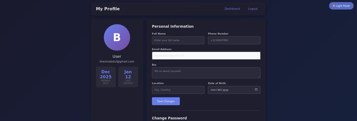
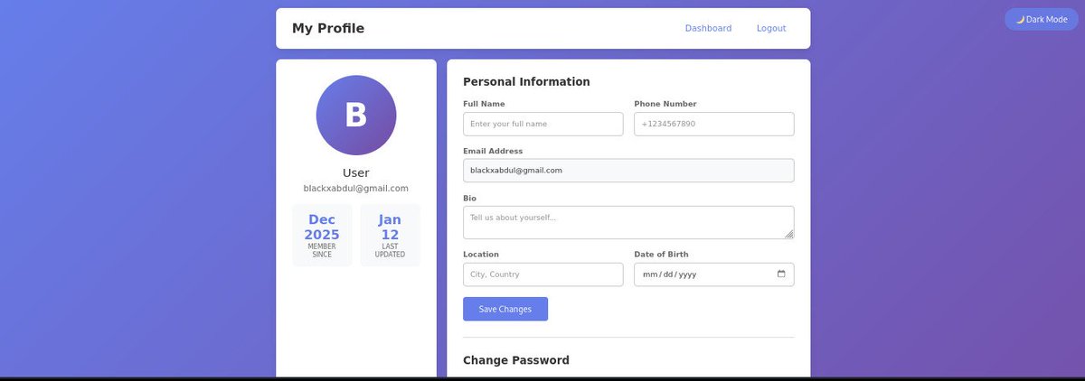
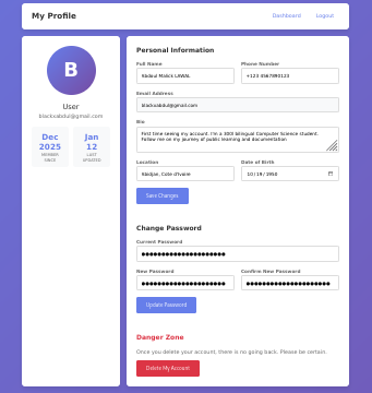
Day 7 - Added Dark Mode to MiniSocialApp — but only where it matters.🌗
Dashboard & Profile support theme switching, while the login page stays light, simple, and focused.
Good UX = intention over decoration.
#WebDev #PHP #DarkMode #UX #BuildInPublic #cssvariables


Jan 20

Day 6 🚀- Built a full user profile system for MiniSocialApp:
✔️ Update personal info
✔️ Change password securely
✔️ Delete account safely
Learning how real apps handle user data, security, and account lifecycle—one feature at a time.
#BackendDev #PHP #WebDev #LearningInPublic

1
1
38

Jan 17
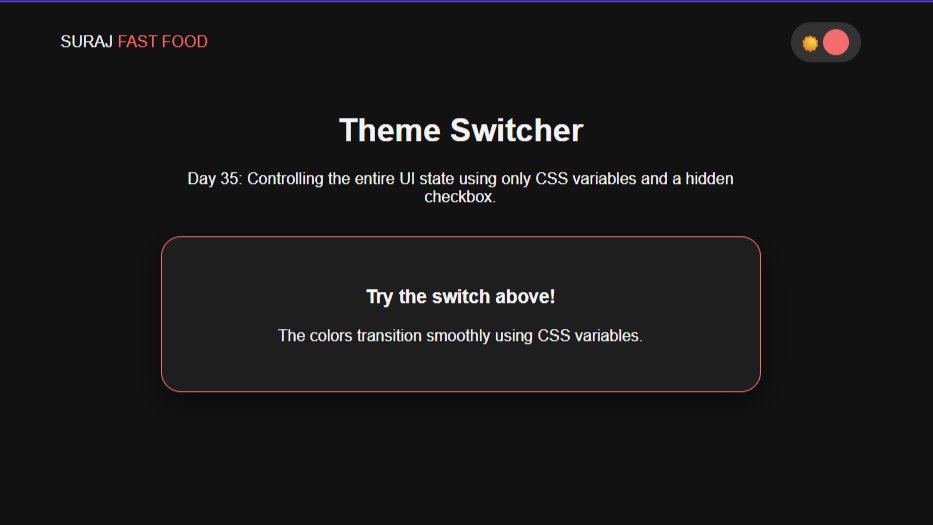
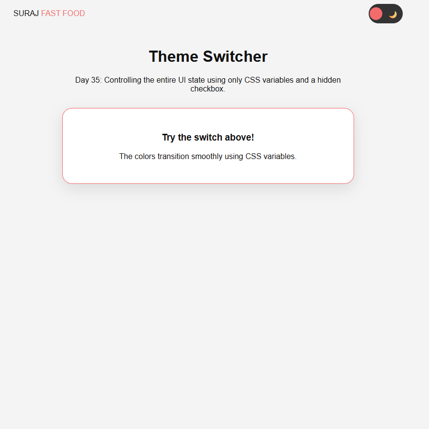
Day (35/100) #100DaysOfWEB
Master of Themes: Pure CSS Dark Mode
For Day 35 of my #100DaysOfWEB journey, I built a global theme switcher.
#100DaysOfCode #WebDesign #DarkMode #CSSVariables #Frontend #CleanCode #BuildInPublic
1
2
14

Custom properties refresher:
Custom properties are defined like:
They cascade, can be scoped, and accept fallbacks with `var(--primary, #000)`.
#CSSVariables

1
22
Quick contrast: variables vs functions
•CSS custom properties (variables): hold a single value, used with `var(--name)`.
•CSS custom functions: compute values from arguments, used like `--fn(…)`.
Think “value vs formula”.
#CSS #CSSVariables
1
3

16 Nov 2025
By using CSS Variables, you only define your themes once and manage all changes in a single block of CSS. It's clean, scalable, and respects user preference by default! Happy theming! 🎨
#CSSVariables #FrontEndDeveloper
15


If you’re using this approach — good job 😄
#ReactJS #TailwindCSS #FrontendDevelopment #DarkMode #WebDesign #UX #UIDesign #CSSVariables #WebDev #ReactTips
6

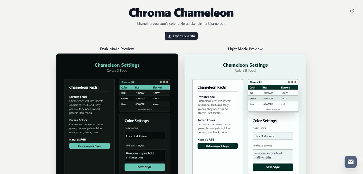
13 Oct 2025
Instantly preview and customize CSS color themes with Chroma Chameleon! A must-have tool for developers and designers. chromachameleon.app
#DarkPreview,#LightPreview,#SemanticColors,#UIMockup,#VisualFeedback,#RapidPrototyping,#CSSVariables,#FrontendStyling,#LivePreview
25

6 Oct 2025
Pure #CSS Elevator: A Creative Interactive Simulation: Pure #CSS Elevator is an innovative project showcasing the capabilities of modern CSS as a state machine.This interactive CSS project utilizes advanced features like #CSSvariables and transitions,… medianic.co.uk/2025/10/06/pu…
2

23 Sep 2025
Every feature I add feels cleaner and easier to manage.
#frontendbootcamp #cssvariables #webdevelopment #darkmode #uidevelopment #frontendengineering #buildinpublic #codingjourney
3

23 Sep 2025
Complete HTML control, visual/CSS sync, GraphQL and all data as JSON APIs, component architecture, Git-like workflows, staging and deployment.
Modern development, visually accessible."
#wordpress #grapql #restapi #webdev #CSS #cssvariables ...
2
73

14 Sep 2025
Design consistent & scalabil? Folosește variabile CSS! Scrie mai puțin cod, obține mai mult impact. 🚀 #CSSVariables

5

7 Sep 2025
/approvals
- allow: read/write files, run local shell commands, start/stop local servers, install packages
You are a precise build/dev agent. Do everything idempotently and non-interactively.
Goal: In the current workspace, (1) create or reuse `web/` as a Next.js (latest stable) React TypeScript app,
(2) integrate Tailwind CSS shadcn/ui, (3) mimic `npx v0@latest init`-style import structure (`components/`, `lib/`),
(4) implement a sample page with a shadcn Card and Dialog ("Hello v0 Clone"), and (5) run a dev server over HTTP with HMR
on port 3100 (fallback 3200). Provide Local/Network URL and PID. Create a README with setup steps.
=== Operating rules ===
- Use Node >=18. If Node <18, stop with an explicit error.
- Prefer pnpm; else yarn; else npm. Use the corresponding DLX (`pnpm dlx` or `npx`) for CLIs.
- If a monorepo exists, work ONLY inside `web/`. Do not run root builds.
- If Next <15 is installed, use `next.config.mjs`; if >=15, use `next.config.ts`.
- All steps must be repeatable (safe to run twice).
- If port 3100 is busy, use 3200 and print why.
- Verify server is reachable and the HTML contains "Hello v0 Clone".
=== Plan ===
1) Preconditions: check Node, choose package manager (PM) and DLX.
2) Project: create `web/` via create-next-app if missing; otherwise reuse. Force Next/React to latest.
3) Tailwind: install configure (content paths include `app` and `components`).
4) shadcn/ui: init add `button`, `card`, `dialog`. Create `components.json`.
5) v0-style structure: ensure `components/` and `lib/utils.ts` (`cn()` helper) exist; alias `@/*`.
6) Files: write `globals.css`, `layout.tsx`, `page.tsx`, `tailwind.config.ts`, `postcss.config.js`,
`next.config.ts` or `.mjs`, `README.md`. Adjust `package.json` scripts to use port 3100.
7) Install deps; start dev server (3100 or fallback 3200) in background. Print Local/Network URLs and PID.
8) Verify GET / returns 200 and HTML includes "Hello v0 Clone".
=== Execute ===
```bash
set -euo pipefail
# 1) Preconditions
if ! command -v node >/dev/null 2>&1; then
echo "ERROR: Node.js is required (v18 )."; exit 1
fi
NODE_MAJOR=$(node -p "process.versions.node.split('.')[0]" || echo 0)
if [ "${NODE_MAJOR}" -lt 18 ]; then
echo "ERROR: Node v18 required. Current: $(node -v)"; exit 1
fi
if command -v pnpm >/dev/null 2>&1; then PM="pnpm"; DLX="pnpm dlx"
elif command -v yarn >/dev/null 2>&1; then PM="yarn"; DLX="npx"
else PM="npm"; DLX="npx"; fi
echo "Using PM=${PM}, DLX=${DLX}"
PROJECT_DIR="web"
mkdir -p "${PROJECT_DIR}"
# 2) Project scaffold (create-next-app only if not already a Next app)
if [ ! -f "${PROJECT_DIR}/package.json" ]; then
if [ "${PM}" = "pnpm" ]; then
pnpm dlx create-next-app@latest "${PROJECT_DIR}" --ts --eslint --app --use-pnpm --import-alias "@/*" --no-tailwind
else
npx --yes create-next-app@latest "${PROJECT_DIR}" --ts --eslint --app --import-alias "@/*" --no-tailwind
fi
fi
cd "${PROJECT_DIR}"
# Ensure latest Next/React (handles 14→15 upgrade)
if [ "${PM}" = "pnpm" ]; then
pnpm up next@latest react@latest react-dom@latest eslint-config-next@latest -L
elif [ "${PM}" = "yarn" ]; then
yarn add next@latest react@latest react-dom@latest eslint-config-next@latest
else
npm i -E next@latest react@latest react-dom@latest eslint-config-next@latest
fi
# 3) Tailwind friends
if [ "${PM}" = "pnpm" ]; then
pnpm add -D tailwindcss postcss autoprefixer tailwindcss-animate
pnpm add class-variance-authority tailwind-merge lucide-react clsx
elif [ "${PM}" = "yarn" ]; then
yarn add -D tailwindcss postcss autoprefixer tailwindcss-animate
yarn add class-variance-authority tailwind-merge lucide-react clsx
else
npm i -D tailwindcss postcss autoprefixer tailwindcss-animate
npm i class-variance-authority tailwind-merge lucide-react clsx
fi
npx --yes tailwindcss init -p >/dev/null 2>&1 || ${DLX} tailwindcss init -p >/dev/null 2>&1 || true
# 4) shadcn/ui init components
# components.json first (idempotent)
cat > components.json <<'JSON'
{
"$schema": "ui.shadcn.com/schema.json",
"style": "default",
"rsc": true,
"tsx": true,
"tailwind": {
"config": "tailwind.config.ts",
"css": "app/globals.css",
"baseColor": "slate",
"cssVariables": true
},
"aliases": {
"components": "@/components",
"utils": "@/lib/utils"
}
}
JSON
# Try CLI (preferred)
(${DLX} shadcn-ui@latest init -y >/dev/null 2>&1 && \
${DLX} shadcn-ui@latest add button card dialog >/dev/null 2>&1) || true
# 5) v0-style structure and aliases
mkdir -p app components/ui lib
# lib/utils.ts (cn helper)
cat > lib/utils.ts <<'TS'
import { type ClassValue } from "clsx"
import { clsx } from "clsx"
import { twMerge } from "tailwind-merge"
export function cn(...inputs: ClassValue[]) {
return twMerge(clsx(inputs))
}
TS
# 6) Config & pages
# tailwind.config.ts (shadcn-ready)
cat > tailwind.config.ts <<'TS'
import type { Config } from "tailwindcss"
export default {
darkMode: ["class"],
content: ["./app/**/*.{ts,tsx}", "./components/**/*.{ts,tsx}"],
theme: {
container: {
center: true,
padding: "2rem",
screens: { "2xl": "1400px" }
},
extend: {
colors: {
border: "hsl(var(--border))",
input: "hsl(var(--input))",
ring: "hsl(var(--ring))",
background: "hsl(var(--background))",
foreground: "hsl(var(--foreground))",
primary: {
DEFAULT: "hsl(var(--primary))",
foreground: "hsl(var(--primary-foreground))"
},
secondary: {
DEFAULT: "hsl(var(--secondary))",
foreground: "hsl(var(--secondary-foreground))"
},
destructive: {
DEFAULT: "hsl(var(--destructive))",
foreground: "hsl(var(--destructive-foreground))"
},
muted: {
DEFAULT: "hsl(var(--muted))",
foreground: "hsl(var(--muted-foreground))"
},
accent: {
DEFAULT: "hsl(var(--accent))",
foreground: "hsl(var(--accent-foreground))"
},
popover: {
DEFAULT: "hsl(var(--popover))",
foreground: "hsl(var(--popover-foreground))"
},
card: {
DEFAULT: "hsl(var(--card))",
foreground: "hsl(var(--card-foreground))"
}
},
borderRadius: {
lg: "var(--radius)",
md: "calc(var(--radius) - 2px)",
sm: "calc(var(--radius) - 4px)"
},
keyframes: {
"accordion-down": { from: { height: "0" }, to: { height: "var(--radix-accordion-content-height)" } },
"accordion-up": { from: { height: "var(--radix-accordion-content-height)" }, to: { height: "0" } }
},
animation: {
"accordion-down": "accordion-down 0.2s ease-out",
"accordion-up": "accordion-up 0.2s ease-out"
}
}
},
plugins: [require("tailwindcss-animate")]
} satisfies Config
TS
# postcss
cat > postcss.config.js <<'JS'
module.exports = {
plugins: {
tailwindcss: {},
autoprefixer: {}
}
};
JS
# globals.css (CSS variables included)
mkdir -p app
cat > app/globals.css <<'CSS'
@tailwind base;
@tailwind components;
@tailwind utilities;
@layer base {
:root {
--background: 0 0% 100%;
--foreground: 222.2 84% 4.9%;
--card: 0 0% 100%;
--card-foreground: 222.2 84% 4.9%;
--popover: 0 0% 100%;
--popover-foreground: 222.2 84% 4.9%;
--primary: 221.2 83.2% 53.3%;
--primary-foreground: 210 40% 98%;
--secondary: 210 40% 96.1%;
--secondary-foreground: 222.2 47.4% 11.2%;
--muted: 210 40% 96.1%;
--muted-foreground: 215.4 16.3% 46.9%;
--accent: 210 40% 96.1%;
--accent-foreground: 222.2 47.4% 11.2%;
--destructive: 0 84.2% 60.2%;
--destructive-foreground: 210 40% 98%;
--border: 214.3 31.8% 91.4%;
--input: 214.3 31.8% 91.4%;
--ring: 221.2 83.2% 53.3%;
--radius: 0.5rem;
}
.dark {
--background: 222.2 84% 4.9%;
--foreground: 210 40% 98%;
--card: 222.2 84% 4.9%;
--card-foreground: 210 40% 98%;
--popover: 222.2 84% 4.9%;
--popover-foreground: 210 40% 98%;
--primary: 217.2 91.2% 59.8%;
--primary-foreground: 222.2 47.4% 11.2%;
--secondary: 217.2 32.6% 17.5%;
--secondary-foreground: 210 40% 98%;
--muted: 217.2 32.6% 17.5%;
--muted-foreground: 215 20.2% 65.1%;
--accent: 217.2 32.6% 17.5%;
--accent-foreground: 210 40% 98%;
--destructive: 0 62.8% 30.6%;
--destructive-foreground: 210 40% 98%;
--border: 217.2 32.6% 17.5%;
--input: 217.2 32.6% 17.5%;
--ring: 224.3 76.3% 48%;
}
* { @apply border-border; }
body { @apply bg-background text-foreground; }
}
CSS
# layout.tsx
cat > app/layout.tsx <<'TSX'
import "./globals.css"
import type { Metadata } from "next"
export const metadata: Metadata = {
title: "v0 Clone",
description: "Next Tailwind shadcn/ui boilerplate"
}
export default function RootLayout({ children }: { children: React.ReactNode }) {
return (
<html lang="en">
<body>{children}</body>
</html>
)
}
TSX
# page.tsx (Card Dialog sample)
cat > app/page.tsx <<'TSX'
"use client";
import { Card, CardHeader, CardTitle, CardContent, CardFooter } from "@/components/ui/card"
import { Button } from "@/components/ui/button"
import { Dialog, DialogContent, DialogHeader, DialogTitle, DialogTrigger } from "@/components/ui/dialog"
import { useState } from "react"
export default function Page() {
const [open, setOpen] = useState(false)
return (
<main className="min-h-dvh grid place-items-center p-6">
<Card className="w-full max-w-md border rounded-2xl shadow">
<CardHeader>
<CardTitle className="text-center text-2xl">Hello v0 Clone</CardTitle>
</CardHeader>
<CardContent className="text-center text-sm text-muted-foreground">
Next Tailwind shadcn/ui boilerplate
</CardContent>
<CardFooter className="flex justify-center">
<Dialog open={open} onOpenChange={setOpen}>
<DialogTrigger asChild>
<Button size="lg">Open Modal</Button>
</DialogTrigger>
<DialogContent className="rounded-2xl">
<DialogHeader>
<DialogTitle>v0 模倣セットアップ完了</DialogTitle>
</DialogHeader>
<div className="text-sm text-muted-foreground">
ここに追加テキストや v0 生成物のプレビューを表示できます。
</div>
</DialogContent>
</Dialog>
</CardFooter>
</Card>
</main>
)
}
TSX
# next config (choose ts or mjs based on Next major)
NEXT_VER=$(node -e "try{console.log(require('next/package.json').version)}catch{console.log('0.0.0')}" || echo "0.0.0")
NEXT_MAJOR=$(node -e "console.log( '${NEXT_VER}'.split('.')[0]||0)")
if [ "${NEXT_MAJOR}" -ge 15 ]; then
cat > next.config.ts <<'TS'
import type { NextConfig } from "next"
const nextConfig: NextConfig = { reactStrictMode: true }
export default nextConfig
TS
else
cat > next.config.mjs <<'JS'
/** @type {import('next').NextConfig} */
const nextConfig = { reactStrictMode: true }
export default nextConfig
JS
fi
# post install: ensure package.json scripts use port 3100
node <<'NODE'
const fs = require('fs')
const p = JSON.parse(fs.readFileSync('package.json','utf8'))
p.scripts = Object.assign({}, p.scripts, {
dev: "next dev -p 3100",
build: "next build",
start: "next start -p 3100",
lint: p.scripts && p.scripts.lint ? p.scripts.lint : "next lint"
})
fs.writeFileSync('package.json', JSON.stringify(p,null,2))
NODE
# 7) Install
if [ "${PM}" = "pnpm" ]; then pnpm i
elif [ "${PM}" = "yarn" ]; then yarn
else npm i; fi
# Fallback shadcn components if CLI didn't generate them
if [ ! -f "components/ui/button.tsx" ]; then
cat > components/ui/button.tsx <<'TSX'
import * as React from "react"
import { cn } from "@/lib/utils"
export interface ButtonProps extends React.ButtonHTMLAttributes<HTMLButtonElement> {}
export const Button = React.forwardRef<HTMLButtonElement, ButtonProps>(
({ className, ...props }, ref) => (
<button ref={ref} className={cn("inline-flex items-center justify-center h-10 px-4 py-2 rounded-md bg-primary text-primary-foreground hover:opacity-90 transition", className)} {...props} />
)
)
Button.displayName = "Button"
TSX
fi
if [ ! -f "components/ui/card.tsx" ]; then
cat > components/ui/card.tsx <<'TSX'
import * as React from "react"
import { cn } from "@/lib/utils"
export function Card({ className, ...props }: React.HTMLAttributes<HTMLDivElement>) {
return <div className={cn("bg-card text-card-foreground border rounded-lg", className)} {...props} />
}
export function CardHeader({ className, ...props }: React.HTMLAttributes<HTMLDivElement>) {
return <div className={cn("p-6 border-b", className)} {...props} />
}
export function CardTitle({ className, ...props }: React.HTMLAttributes<HTMLHeadingElement>) {
return <h3 className={cn("text-xl font-semibold leading-none tracking-tight", className)} {...props} />
}
export function CardContent({ className, ...props }: React.HTMLAttributes<HTMLDivElement>) {
return <div className={cn("p-6 pt-0", className)} {...props} />
}
export function CardFooter({ className, ...props }: React.HTMLAttributes<HTMLDivElement>) {
return <div className={cn("p-6 pt-0", className)} {...props} />
}
TSX
fi
if [ ! -f "components/ui/dialog.tsx" ]; then
cat > components/ui/dialog.tsx <<'TSX'
"use client"
import * as React from "react"
import { cn } from "@/lib/utils"
export function Dialog({ open, onOpenChange, children }: { open?: boolean; onOpenChange?: (o:boolean)=>void; children: React.ReactNode }) {
React.useEffect(() => {}, [open])
return <div data-dialog-open={open ? "true" : "false"}>{children}</div>
}
export function DialogTrigger({ asChild, children, ...props }: any) {
const child = React.isValidElement(children) ? children : <button>{children}</button>
return React.cloneElement(child as any, { ...props, onClick: (e:any) => { child.props?.onClick?.(e); const root = (e.target as HTMLElement).closest("[data-dialog-open]"); if (root){ const isOpen = root.getAttribute("data-dialog-open")==="true"; root.setAttribute("data-dialog-open", (!isOpen).toString()) } } })
}
export function DialogContent({ className, children }: React.HTMLAttributes<HTMLDivElement>) {
return <div className={cn("fixed inset-0 z-50 grid place-items-center p-4", className)}>
<div className="fixed inset-0 bg-black/40" />
<div className="relative z-10 w-full max-w-md rounded-lg bg-background p-6 shadow">{children}</div>
</div>
}
export function DialogHeader({ className, ...props }: React.HTMLAttributes<HTMLDivElement>) {
return <div className={cn("mb-2", className)} {...props} />
}
export function DialogTitle({ className, ...props }: React.HTMLAttributes<HTMLHeadingElement>) {
return <h2 className={cn("text-lg font-semibold", className)} {...props} />
}
TSX
fi
# 8) README
cat > README.md <<'MD'
# v0 Clone (web)
Next.js (latest) React TypeScript Tailwind CSS shadcn/ui
## Setup
- Install: `pnpm i` (or `yarn` / `npm i`)
- Dev (HTTP HMR): `pnpm dev` → http://localhost:3100
- If 3100 busy, this setup may use 3200 and will print the URL.
- Build/Start: `pnpm build && pnpm start`
## Notes
- v0 生成物は `components/` に置けば `@/components/...` で import 可能。
- shadcn/ui は `components/ui/` に展開。CLI が使えない環境では最小限のフォールバック実装を自動生成。
- Next 15 は `next.config.ts`、Next 14系では `next.config.mjs` を使用。
MD
# Start dev server (3100 → fallback 3200), background, store PID
PORT=3100
if lsof -nP -iTCP:${PORT} -sTCP:LISTEN >/dev/null 2>&1; then
echo "Port ${PORT} busy; switching to 3200"
PORT=3200
fi
LOG="dev-${PORT}.log"
PIDFILE=".next-dev-${PORT}.pid"
( ${PM} -s dev -p ${PORT} > "${LOG}" 2>&1 & echo $! > "${PIDFILE}" ) || ( ${PM} dev -p ${PORT} > "${LOG}" 2>&1 & echo $! > "${PIDFILE}" )
# Wait for server
for i in $(seq 1 60); do
if nc -z localhost ${PORT} >/dev/null 2>&1; then break; fi
sleep 1
done
STATUS=$(curl -s -o /dev/null -w "%{http_code}" "http://localhost:${PORT}" || true)
TITLE=$(curl -s "http://localhost:${PORT}" | sed -n 's:.*<title>\(.*\)</title>.*:\1:p' | head -n1)
echo "HTTP status on ${PORT}: ${STATUS}"
echo "HTML <title>: ${TITLE:-unknown}"
PID=$(cat "${PIDFILE}" 2>/dev/null || echo "unknown")
LOCAL_URL="http://localhost:${PORT}"
NET_URL=$( (sed -n 's/^ *- Network: *\(http[^ ]*\).*/\1/p' "${LOG}" | tail -n1) || true )
echo "PID: ${PID}"
echo "Local URL: ${LOCAL_URL}"
echo "Network URL: ${NET_URL:-(check your LAN IP)}"
# Assert page content
HAVE_HELLO=$(curl -s "http://localhost:${PORT}" | grep -c "Hello v0 Clone" || true)
if [ "${HAVE_HELLO}" -eq 0 ]; then
echo "WARNING: 'Hello v0 Clone' not detected in HTML. Check app/page.tsx and HMR."
fi
1
3
113

26 Aug 2025
CSS variables have rendered preprocessors like Sass obsolete! With native variable support, we can now achieve dynamic styling without the need for additional tools. This simplifies our workflow and keeps everything within good ol' CSS. #CSSVariables #NoMoreSass
12

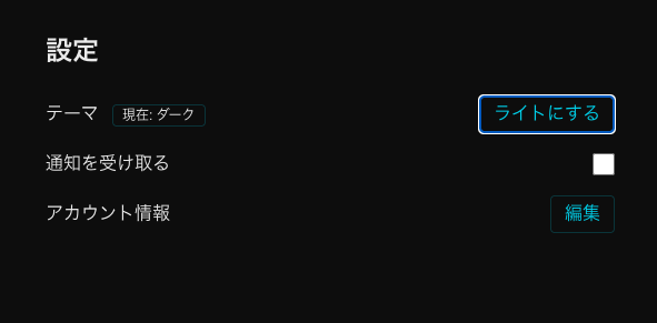
②
対策としてテーマ用CSS変数を導入し、[data-theme="light|dark"] で色を切替。全コンポーネントの固定色を変数参照に統一し、ThemeInitで起動時に適用+localStorageで永続化。これで全ページ即時ライト/ダーク切替が可能に。
#CSSVariables #UI開発 #WebDev
53

10 Aug 2025
Using Atomic Design with shadcn in a Next.js project:
When installing shadcn components, you can configure your components.json so ui maps directly to your atoms folder:
{
"$schema": "ui.shadcn.com/schema.json",
"style": "new-york",
"tsx": true,
"tailwind": {
"css": "app/globals.css",
"baseColor": "slate",
"cssVariables": true
},
"aliases": {
"components": "@/components",
"utils": "@/lib/utils",
"ui": "@/components/atoms", // Atoms go here
"lib": "@/lib",
"hooks": "@/hooks"
},
"iconLibrary": "lucide"
}
This ensures every generated shadcn UI element lands in components/atoms, perfectly aligned with Atomic Design.
30

5 Aug 2025
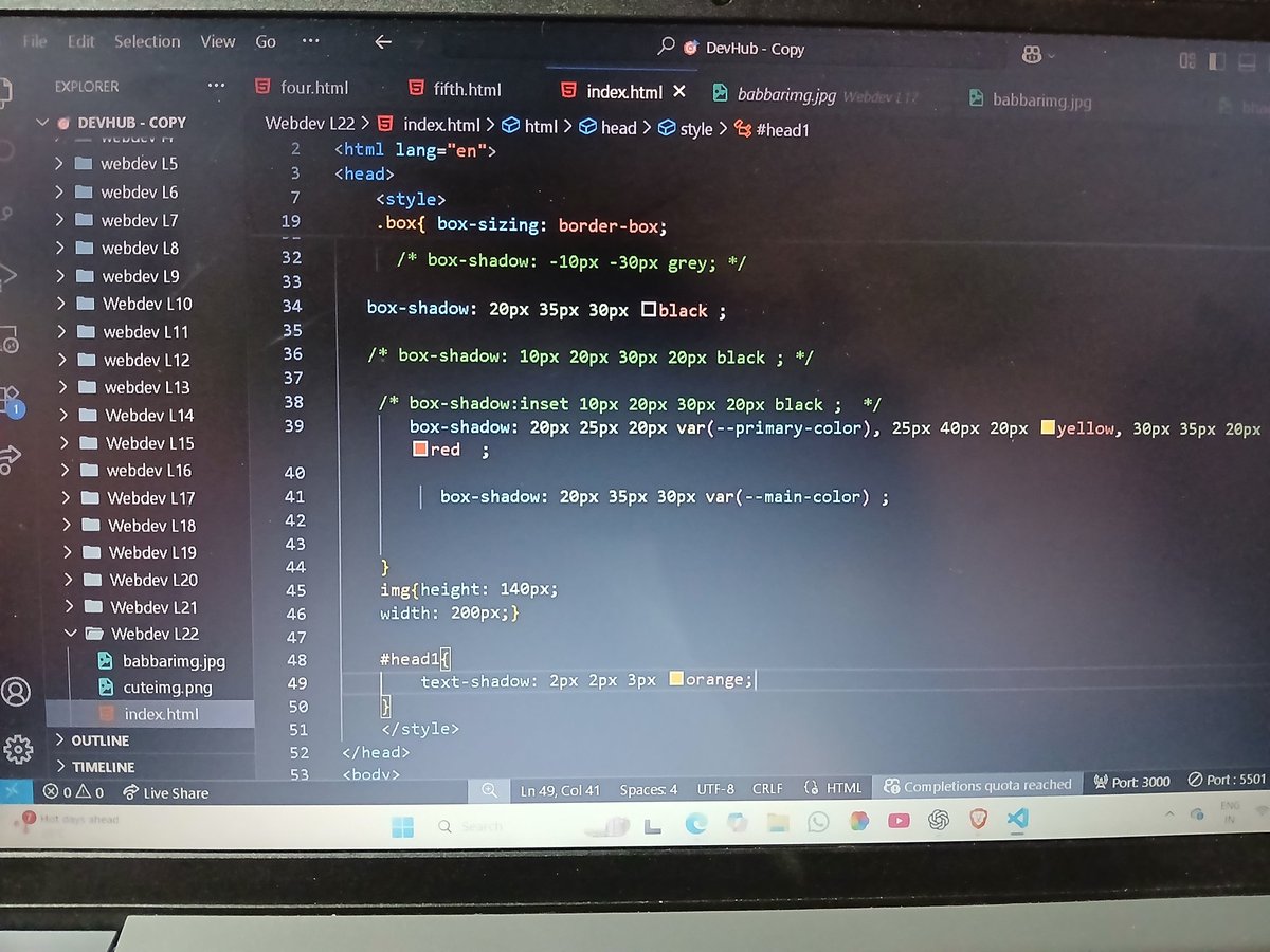
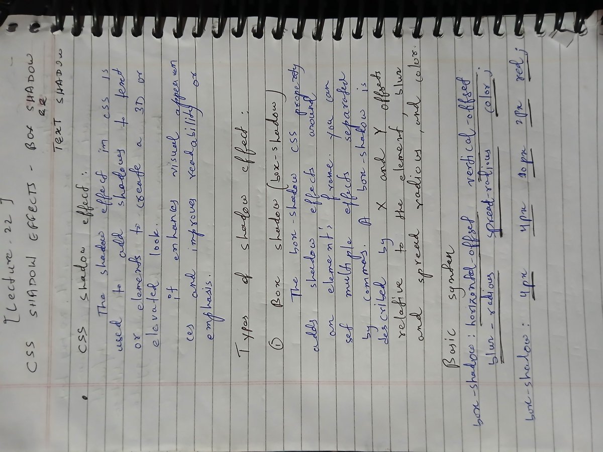
✅ Completed Lecture 22 of Love Babbar’s Web Dev Course
➤ Learned Box Shadow, Text Shadow, and CSS Custom Variables
➤ Improved UI design & reusable code through smart styling
#WebDev #CSS #FrontendDevelopment #BoxShadow #TextShadow #CSSVariables #100DaysOfCode #CodeHelp


5
28

11 Jul 2025
the fumabase.jsonc file has an option to hide the sidebar like you wanted
you can do other customizations there for colors and other cssVariables
I added you to the repo in case you want to try customizing it more, every commit will be deployed automatically
github.com/remorses/zod-v3-d…
1
37