
May 5
Build a high-end, responsive, full-stack landing page for a productivity SaaS called "Slate" using the exact specifications below.
### Tech Stack
- Vite React TypeScript
- Tailwind CSS
- lucide-react (for icons)
- gsap @gsap/react (for heading text animations via a reusable `SplitText` component)
### Global Typography & CSS
In `index.css`, use the following global resets, typography, Liquid Glass utilities, and 3D Card styles:
```css
@import "tailwindcss";
@layer base {
* {
font-family: 'Helvetica Neue', Helvetica, Arial, sans-serif;
font-weight: 200;
-webkit-font-smoothing: antialiased;
-moz-osx-font-smoothing: grayscale;
box-sizing: border-box;
}
body { background: #000; color: white; margin: 0; padding: 0; }
h1, h2, h3, h4, h5, h6 { font-weight: inherit; }
}
@layer utilities {
.liquid-glass {
background: rgba(255, 255, 255, 0.01);
background-blend-mode: luminosity;
backdrop-filter: blur(4px);
-webkit-backdrop-filter: blur(4px);
border: none;
box-shadow: inset 0 1px 1px rgba(255, 255, 255, 0.1);
position: relative;
overflow: hidden;
}
.liquid-glass::before {
content: '';
position: absolute;
inset: 0;
border-radius: inherit;
padding: 1.4px;
background: linear-gradient(180deg,
rgba(255,255,255,0.45) 0%, rgba(255,255,255,0.15) 20%,
rgba(255,255,255,0) 40%, rgba(255,255,255,0) 60%,
rgba(255,255,255,0.15) 80%, rgba(255,255,255,0.45) 100%);
-webkit-mask: linear-gradient(#fff 0 0) content-box, linear-gradient(#fff 0 0);
-webkit-mask-composite: xor;
mask-composite: exclude;
pointer-events: none;
}
.hero-fade-up {
opacity: 0;
animation: heroFadeUp 0.9s cubic-bezier(0.22, 1, 0.36, 1) forwards;
will-change: transform, opacity;
}
}
@keyframes heroFadeUp {
from { opacity: 0; transform: translateY(20px); }
to { opacity: 1; transform: translateY(0); }
}
/* 3D Glass Card Section Styles */
.section {
position: relative; min-height: 100vh; padding: 4vh 40px;
display: flex; align-items: center; justify-content: center;
overflow: hidden; background: #050607;
}
.section::before {
content: ""; position: absolute; inset: 0;
background:
linear-gradient(rgba(255,255,255,0.04) 1px, transparent 1px),
linear-gradient(90deg, rgba(255,255,255,0.04) 1px, transparent 1px);
background-size: 145px 145px; opacity: 0.45;
}
.section::after {
content: ""; position: absolute; inset: 0;
background:
radial-gradient(circle at center, transparent 35%, rgba(0,0,0,0.72)),
linear-gradient(to bottom, rgba(0,0,0,0.25), rgba(0,0,0,0.9));
}
.container { position: relative; z-index: 2; max-width: 1100px; width: 100%; margin: 0 auto; }
.header { margin-bottom: 24px; }
.header h1 { font-size: 38px; line-height: 1.1; letter-spacing: -1px; margin-bottom: 14px; font-weight: 600; }
.header p { font-size: 14px; line-height: 1.45; color: rgba(235,240,255,0.65); margin-bottom: 24px; max-width: 440px; }
.header p:last-child { margin-bottom: 0; }
.cards {
display: grid; grid-template-columns: repeat(3, 1fr); gap: 26px;
perspective: 1200px; transform-style: preserve-3d;
}
.card {
position: relative; height: 300px; border-radius: 42px; padding: 24px;
overflow: hidden; isolation: isolate;
background: linear-gradient(180deg, rgba(22,26,38,0.96) 0%, rgba(12,15,25,0.98) 48%, rgba(5,7,12,1) 100%);
border: 1px solid rgba(255,255,255,0.1);
box-shadow:
inset 0 1.5px 1px rgba(255,255,255,0.22),
inset 0 -18px 38px rgba(0,0,0,0.55),
inset 0 0 28px rgba(255,255,255,0.035),
0 2px 1px rgba(255,255,255,0.08),
0 18px 25px rgba(0,0,0,0.38),
0 42px 85px rgba(0,0,0,0.78);
transition: transform 0.45s ease, box-shadow 0.45s ease;
}
.card::before {
content: ""; position: absolute; inset: 0; border-radius: inherit; padding: 1.8px;
background: linear-gradient(145deg, var(--edge-bright) 0%, rgba(255,255,255,0.38) 9%, rgba(255,255,255,0.08) 32%, rgba(255,255,255,0.025) 58%, var(--edge-soft) 100%);
-webkit-mask: linear-gradient(#fff 0 0) content-box, linear-gradient(#fff 0 0);
-webkit-mask-composite: xor; mask-composite: exclude;
z-index: 5; pointer-events: none;
filter: drop-shadow(0 0 12px var(--edge-bright));
}
.card::after {
content: ""; position: absolute; left: -8%; right: -8%; bottom: -32px;
height: 138px; background: var(--bottom-glow); filter: blur(13px);
opacity: 1; z-index: 1;
}
.glass {
position: absolute; inset: 0; border-radius: inherit; z-index: 2;
background:
linear-gradient(115deg, rgba(255,255,255,0.18) 0%, rgba(255,255,255,0.05) 22%, transparent 45%),
radial-gradient(circle at 7% 5%, var(--corner-glow), transparent 45%),
radial-gradient(circle at 50% 112%, var(--base-glow), transparent 47%),
linear-gradient(180deg, rgba(255,255,255,0.055), rgba(255,255,255,0.01) 48%, rgba(255,255,255,0.04));
backdrop-filter: blur(32px); -webkit-backdrop-filter: blur(32px); pointer-events: none;
}
.glass::before {
content: ""; position: absolute; top: 0; left: 18px; right: 18px; height: 1px;
background: linear-gradient(90deg, transparent, rgba(255,255,255,0.55), transparent); opacity: 0.45;
}
.glass::after {
content: ""; position: absolute; inset: 0; border-radius: inherit;
background: linear-gradient(to bottom, rgba(0,0,0,0.02), rgba(0,0,0,0.28) 55%, rgba(0,0,0,0.08));
}
.depth {
position: absolute; inset: auto 18px -18px 18px; height: 38px; border-radius: 0 0 42px 42px;
background: linear-gradient(to bottom, rgba(255,255,255,0.12), rgba(0,0,0,0.65));
filter: blur(16px); opacity: 0.75; z-index: 0; pointer-events: none;
}
.card-content { position: relative; z-index: 6; display: flex; flex-direction: column; height: 100%; }
.icon-box {
width: 48px; height: 48px; border-radius: 12px; margin-bottom: 32px;
display: flex; align-items: center; justify-content: center;
background: linear-gradient(145deg, rgba(255,255,255,0.15), rgba(255,255,255,0.03)), rgba(8,10,16,0.72);
border: 1px solid var(--icon-border);
box-shadow: inset 0 1px 0 rgba(255,255,255,0.22), 0 0 22px var(--icon-glow), 0 10px 28px rgba(0,0,0,0.45);
}
.icon-box svg { width: 24px; height: 24px; stroke: white; stroke-width: 1.8; fill: none; filter: drop-shadow(0 0 8px var(--icon-glow)); }
.card h2 { font-size: 24px; line-height: 1; letter-spacing: -0.8px; margin-bottom: 13px; font-weight: 600; }
.card p { font-size: 15px; line-height: 1.32; color: rgba(235,240,255,0.68); max-width: 280px; margin-bottom: 18px; }
.card a { color: white; font-size: 14px; font-weight: 700; text-decoration: none; margin-top: auto; }
.card:hover {
transform: rotateX(3deg) rotateY(-3deg) translateY(-8px) translateZ(28px);
box-shadow:
inset 0 1.5px 1px rgba(255,255,255,0.26), inset 0 -22px 42px rgba(0,0,0,0.62), inset 0 0 34px rgba(255,255,255,0.045),
0 3px 1px rgba(255,255,255,0.08), 0 28px 35px rgba(0,0,0,0.48), 0 60px 110px rgba(0,0,0,0.88);
}
.orange {
--edge-bright: rgba(255,131,45,0.95); --edge-soft: rgba(255,247,151,1);
--corner-glow: rgba(255,115,35,0.32); --base-glow: rgba(255,89,30,0.82);
--icon-border: rgba(255,108,39,0.55); --icon-glow: rgba(255,88,24,0.75);
--bottom-glow: linear-gradient(to bottom, transparent 0%, rgba(255,61,20,0.25) 25%, rgba(255,76,24,0.85) 58%, rgba(255,247,155,1) 100%);
}
.blue {
--edge-bright: rgba(97,145,255,1); --edge-soft: rgba(214,255,255,1);
--corner-glow: rgba(91,139,255,0.34); --base-glow: rgba(89,120,255,0.84);
--icon-border: rgba(92,139,255,0.6); --icon-glow: rgba(84,130,255,0.75);
--bottom-glow: linear-gradient(to bottom, transparent 0%, rgba(75,106,255,0.25) 25%, rgba(86,118,255,0.85) 58%, rgba(218,255,255,1) 100%);
}
.green {
--edge-bright: rgba(73,255,139,1); --edge-soft: rgba(212,255,244,1);
--corner-glow: rgba(73,255,139,0.34); --base-glow: rgba(52,255,126,0.88);
--icon-border: rgba(74,255,143,0.6); --icon-glow: rgba(74,255,143,0.78);
--bottom-glow: linear-gradient(to bottom, transparent 0%, rgba(52,255,126,0.25) 25%, rgba(48,255,118,0.86) 58%, rgba(217,255,247,1) 100%);
}
.features { margin-top: 24px; display: flex; gap: 34px; color: rgba(235,240,255,0.65); font-size: 14px; }
.feature { display: flex; align-items: center; gap: 8px; position: relative; }
.feature:not(:last-child)::after {
content: ""; position: absolute; right: -17px; top: 50%;
transform: translateY(-50%); height: 12px; width: 1px;
background: rgba(255,255,255,0.15);
}
@media (max-width: 950px) {
.section { padding: 80px 24px; }
.cards { grid-template-columns: 1fr; max-width: 430px; }
.features { flex-wrap: wrap; }
}
Components & General Rules
Create a reusable VideoBackground component to handle <video autoPlay muted loop playsInline> strictly covering its container (absolute inset-0 w-full h-full object-cover).
It must accept a src prop, and an optional flip boolean prop (which applies style={{ transform: 'scaleX(-1)' }}).
1. Navbar
Layout: Absolute positioning to the top (absolute top-0 left-0 right-0 z-50), transparent (no fixed background bar, stroke, or overlay).
Padding: px-4 sm:px-6 lg:px-10 py-4 lg:py-5.
Left side: Contains an inline 22x22 SVG logo (Chevron diamond mark: d="M 256 256 L 128 256 L 0 128 L 128 128 Z M 256 128 L 128 128 L 0 0 L 128 0 Z") and wordmark "Slate".
Center: Navigation links.
Right: "Start today" button utilizing .liquid-glass class.
2. Hero Section
Has the primary VideoBackground positioned at z-0 using this source URL (must be horizontally flipped using flip prop):
d8j0ntlcm91z4.cloudfront.net……
Content z-10 container is aligned entirely to the LEFT side of the screen (flex-col items-start text-left).
Features a Notification Badge (Liquid Glass Pill).
Features a GSAP SplitText animated heading ("Grow Your Team <br /> Thriving") with an explicit textShadow: '0 2px 20px rgba(0,0,0,0.3)' styling.
Features subtext animated with CSS .hero-fade-up and staged staggered CTA buttons.
3. "How We Keep You Ahead" Section (3D CardSection)
Use the CSS .section logic and .card styling strictly as provided in index.css.
Three GlassCard components (theme="orange", theme="blue", theme="green").
Contains text: "How We Keep You Ahead®".
Has no background videos strictly built on the CSS backdrop-filters and animated 3D perspective transforms on hover.
4. Features Section
Layout is pure black background.
Holds a grid of 4 cards containing Lucide icons.
Hover interaction: The cards themselves use .liquid-glass. Inside each card container, there is an absolute VideoBackground with opacity-0 by default. On hover only, the video smoothly transitions to opacity-40 (group-hover:opacity-40).
Video Source for card backgrounds:
d8j0ntlcm91z4.cloudfront.net……
5. Benefits Section
pure black background section split into two columns.
Left column: Text content, bulleted list of benefits.
Right column: Large Statistics Block (liquid-glass). Inside this specific glass block, it contains a persistent VideoBackground constrained strictly inside the card with opacity-50.
Video Source strictly inside the Stats Card:
d8j0ntlcm91z4.cloudfront.net……
6. Testimonials Section
Grid of 3 testimonials (liquid-glass cards).
Hover interaction state: Track hover states using React useState(0). The VideoBackground exists in all three cards. By default, Card 0 (the first card) has its target video visible (opacity-50). As the user hovers over another card, the video smoothly shifts (opacity-0 -> opacity-50) to the currently hovered card exclusively.
Video source for these cards:
d8j0ntlcm91z4.cloudfront.net……
7. Pricing Section
Two large liquid-glass comparison cards (Starter & Pro).
Both pricing cards contain a persistent VideoBackground constrained exactly to the card borders with opacity-40 acting as an animated background behind the text.
Video source strictly inside the Pricing Cards:
d8j0ntlcm91z4.cloudfront.net……
8. Final CTA Section
Single, massive centered liquid-glass container holding the header "Ready to start building?".
Has a VideoBackground rigidly attached just inside the rounded card.
Video Source strictly inside the Final CTA Glass Card:
d8j0ntlcm91z4.cloudfront.net……
9. Footer Section
Minimal, multi-column standard layout logic.
Entirely solid #000 / bg-black background. No videos, no glass effects.
9
362

May 3
Access ALL prompts for stunning animated websites in one click: motionsites.ai
Build a high-end, responsive, full-stack landing page for a productivity SaaS called "Slate" using the exact specifications below.
### Tech Stack
- Vite React TypeScript
- Tailwind CSS
- lucide-react (for icons)
- gsap @gsap/react (for heading text animations via a reusable `SplitText` component)
### Global Typography & CSS
In `index.css`, use the following global resets, typography, Liquid Glass utilities, and 3D Card styles:
```css
@import "tailwindcss";
@layer base {
* {
font-family: 'Helvetica Neue', Helvetica, Arial, sans-serif;
font-weight: 200;
-webkit-font-smoothing: antialiased;
-moz-osx-font-smoothing: grayscale;
box-sizing: border-box;
}
body { background: #000; color: white; margin: 0; padding: 0; }
h1, h2, h3, h4, h5, h6 { font-weight: inherit; }
}
@layer utilities {
.liquid-glass {
background: rgba(255, 255, 255, 0.01);
background-blend-mode: luminosity;
backdrop-filter: blur(4px);
-webkit-backdrop-filter: blur(4px);
border: none;
box-shadow: inset 0 1px 1px rgba(255, 255, 255, 0.1);
position: relative;
overflow: hidden;
}
.liquid-glass::before {
content: '';
position: absolute;
inset: 0;
border-radius: inherit;
padding: 1.4px;
background: linear-gradient(180deg,
rgba(255,255,255,0.45) 0%, rgba(255,255,255,0.15) 20%,
rgba(255,255,255,0) 40%, rgba(255,255,255,0) 60%,
rgba(255,255,255,0.15) 80%, rgba(255,255,255,0.45) 100%);
-webkit-mask: linear-gradient(#fff 0 0) content-box, linear-gradient(#fff 0 0);
-webkit-mask-composite: xor;
mask-composite: exclude;
pointer-events: none;
}
.hero-fade-up {
opacity: 0;
animation: heroFadeUp 0.9s cubic-bezier(0.22, 1, 0.36, 1) forwards;
will-change: transform, opacity;
}
}
@keyframes heroFadeUp {
from { opacity: 0; transform: translateY(20px); }
to { opacity: 1; transform: translateY(0); }
}
/* 3D Glass Card Section Styles */
.section {
position: relative; min-height: 100vh; padding: 4vh 40px;
display: flex; align-items: center; justify-content: center;
overflow: hidden; background: #050607;
}
.section::before {
content: ""; position: absolute; inset: 0;
background:
linear-gradient(rgba(255,255,255,0.04) 1px, transparent 1px),
linear-gradient(90deg, rgba(255,255,255,0.04) 1px, transparent 1px);
background-size: 145px 145px; opacity: 0.45;
}
.section::after {
content: ""; position: absolute; inset: 0;
background:
radial-gradient(circle at center, transparent 35%, rgba(0,0,0,0.72)),
linear-gradient(to bottom, rgba(0,0,0,0.25), rgba(0,0,0,0.9));
}
.container { position: relative; z-index: 2; max-width: 1100px; width: 100%; margin: 0 auto; }
.header { margin-bottom: 24px; }
.header h1 { font-size: 38px; line-height: 1.1; letter-spacing: -1px; margin-bottom: 14px; font-weight: 600; }
.header p { font-size: 14px; line-height: 1.45; color: rgba(235,240,255,0.65); margin-bottom: 24px; max-width: 440px; }
.header p:last-child { margin-bottom: 0; }
.cards {
display: grid; grid-template-columns: repeat(3, 1fr); gap: 26px;
perspective: 1200px; transform-style: preserve-3d;
}
.card {
position: relative; height: 300px; border-radius: 42px; padding: 24px;
overflow: hidden; isolation: isolate;
background: linear-gradient(180deg, rgba(22,26,38,0.96) 0%, rgba(12,15,25,0.98) 48%, rgba(5,7,12,1) 100%);
border: 1px solid rgba(255,255,255,0.1);
box-shadow:
inset 0 1.5px 1px rgba(255,255,255,0.22),
inset 0 -18px 38px rgba(0,0,0,0.55),
inset 0 0 28px rgba(255,255,255,0.035),
0 2px 1px rgba(255,255,255,0.08),
0 18px 25px rgba(0,0,0,0.38),
0 42px 85px rgba(0,0,0,0.78);
transition: transform 0.45s ease, box-shadow 0.45s ease;
}
.card::before {
content: ""; position: absolute; inset: 0; border-radius: inherit; padding: 1.8px;
background: linear-gradient(145deg, var(--edge-bright) 0%, rgba(255,255,255,0.38) 9%, rgba(255,255,255,0.08) 32%, rgba(255,255,255,0.025) 58%, var(--edge-soft) 100%);
-webkit-mask: linear-gradient(#fff 0 0) content-box, linear-gradient(#fff 0 0);
-webkit-mask-composite: xor; mask-composite: exclude;
z-index: 5; pointer-events: none;
filter: drop-shadow(0 0 12px var(--edge-bright));
}
.card::after {
content: ""; position: absolute; left: -8%; right: -8%; bottom: -32px;
height: 138px; background: var(--bottom-glow); filter: blur(13px);
opacity: 1; z-index: 1;
}
.glass {
position: absolute; inset: 0; border-radius: inherit; z-index: 2;
background:
linear-gradient(115deg, rgba(255,255,255,0.18) 0%, rgba(255,255,255,0.05) 22%, transparent 45%),
radial-gradient(circle at 7% 5%, var(--corner-glow), transparent 45%),
radial-gradient(circle at 50% 112%, var(--base-glow), transparent 47%),
linear-gradient(180deg, rgba(255,255,255,0.055), rgba(255,255,255,0.01) 48%, rgba(255,255,255,0.04));
backdrop-filter: blur(32px); -webkit-backdrop-filter: blur(32px); pointer-events: none;
}
.glass::before {
content: ""; position: absolute; top: 0; left: 18px; right: 18px; height: 1px;
background: linear-gradient(90deg, transparent, rgba(255,255,255,0.55), transparent); opacity: 0.45;
}
.glass::after {
content: ""; position: absolute; inset: 0; border-radius: inherit;
background: linear-gradient(to bottom, rgba(0,0,0,0.02), rgba(0,0,0,0.28) 55%, rgba(0,0,0,0.08));
}
.depth {
position: absolute; inset: auto 18px -18px 18px; height: 38px; border-radius: 0 0 42px 42px;
background: linear-gradient(to bottom, rgba(255,255,255,0.12), rgba(0,0,0,0.65));
filter: blur(16px); opacity: 0.75; z-index: 0; pointer-events: none;
}
.card-content { position: relative; z-index: 6; display: flex; flex-direction: column; height: 100%; }
.icon-box {
width: 48px; height: 48px; border-radius: 12px; margin-bottom: 32px;
display: flex; align-items: center; justify-content: center;
background: linear-gradient(145deg, rgba(255,255,255,0.15), rgba(255,255,255,0.03)), rgba(8,10,16,0.72);
border: 1px solid var(--icon-border);
box-shadow: inset 0 1px 0 rgba(255,255,255,0.22), 0 0 22px var(--icon-glow), 0 10px 28px rgba(0,0,0,0.45);
}
.icon-box svg { width: 24px; height: 24px; stroke: white; stroke-width: 1.8; fill: none; filter: drop-shadow(0 0 8px var(--icon-glow)); }
.card h2 { font-size: 24px; line-height: 1; letter-spacing: -0.8px; margin-bottom: 13px; font-weight: 600; }
.card p { font-size: 15px; line-height: 1.32; color: rgba(235,240,255,0.68); max-width: 280px; margin-bottom: 18px; }
.card a { color: white; font-size: 14px; font-weight: 700; text-decoration: none; margin-top: auto; }
.card:hover {
transform: rotateX(3deg) rotateY(-3deg) translateY(-8px) translateZ(28px);
box-shadow:
inset 0 1.5px 1px rgba(255,255,255,0.26), inset 0 -22px 42px rgba(0,0,0,0.62), inset 0 0 34px rgba(255,255,255,0.045),
0 3px 1px rgba(255,255,255,0.08), 0 28px 35px rgba(0,0,0,0.48), 0 60px 110px rgba(0,0,0,0.88);
}
.orange {
--edge-bright: rgba(255,131,45,0.95); --edge-soft: rgba(255,247,151,1);
--corner-glow: rgba(255,115,35,0.32); --base-glow: rgba(255,89,30,0.82);
--icon-border: rgba(255,108,39,0.55); --icon-glow: rgba(255,88,24,0.75);
--bottom-glow: linear-gradient(to bottom, transparent 0%, rgba(255,61,20,0.25) 25%, rgba(255,76,24,0.85) 58%, rgba(255,247,155,1) 100%);
}
.blue {
--edge-bright: rgba(97,145,255,1); --edge-soft: rgba(214,255,255,1);
--corner-glow: rgba(91,139,255,0.34); --base-glow: rgba(89,120,255,0.84);
--icon-border: rgba(92,139,255,0.6); --icon-glow: rgba(84,130,255,0.75);
--bottom-glow: linear-gradient(to bottom, transparent 0%, rgba(75,106,255,0.25) 25%, rgba(86,118,255,0.85) 58%, rgba(218,255,255,1) 100%);
}
.green {
--edge-bright: rgba(73,255,139,1); --edge-soft: rgba(212,255,244,1);
--corner-glow: rgba(73,255,139,0.34); --base-glow: rgba(52,255,126,0.88);
--icon-border: rgba(74,255,143,0.6); --icon-glow: rgba(74,255,143,0.78);
--bottom-glow: linear-gradient(to bottom, transparent 0%, rgba(52,255,126,0.25) 25%, rgba(48,255,118,0.86) 58%, rgba(217,255,247,1) 100%);
}
.features { margin-top: 24px; display: flex; gap: 34px; color: rgba(235,240,255,0.65); font-size: 14px; }
.feature { display: flex; align-items: center; gap: 8px; position: relative; }
.feature:not(:last-child)::after {
content: ""; position: absolute; right: -17px; top: 50%;
transform: translateY(-50%); height: 12px; width: 1px;
background: rgba(255,255,255,0.15);
}
@media (max-width: 950px) {
.section { padding: 80px 24px; }
.cards { grid-template-columns: 1fr; max-width: 430px; }
.features { flex-wrap: wrap; }
}
Components & General Rules
Create a reusable VideoBackground component to handle <video autoPlay muted loop playsInline> strictly covering its container (absolute inset-0 w-full h-full object-cover).
It must accept a src prop, and an optional flip boolean prop (which applies style={{ transform: 'scaleX(-1)' }}).
1. Navbar
Layout: Absolute positioning to the top (absolute top-0 left-0 right-0 z-50), transparent (no fixed background bar, stroke, or overlay).
Padding: px-4 sm:px-6 lg:px-10 py-4 lg:py-5.
Left side: Contains an inline 22x22 SVG logo (Chevron diamond mark: d="M 256 256 L 128 256 L 0 128 L 128 128 Z M 256 128 L 128 128 L 0 0 L 128 0 Z") and wordmark "Slate".
Center: Navigation links.
Right: "Start today" button utilizing .liquid-glass class.
2. Hero Section
Has the primary VideoBackground positioned at z-0 using this source URL (must be horizontally flipped using flip prop):
d8j0ntlcm91z4.cloudfront.net…
Content z-10 container is aligned entirely to the LEFT side of the screen (flex-col items-start text-left).
Features a Notification Badge (Liquid Glass Pill).
Features a GSAP SplitText animated heading ("Grow Your Team <br /> Thriving") with an explicit textShadow: '0 2px 20px rgba(0,0,0,0.3)' styling.
Features subtext animated with CSS .hero-fade-up and staged staggered CTA buttons.
3. "How We Keep You Ahead" Section (3D CardSection)
Use the CSS .section logic and .card styling strictly as provided in index.css.
Three GlassCard components (theme="orange", theme="blue", theme="green").
Contains text: "How We Keep You Ahead®".
Has no background videos strictly built on the CSS backdrop-filters and animated 3D perspective transforms on hover.
4. Features Section
Layout is pure black background.
Holds a grid of 4 cards containing Lucide icons.
Hover interaction: The cards themselves use .liquid-glass. Inside each card container, there is an absolute VideoBackground with opacity-0 by default. On hover only, the video smoothly transitions to opacity-40 (group-hover:opacity-40).
Video Source for card backgrounds:
d8j0ntlcm91z4.cloudfront.net…
5. Benefits Section
pure black background section split into two columns.
Left column: Text content, bulleted list of benefits.
Right column: Large Statistics Block (liquid-glass). Inside this specific glass block, it contains a persistent VideoBackground constrained strictly inside the card with opacity-50.
Video Source strictly inside the Stats Card:
d8j0ntlcm91z4.cloudfront.net…
6. Testimonials Section
Grid of 3 testimonials (liquid-glass cards).
Hover interaction state: Track hover states using React useState(0). The VideoBackground exists in all three cards. By default, Card 0 (the first card) has its target video visible (opacity-50). As the user hovers over another card, the video smoothly shifts (opacity-0 -> opacity-50) to the currently hovered card exclusively.
Video source for these cards:
d8j0ntlcm91z4.cloudfront.net…
7. Pricing Section
Two large liquid-glass comparison cards (Starter & Pro).
Both pricing cards contain a persistent VideoBackground constrained exactly to the card borders with opacity-40 acting as an animated background behind the text.
Video source strictly inside the Pricing Cards:
d8j0ntlcm91z4.cloudfront.net…
8. Final CTA Section
Single, massive centered liquid-glass container holding the header "Ready to start building?".
Has a VideoBackground rigidly attached just inside the rounded card.
Video Source strictly inside the Final CTA Glass Card:
d8j0ntlcm91z4.cloudfront.net…
9. Footer Section
Minimal, multi-column standard layout logic.
Entirely solid #000 / bg-black background. No videos, no glass effects.
1
18
6,113

Turn complex layouts into clear, conversion-ready Card sections.
3100 components and 40 templates
for Figma, webflow, Framer, and Tailwind.
Just Copy, Paste, Edit & Go.
Never start from zero again.
Explore Pagifye today.
#Pagifye #CardSection #UIComponent #WebDesign #Figma

1
2
34

21 Jul 2025
Taiwanese FEARNOTs prepared an amazing card section for LE SSERAFIM's concert! So much dedication! 💖 #LE_SSERAFIM #FEARNOT #CardSection #LE_SSERAFIM_DIFFERENT
57
320
3,615

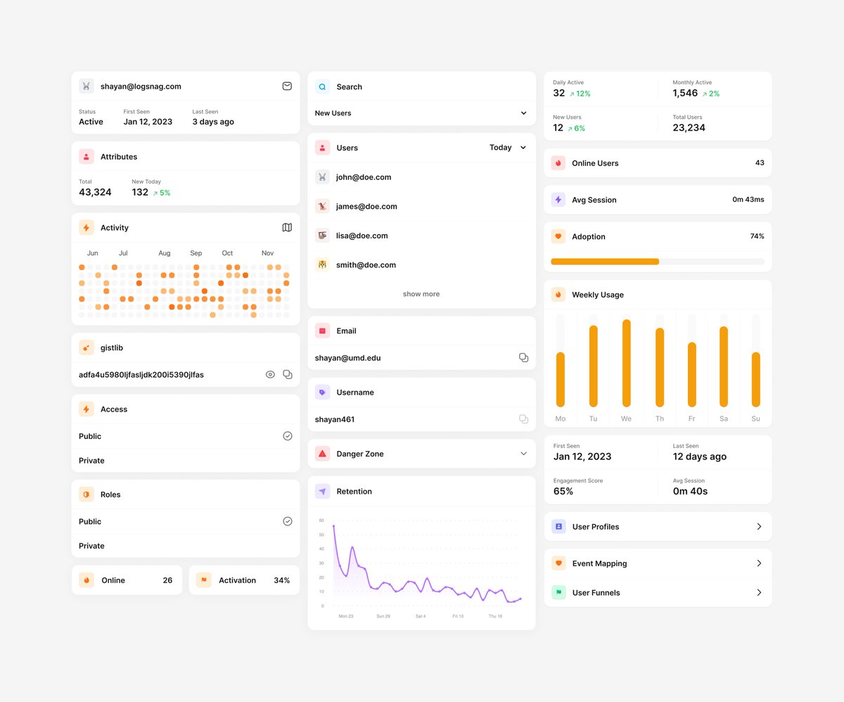
Since you asked, here's how I created my UI kit.
I start by drawing the UI elements that I think I need, and as I go along, I try to come up with a pattern that I can reuse across the UI.
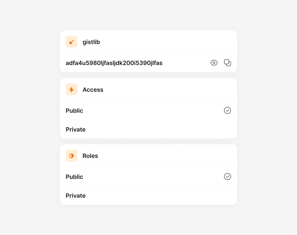
For LogSnag, what worked really well was to treat everything as a card and stack related items within the cards.
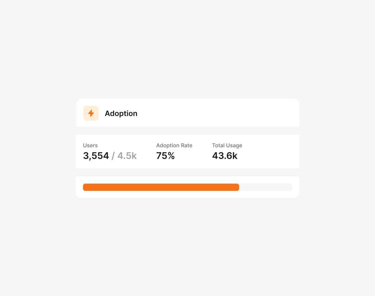
For example, this feature adoption card was one of the first things I drew.
Once I start seeing a pattern, I create a Figma component and use it for drawing the rest of the UI elements.
As I go along, I modify the original component or, in some cases, create another one when there's too much variation.
Finally, I transfer the components to my codebase, starting from the building blocks and then moving on to using them to create the UI elements.
For example, I have Card, CardHeader, and CardSection components and use these to create the FeatureAdoptionCard component.
Here's some of the mockups I created for LogSnag. Hope this helps.
34
27
616
159,530

7 Jun 2021
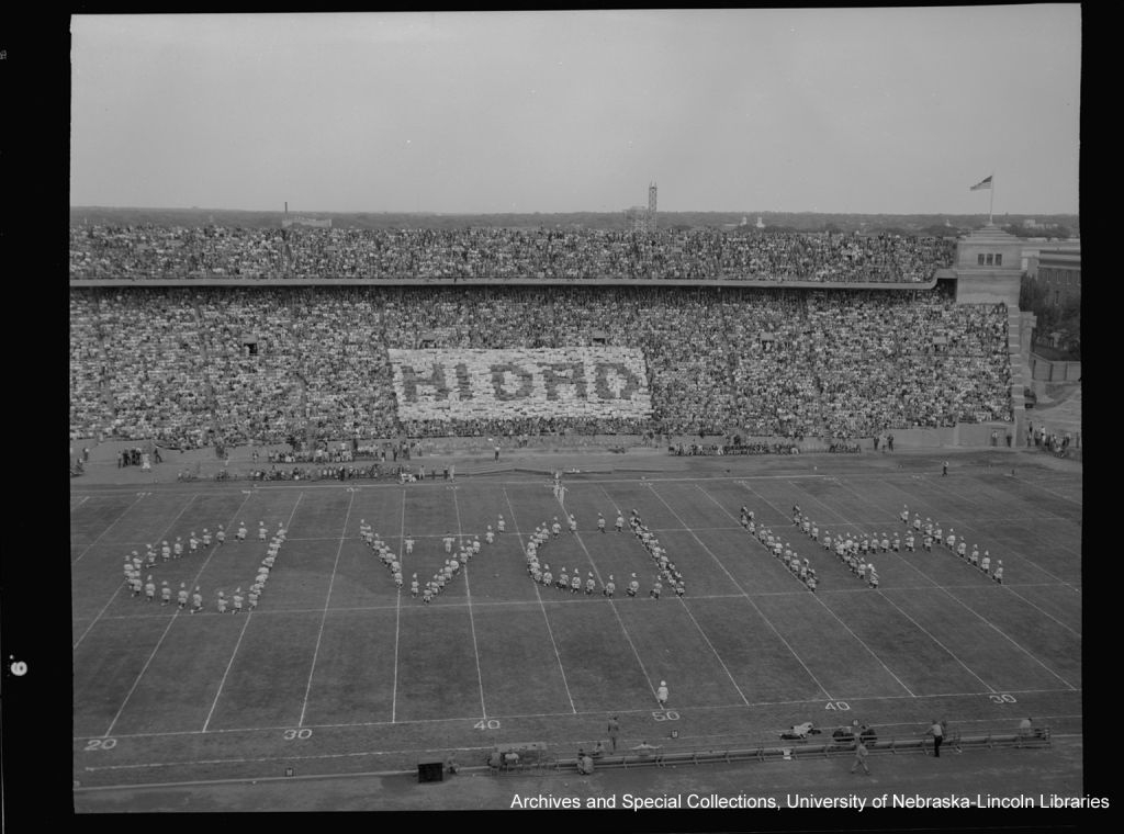
Happy Monday #Huskers! Let's kick off the week with some wholesome hello's from our card section and @UNLBands!
(Hi Dad, 1949)
@HuskerFBNation #UNL #LNK #marchingband #football #cardsection
1
8


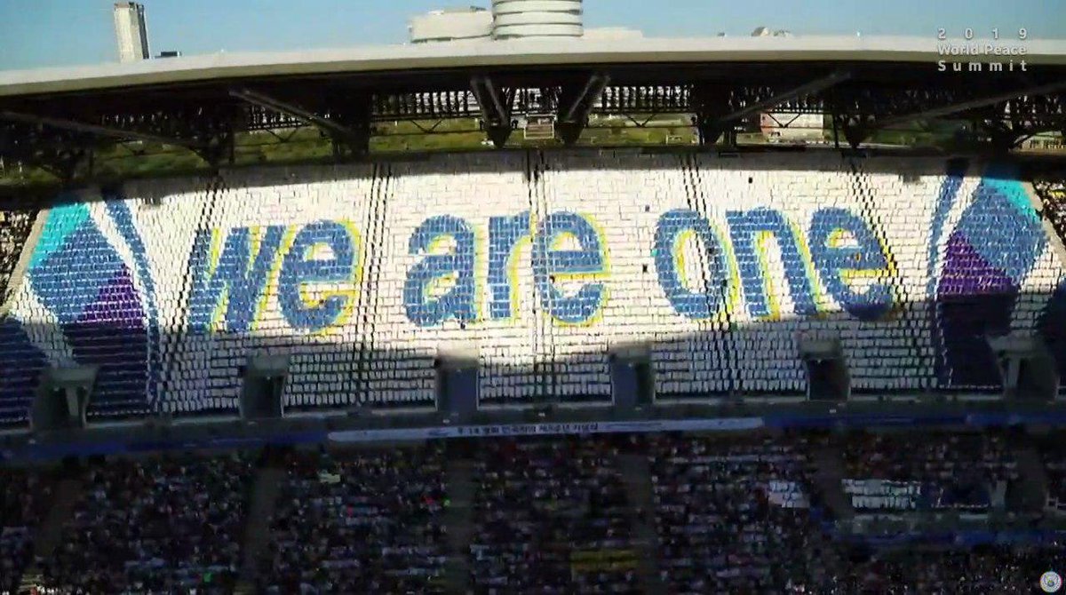
18 Sep 2019
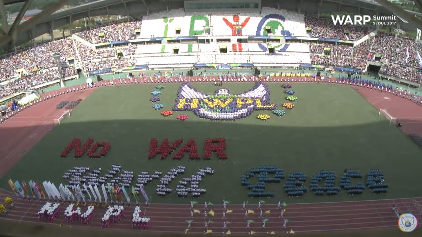
#NowPlaying #YoutubeLive #Cardsection of #IPYG Amazing performances with colorful cards!!
#Reunification
bit.ly/2Zi1BDQ #WeAreOne #DPCW


1
6
3
18 Sep 2019
<<History of the Korean Peninsula and the Light of the Peace>>
#NowPlaying #Cardsection #CardPerformance #IPYG #YoutubeLive bit.ly/2Zi1BDQ
1
3
4

7 Oct 2017
I'm so inspired by the #cardsection really shows when we work #togehterforpeace we can make something beautiful
1
9
5
25 Sep 2017
WOW!!! This #cardsection is amazing seeing people from around the world reuniting together for peace really shows peace is possible.
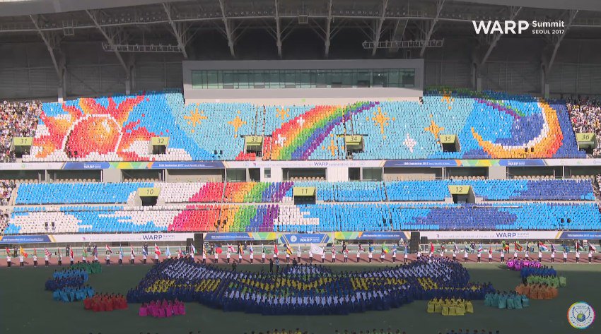
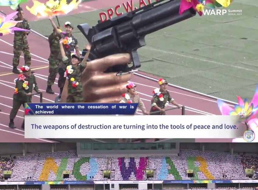
18 Sep 2017

We are now live at the #WARPSummit2017!
You won't want to miss a second of this amazing #peace festival!
Join now at goo.gl/sJ1n3s
4
4
18 Sep 2017
Hoping #Reunification of Korea!! #Cardsection for the peace train to the Pyeongyang Station!! T_T at #WARPSummit2017 We need DPCW!!
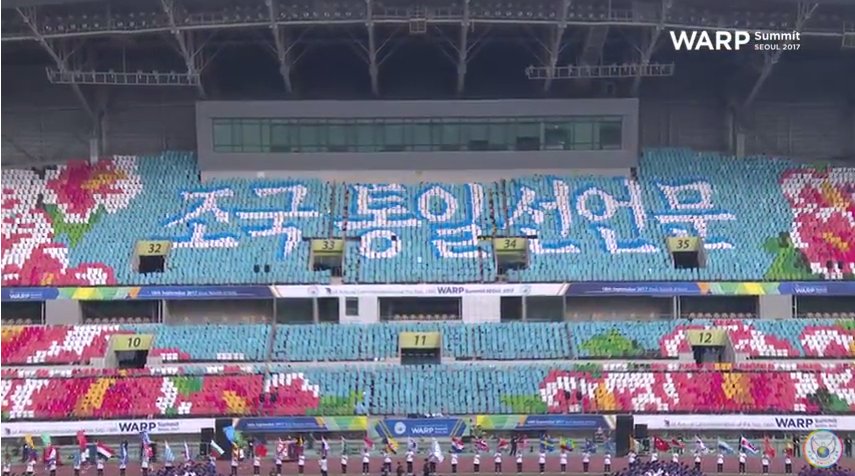
12
4
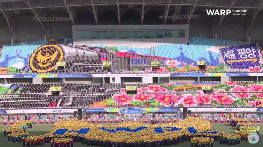
18 Sep 2017
23
14


20 Sep 2016
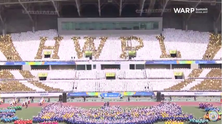
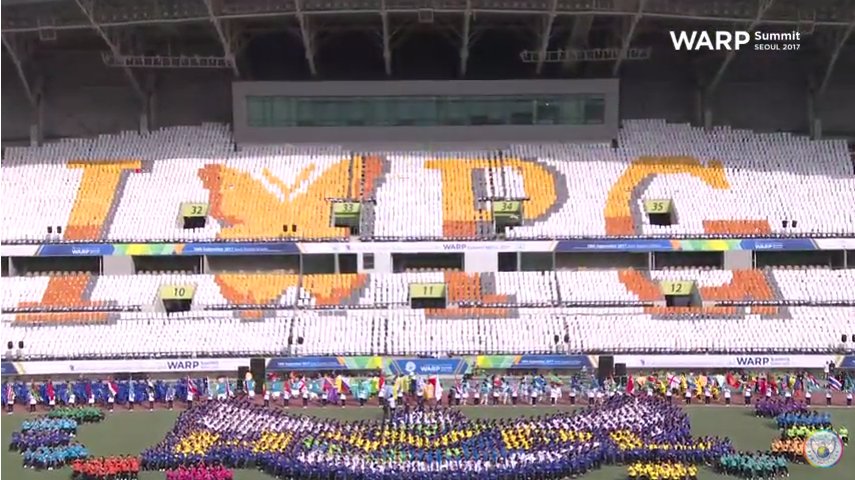
12,126 Messengers Deliver the Hope of Peace to the World. #IPYG #CardSection #Performance <War> hwpl.kr/media/hwpl_news/view… #HWPL @hwpl_kr 님이 공유
6
1

17 Sep 2016
what again the amzaing card section of IPYG! #Cardsection #IPYG #peace youtube.com/watch?v=xXB56P6W…
58
19

8 Sep 2016
#ThursdayThoughts Psyched to see the #cardsection at #HWPL #warpsummit! It's gonna be #Dynamic #somethingtotalkabout edelweisshwplpeace.wordpress…
23
12